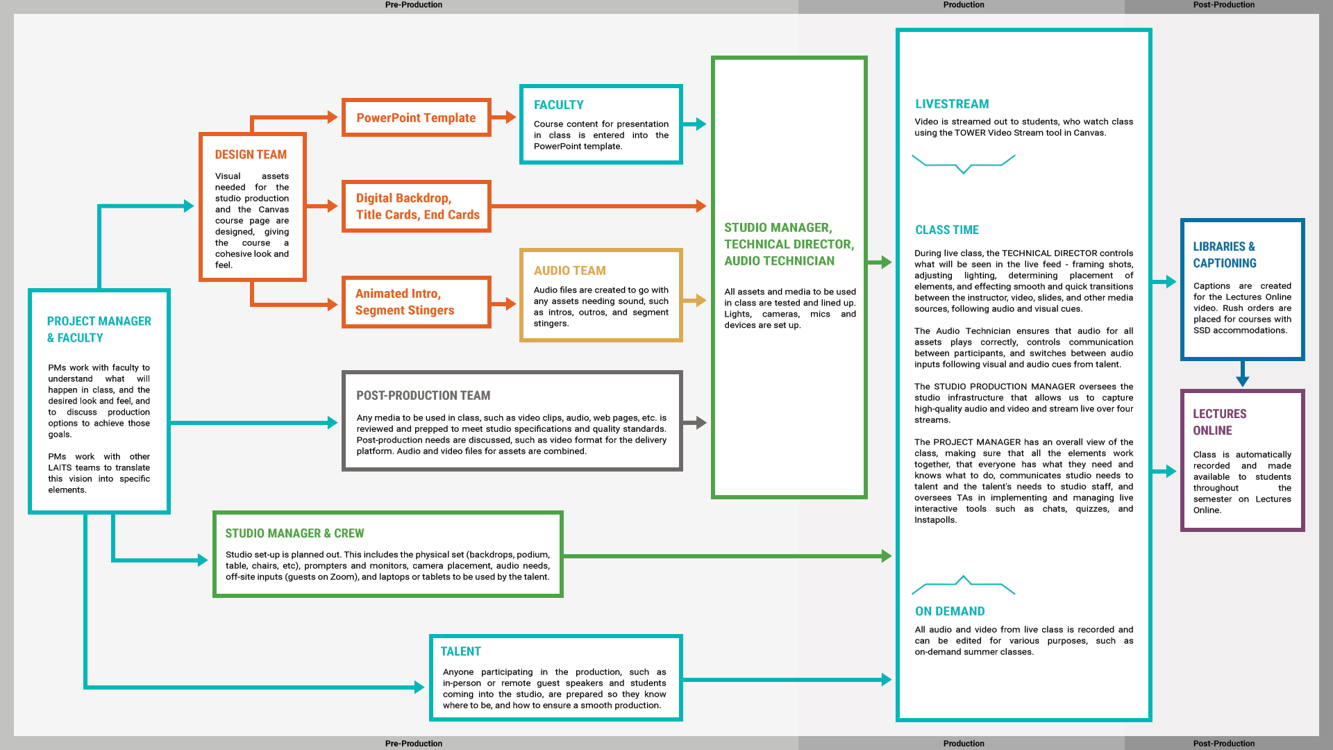
Anne’s Graphic: Online Course Production Timeline
Project: Online Course Production Timeline
Client: Internal LAITS Team
Completion Status: In Progress…
Staff Guidance: Maddy Kaniewski
STA Team Members: Cristina (at your service)
Description/Plans: To redesign this production timeline into a horizontal (16:9), color coded, more digestible version.
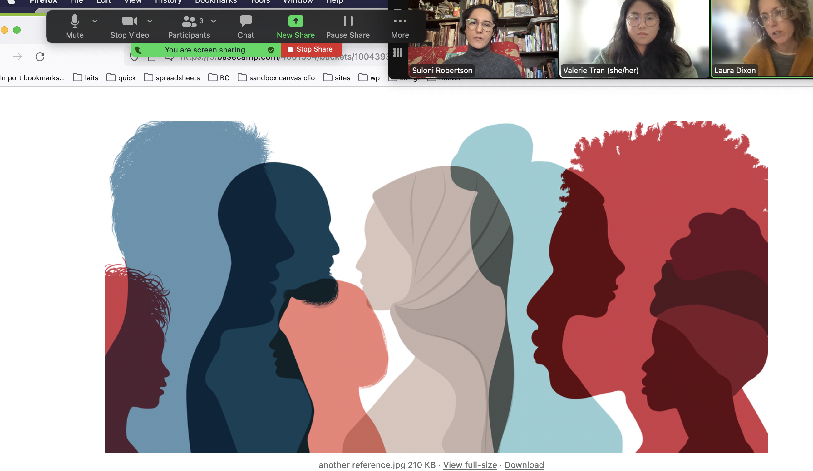
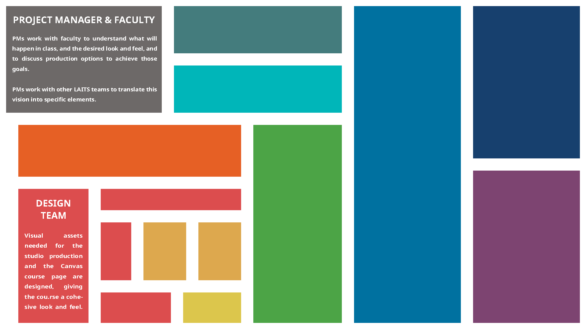
These were my original drafts…
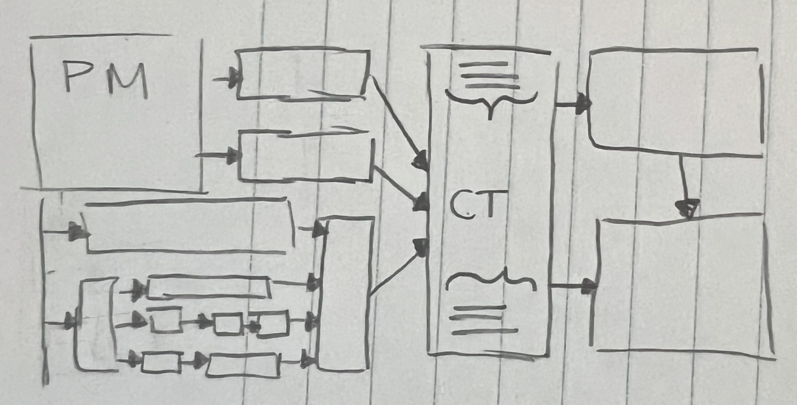
But after finally being able to meet with Maddy to talk about the project briefing, we decided that was not the right direction, and I worked on a different one… And so, the Confusing Version was born…
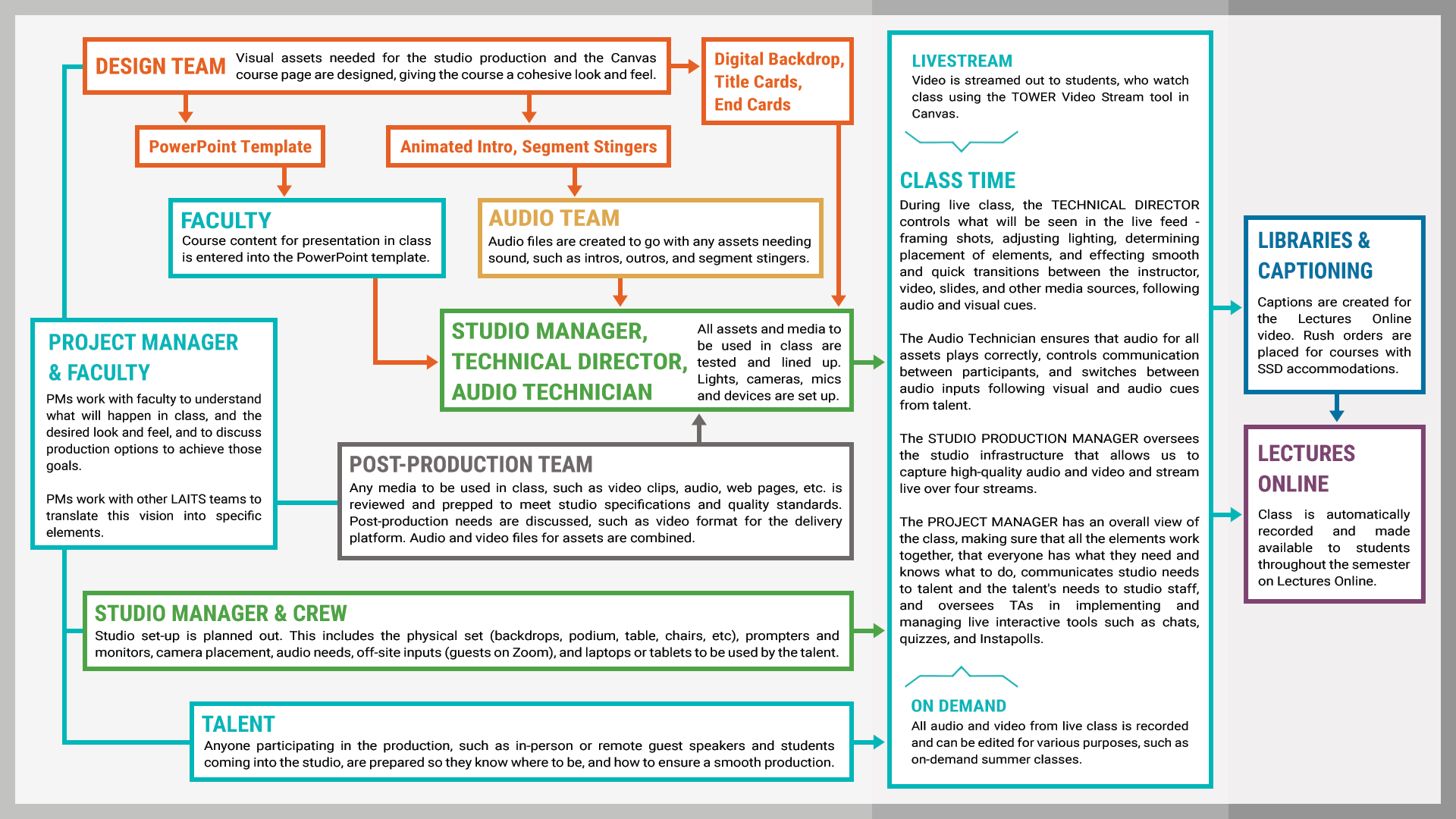
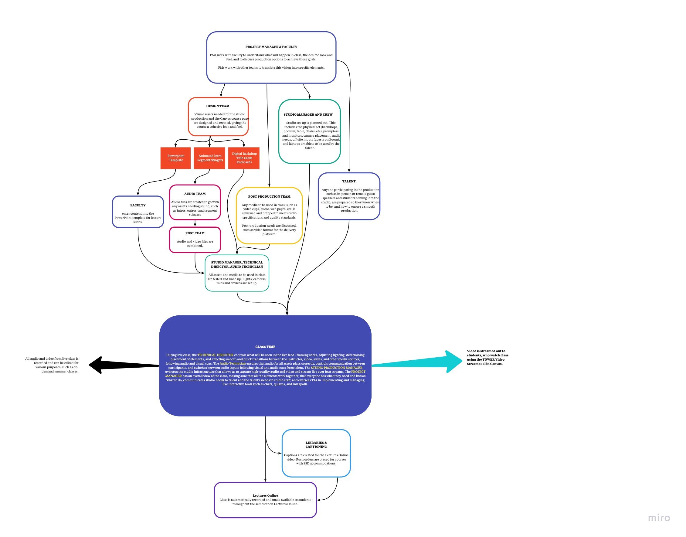
But the Confusing Version was, of course, confusing. So I worked off the feedback I got from Maddy and Abriella to work on a new draft. Thus, I present to you New Version. I tagged Anne on this version to double check on the flow of information, and to make sure it was correct. Updates will come after I get feedback from her.