RANDOM ART/DESIGN PROJECTS
I’m taking a design communications class and our first project was developing a logo. I got really excited and did whole presentation because I <3 design. Anyways this is what it looks like!

Here is the banner I created for the banner contest. I waited until it was over to post about it on my blog. I was inspired by the movie clerks for this banner. The prompt was “feelings about returning to campus” and the vibe was like kinda off, kinda ok, some good things here and there.
Over the past week, I worked on updates to the CMSTA shift spreadsheet as well as the tasks spreadsheet. I worked with Adrian to set up more CMSTA interviews. I also dropped in on Lindsay’s orientation and worked a little bit with her to get comfortable with everything.
I also worked on a number of pages and sent a status update for Academic Enrichment to the relevant contacts. No response yet, so fingers crossed.
Project: Photo ID KB Training
Client /Prof: internal to LAITS Design STA team
completion status: started on 9/23
staff guidance: Suloni
STA team members: Abriella, Angie, Megan, Cristina
description/plans: Working to create new client comm templates and guidelines for unique photo ID situations. Also created PPT (eventually to be converted to pdf) w/ Megan to guide STAs on basic photo edits.
To be completed: Maybe within next 2 weeks??
Project: Design Survey for CMSTAs
Client /Prof: CMSTA team
completion status: sent out on 10/1
staff guidance: Suloni
STA team members: Angie
description/plans: With Angie, created list of basic skills CMSTAs might need for editing existing COLA photos during the web refresh project and/or graphic creation (possibly). Once we get responses from all 3 current CMSTAs we’re going to use it to plan and create documentation for this purpose
If you know, you know.
No more progress yet, with return this either today or Wednesday (Thuy is online Thursdays.)
My roommate’s dad reinforced and “Pirate-proofed” our apartment balcony, so have a quick glimpse of her enjoying the great outdoors
By Adrian McKee
This week, in lieu of new pages to create, most of the Refresh work was reformatting, featuring…
*drumroll*
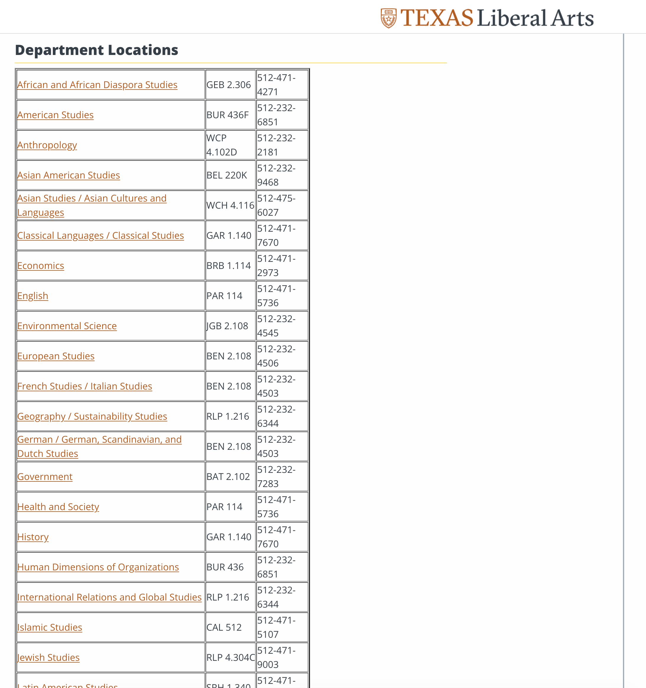
Tables! At long last, we can arrange multiple columns into a table. The old site uses a lot of these, so this is very useful. And it looks…
 Well, okay, maybe it could use some work visually, but it looks better for smaller tables.
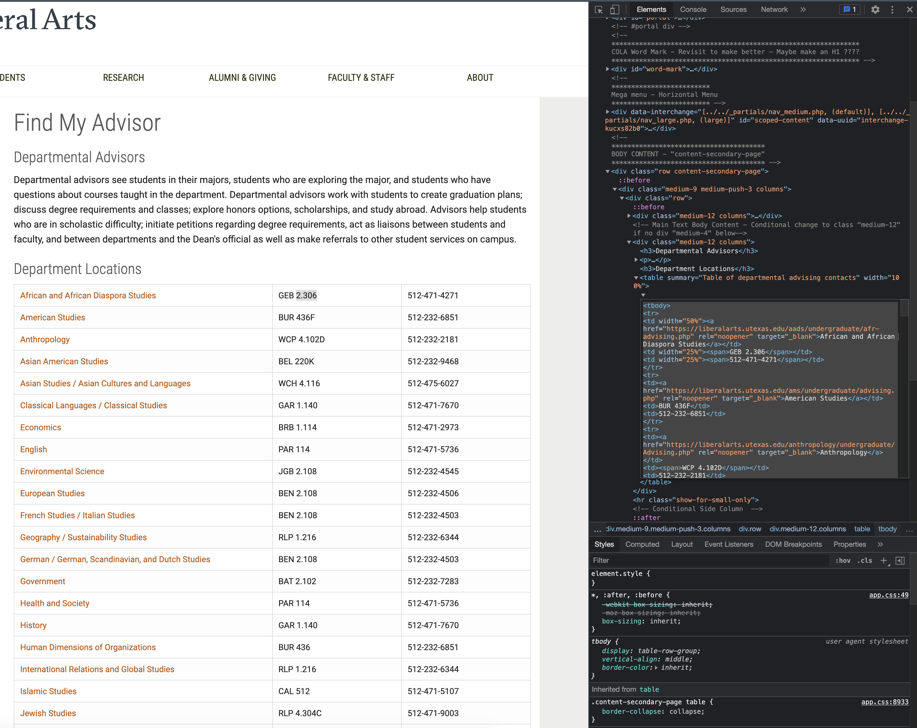
 For this one, I actually had to inspect the original and copy the html, since I copying every individual link may have taken all day.
Personally, I like the column layout better for tall vertical tables like this, which is also a very useful new feature.
This training was very informative, not as technical-skill-heavy as some others, but a very good overview. It covered the history of font design and the different types of typefaces, with two exercises. The first one was picking two different fonts that paired well together.
The second one was picking a different font from every category of typeface (Serif, Sans, Display, Script, and Monospace). My favorite was Medula One, a very stylized display font.
All in all, not the busiest week I’ve had, but I learned a lot!
Project: Fall 2021 STA Roster Poster
Client: Internal/LAITS STA Program
Completion Status: In progress…
Staff Guidance: Mike Heidenreich
STA Team Members: Cristina (’tis I)
Description/Plans: Create this semester’s STA Roster Poster according to specifications.
∘˚˳° Spooky howdy y’all, and happy start of the most wicked month of the year ⊂(´・◡・⊂ )∘˚˳°
For those of you who might not know, the Roster Poster referred to in this project is the one you’ve probably seen before (taped to our office’s door) that was a picture of all the STAs in our program, not just from Design and WebDev, but from all other teams, too. Here are some pic from past posters, just for reference…
Well, this year’s theme is “Atomic Connecting Circles”… Mike (the project manager) and myself have been working on a few different ideas that might be successful at portraying this theme, so no spoilers there. But, let me show you some progress pics from a version that didn’t make the cut:
Welcome back to the TBH Recap Show. Today we present to you the Tokyo Drift of our saga: Rusk County Map Update Pt.3. As always, I’m your host Cristina. Let’s get to it…
Project: Rusk County Map for TBH
Client: Steve Black & Emily McCuistion
Completion Status: In progress… soon to be done.
Staff Guidance: Suloni Robertson, Lauren Moore, Ruben Garza, Estella Sun, and the WebDev fam as a whole, to be honest.
STA Team Members: Cristina (at your service)
Description/Plans: Develop an interactive image through Canvasser for a new Texas Beyond History page, add it to the TBH server, and create one of the pages linked to the interactive image in question.
Since the last update on this, a lot has happened. After sending the mockups I talked about on the past TBH post, we got some comments, some feedback, and some new requests. So let’s talk about it in order:
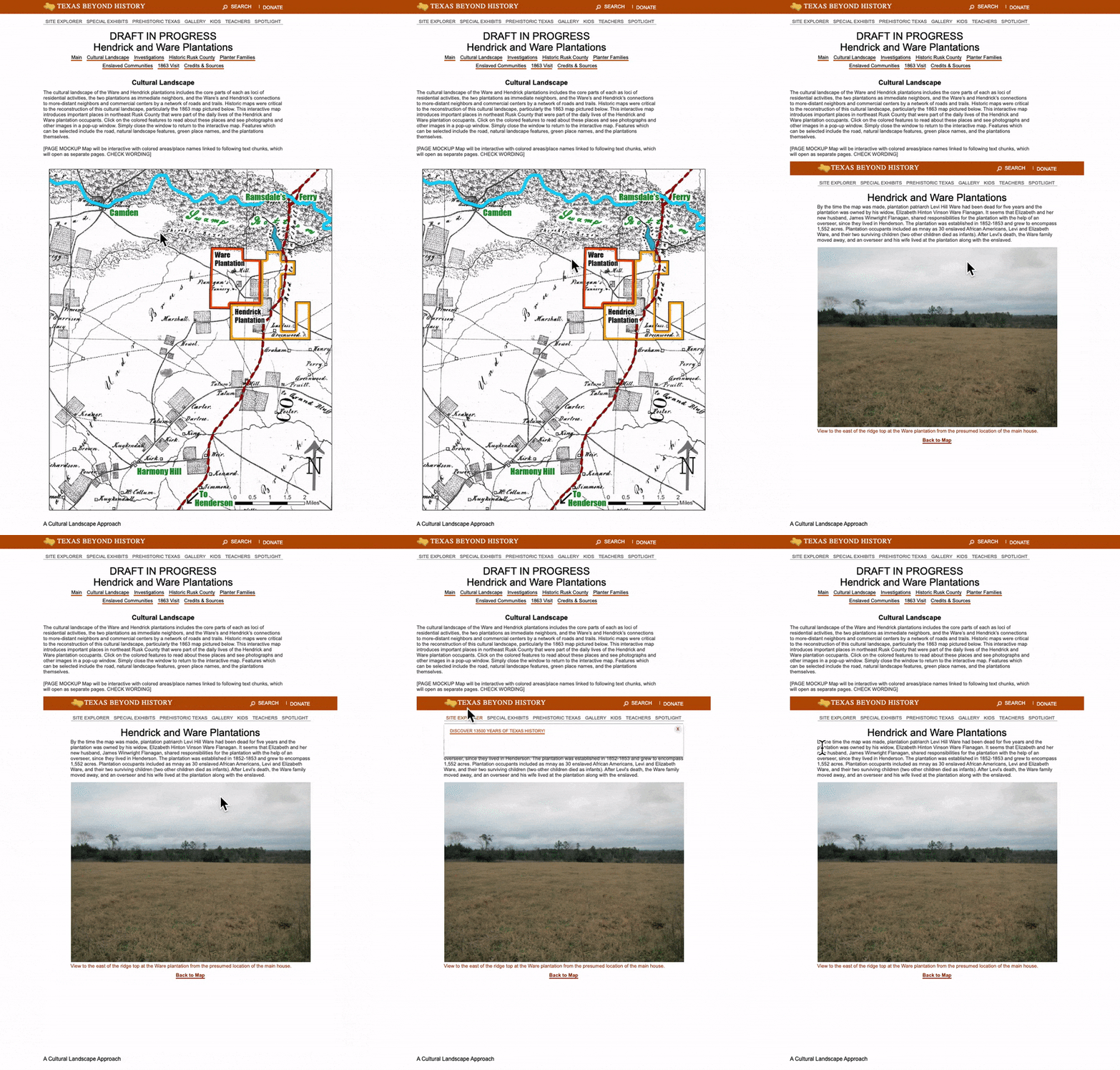
First thing I did after that was to ask for help, since coding on html was not something I was familiar with. So, eventually, Thuy (a fellow STA that’s really versed on these kinds of tasks and is also a CompSci mayor) was able to help me getthe new requests from the third mockup onto the site… However, I noticed that we still had some requests on that pending by the time I logged onto my next shift. Good thing is I had a long shift that day, so I used that time to literally learn how to log onto the TBH development server, and familiarize myself with html coding. So I did what I could to the best of my abilities and commented on BC about what I couldn’t fix: mainly a header on the rusk/images/warep.html site, and the fact that, when you interacted with the map on the rusk/landscape.html site, the map’s linked sites would not just on the same tab (which is what we previously agreed with our clients on doing), but are also confined to the space of the map within the landscape page. This is what I mean:

Afterwards, I got some feedback to lean into that bug, and just make it look neater, so I got down to work on that. Simultaneously, I asked for some more help from the webdev team on fixing the header issue. Few days later, I was done with that and send an email to the client with all the updates Thuy and myself were able to make.
Nonetheless, a few more days later we got a response and more tasks to manage. On the landscape site we got comments about the size of the map (asking for me to fix an overflow issue) and on the functionality, since they really needed for us to have the links from the map’s hot spots to open on a new tab… so the next step would be to ask Ruben if that was even possible, and then how to fix this on the embedding of the map. Moreover, on they also had more requests fixing the warep site’s format. Finally, they had a new request to, if possible, arrange for the “Back to map” button to return to the same place on the page as the viewer left it on the landscape page. Long story short, I was able to address some of these requests, and had to ask the webdev team (and Estella) to help out with the rest, and soon enough, we were able to tackle every single one of those requests.
We are currently waiting for either more feedback, or a final comment from the clients, so fingers crossed it all goes well!