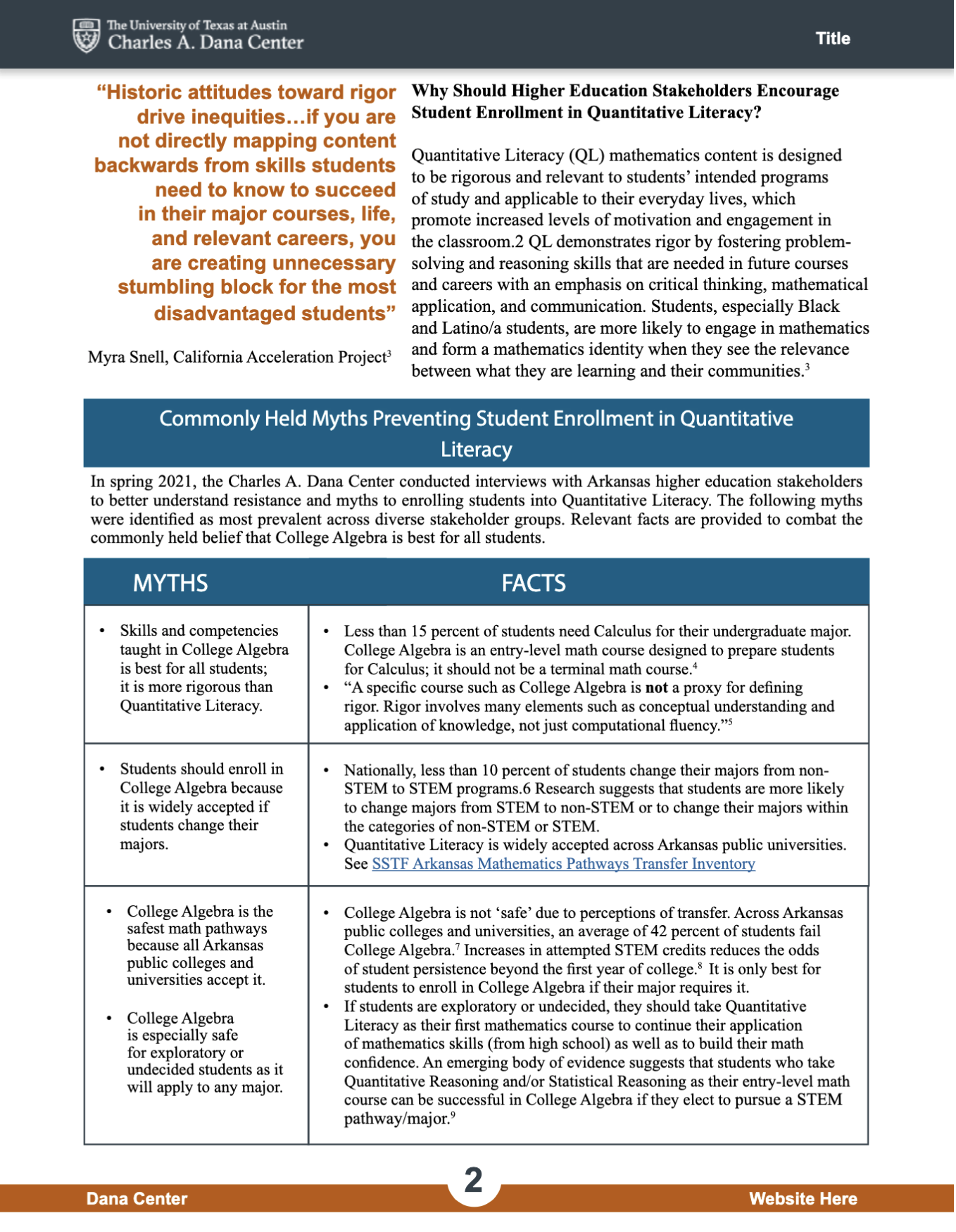
Dana Center: Infographics
Project: Dana Center Infographics
Client: The Charles A. Dana Center
Completion Status: In progress…
Staff Guidance: Maddy Kaniewski, Suloni Robertson
STA Team Members: Cristina (it me)
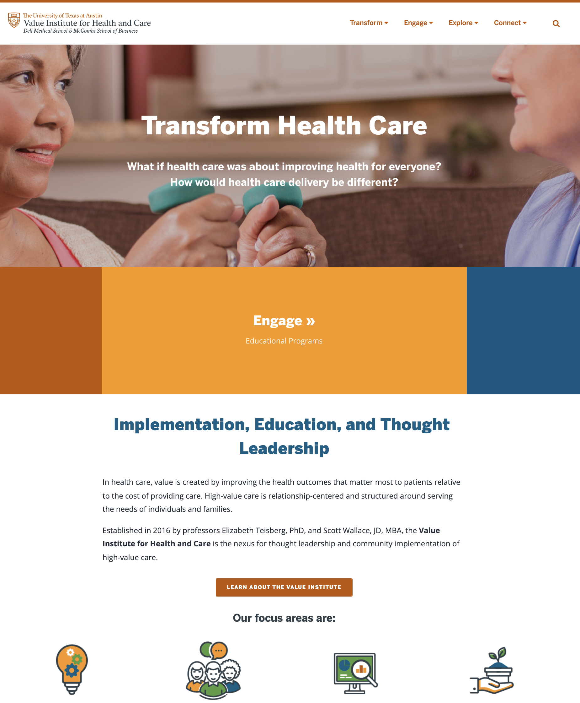
Description/Plans: In brief, the Charles A. Dana Center wants us to make some infographics on their policies, curriculum, etc, keeping in mind their audience will be people who don’t know the dana center. They want us to help them understand what they do.
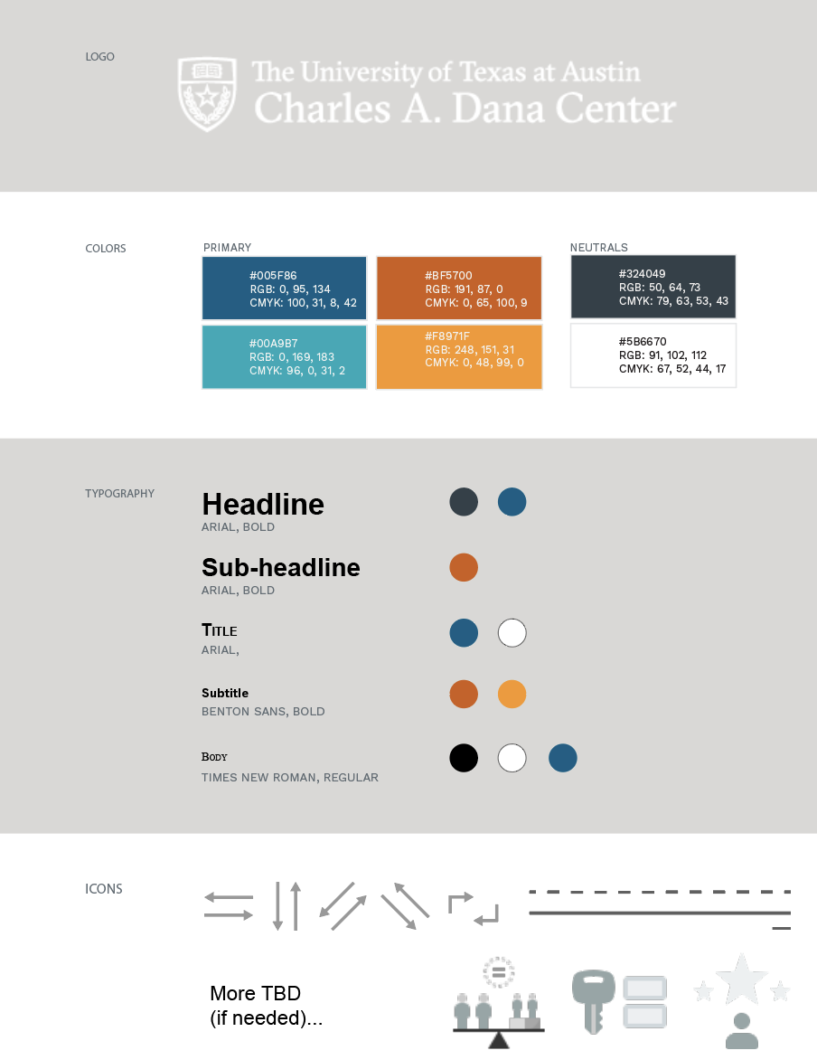
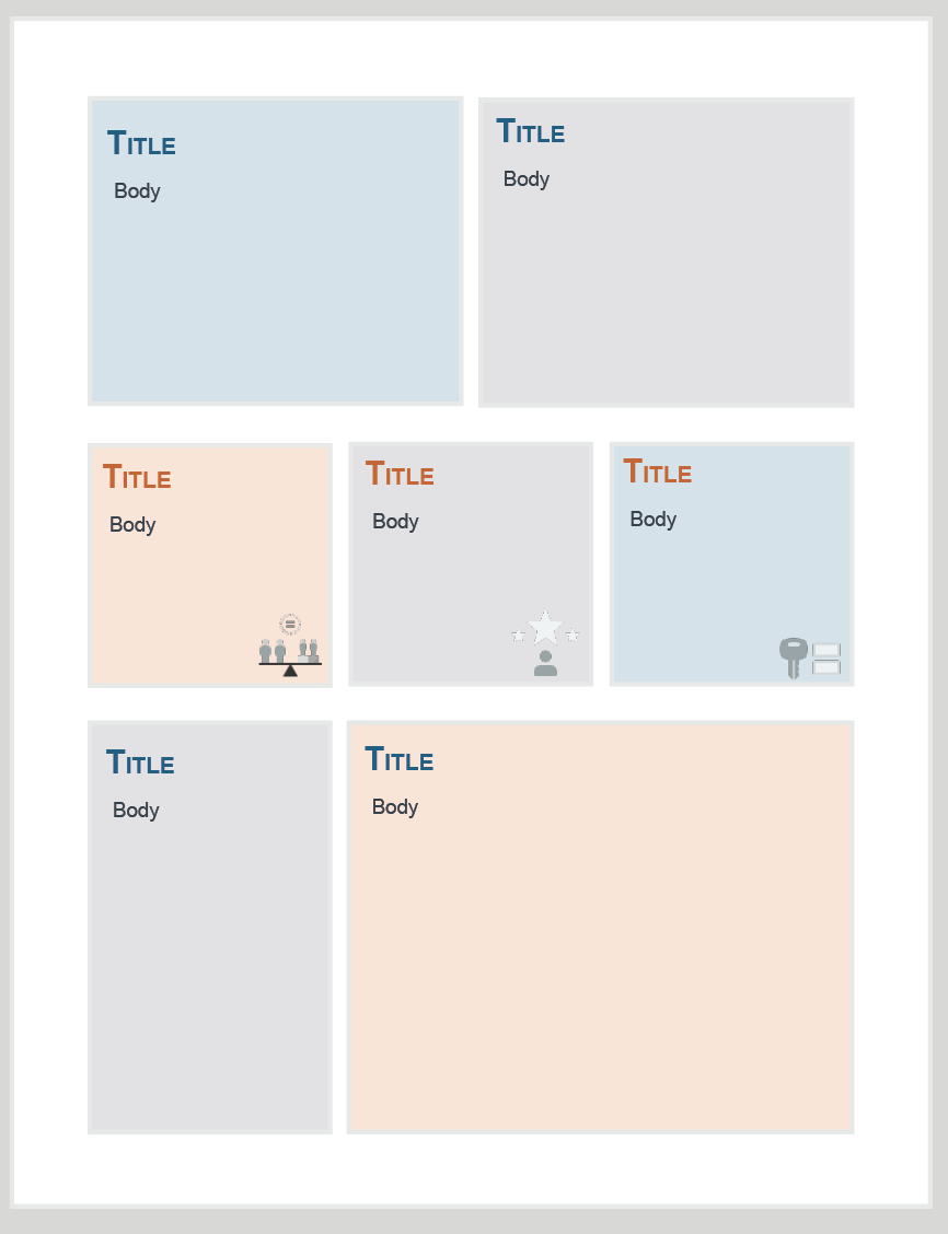
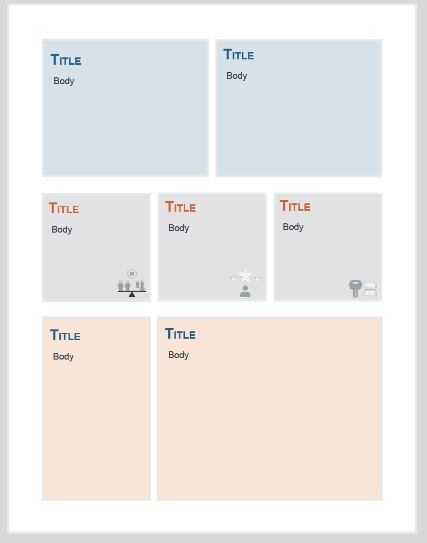
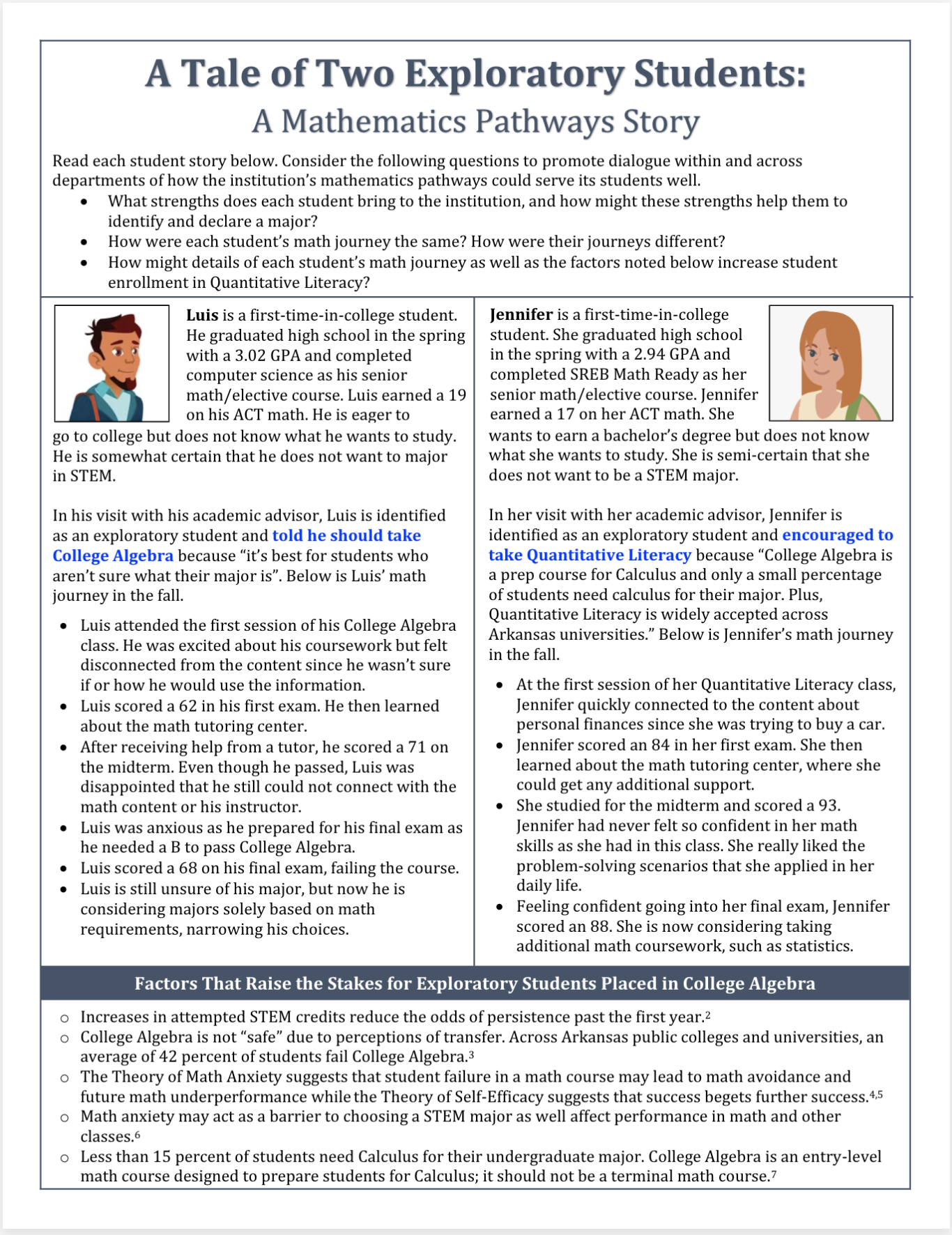
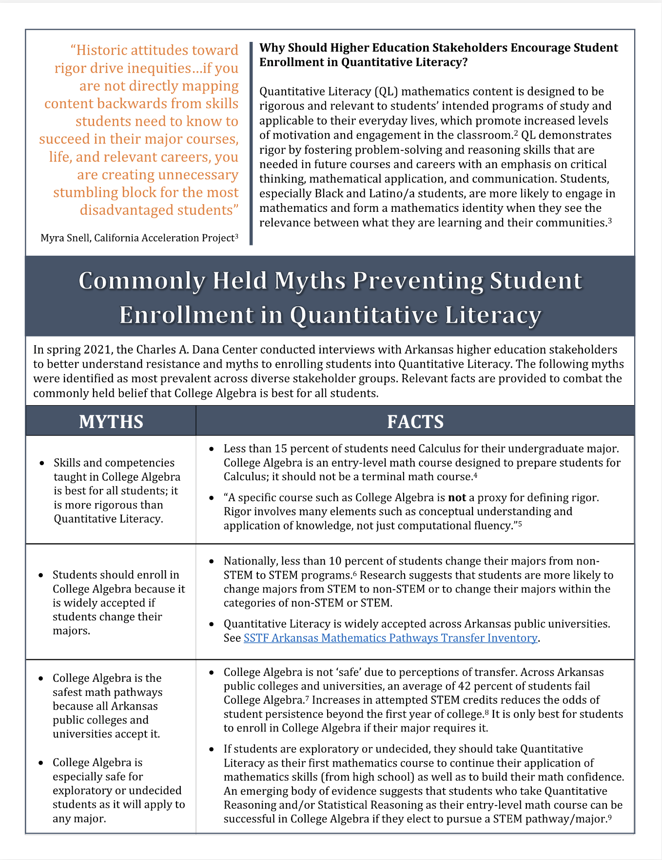
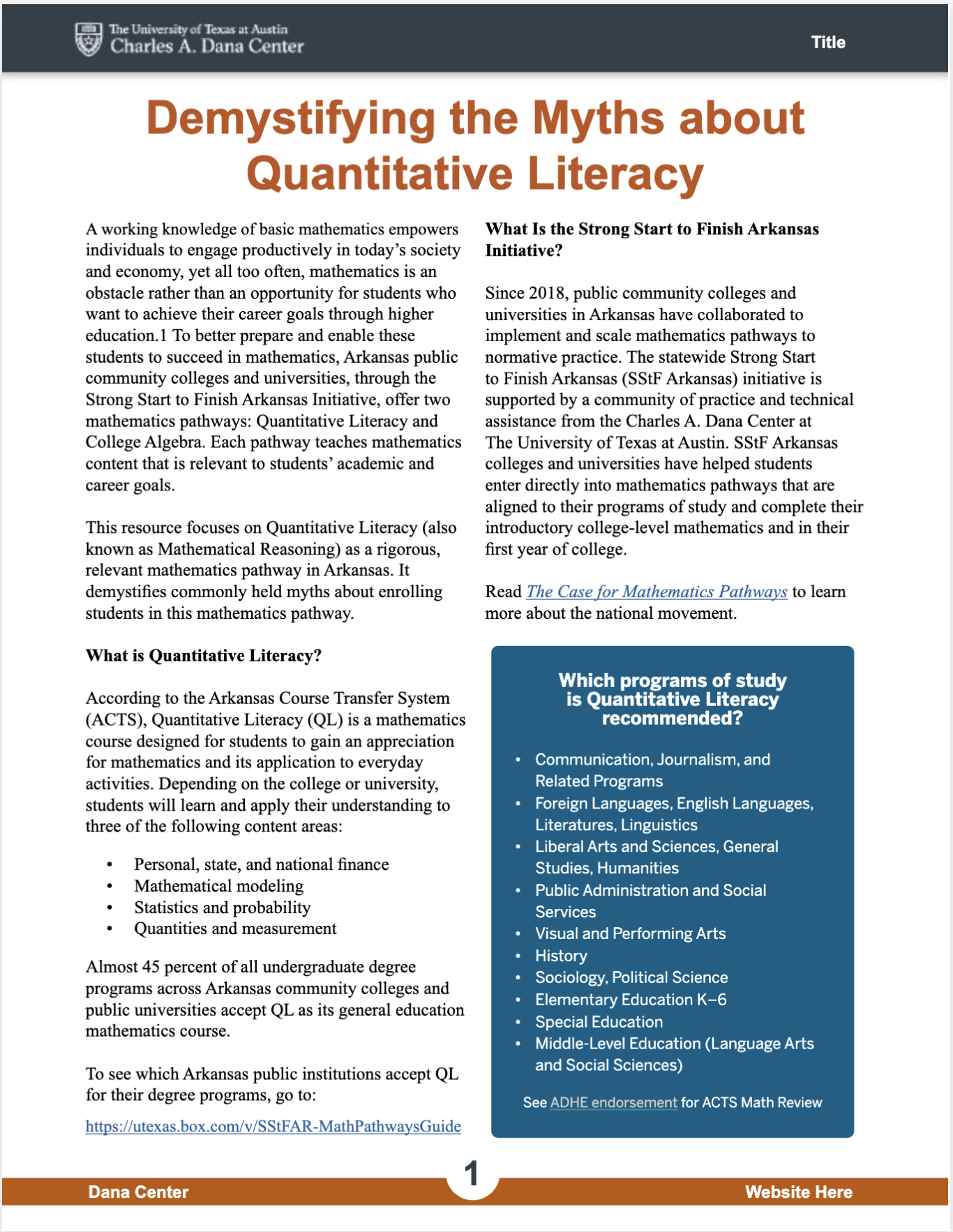
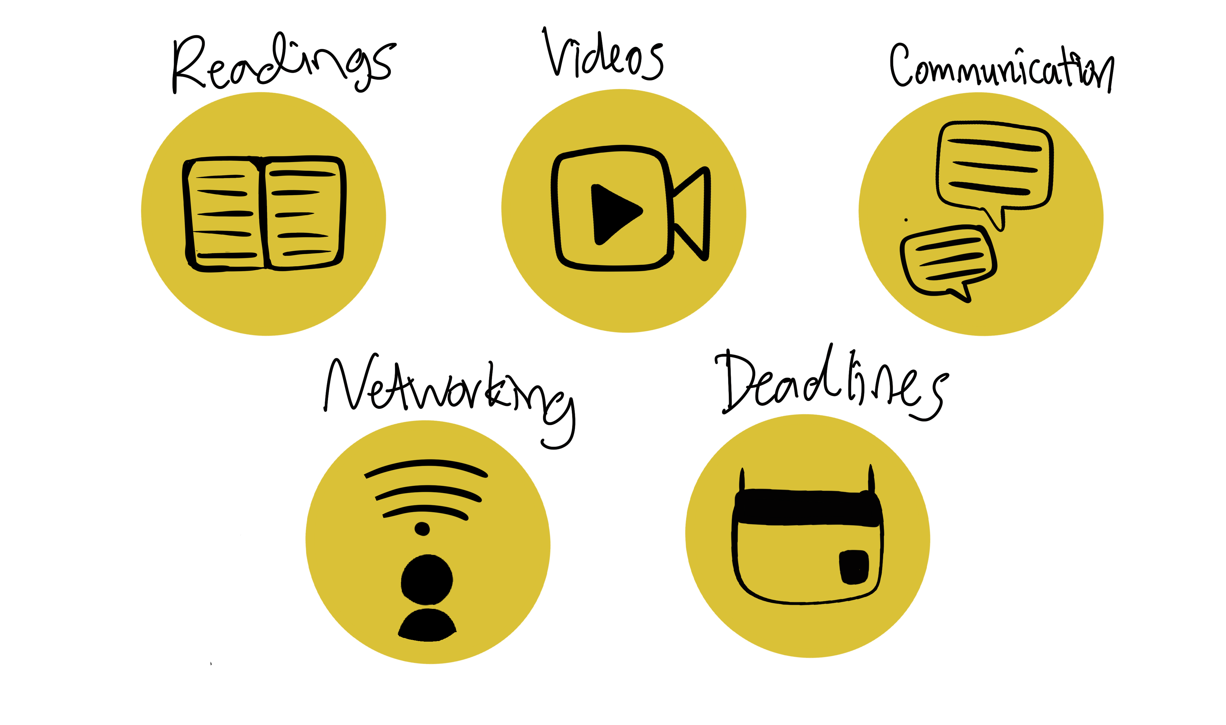
First, I started off drafting a style guide and a basic layout…
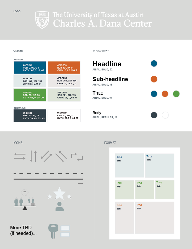
But then, I realized that the infographics would likely need more color and some more arrangements…

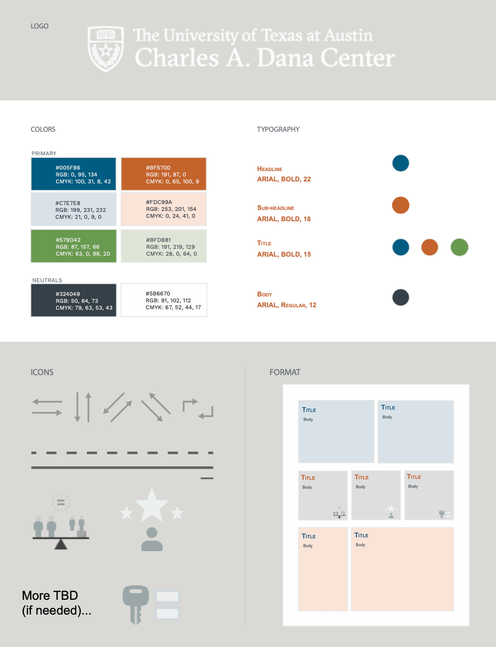
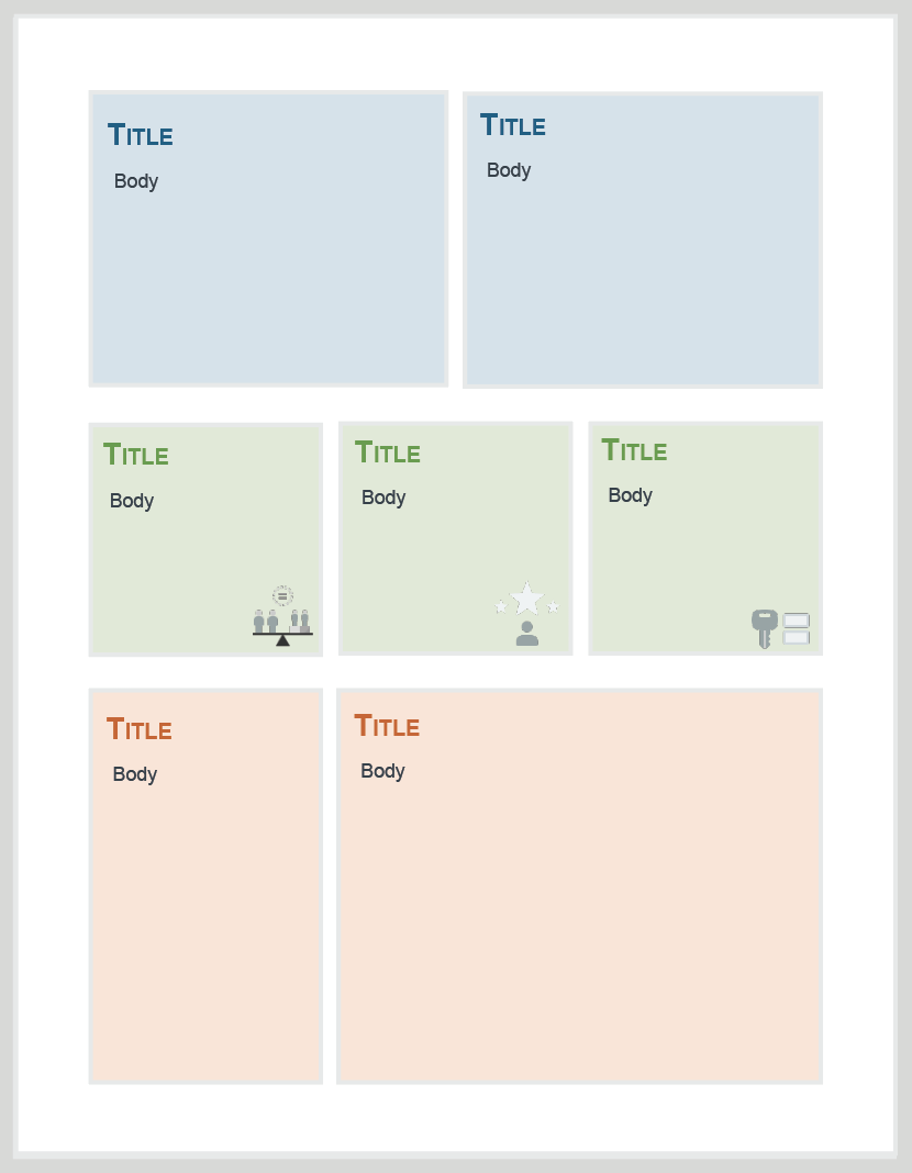
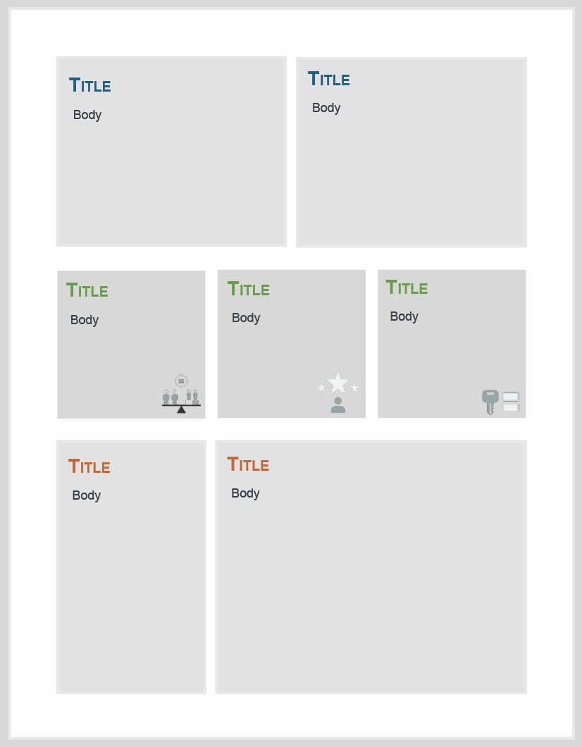
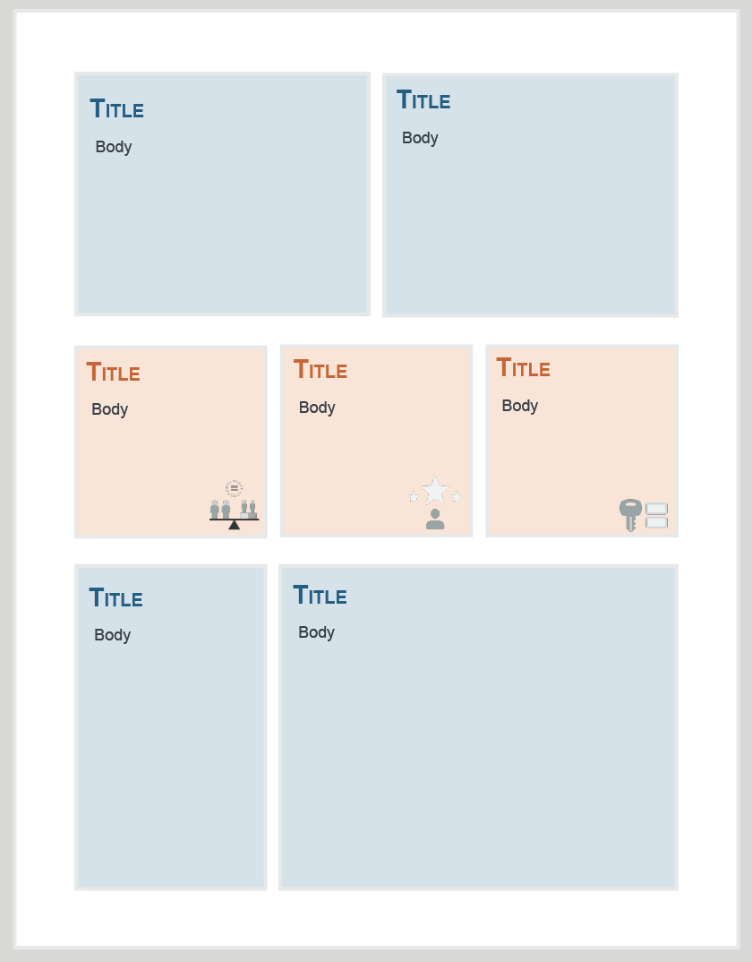
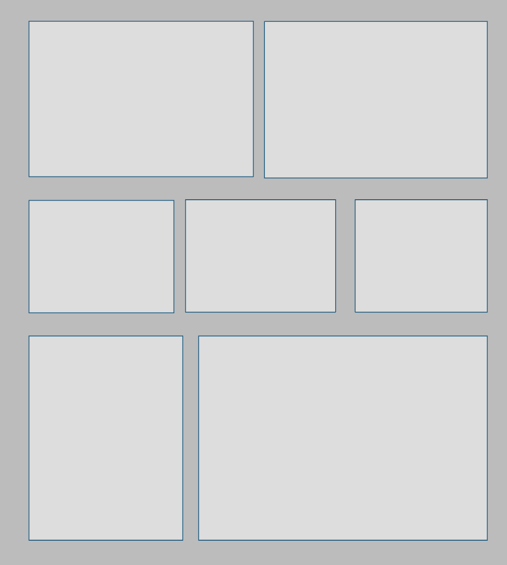
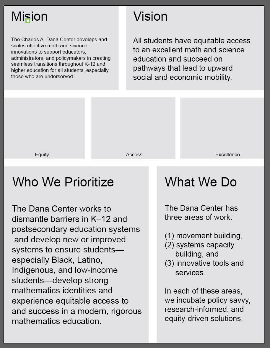
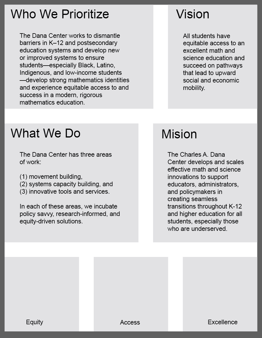
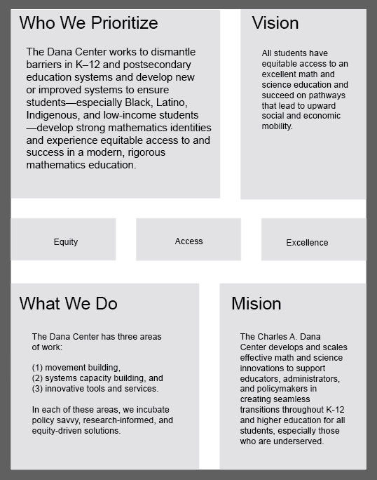
However, starting out with the style guide was not the move. So Suloni suggested we paused this progress. After that, I started focusing on the layout rather than the style, and the following images are some of the things I came up with after realizing that my original idea did not properly convey the topic hierarchy that they set to prioritize:
1. Who we prioritize
2. (1.5) Vision
3. What we do
4. 3 core values
5. mission
Here, I tried defining the hierarchy in different manners, such as through font size, through box positioning, and through box size.
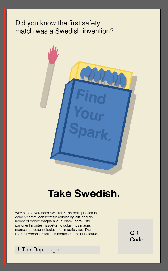
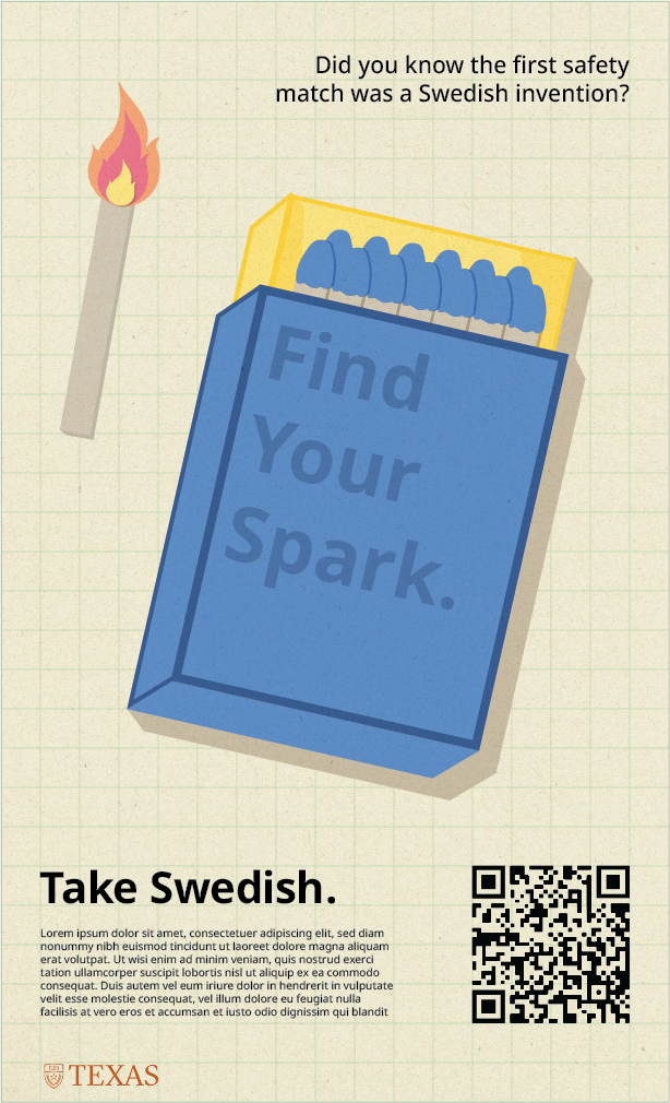
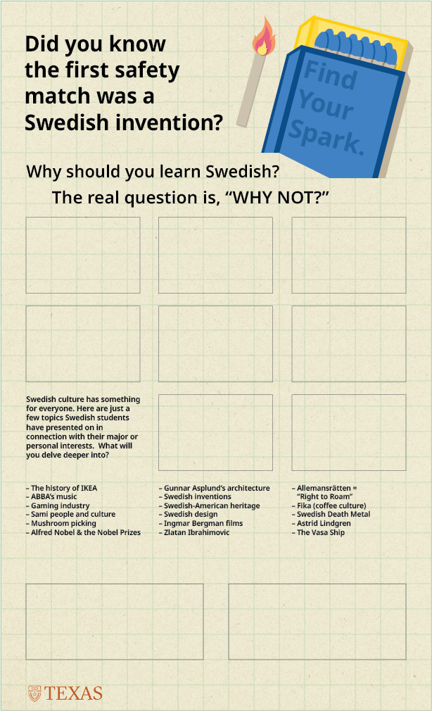
However, I was then given some more advice and then asked to put this project on pause to redirect my attention back to the Swedish Language Promo Designs…


")
")
")
")
")
")
")
")
")