Swedish Language Promo Designs Pt. 2
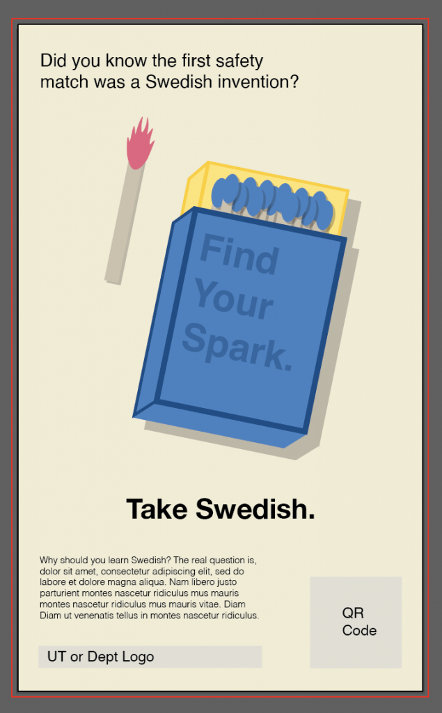
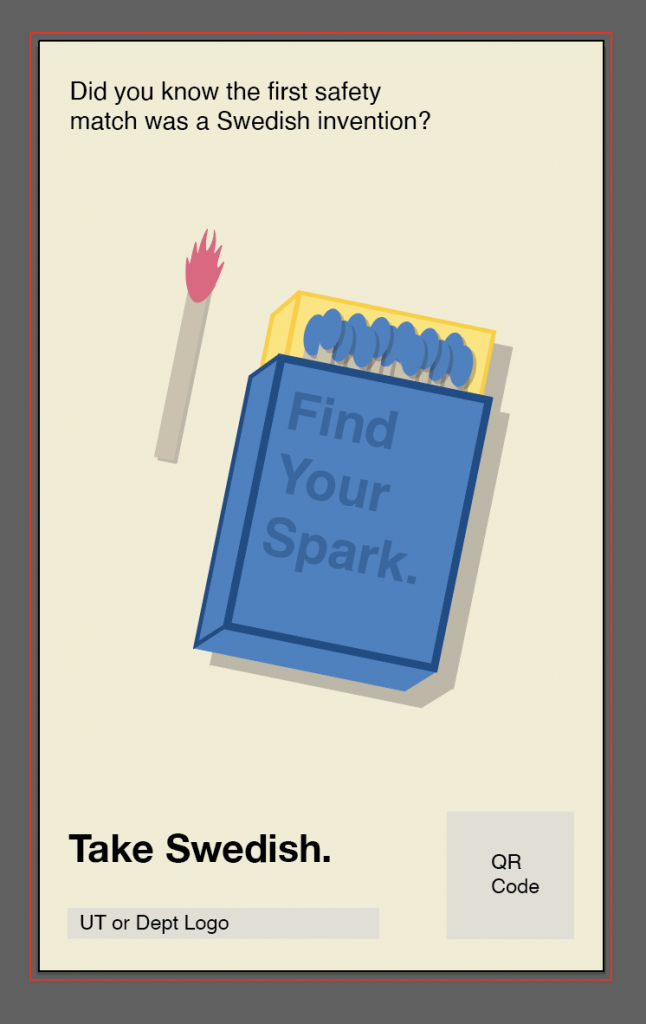
After getting feedback on my original layout idea that was based on the VW’s Lemon ad, we came to the conclusion that I couldn’t follow through with that format since it iconically came from German inspiration. So, I started looking for ways to reformat that concept into a different minimalist style. Here are some ideas I tried out:
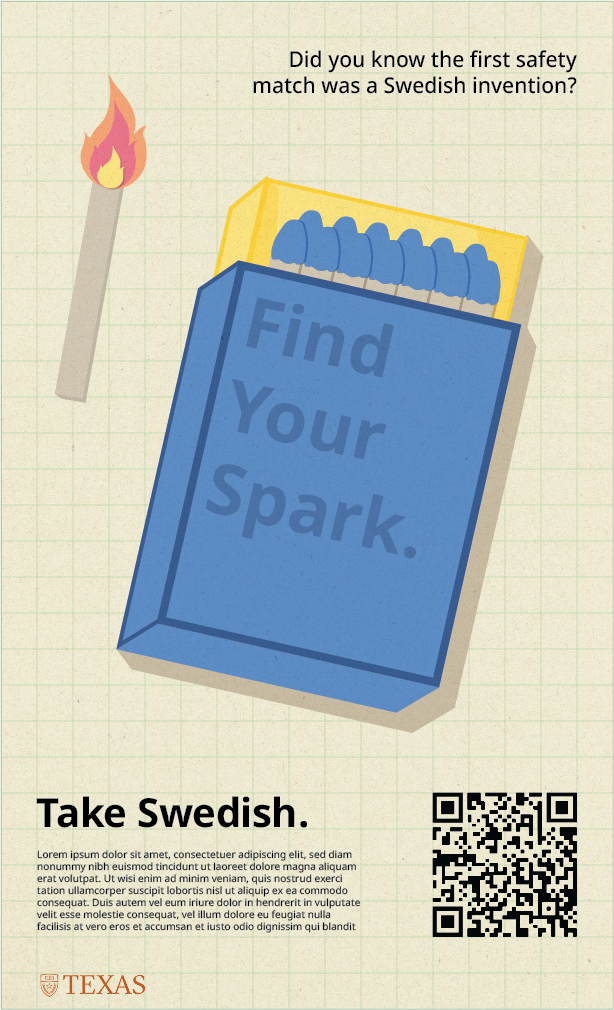
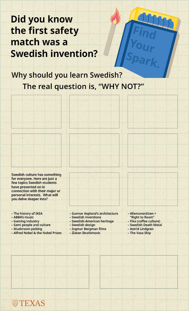
The following two images are what we eventually showed the client in order to get feedback from them. One of them is a product of this minimal content style we had been shooting for, and the other is a very rough draft of a maximal content idea the client and Suloni had considered and suggested I try out.
Fun Fact: the green grid was a guide for me to symmetrically place elements on the design, but I accidentally left it visible in one of the drafts I uploaded to Basecamp, and that mistake was actually well received and I was asked to leave it for future drafts, lol.
After sending these over two things were clear:
1. The maximal content version was scrapped.
2. I needed to revamp the minimal content version into a more ornate 19th century matchbox… more on that to come.


