• We are STAs
    • Asha Rountree
    • Haley Ma
    • Kate Shih
    • Kyra Lee
    • Nicholas Peasley
    • Sasha Kenney
    • Shanda Horm
    • Shriya Atreya
    • Tomas Marulanda-Mesa
  • We were STAs
  • STA Presentation
    • STA Presentation 2017
    • STA Presentation 2016
  • Testimonials
  • Resources
  • Home

STA Blog

Life and Letter: INHALE. EXHALE. ANALYZE.

October 30, 2019 By Abriella Corker

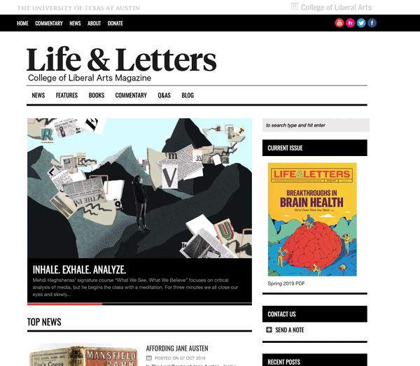
Life and Letters: INHALE. EXHALE. ANALYZE.

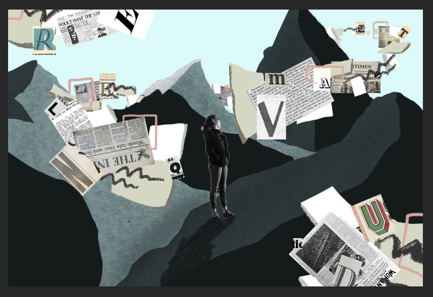
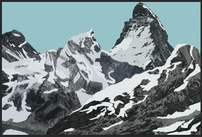
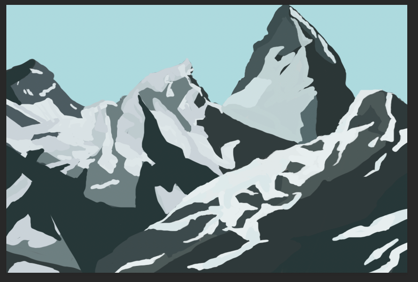
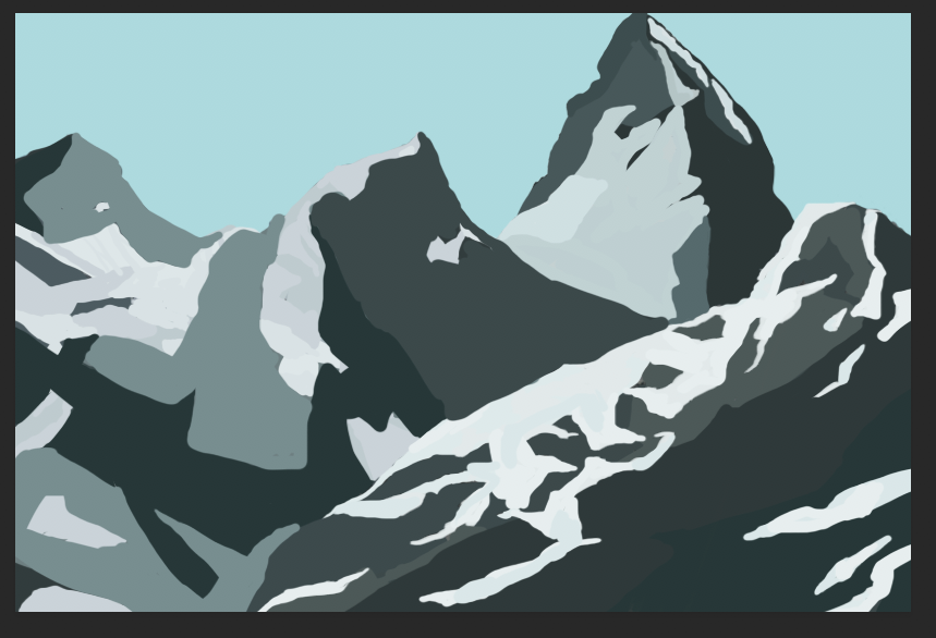
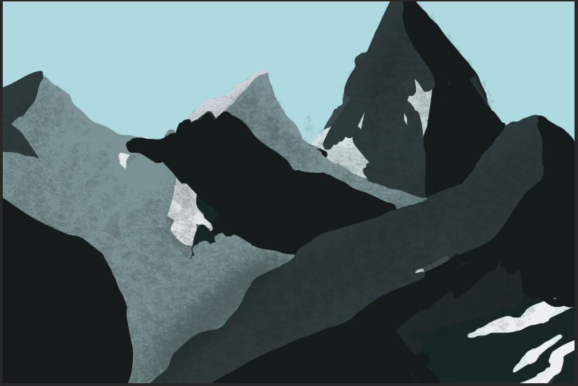
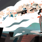
I had the opportunity to work on another illustration for the Life and Letters magazine. Below are parts of my process for how I came up with the illustration and the end product. Many images for inspiration and reference for color palettes come from the NY Times Opinion art on Instagram that I follow. The exception is the image on the right in the first row which is done by the artist Molly Mendoza. My idea for the composition was based around the mountains and objects floating in space that represent types of media to get news. The person directing me wanted the imagery to focus primarily on text and newsprint so I implemented typography and news spreads in the floating shapes.


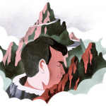
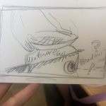
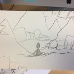
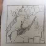
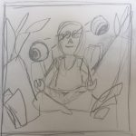
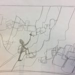
Here are some of the first sketches I came up with for how the message of the article can best be conveyed. Two of the sketches are very different from the idea of mountains and floating objects as they were some of the first brainstorms. The rest of the sketches are refinements of the compositional layout for the idea we agreed upon. Some ideas that were brought up to consider was what the person would be doing on the side of the mountain. We did not want imagery of a person hiking or be obviously meditating in the landscape. The image should be of someone who is contemplating and analyzing in a meditative manner.

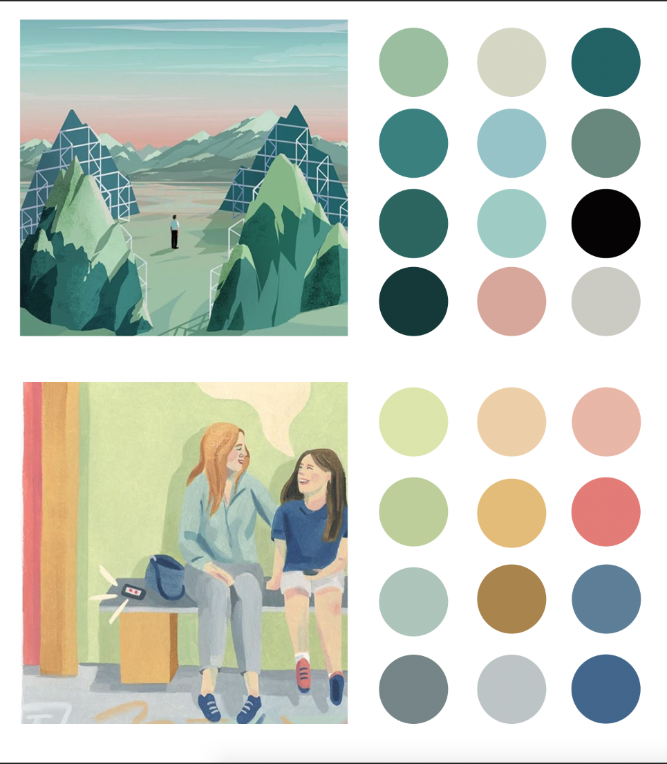
Here is the two color palettes I created for the client so they could decide what they wanted the overall look of the image to be. They decided upon the top one with more blue-green ranges and fewer pinks and yellows. The hope was using cool colors well help convey an overall mood of calmness compared to warmer colors of the second palette. From these options I would adjust the values of these colors to get more range in the illustration.

I am very pleased with the final product and I think the people who asked me to work on it were very happy with how it turned out. It is now published on the site and is displayed as the first image on the homepage, and the image after is my work from the Stress Tips article as well. Having the opportunity to work on illustrations that allow me to be more involved in the creative process as well as getting my work published is something that I find most rewarding about working here in the office. Hopefully in the future I can keep working on building a portfolio here through these projects.

GIF


Filed Under: 2019 Fall-Winter | Spring-Summer 2020, Uncategorized

Vlabs Updates

October 29, 2019 By Estella Sun

The past few weeks I haven’t had stuff to update on here because I’ve just been doing vlabs work. But now that I’ve made substantial project, I’ll post the link here:

https://anthro-virtual-labs.development.la.utexas.edu/

  • I finally finished fixed the top navigation!! It took a while but now they are all clickable and other sections don’t overlap each other.
  • I started working on the side navigation and ran into a few issues. The colors kept seeming off to me, the link names were too long, and I realized that the Lab names don’t appear anywhere on the site outside of the side navigation menu.
  • Besides that, I’ve been adding media queries to start making the side more responsive.


Besides Vlabs, I’ve done some COLA IDs on the side. But other than that, nothing else new to report!

Filed Under: 2019 Fall-Winter | Spring-Summer 2020

McCombs Studio Testing

October 29, 2019 By Maddy Kaniewski

McCombs

The McCombs graphics team sent over assets they’d like to be used for the online courses. My job now is to take their templates and edit them for each class. One major concern is color correcting. LAITS courses are filmed in a studio with a digital monitor backing the professor. While this allows each course to easily look different, filming a digital screen often leads to color issues like in the image below. Understandably McCombs wants to stick to their color palette, so I’ve been working on color correcting the images to come out looking “right” on camera.


This burnt orange and white image looks brown and light blue on camera.


Here are my files:

The color corrected ones look salmon-colored on a computer screen, but as you can see in the images I took from the studio they end up looking tan on camera. I did 5 of these.

Filed Under: 2019 Fall-Winter | Spring-Summer 2020, We are STAs

V-Labs

October 28, 2019 By Abriella Corker

V-Labs


This one interactive was a bit of a headache for me to figure out. Maddy and Rodrigo helped find out the small mistakes I made and once that was pointed out everything came together quickly. I had to do a lot of editing to the PSD since the PNGs made for canvasser didn’t line up with the kind of commands we were making for other interactive similar to this one. In this one, the numbers inserted by the student would pop up at the bottom in the submit window popup. The part that got tricky but had a simple solution was making the text and window disappear together when exiting out of the pop up.


Filed Under: 2019 Fall-Winter | Spring-Summer 2020

InDesign: Bookmark

October 25, 2019 By Abriella Corker

InDesign: BOOKMARK EDITS

The bleeds needed to be adjusted better for the printing of the bookmarks. Valerie directed me to InDesign bleed and export in the Knowledge Base and I used those instructions to make edits for the bookmarks. With InDesign cutting guides were added to the pdf for the trim and bleed marker.


Filed Under: 2019 Fall-Winter | Spring-Summer 2020

BG images: Progress

October 25, 2019 By Abriella Corker

BACKGROUND IMAGES: PROGRESS

I have been working on a new illustration for the UT Life and Letters magazine article. Since it has not been published yet I am only going to show a progression of how I developed the background for the illustration. They wanted photo collage but I simplified it into solid colors of shape because the content that will added is very busy visually. The last image has messy aspects to it but those are areas that are not shown in the final published image.

Filed Under: 2019 Fall-Winter | Spring-Summer 2020

  • « Previous Page
  • 1
  • …
  • 65
  • 66
  • 67
  • 68
  • 69
  • …
  • 80
  • Next Page »

link to LAITS home page

Video STA Home

© 2025 Liberal Arts Instructional Technology Services | Production Credits