Illustration Test
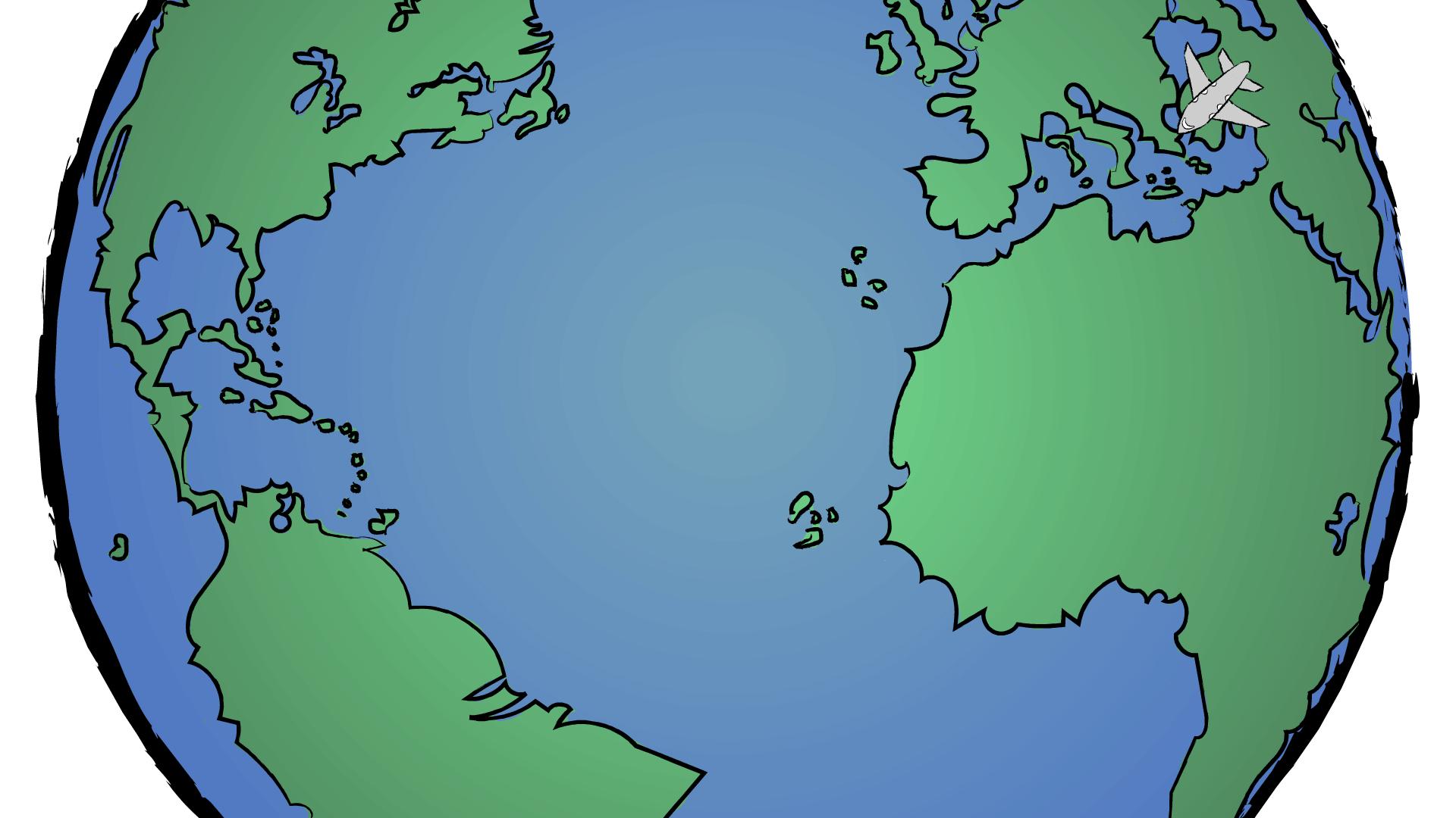
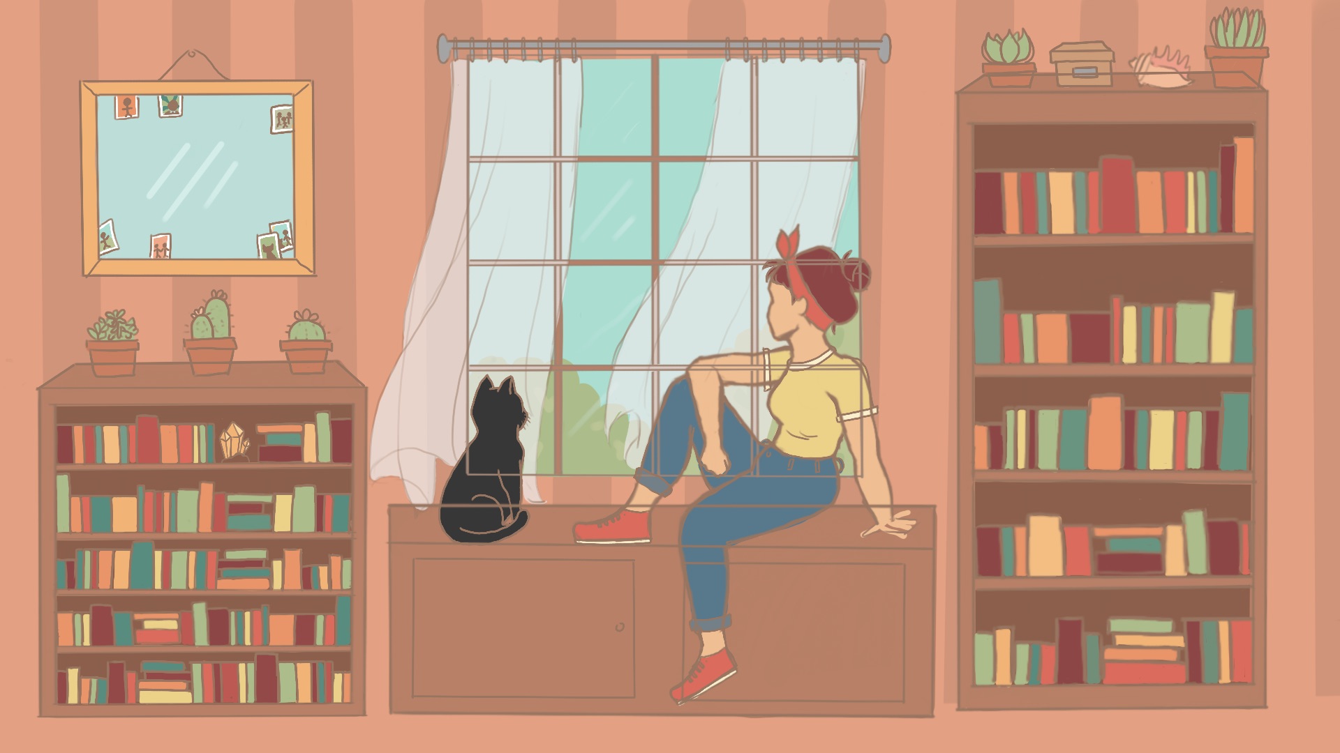
Here is what I ended up with for my illustration test. I could probably have done more with the coloring by adding some shadows and textures but I needed to move on and work on other projects.
Who We Are
LAITS: IT and Facilities Director, Joe TenBarge initiated the Student Technology Assistant program in 2004. STAs are UT students who work on a variety of projects in collaboration with UT faculty and LAITS staff members. STAs assist College of Liberal Arts faculty members and administrative staff with print and web design. From building presentations, to creating audio/visual works, and producing online classes in the LAITS film studios, STAs are instrumental in helping COLA faculty realize their vision for multimedia projects that enhance their teaching and the students learning experience. By the end of their student careers, STAs have portfolios which demonstrate their accrued technical and design skills.
Creative and technically inclined students are appointed as STAs for one year, with the possibility of being rehired as long as they study at the university. Applicants for the program are hired before both long semesters. Interested students may look for postings on Hire-A-Longhorn when positions are available. Positions will have Student Technology Assistant (illustrator or web designer) in the title of the job post.
Faculty & Staff with questions about services, please contact us.
https://liberalarts.utexas.edu/laits/contacts.php
Here is what I ended up with for my illustration test. I could probably have done more with the coloring by adding some shadows and textures but I needed to move on and work on other projects.
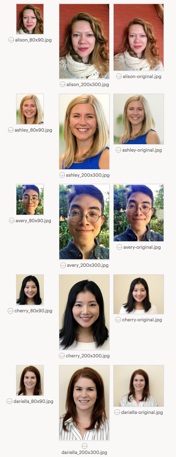
In the past week, I have worked on varous projects, one of which includes the good ol’ photo ID’s for faculty/grad students/ staffs. This week, I worked on editing 10 photo’s, and I am waiting for Emily’s approval for my edits:

I also had lots of fun making the STA banner (although I’m still waiting on few people to submit their avatars). I tried to make it look like we ~like~ each other and enjoy spending time together…which is ironic, because most of us are usually very quiet when we work on our own projects in the office! I thought a backyard party with warm lights would lighten up the mood! I also helped Nick with his caricature – we had some struggles, but overall, we learned a great lot about transforming a photograph into a “cartoon.”

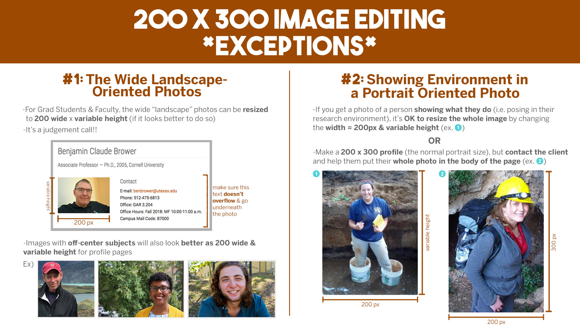
I was also asked my Suloni to make a guideline for editing 200×300 photo id’s. We are hoping that the STA’s who work on the photo ID’s in the future will be able to apply these new “rules”!
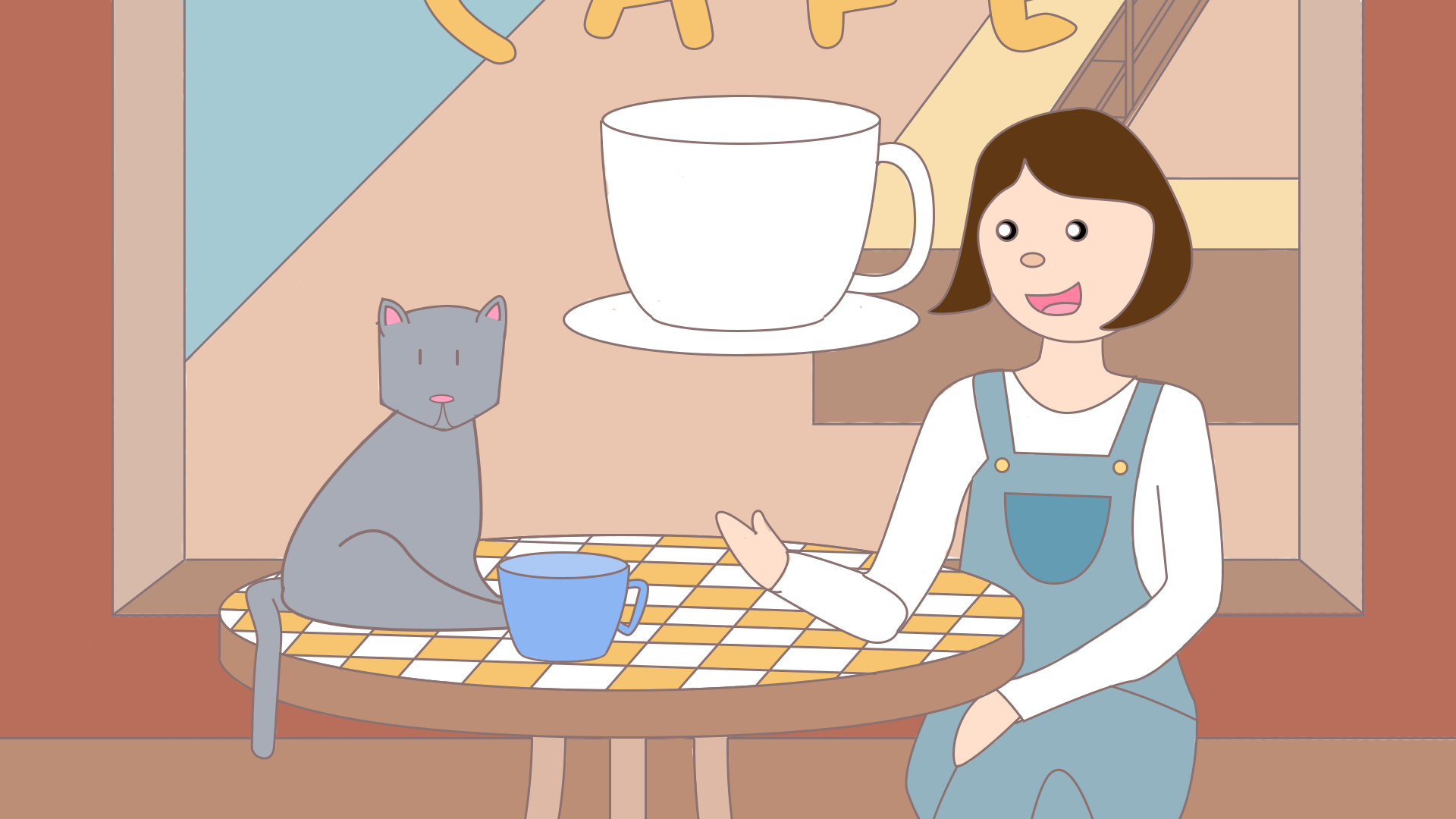
So for Russian, I did an animation and another water color bg this past week:
The animation was basically creating a plane overhead and having it fly from Russia to Florida and back. It was a pretty basic animation, I just used a motion tween and curved it a bit:
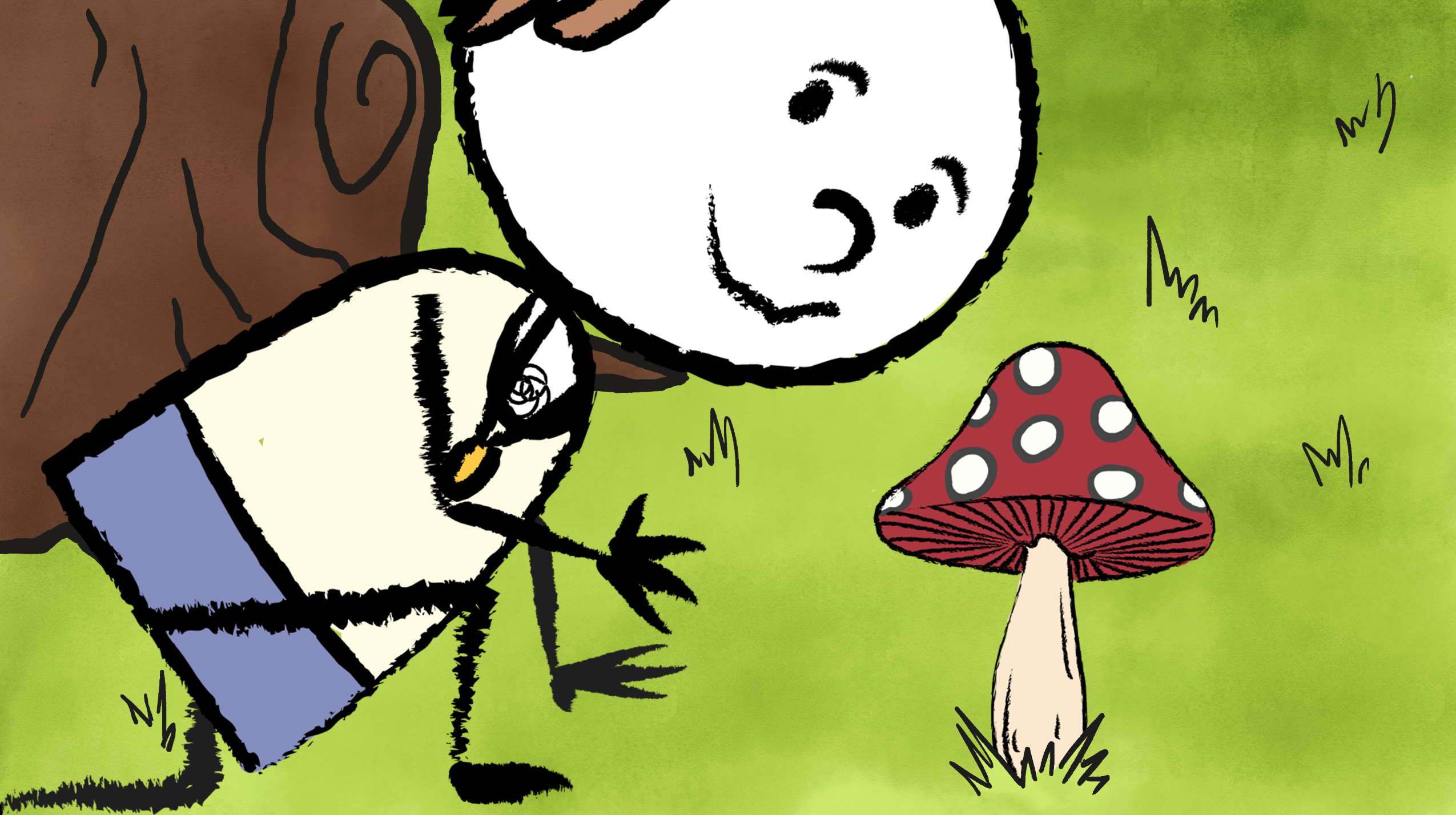
The watercolor bg was needed for a close up scene where the character examines a mushroom, so I made the grass and the bottom portion of the tree in PS.
Besides Russian, I also worked on the blog banner. I decided to deviate away from the Idea I had originally into something more abstract and colorful:
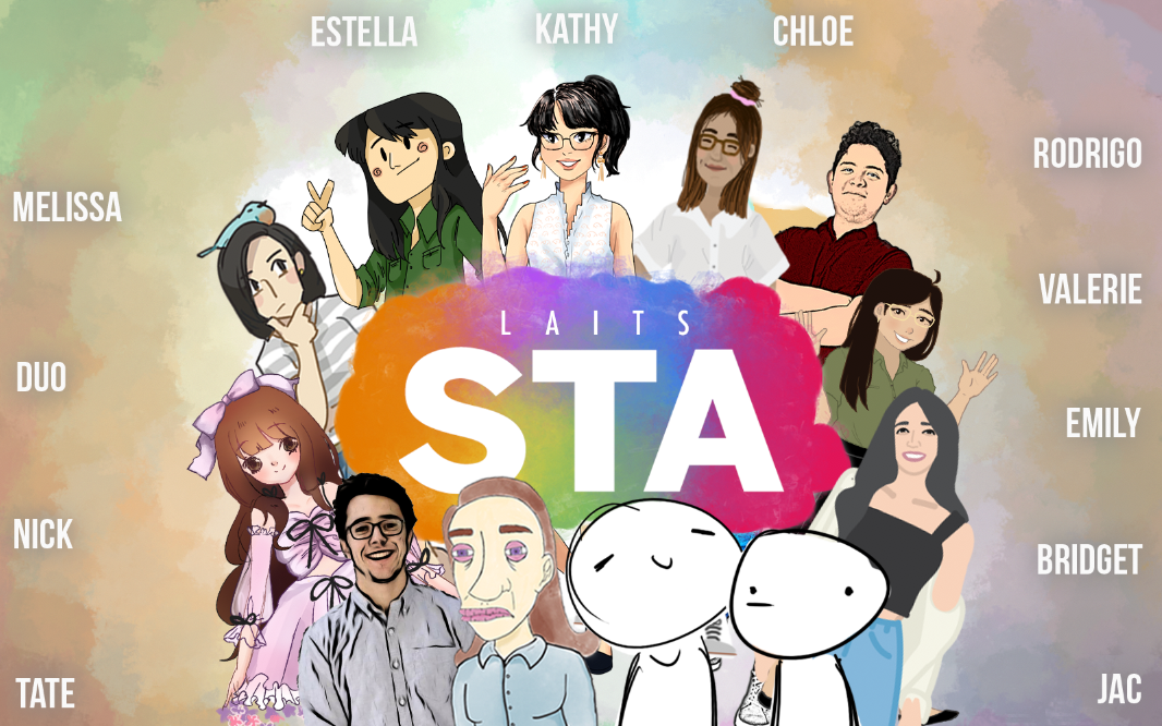
It’s still missing Jaclyn and Bridget’s portraits, but overall I am fairly happy with how it turned out. I’m still struggling with how to arrange the names so that they all show clearly (open to feedback!). I got the idea for the composition from several movie posters (like Avengers I.W.) where there’s the title in the center and all the characters and branching out from it.
We also got started on the eanthro vlabs project! Basically, it’s taking a bunch of older interactive virtual labs and transferring the content onto an updated format. (I’ll be holding a short training for it soon!) Each STA assigned to this project will get about 2 labs to update.
Here’s what the new website looks like:
And the old one:

This is the new self portrait for the STA banner I designed with Chloe’s help and youtube.
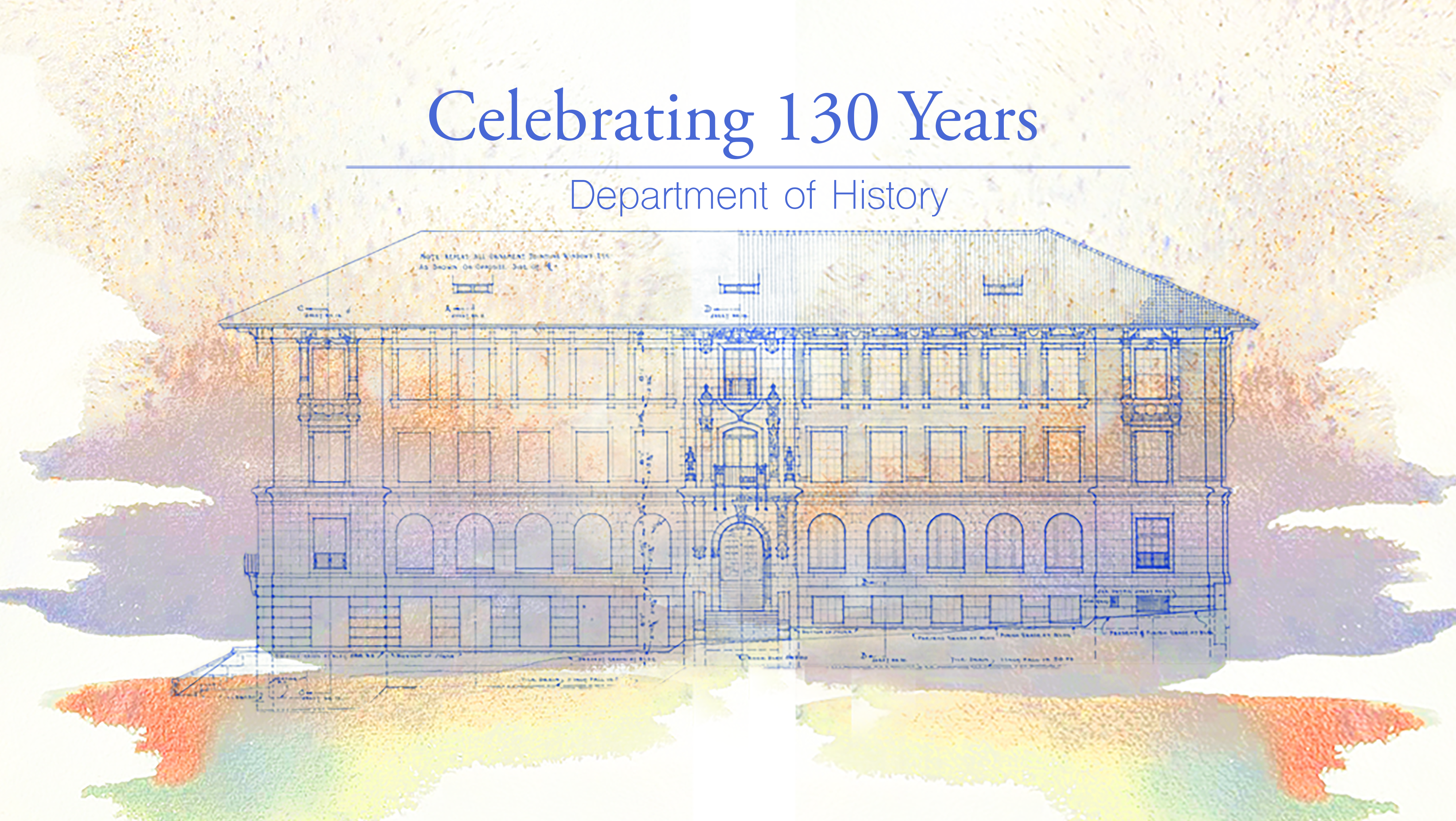
Today I continued working on the History Department Graphic. I messed around with colors, PhotoShop brushes, format, and whatnot. Here are some different versions with mixed typeface and colors:

These are the various versions with different combinations of fonts and formats.
I also started on the paint effect of the graphic since the drafts above used a copyrighted image. I did this through PhotoShop using the “Kyle’s Paintbox- Supreme Spatter and Texture” brush and smudging it. Here’s the result!
Here’s my version of the draft, free of copyright materials!
I think I’m gonna add a little more texture to the paint effect, add some more bright/bold/opaque colors, and make it look less like a butterfly. It’s too symmetrical for my taste currently, so I’m gonna fill the foreground with various colors to make it look more “organic”.
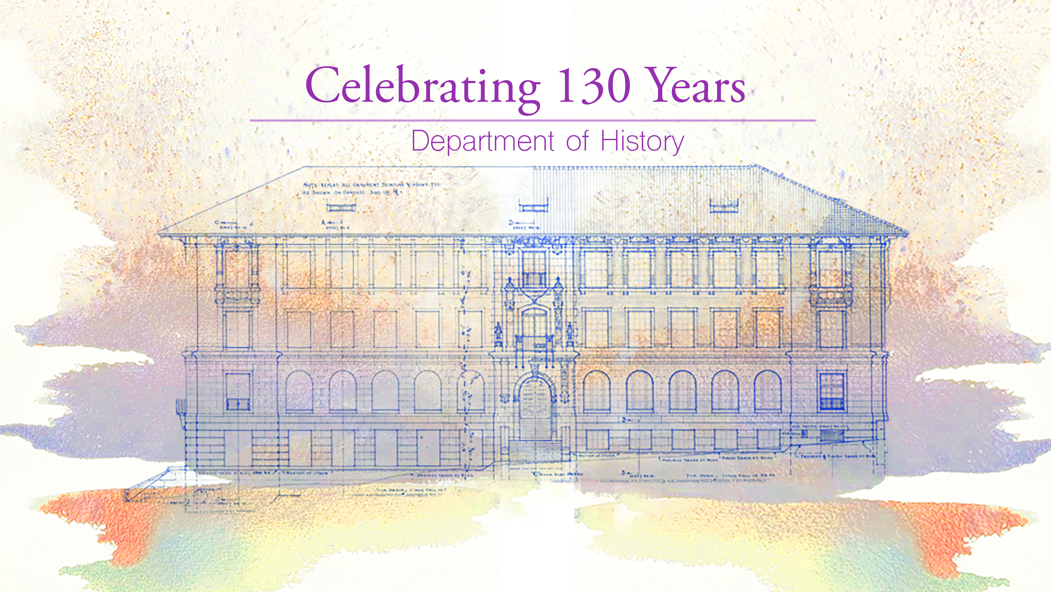
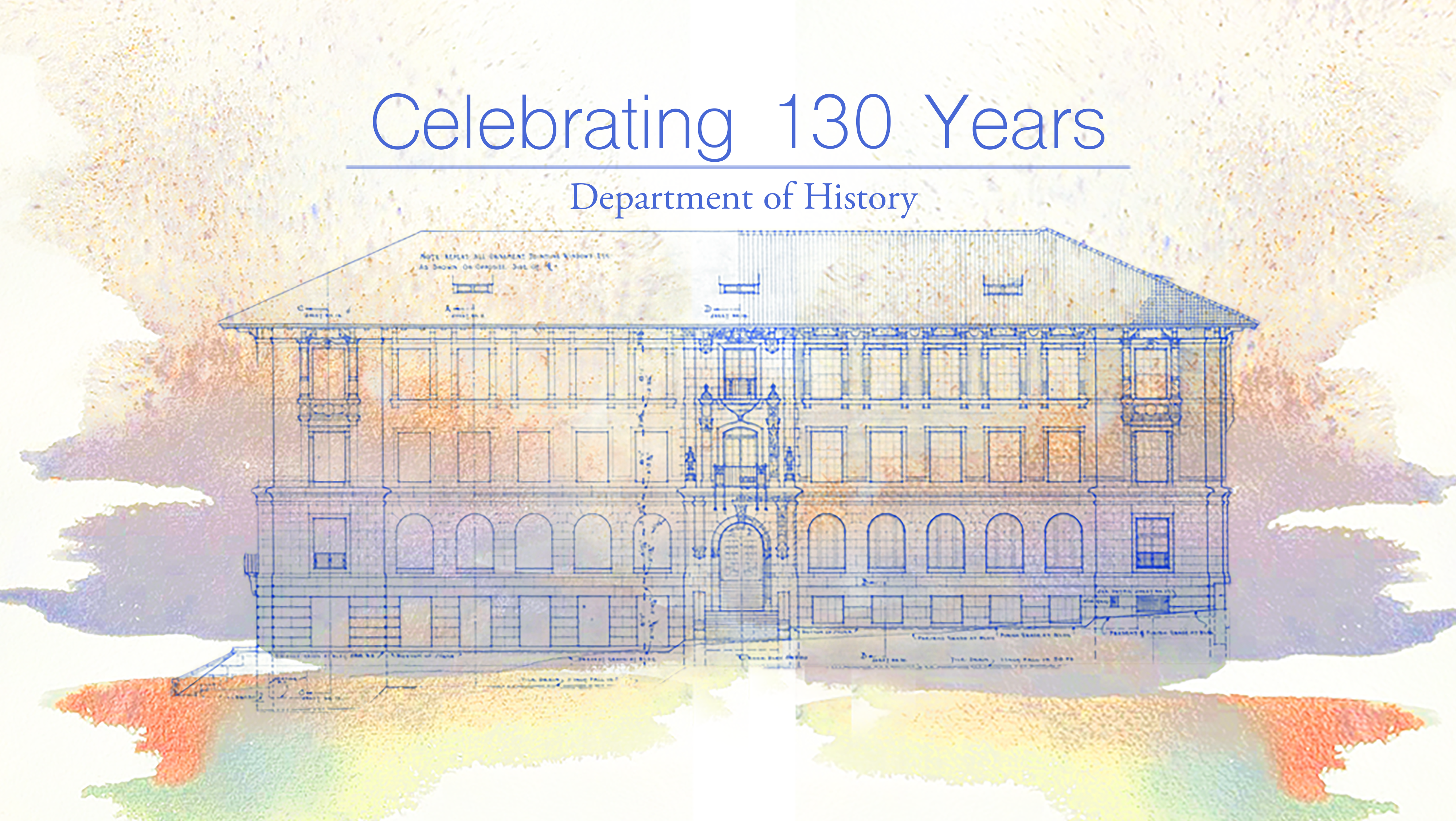
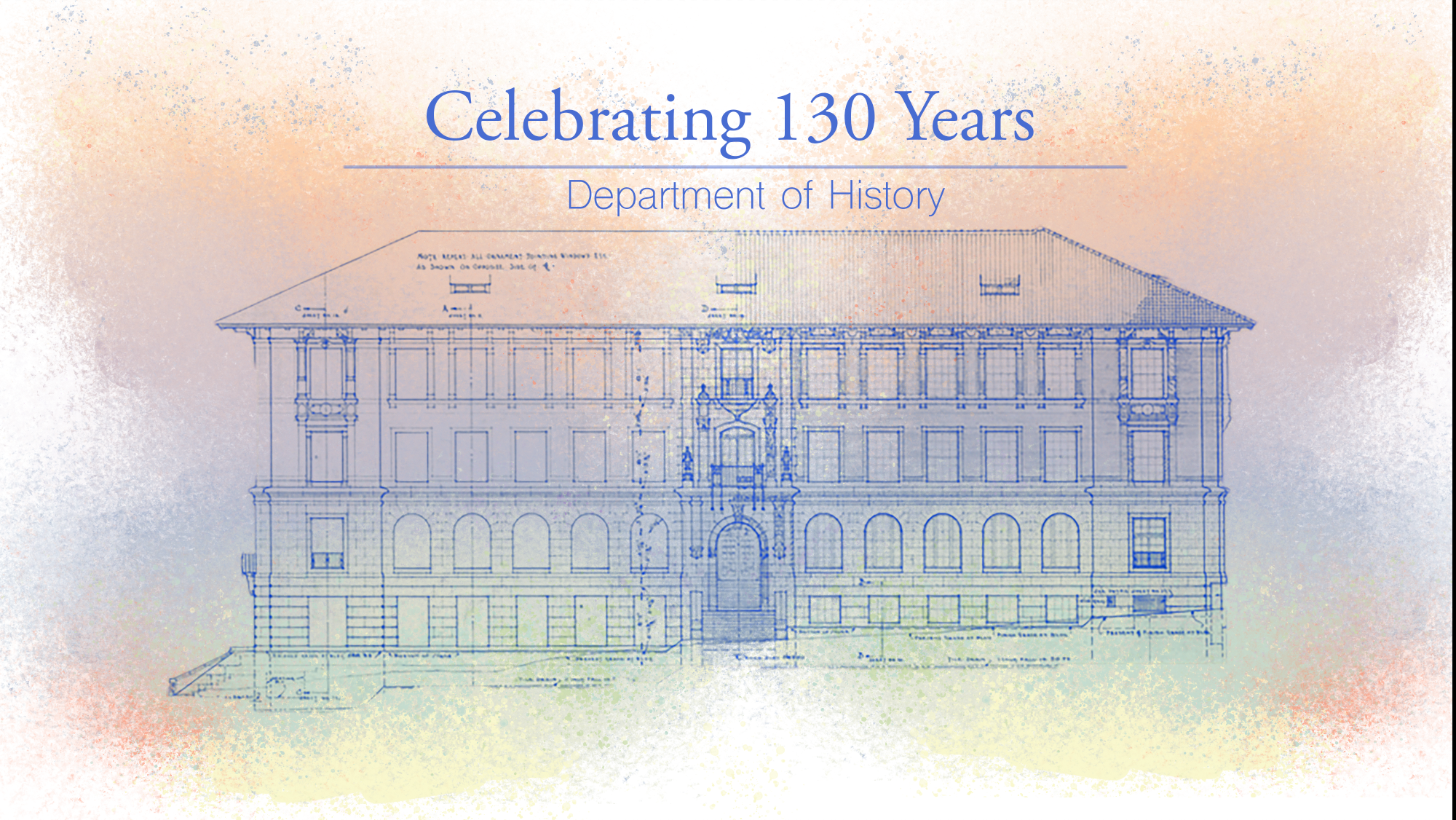
Today I continued working on the History Department project. The client chose the “Splash” version, but the image used for that version is copyrighted and was only used to draft a design direction. So my current goal at the moment is to emulate something similar in style and color. I also made 3 different versions of “Splash”, each with different fonts. The client wanted something with sans serif, serif, and Garamond.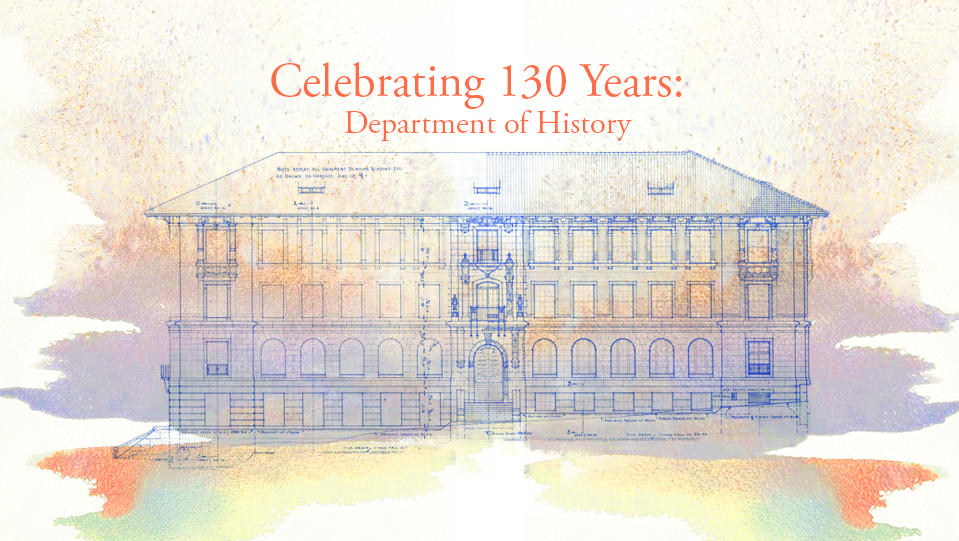
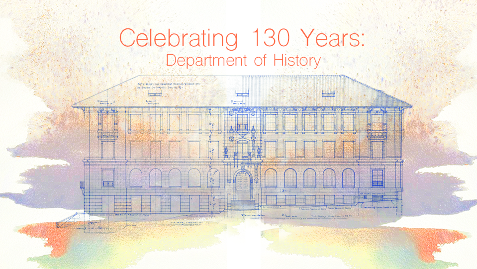
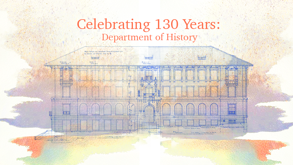
Top: “Splash” the font “Garamond”
Middle: “Splash” the font “Shree Devanagari 714”
Bottom: “Splash” the font “Charter”
I will be doing a lot of painting on Photoshop tomorrow in an attempt to make something similar to what the client would like, while preserving the aesthetic and colors.
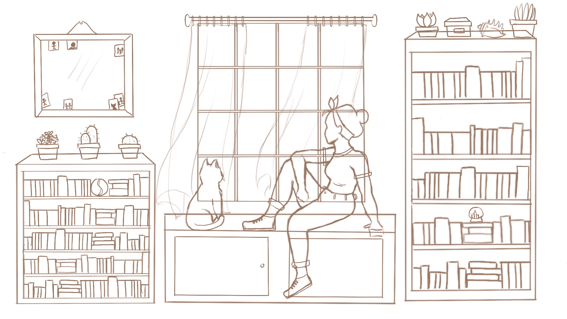
I also was working on the Russian test illustration! Below is my progress:
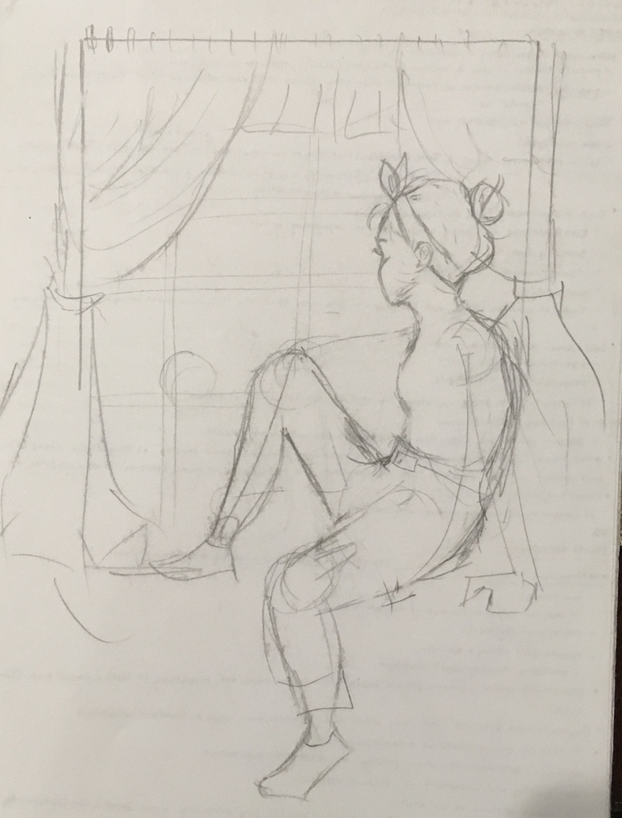
Top: Initial First Sketch
Middle: Initial Line Art
Bottom: Initial Line Art + Flat Colors
I’m hoping that this should be okay! I didn’t get to do the cell-shading that I wanted to because of other COLA projects, but hopefully this is okay. I really like the colors I chose 🙂