Roster Poster Updates
(This post was made earlier in the month but due to an error with publishing it shows up before my later progress.)
The roster posters have undergone many changes following the winter olympics and Americana art themes. Here’s some more mockups I made for those themes.


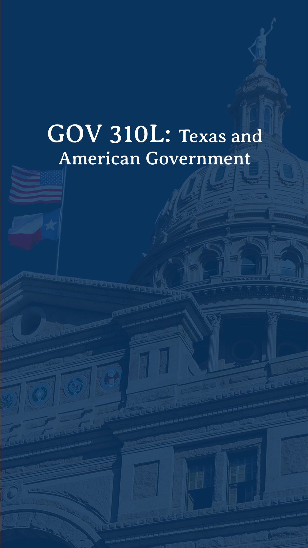
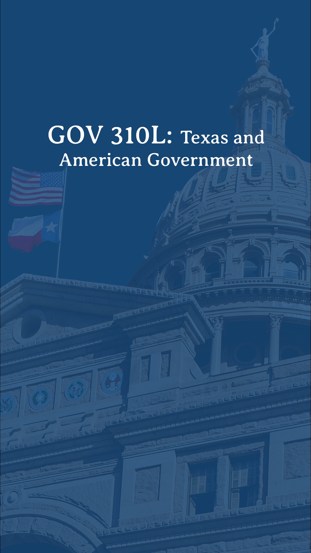
After meeting with my supervisor, De’sha, we thought of broadening the theme of Americana art to eras in American art that will span for 4 posters! We will keep Americana art as one of the posters. Here’s a layout sketch I made for it and I’m pretty excited to work further on it.