Summer 2025!
This summer I traveled, hung out with friends, went to my first convention, and drew as much as possible!
Travel
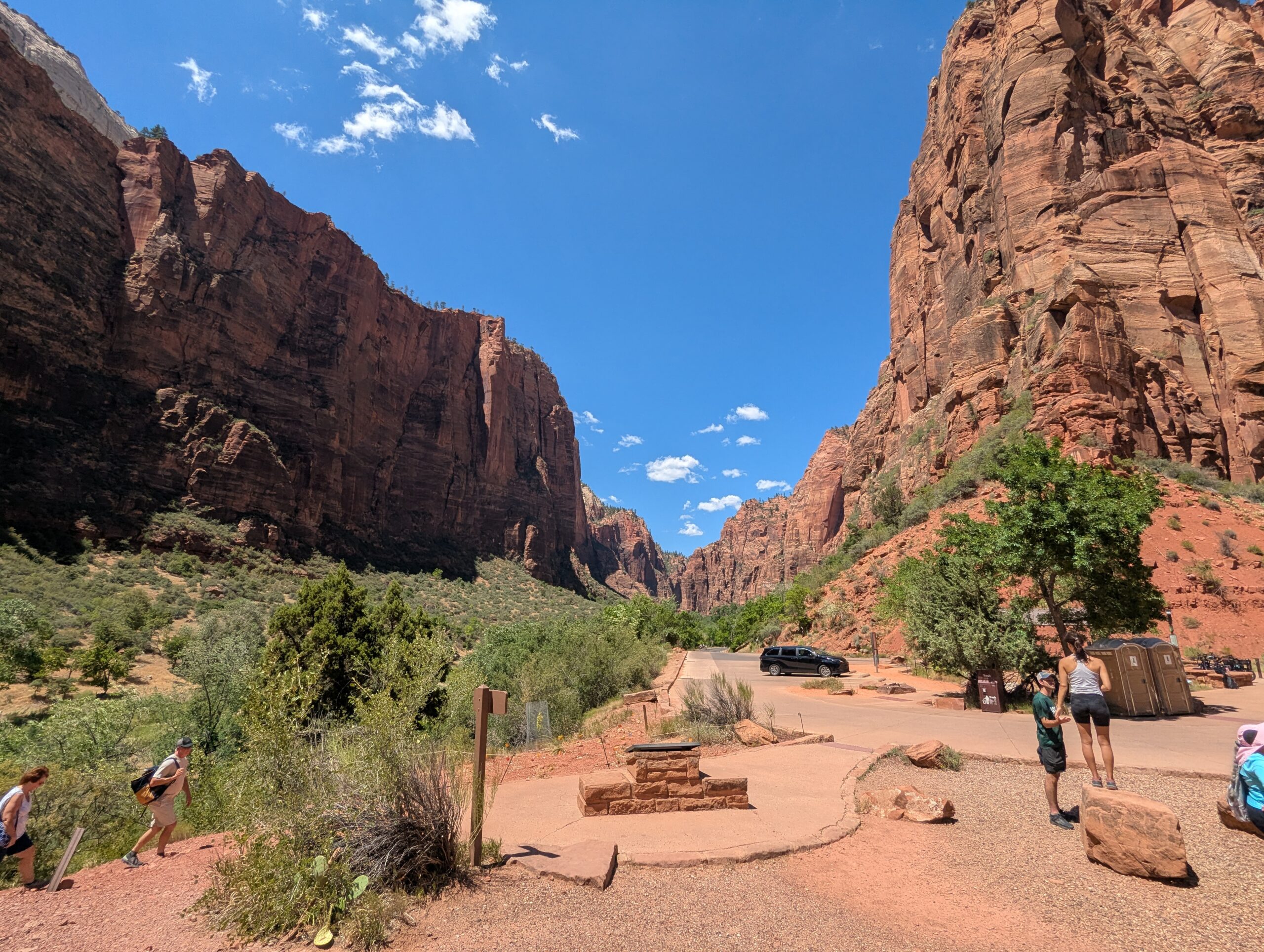
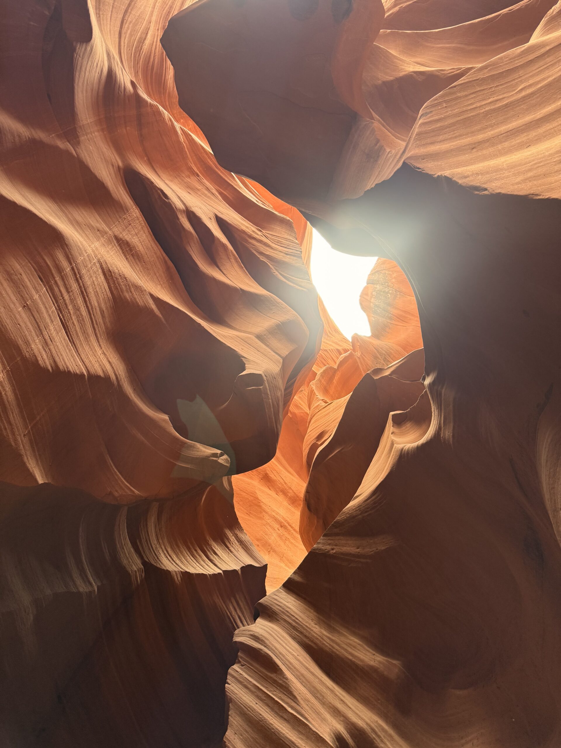
In July, my brother, mom, and I flew to Arizona to visit family, including a new baby cousin! While here we went on a roadtrip around parts of Utah and Nevada. I burnt to a crisp in the sun, but the views were worth it.
Art
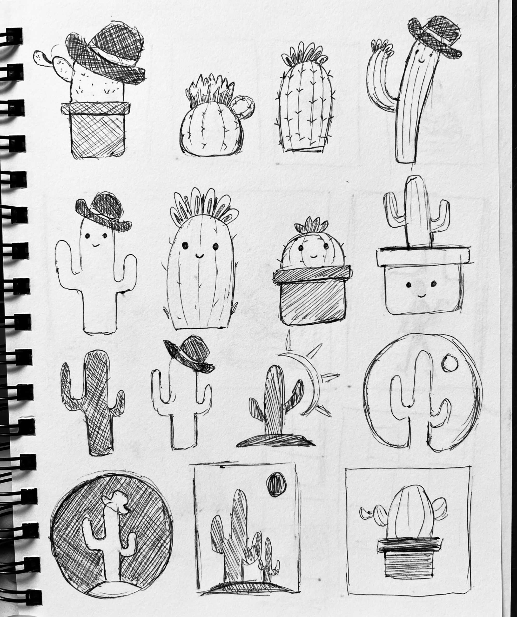
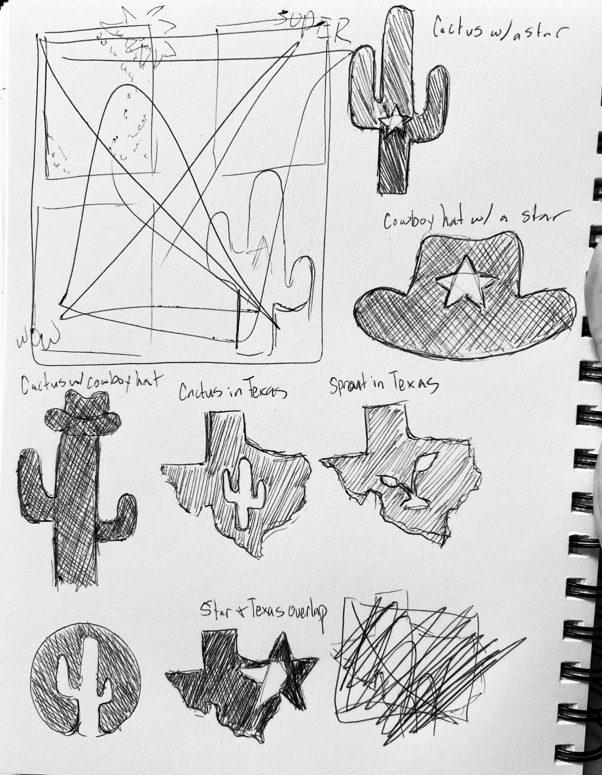
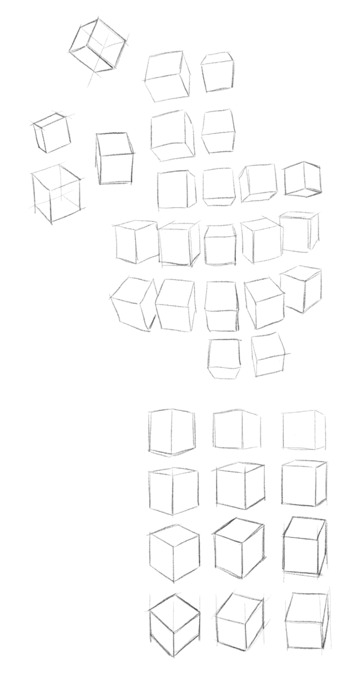
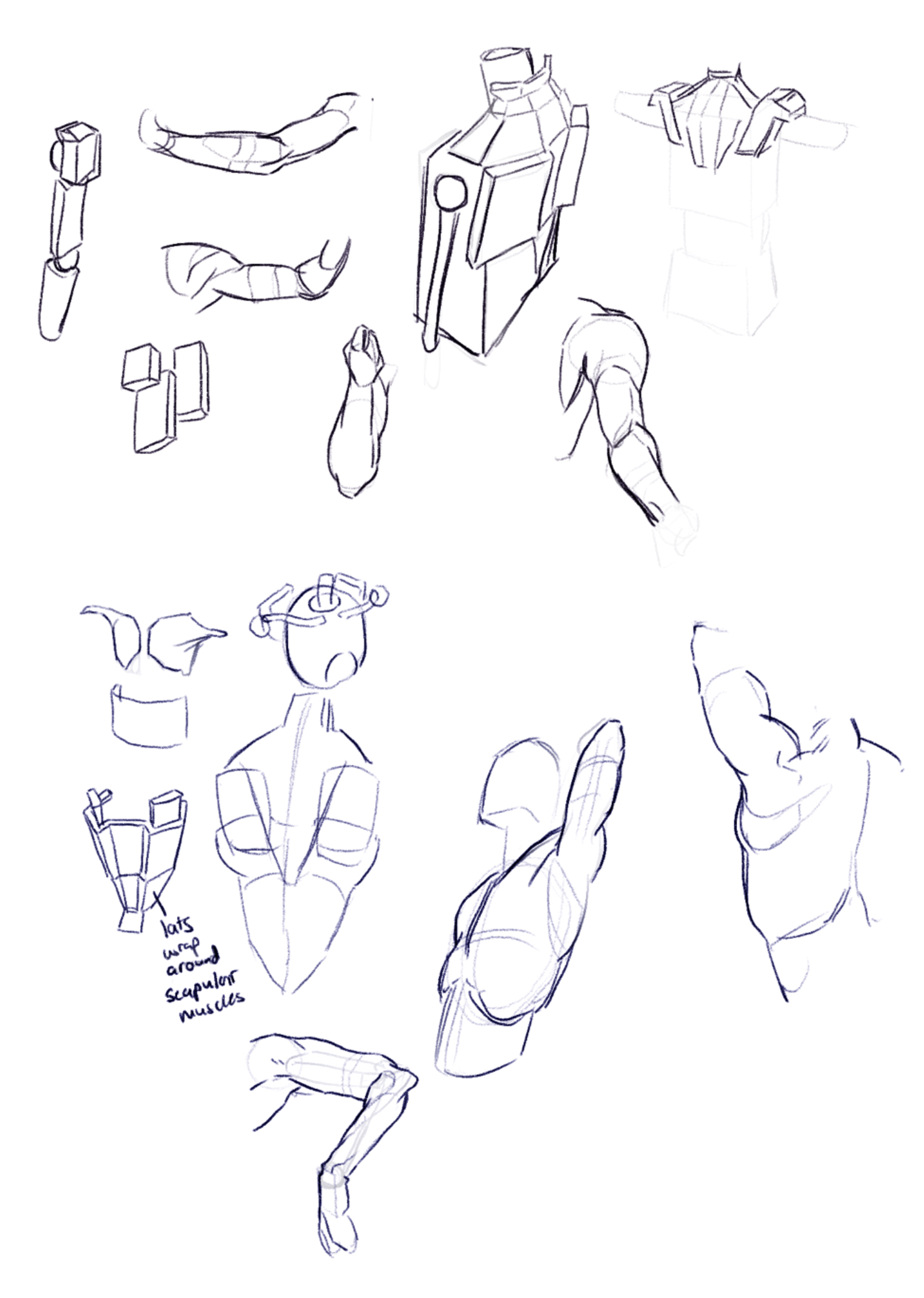
When I wasn’t traveling, I was left with a lot of free time, so I decided to draw everyday — a goal I’ve had for a while. I worked on some fundamental skills like form and perspective and am happy to say I am noticing some pretty significant improvements! I’m also studying figure drawing with Tom Fox’s book Anatomy for Artists: Drawing Form and Pose. Thinking about the body as fundamental 3D forms feels like I’ve unlocked a new part of my brain.
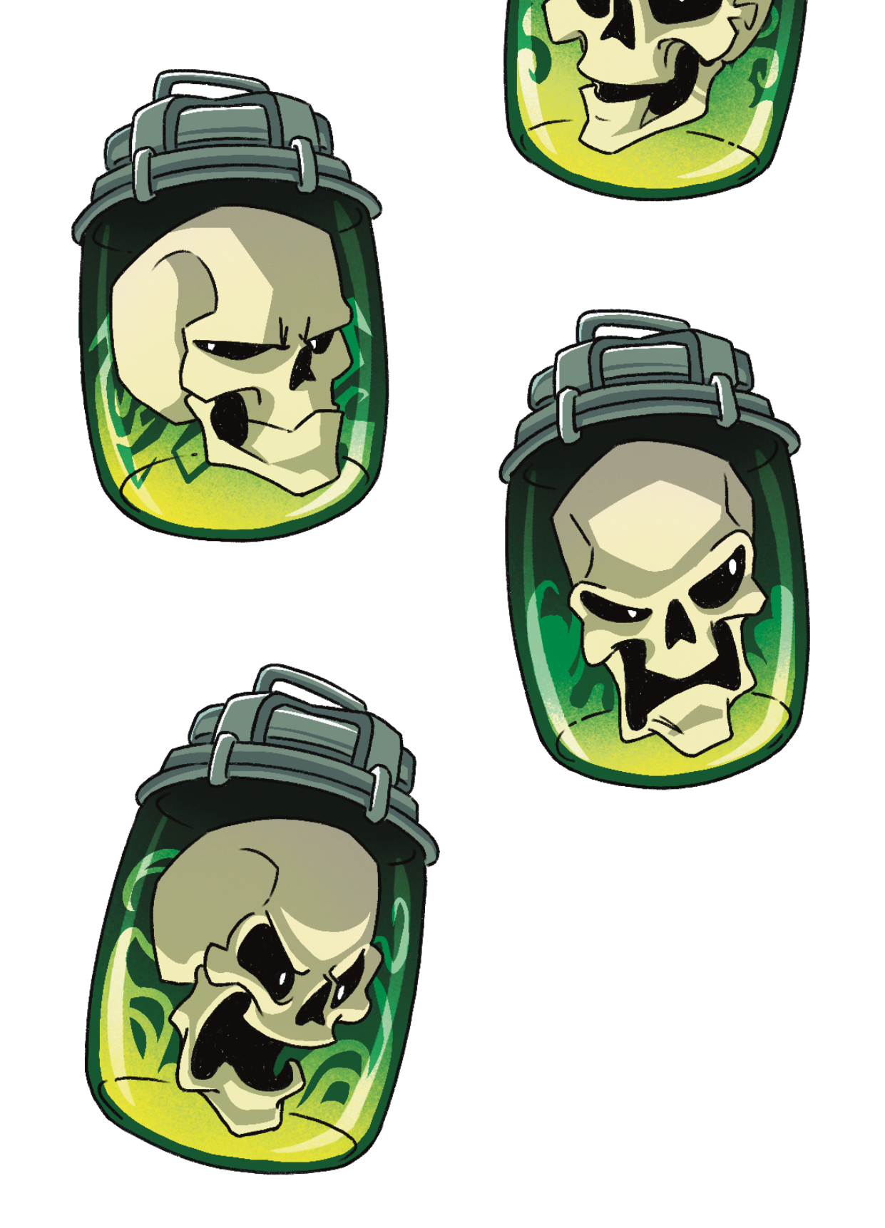
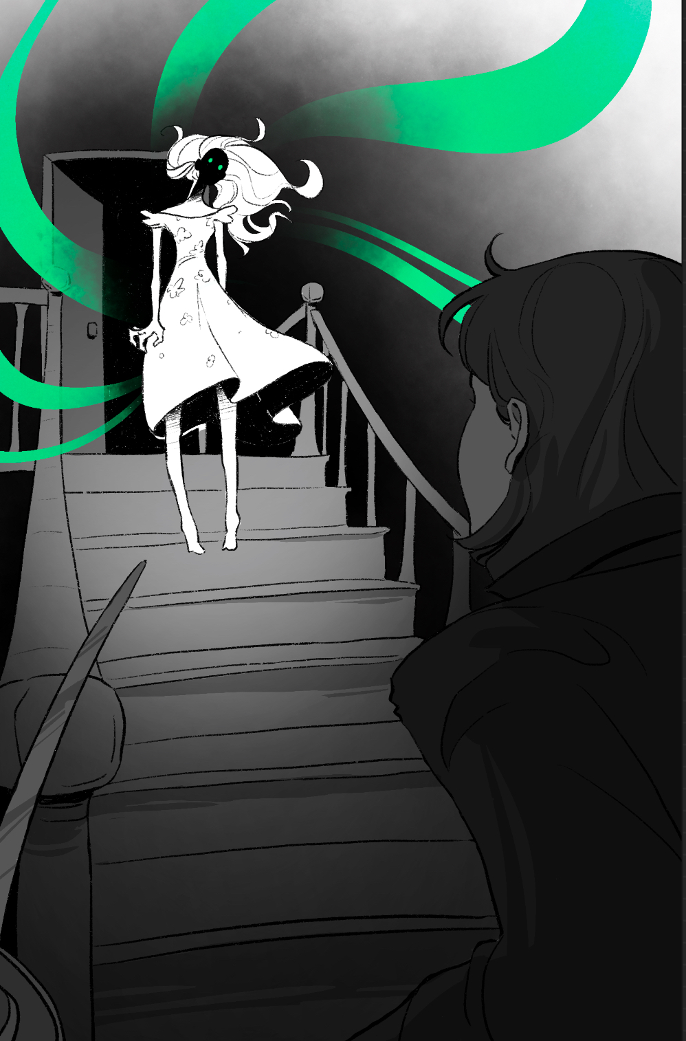
In addition to sketching for fun, I also did some more art commissions. In total, I did 15 overlay illustrations and 2 sticker sheets for a special edition set of the Lockwood & Co book series! It was a lot, but they were very fun to do and they pushed my illustration skills to the limit.