UT Instapoll & Vue.js!
The past few weeks I was given the opportunity to take a break from Vlabs and learn something new! I worked with Chris Pittman to learn Vue.js and create a Vue component for UT Instapoll grading options… with a lot of help from Chris.
Vue is a progressive framework of javascript built for creating user interfaces, or as Chris called it, the “hipster” competitor of React.js. Vue allows programmers to create “components” (in our case, forms) which can be dropped anywhere into the site instead of recoding the component each time it’s needed.
To gain a better understanding of Vue.js check out the “Learn” section on their site: 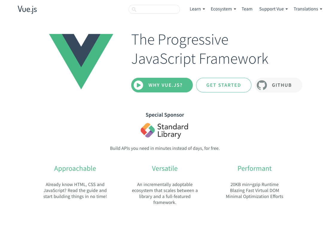 https://vuejs.org/v2/guide/index.html
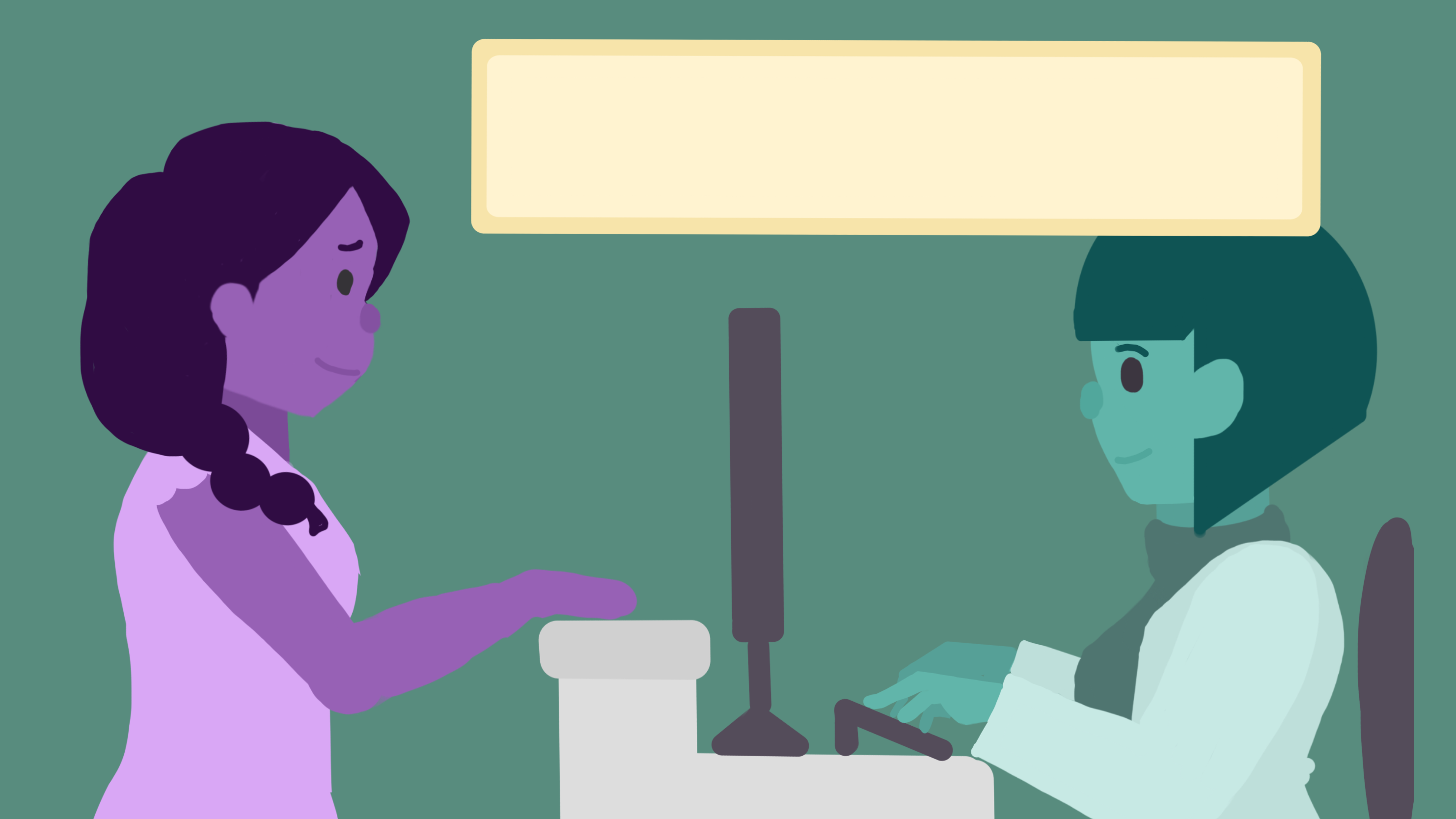
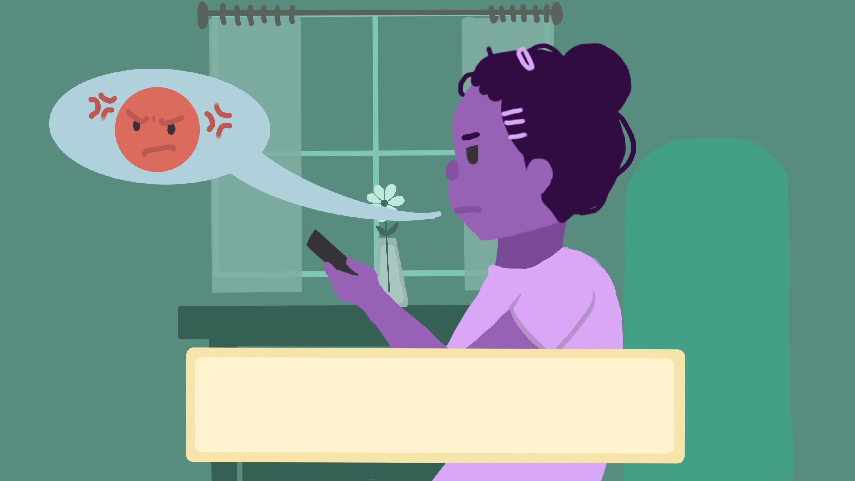
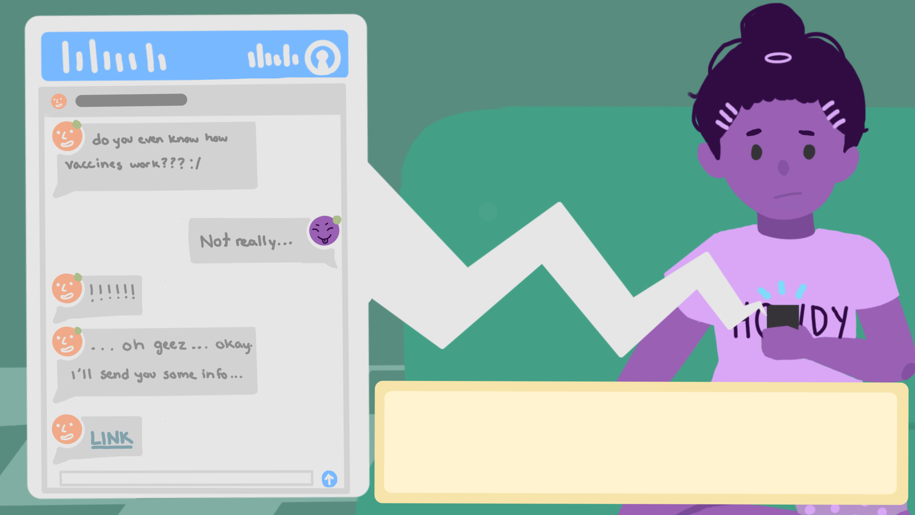
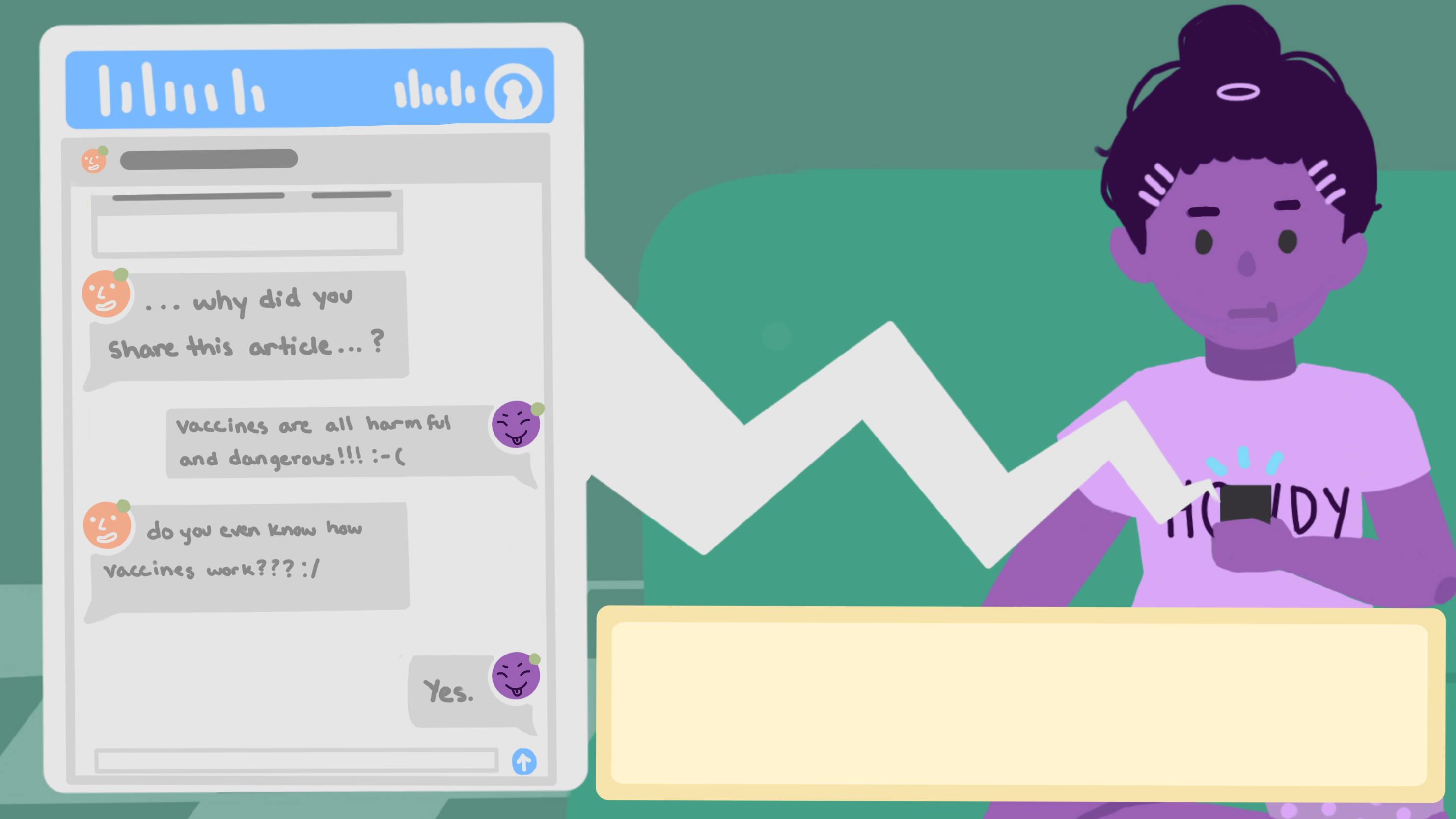
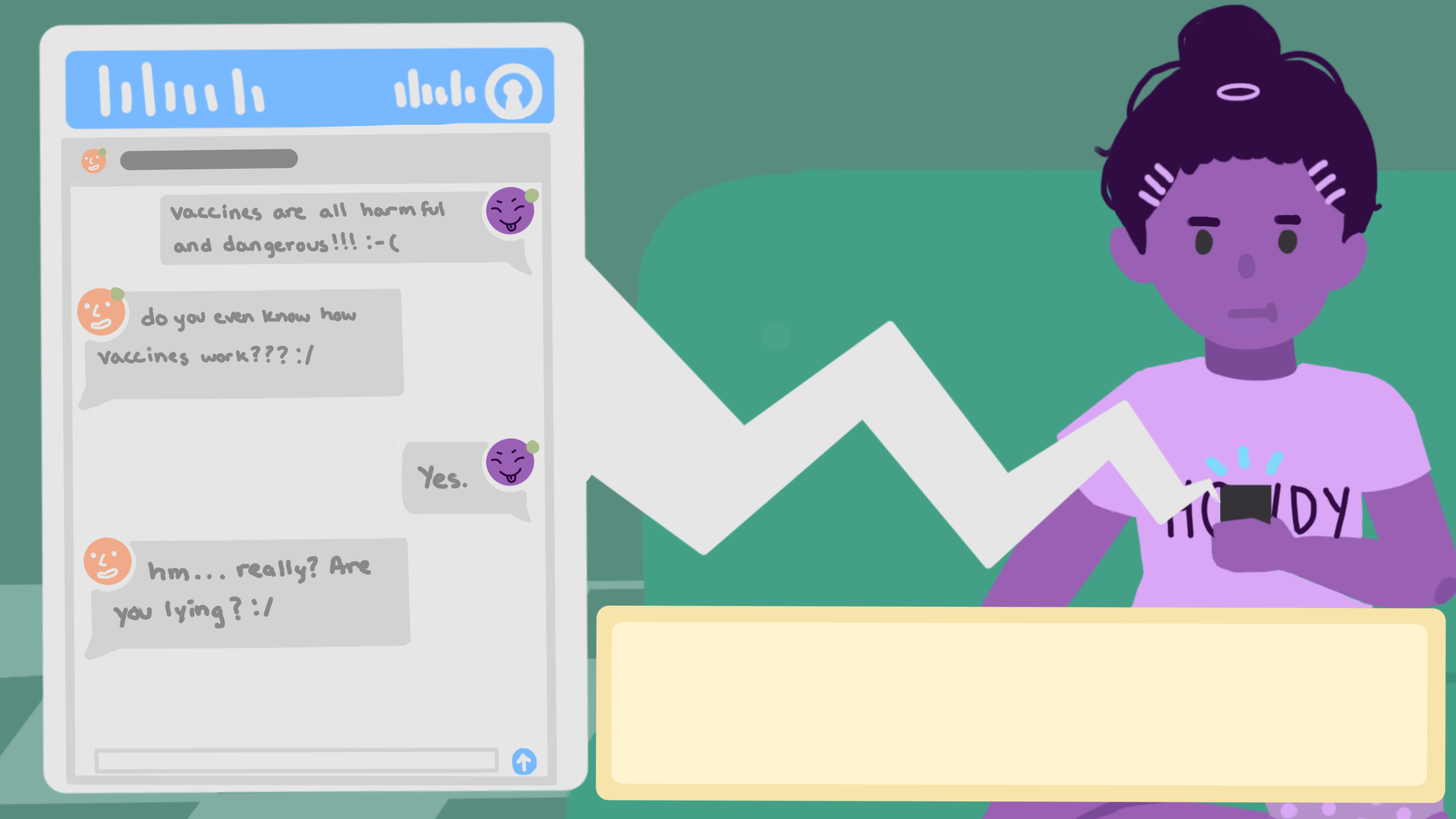
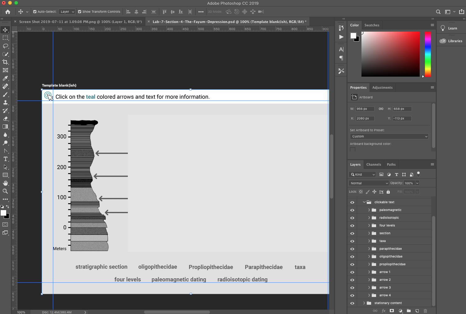
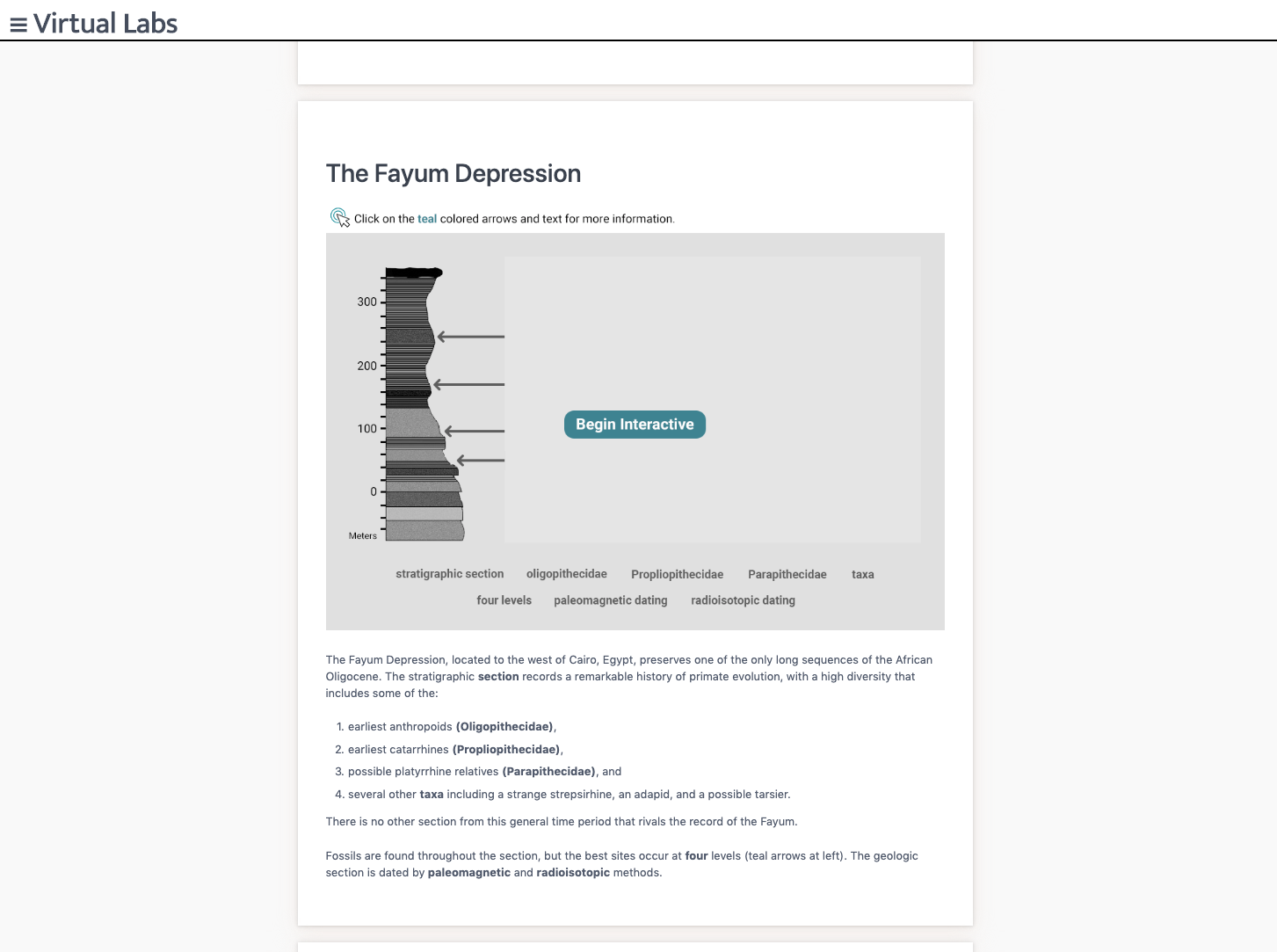
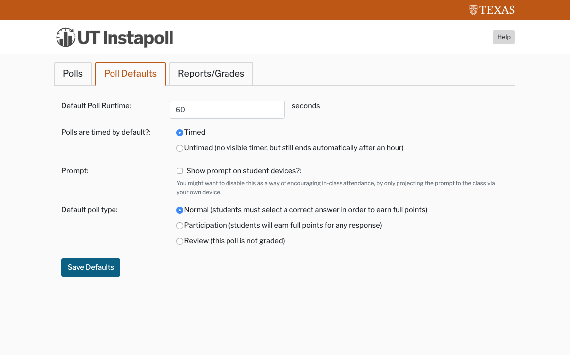
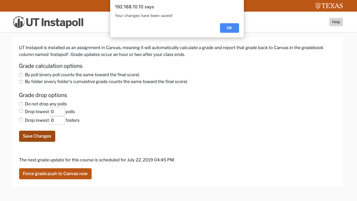
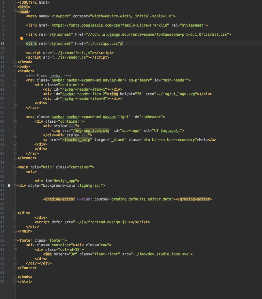
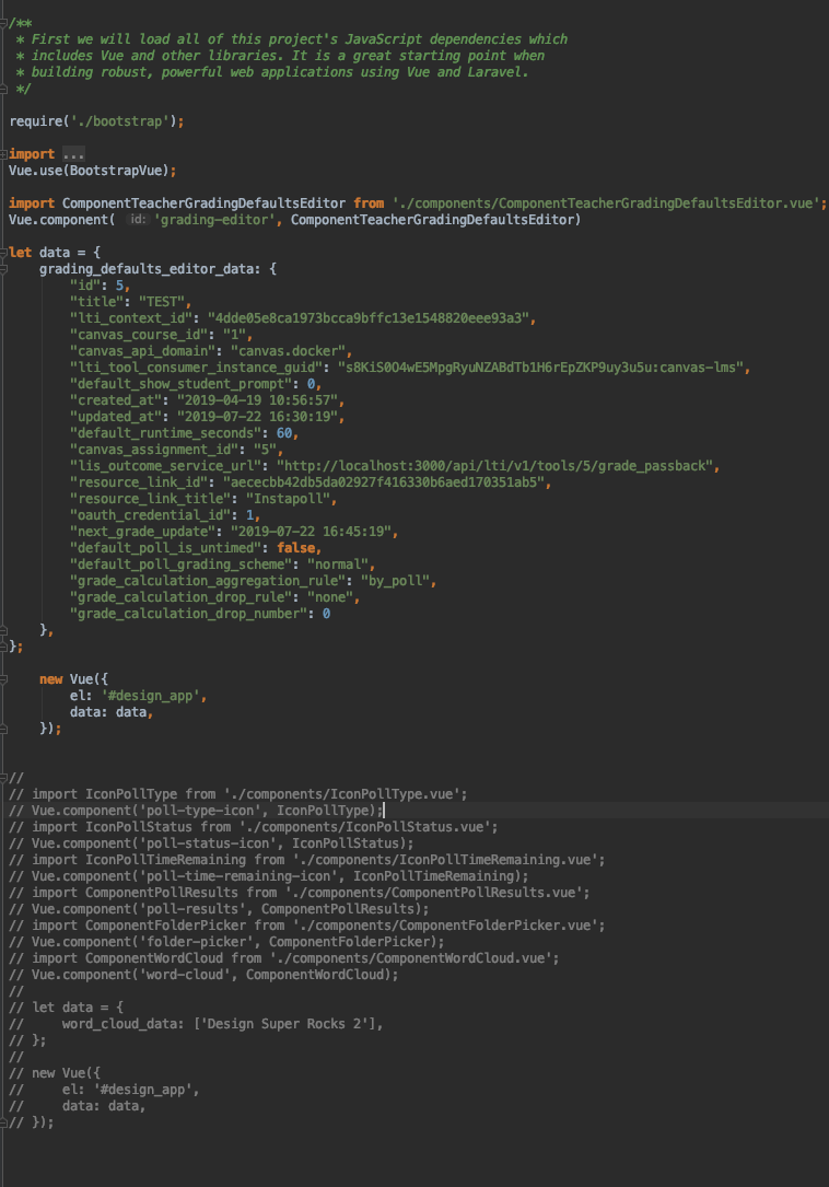
Here are some screen shots of my less than successful attempt to create this component. Thankfully Chris and I ended up walking through the full process together to accomplish this task. Still these shots provide an example of our final component’s appearance and function.
It was difficult for me to dive back into javascript after not writing in it for a year or so, but I really enjoyed the experience and am excited to dive into more coding and UX projects with Chris this fall!

8-bit GIF!

This week every STA was assigned the task of creating an 8-bit GIF sized 80X80 pixels. This was my first time making a GIF and it was a lot harder than I anticipated. Working pixel by pixel is something I’m used to with CSS but not when creating my own artwork. I’m inspired to create more GIFs in the future and now consider going back to this original attempt and cleaning it up a bit!
Oh, this is a dog because I love them. They’re better than humans sometimes.. most of the time 🙂