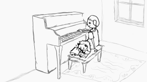
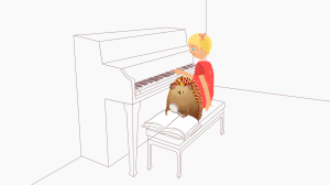
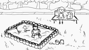
U13_1 Illustration
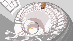
U12_2 Illustration
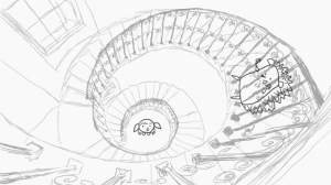
The U12_2 depicts Oleg and Polina on an ornate staircase, where Polina is at the bottom looking up the stairs with Oleg at the top looking down on her.
I felt the most important part of the scene was the perspective. The stairs are the focal point of the scene, but Polina and Oleg also needed to have the correct perspective to make it seem more realistic and show their position and where they are looking.
The photo I chose reference showed a clear perspective that could easily show the two characters and had good tonal qualities.
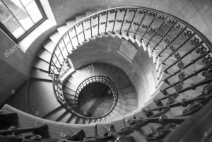
I did a rough sketch of the scene.
Once I got approval, I started the final drawing. The perspective of the staircase was easy to capture, but the hardest part was actually drawing the ornate railing, especially since they were all at different distances. I needed to get the right amount of ornate-ness but not detract from the actual stairs and Oleg/Polina (since that was not the focal point).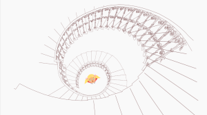
I added Polina and Oleg in, and while Polina fit in nicely as the perspective was much more straight forward, it was a lot harder to capture Olegs perspective.
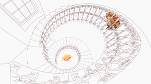
I needed to make a sculpture of Oleg out of clay in order to visualize the perspective, because none of the other character sheets showed that perspective from looking down at him. Once I found the right perspective, I pieced together parts of Oleg from multiple character sheets and constructed a new position for him on the stairs.
The tonal renderings were not that difficult, especially since there is a pattern going up the stairs where there is much harsher light and shadows towards the window and softer more dispersed light towards the back.
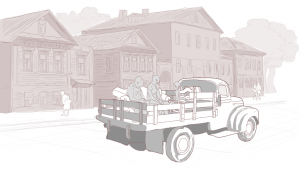
U12_3 Illustration
The illustration for the U12_3 scene depicts people riding in the back of an old pick up truck sitting on furniture. The houses in the background should show ornate and traditional Siberian wooden buildings.
I pieces together multiple scenes and objects to construct a rough draft of the scene. I chose to use a truck later on that had a more open bed, but I stuck with older style of furniture
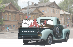
The background of the scene was my favorite part of the scene to do. I loved drawing the ornate windows and woodwork of the houses. The background couldn’t be too detailed, but enough to show that traditional woodwork. The truck and the furniture were hard to fit into the scene to get the perspective right, but I think I got it down.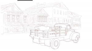
I cleaned up the drawing and added more trees in the background to fill out space. The tonal renderings were simple in the background and required just simple shading. On the truck, however, I wanted to show the shine of the coating as it drove in the sun, and the shading was much more dynamic and had more contrast than the background. The people are simple in the drawing but require some detail to make it look more realistic.
U11_2 Illustration
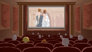
The U11_2 illustration depicts Polina and Oleg in the a movie theatre, and on the screen shows an Eastern Orthodox wedding with traditional elements. This scene was going to be interesting because of the lighting. I have to think of the shadows and highlights of the scene because of the movie screen.
I started a rough sketch of the scene. Oleg and Polina are sitting towards the back of the movie theatre so they can be more easily seen. The scene of the screen shows the bride and groom being adorned with crowns as part of their wedding ceremony.
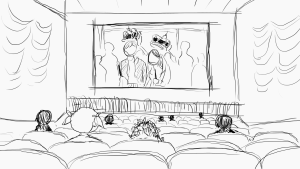
I started the final draft of the illustration, keeping more simple draping around the screen on the sidewalls. The scene on the screen was also initially more simple, with more detail but on the bride and groom.
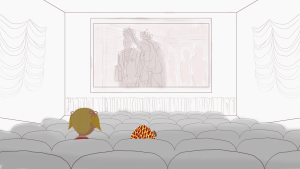
My tonal rendering showed the lighting on the side walls with a more diffuse effect, with the side drapes with stronger shadows, and a very strong highlight on the edge of the chair. I also added more people into the scene.
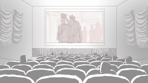
After talking with Suloni and Kathy, we decided that the movie theatre needed more ornate decoration, including wood framing around the screen and the drapes on the side wall. It just felt a little incomplete in the sketch before and need more detail. The people also needed to be more detailed, so I gave some of them hair and made some of them children, etc.
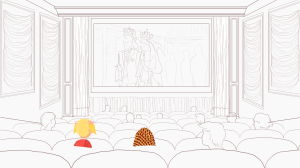
I was given the task to color the scene, and I initially chose to do a blue wall color. The chairs were a red velvet.
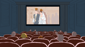
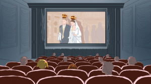
However, I think to go in theme with an older, more classic style of cinema, I tried out the color red for the movie theatre. I also changed the drapes to red and made the wood framing a warm brown. I gave more detail to the wedding scene, including adding more decor to the church walls and cieling and adding more detail to the crowns and adding shadow to the bride and groom’s clothing.
This was the hardest but most rewarding scene I had to do. It was hard to get the correct shadows and highlights in the theatre, and also finding a balance of detail on the screen and in the audience.
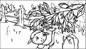
U9_7 Drawing
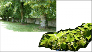
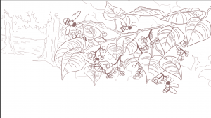
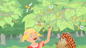
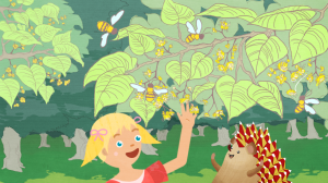
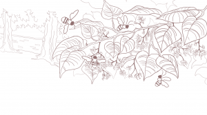
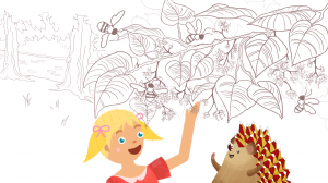
I started my first illustration for RUS 407 today! My first assignment should depict Polina and Oleg inspecting a linden tree. I used reference images of the tree and of linden orchards for the background. From there, I made a rough sketch of the orientation of the page to show what is in the background and where Polina and Oleg are.
I cleaned up the line-work, and changed the shape of the leaves to be more accurate to the linden tree.
I also fixed the flowers to be more acurate as well.
 I added in Oleg and Polina to the scene.
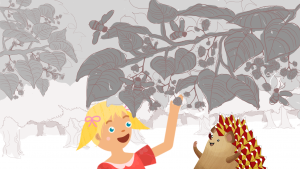
 I was given the task to color the scene, which I was stoked for! I added greys and sepias to each layer in order to label the foreground and background
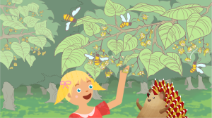
Here is the final colored drawing:
