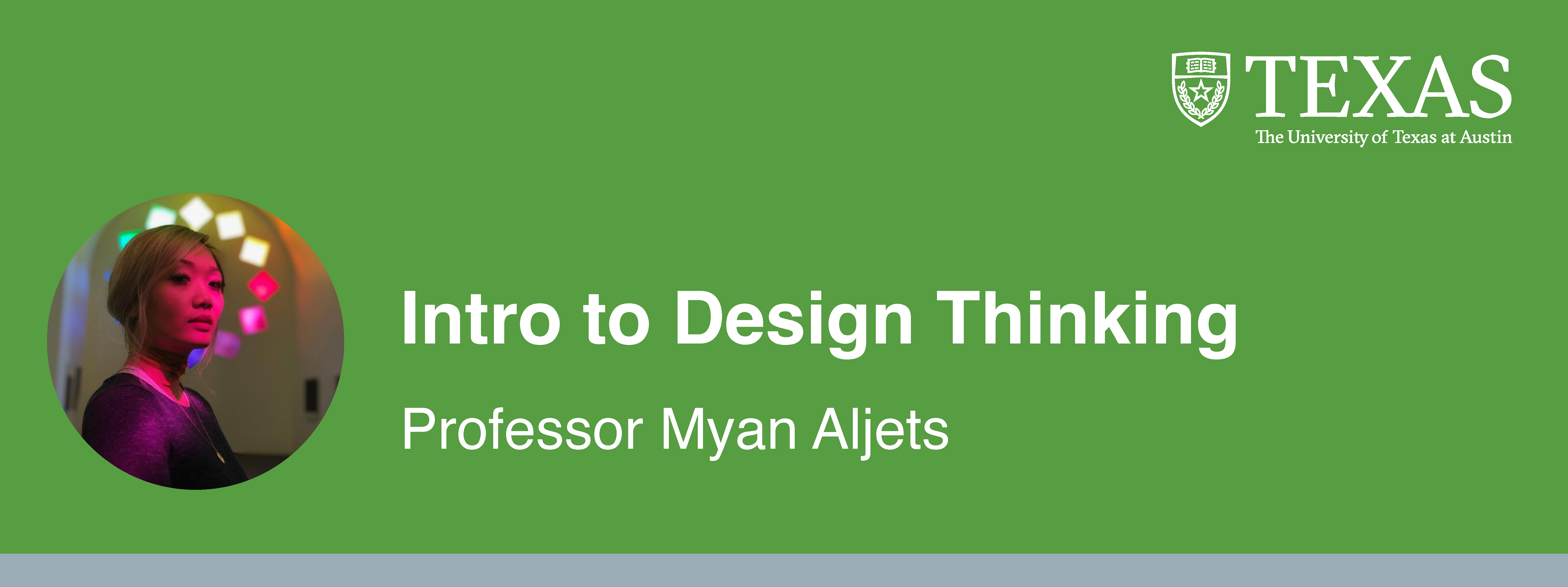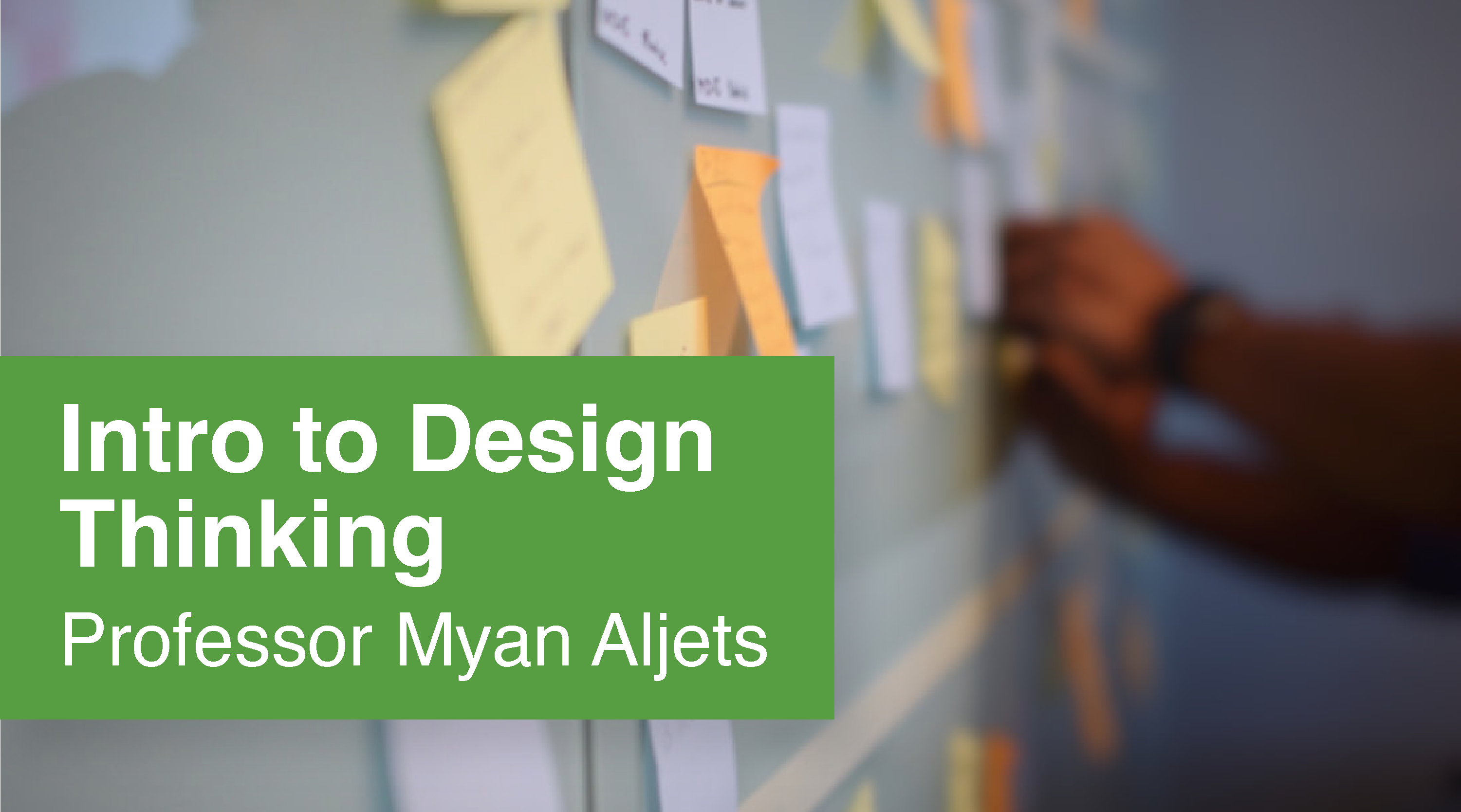
PSY 339 Course Graphics
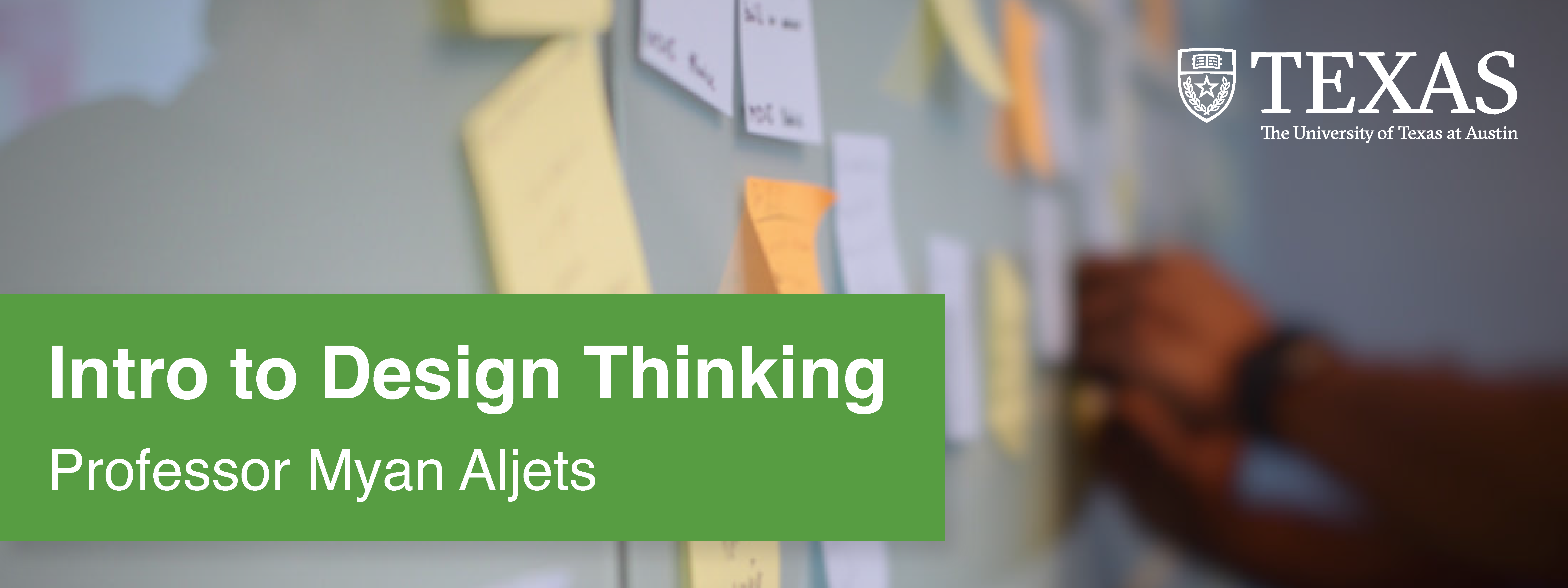
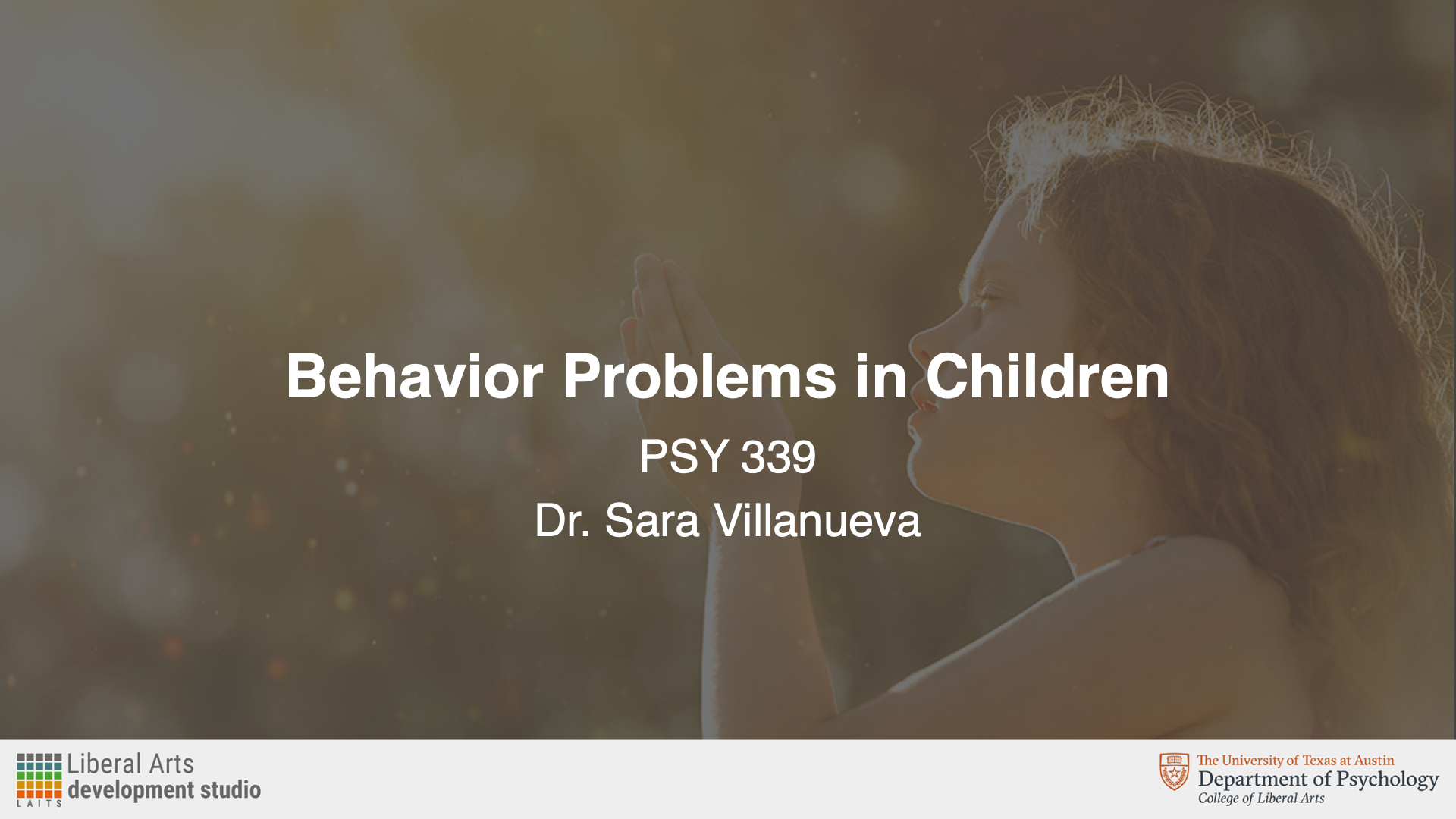
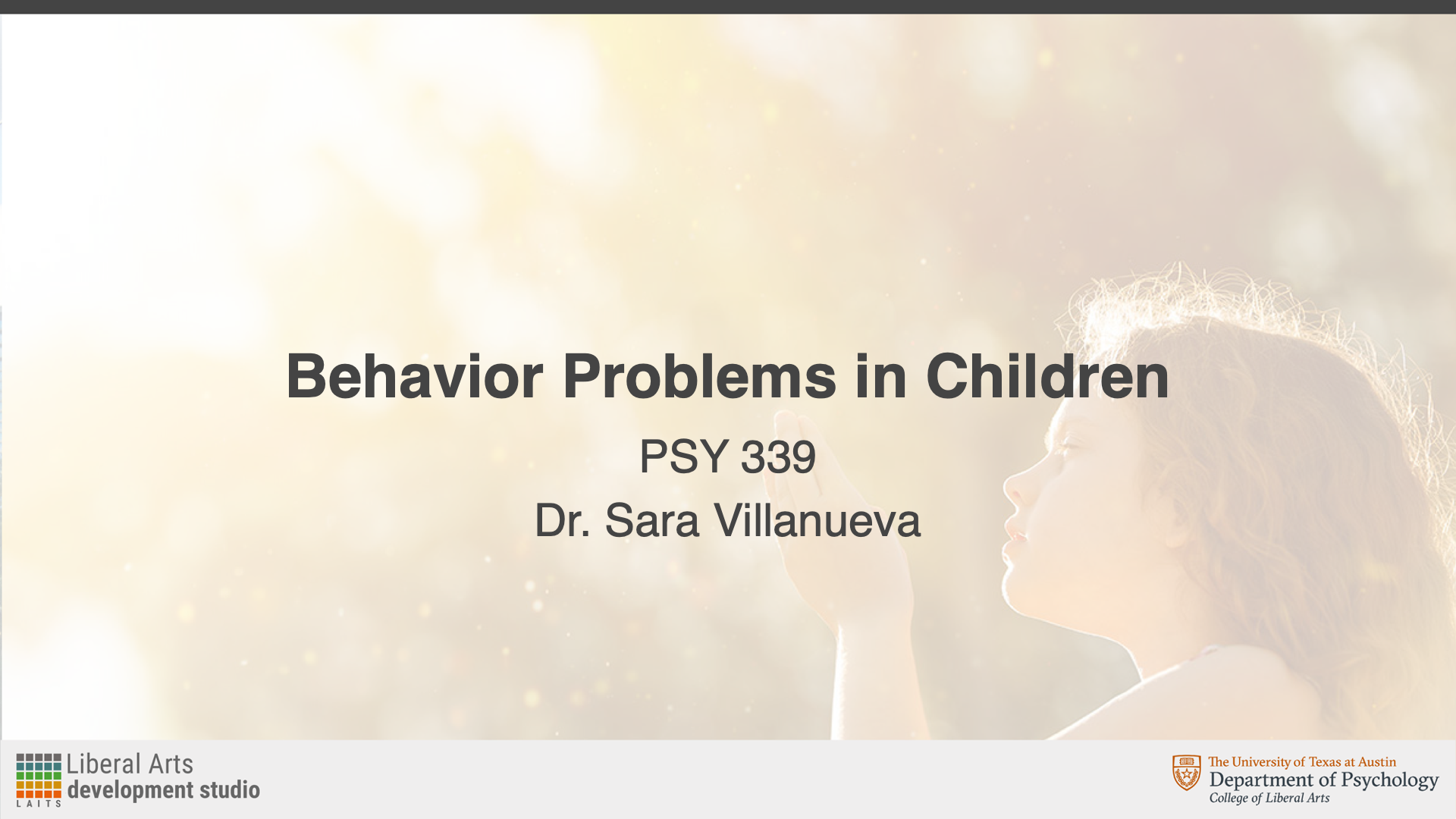
My first assignment was to work on making course graphics for PSY 339: Behavior Problems of Children. The professor wanted Style B graphics and had already chosen an image to be used.
For this assignment, I created:
Canvas dashboard/homepage graphics
Canvas buttons
Powerpoint resources
Animated stingers
An end card
Canvas Assets
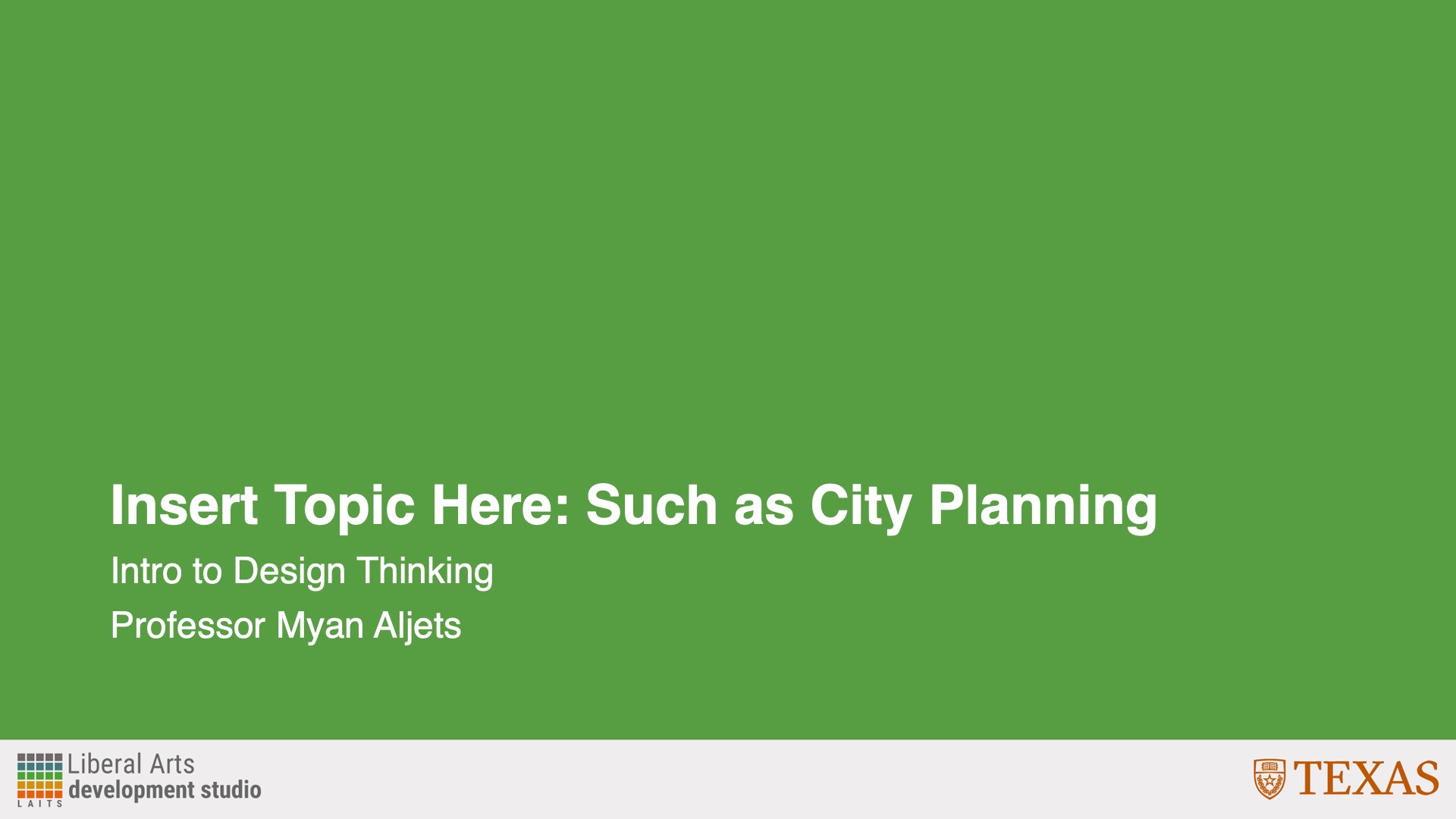
These were my initial designs for the Canvas assets. I had some trouble positioning the girl so that she wasn’t covered up by anything, and couldn’t find the department logo initially.


After this, I received feedback to:
- Use the department branding
- Use a color overlay on the logo
- Change the color bar to more of a gray color instead of a slightly blue color
- Put “of” on the second row with “children”
- Push the picture of the girl up a little
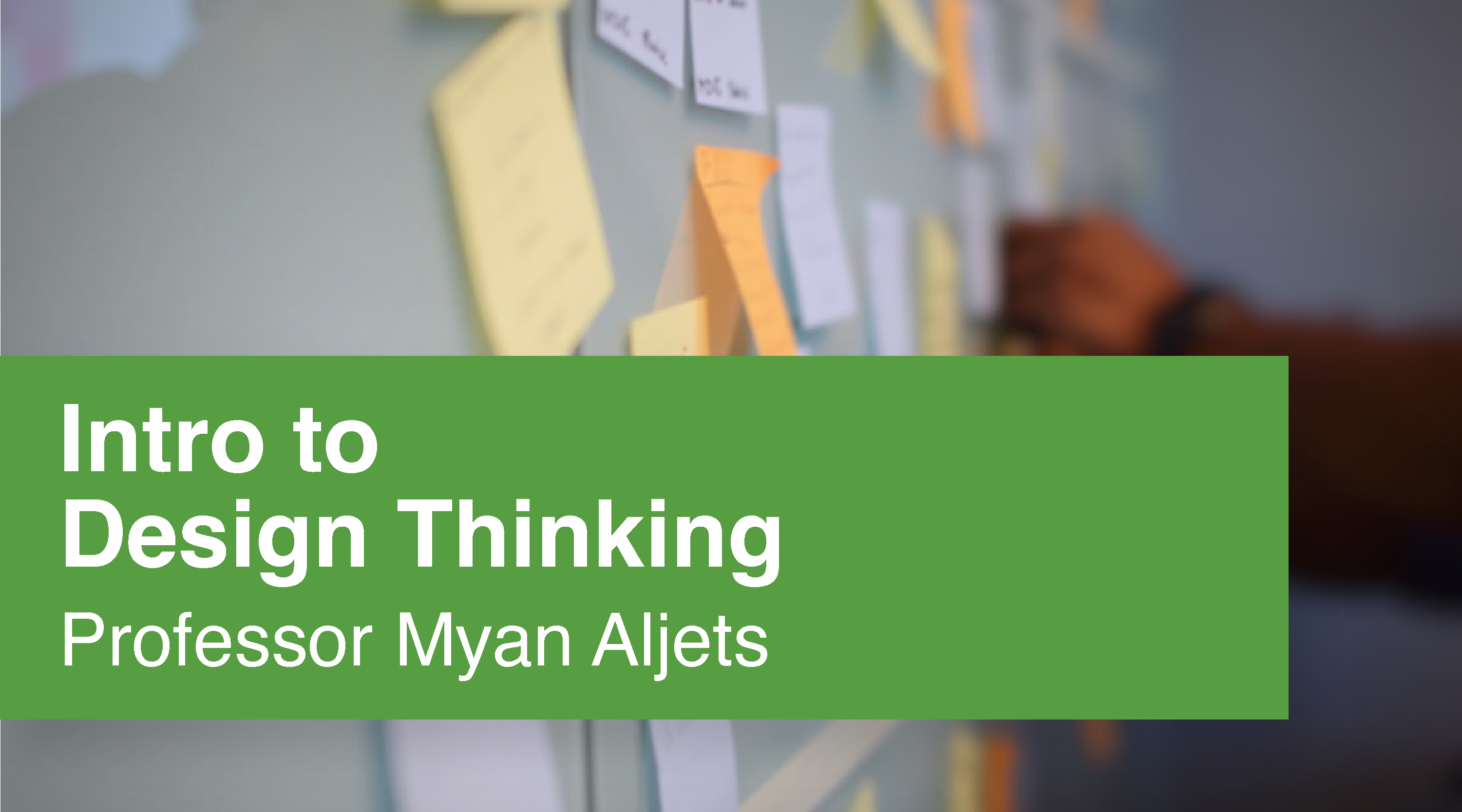
Incorporating Feedback
After receiving feedback, I changed the logo, color bar, text, and played with the photo. I tried to make sure that the girl was more visible and more fully in the frame.


Canvas Buttons
After this, I created my Canvas buttons. I wasn’t sure what color to make the bottom bar, so I just made them a different gray because it didn’t clash with the main gray.


After this, I received feedback to:
- Make the main color a gold/yellow so it matches the image
- Make the bottom bar the gray color
Incorporating Feedback
I used the eyedropper tool to pick a gold/yellow color from the photo, and my buttons ended up looking like this:


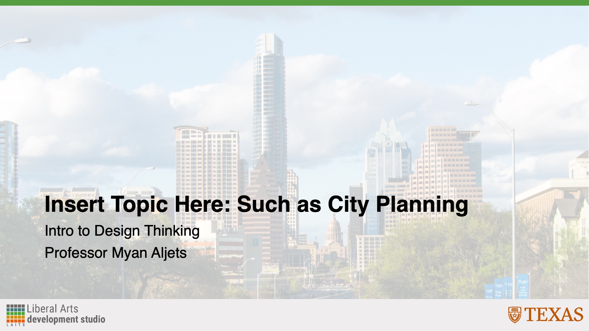
Powerpoint Assets
Next, I created my Powerpoint assets. The professor specified that she wanted them to be in Style B Color Overlay. Creating these slides involved using Adobe Illustrator to make the backgrounds and then importing them into Powerpoint.


After this, I received feedback to:
- Change the slide to the faded color instead so that the image doesn’t have the gray overlay
Incorporating Feedback
After changing the background accordingly, the slides looked like this:

Stinger Animations
Lastly, I created stinger animations and the end card. The professor had some that she had previously used, but she wanted to change the background color to match. I made these in Adobe After Effects.
After this, I received feedback to:
- Change the background color to the same gold/yellow color that buttons use
- Add the Department of Psychology branding onto the end card
Incorporating Feedback
I then changed the background to the gold button color and revised the end card. Since I’m not as familiar with After Effects, it took me a little while to figure out how to add the new logo and animate it. However, after playing around (and a bit of Google), I learned how to use keyframes and opacity to make the logo fade in and out.
I then got final feedback to:
- Add the utexas logo back in at the end of the end card
Incorporating Feedback
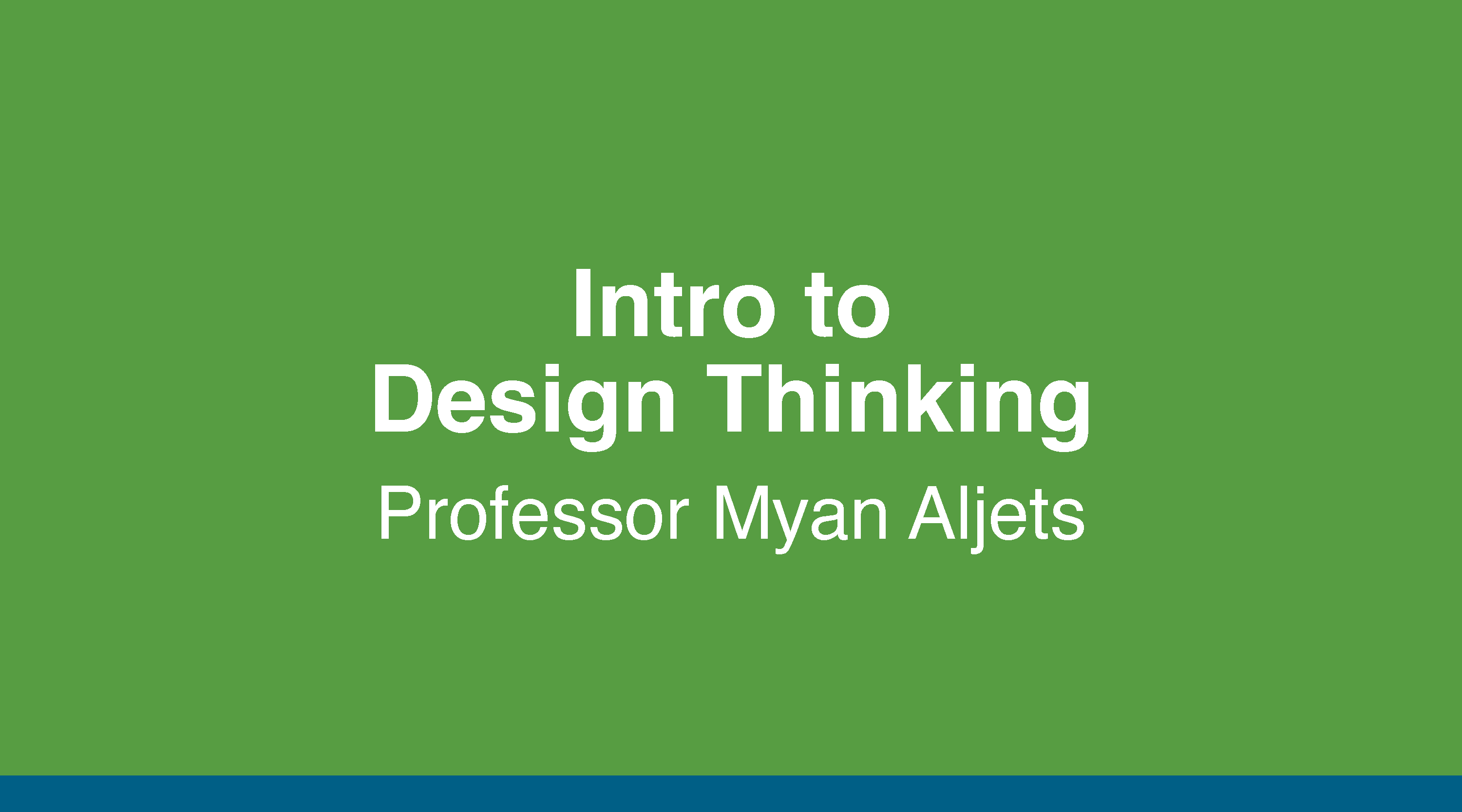
Here is the updated end card with the added logo:
Pre-Roll Animation
Lastly, I had to fix the pre-roll animation logo. Originally, it was the logo for the Department of Government, and it should have been the logo for the Department of Psychology. This wasn’t necessarily a difficult task, but I’m not as adept with Adobe After Effects, so it was a fun challenge for me to see if I could figure out the layers and elements needed.
Final Thoughts
Overall, I thought this assignment was interesting and a good way to practice the skills and guidelines I learned in my previous course graphics trainings. The most challenging part for me was the end card because I’m not as familiar with Adobe After Effects. I had a little trouble figuring out how to get the logos to fade in from black and color, and just how to animate in general. I held off on asking for help, just to see if I could teach myself—and I was able to use online resources, as well as a little trial and error to learn what I needed to do. Aside from After Effects, I thought I was a fun exercise in layout and color.