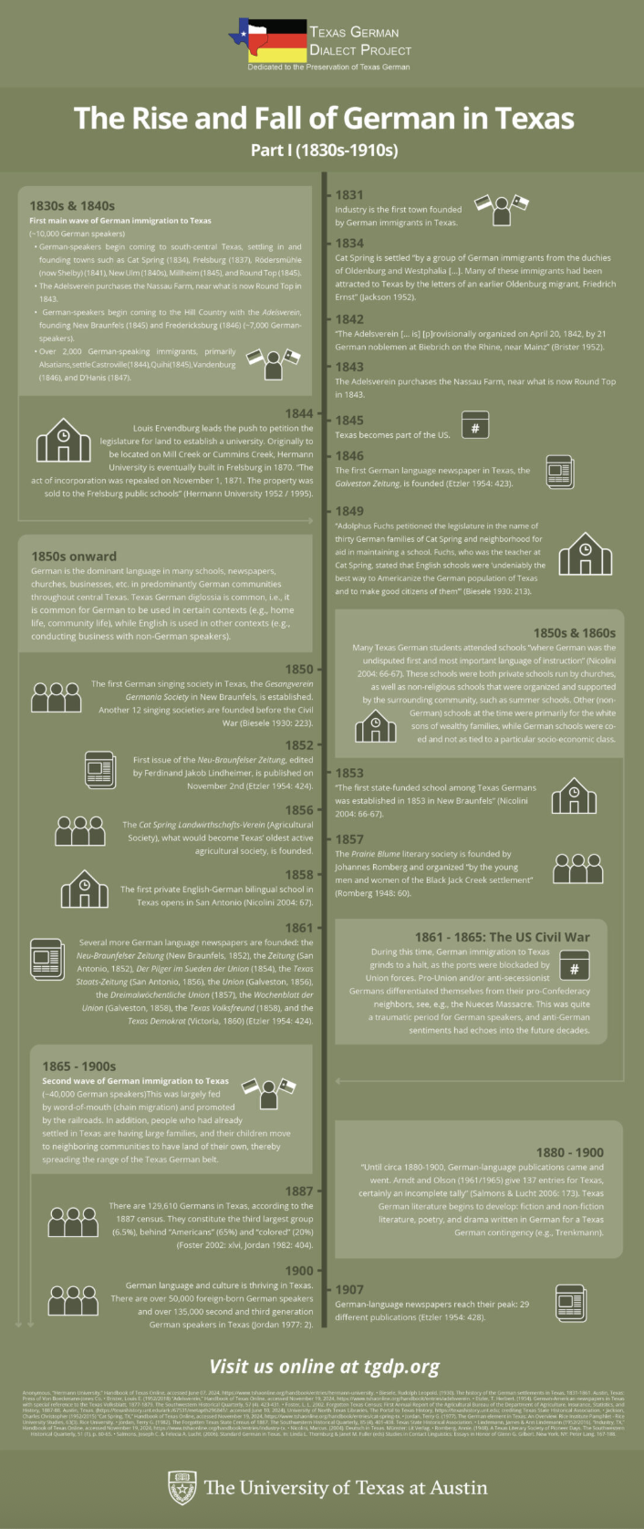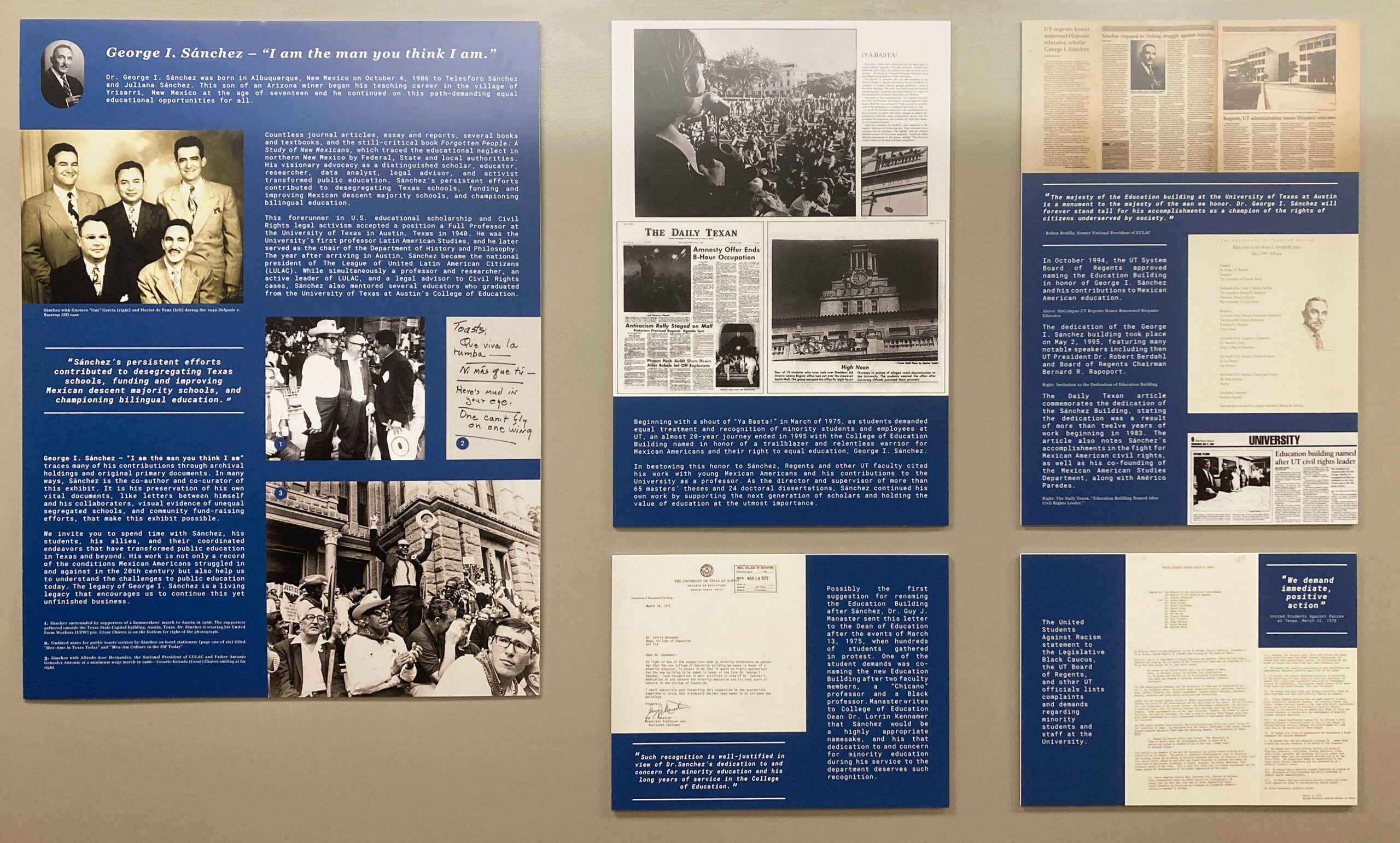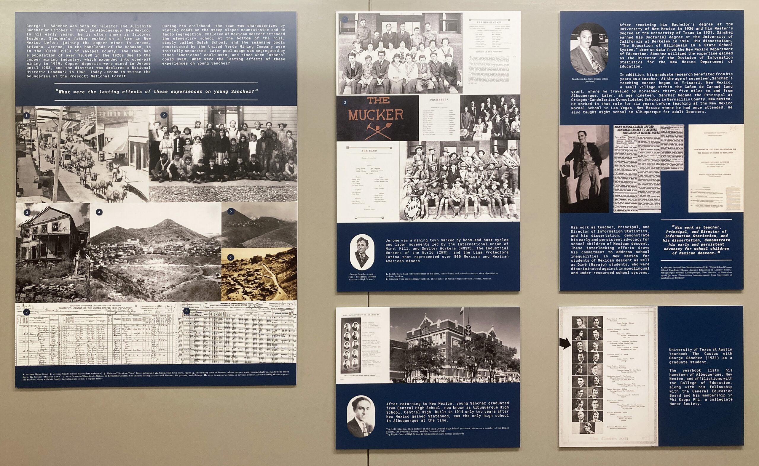
UT in Context Website Redesign: Sweatt v. Painter
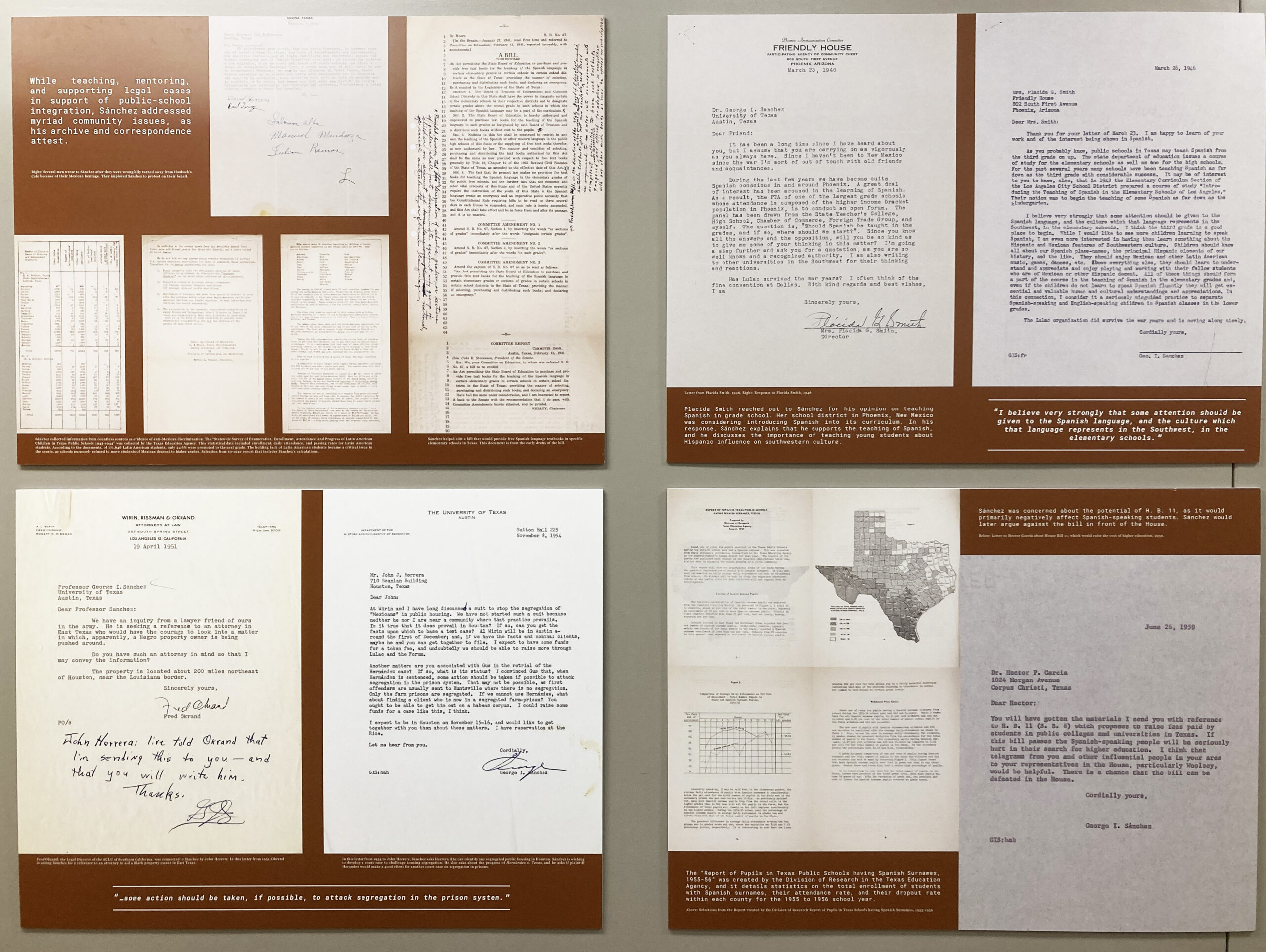
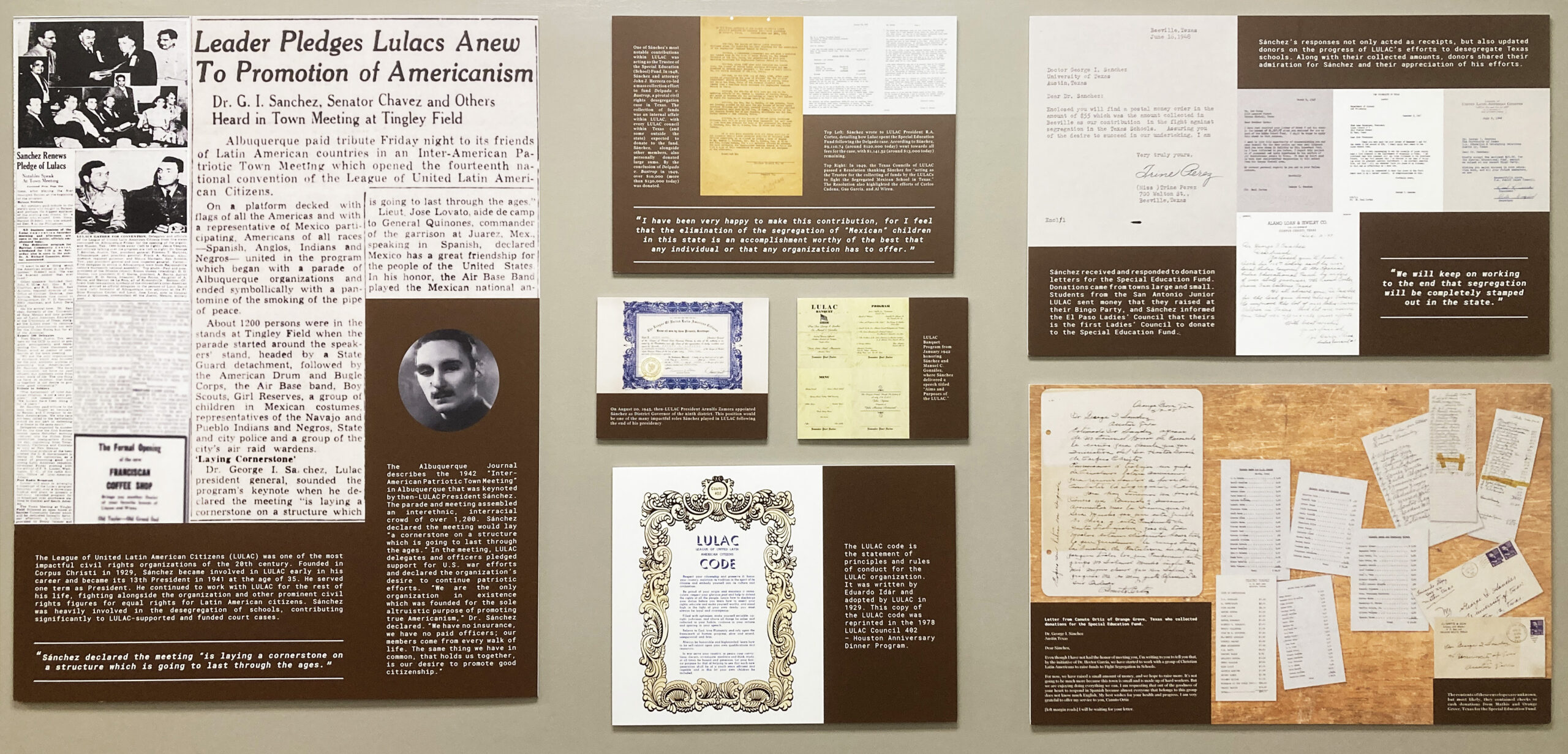
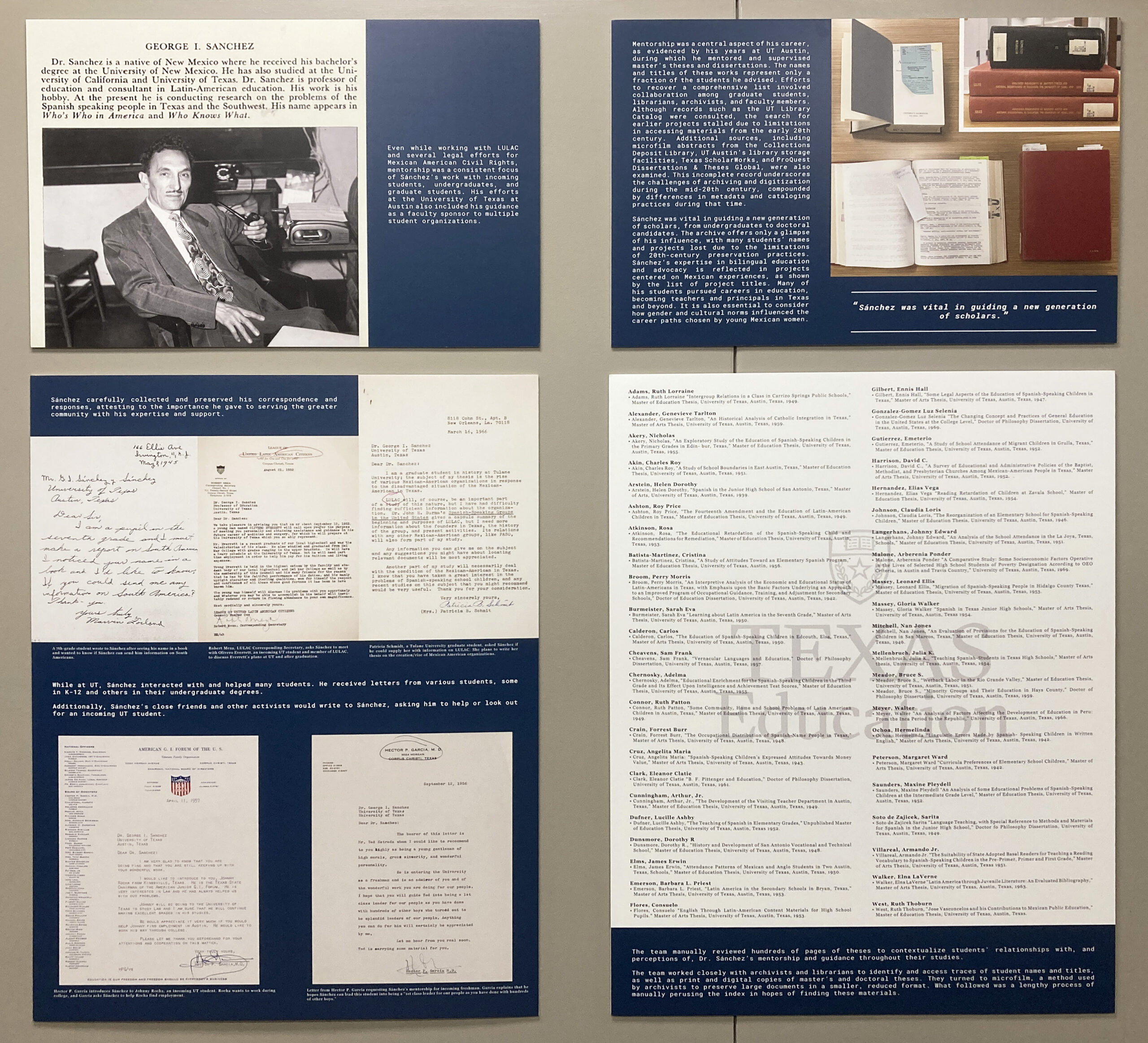
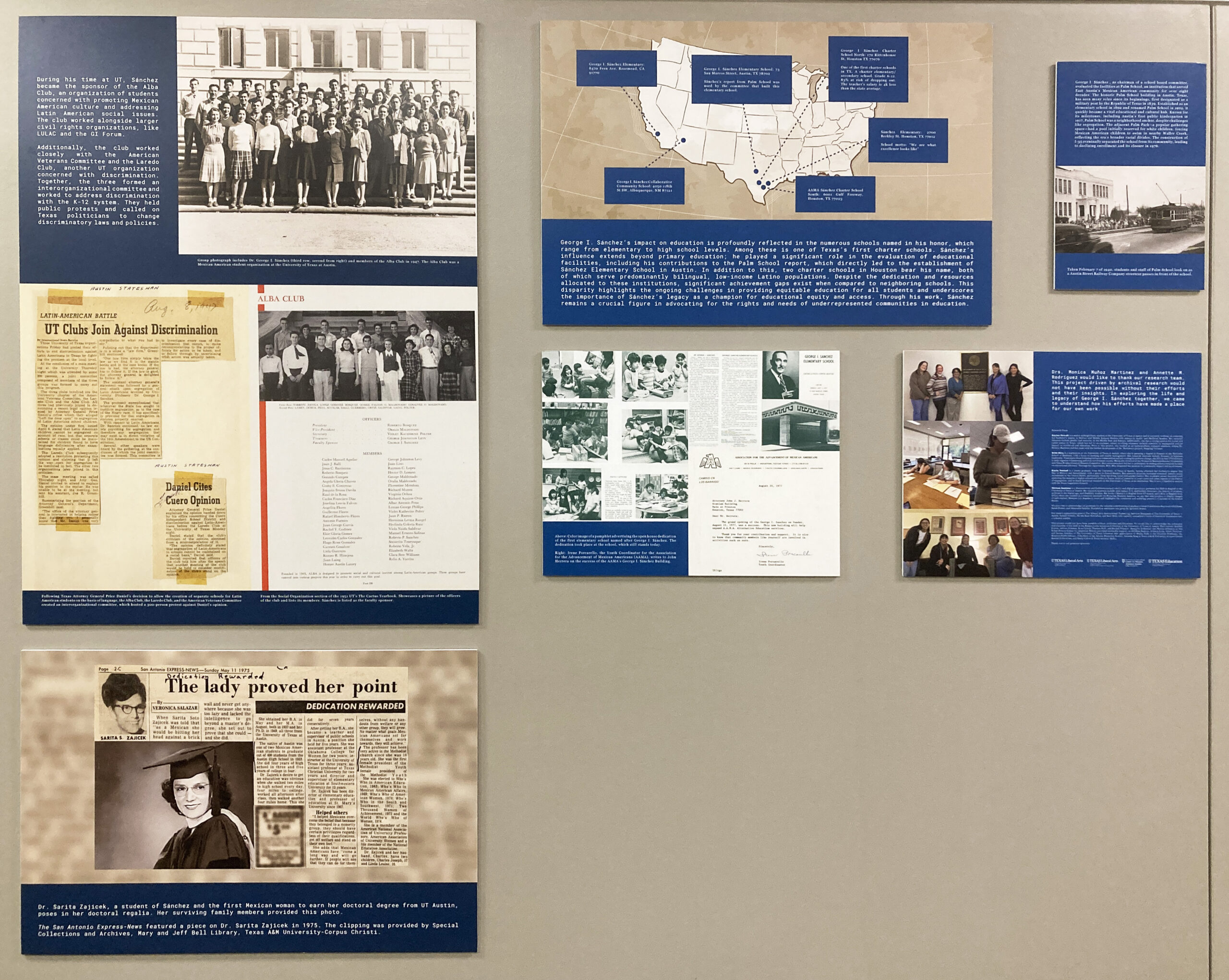
UT In Context requested a redesign of their existing website (https://utincontext.la.utexas.edu/). By the time the project was handed to me, the site had already been modernized. What the client wanted me to do was to create pages that showcased their physical Sweatt v. Painter gallery in a digital manner.
The site originally looked like this:
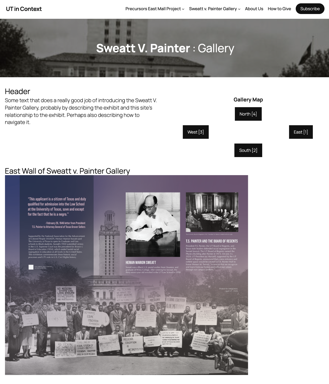
I liked the idea of having a separate page for each wall; however, I felt that the navigation buttons laid out in the cardinal directions was a bit clunky. My main goals going forward were to make navigation intuitive and to lay out all the information in a visually appealing and non-overwhelming way.
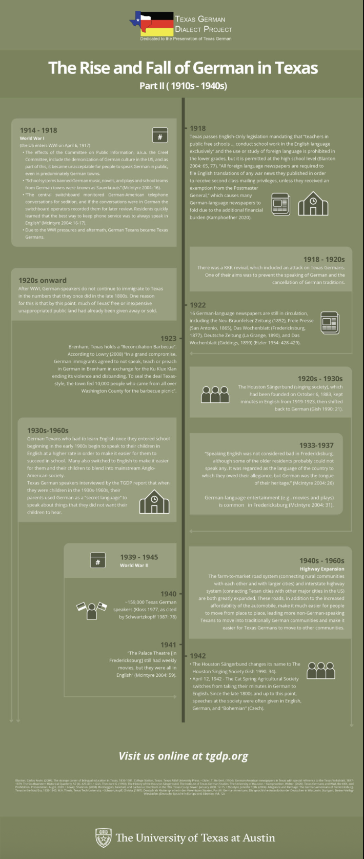
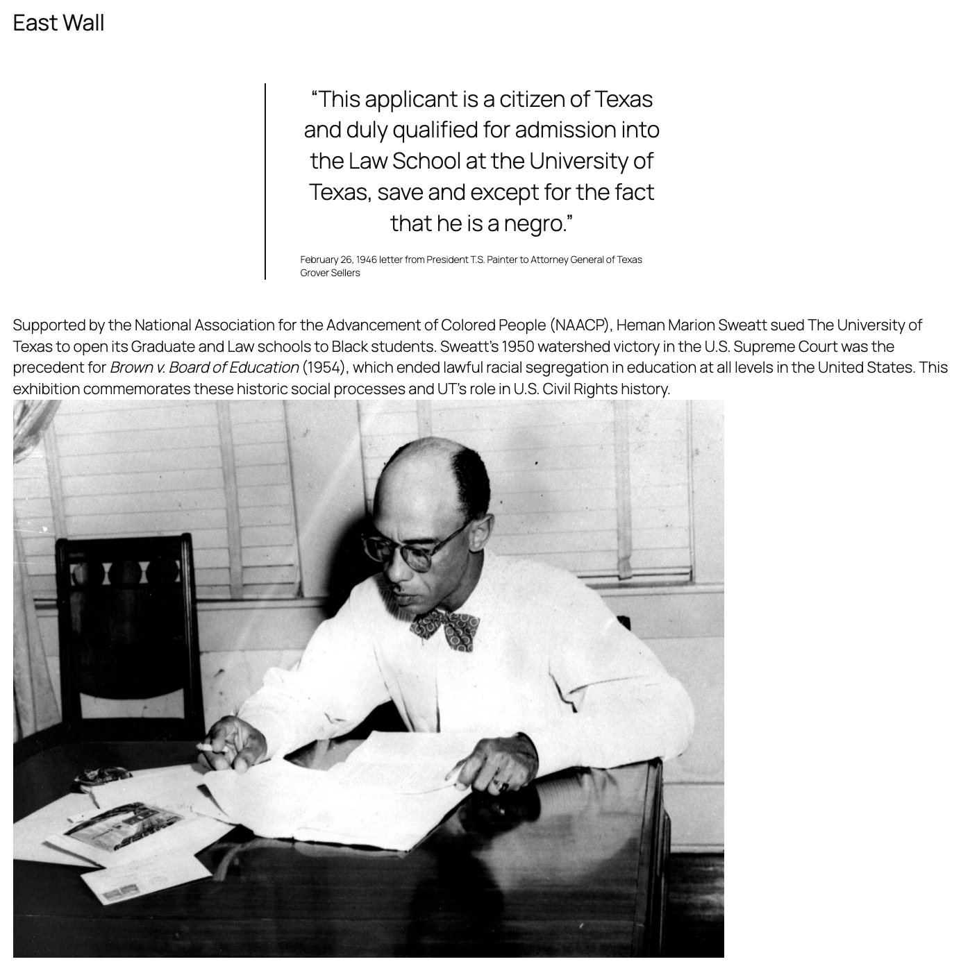
My next step was to mock up the pages on Figma:
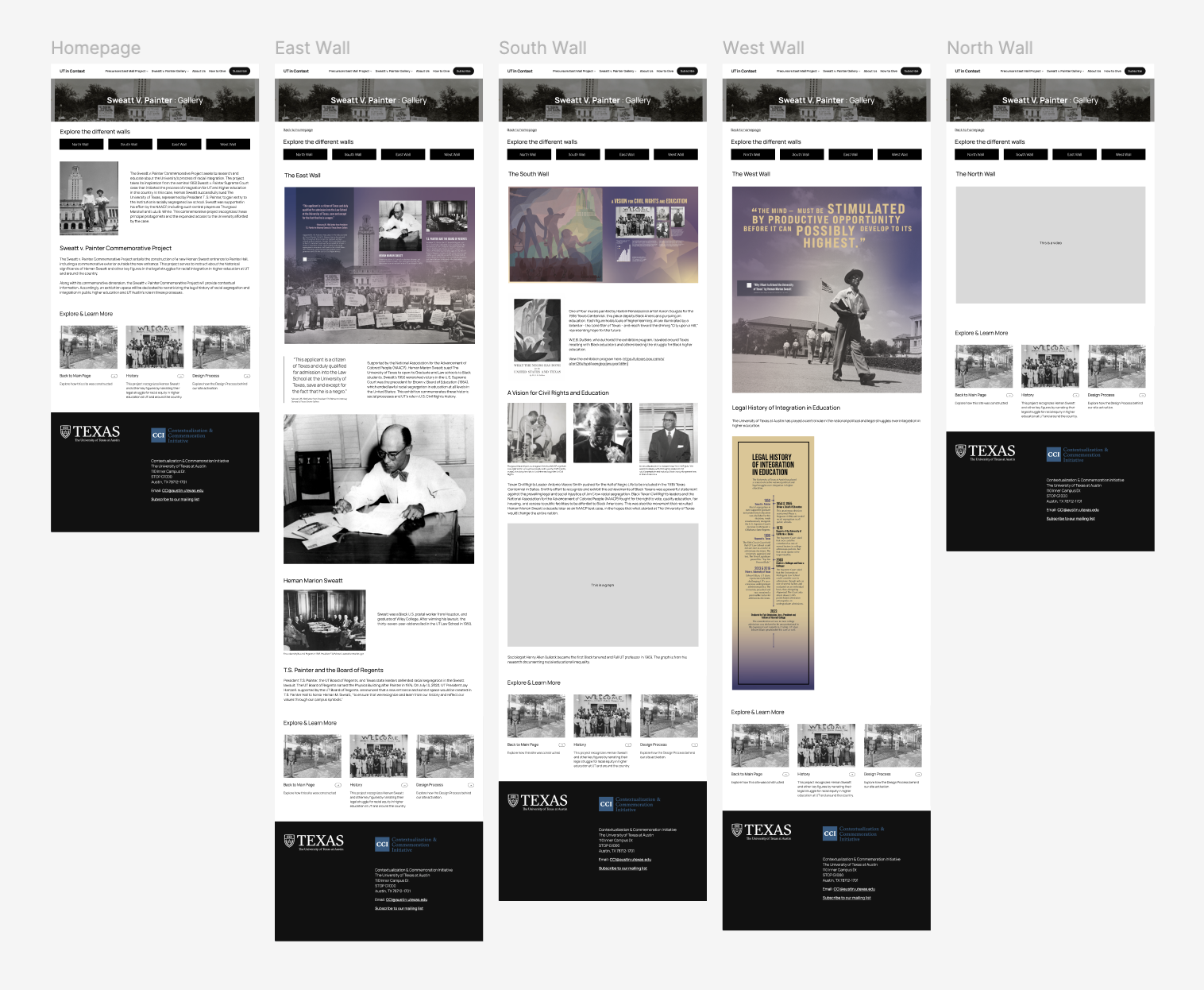
Interact with the mockup here!
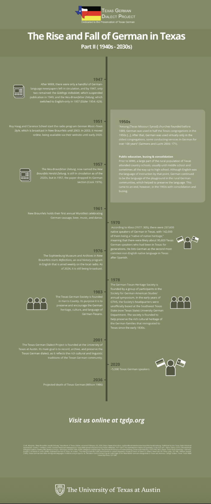
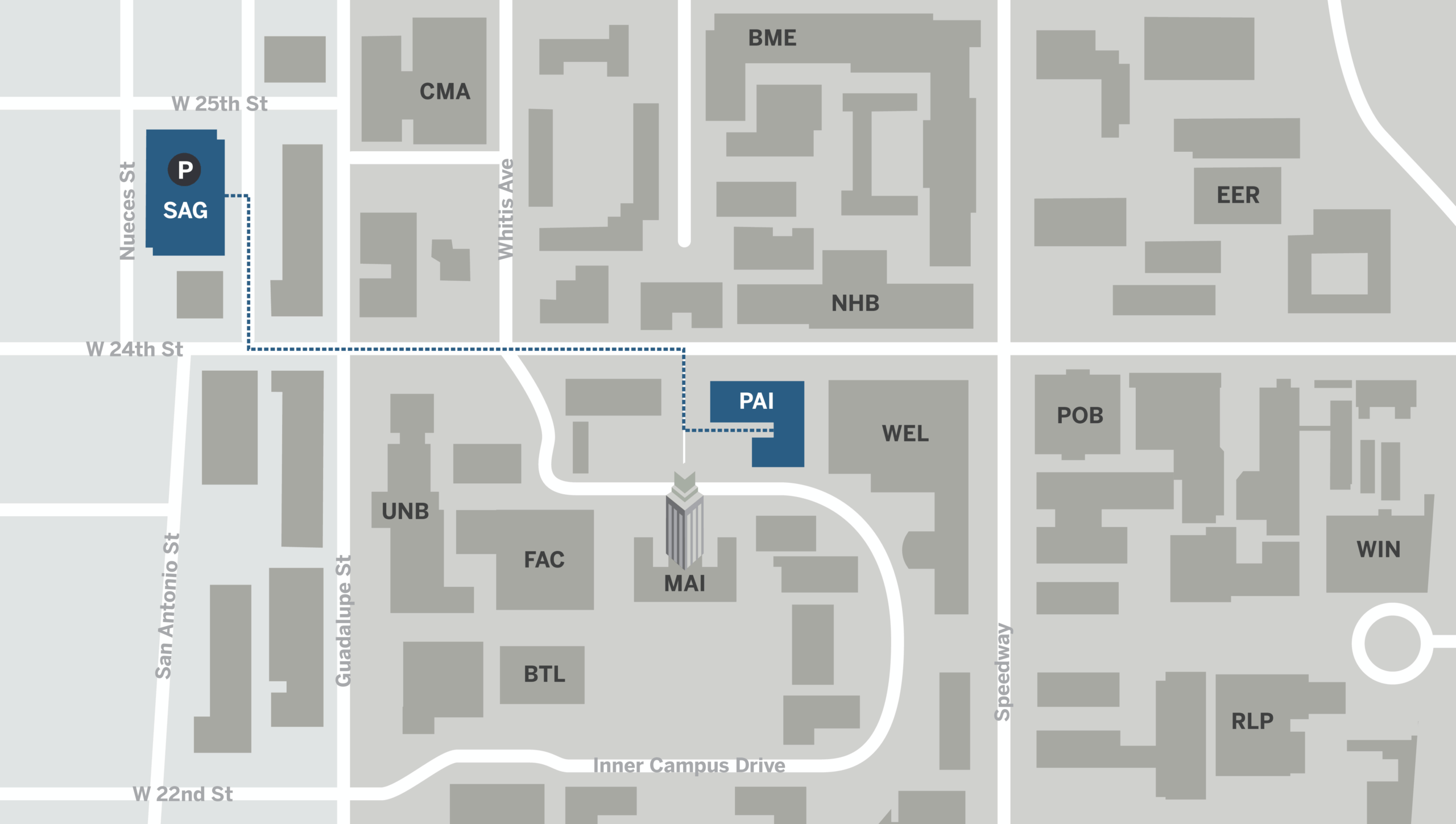
I then created a map to help guide visitors to the physical location:
Project status: Waiting for feedback