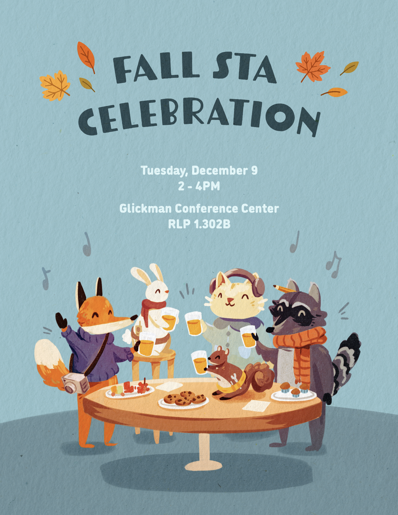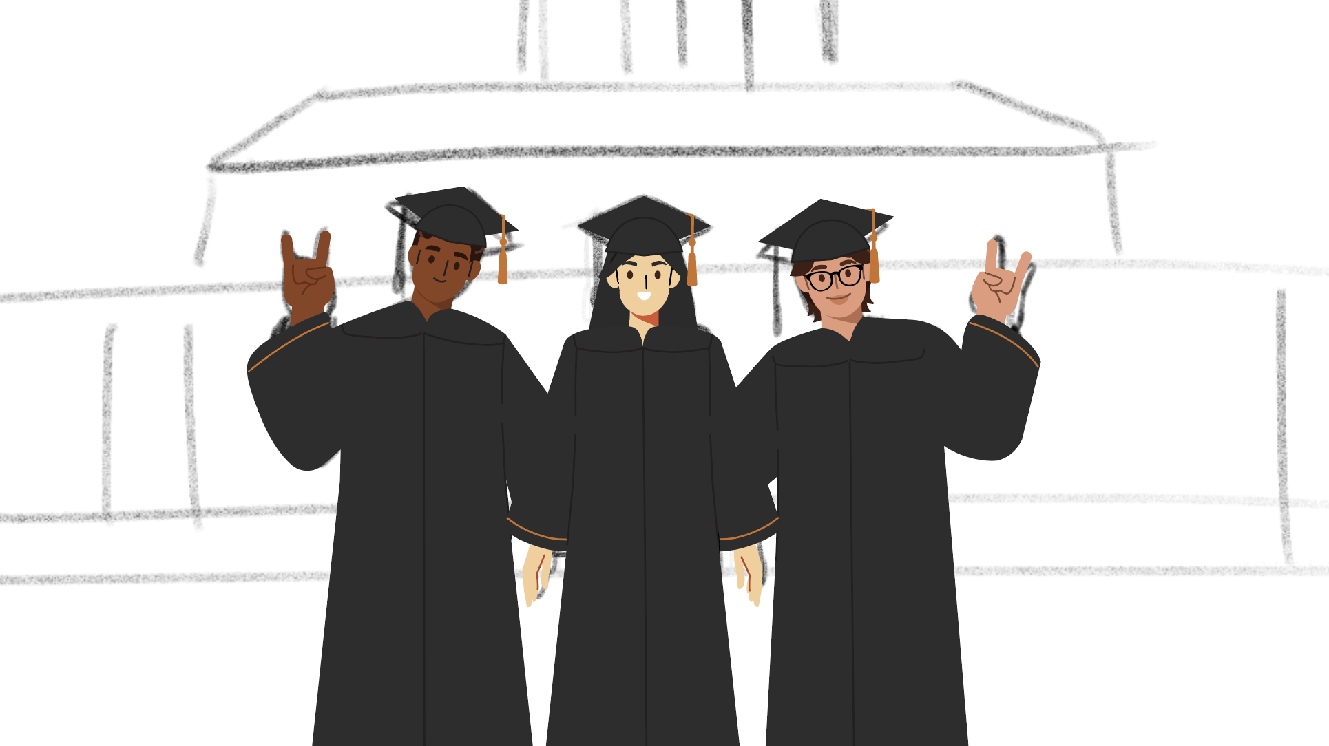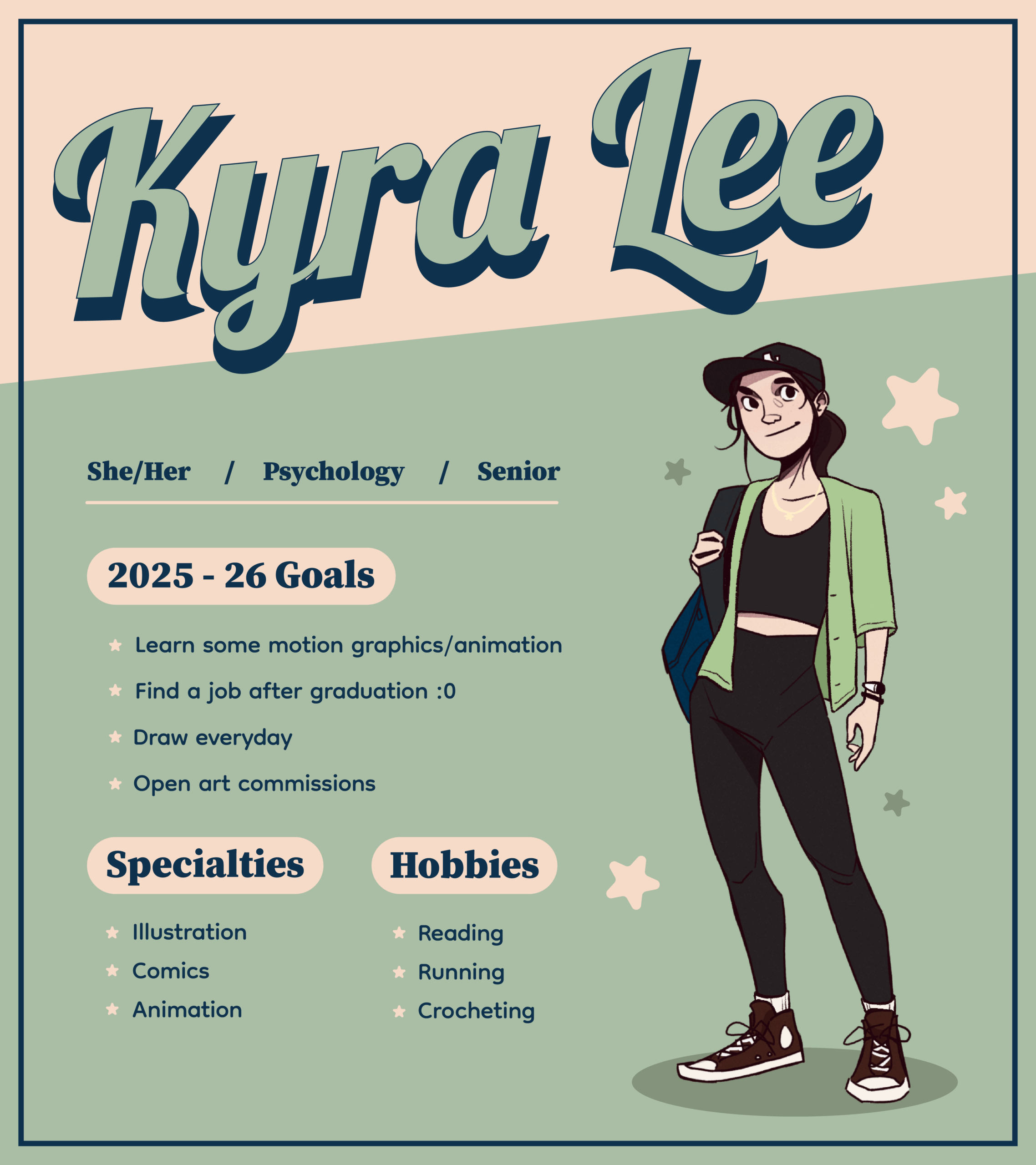
Goodbye STA Team!
It’s hard to believe, but I am officially a college graduate, which means it’s time for me to move on from my position as an STA. I am truly grateful for my time at LAITS. This team felt welcoming and supportive from the very start and I met a lot of wonderful people along the way. I credit a lot of my artistic and personal growth to the experiences I had here, so thank you <3
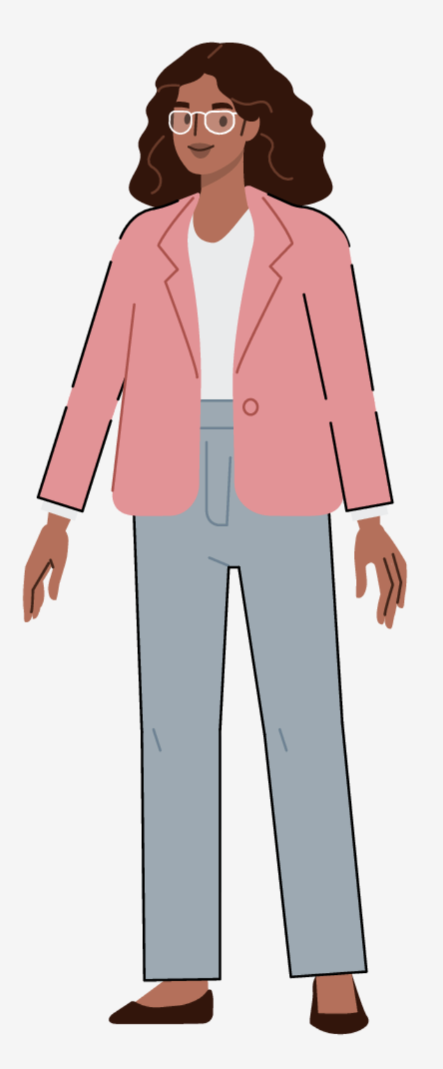
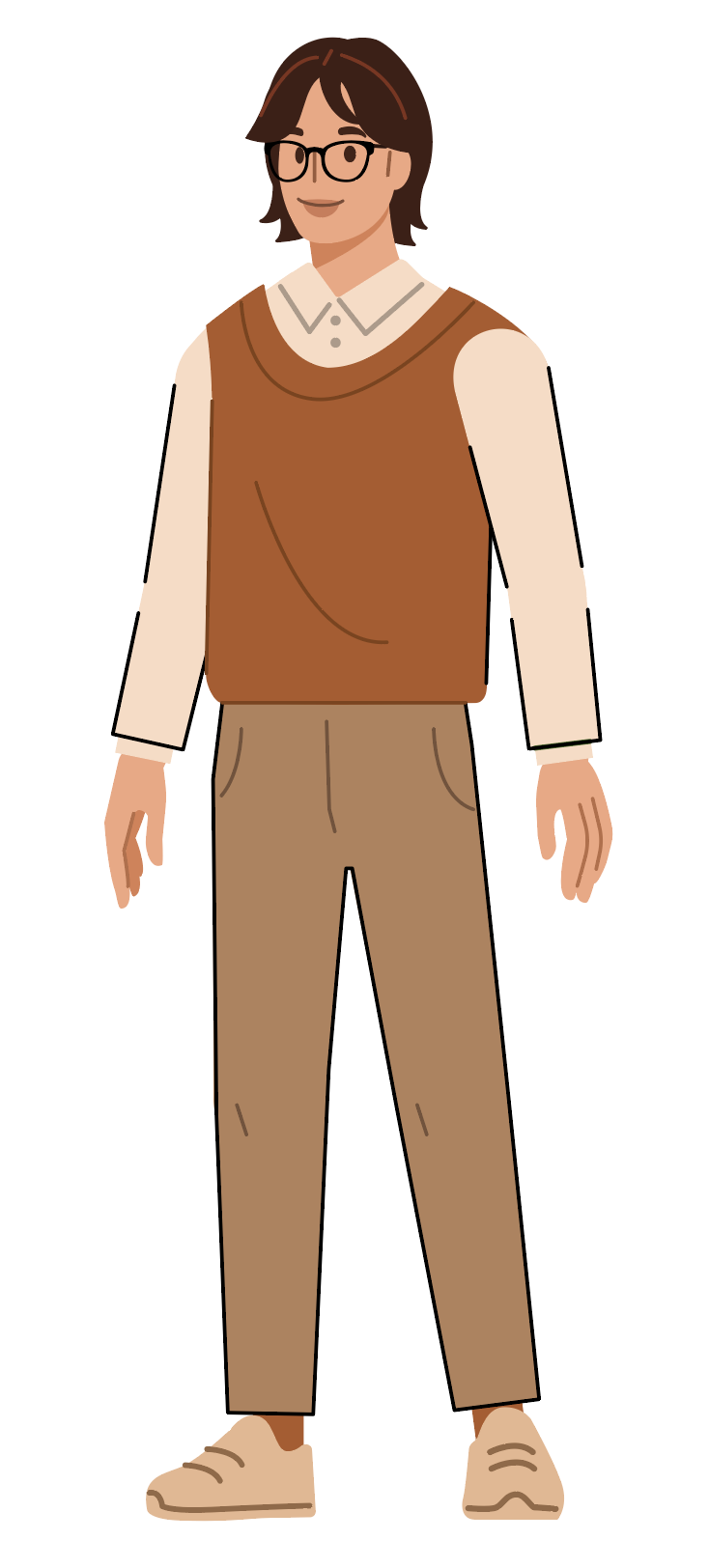
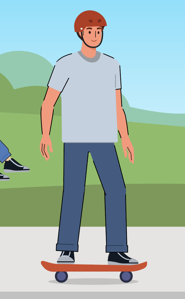
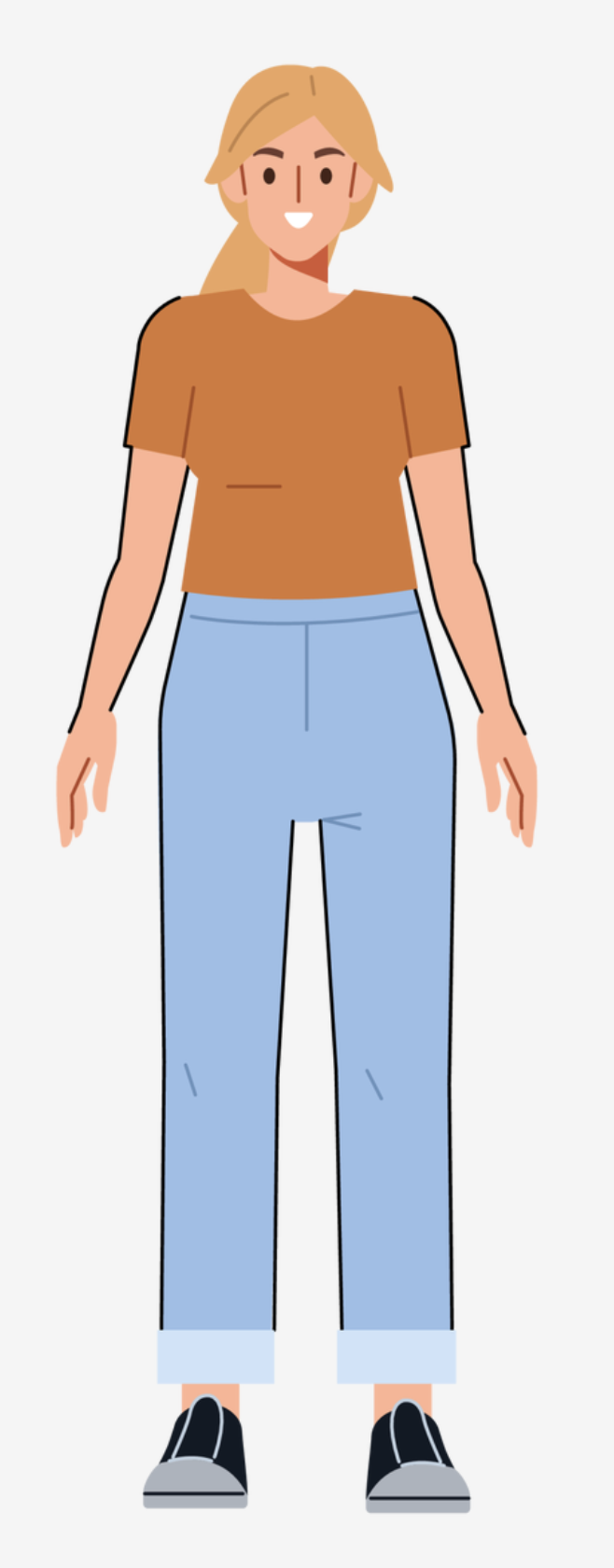
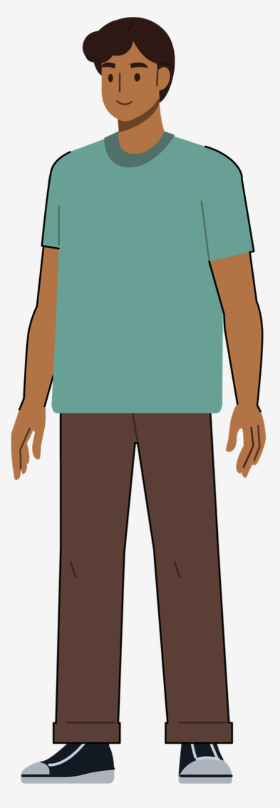
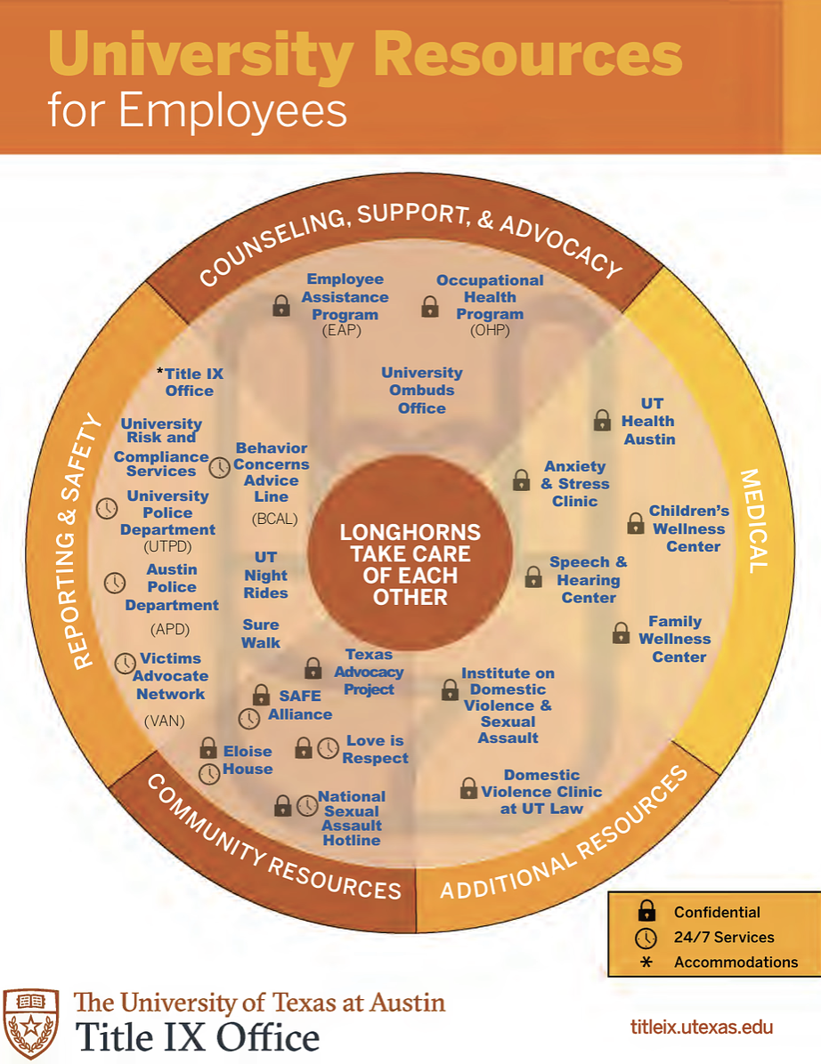
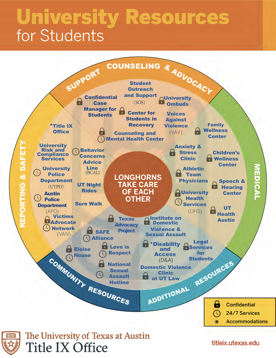
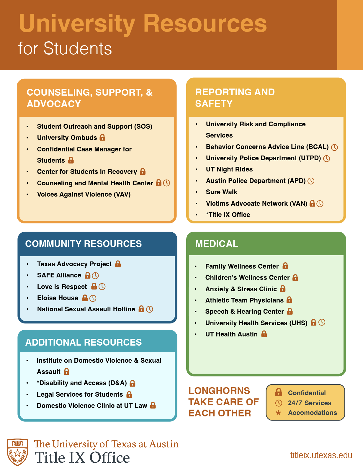
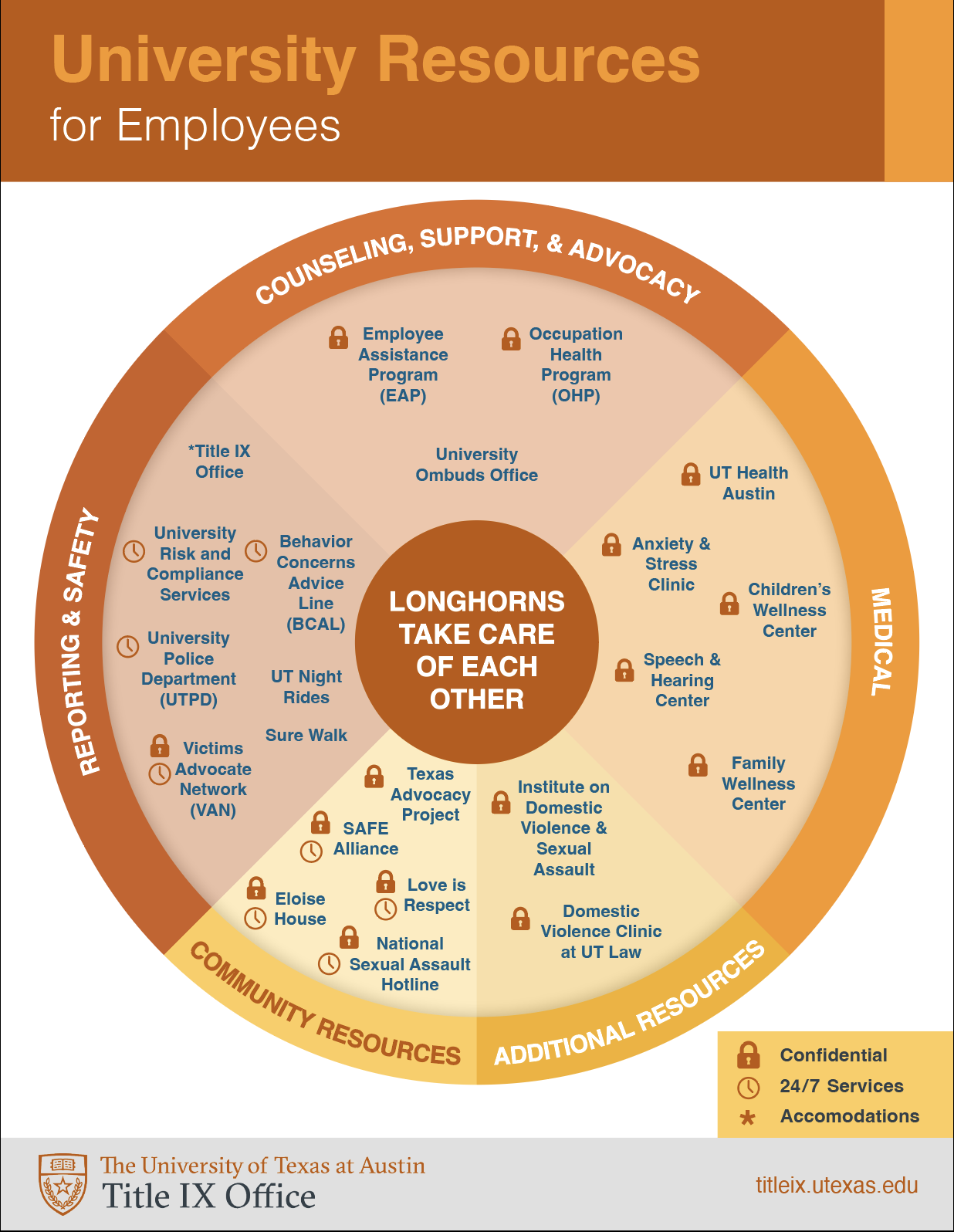
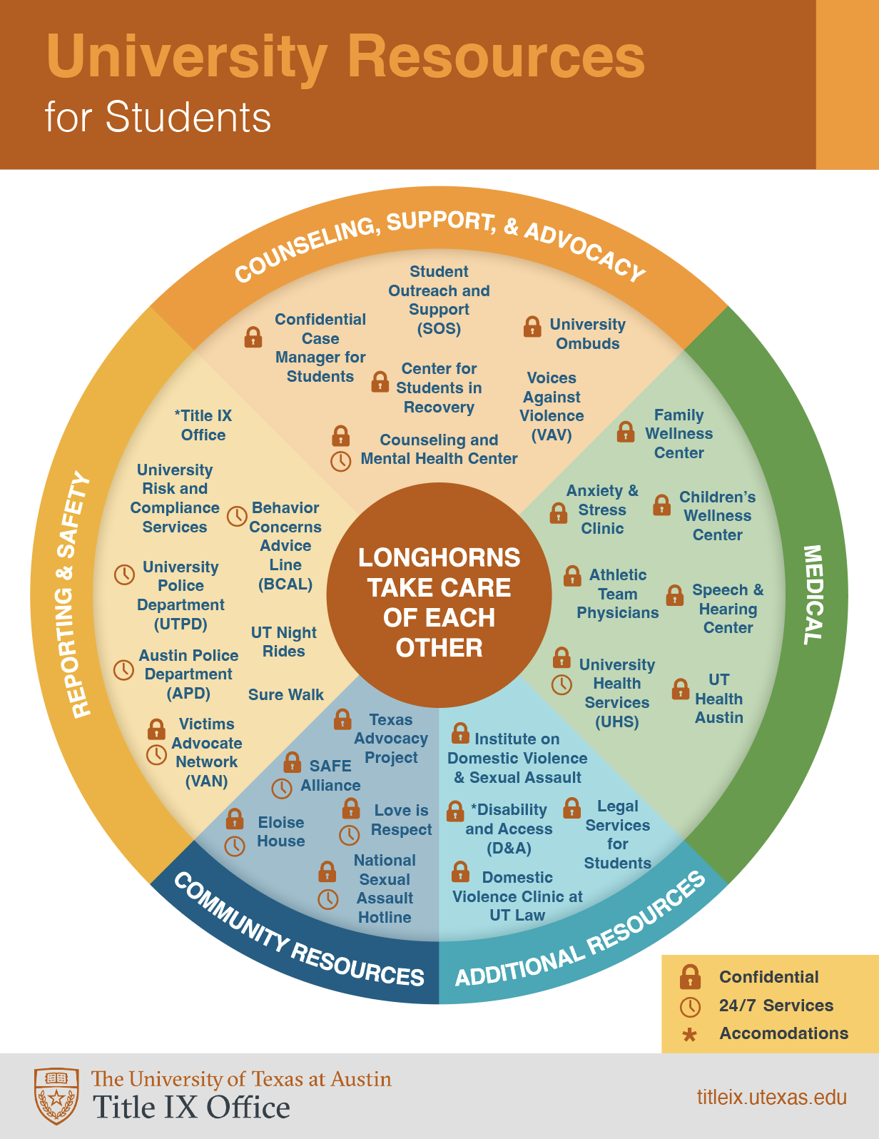
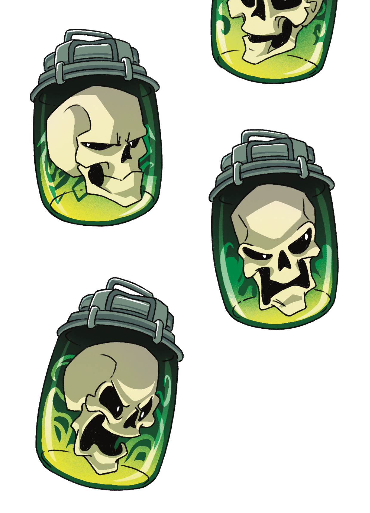
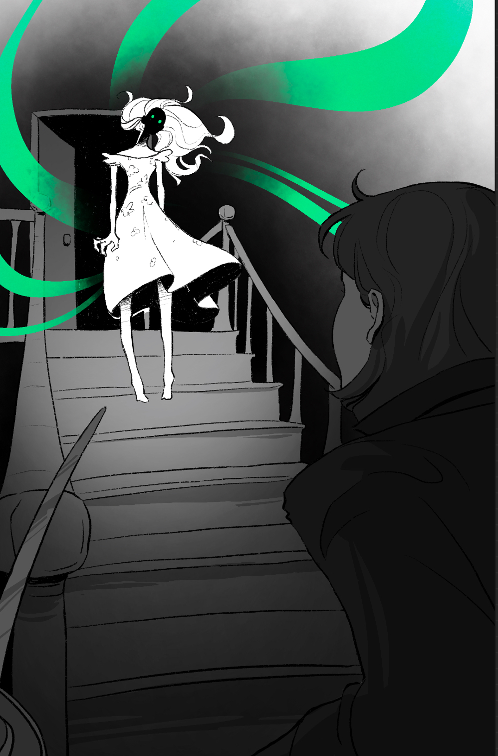
SOC325K Course Graphics
First Drafts
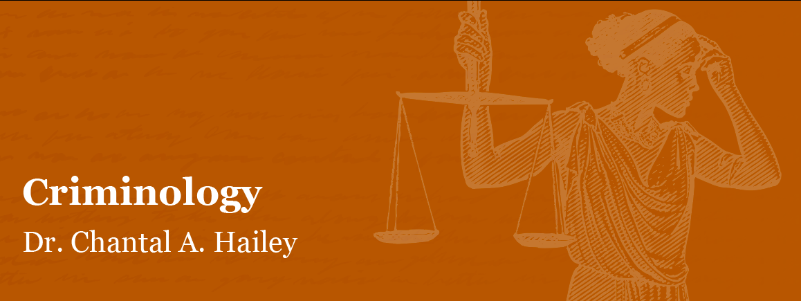

Final Design