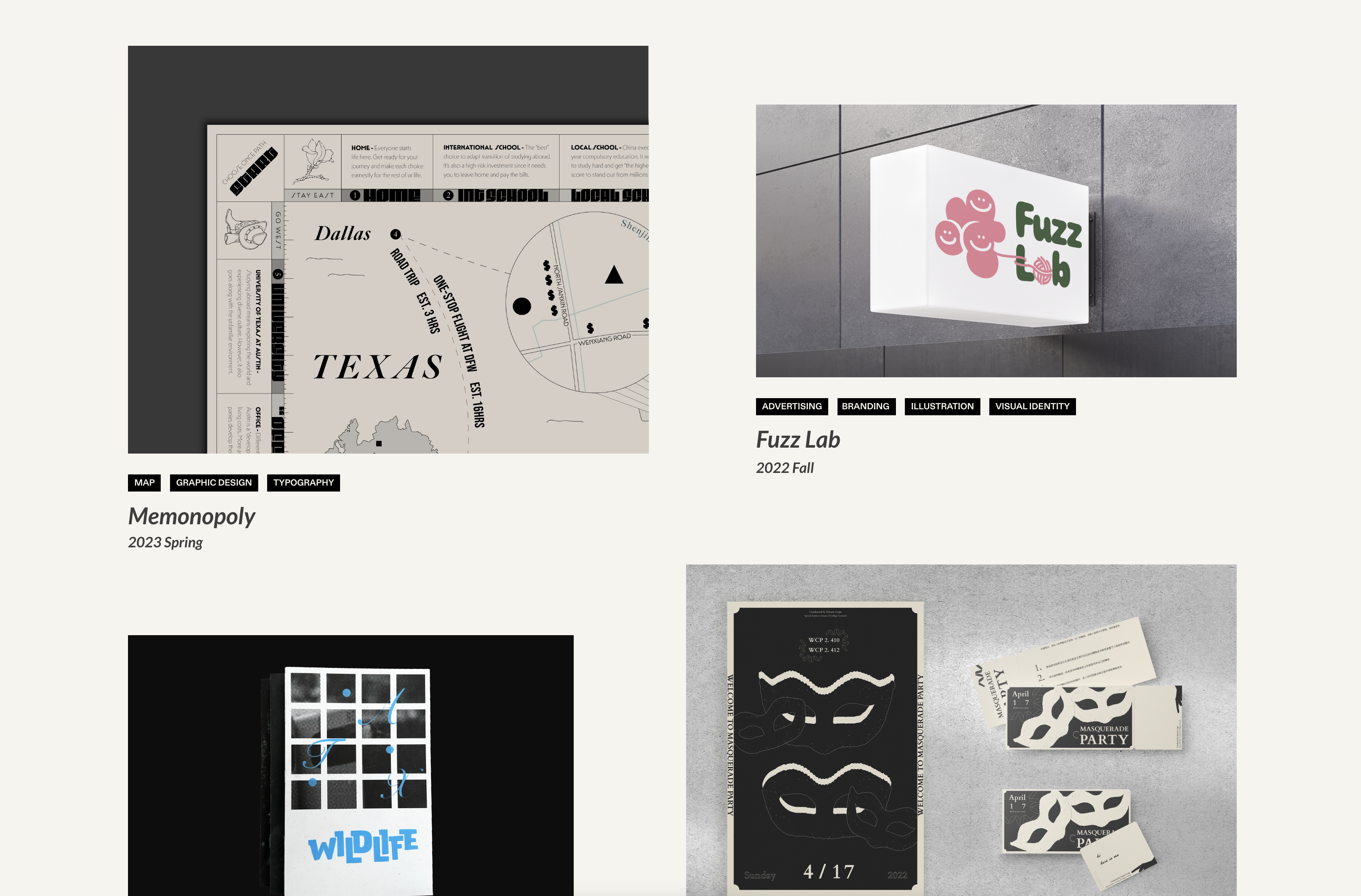
Australia Texas Connection
Start: Jan 16th, 2023
To be Completed: Feb 29th
Staff Guidance: Desha
Client: Rhonda Evans
Project Description: Create a podcast cover that showcases the connection between Australia and Texas with globalization trends without no cultural appropriation
Since the client expressed an interest in broader trends with illustration and typography, I want to move on the vector illustration and bold typography to convey this vibe. My original idea is to utilize lines and dots to connect two maps of Australia and Texas.
First Round:
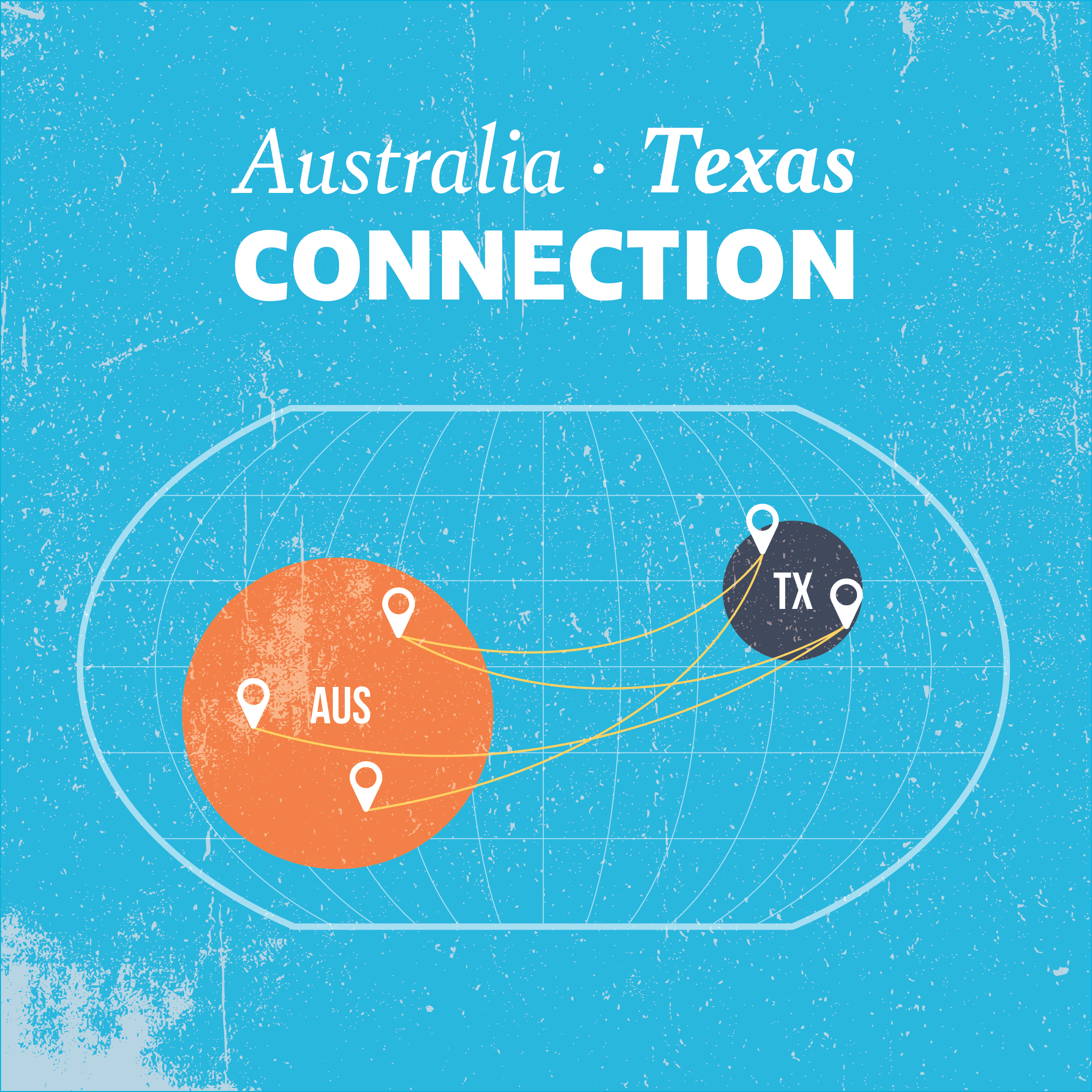
#1: With this iteration, I focused on the location and size difference between Australia and Texas with a simplistic design on a flat globe. Each abstract shape has various location markers to showcase the different connections that tie these two locations together.
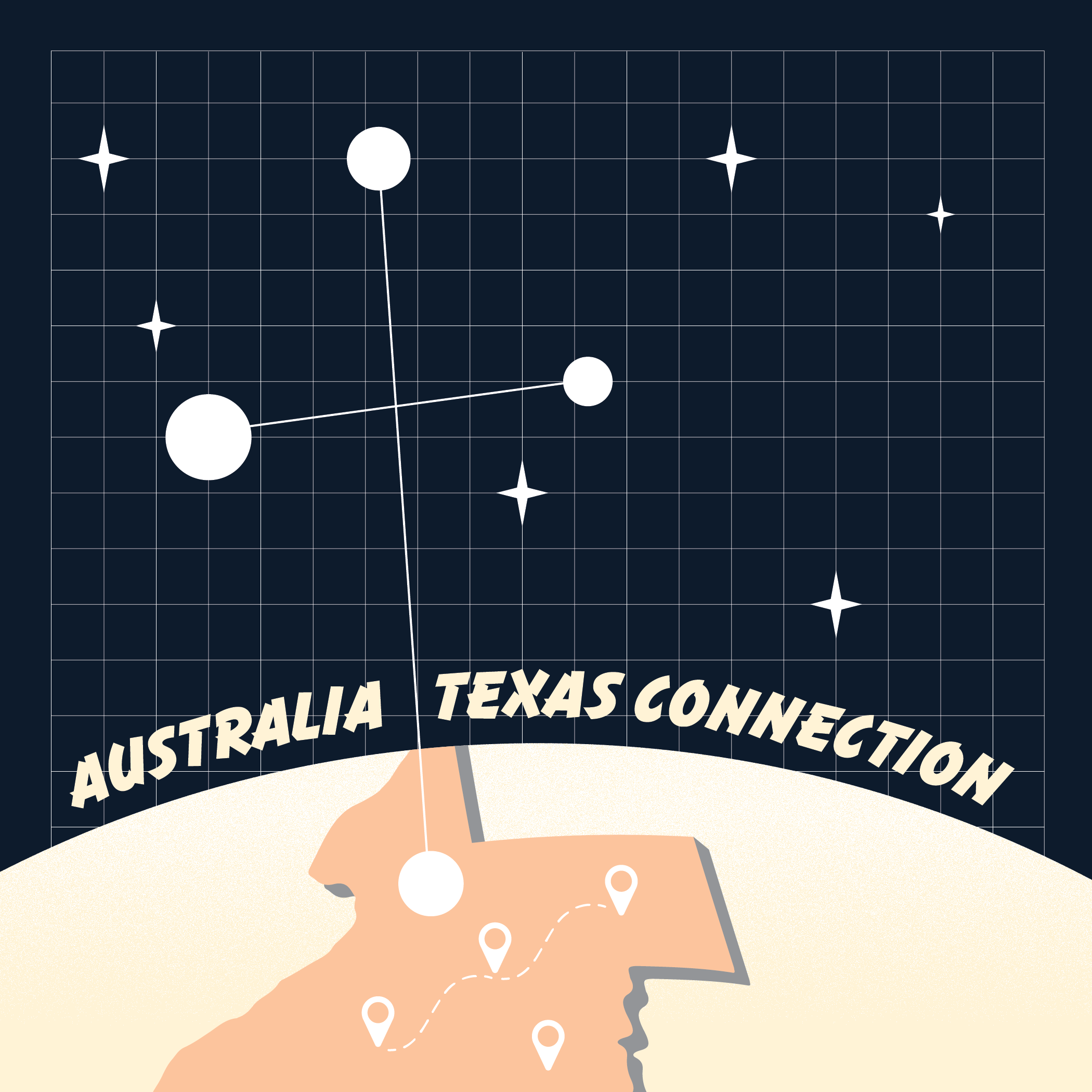
#2: The second idea is about using the Crux constellation to represent Australia as it connects with a 3D Texas. To enhance the reference of the constellation, I also included stars.
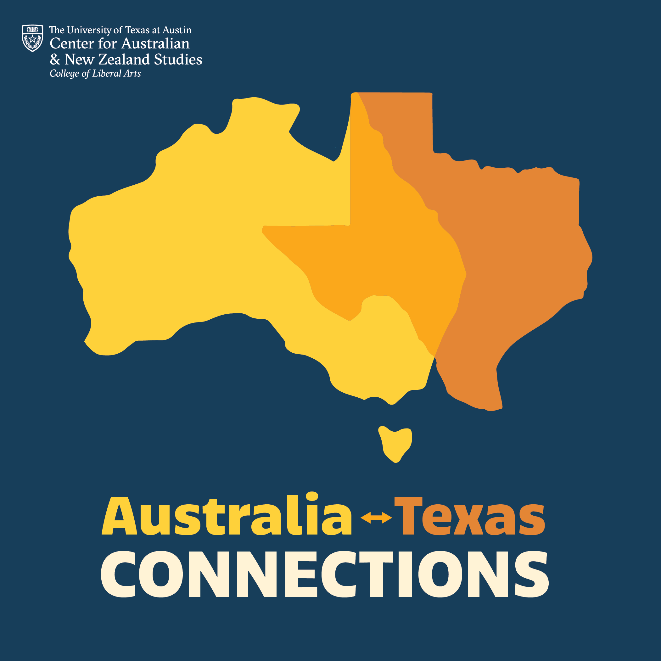
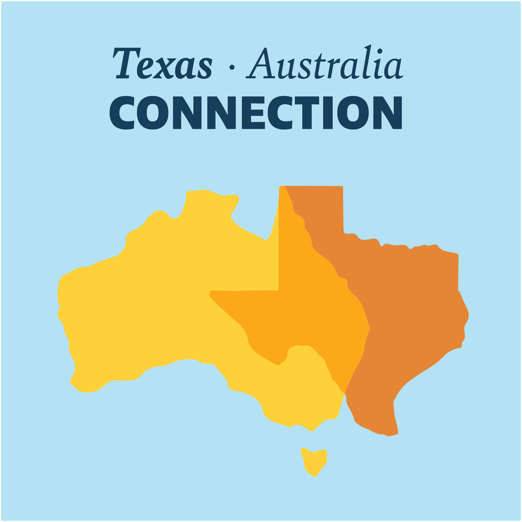
#3: The third design is a van diagram that showcases the relationship between Australia and Texas. By utilizing different colors and the blended center, it expresses the certain shared features between the two locations and their differences as well.
As for the font choice, I used more italic fonts for the country/state name applying a strong and bold font for “CONNECTION” for #1 and #3. For #2, the font choice is more dynamic to complement the layout of the globe. In addition, the current color palette has a hint of UT branding color.
Revision:
The client chooses to further develop option 3, the van diagram. To emphasize the connection between the two locations, the client requested to change the color palette of the background as well as replace the dots with the arrow. I wrapped up the project with these changes and the typography iteration.