Wow, it’a my last day here and the work I’ve done for the past semester isn’t all in this blog; however, I am very happy to say I have learned quite a lot and met wonderful people through this STA program! I will miss being an STA and I would like to thank Chloe Kim for recommending me to Suloni to be an STA! I also would like to thank Suloni for being such a warm, kind and patient boss! I loved our conversations, your encouragements and advice! I wish I was more invested in this during my busy seasons; but, the experience was worthwhile and I got to learn and do things I never thought I would do: such as learning how to scan those old little photo slides, learning how to talk to clients and collaborating with others! And so on! Thank you for everything (I hope this wasn’t cheesy)
Photo ID’s
Photo ID’s
I edited many, many photo IDs and it’s really easy! It only gets tough in certain situations but here is what I did.
 This first example is a classic one. I edited the photo to be less pink/orange and increased the brightness a little bit and saved them as 80×90 and 20×30 (below).
Sometimes photos that are submitted to be edited are not too hard to edit. Just small amounts of color or more light often do the trick. However, in the next example, things get a little tricky.
Yikes! This one took a while for me to find a good balance in colors. First, I listed what needed fixing. The yellow is too strong and so is the blues. Just in general, the saturation and contrast is too much. Therefore, I decreased the saturation & contrast. Now I needed to decrease the specific colors (yellow and blue) and bring in other colors. I messed around with Levels and Curves. There was very little help in that area. Image>Adjustments>Color Balance seemed to help more. Certain colors I would decrease and others I would increase. Make sure to export the photo in the end as “Save for Web”!!! ** I tried my best editing and ended up with this:
STA Training: Live Trace
Live Trace – STA Training
This training exercise was something I had a lot of fun with. I took something I doodled in my sketchbook and then converted it into vector art!
Here is my process.
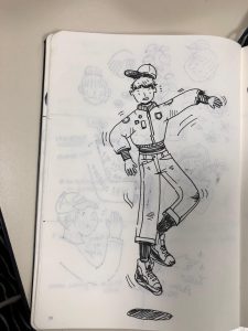
Step 1) First, I drew something I liked in black pen, made sure they were clear lines and it was what I was satisfied with.
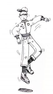
Step 2) I took a picture of that drawing and then I opened it in Photoshop and increased the brightness and contrast (2nd photo) to make the process easier for the image trace with a clearer photo.
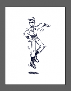
Step 3) I saved that image as a new image (jpg) and then opened it onto Illustrator. From here, I went to Object > Live Trace > Make. Now your drawing has been converted to vector! (below)
Step 4) Color Time! For me, I took an artwork I admire/like and decided to go with a similar color scheme as them. BUT, before I color, I made sure the white parts of the drawing were clear, or of no color. I went through all the parts that are colored white and made them transparent. Then, I layered each element I wanted colored and mostly used the brush tool to color behind the vector art. In the end, I finished it and it turned like that! (below)
Slideshow of the Flash Cards
Flash Card Slideshow – STA Training
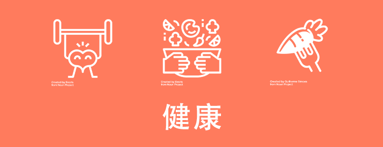
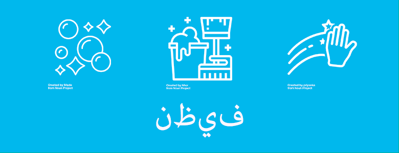
This was a lot of fun to make! I sized each slide to be 780px X 300px.
First I thought of the words for each slide, in order it’s design, health, technology, clean, and rich. They are all in a different language that I google translated. I copy and pasted it onto the slide for each one. Then looked for the different graphics that represent them at the noun’s project website. Pasted all three into each slide, then I went to Layer > Layer Style > Color Overlay; then changed the color to white. I exported and saved each on, made sure to label them too. It was very easy to assemble but the tricky part was figuring out how to upload the slideshow.
I first went to new post, and I saw that you can upload a slide through “MetaSlider”. I went to that tab, and made a New Slideshow. There, I got stuck and asked for help. I resized the slide show to fit my slides “780×300” and added 5 new slides (the png’s of all 5 I designed). From there, I went back to the new post and added my new slideshow into this post! wow~
RUS Illustrations!
RUS Illustration Practice
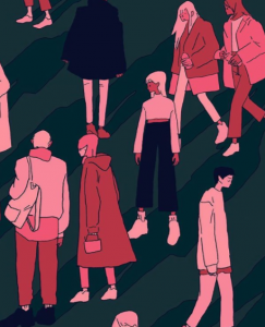
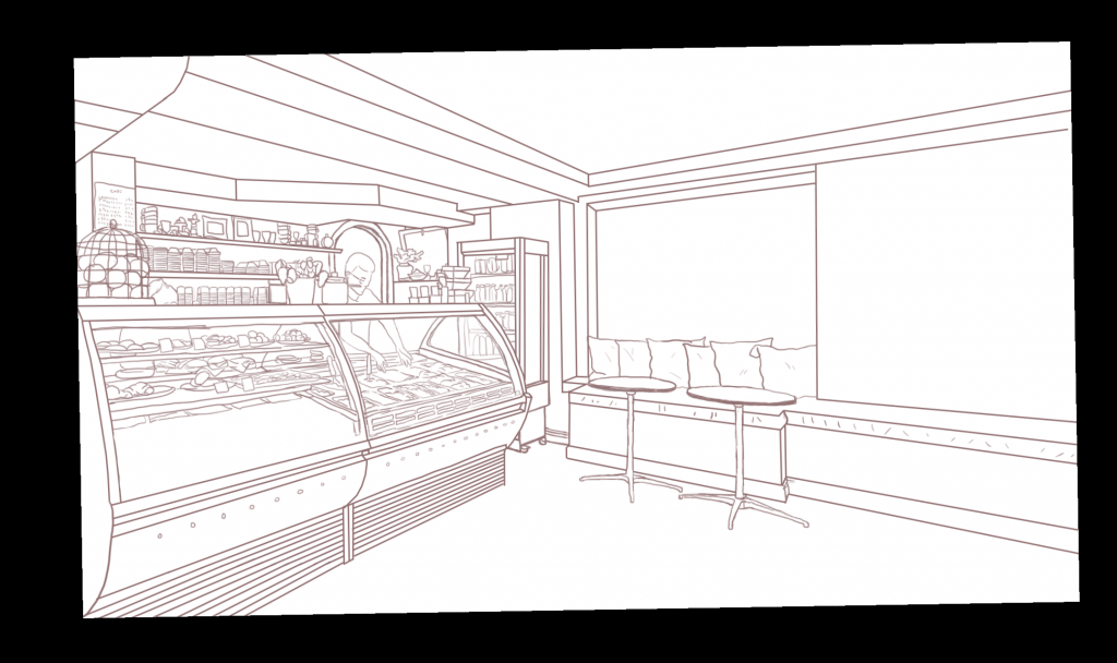
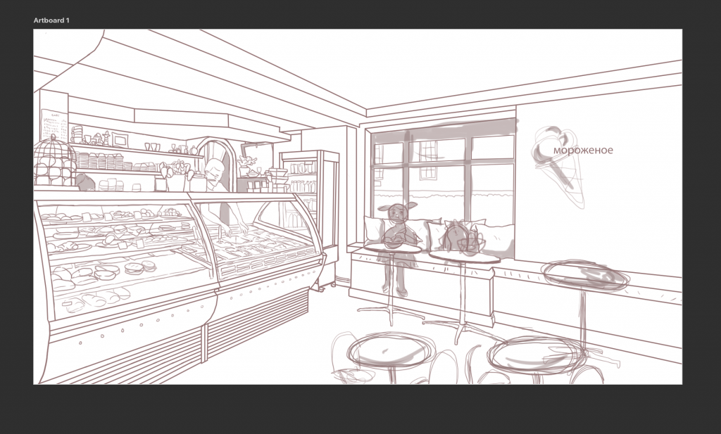
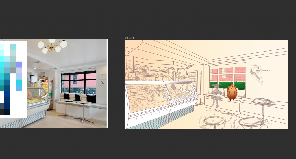
I was assigned to practice making a RUS style illustration, for the illustration series many STA’s work on!
Hello STA Blog~ This is my first post!
Hiya, the name’s Esther Shin!
This is my third day working here ( didn’t make a post until now) so I’m going to update you on what I did so far!
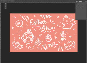
I made my banner and avatar on Photoshop and did ! It was fun to doodle around and draw myself (something I haven’t done in a while).
On my first day, I worked on designing my banner. I knew it had to be doodle-like and pink haha, so I started using the tablet and drew some things I liked. Cleaned it up, saved it as a png, then uploaded to this blog!
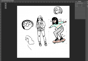
Then, on the second day, I started to design my avatar for both basecamp and for the blog site 🙂 ! Like most of my drawings I start doodling around until I draw something I like.
I ended up liking my drawing of me riding a skateboard (even though irl I don’t) wearing my favorite comfy outfit, consisting of a bright/weird/favorite sweater I own and some gray sweatpants haha. Here’s the final product!
wow! wish I looked like this in real life
Anyway~ I’m super excited to start working on projects and assignments since orientation is almost over, hoping I get more into animation and other things hehe!!
