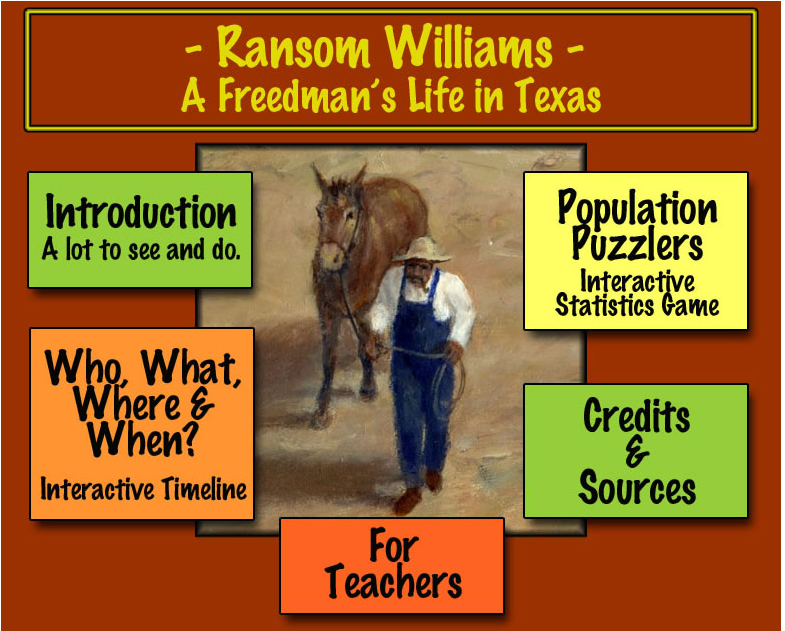
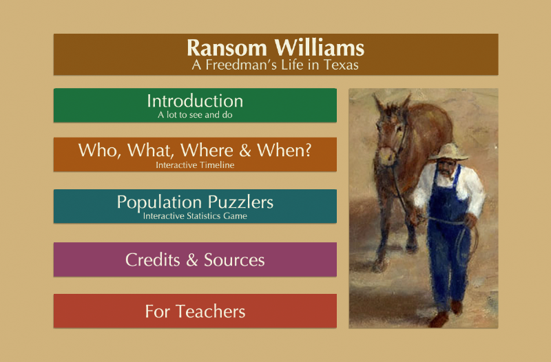
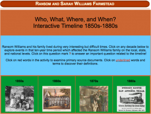
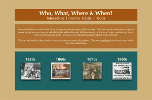
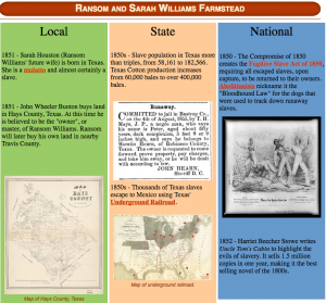
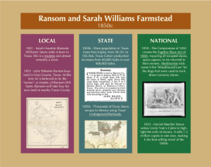
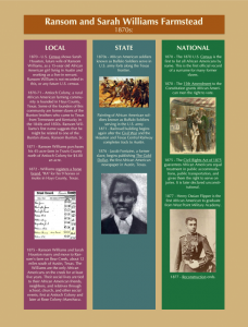
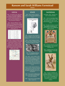
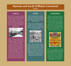
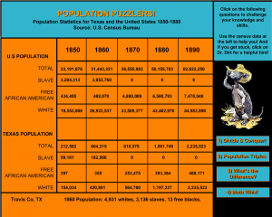
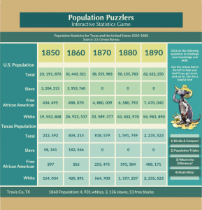
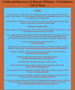
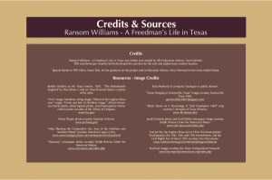
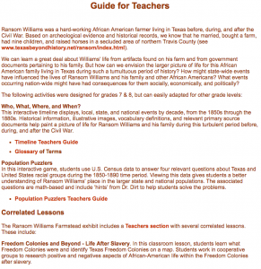
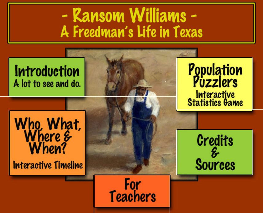
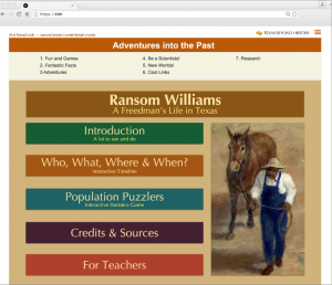
As part of redesigning the Ransom William’s interactive, I was also asked to redesign the kid’s banner:
Workday Icons
Total Redesign for Ransom Williams
Comparative Literature Banner
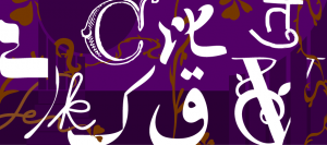
This was the first the draft for the new Comparative Literature banner for their website:
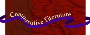 I took away the “Comparative Literature” and ribbon and added the different language letters/characters into the patterned line work in the background, varying them in size and color:
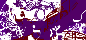
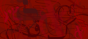 Since this major focuses on different literature across the world, there is great importance in the many languages they study so this banner emphasizes the languages more with a few more art nouveau accents:
This next draft is using a base composition of a stairwell photo that was provided by the client. The different language letters are still present but are instead integrated in this art nouveau stairwell composition using jewel tones:
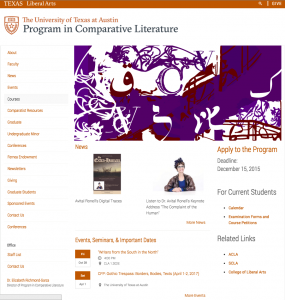
And here is the latest banner in context:
Ransom Williams
- « Previous Page
- 1
- …
- 3
- 4
- 5
- 6
- Next Page »


