2026 STA Presentation Poster
This goal of this project is to create a poster for the 2026 STA Presentation following an “art gallery” theme. In the project specifications, I was instructed to split the STAs into two posters while still thinking about how these posters would fit side-by-side cohesively.
This was a fun assignment, because I got to explore different ways to present the STAs within an art gallery format, emphasizing their unique poses and expressions.
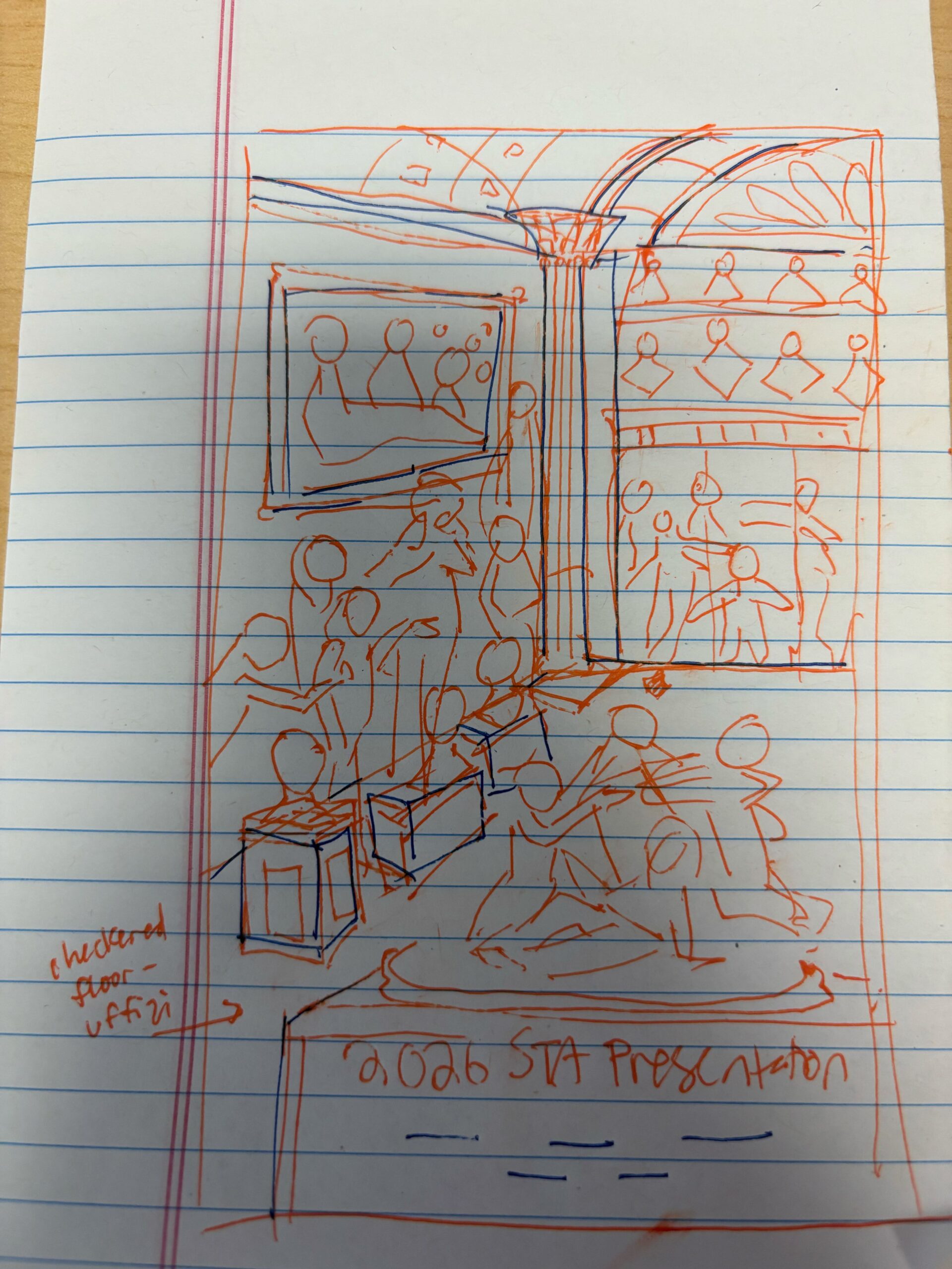
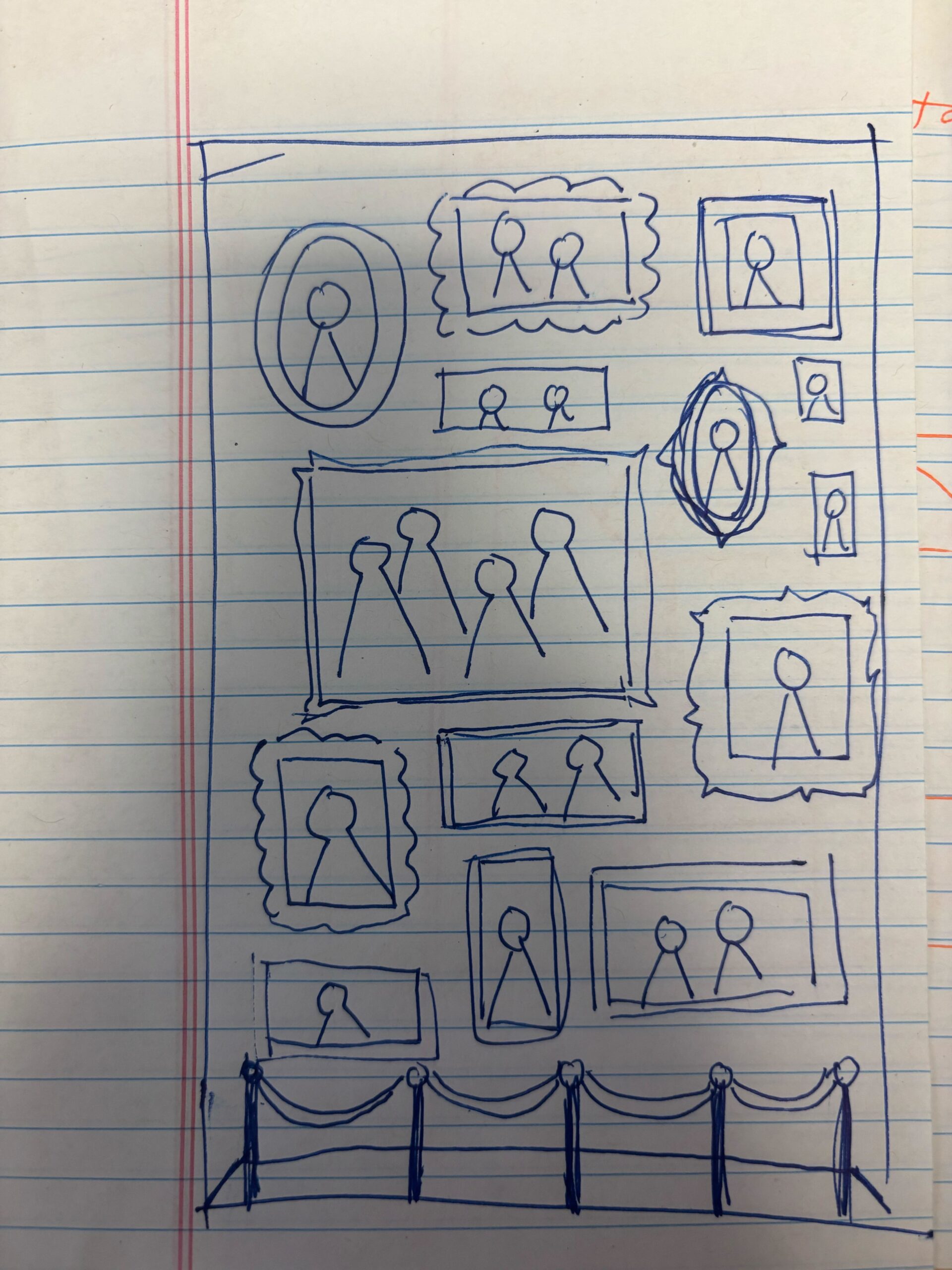
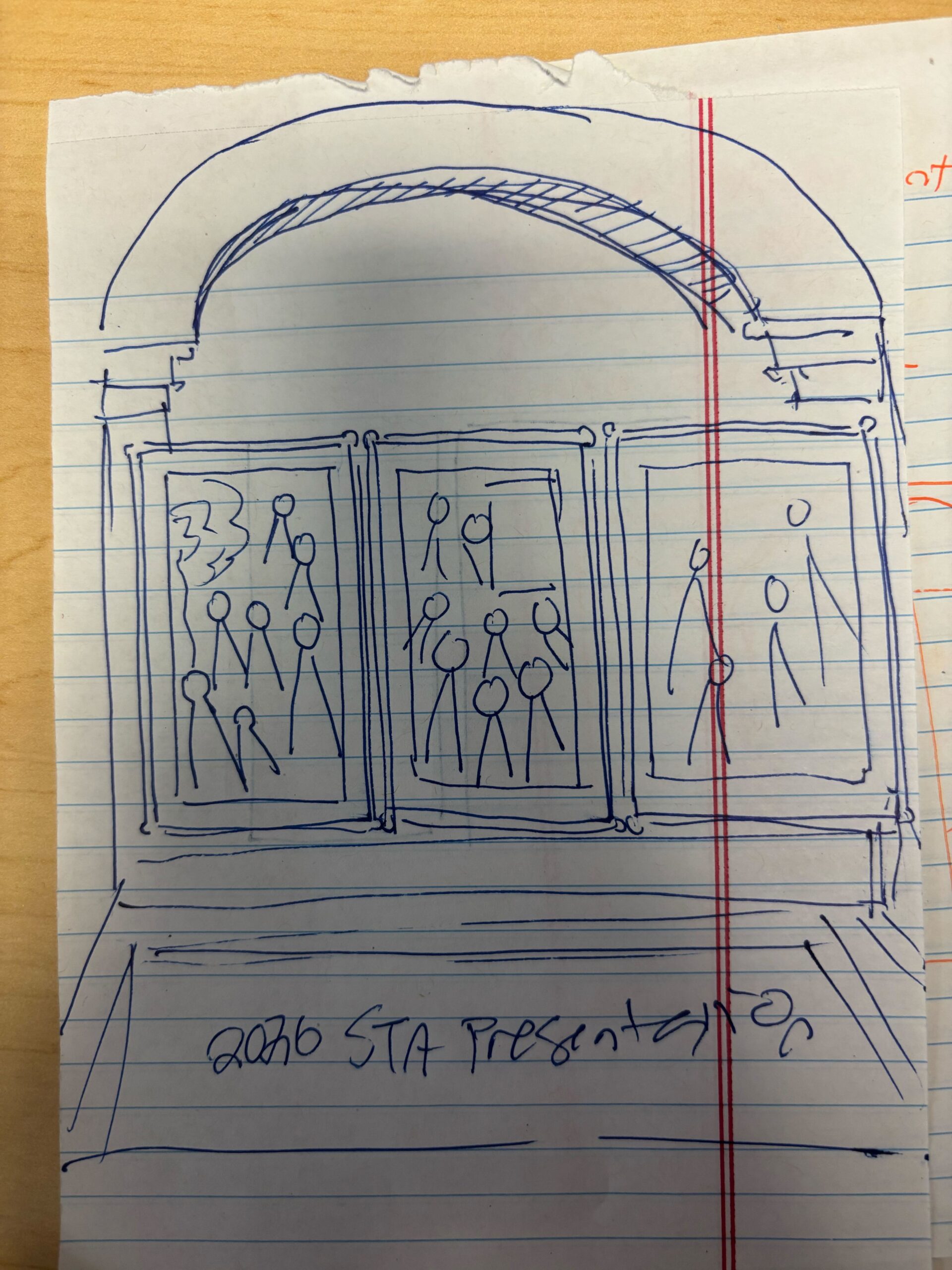
★ Design Drafts: To get an idea of how I could lay out the posters, I created a few rough sketches on paper. The left sketch was more classical inspired (primarily focusing on sculptures), while the right ones have a more modern gallery look.
I received feedback to incorporate both sculptures and paintings, and to simplify the layout of sculptures into a 2-D view (my original left sketch used one-point perspective to add depth). Using this feedback, I created the following sketches on Illustrator:
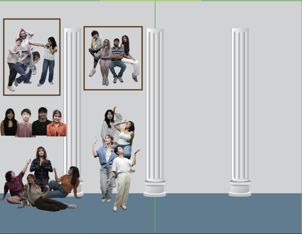
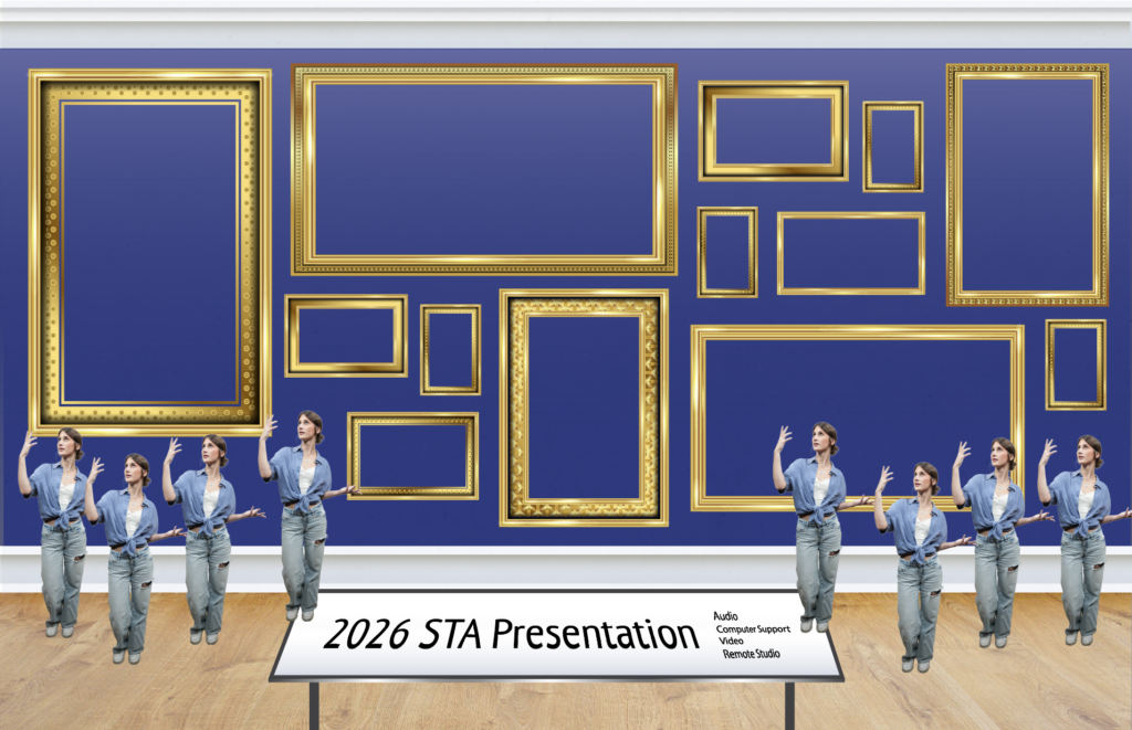
I created drafts of columns to place in the background, and played around with the layout of the photo cutouts. I tried to group interesting poses together in scenes that could be interpreted through sculpture or painting.

On this iteration, I formalized the background a bit more (adding texture, patterns, ect), and made the choice to include the poster title on a plaque to align with the museum theme. I also decided to orient the posters horizontally instead of vertically to leave more room for standing statues.
★ Pivot to Modern Gallery: Next, I received feedback that the current artistic direction leaned a bit too much towards Greek-style architecture, and that LAITS wanted to emphasize a more modern gallery aesthetic. This involved removing the pillars (which left more room for frames), and including more wooden/warm accents.
For my first draft of the modern gallery, I experimented with the layout of a few frame assets Shanda provided me, and thought about how statues could be organized.
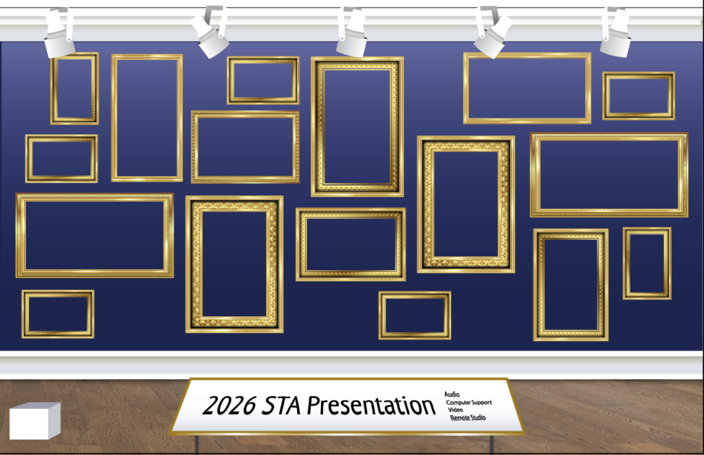
I received some feedback to add light fixtures, and to make the frames more organically structured with breathing room around the sides. I also adjusted the frames so that there are even pockets for statues to be placed. I also made the backgound a little darker to make the paintings/statues stand out more.
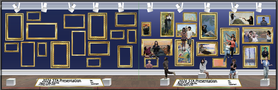
I’ve begun thinking about how the two posters will fit together and what paintings/photo cutouts will be used. I scoured free photo archives online to find fun and recognizable paintings to include, many of them from the impressionist era. Overall, I want the colors of the paintings, the poses, and expressions to feed harmonious. I also adjusted the height of the pedestals to make sure they are visible over the title plaque.
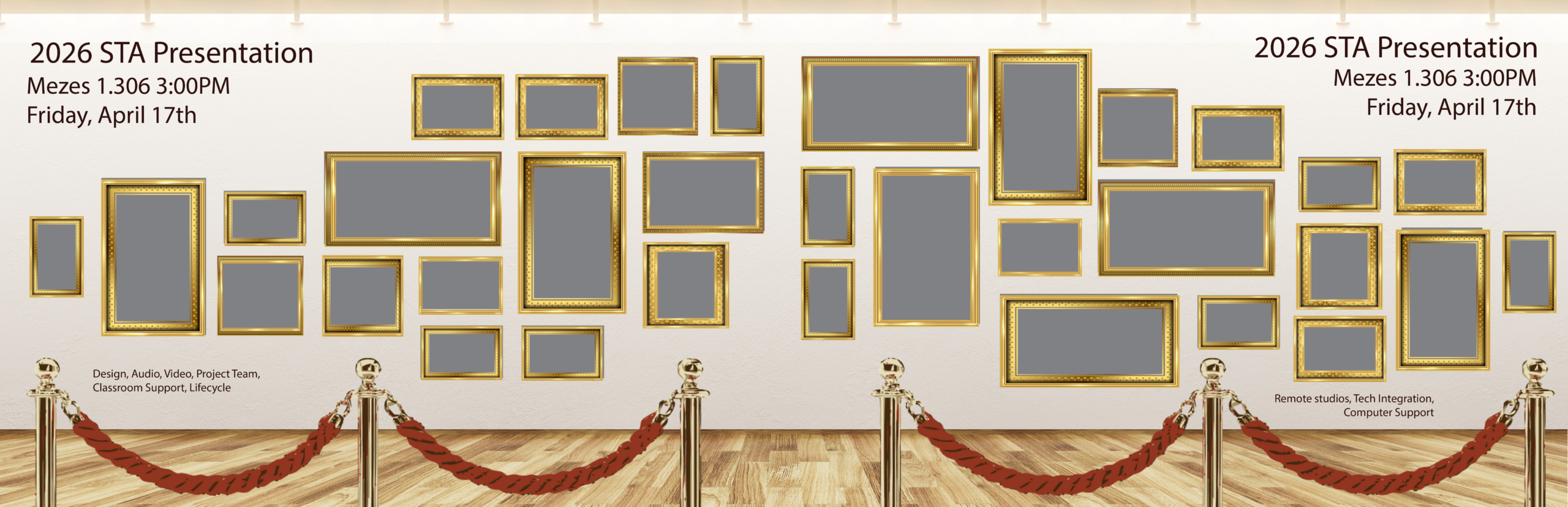
★ Pivot to a new background: I have received feedback that in order to fully bring attention to the paintings, we will remove the statues, change the wall and floor to lighter, textured assets, add velvet ropes, and move the text to the wall. This edit in background will be accompanied by a re-ordering of the picture frames to better convey movement. I was given this reference to work off of:
After experiencing a second big pivot in the design direction of this project, I have a few questions:
- What caused a lack of attention in the paintings of the original design?
- What is the process in deciding upon a design pivot? Are all decisions made at once, or over time and communicated in one message?
- After seeing this pivot, I feel a little bit like I lack agency over the creative direction of this project; is this something to get used to in client settings?
★ Reflection: Working on a poster with so many assets is definitely a challenge. Although I have creative liberty in my designs, there are specific criteria that I must adhere to, so it was important to strike a balance. The following are a few lessons I learned:
- Project Scope Flexibility: When I first started drafting the poster, I wanted to include grand archways and columns, reminiscent of an ancient art display. However, when the project scope changed to focus more on a modern gallery look, I realized I would have to pivot my creative direction. I learned that even if I’ve started fleshing out one idea, the outcome of the project ultimately depends on the client’s needs and scope, and it’s important to be able to adjust accordingly.
- Communication and Clarity: As I added more and more assets to the posters, making a big change (such as re-arranging the picture frames or adjusting the layout of the statues) became more difficult, especially because the photo and vector assets are dependent on each other’s positions. The main lesson I learned here is the importance of communication with the client; strong communication from the start eliminates the need for me to backtrack, and ensures the criteria for any time-consuming big changes is clearly defined.