Save the Date
The theme for STA Presentations this year was movie productions! The presentation poster was themed around “The Peanuts Movie” film poster, so Save the Date was to be similarly themed.
First Drafts
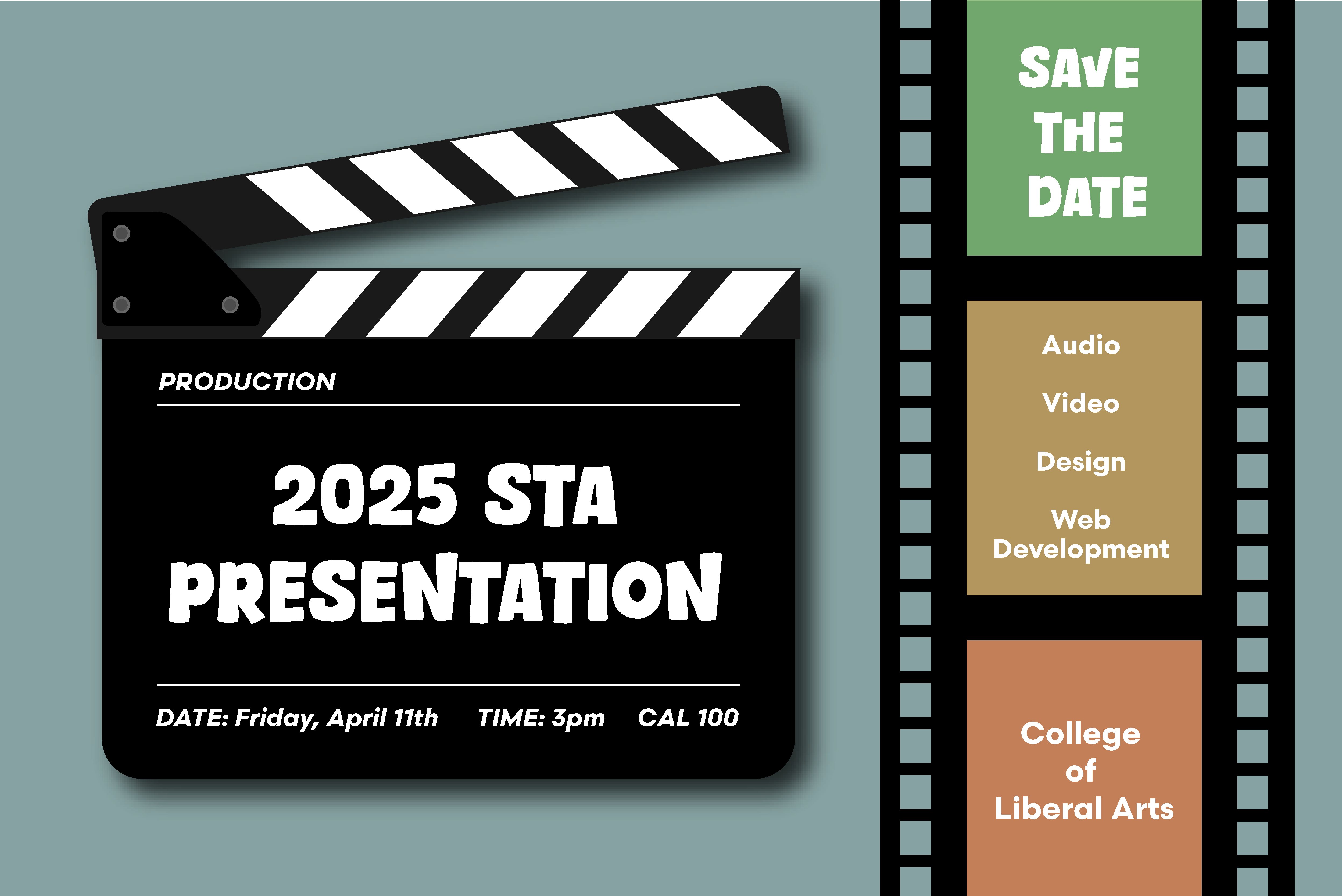
I decided to display the important information on a clapper board to keep with the movie theme. However, after doing that, the background looked really empty, so I added film strips behind it. I used the LAITS logo colors as the accent colors for my design.
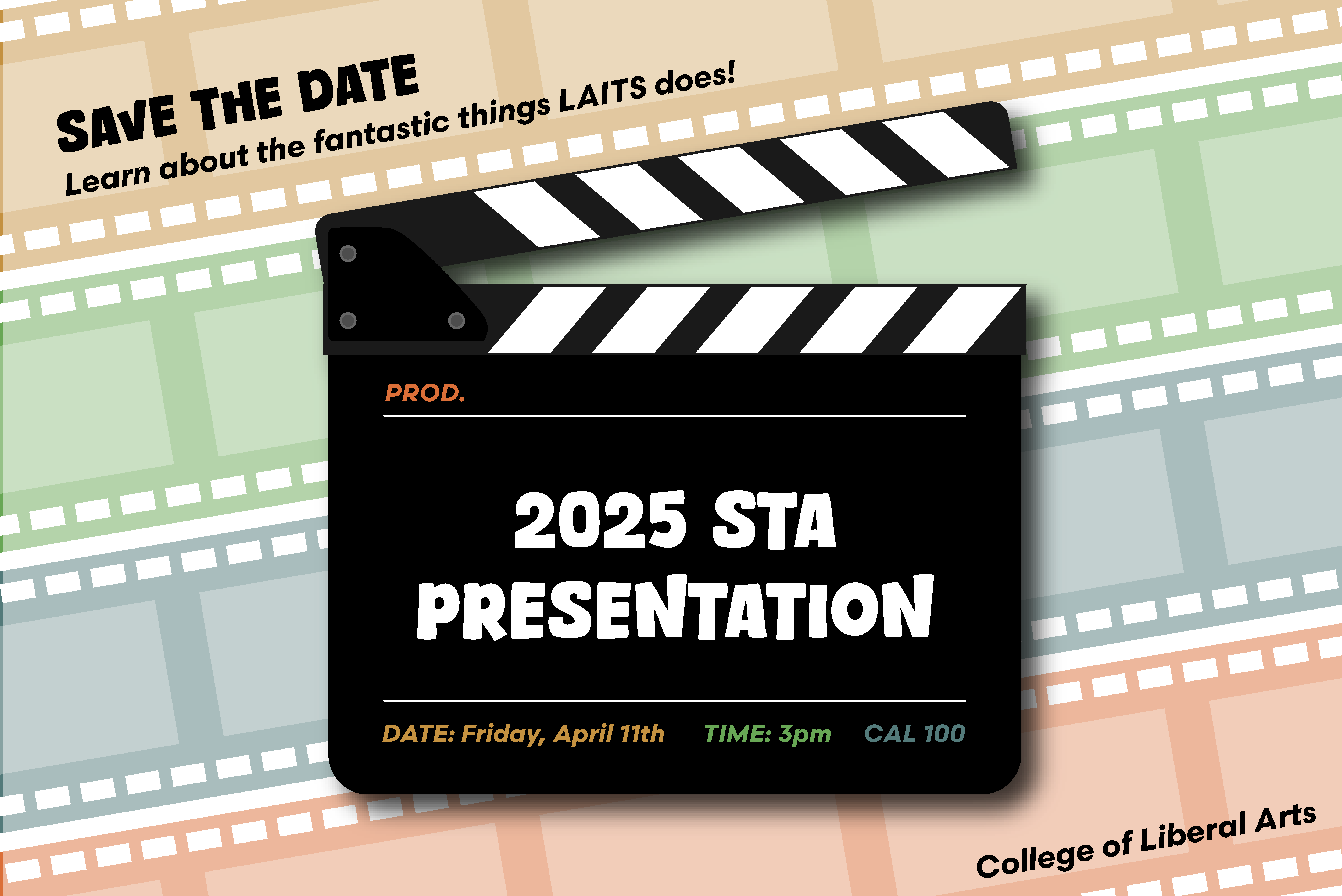
Additionally, I came up with a secondary design because I felt that the colors on the clapper board may be unnecessary, and the black letters for the less important information (“Save the Date”, “College of Liberal Arts”) might be too bold. I also switched the order of the colored film strips in the background (and brightened them) to match the order they are in in the LAITS logo.
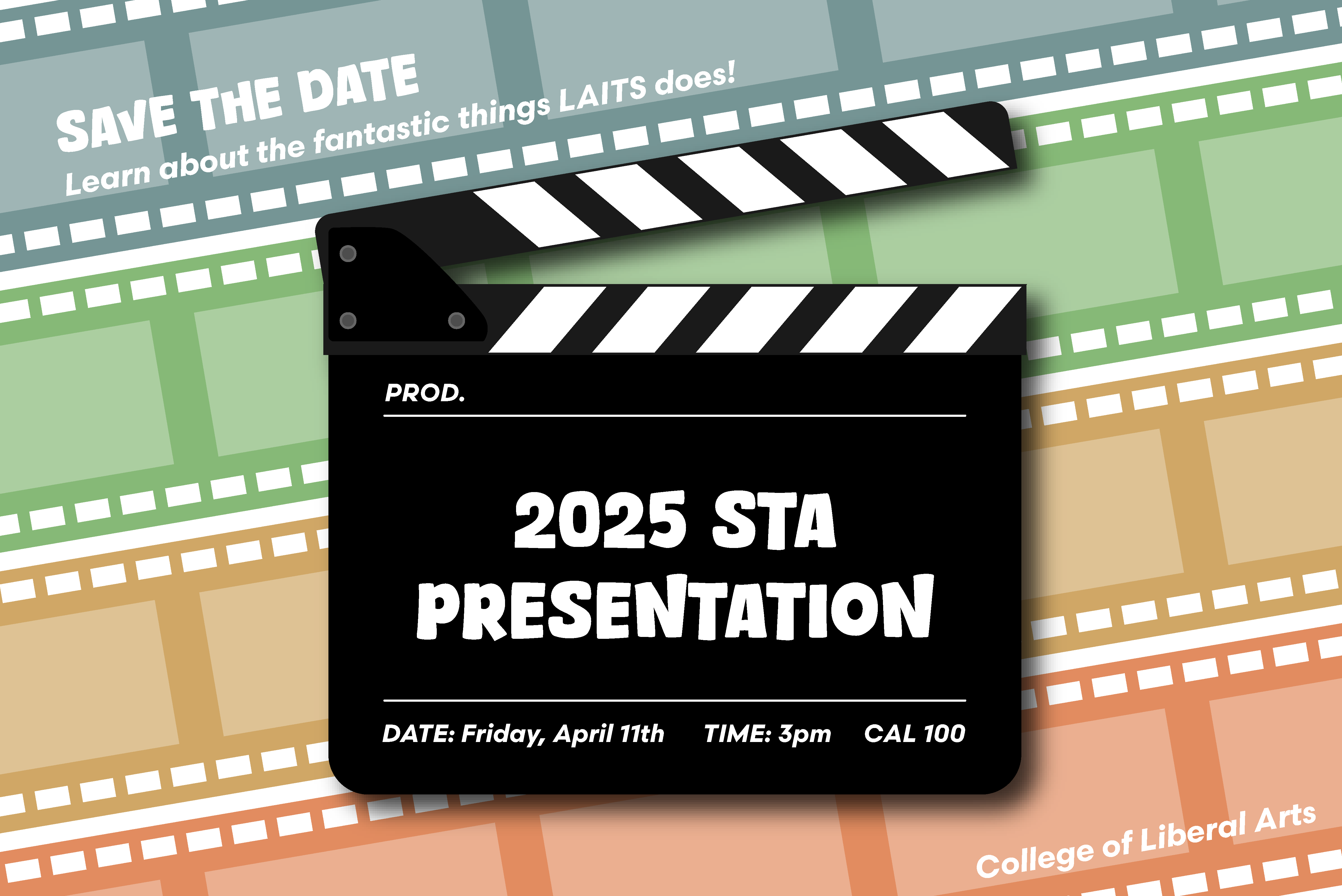
Lastly, I created an option with a different accent font choice. This is a font that matches the one on “The Peanuts Movie” poster, so I thought we may want to see what that looked like too.
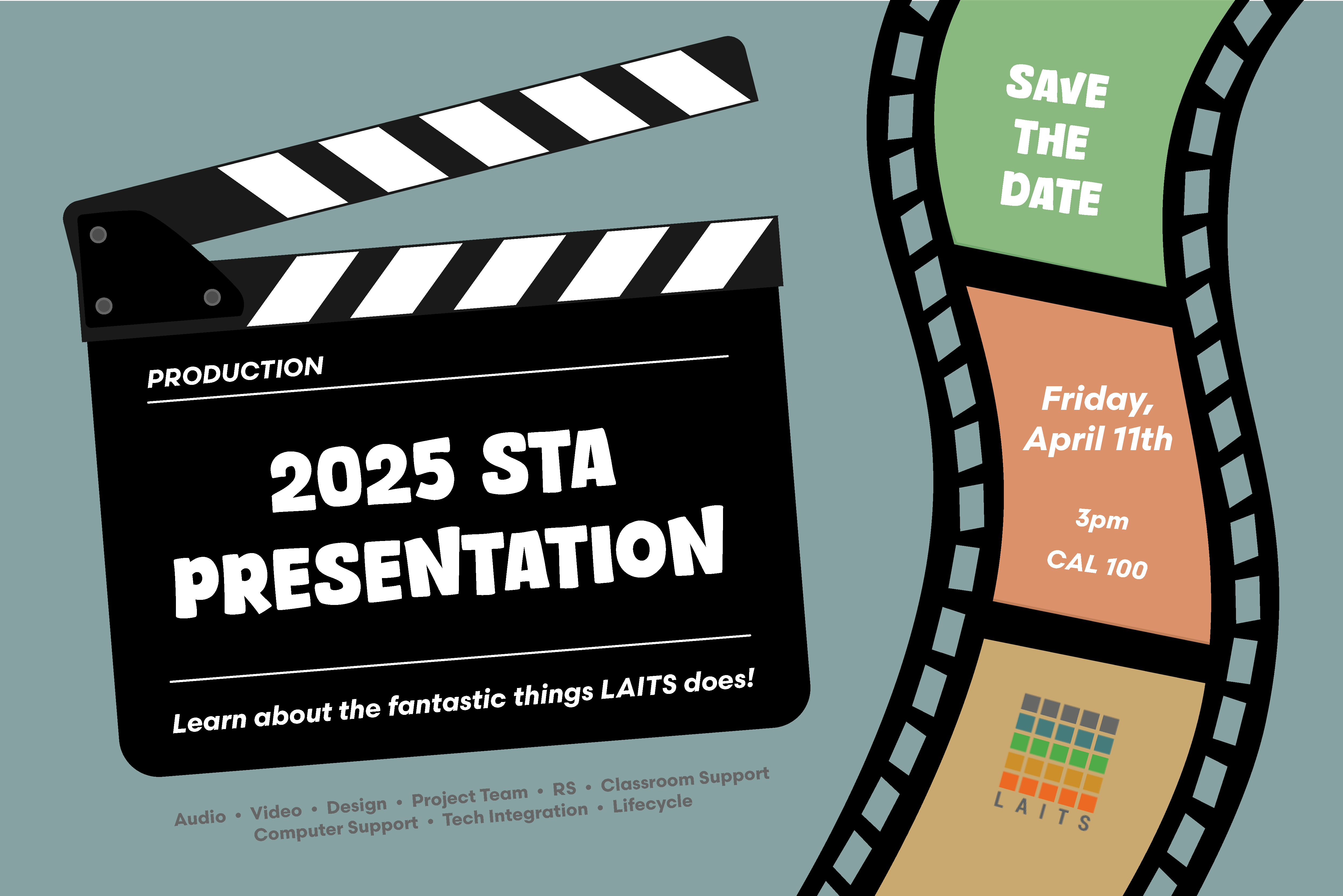
This is an alternate design that I thought could work as well. I was also able to get the STA roles information in using this layout.
For style one, I received feedback to:
- Add STA photos to the film strips with a color overlay
- Replace “College of Liberal Arts” with the LAITS logo
For style two, I received feedback to:
- Try and add more personality, as the black was a little overwhelming, and it wasn’t very dynamic
- Rework the hierarchy/arrangement so that the date is more prominent
- Add the LAITS logo
Second Drafts
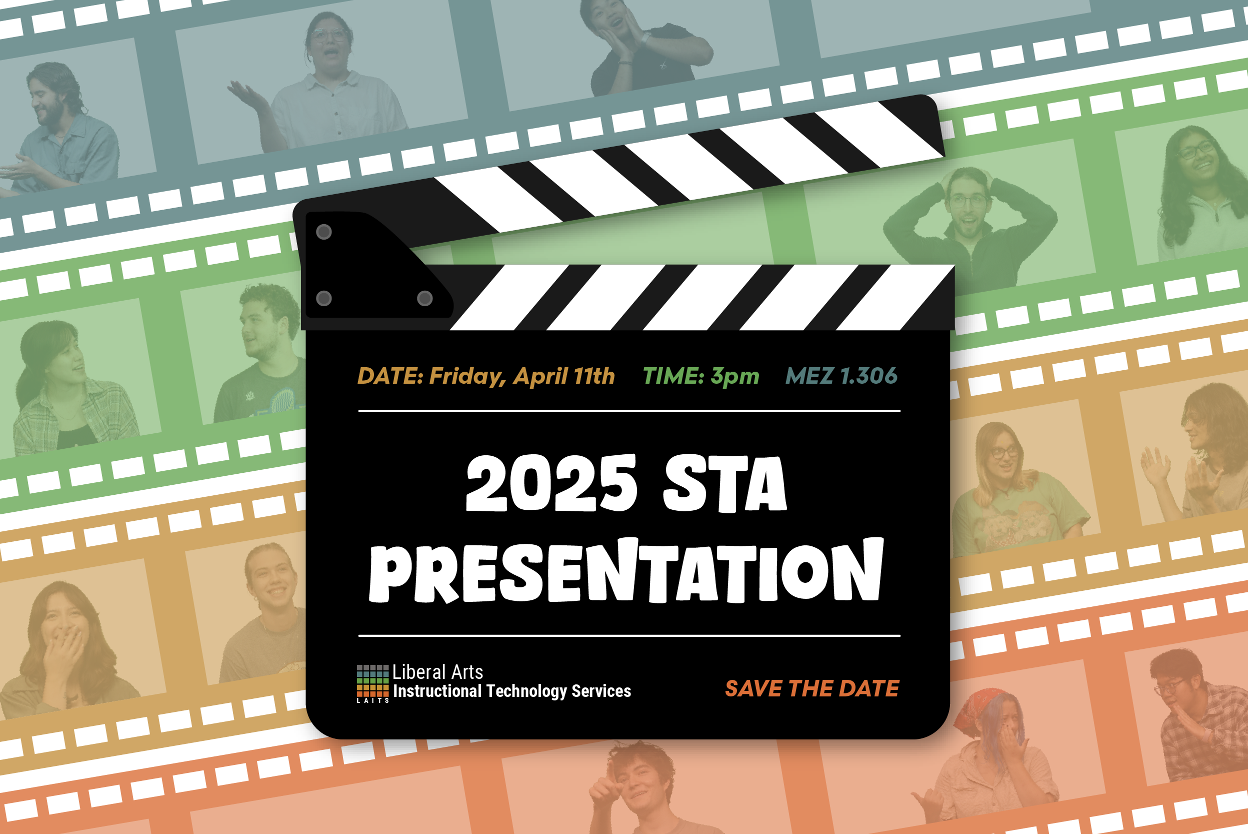
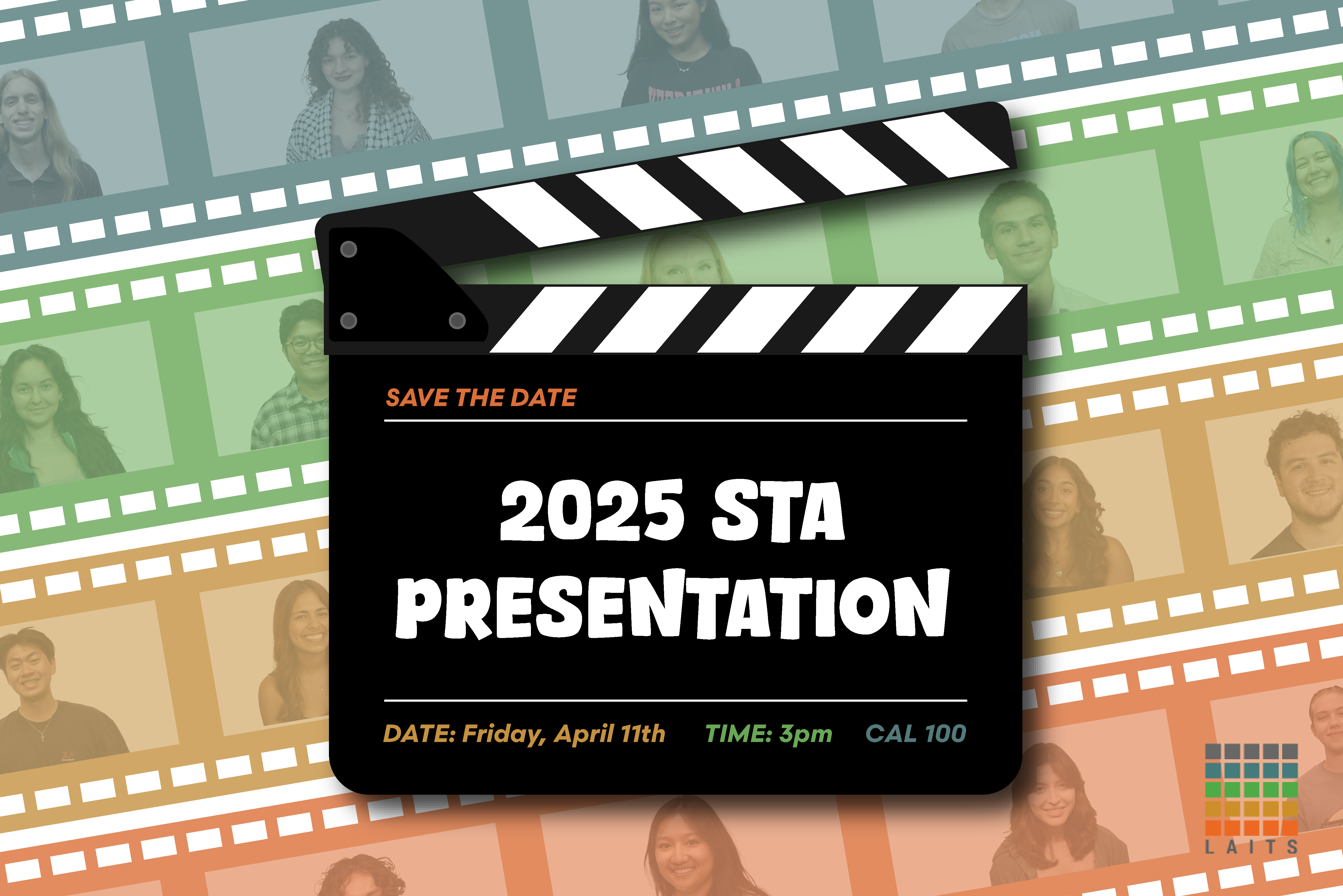
For the first version, I added the STA cutouts to all the film strip rectangles because it looked a little odd to have some empty, even if they were covered with something in front. I also moved “Save the Date” to the slate because it became hard to read in the top left corner when I added the STA photos.
For the second version, I tried to add some movement by creating a new, curved film strip and tilting the film slate. I also added the date/time/location to the film strip because it was more prominent there and put the STA roles under the slate.
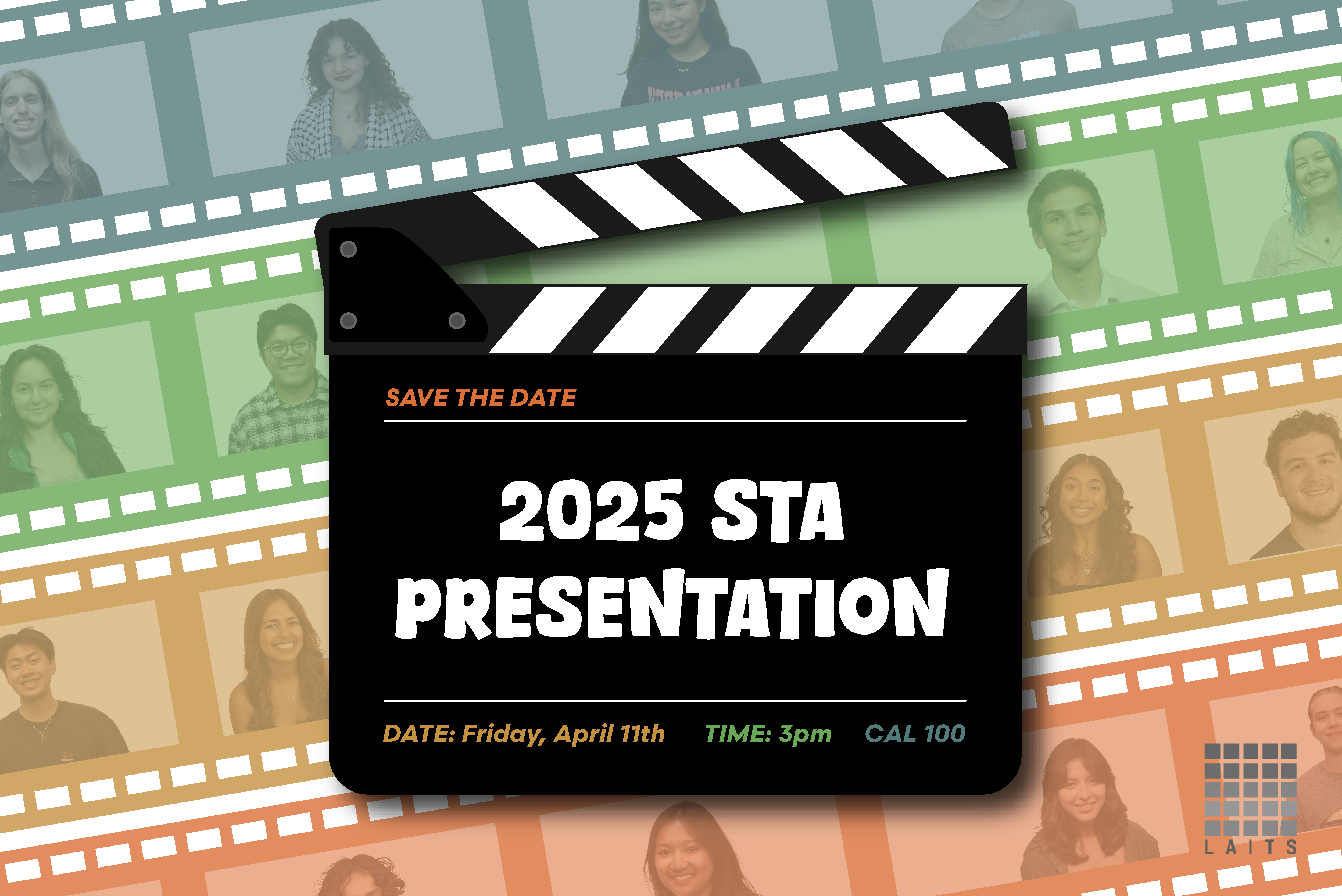
We decided to go with style 1, and I received feedback to:
- reposition the STA photos so that they weren’t being blocked by the film slate
- make the LAITS logo grayscale
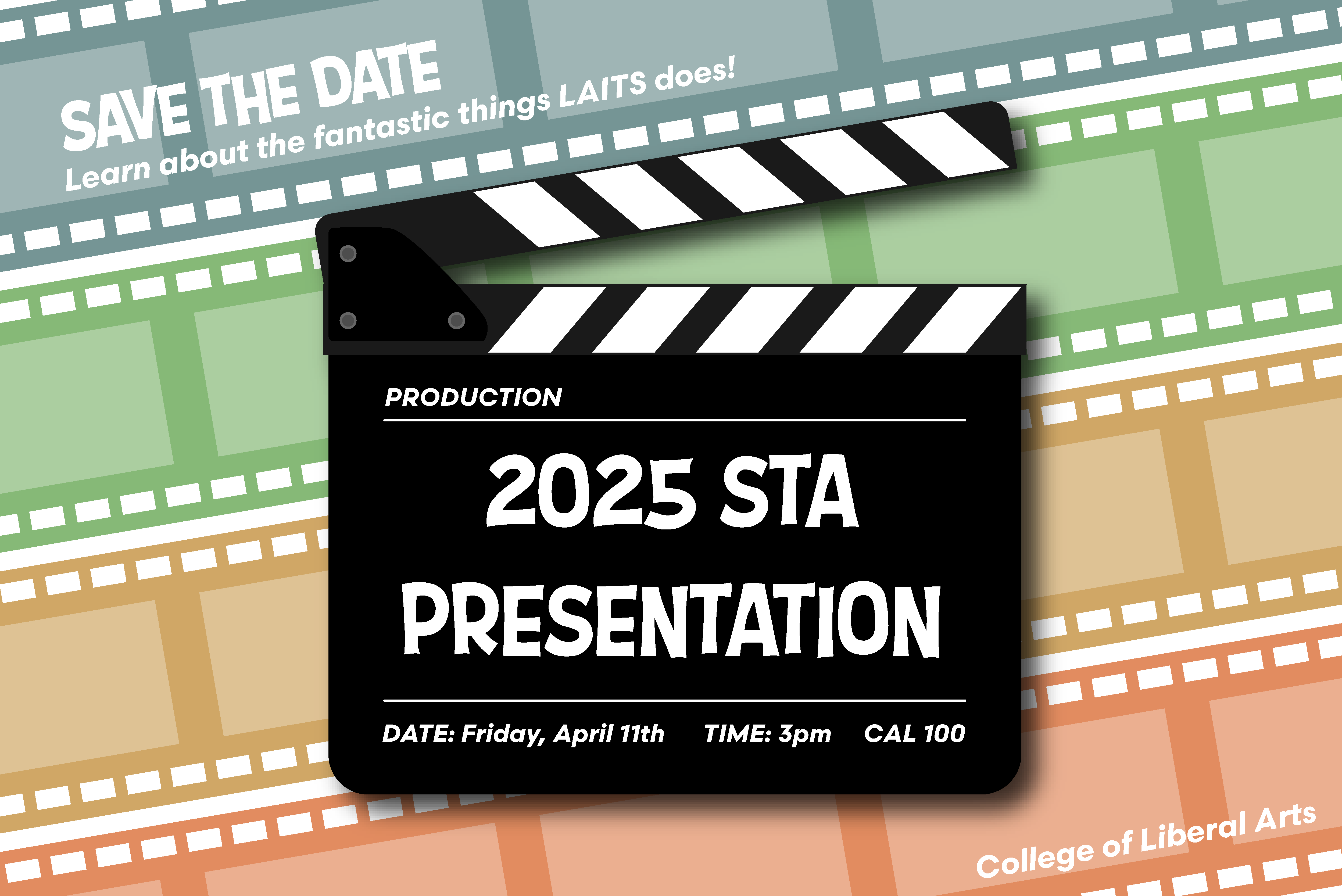
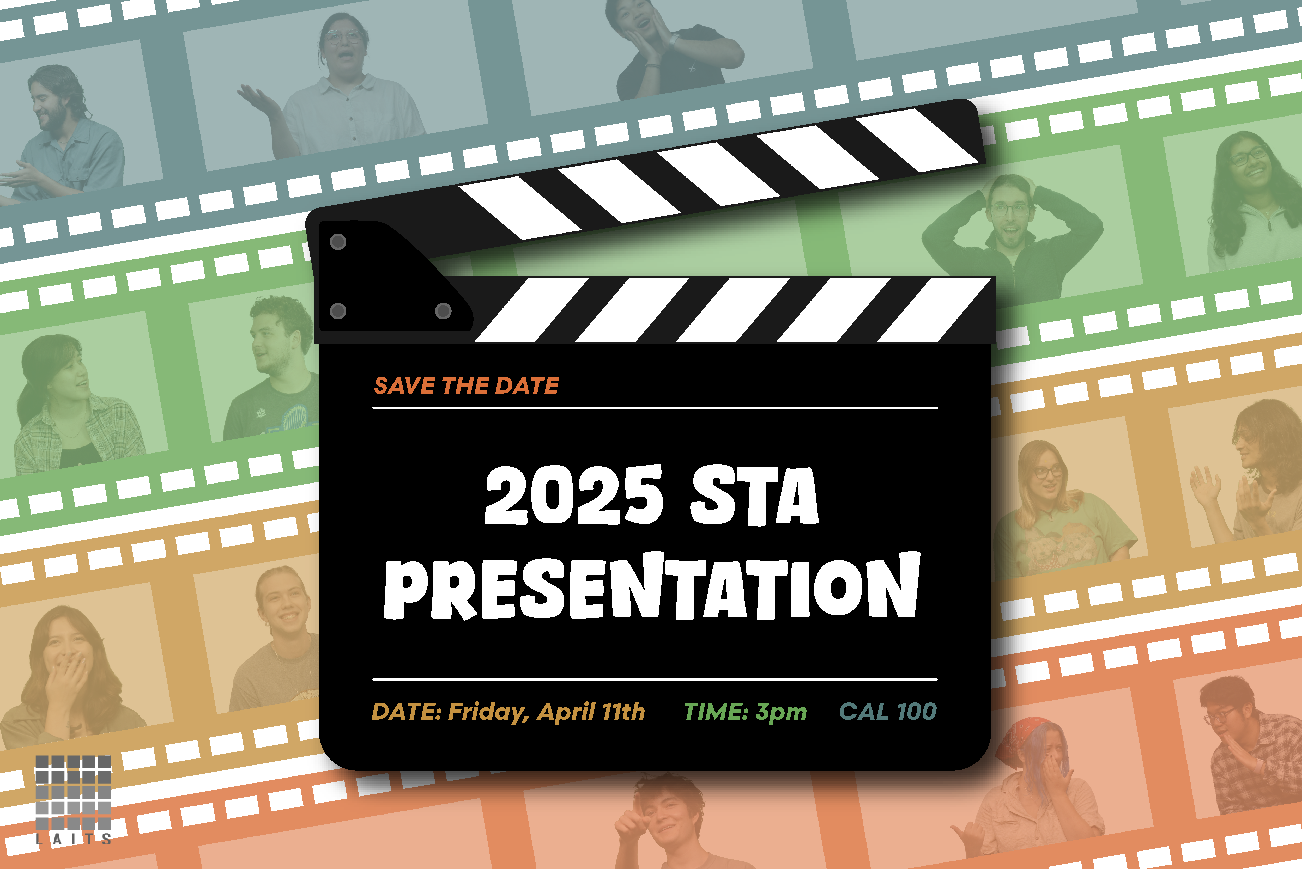
Third draft
After adjusting the graphic according to the feedback I received, it ended up looking like this:
We then decided that there was too much white space in certain places, so we decided to use the more dynamic photos of STAs that were also used on the presentation poster. After deciding this, the graphic looked like this.
Final Thoughts
Overall, this assignment was a fun way for me to practice both my layout and graphic design skills. I don’t have as much practice with Illustrator, so making graphics for this assignment was a new and fun challenge. I’m also happy that we decided on adding the STAs inside the filmstrips—I think it’s a lot more visually interesting and unique. Here is the final design!