New Self Portrait
This is the new self portrait for the STA banner I designed with Chloe’s help and youtube.
By Nick Lavigne
By Nick Lavigne
I had the opportunity to work for Amazon this summer in Seattle and it was probably one of the most intense summer’s I have ever had. As someone who has not lived outside of Texas since the age of 5 it was a very dramatic shift in scenery and culture that I had not expected. To start with all the food was delicious. There are so many more varieties of food and the food truck scene is even bigger than in Austin! The only thing that was bad was the “mexican” food. Also the nature was incredible! I now see how people can go on hikes in the summer because the weather is actually perfect (besides the first 2 weeks I was there when it rained the entire time, which was a nice welcome to Seattle). In Texas you’d probably die if you went on a long hike in the middle of the day during Summer. Here’s a picture of a hike called Rattlesnake Ridge: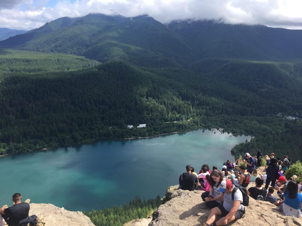
and another hike we did called Twin Falls: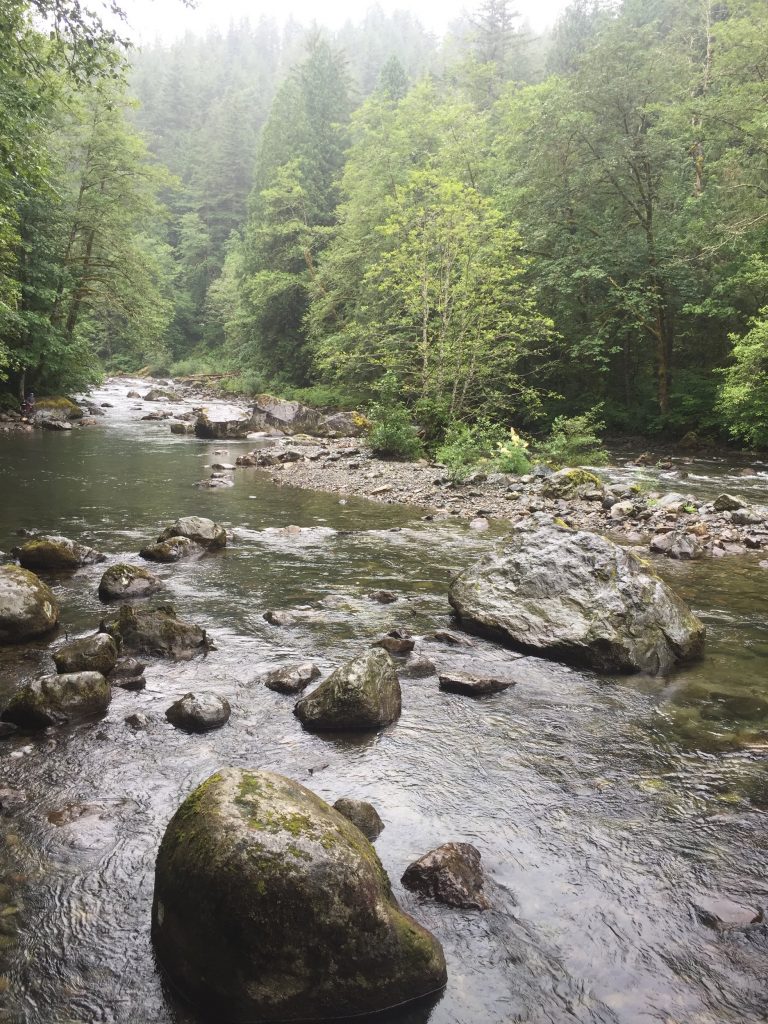
In terms of my actual internship I worked on the backend for the Customer Service team at Amazon. At Amazon they have small (6-8 people) teams for just about every operation within Amazon. My team specifically handled customer service surveys. My intern project was to write code to automatically send/not send surveys based on certain criteria. For example if the customer service call was disconnected you do not send a survey. To accomplish this I had to design a brand new back-end API using Java which returned a true of false after doing a series of checks within different Amazon systems. The culture at Amazon is to basically let someone at a project with little to no help and see if they survive/ask for help themselves. This was especially stressful because I had no idea this was the case. I thought I was just being ignored at first but it turns out people were waiting for me to reach out. Towards the end of the project I was messaging people who I previously thought were just some high up people that I could never talk to. I learned that there is also a lot of bureaucracy that goes on in big companies. In school I’m used to diving head first into a project without much thought, yet at these companies literally everything you do has to be approved by ~1 million people. It sucks but I can see why it’s necessary so you don’t mess up anything big! In fact during my time there the entire website crashed once and there was mass pandemonium.
Overall, the experience was enlightening but it definitely was not my the job I was looking for. I think that the culture at Amazon fits a certain type of person, which I am not. Seattle itself was amazing, and I highly recommend visiting if you have not!
By Nick Lavigne
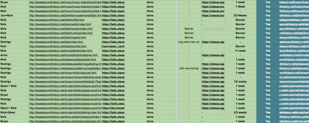
In what is possibly the least exciting looking but most monumental post I’ve ever had, I want to announce that we finished the kids section of TBH. I’ve been reviewing every single animation that we’ve done which is why I don’t have much to talk about or even post images of. I think what I’ll do is create a graphic or movie of every single TBH animation together so people can truly appreciate the magnitude of what we’ve done. Once I finish that I will post it here and also use it in the TBH presentation I need to give at the end of the year. In the mean time here’s a beautiful photo of our spreadsheet, green = done.
By Nick Lavigne
Over the past few weeks I’ve been coding the new TBH site. I’m starting with the homepage which I modeled in the previous posts. Stacy advised to use CSS grids and gave me this site, which I found extremely helpful: https://gridbyexample.com/examples/ .T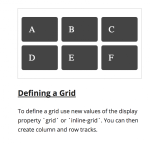 To achieve the grid layout I basically followed the tutorial and implemented my own version. Currently each grid box contains an image of the thumbnail I want but that leads to scaling problems with the text and images being fuzzy so I think I’m going to redo it and make it dynamic.
Heres a code snippet of the html I’m using: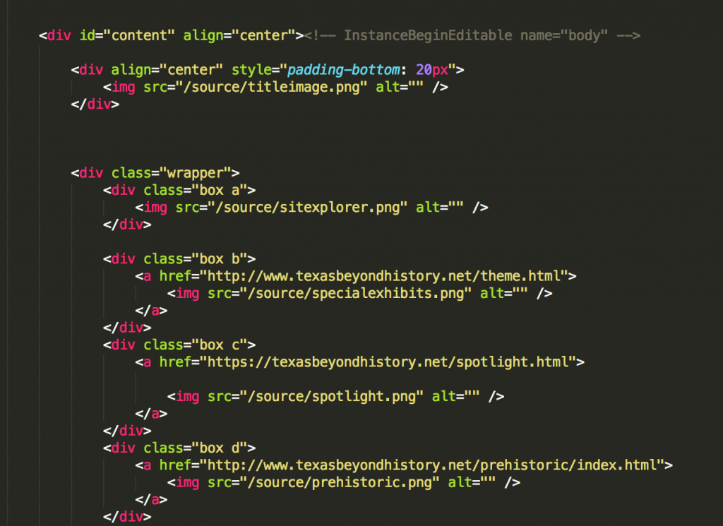
Also here’s the current working prototype:
By Nick Lavigne
I was asked by Suloni to redesign the existing TBH homepage which looks like this: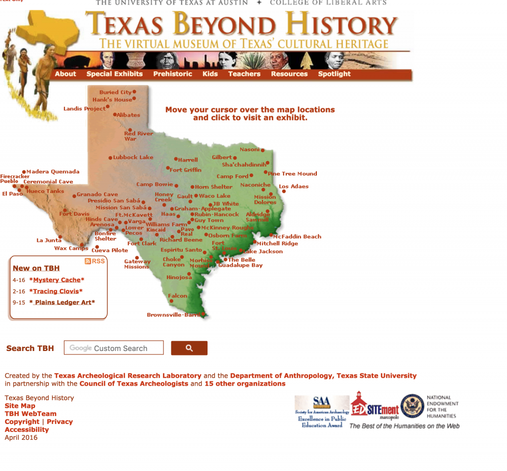
As you can see the design was really dated and uninspiring, especially since the main audience for this website is kids. We needed to update it to make it more tablet friendly/exicting and also give it a more “modern” feel. The client who oversees Texas beyond history typically does not like changes so Suloni had me create two design mockups. One was pretty close to the old design and the other was very different.
I tried to keep the same “feel” as the old website but add modern design elements such as the nav box/ drop shadows. I also reformatted header and footer to look cleaner.
This was my preferred design option. It offers a completely different look and feel from the old home page. It is clean and simple. The large icons are easier to press for children, especially since most will be accessing this site with a tablet. The client ended up choosing this version to our surprise! In the next coming weeks I will be working with Stacy, one of the web developers here, to bring this mockup to life in the new site using CSS/HTML.
By Nick Lavigne
I’ve also been working on a project for Stacy involving completely replicating this website using wordpress:
I’ve learnt a lot about CSS/HTML in this project which is cool because that’s probably the career I want to be a web developer in the future. It’s a little different working with WordPress because you don’t really get to create the HTML elements you are more working directly with the CSS to kind of “hack” the website into looking the way you want. For example the top portion with the green quarter circles, I used WordPress widgets and modified the CSS for them to have that green quarter circle background. The code for that was:
 This is essentially the process for every part of the website.