TBH Landing Page Redesign
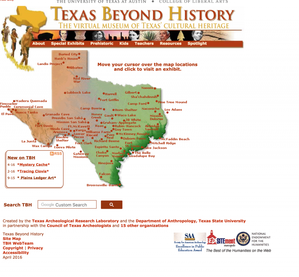
I was asked by Suloni to redesign the existing TBH homepage which looks like this:
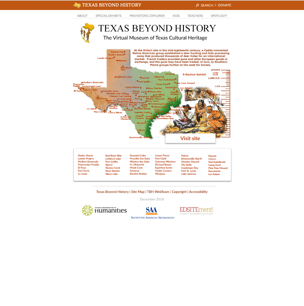
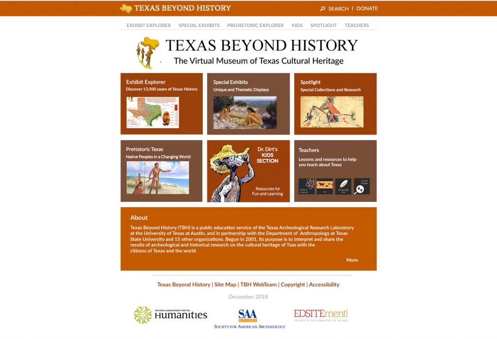
As you can see the design was really dated and uninspiring, especially since the main audience for this website is kids. We needed to update it to make it more tablet friendly/exicting and also give it a more “modern” feel. The client who oversees Texas beyond history typically does not like changes so Suloni had me create two design mockups. One was pretty close to the old design and the other was very different.
I tried to keep the same “feel” as the old website but add modern design elements such as the nav box/ drop shadows. I also reformatted header and footer to look cleaner.
This was my preferred design option. It offers a completely different look and feel from the old home page. It is clean and simple. The large icons are easier to press for children, especially since most will be accessing this site with a tablet. The client ended up choosing this version to our surprise! In the next coming weeks I will be working with Stacy, one of the web developers here, to bring this mockup to life in the new site using CSS/HTML.

