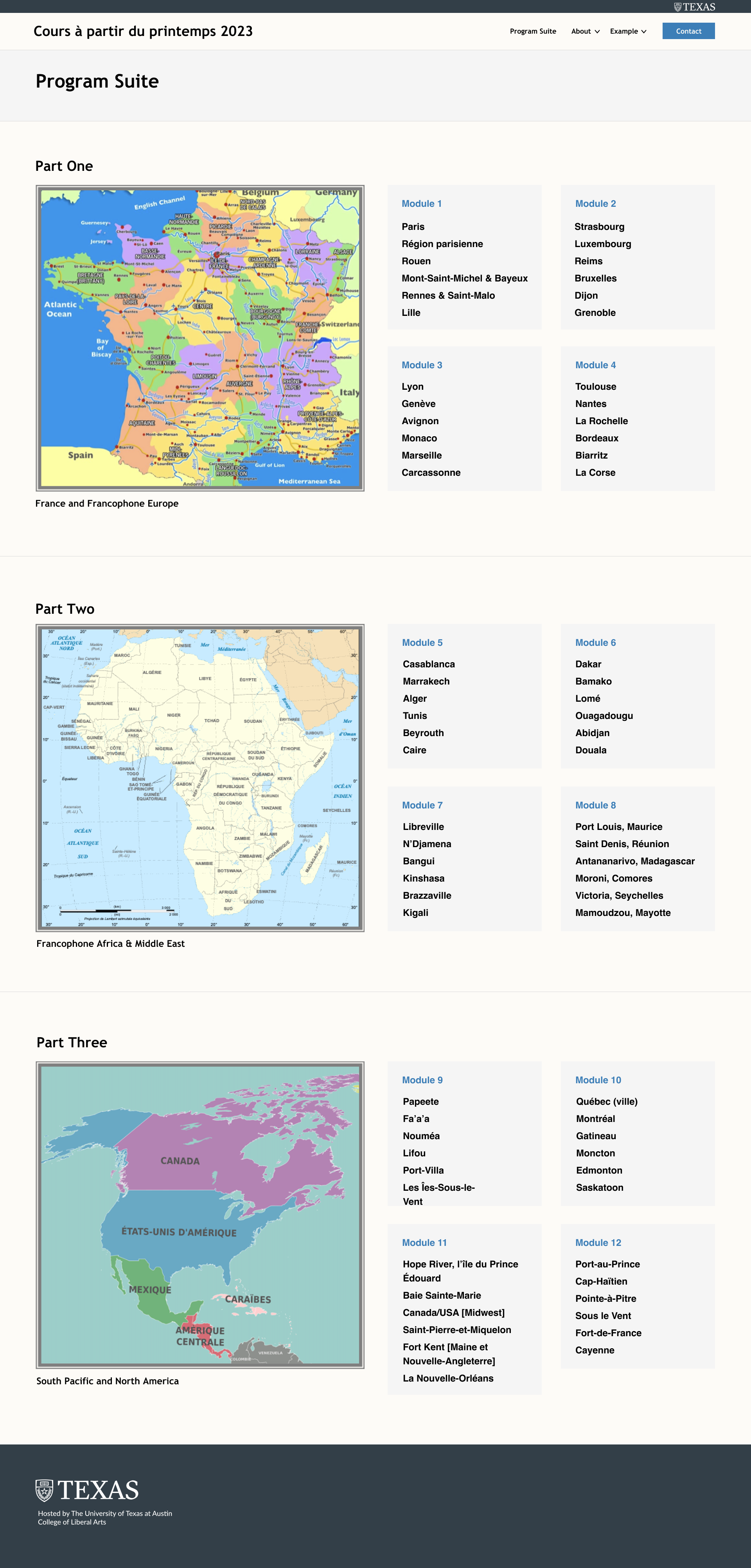
• We are STAs
    • Asha Rountree
    • Haley Ma
    • Kate Shih
    • Kyra Lee
    • Nicholas Peasley
    • Sasha Kenney
    • Shanda Horm
    • Shriya Atreya
    • Tomas Marulanda-Mesa
  • We were STAs
  • STA Presentation
    • STA Presentation 2017
    • STA Presentation 2016
  • Testimonials
  • Resources
  • Home

STA Blog

Week 8 – Thang Truong

October 31, 2022 By Thang Truong

Week 8

Project: Exposure Therapy Lab

Started on: October 24, 2022

Completed on: October 27, 2022

Staff Guidance: Ruben, Marianne

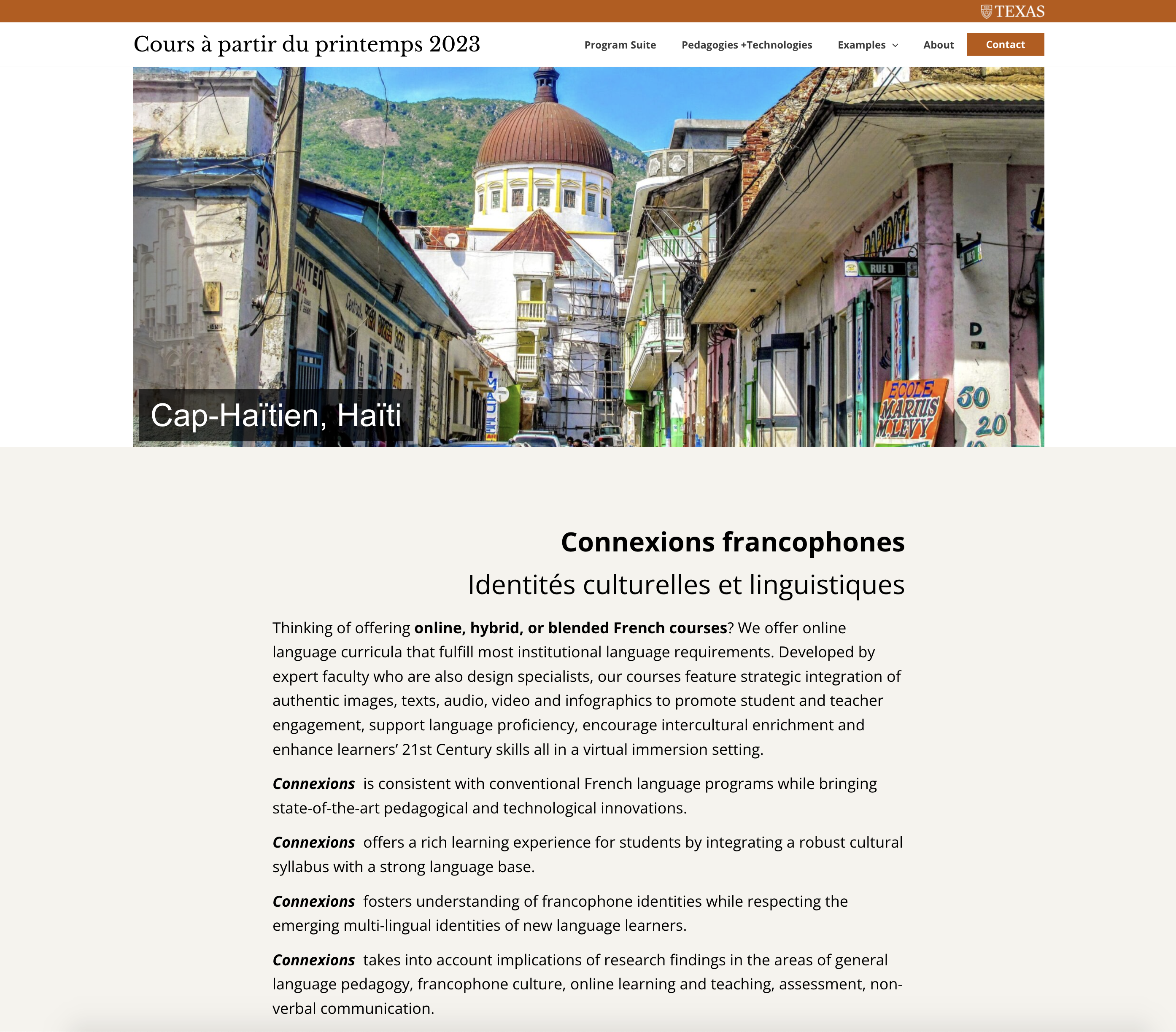
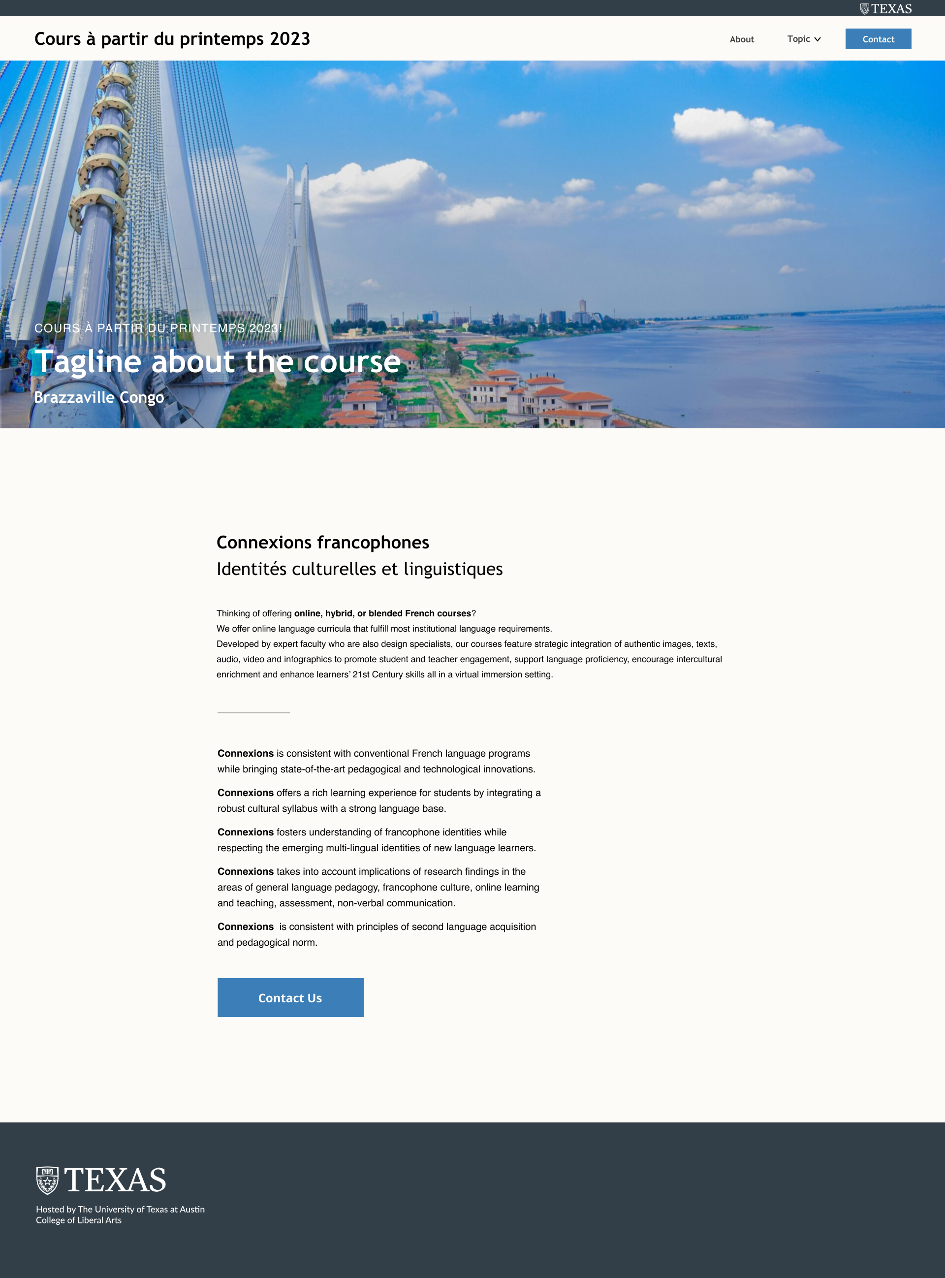
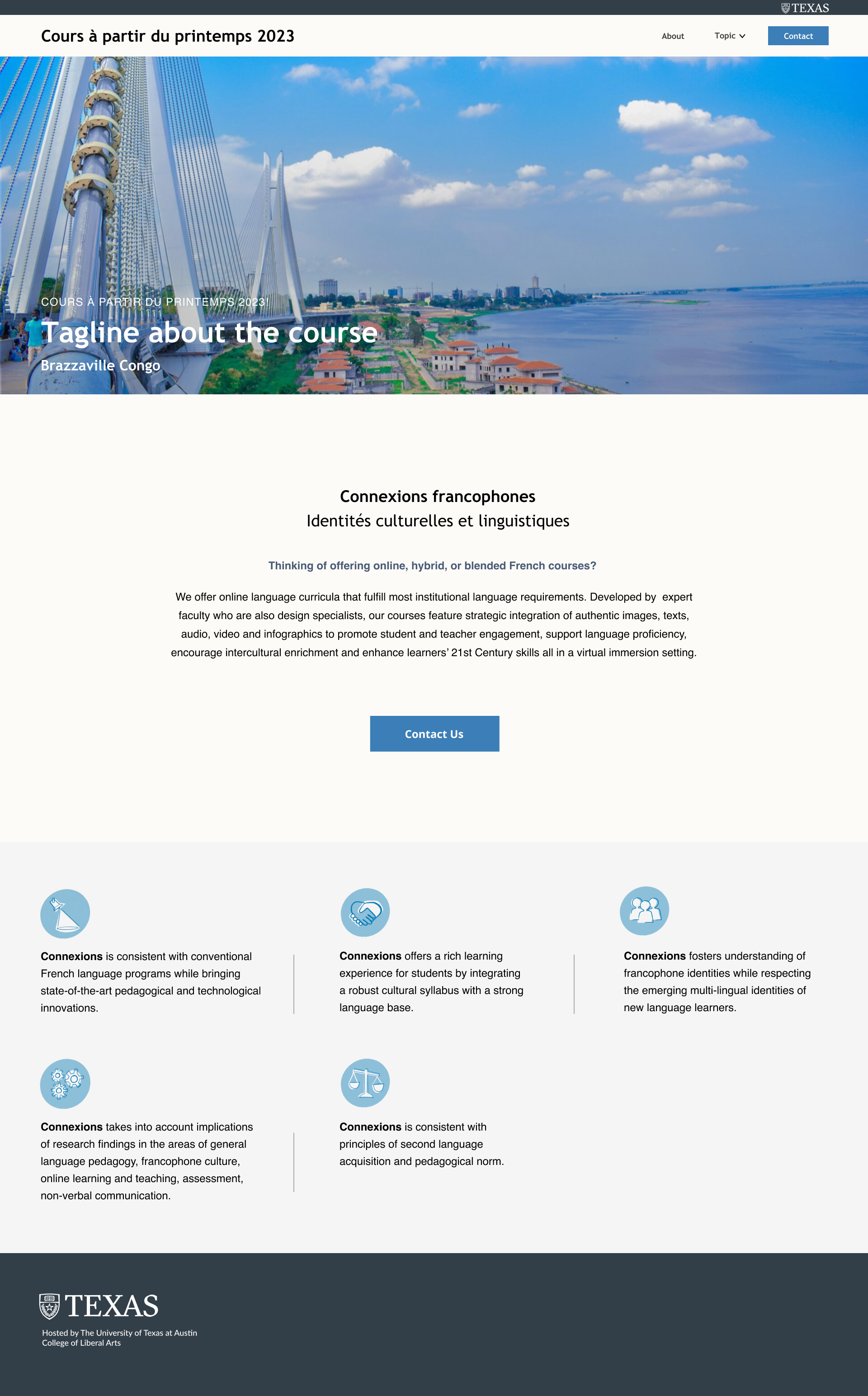
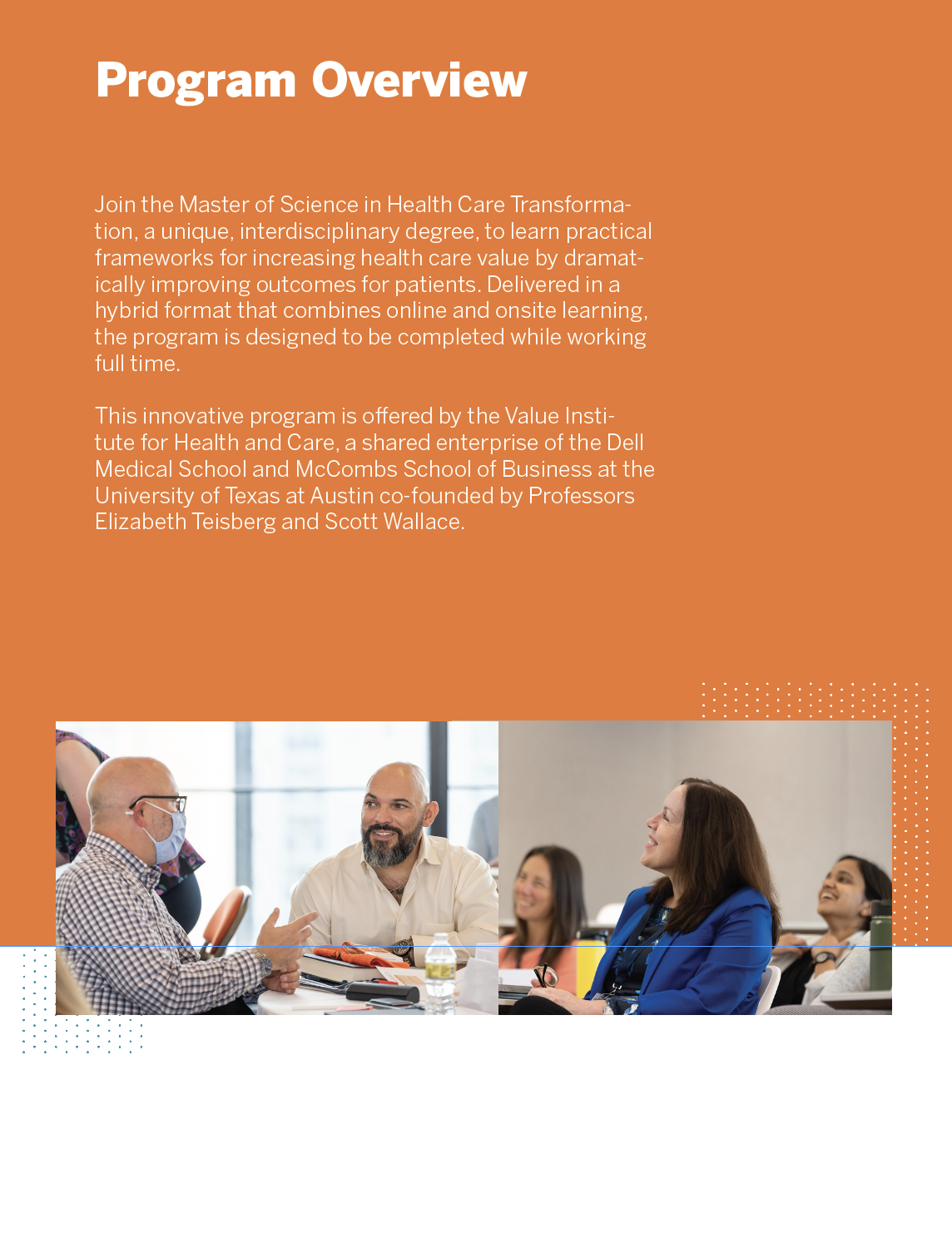
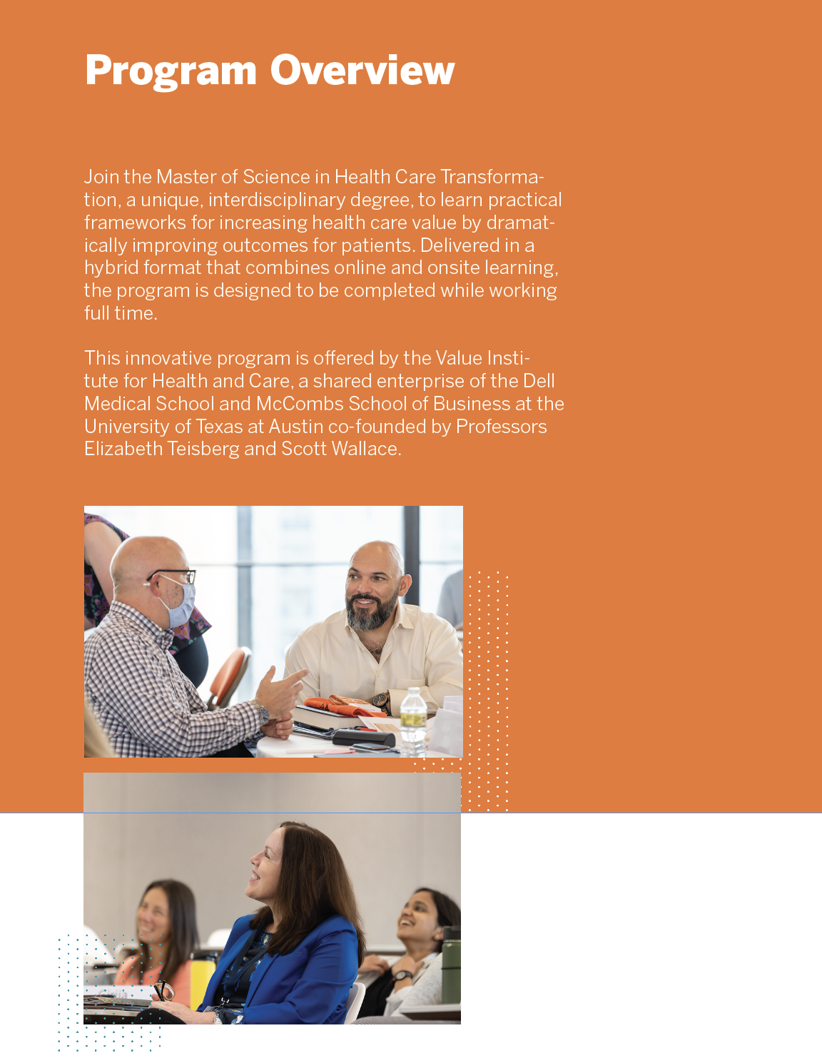
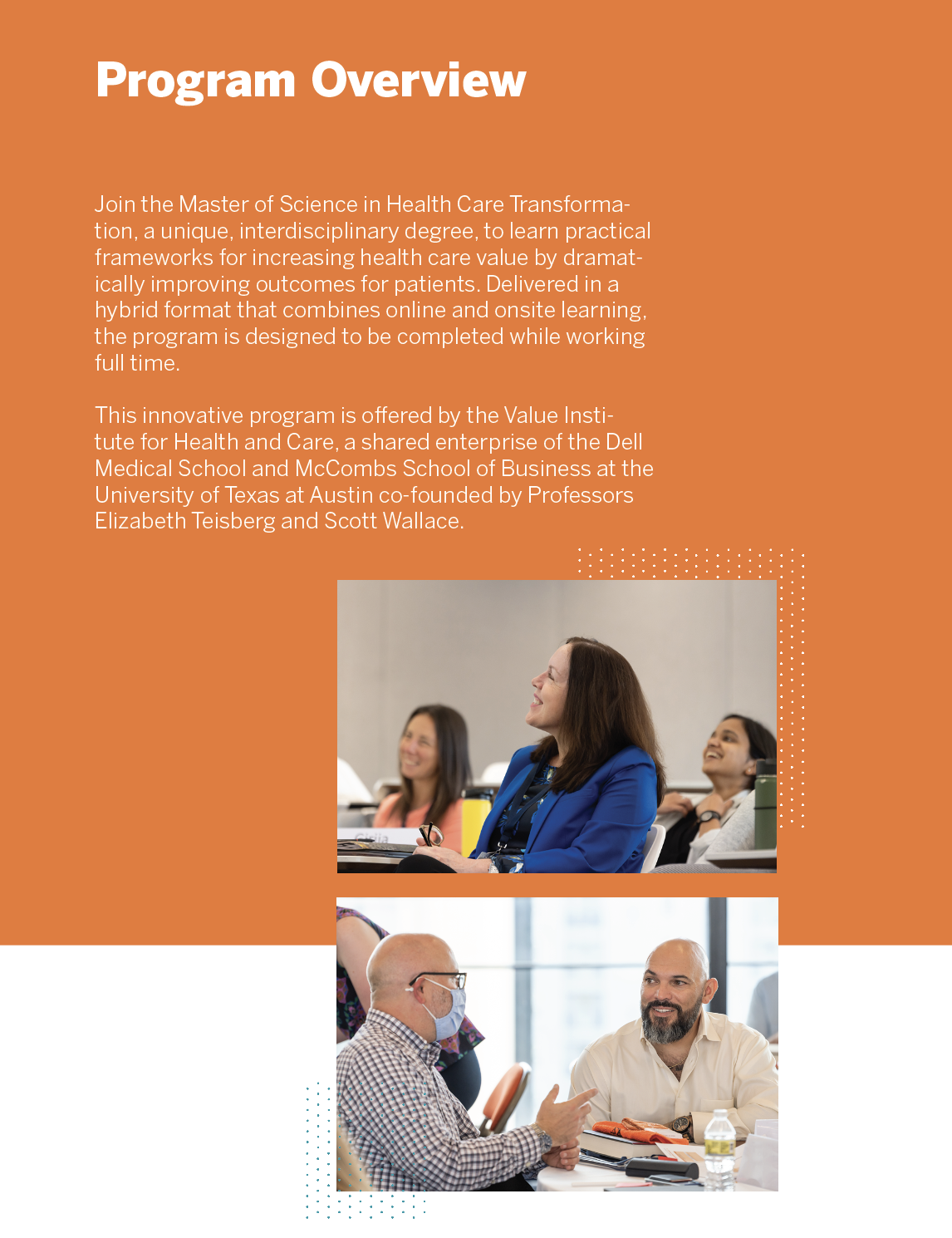
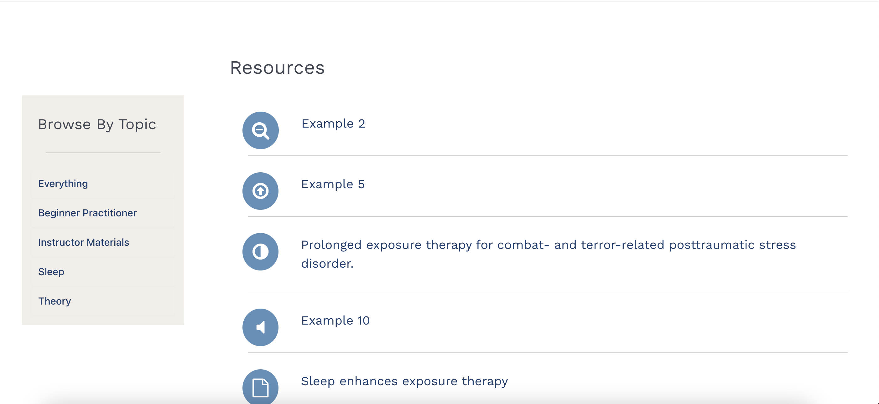
Description: For this project, I was asked to complete different things. 

  1. Display different research posts as rows like Maddy’s new designs.
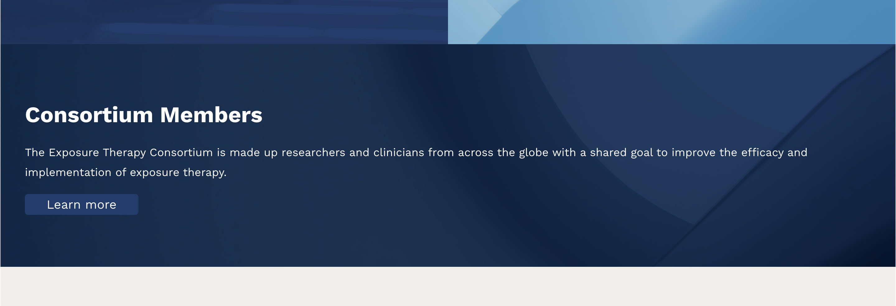
  2. Fixing up the size for the consortium member banners in the home page.
  3. Moving the logo wall block and + subscribe to mailing list block to be after “consortium member” banner
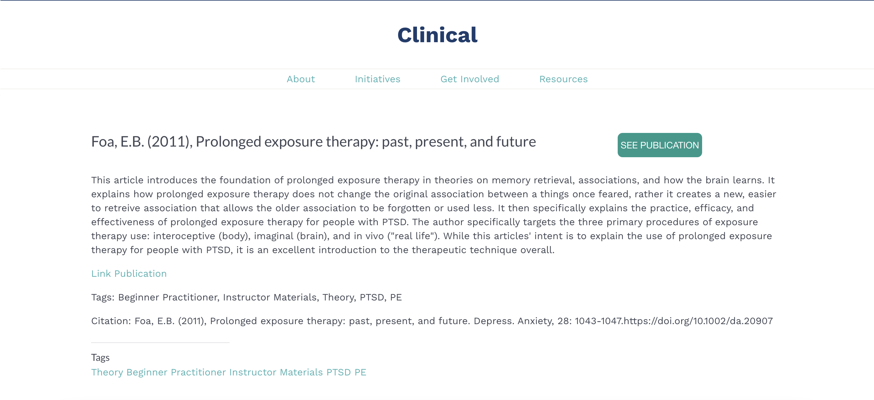
  4. When clicking on the “read more” of the research posts, the user will see clinical instead of research like projects nested under research page.
  5. Tell the client how to change the title based on the type of resources as icons.
  6. Fixing up the layout of the About Us Section.
  7. Display the Research Posts
  8. I am still working on walls of logo as carousel.

Challenges: It took a lot of time for me to do the research post because there is another blog item that was done for the project, and I thought I could easily duplicate and use it, but no matter how much I tried. It cannot display accordingly. Therefore, after days at the problem, I took another approach to display it.


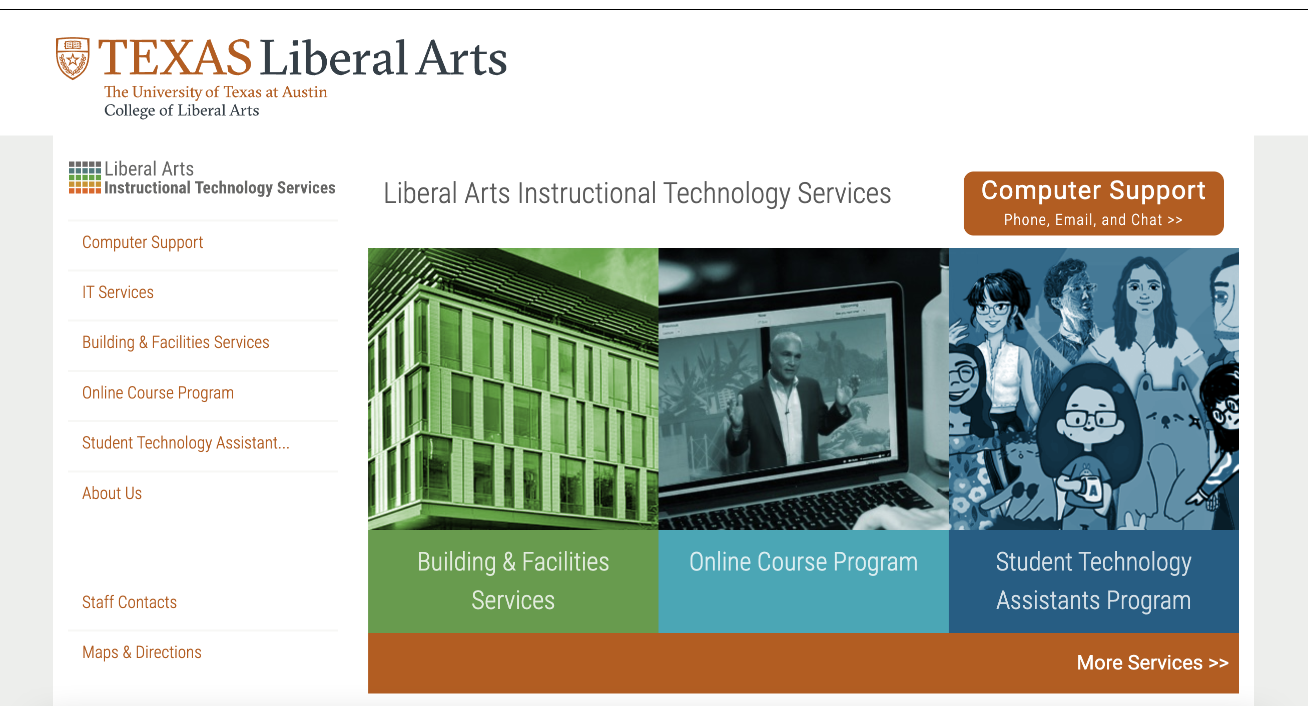
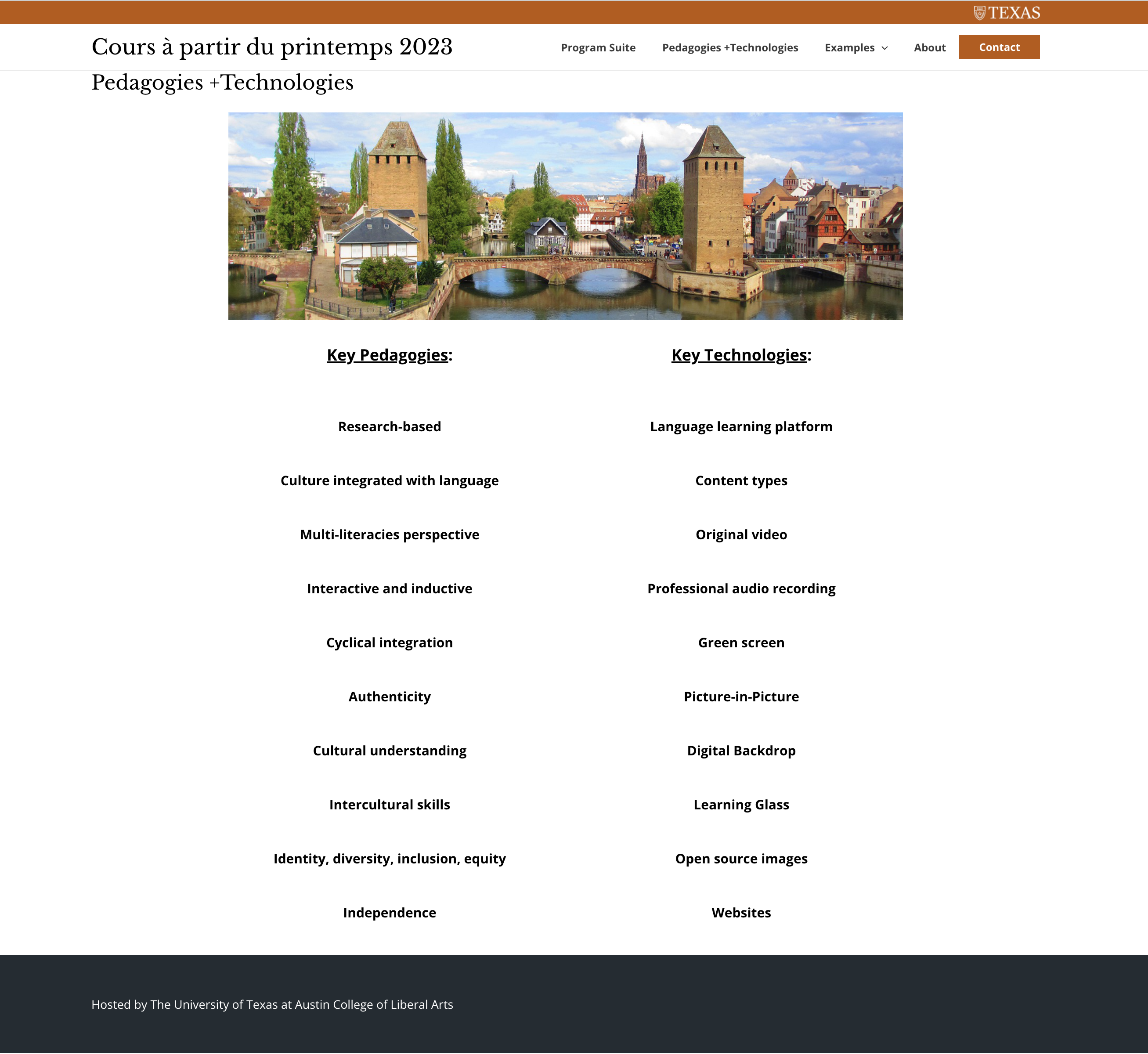
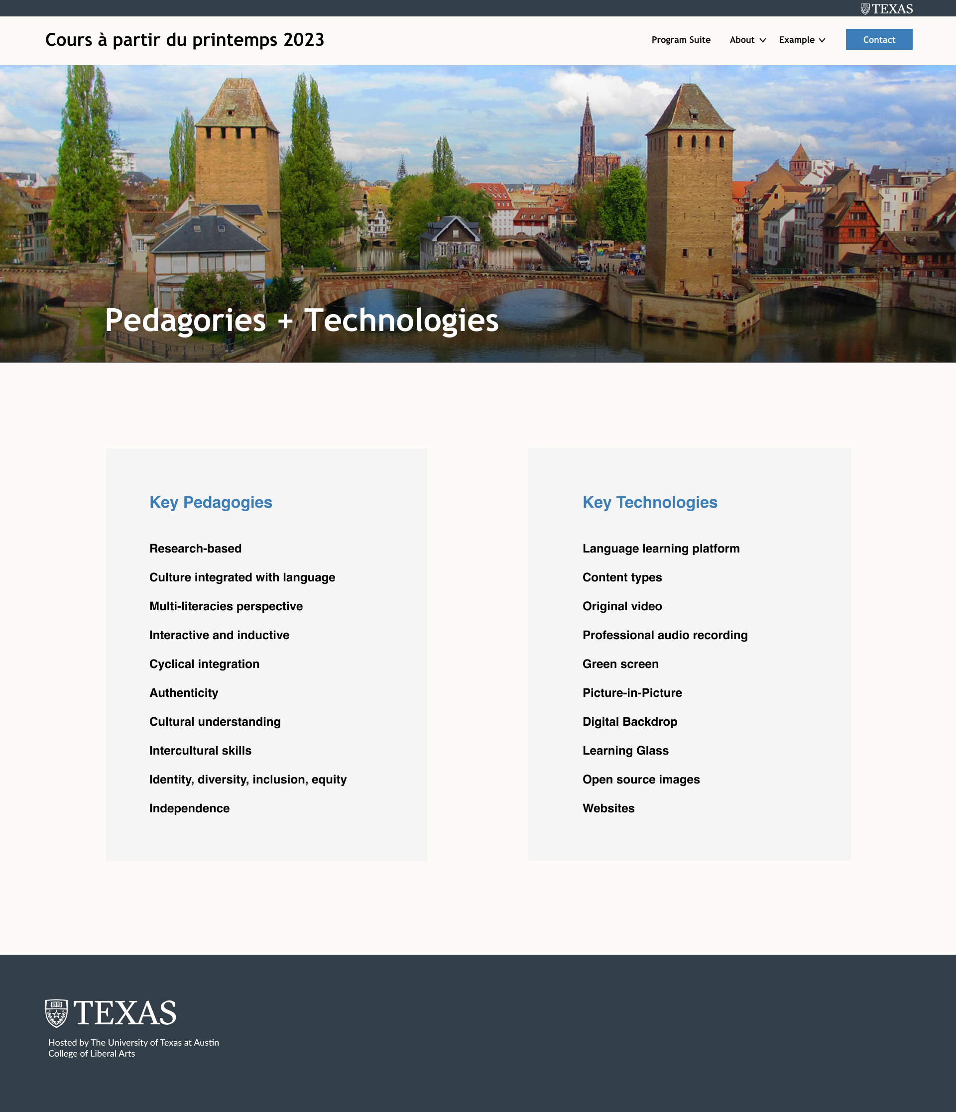
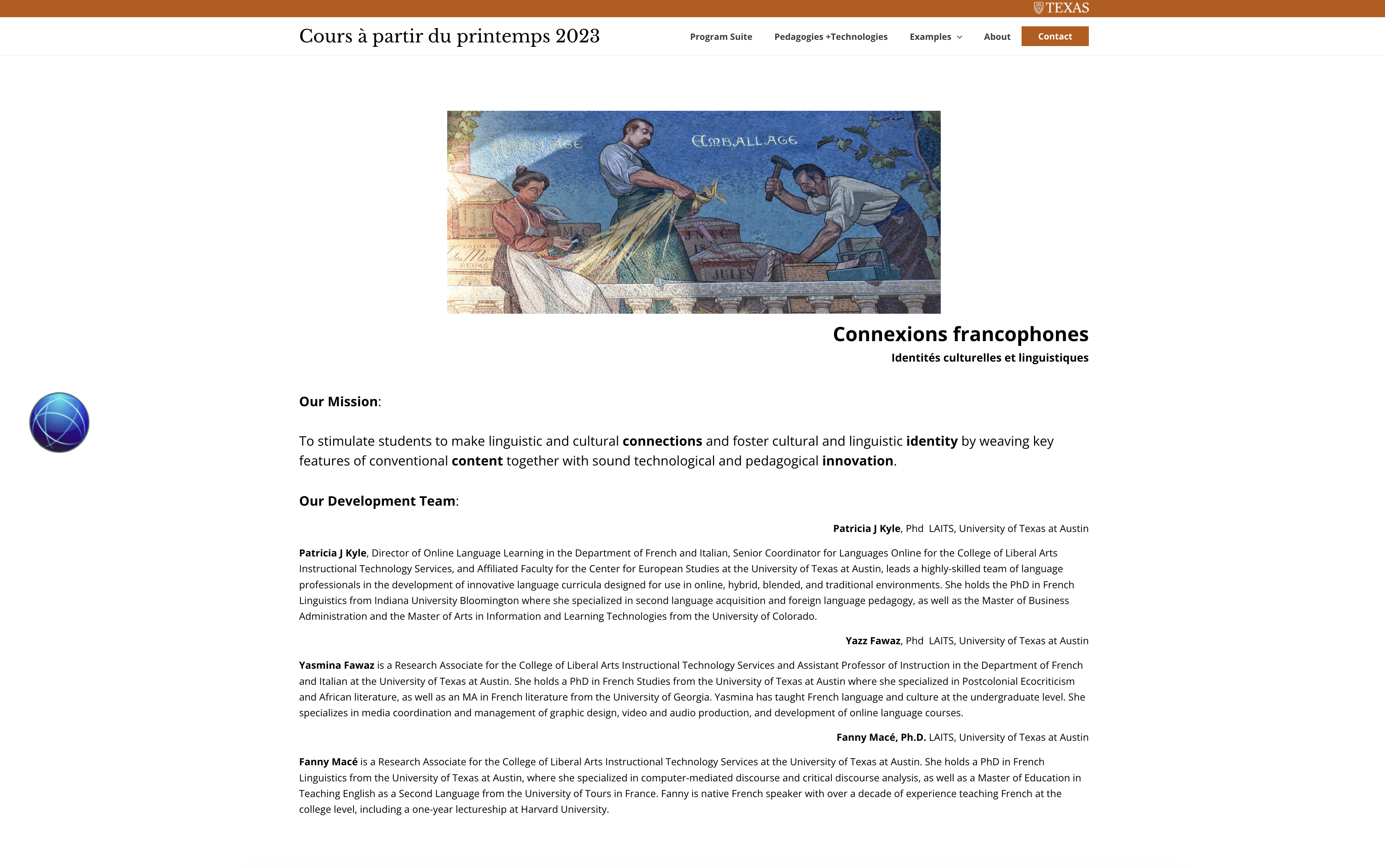
Project: LAITS Main Website

Started on: October 26, 2022

Completed on: October 26, 2022

Staff Guidance: Ruben, Marianne

Description: Recently, LAITS just changed its domain with laits at the end, and therefore the website has some broken links because the links are not updated accordingly. Therefore, I was asked to check the whole site if any of the links are broken, and if it does, update it.


Filed Under: Fall 2022 - Spring 2023

Week 8

October 28, 2022 By Carrie Wang

Project: French Connexion

Start: Oct 21th 2022

To be Completed: Oct 30th 2022

Staff Guidance: Maddy

This week I started to design the pages for French Connexions. The final color palette I chose is the blue family with UT slate gray since it looks rational and clean.

Issues on Homepage:

  • The white bar on the side of pictures seems awkward when I expand the windows
  • better way to place the text on slider
  • Text is too big and hard to read
  • There is no hierarchy in texts
  • How to place the parallel text

Ways to tackle issues on homepage:

  • expand the banner for full screen (the width can expand when users stretch the window but the height will be fixed
  • use icons to list out parallel text and emphasize the different definition of connexions
  • use font weight, size, color, and leading to hierarchy.

Issues on Program Suite:

  • Different padding for titles
  • when users minimize the window, text and maps cannot be read on the same page
  • uneven padding in left and right
  • break between each part

Ways to tackle issues on Program Suite:

  • Align text along the map
  • Use color block to differentiate each part
  • Use boxes to emphasize each module and balance with the block of map (align perfectly)


Issues on Pedagogies + Technologies:

  • Big leading
  • white bar along with the banner


Ways to tackle Pedagogies + Technologies:

  • Full width for the banner
  • Usr block to make division
  • Decrease the leading between text
  • Increase the padding of block

Issues on About

  • Mission and Team are mixed together
  • long sentences in each paragraph makes users hard to read (50-70 character is the best)
  • Hierarchy
  • Text block is not align with the pictures


Ways to tackle About:

  • Emphasize the mission since it’s the main goal of the site
  • Use color block to represent each members of the team
  • Use colored text differentiate name, role, contribution on the project and other description
  • Full width of the banner (add color overlay to ensure the readability)


Issues on Contact

  • Not consistency color use
  • Blurred image at the top
  • The caption of the image looks like a part of the contact page
  • Text about Contact Us is not aligned to any other part of the page
  • The bottom padding is to narrow
  • Missing the purpose of contact?

Ways to tackle Contact:

  • Find new copyright picture
  • Full width for the banner
  • add the purpose align with the title
  • Use the same color of block from other pages as the enter box

Finally I make the developer note for them to code CSS more easily, including text style, color palette and padding.

Filed Under: Fall 2022 - Spring 2023

Week 8

October 27, 2022 By Marissa Devivar

Week 8


PSY Labs Site: Imagination & Cognition Lab Banner Design

Client /Prof: Dr. Jacqueline D. Woolley
completion status: Started Oct 19, 2022
staff guidance: Valerie
description/plans: Create/design a new banner that will be placed on Dr. Woolley’s new website. She wants something related back to her research, yet whimsical and colorful.
To be completed: Oct 31, 2022


  • Ashley (our point of contact with the client) asked for the number 1, exclamation point, and cat to be changed to symbols of a unicorn head, light bulb, and beaker ( or another science-related symbol). These symbols, coupled with the pre-existing ones, perfectly represent the concepts that the lab researches.

before edits:

after edits:

banner uploaded to the website:


UTFC – Green Screen: 7.1B Fashion

completion status: Started Oct 24, 2022
staff guidance: Yazz Fawaz
description/plans: STA is to find images for each word in the list and create a PowerPoint with accompanying french text on the slide.
To be completed: Oct 27, 2022


Filed Under: Fall 2022 - Spring 2023, We are STAs

CSMS Logo and Animation Process Documentation

October 27, 2022 By De'sha Bass-McClellan

CSMS Logo and Animation Process Documentation

For the past couple of days I have been working on creating documentation on the animation and logo process for the CSMS course. CSMS has a particular style format for all of their graphics. This document showcases the consistency and provides information on creation the animation and logo.

Filed Under: Fall 2022 - Spring 2023, We are STAs

Planning, Search, and Reasoning Under Uncertainty Finalization

October 27, 2022 By De'sha Bass-McClellan

Planning, Search, and Reasoning Under Uncertainty Finalization

For this course, finding the right animation was an extensive process that require multiple revisions. We wanted to keep it to where it follows only one path, but slow the animation down a bit. In addition, here are the other edits I needed to add to the animation:

  • Change the template from the “with subtitle” to the “without subtitle” for the name of the course.
  • Make sure that the begin cursor animation matches up with the cursor when the text animation occurs.
  • Change/differentiate the final path’s endpoints and the other paths in the animation.


http://sta.laits.utexas.edu/wp-content/uploads/2022/10/CSMS_PSRUU_Intro-2.mp4


Since the logo design ended up changing, I had to also edit the course card and title card.

Filed Under: Fall 2022 - Spring 2023, We are STAs

Infographics, Dot Patterns, and… Nearing Completion?

October 25, 2022 By Luisa Matzner

Value Institute Brochure

Thursday Update

This week, I moved forward on the Class Profile page. It’s my favorite page so far! I love the graphic elements and the colors. It’s really incredible to look back and see how far the brochure has come. We’re nearing the last two weeks of editing before the deadline, and I’m so excited to see how it will look at the end.

Tuesday Update

This week, I mainly focused on the cover and first spread. I designed a graphic based on a previous graphic from the Value Institute, making some aesthetic and functional changes. Because the client wanted a recreation of this specific graphic format, I had to shift around the layout. Here is the result:

I’m also working through iterations for the first page. The client feedback was that there was too much blank space. Here are a few options for the layout.

That’s it for this week!


Filed Under: Fall 2022 - Spring 2023

  • « Previous Page
  • 1
  • …
  • 31
  • 32
  • 33
  • 34
  • 35
  • …
  • 50
  • Next Page »

link to LAITS home page

Video STA Home

© 2026 Liberal Arts Instructional Technology Services | Production Credits