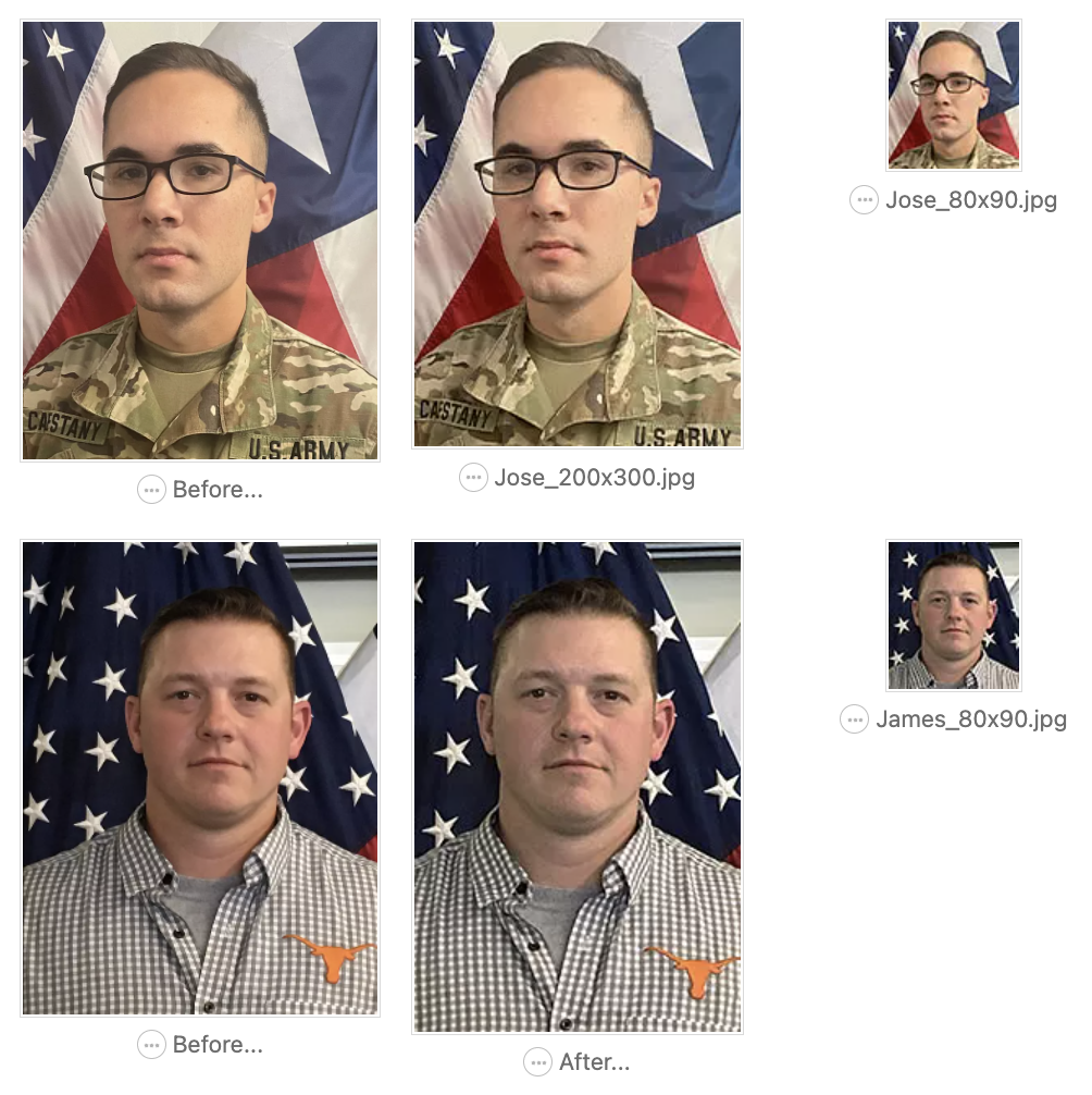
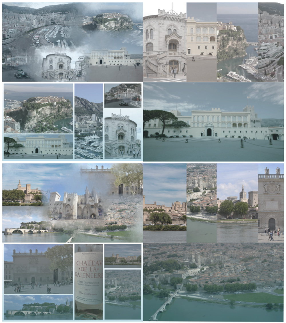
• We are STAs
    • Asha Rountree
    • Haley Ma
    • Kate Shih
    • Kyra Lee
    • Nicholas Peasley
    • Sasha Kenney
    • Shanda Horm
    • Shriya Atreya
    • Tomas Marulanda-Mesa
  • We were STAs
  • STA Presentation
    • STA Presentation 2017
    • STA Presentation 2016
  • Testimonials
  • Resources
  • Home

STA Blog

Photo IDs

April 13, 2022 By Cristina Villarreal Núñez

Photo IDs

This one was pretty straight forward. To be honest, I didn’t change much in either picture because

1. These were already pretty good in terms of the quality of photography, and

2. Because military related pictures, and pictures showing flag can be very particular with the extend to which you can edit things.

So, in the end, I just did some subtle color corrections, and adjusted the clarity of the images to make them less blurry.


Filed Under: Fall 2021 - Spring 2022

Weekly update

April 13, 2022 By Sheryl Long

PSY352 Graphics Update

PSY352 got a new title so I updated their course graphics accordingly

Did some photo IDs…

Send some follow-up emails…

UTFC powerpoint (Abriella pretty much wrapped it up for me when I was gone <3)


LAITS T-Shirt

Considering people have different pet preferences, we will add more variety.

Design department will be capybara, open to suggestions

Filed Under: Fall 2021 - Spring 2022

Updates + Photo IDs – 4/13/22

April 13, 2022 By Rachel Sacks

Updates: 4/13/22

Dana Center – Strategic Direction

Hello! I am currently waiting for more feedback on the second and third set of infographics. However, these are what they currently look like:

More updates on these soon!

Photo IDs

Last Wednesday, I began working on two sets of photo IDs for COLA. This was my first time doing an official Photo ID request, and it was a lot of fun! I really enjoy working on Photo IDs, as I love portraiture and it’s very satisfying for me to edit and recolor images.

Batch #1: 4 IDs

The first set went very smoothly. All of the images were very nice and had room to be cropped properly.

Erin Brantmayer: This graduate student’s image was very nice already, so the only thing I had to do was brighten it up a bit and add some contrast.

My edits:

Tamra Lawson Webb: This staff member had a lovely image. However, it was bit too warm for LAITS standard photos. To solve this, I color corrected with the auto-color tool, and then edited it from there. I also up’d the brightness and contrast so the highlights on their face didn’t appear as yellow.

My edit:

Adé Thomas: This staff member had a great image, but it was slightly pixelated image. However, the overall composition was very nice and the colors were fixable. It looked as if their photo had a slight filter to it, so my main task was removing the filter-like colors and give it a more natural feel.

My edit:

I wasn’t sure about the blue highlights on the side of their face, so I toyed a bit with the heal/patch brush as well as painting over it with their neutral skin color. I was consequently able to subdue the highlights quite a bit so the lighting looked more even.

Briana Lopez: This graduate student had a very cool image with a great background. I barely had to tweak it beyond just up’ing the contrast slightly.

My edit (can you tell the difference?):

It’s a shame a lot of the cool background got cropped off in the final profile picture!

Batch #2: 3 IDs

The second batch was a bit more tricky.

One of the images for Iopeka Casumbal-Salazar was absolutely perfect, and I didn’t have to process it at all:

I really like the warm lighting coming from the left side, as well as the low depth of field effect conveyed with the out-of-focus plants. It looks as if this was taken with a professional camera! (If it wasn’t – then iPhones are getting pretty good.)

The other two images I was sent had some issues, so I wasn’t able to use them, and am now waiting to receive replacement images.

For the first one, the image was cropped too close to their head, and they weren’t forward facing, so there was a lot of negative space:

The second had a lovely composition, but like the first, wasn’t forward facing:

There is another image of this professor online that does fit the guidelines, however the professor is not sure if they wish to use this image. I am waiting to see if they take another image that better fits the guidelines.

Other Projects I am beginning:

As the Dana Center is mostly wrapping up, I am beginning to work on an animation project for Tate Gibson. This project is in preparation for the COLA grad website. Additionally, I will be doing some course graphics for Maddy. I will update my blog accordingly when I have more progress on these!


Filed Under: Fall 2021 - Spring 2022

Week XXXI

April 12, 2022 By Adrian McKee

Week XXXI

I’ll be brief!

Norwegian Poster

The client preferred the my draft with the northern lights and embroidered banner, so I reformatted that for the new templates Suloni gave, in 3 sizes + a digitial banner ad. Let me tell you, Illustrator is not a program that likes to help you crop photos and tile them nicely, but I made it work eventually.

I actually saw these in person, printed out at the World Language Fair near speedway! I’ll admit, my bold color choices looked a little off, printed out. The dark-on-light posters fared much better. But still exciting! I walked up to someone and was like, hey I made that poster! I also won a bracelet in a game of Turkish trivia because I knew what the Bosporus Strait is.

Course graphics: Physics

Just wrapped this up with some Canvas buttons.

UTFC graphics

Sort of getting in the hang of these? I made a collage this time, since WordPress didn’t like my image sizes last time. These were Monaco (top) and Avignon (bottom).

There was also an alt version of each for a Picture-in-Picture background, with slightly less blue tones, but I am too lazy to collage 16 of these.

Edit: I accidentally uploaded a collage of the wrong city the first time, the backgrounds for Marseille done by someone else. Goes to show how good my french geography is.

Course graphics: Masterworks of American Literature

This one was a plain Style A, so it didn’t take very long, but a good refresher. No relation to my previous E316M course.

The only thing I had to do off-model was adjust the text size/placement for no portrait photo, so the button text is a little bigger.

Filed Under: Fall 2021 - Spring 2022

Lingco Banner edits round 2

April 11, 2022 By Abriella Corker

Lingco Banner Edits Round 2


I hadn’t had time to work on the banner recently because I had other time-sensitive tasks for COLA and for greenscreen edits. Here are some of the edits Yazz and Pat wanted to see, I changed out some colors and added an outline color on the white text in addition to the drop shadow color. They also wanted 2-line titles for all the secondary banners and changed the name of one of the titles.


Filed Under: Fall 2021 - Spring 2022

COLA Web Refresh

April 8, 2022 By Ingrid Alberding

COLA Web Refresh has continued to be my primary focus. I, Adrian, Anya, Lorena, Chris, Michelle, and a handful of other people have been working hard to clean up sites auto-migrated to Pages and hand them off to the client. It’s a pretty enormous task, so I undertook additional hours for the remainder of my time here in order to help as best as I can. I finished cleaning up the site for Government yesterday, so pending any feedback or requested changes from Chris, Michelle will soon send it off to Sarah for review.

Screengrab from the dev server preview of the Government site

Next up is Latino Studies — a constellation of sites similar to the structure of Black Studies, with the trifecta of a department, center, and institute under its umbrella. I’ve finished cleaning up the “umbrella” site of Latino Studies, as well as the Latino Research Institute (LRI) sites, but that leaves MALS and CMAS.

Filed Under: Fall 2021 - Spring 2022, We are STAs

  • « Previous Page
  • 1
  • …
  • 7
  • 8
  • 9
  • 10
  • 11
  • …
  • 63
  • Next Page »

link to LAITS home page

Video STA Home

© 2025 Liberal Arts Instructional Technology Services | Production Credits