• We are STAs
    • Asha Rountree
    • Haley Ma
    • Kate Shih
    • Kyra Lee
    • Nicholas Peasley
    • Sasha Kenney
    • Shanda Horm
    • Shriya Atreya
    • Tomas Marulanda-Mesa
  • We were STAs
  • STA Presentation
    • STA Presentation 2017
    • STA Presentation 2016
  • Testimonials
  • Resources
  • Home

STA Blog

French Course

April 25, 2022 By Abriella Corker

ICONS, WORKFLOW, THINGS GETTING DONE!

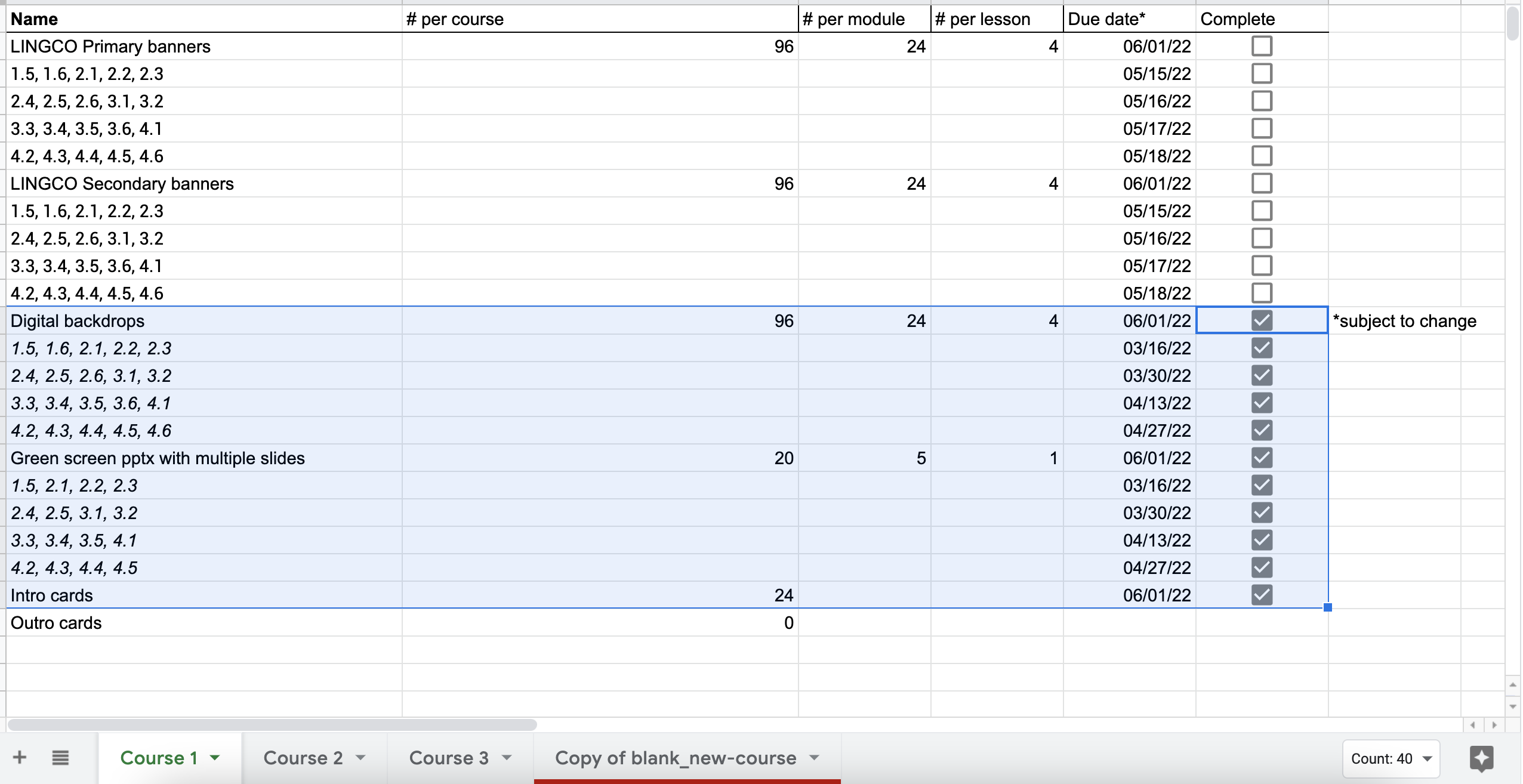
Things are moving along well with the French course. I have set up all the basecamp for banners for course one and everything else for course one is now down. After I graduate it should be easy for the team to copy-paste how I set up the workflow for course 1 for courses 2 and 3. I also spent all of my last shift making icons in the new color versions to match the banner changes we did. The psds have been updated too for other STAs to be able to edit and access them.


Filed Under: Fall 2021 - Spring 2022, We are STAs

Week 5 Summary

April 22, 2022 By Hoa Truong

This week I have been working on the Principles and Elements assignment. Earlier this week, I had a few troubles with finding good examples for the principle or elements. After receiving feedback from Maddy, I finally understand more about how the design principles and elements work.

Design Elements slide


Design Principles slide

Principle google slide

Later this week, I start working on the color theory assignment and will focus on working on the Color wheel by photoshop. I’m very excited about the materials that I have learned so far and hope that I will be able to apply them on the project.

Filed Under: Fall 2021 - Spring 2022, We are STAs

finishing ties lab, start virtual meeting app

April 22, 2022 By Marianne Lê

finished migrating content for TIES Lab, minus contact info, social media, and the People page

The site is now live: Home | TIES Lab (utexas.edu).

I also worked on the VirtualMeeting App this week.

Fixed Issue #3: making the status block the same size as the video

Fixed issue #4: ability to create custom waiting message


the default waiting message is

I added a filed on the edit page to add custom html for the waiting message, and a column in the meeting database table to store the custom message

Filed Under: Fall 2021 - Spring 2022

Week XXXII

April 22, 2022 By Adrian McKee

Week XXXII

I think these numberings are turning into a fencepost problem since I’m writing midweek anyways, but I want to stick with the roman numerals.

Japan Lab

Project: Japan Lab logo design
Client /Prof: Adam Clulow
completion status: WIP
staff guidance: Suloni Robertson
STA team members: N/A
description/plans: Refine existing logos for the Japan Lab site
To be completed: Mon, Apr 25

This project has a hard cap of 15 hours, so it’s been an exercise in workflow and client communication to get everything done efficiently. The gist is to refine a logo for Japan Lab, a UT project for developing computer games based on Japanese history. It’s gone in a lot of different directions so far.

I started by, at Suloni’s suggestion, choosing the 3 frontrunners from a long design document of logo drafts, and incorporating a vectorized Godzilla shape the client was hoping to see, as well as mocking up how they look in the site.


The client then expressed interest in my own ideas, so with time constraints in mind, I drafted a simplified vector.

(I say simplified, but I just want to show off how stupidly complex I made this vector, because I don’t know how to draw just the white outline)

The client then reminded me that the project is computer game-related, which I hadn’t thought about because I didn’t really read the site, so I drafted a pixelated fujiyama. This one was my personal favorite design so far.

As of writing, we’ve left off with ~30 variants for the client to choose from (with multiple fonts and new graphics such as a pixelated Japan shape) so I am waiting for those to be narrowed down.

Advanced Training: Create Pixel Art in Illustrator

Suloni suggested this because of the above project. It’s straightforward enough, so of course I had to make it more complicated for myself and choose a difficult image, an animation still from Castle of Cagliostro.

The shapes were difficult to get right, but I was happy with how the colors and overall composition came out.

Out of sheer curiosity, I tried simply shrinking the image and indexing the same number of colors, to see how my work compared to the computer’s, and then overlaid them in a GIF.

The computer’s was definitely bumpier, albeit more accurate shapewise. I’ve done a lot of pixel art, but often by shrinking the reference first and then cleaning up the shape. This training was very useful for learning an entirely different approach that I ended up using for one of the logos not long after. Thanks Suloni!

CoLA Refresh

We’ve been cleaning up a lot of auto-migrated sites both small and large, and while it’s too much to summarize everything, I want to show one example of the type of philosophical issue I run into.

On a long page like this, with anchor links at the top (a feature not supported in Pages) our rule of thumb is to translate the sections into accordions or tabs. Makes sense, right? Shortens the page, makes it more navigable at a glance. Well…

It seems as if each of these categories had several subcategories. Ranging from 1 or 2,

To… however many this is.

So an accordion would look like: 2 sentences, 2 sentences, 1 sentence, 2 sentences, several pages of info, 2 sentences.

And then you get into the question of, what are these categories anyways? What is the hierarchy supposed to be here? Is Specific Interests/Requirements noteworthy enough to deserve its own formatting separate from every other section of the page? How much does consistency matter?

Cascade layouts do not make it easy. For now, I’ve been noting a lot of these long pages and leaving them on the back burner.

Filed Under: Fall 2021 - Spring 2022

Immigration & European Soccer Course Promo

April 20, 2022 By Cristina Villarreal Núñez

Immigration & European Soccer Course Promo

Project: Immigration & European Soccer Course Promo
Client: Dr. Hans C. Boas
Completion Status: Done! (And in about 4 days, I’m impressed)
Staff Guidance: Suloni Robertson
STA Team Members: Cristina (it me)
Description/Plans: To design and art-direct the promo material material for the GSD course on Immigration & European Soccer.


Client Direction:

Pick one of the following taglines, and add the call to action “Learn more about European soccer and immigration in GSD s310 IMMIGRATION AND EURO SOCCER this summer!”


– “For Immigrants, Soccer Is often more than a Sport”
– “Diversity at Play: Immigration and France’s Soccer Team”
– “What a Soccer Scandal Says About Dog-Whistle Politics”
– “Germany Wants to Unite People Hosting Soccer’s Euro 2024”


They also gave me the following images as inspiration and possibly to work with as well, but I didn’t see any of those as a potential good fit.


So I decided to look for images on my own that were for sure free to use, and I found this picture of some soccer shoes resting over a ball, in the middle of a field, which I thought showed great potential. Then I revisited the client’s potential taglines and noticed that they were not focused on a specific country. Some mentioned Germany, some France, and one mentioned the 2024 UEFA European Football Championship. SoI decided that representing a single country wasn’t enough, and decided to look for an image that represented European culture as a whole, and I stumbled upon the European Union flag. From there, an idea was born… (This was my original quick draft to propose the general idea).


I went through a few different iterations trying to edit the ball properly. First, I masking the shape of the ball was a challenge because of the pattern in the original image and the shading. I was able to remove the color, but with it, the texture and lines of the ball were messed up. So I looked for a different copyright-free image that was the closest thing to a monochromatic ball I could find, and used that to mimic the texture and shading of the ball. Then I had to fix the color of the overlayed image of the EU flag. Next, when I tried to translate this idea into the printed promo formats, the hues of the ball came off way duller than in the original. Turns out, that blue is one of the hardest colors to translate from RGB and CMYK. The more you know! 🌈⭐️ Anyhow, I compromised and remade the design fully on CYMK, since most of the deliverables required that color scheme anyway. Long story short, here’s how everything turned out!


Filed Under: Fall 2021 - Spring 2022

April 20, 2022 By Sheryl Long

Shirt update

https://sta.laits.utexas.edu/blog/2022/04/20/44680-2/

Filed Under: Fall 2021 - Spring 2022

  • « Previous Page
  • 1
  • …
  • 5
  • 6
  • 7
  • 8
  • 9
  • …
  • 63
  • Next Page »

link to LAITS home page

Video STA Home

© 2025 Liberal Arts Instructional Technology Services | Production Credits