• We are STAs
    • Asha Rountree
    • Haley Ma
    • Kate Shih
    • Kyra Lee
    • Nicholas Peasley
    • Sasha Kenney
    • Shanda Horm
    • Shriya Atreya
    • Tomas Marulanda-Mesa
  • We were STAs
  • STA Presentation
    • STA Presentation 2017
    • STA Presentation 2016
  • Testimonials
  • Resources
  • Home

STA Blog

French Textbook Icons

November 29, 2021 By Abriella Corker

French Textbook Icons


These are the pending french textbook icons so far and what the process has looked liked. I start off by drafting all my icons in gray scale and I used adobe illustrator with clean lines to mimic the look of the site. However, the team wanted to go in the direction of making it look more like an illustrated icon similar to the style of Tex and Tammy. I also made a page of drafts for each kind of icon. The last set of images was the new style however they wanted every icon image to be changed to something else so I sent over all my drafts so they pick which ones they like instead of the ones I had done. Hopefully there’s some in there that they like, if not I will re-sketch some more icon images in the direction they’d like. (:


Filed Under: Fall 2021 - Spring 2022, We are STAs
Week 14

November 29, 2021 By Asmita Karmakar

Intro to Typography training:

Learned more about typefaces and their effect on design.

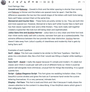
Some font pairings I thought were simple and cool:

I like the modern feel of Julius Sans One. To me it looks expensive paired with Archivo Narrow. I think its good for brand titles.


I like this pairing because it gives me a typewriter feel but there is a good separation between the two fonts. Usually in my mind titles are bold rather than thin but Montserrat in this example is the opposite. It’s thinner than Courier New but it works.

HTML/CSS training:

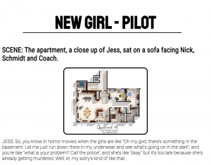
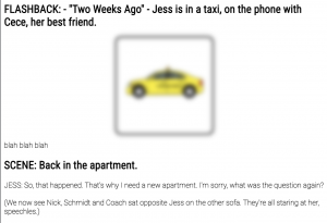
I spent a lot of time trying to animate the title text and do a wave. This is an example of something similar to what I was trying to do.

GIF

I am not very good at JavaScript so I tried making the animation with just CSS and still have not made it work :/. I did not want to spend anymore time on this training so I started others and I’ll revisit this later with a fresh mind.


Filed Under: Fall 2021 - Spring 2022, We are STAs

Web Accessibility Training

November 29, 2021 By Abriella Corker

Web Accessibility Training


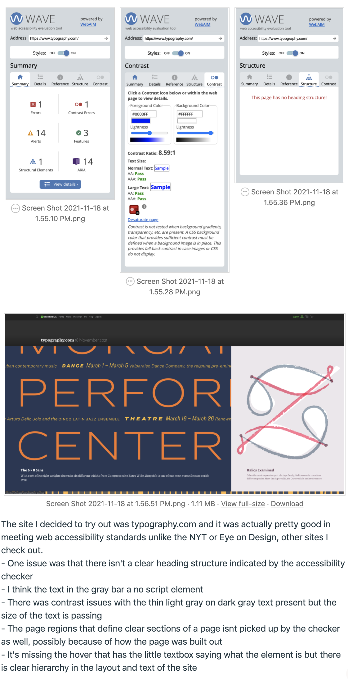
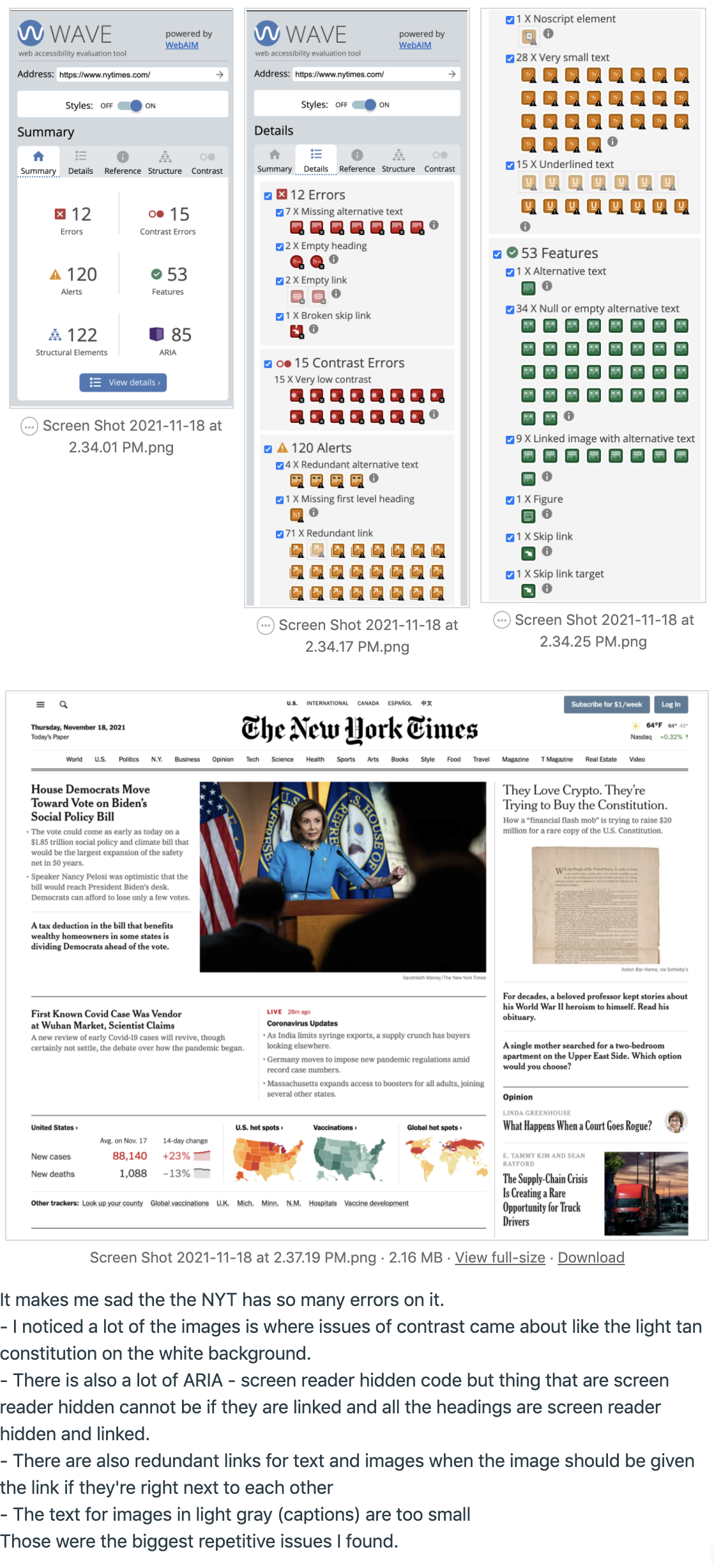
For the web accessibility training I reviewed typography.com and the New York Times. Surprisingly, the NYT website had a lot of accessibility issues and is not a friendly site for visually impaired individuals. Typography.com did very well besides not having a clear header. After that I looked at a FIGMA site that was mocked up and had to quiz myself by listing out as many things wrong with it as possible and then compare it to the answer sheet.


Filed Under: Fall 2021 - Spring 2022, We are STAs

color theory training

November 29, 2021 By Rachel Sacks

Training: Color Theory

GOAL: Understand the purpose of colors and how they relate to others, as well as their societal and cultural meanings and how they may vary.

Step 1:

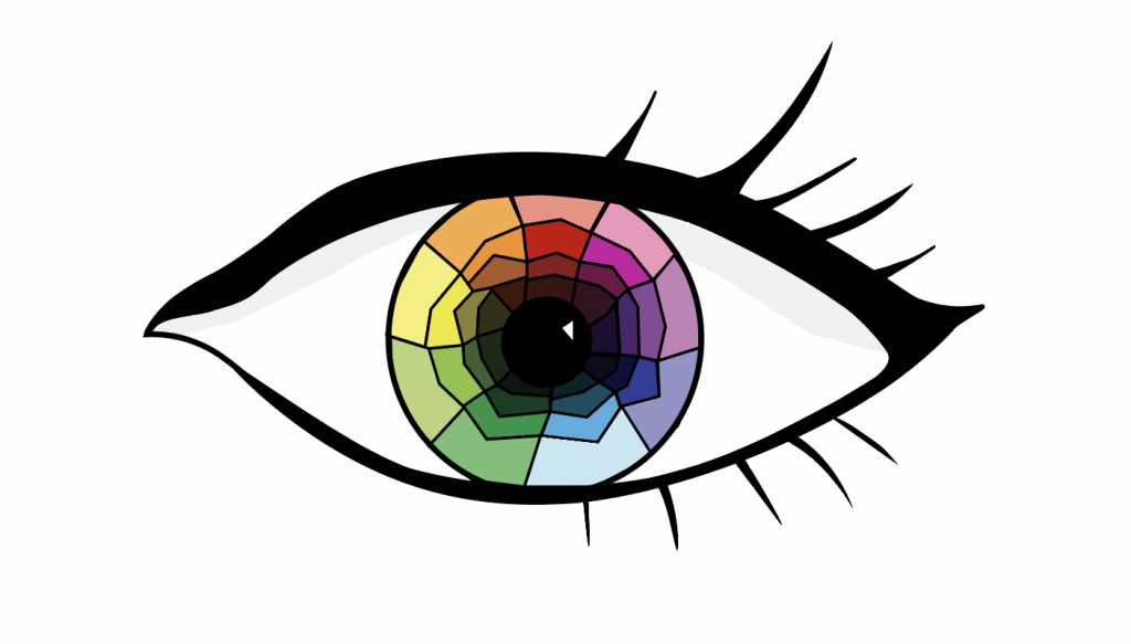
The first step of this training was  to devise a color wheel. I decided to create a color wheel within an eye, which I created within adobe illustrator. It was a bit tricky at first to create such an organic shape with the curved pen tool, but with a bit of practice and tweaking I was able to make the shape work. Instead of relying on the adobe illustrator pen strokes, I used the pen shapes and created thin shapes that would look like stroke lines but be more organic and fluid.

I started out with an eye that looked like this:


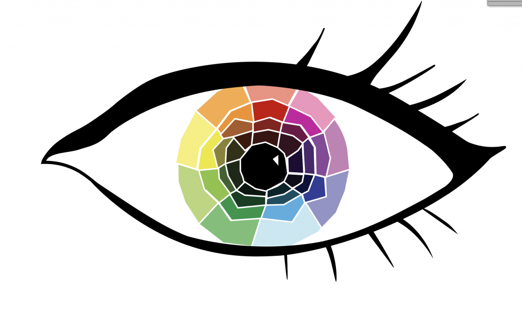
However, I felt that it looked a bit cartoonish for my taste, like something out of a coloring book. I decided to try and change the lines to a white color, and it worked much better!

I decided to also play around with shapes so that the shapes did not align quite as perfectly – this created a more playful and colorful aesthetic. I also removed the shadow that was under the eyelid, as I felt like the shading was contributing to the coloring book feel. The color wheel works such that the colors get darker as you go down, starting with tint, then going to a medium/default color, then a grey tone, and then finally a dark shade. I went with this route rather than starting with the default color as I felt visually it made more sense to show a hierarchy of lightness.


Step 2:

The second step of this training was to create a representation of value (a greyscale going from light to dark or vice versa) to go with this initial color wheel. I chose this as I felt it would complement the first eye, considering that eyes go in pairs (…generally).

I created a new eye and then began a value ring

I particularly like how this one came out, and am surprised I was able to make it in illustrator. If you look at it for long enough, the rings look as if they are moving.

Step 3:

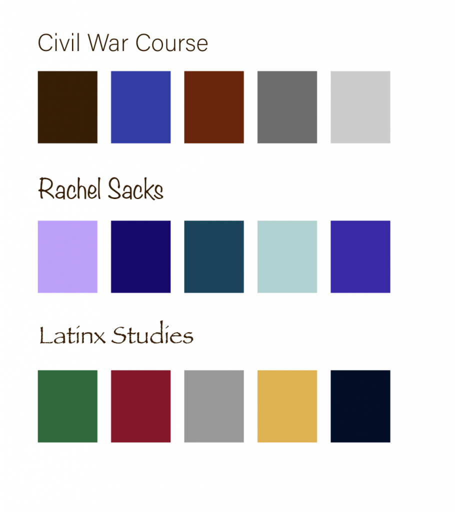
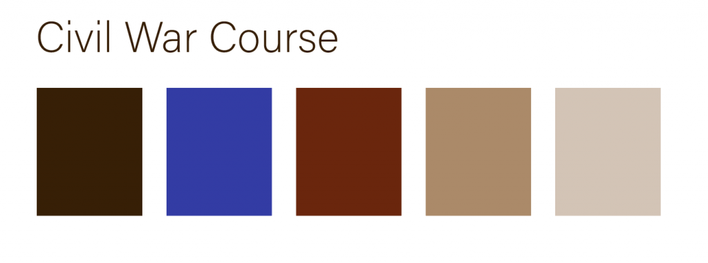
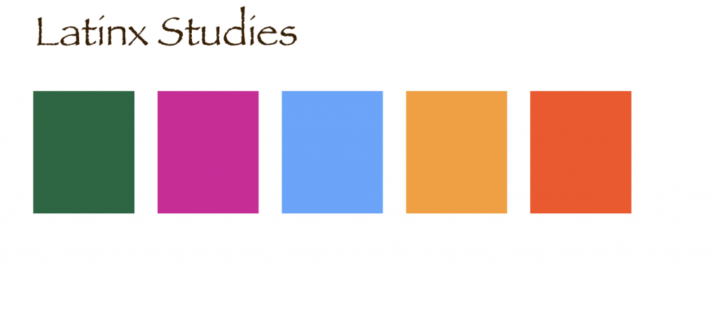
The next step to this training was to create a color palette for three different “clients,” based off of what we learned in the KB about color and meaning. The clients were a civil war course, branding yourself, and a modern Latinx studies course.

I started with these colors:

For the Civil War Course, the colors worked well, but would work even better with some sepia browns to represent the warmth of old films and papers. I kept my own color palette the same as it fit my vision well, but I decided to entirely change the Latinx Studies one. Abriella suggested I go for traditional colors rather than using the colors of one flag, as they’d appear more vibrant and relevant to a larger population. Thus, I edited the civil war course palette to look like this:

And used traditional colors for the Latinx Studies course that looked like this:

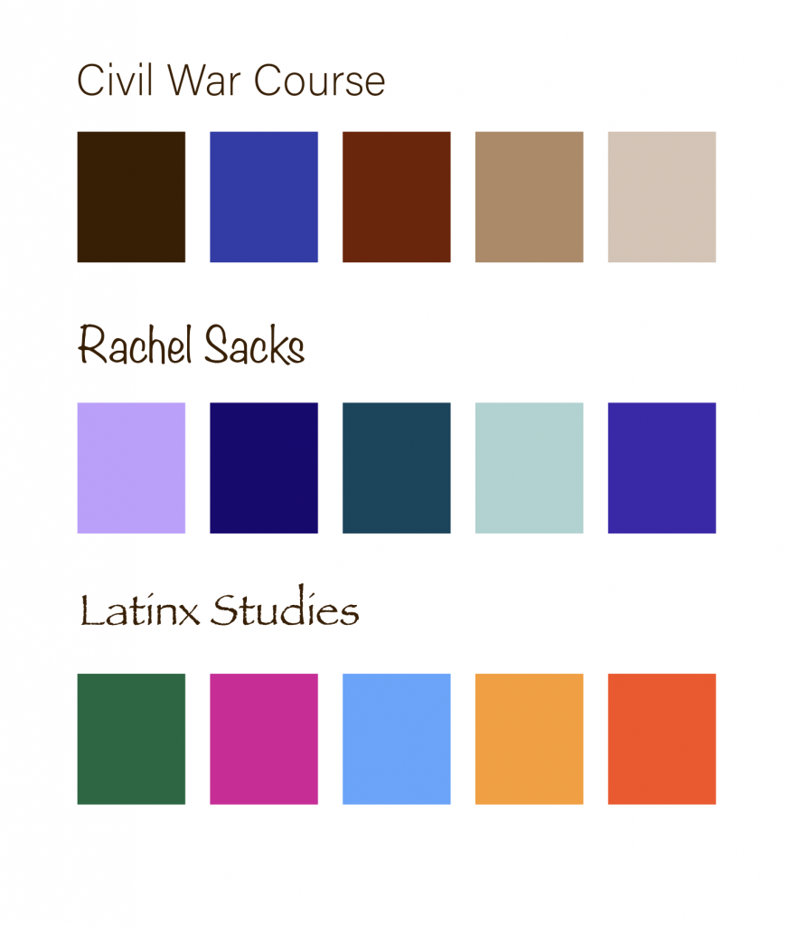
All together, they looked like this:

After finishing this, I was done with the training!

To more thoroughly explain why I chose the colors I did, I wrote this check for understanding:


Civil War Main Color: Dark Brown

  • Brown is associated with professionalism, age or antiquity, continuity, and traditional masculinity. It felt like a fitting color to represent the Civil War: a historical event that dealt with soldiers and antiquated male ideals.
  • I did not want to use either blue or red as those colors are associated with war “sides” more. Brown seemed to be the most neutral and professional of the colors.
  • The color scheme is complementary with the blue and red, and then the rest of the colors are neutral or low in saturation. This yields a slightly last dramatic form of complementary color scheme, but still has the impact of the blue and red.
  • In this case, I focused mostly on changing the hues. I made slight alterations to the tint, but maintained mostly medium-toned colors for this color palette.
My Main Color: Lavender
  • Amongst many things, purple represents imagination and creativity. These are qualities I appreciate, and I consider myself to be an imaginative person, so I felt it is a suitable color (amongst being my favorite color.) I wanted to focus on these aspects rather than the “royal” or “noble” ones, so I went with a lighter purple as it appears more whimsical and a bit less regal.
  • I was torn between purple and teal, but decided to make purple the primary color as the symbolism for it was more accurate.
  • This color scheme ended up being very analogous. I imagine these are the types of colors one would see in a forest at night.
  • In this one the focus was primary on tint/shades with slight hue alterations, since the colors are close to each other and there is not a huge variety of hues.
Latinx Course Main Color: Forest/Emerald Green
  • Looking through various traditional colors, this one was the one that stuck out to me the most. Green often represents freshness, energy, and ingenuity. I felt as if it was a fitting color for the primary color palette, and also fit the general tone of the class and social justice.
  • I picked this color over magenta as I felt the meanings behind green were more significant overall.
  • The color scheme is tetradic with various hues around the color wheel. Some colors like red and orange and magenta and red are closer to each other than others, such as magenta and blue or red and green. This allows for some analogous colors and some that are complementary.
  • In this one the focus was on hue and not on tint or shade, and there is very little variation in the tint or shade beyond the main green color.


Filed Under: Fall 2021 - Spring 2022

November 29, 2021 By Ingrid Alberding

Hope you all had a good Thanksgiving break! The majority of what I did besides hanging out with friends + family is catsit. Here is Pirate waiting for her drink.

I don’t have a ton of updates, but here you go:

Pages STA Essentials KB

This was added to the KB! Pages STAs of present and future (orientation is this Wednesday) can view it as a resource and reference, a supplement to training by Michelle.

Web Development KB Assistance

I’ve started helping to copyedit web dev KB entries like the Github one. I’ve also started brainstorming edits for the Canvasser KB.

https://sta.laits.utexas.edu/blog/2021/11/29/42693-2/

Filed Under: Fall 2021 - Spring 2022, We are STAs

History of Design Training

November 29, 2021 By Marianne Lê

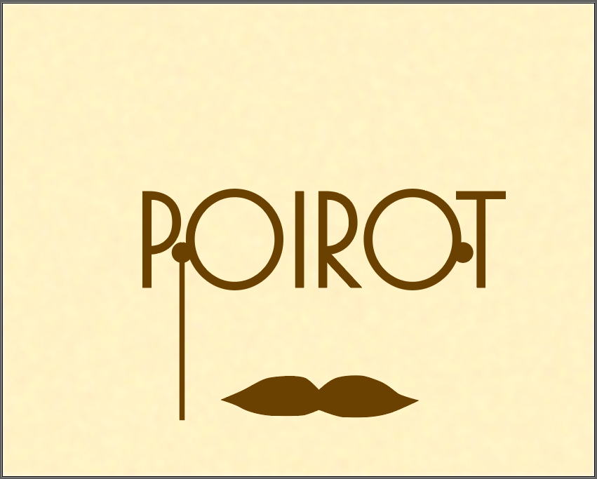
I am currently working on the History of Design Training.

I decided to make my graphic using the Art Deco style.

It’s a work in progress. And it’s taking a while because it’s my first time using an Adobe product other than pdf reader.

Filed Under: Fall 2021 - Spring 2022

  • « Previous Page
  • 1
  • …
  • 28
  • 29
  • 30
  • 31
  • 32
  • …
  • 63
  • Next Page »

link to LAITS home page

Video STA Home

© 2025 Liberal Arts Instructional Technology Services | Production Credits