Training: Color Theory
GOAL: Understand the purpose of colors and how they relate to others, as well as their societal and cultural meanings and how they may vary.
Step 1:
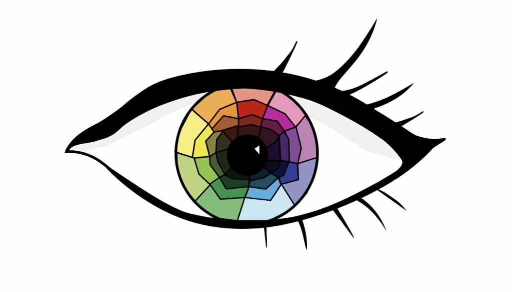
The first step of this training was to devise a color wheel. I decided to create a color wheel within an eye, which I created within adobe illustrator. It was a bit tricky at first to create such an organic shape with the curved pen tool, but with a bit of practice and tweaking I was able to make the shape work. Instead of relying on the adobe illustrator pen strokes, I used the pen shapes and created thin shapes that would look like stroke lines but be more organic and fluid.
I started out with an eye that looked like this:
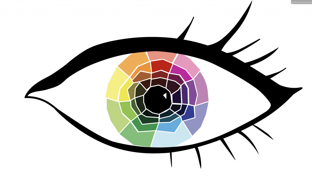
However, I felt that it looked a bit cartoonish for my taste, like something out of a coloring book. I decided to try and change the lines to a white color, and it worked much better!
I decided to also play around with shapes so that the shapes did not align quite as perfectly – this created a more playful and colorful aesthetic. I also removed the shadow that was under the eyelid, as I felt like the shading was contributing to the coloring book feel. The color wheel works such that the colors get darker as you go down, starting with tint, then going to a medium/default color, then a grey tone, and then finally a dark shade. I went with this route rather than starting with the default color as I felt visually it made more sense to show a hierarchy of lightness.
Step 2:
The second step of this training was to create a representation of value (a greyscale going from light to dark or vice versa) to go with this initial color wheel. I chose this as I felt it would complement the first eye, considering that eyes go in pairs (…generally).
I created a new eye and then began a value ring
I particularly like how this one came out, and am surprised I was able to make it in illustrator. If you look at it for long enough, the rings look as if they are moving.
Step 3:
The next step to this training was to create a color palette for three different “clients,” based off of what we learned in the KB about color and meaning. The clients were a civil war course, branding yourself, and a modern Latinx studies course.
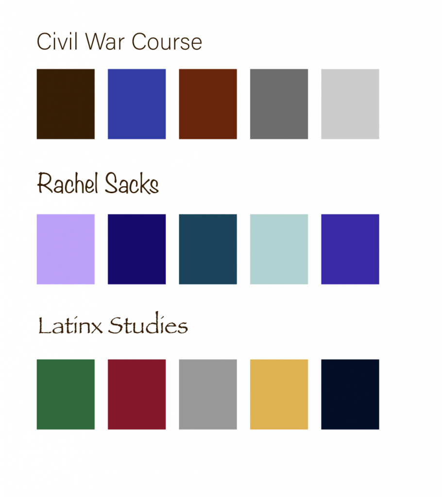
I started with these colors:
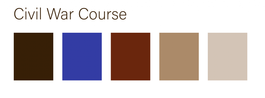
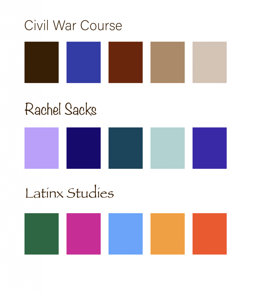
For the Civil War Course, the colors worked well, but would work even better with some sepia browns to represent the warmth of old films and papers. I kept my own color palette the same as it fit my vision well, but I decided to entirely change the Latinx Studies one. Abriella suggested I go for traditional colors rather than using the colors of one flag, as they’d appear more vibrant and relevant to a larger population. Thus, I edited the civil war course palette to look like this:
And used traditional colors for the Latinx Studies course that looked like this:
All together, they looked like this:
After finishing this, I was done with the training!
To more thoroughly explain why I chose the colors I did, I wrote this check for understanding:
Civil War Main Color: Dark Brown
- Brown is associated with professionalism, age or antiquity, continuity, and traditional masculinity. It felt like a fitting color to represent the Civil War: a historical event that dealt with soldiers and antiquated male ideals.
- I did not want to use either blue or red as those colors are associated with war “sides” more. Brown seemed to be the most neutral and professional of the colors.
- The color scheme is complementary with the blue and red, and then the rest of the colors are neutral or low in saturation. This yields a slightly last dramatic form of complementary color scheme, but still has the impact of the blue and red.
- In this case, I focused mostly on changing the hues. I made slight alterations to the tint, but maintained mostly medium-toned colors for this color palette.
- Amongst many things, purple represents imagination and creativity. These are qualities I appreciate, and I consider myself to be an imaginative person, so I felt it is a suitable color (amongst being my favorite color.) I wanted to focus on these aspects rather than the “royal” or “noble” ones, so I went with a lighter purple as it appears more whimsical and a bit less regal.
- I was torn between purple and teal, but decided to make purple the primary color as the symbolism for it was more accurate.
- This color scheme ended up being very analogous. I imagine these are the types of colors one would see in a forest at night.
- In this one the focus was primary on tint/shades with slight hue alterations, since the colors are close to each other and there is not a huge variety of hues.
- Looking through various traditional colors, this one was the one that stuck out to me the most. Green often represents freshness, energy, and ingenuity. I felt as if it was a fitting color for the primary color palette, and also fit the general tone of the class and social justice.
- I picked this color over magenta as I felt the meanings behind green were more significant overall.
- The color scheme is tetradic with various hues around the color wheel. Some colors like red and orange and magenta and red are closer to each other than others, such as magenta and blue or red and green. This allows for some analogous colors and some that are complementary.
- In this one the focus was on hue and not on tint or shade, and there is very little variation in the tint or shade beyond the main green color.
