• We are STAs
    • Asha Rountree
    • Haley Ma
    • Kate Shih
    • Kyra Lee
    • Nicholas Peasley
    • Sasha Kenney
    • Shanda Horm
    • Shriya Atreya
    • Tomas Marulanda-Mesa
  • We were STAs
  • STA Presentation
    • STA Presentation 2017
    • STA Presentation 2016
  • Testimonials
  • Resources
  • Home

STA Blog

PIP Logo

January 27, 2022 By Abriella Corker

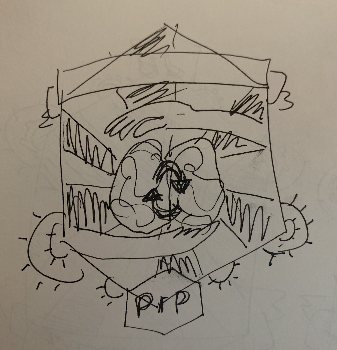
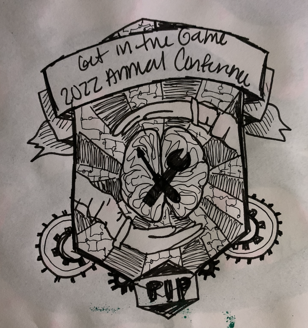
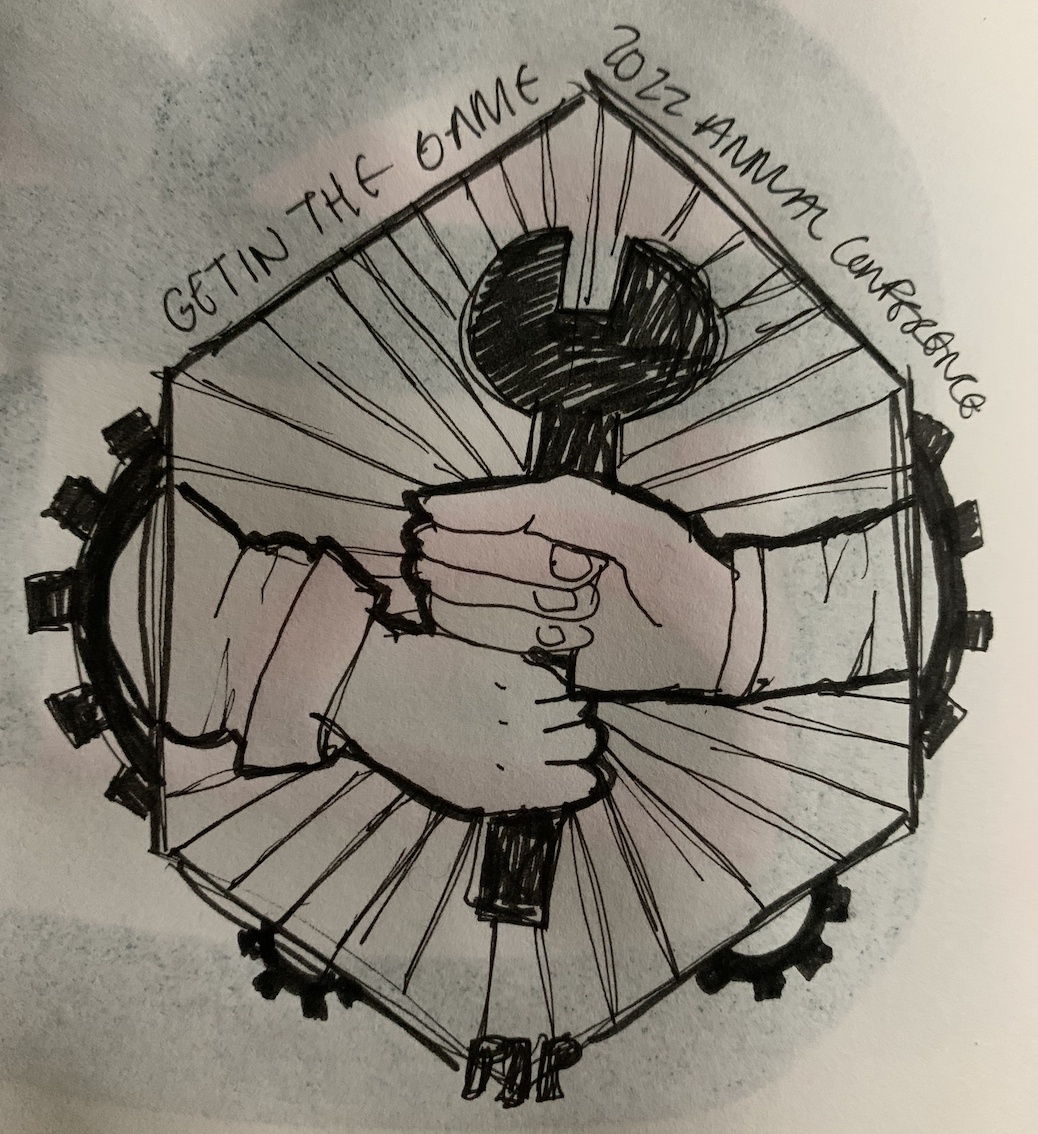
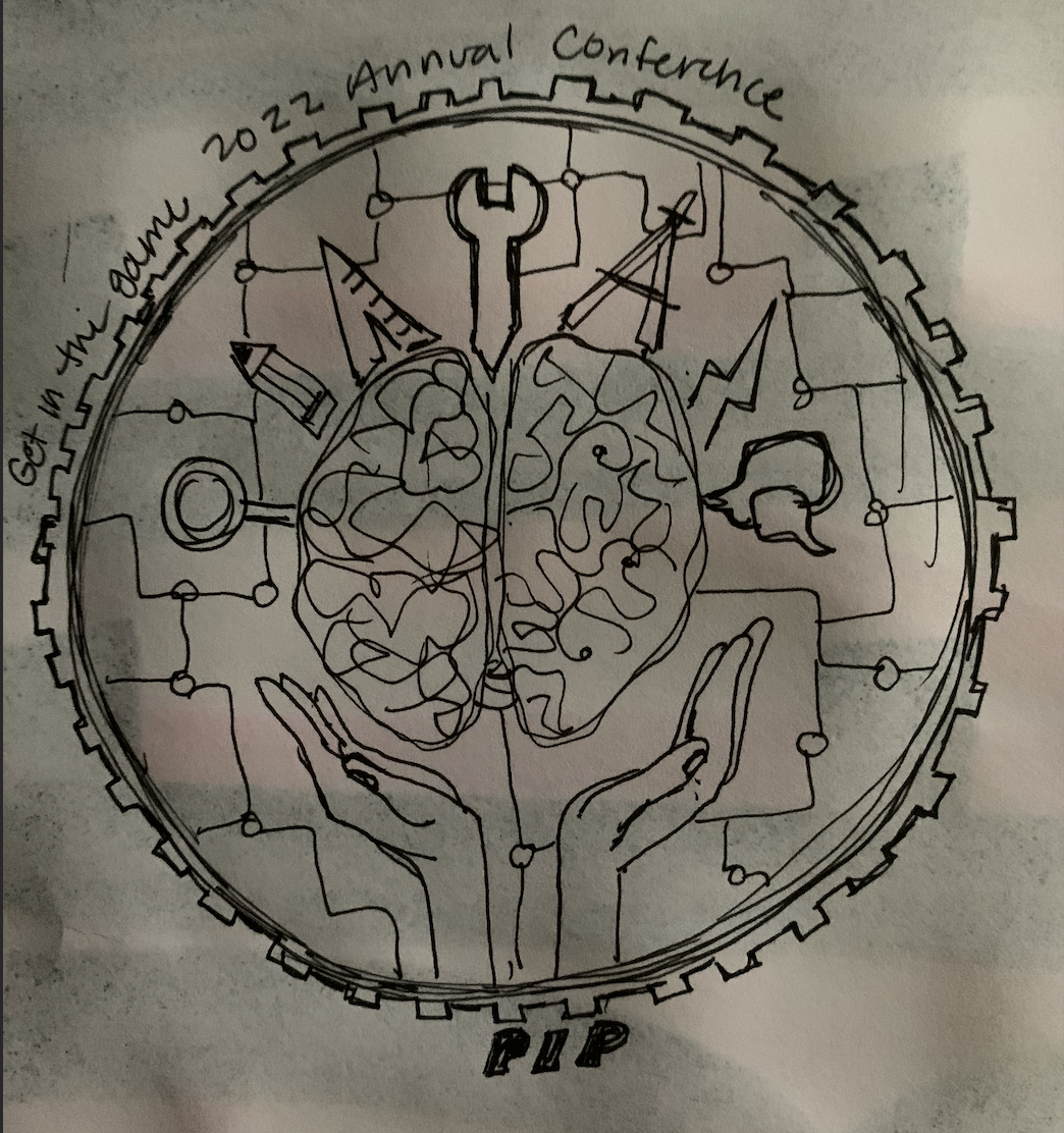
PIP LOGO DRAFTS

Project: Team PIP

Client /Prof: PIP board

Completion status: February 4, 2022

Staff guidance: Maddy Kaniewski and Suloni Robertson

STA team members: Abriella Corker

Description/plans:PIP is a consortium made of up of members (companies) that work together to develop engineering standards and policies for the industry across construction/pharmaceutical/petroleum/solar/etc. PIP is loosely connected to Construction Industry Institute, a research unity within Cockrell school of engineering.

Every year they invite their members to a 1-day annual conference featuring keynotes, speakers, & networking.
They make a shirt every year with the logo – the shirt & logo are a BIG deal to members and many have collected the shirts since the conf started in 1993.

To be completed: March 1, 2021


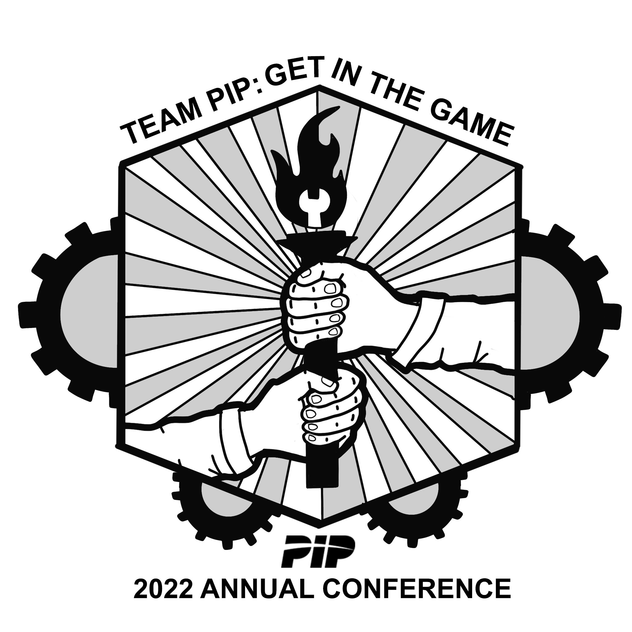
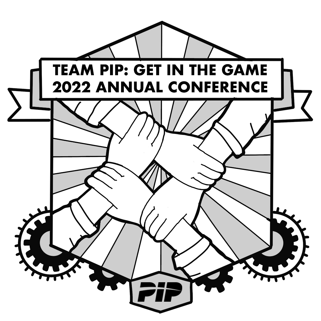
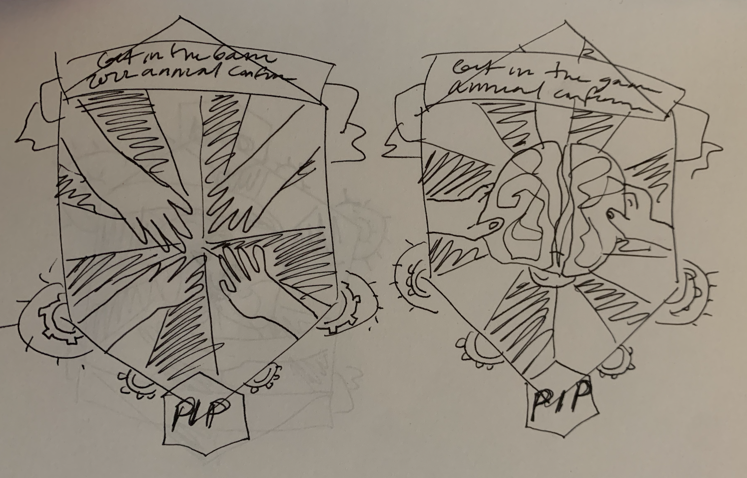
I decided to go with a badge-like logo, here are the first few drafts. The idea is to focus on images of collaboration and friendship across generation and experience of engineers in all fields.


Here are are the first cleaned up variations in gray-scale:


They want their logo on a red shirt so I drafted up a white and tan colored look. I included a blue on black as well. I am not married to any of these looks but I wanted to lay down some color to get a sense of the procress and how it might look with the line-weight which was good because I realize how I should adjust some of those things if I add color.

Filed Under: Fall 2021 - Spring 2022, We are STAs

Setting Up a New Exhibit in Canvasser KB

January 27, 2022 By Cristina Villarreal Núñez

Setting Up a New Exhibit in Canvasser KB

Project: Setting Up a New Exhibit in Canvasser KB
Client: Internal
Completion Status: Complete
Staff Guidance: Suloni Robertson, Estella Sun
STA Team Members: Cristina (myself), and Ingrid
Description/Plans: To create a new KB step-by-step tutorial on how to set up new exhibits through Canvasser for Texas Beyond History projects.  This was a project Ingrid and I worked on based on the work I’ve previously done for TBH so that future STA’s get task-specific instructions on how to work for this client through a medium that they might not be as familiar with.


Ingrid set up the KB, and I wrote the steps based on my past experience, gathered some helpful screenshots, and made a cute little banner.

Setting Up a New Exhibit in Canvasser

Filed Under: Fall 2021 - Spring 2022

GOV 371U Powerpoints

January 26, 2022 By Rachel Sacks

GOV 371U Powerpoints

This past week and a half, I have been working on powerpoints for the GOV 371U course – Politics and Film. As there are quite a few powerpoints that I have done, I will exhibit and example of the type of work I am doing in a step-by-step process.

1.) Review the old powerpoint

The first step is to review the old slides – these are created by the professor and have all the content that I need to move over. When reviewing these, I try to keep in mind the format and overall vibe the professor went for on each slide.

2.) Copying and pasting the content

This next step involves copying the content – usually with the actual copy and paste tool – onto the new template document. When doing this, I try to keep the format the same as much as possible. However, because the original powerpoint is 4:3 and does not have a picture-in-picture, there is quite a bit of structural difference between the original and the new powerpoint, which is 16:9 and has a picture-in-picture. Usually this can be fixed by moving around the images to accompany the picture-in-picture better. Additionally, there are instances when there is too much text to fit in the new slide format. This can be fixed by splitting up the text into two separate slides, this way the text can remain a bit larger and easy to read.

3.) Editing for visual clarity

The final step involves moving things around further to make sure that the slide is as visually balanced as possible. Ingrid has been incredibly helpful in this step, and we have been able to solve some tough formatting situations!

As you can see in this transfer, I kept the main “feel” of the original powerpoint, while moving things around to fit the format. I decided to place the two film images next to each other to create more balance than if “Idiocracy” was placed on lower than “Borat.” Sometimes, I try to have the film images perfectly align next to each other, but this can only be done if they are the same aspect ratio.

A few other ways I tend to organize the images include:

A tryptic-style where they overlap each other – usually I do this when there isn’t a lot of extra space and the images can be inferred even if a bit is covered up.

A scatter style, if there is enough space and only a small amount of images.

Single images are usually the most straight-forward – as you can just place them to the right of wherever the text is.

Things I’ve learned (and learned to avoid doing):

  • Do not try to move the text to the right of the image – it throws off the general balance of the powerpoint
  • 2-3 images has the best overall visual balance. 1 is okay, and more than 3 can be too cluttered
  • Images that have the same aspect ratio look the best together
  • Text does not always have to be the same size every slide, but should be as consistent as possible (i.e. located in the same place, and as little variation in size as possible)
  • It’s better to keep all the text closer to the left of the slide. People typically have trouble reading horizontally-long lines, and have an easier time reading vertically (which is interesting, as many languages have entirely vertically-set reading systems.)

And that’s it! I’ve learned quite a lot doing these powerpoints for this course. I’m not certain I could ace an exam in this class – but maybe a quiz?

Filed Under: Fall 2021 - Spring 2022

Week 15

January 25, 2022 By Rahul Palla

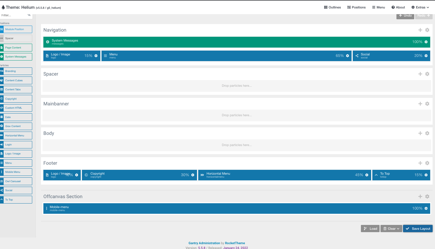
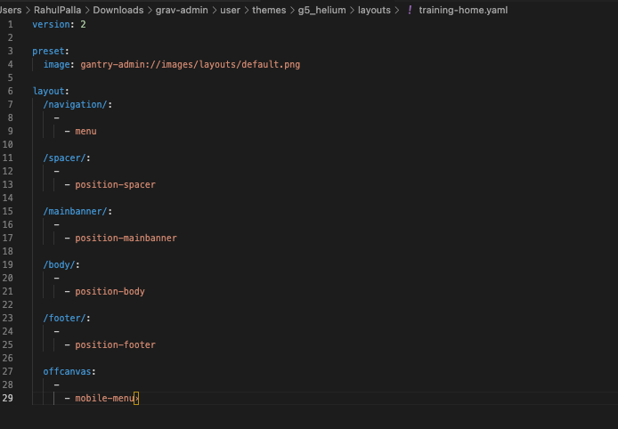
Update: This is what my current site looks like:


Hey everyone. This past week has been my first week back since last semester and I’ve mostly been using it to do the “Create a Grav site from scratch using Gantry 5” training. It’s a pretty large training so it’s been taking some time but here is what my current progress looks like:


Filed Under: Fall 2021 - Spring 2022, We are STAs

January 24, 2022 By Ingrid Alberding

Hello, blog! It’s been a little while.

I’ve been working on several different things, listed below:

UT in Context

Before my week-long break, I prepared a mock-up for UT in Context, which I handed off to Thuy and Estella for further development.

GOV 371U PPTs

I’ve been helping give Adrian and Rachel feedback for a reformatting project.

MUS307 Icons

I sent off final icons (PNGs) and pre-formatted icons off to the professor.

MIS 320F

I prepared a TA Vertical Monitor for this course.


https://sta.laits.utexas.edu/blog/2022/01/24/43280-2/

Filed Under: Fall 2021 - Spring 2022, We are STAs

Germanic Studies Flyer and Graphics

January 24, 2022 By Cristina Villarreal Núñez

Germanic Studies Flyers

Happy new year!!! I know January is almost over but here’s to hoping that the rest of the year brings great things to us all 🙂 In other news, let me tell you about this project…

Project: Germanic Studies Flyer
Client: Dr. Hans C. Boas
Completion Status: In progress…
Staff Guidance: Suloni Robertson, and Abriella Corker
STA Team Members: Cristina (t’is I), and during my winter break absence, Abriella Corker
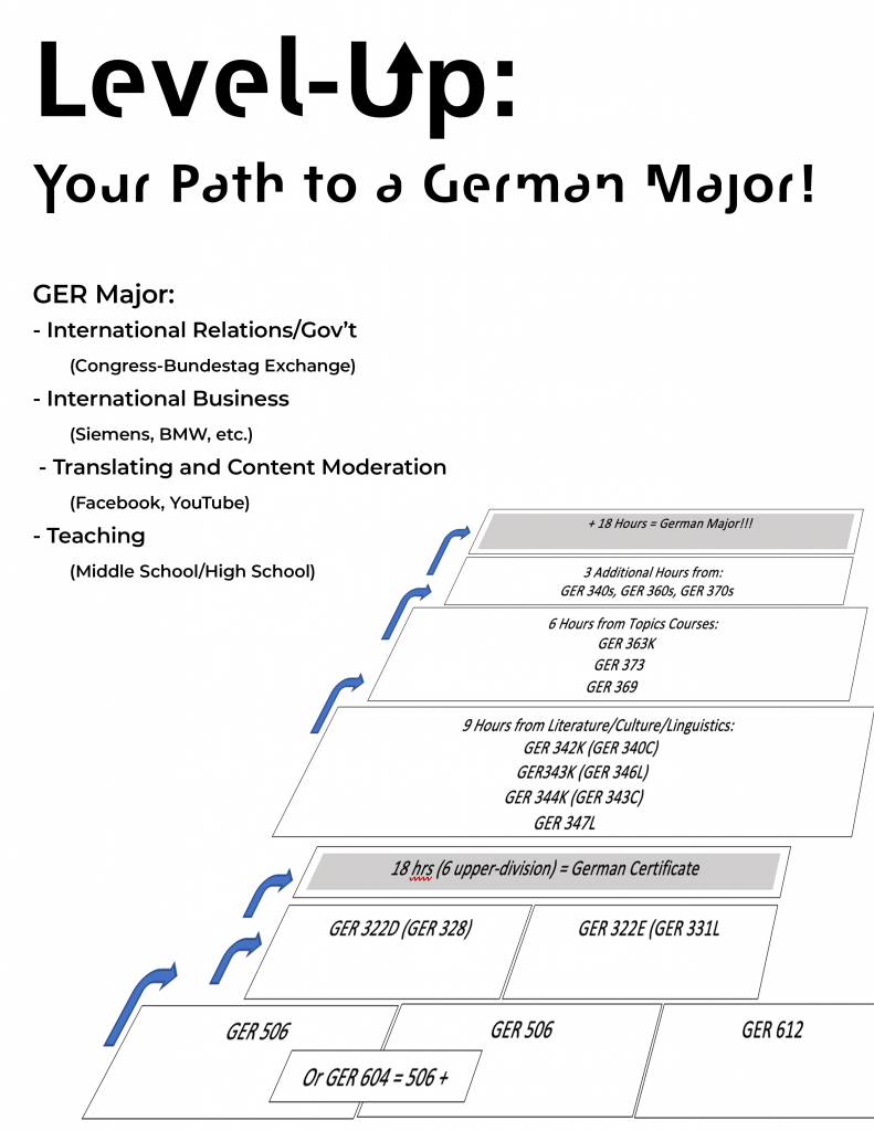
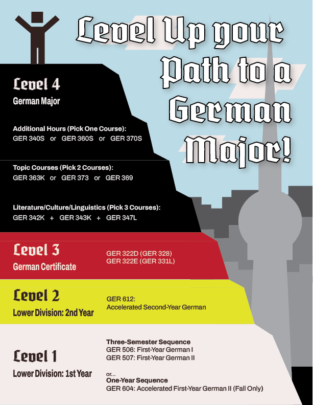
Description/Plans: To design a unified flier that explains to UG students what is needed to get a German certificate and/or a German major.


So, first things first, I started out the project back in December (pre winter break), by proposing a few design ideas like colors, fonts and mockups to define a style, and send those out to get feedback and also have Dr. Boas answer additional questions I had.


These are a few examples of what I ideated:


As I waited for a response, I started drafting some ideas of what I thought the format could look like.


Afterwards I had to leave for the winter break, so Abriella took over the project…


Based on Dr. Boas’ response, Abriella moved the project forward in this direction concerning colors, fonts and themes…

But when I came back, I reviewed the project and made some adjustments to the concept for the format.


Eventually, with the support of Suloni and others in our daily check-in meetings (brought to us by the Omicron variant therefore having to revert to remote work mode), I was able to play around with the colors and style a bit more.


Moving on, I sent two of the previous styles to Dr. Boas, and now I’m awaiting feedback. I’ll keep you up to date with this project as soon as possible….

Filed Under: Fall 2021 - Spring 2022

  • « Previous Page
  • 1
  • …
  • 21
  • 22
  • 23
  • 24
  • 25
  • …
  • 63
  • Next Page »

link to LAITS home page

Video STA Home

© 2026 Liberal Arts Instructional Technology Services | Production Credits