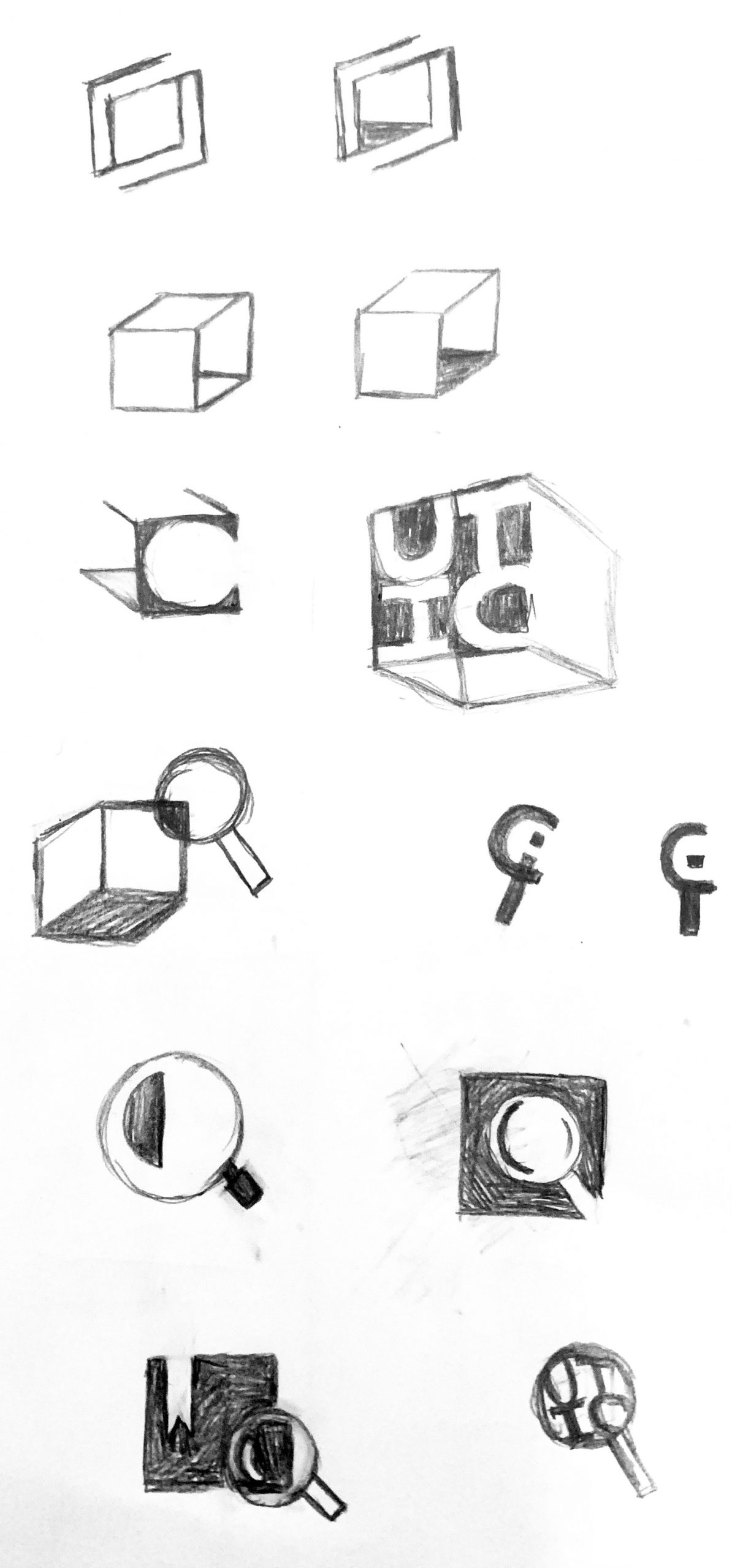
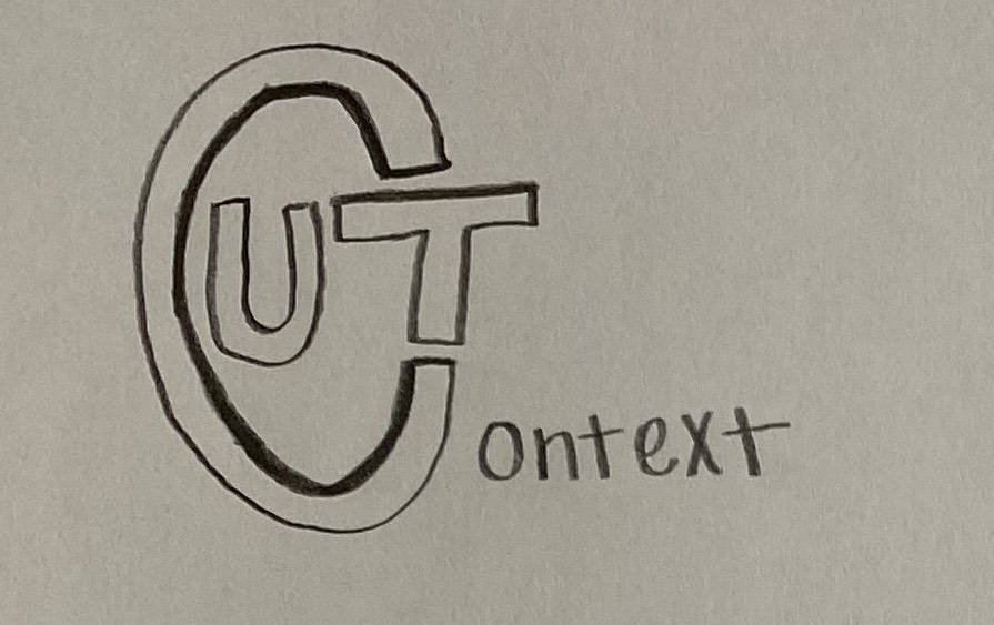
• We are STAs
    • Asha Rountree
    • Haley Ma
    • Kate Shih
    • Kyra Lee
    • Nicholas Peasley
    • Sasha Kenney
    • Shanda Horm
    • Shriya Atreya
    • Tomas Marulanda-Mesa
  • We were STAs
  • STA Presentation
    • STA Presentation 2017
    • STA Presentation 2016
  • Testimonials
  • Resources
  • Home

STA Blog

Graph Re-Design

February 7, 2022 By Abriella Corker

Graph Re-Design


Professor Boas wanted to have the two graphs he made re-designed into simple black and white charts. He was kind to provide us with accompanying text to help me understand the flow of the chart in case it needed any adjustments. The goal was for simplicity and no filled-in shapes. Here is my first round of drafts:

Filed Under: Fall 2021 - Spring 2022

coding tbh site explorer (part 2)

February 7, 2022 By Marianne Lê

new tbh site explorer dev

i got the pin to move (thanks to Ruben)

more than halfway through the site list

Filed Under: Fall 2021 - Spring 2022

UT in Context Logo

February 2, 2022 By Sheryl Long

Project: UT IN CONTEXT Logo

Stage I: We met with Celeste and gathered these basic parameters for the logo:

  • No burnt orange
  • No images of the tower or buildings
  • No symbolism of UT in general
  • The do not want the “UT in Context” to be turned into a logo, they would like an image to be alongside the name of the site.
  • Suloni would like to see a logo version using roots, Abriella suggested magnifying glass
I went for a box design since the client seems to like the “in” aspect of UT in Context, but before we get to develop my first draft, Suloni had another meeting with the client and brought back the news that the client would like to see their original draft refined. So we are moving forward with one of the sketches they provided us:
Stage II: New parameters provided by the client:
  • Does not want it to read “Cut,” make the “C” a design element/art object 
  • Would like a encapsulating/enclosed shape that is holding “UT”
  • “C” will be more like a stroke/shape, “UT” will be a font that goes with the website
  • Suloni would like to see a version where the “C” shape is made out of dots
  • The “C” shape should be able to stand by itself, iconic, recognizable, distinctive
  • Start with monochromatic versions, eventually “C” shape will be read and “UT” will be black
  • Test out how the “C” shape looks next to the full title(play with different placements)
  • Try a version with drop shadow(like the sketch above)
Abriella and Suloni both suggested to try the paint and scan method, so here’s me trying it:
1. Made some “C” with different brushes and paint
2. Scanned and vectorized
Abriella marked the ones with potential, I will continue developing and refining those.
Suloni suggested less texture and wanted to see versions with dots.
Stage III:
Got rid of texture

Filed Under: Fall 2021 - Spring 2022

PSY 341K

February 2, 2022 By Sheryl Long

Project: PSY 341K Backdrops
Client: Dr. David Yeager
Completion Status: In progress…
Staff Guidance: Suloni, Maddy
STA Team Members: Cristina, Abriella, Rachel
Description/Plans: Each STA is drafting up a couple of backdrop designs following their theme. Cristina did word cloud and photo strips & grid, Rachel did icons, Abriella did brain pattern, and I did silhouette.

Filed Under: Fall 2021 - Spring 2022

PSY 341K Course Graphics

February 2, 2022 By Cristina Villarreal Núñez

PSY 341K Course Graphics

Project: Course Graphics for PSY 341K
Client: Dr. David Yeager
Completion Status: In progress…
Staff Guidance: Suloni Robertson
STA Team Members: Cristina (yo), Abriella, Sheryl, and Rachel
Description/Plans: Full plan is to make course graphics for this class. Short term plan, we had to make various different drafts for the digital backdrop so that the professor can choose and use one ASAP.


These are my drafts…


Oh, and as you might have noticed from those designs, that image is not one of our usual template “professors” to test out the backdrops. That’s because that person is actually the professor for this course. Following advice from Suloni, I took his image from our LAITS files and edited it into a new template, so that he himself could see the a more realistic version of what his classes would look like with our backdrop designs. Here’s that image:

Filed Under: Fall 2021 - Spring 2022

Beginning of Bezier Curves Training

February 2, 2022 By Rachel Sacks

Bezier Curve Training

The Bezier Curve training involves taking a stock font letter and using Bezier Curves in adobe illustrator to alter that into a symbol used for a logo.

I began with an “R” in the font Adam Warren Pro, which looked like this:

I picked this font to create myself (another) logo, and felt the handwritten style would work well with the type of look I was going for.

With Bezier curves, I began altering the R to look less clunky, and to have more personality:

The main thing I wanted to do here was create a sense of motion with the R – as if it was pulling towards the right. Thus, I added the long legs to the R’s endings, and also rounded out the top. Next, I added various shapes, colors, and bottom text to make it feel more like an actual logo. I decided to add a gradient to the R as well as an outline to it, to give it a more futuristic look.

I will update this more as I am given more changes to make to it!

Filed Under: Fall 2021 - Spring 2022

  • « Previous Page
  • 1
  • …
  • 19
  • 20
  • 21
  • 22
  • 23
  • …
  • 63
  • Next Page »

link to LAITS home page

Video STA Home

© 2025 Liberal Arts Instructional Technology Services | Production Credits