Bezier Curve Training
The Bezier Curve training involves taking a stock font letter and using Bezier Curves in adobe illustrator to alter that into a symbol used for a logo.
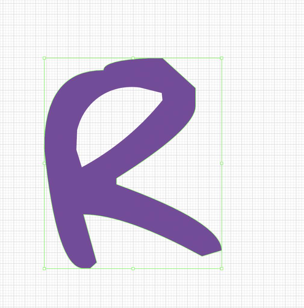
I began with an “R” in the font Adam Warren Pro, which looked like this:
I picked this font to create myself (another) logo, and felt the handwritten style would work well with the type of look I was going for.
With Bezier curves, I began altering the R to look less clunky, and to have more personality:
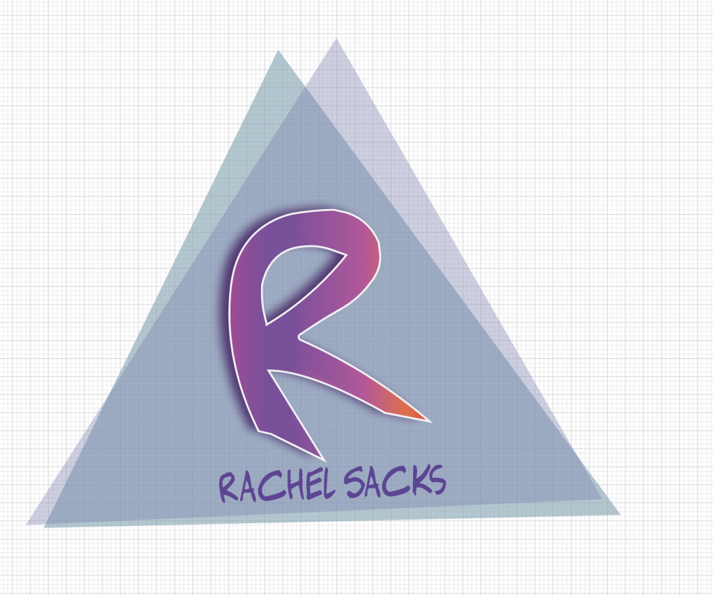
The main thing I wanted to do here was create a sense of motion with the R – as if it was pulling towards the right. Thus, I added the long legs to the R’s endings, and also rounded out the top. Next, I added various shapes, colors, and bottom text to make it feel more like an actual logo. I decided to add a gradient to the R as well as an outline to it, to give it a more futuristic look.
I will update this more as I am given more changes to make to it!


