The client wanted depth added to the elements; not gaudy and not minimal
After chatting with Suloni, we decided to get rid of the border to give elements more space and to use styling from the Texas Beyond History site.
The client wanted depth added to the elements; not gaudy and not minimal
After chatting with Suloni, we decided to get rid of the border to give elements more space and to use styling from the Texas Beyond History site.
On Wednesday and Friday, I made quite a few alterations to the Dana Center Arkansas pages based off of the requests by the client. The primary changes they were looking for were to make room for citations in the bottom of the second page of both sets of pages. This required me to rethink how the pages were structured slightly, and also change some of the margins. Fortunately, the clients also shortened much of the text, which made it quite a bit easier to make room for citations. Besides changing the citations, the clients also had some wording and design change requests, and wanted unique titles for each cover page (previously, the cover pages had been the same for both sets of pages.) The current drafts look like this:


Currently, I am waiting to hear back from our clients about any further changes to make to these pages. I will update my blog about these changes ASAP!
After hearing back from our client, I made a few more changes to these pages. These namely were changes with the citations:


In my old draft, I had make some mistakes with the bulleting:
As you can see here, InDesign accidentally bulleted every single line rather than the sentences I specified. I fixed that in this draft!
I also fixed a few other formatting things, such as alignment and font sizing. I am sending this back to the client, and will update once more depending on how it goes.
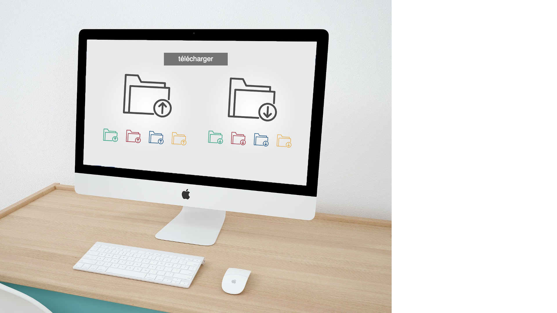
How to Upload a Homepage Banner
Notification comments: etiquette, files, questions, feedback
@ your STA mentor and Suloni in your comments when you want to:

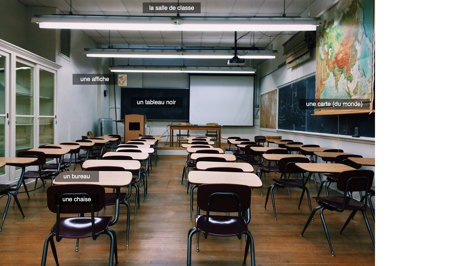
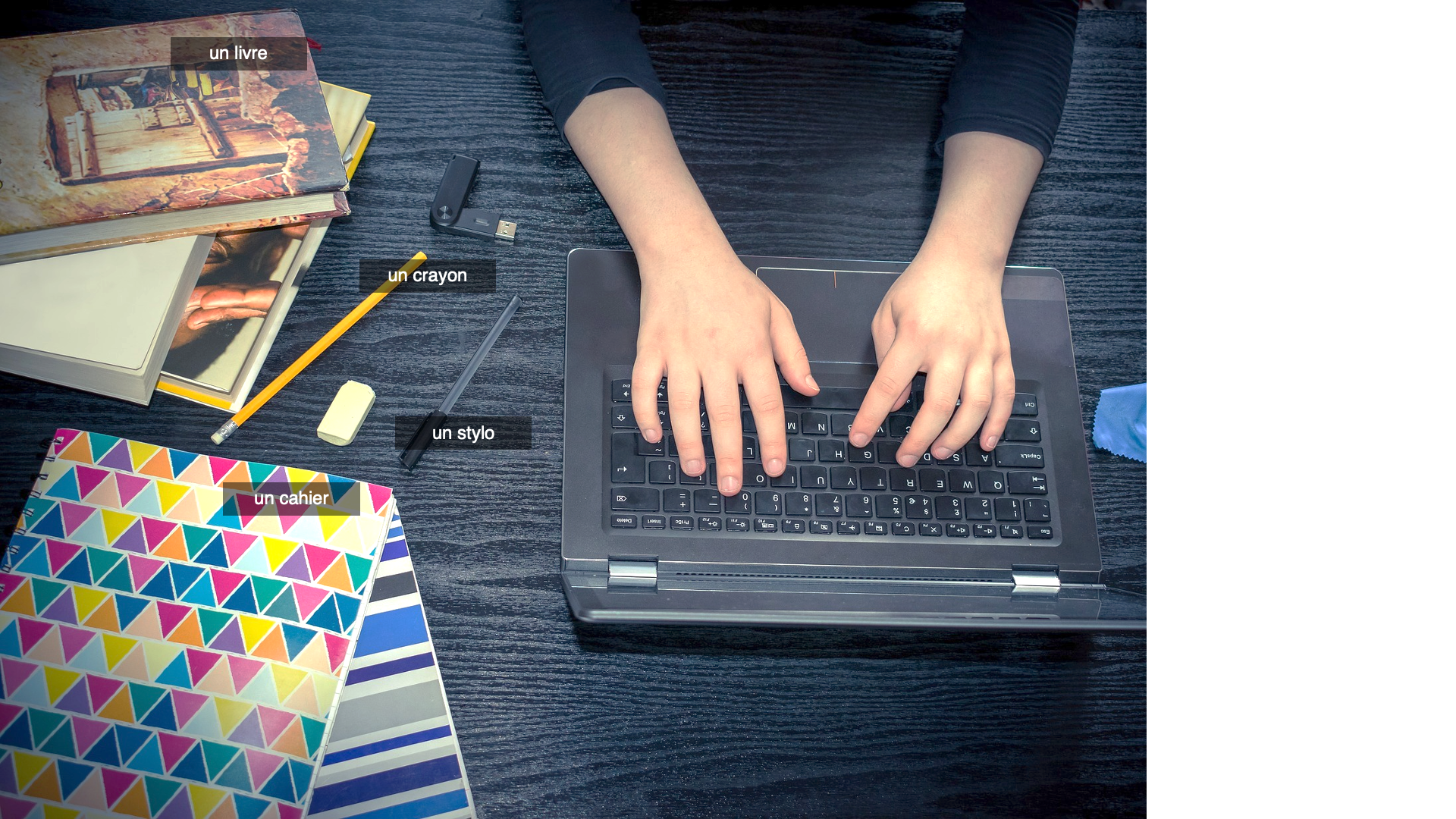
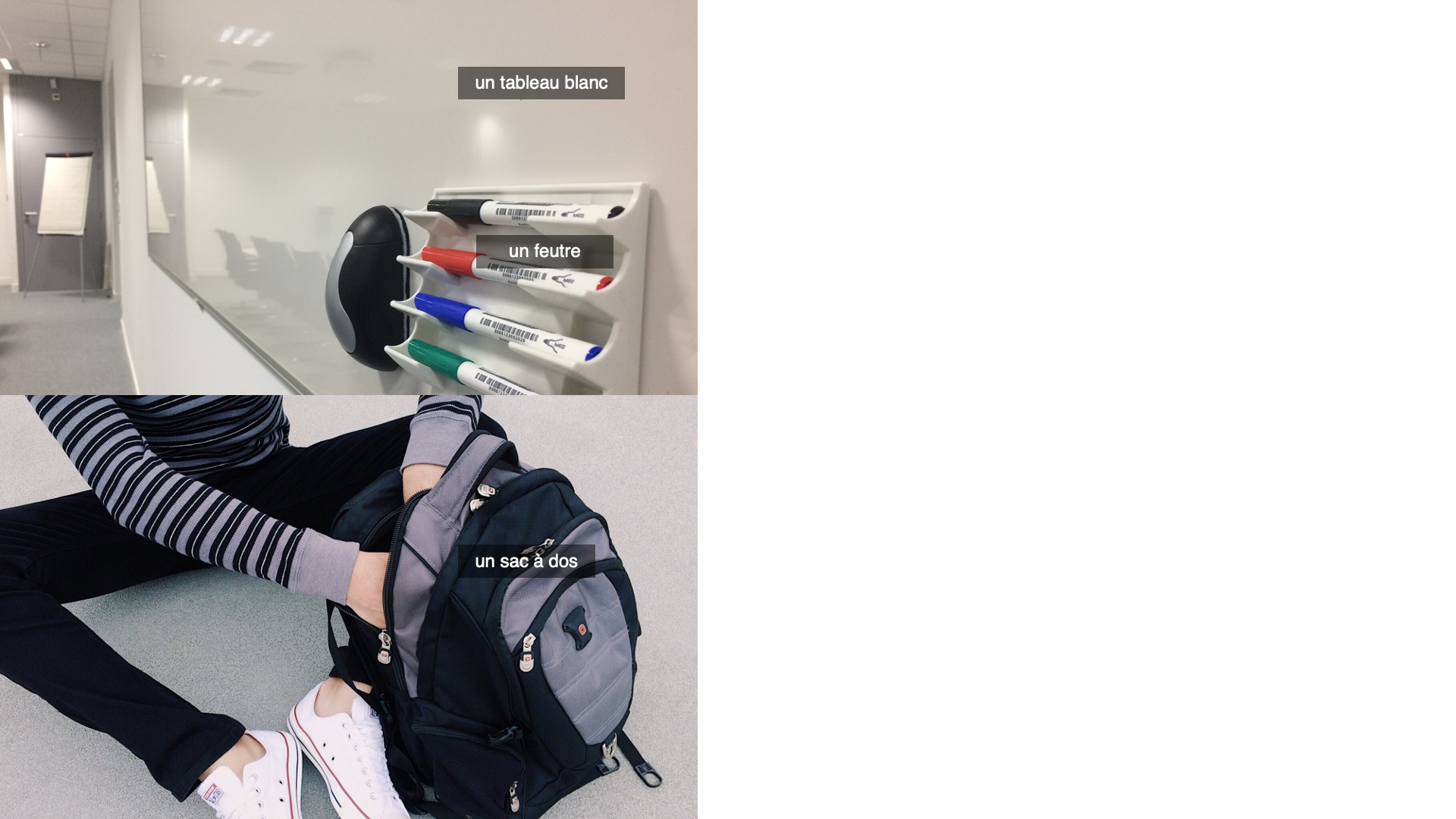
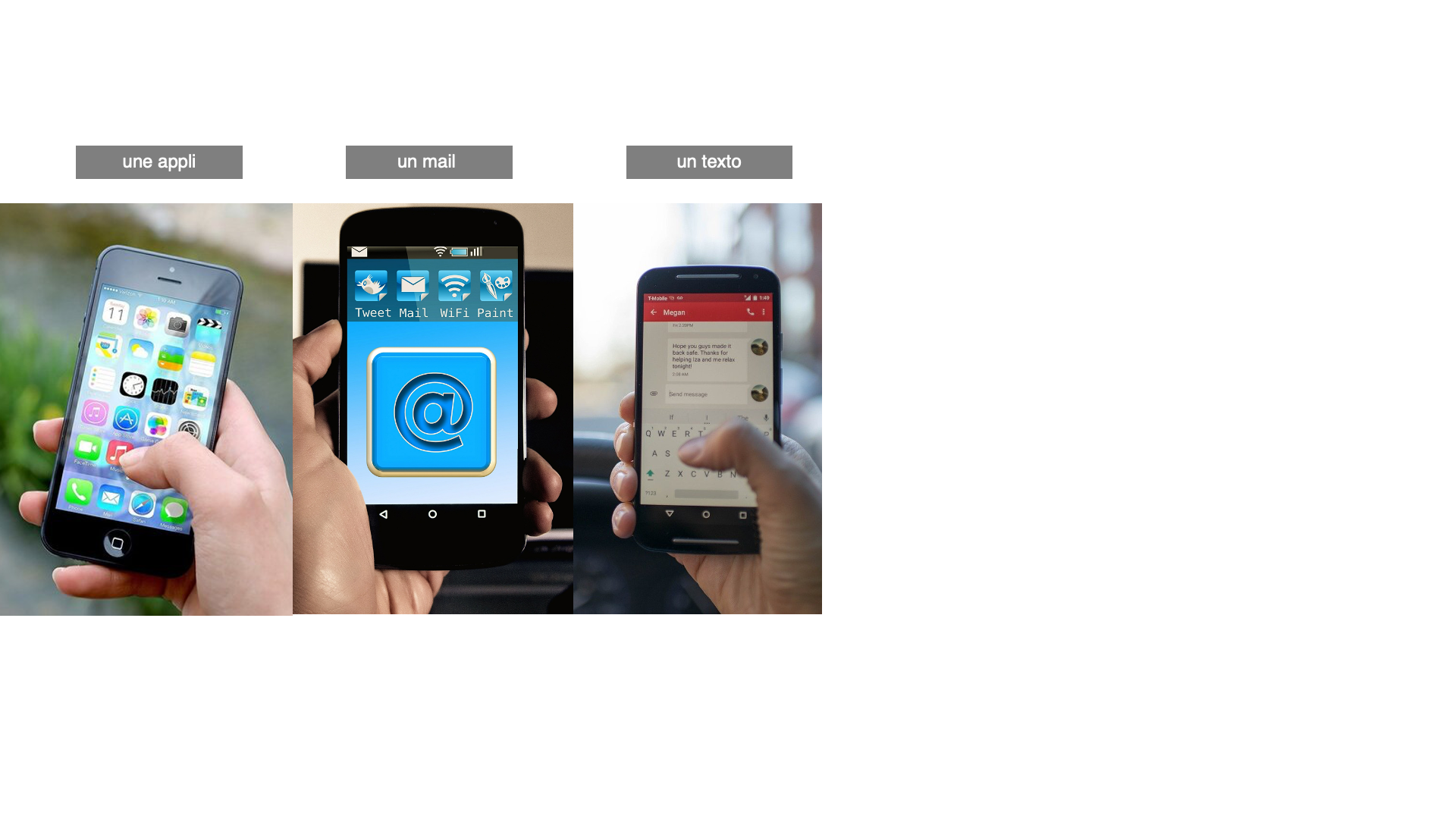
Yazz, one of our clients provided me with a list of classroom objects and digital classroom objects she needed images for to be translated into a PowerPoint and projected onto a green screen. We tried to get as many images in a single photo as possible. Commercial use attribution-free images were harder to find for the digital version so some only have 3 or less on a slide. I had about 4 days to make two different powerpoints.

Another list was provided with the numbers 1-20. They wanted to use dice to represent this and luckily Valerie had a 20 sided die? dice? and took photos for me to place inside the PowerPoint. Yazz came back with a request to fill in the numbers to be black so I added in that. I also added a throwing the dice animation for each slide so they are more interactive.
https://utexas.box.com/s/0iquk47fjowthqv5bjn9k7rsbxplzqev
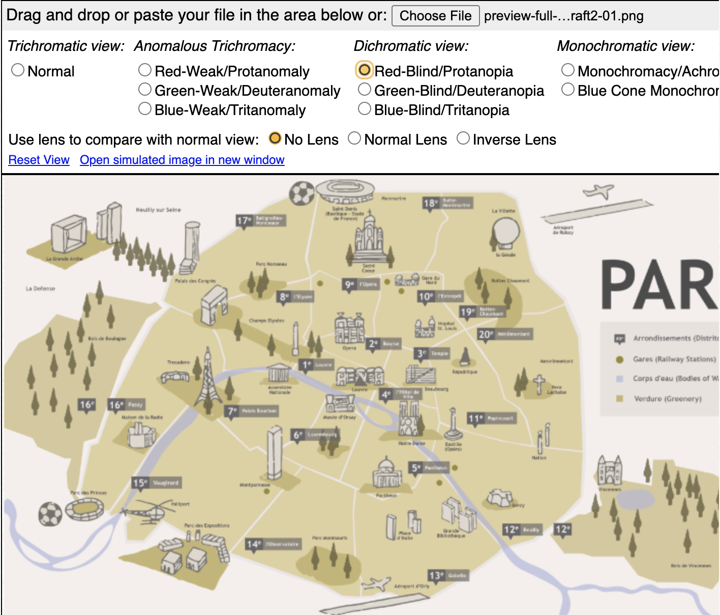
The French textbook map is has been completed and will be used on the platform Lingco as supplementary material. The first two images were the maps I was given to combine into a single image. It contained a lot of detailed names of places I had to type out and sometimes look up because the text was too pixelated and monuments that I had to illustrate and rasterize by hand. The clients were satisfied with how the map looked so I moved forward with adjustments on contrast so that maps legend and features are distinguishable among different color-blindnesses. I found that it’s not so much saturation that matters than it is the contrast in values. I made the railway stations a lot brighter against the background. I also darkened all the text.


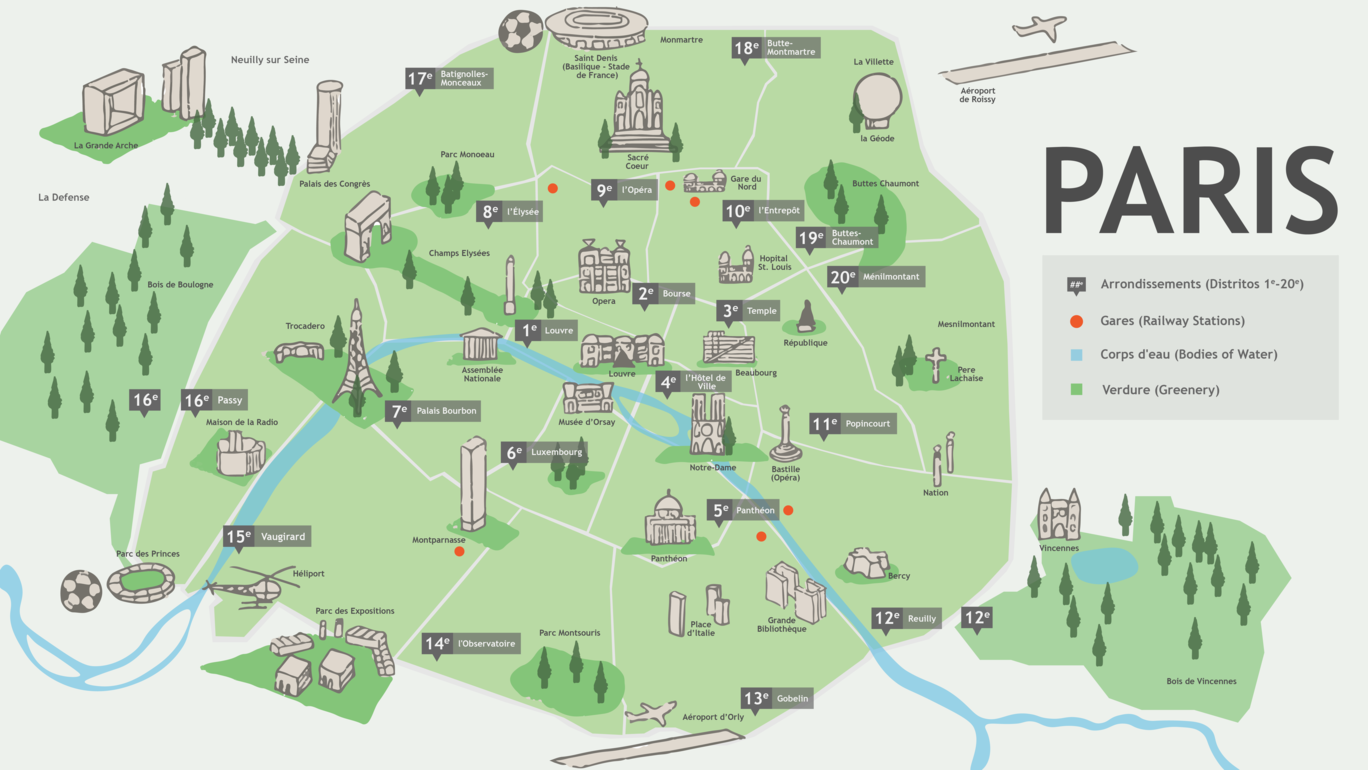
Here are what the maps look like in the different simulators:


Sort of? I’ll say this covers the week of 2/28-3/03. That’s good enough.
We’re waiting on final client feedback, but this one is pretty much wrapped up. I was proud enough to overcome my laziness and actually assemble a design menu for one!
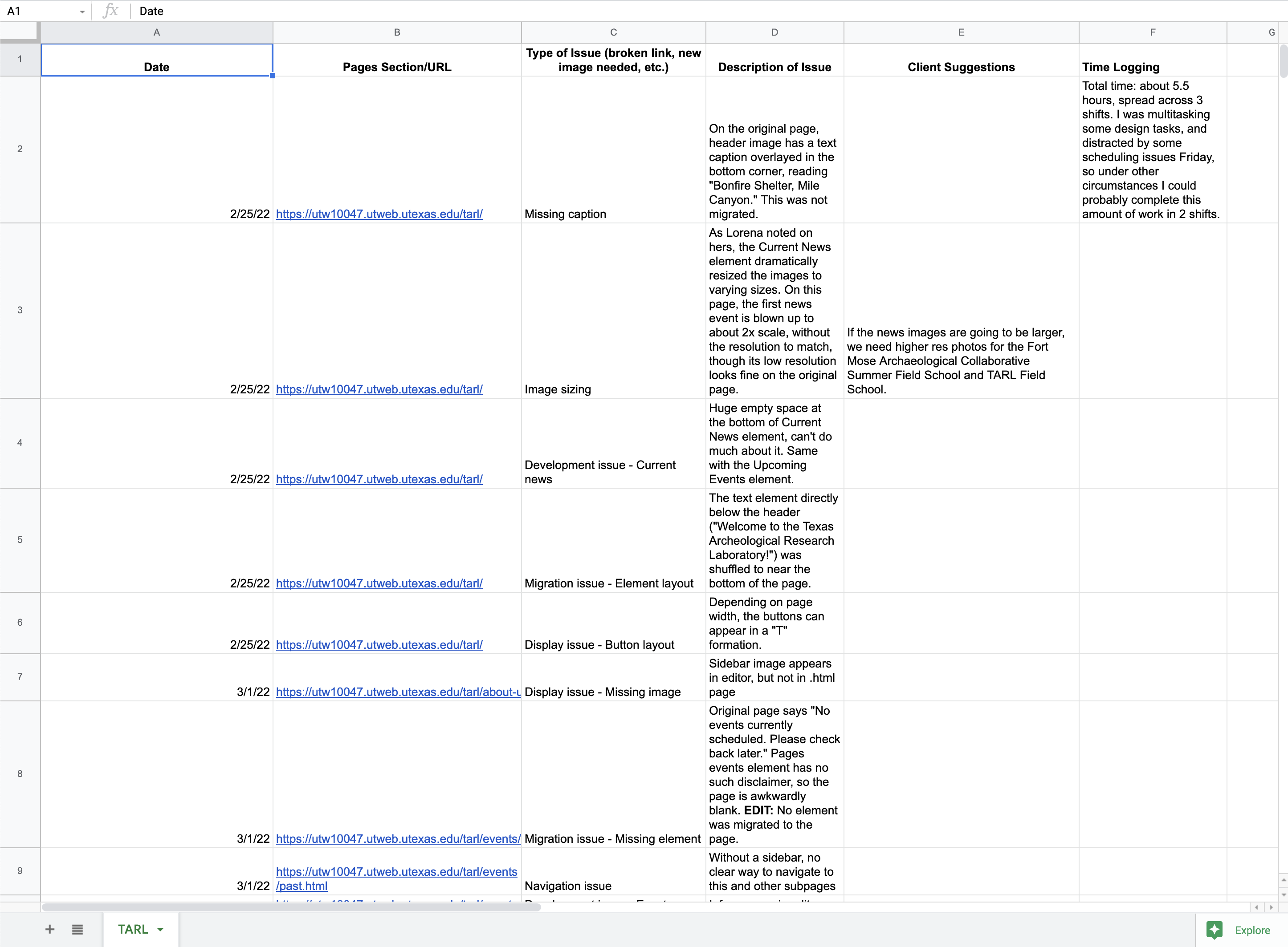
Not too much to report here yet, but we’re troubleshooting auto-migrated sites and logging how long it takes to go through different sizes of directories. I didn’t make this spreadsheet, so I haven’t bothered to elaborately color-code it yet :p
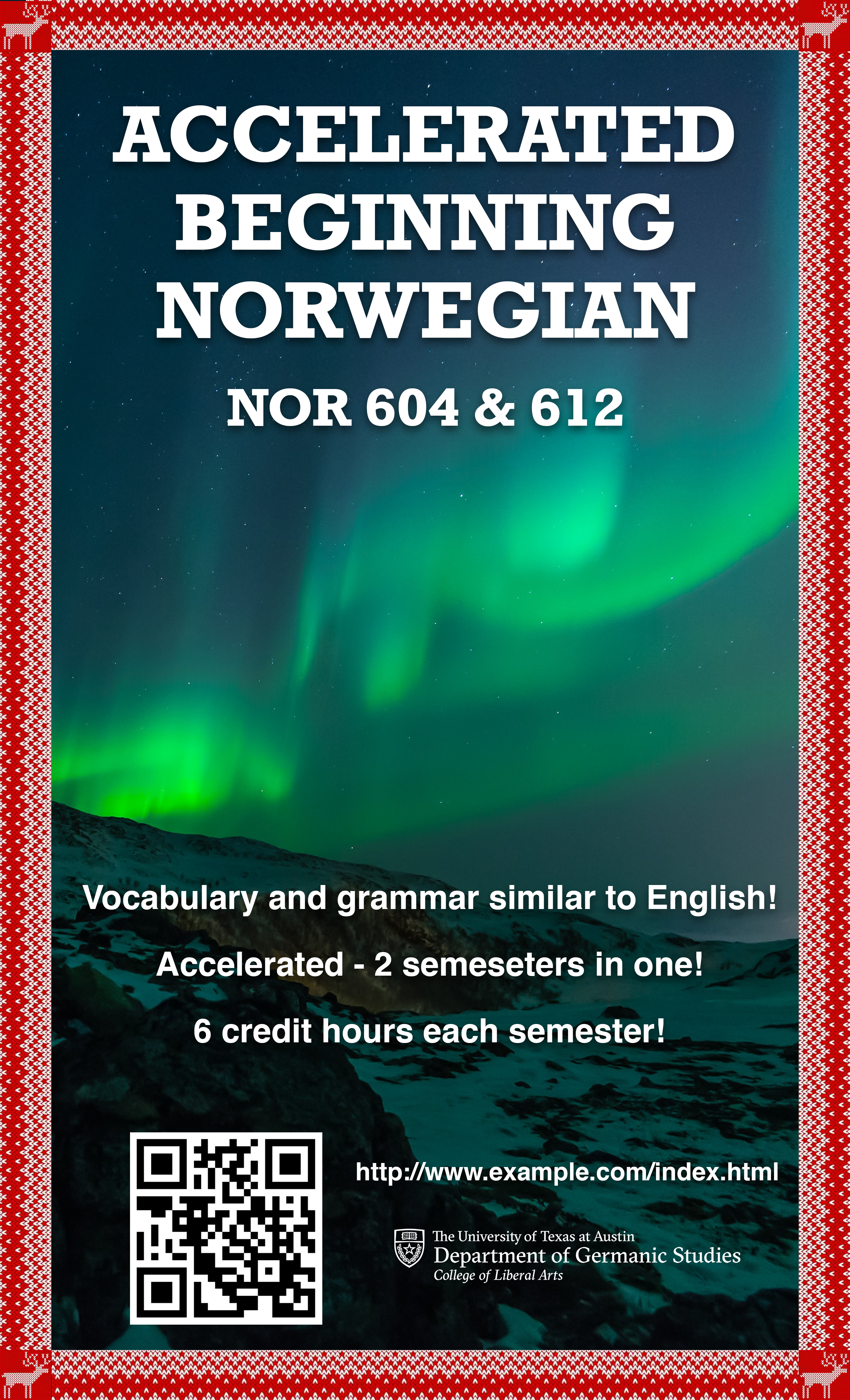
Project: Norwegian Flyer Design Request
Client /Prof: Boas, Hans C
completion status: WIP
staff guidance: Suloni Robertson
STA team members: N/A
description/plans: Design a promotional flyer for one of the smaller COLA languages in order to boost enrollment.
To be completed: April 4th
Pretty straightforward – this is the example given by the client. 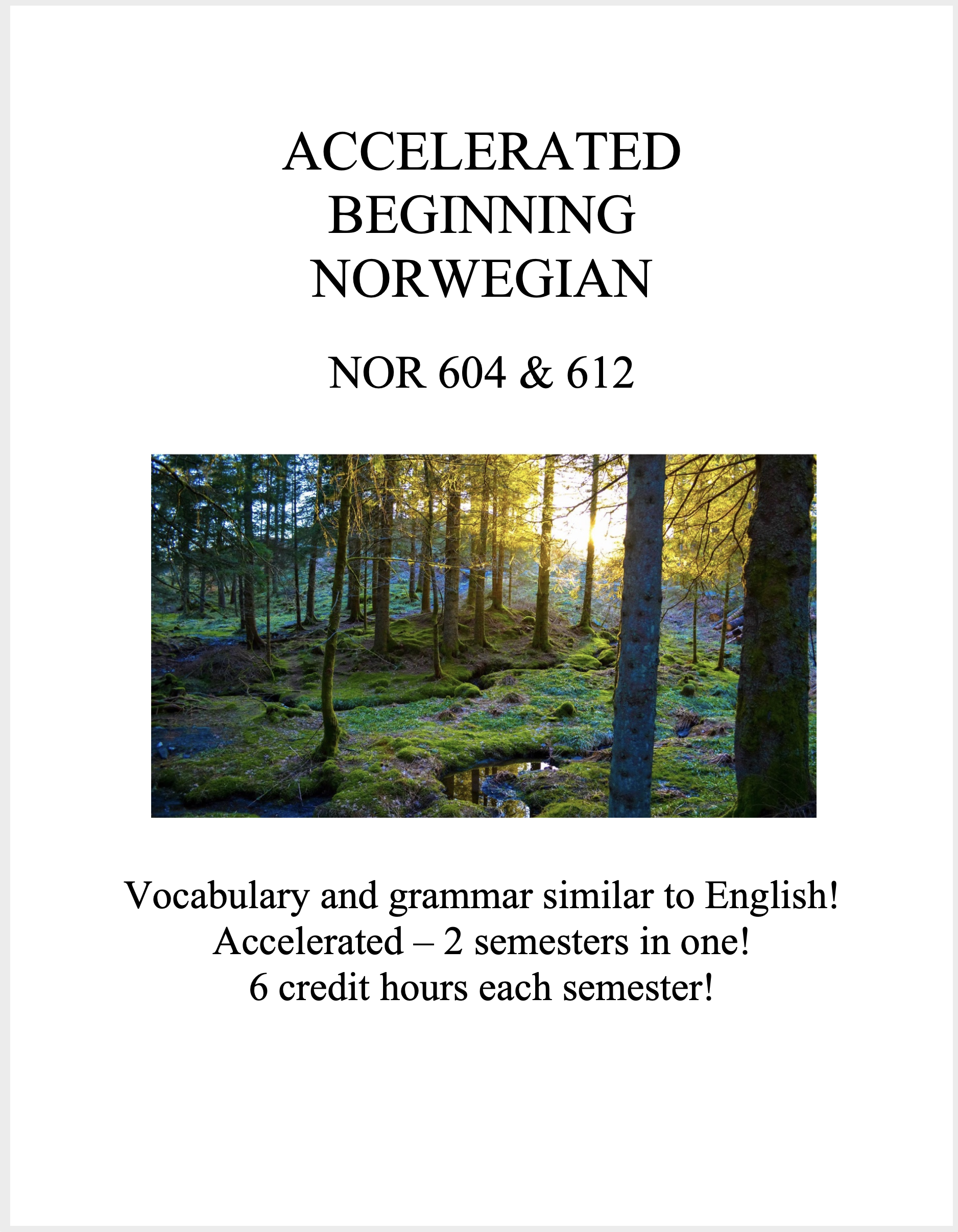
They wanted a theme of Norwegian nature/scenery. I was very disappointed to find out John Bauer was Swedish, not Norwegian, but looking more into fairy tale illustrators I remembered Theodor Kittelsen, who did some very nice landscapes too. These 2 are my main drafts for the first round of client feedback, 1 painting and 1 photo.
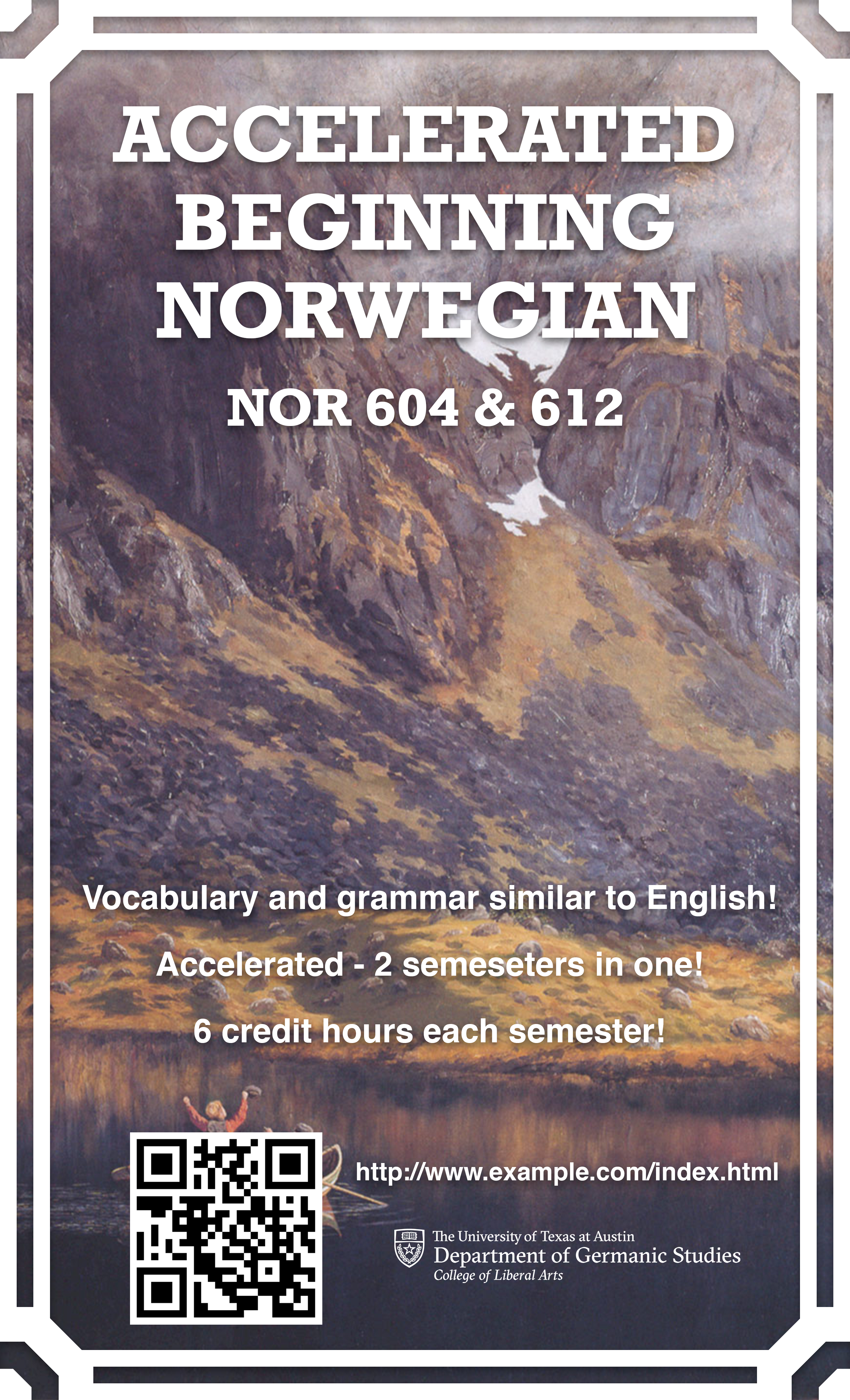

Lastly, at Suloni’s suggestion, I tried incorporating some Norwegian embroidery and an aurora borealis. Not sure how they look together, but I may end up using the elements in other ways.