Update on Things and Stuff (October 24)
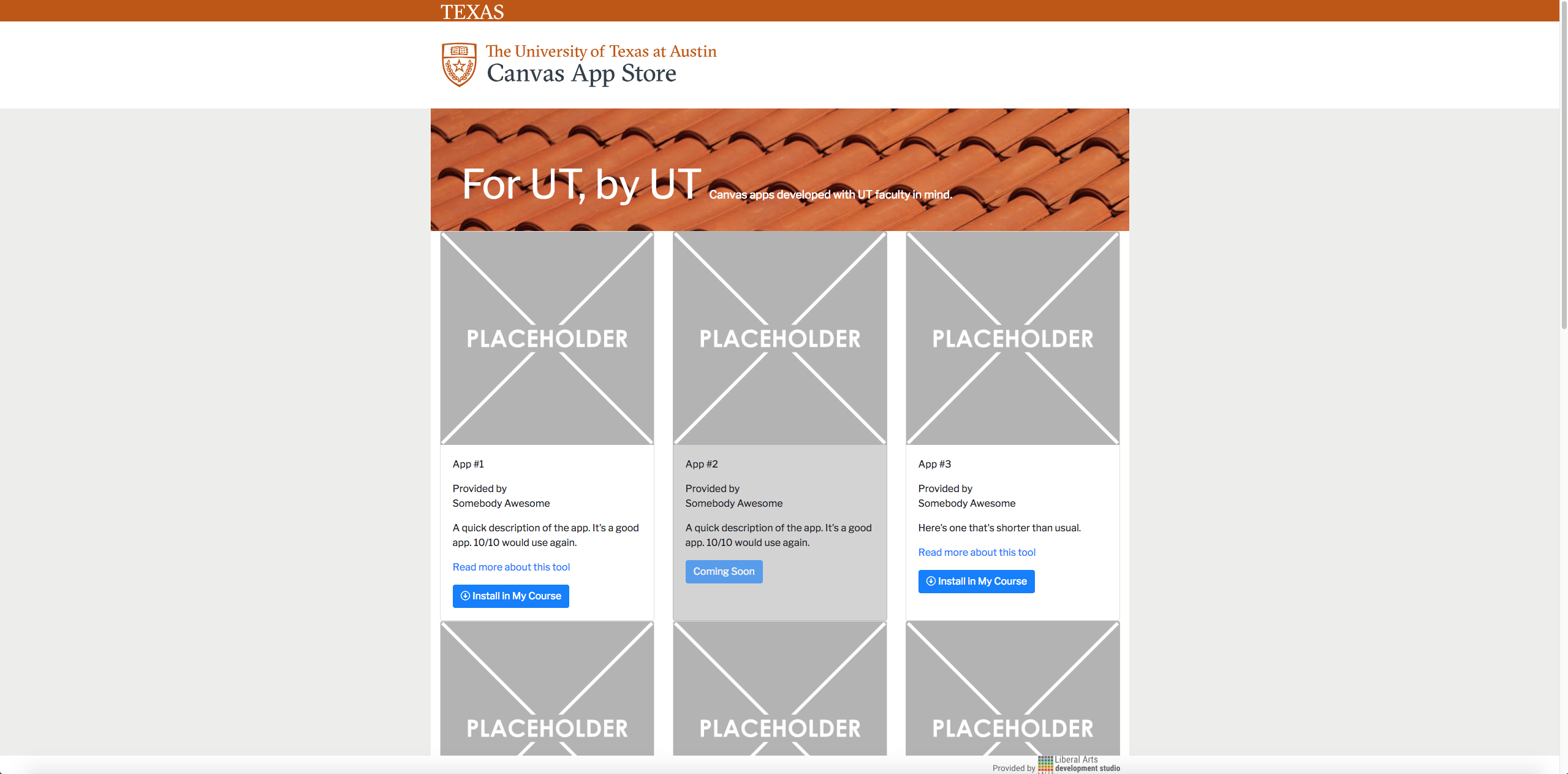
UT Canvas App Store
project: UT Canvas App Store UI Design
Client /Prof: LAITS
completion status: Started July 27th, 2018, finished mockups, currently being coded on up by Sanika
staff guidance: Suloni, Marla, Chad, Andre, Chris
STA team members: Sanika! (CSS)
description/plans: Create page mockups for a new App Store for Canvas apps developed by UT
To be completed: October 2018


LAITS Computer Support Webpages
project: LAITS Computer Support Webpages
Client /Prof: LAITS
completion status: Started Oct. 10th, 2018
staff guidance: Suloni, Tim, Mike, Aiden
STA team members: na
description/plans: Create page mockups for more user friendly and self-help focused Computer Support UI
To be completed: October 24, 2018
Project Notes:
(Cascade interface)
- under stress (dealing with a problem)
- usually under time constraints
- need some encouragement to seek information
- help users help themselves (my first action shouldn’t be to call)
- make finding information clear and easy and efficient (i.e. clear, clean, obvious)
- phone
- email (uses ticket system)
- in-person visit
- chat (not released yet)
- current page is more of an “about us”
- pages aren’t concrete, can be changed
- set of help guides in progress
- FAQ in progress
- no search function
- info/issues should be categorized into easily identifiable/understandable “buckets” (since there is not a search function)
- most users will scan the page in search of a quick fix; the current canvasser pages inhibit this with the click-through/gamified help portal (thus making the user’s journey lengthier)
- the help portal makes me feel like my answers are being hidden from me (i.e. I have a question, so why do I have to answer more questions before I get an answer for MY question?)
- personally I think the ticket system is more rigid and that chat and phone would be more efficient so I think the current ranking of help channels that makes the most sense to me right now is Help Myself > chat or phone (equally helpful) > email > in person visit > contact someone else in LAITS/my needs weren’t met
- current page ideas (3 levels of pages here):
- a list/menu of issue categories (no problem to have around 30-50? of these) on a page
- each issue category having its own page that houses many issue answers (utilizing dropdown/accordion styles)
- a separate master list page of issues
- Adobe Help does a good job of this: https://helpx.adobe.com/photoshop/user-guide.html
- research (find some good examples of help pages; see what they do right and how those techniques can be implemented here)
- create mockups of support homepage!
https://squareup.com/help/us/en
https://www.eventbrite.com/support
https://help.instagram.com/
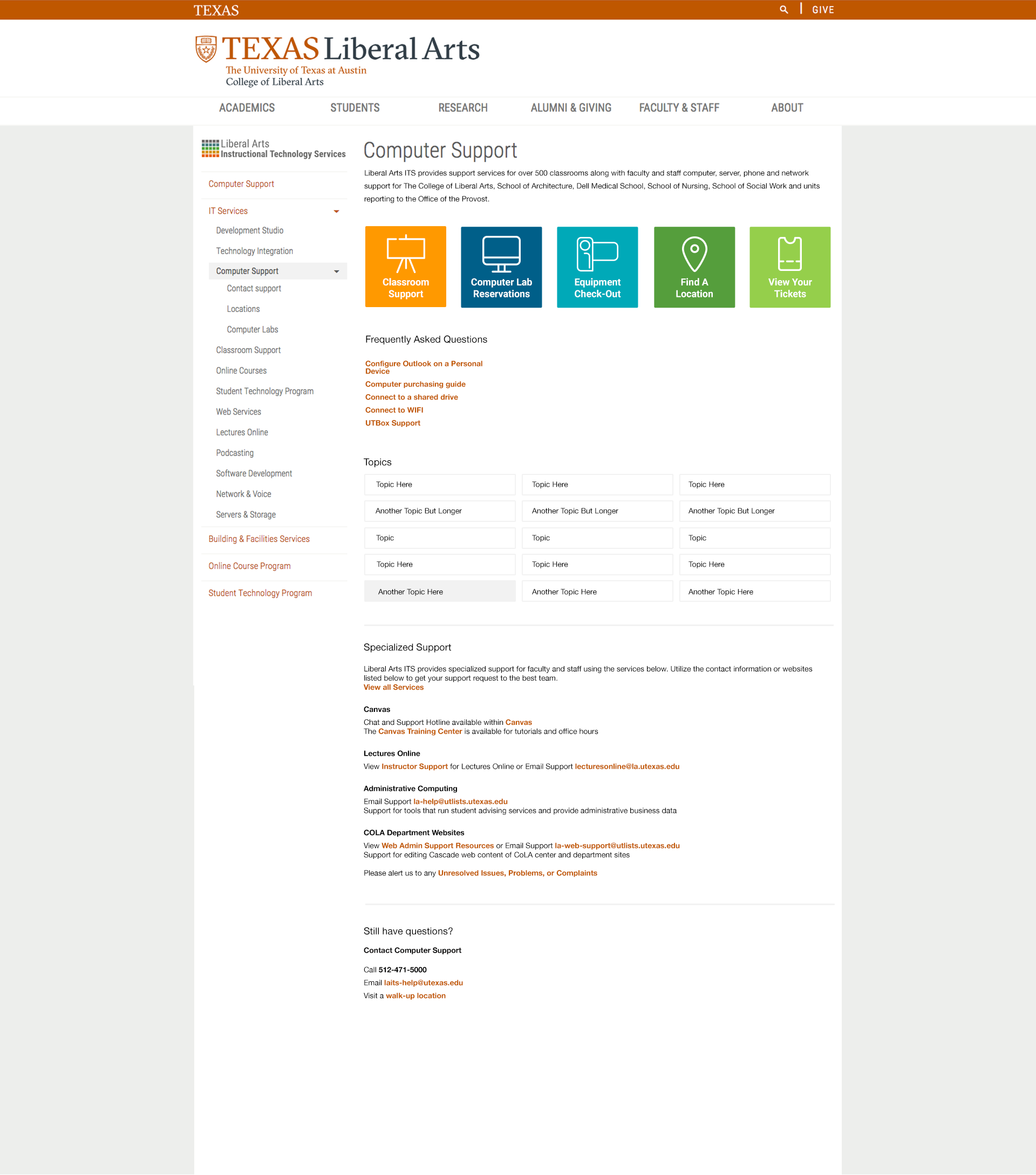
Current home page:
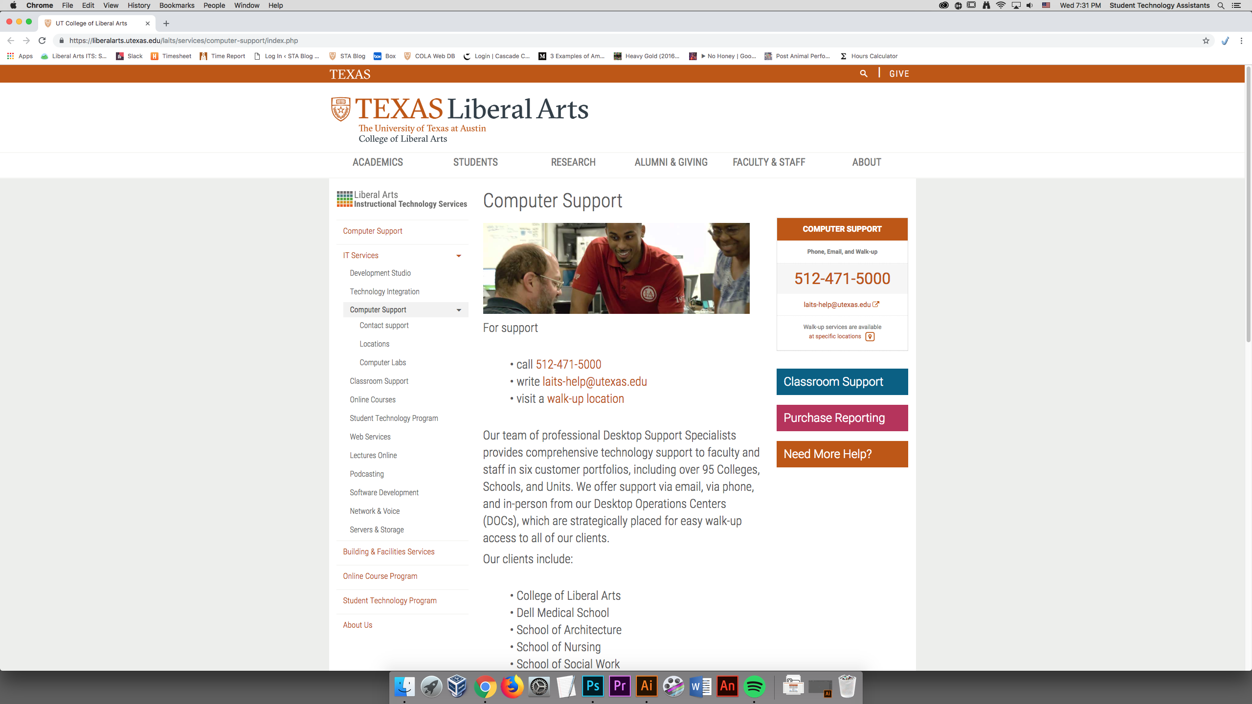
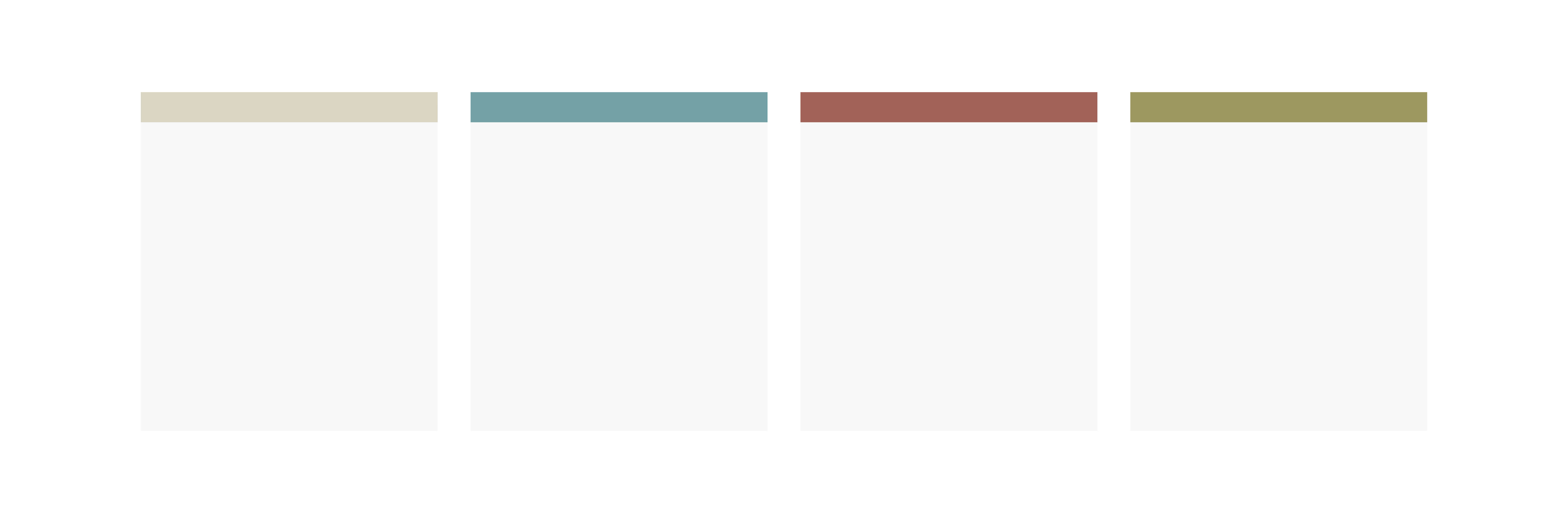
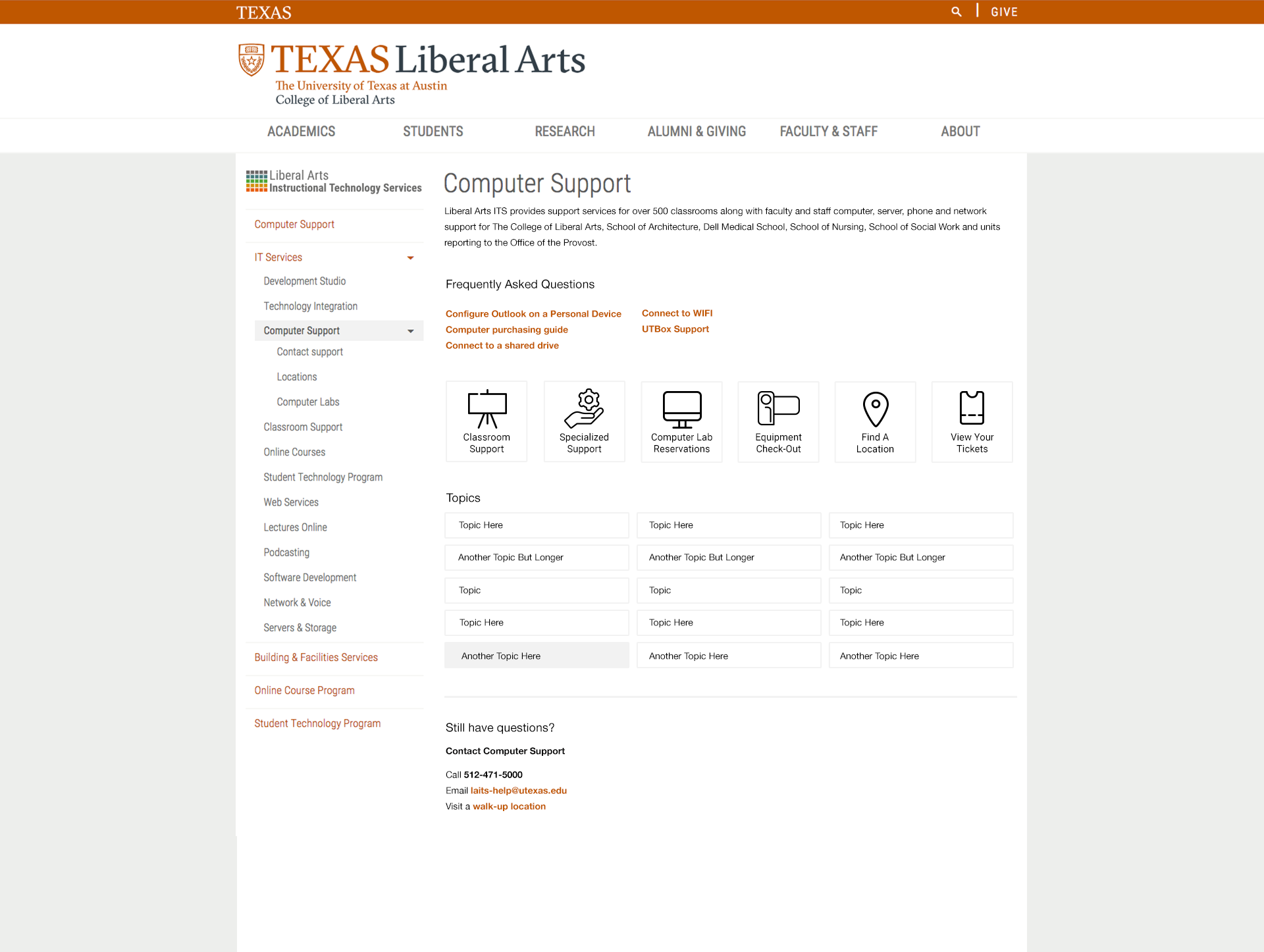
First Draft Mockup:

- 6 square buttons
- type written in bolded orange (underlined on hover)
- “Topic” buttons (button container becomes grey on hover)
- Tried to keep things as clean as possible
- Colors used are in the UT Brand Guide: https://brand.utexas.edu/identity/color/
- If this design were to go up tomorrow, the “Topics” section would be removed. All of the other content shown on the mockup is currently published on the site.
- I placed contact info at the bottom of the page as to encourage users to search for the answer to their issue first/help themselves
- i.e. while scanning the page, they might see the answer to their question
- on the current site, the first thing the user sees is contact info (this might make the user halt their search and ask for help)
More Drafts:

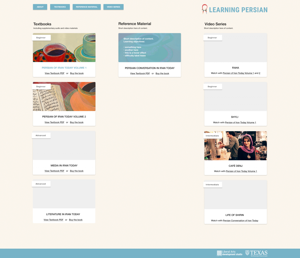
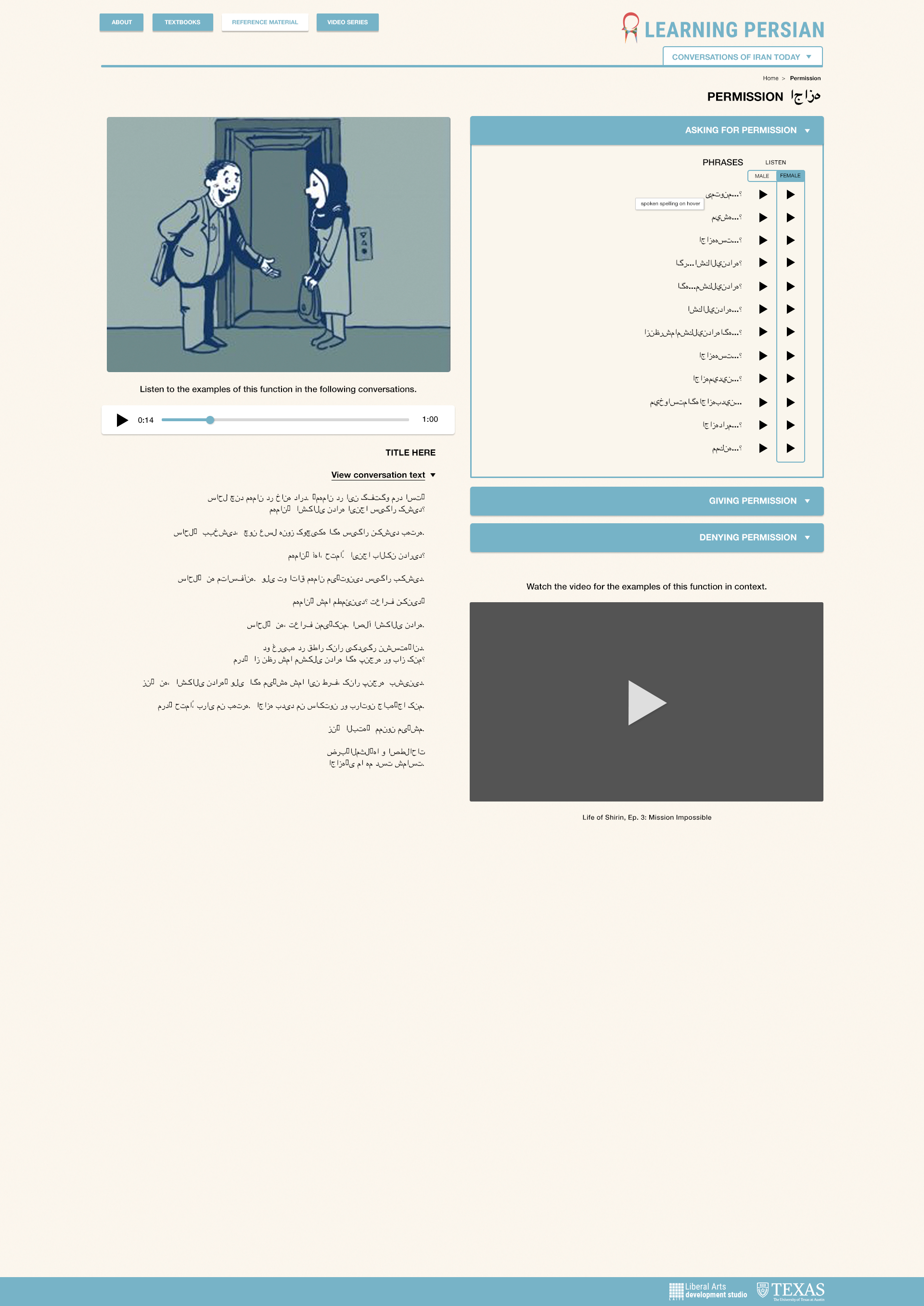
Persian UI Update
project: Learning Persian Online Resources
Client /Prof: Anousha
completion status: Started June 21st
staff guidance: Suloni Robertson, Stacy Vlasits
STA team members: Kathy Vong
description/plans: create page mockups for a site that provides language learning materials (including audio and video)
To be completed: Before Oct.
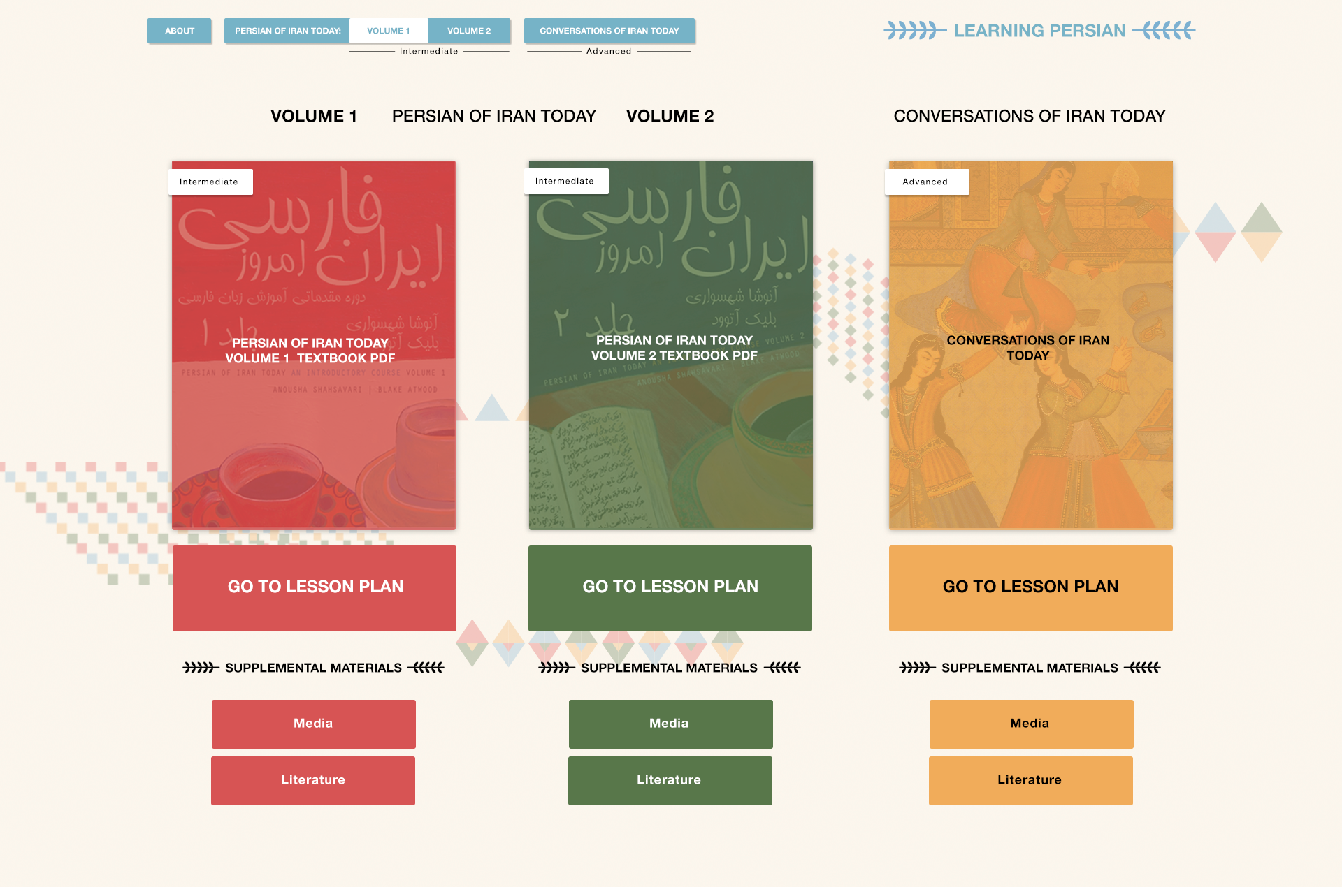
- formatted the different categories into columns instead of rows
- added all the unpublished content that was on Anousha’s mockup (media, lit, raha, and shyli)
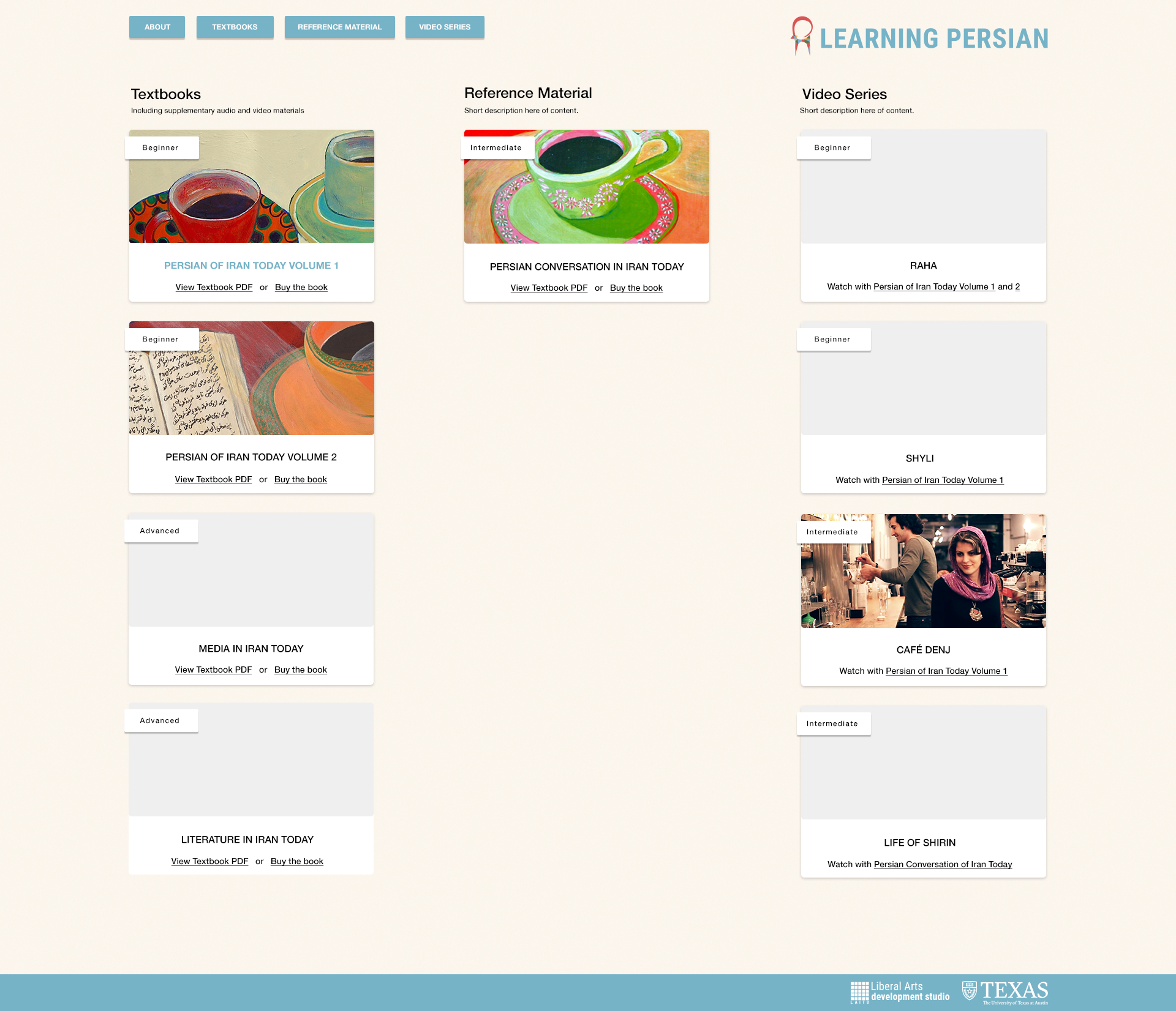
- updated uni nav menu–Hover on menu inverts the text and button color. This helps tie together the parent with the dropdown content.
- description/blue overlay hover effect on each card
- hover effect for links can be bolded + blue as shown on PIT Vol 1
Draft #1
Draft #?
Menu Dropdown

Card Description Hover Effect