
STA Work Blog
STAs: Student Technology Assistants
Who We Are
LAITS: IT and Facilities Director, Joe TenBarge initiated the Student Technology Assistant program in 2004. STAs are UT students who work on a variety of projects in collaboration with UT faculty and LAITS staff members. STAs assist College of Liberal Arts faculty members and administrative staff with print and web design. From building presentations, to creating audio/visual works, and producing online classes in the LAITS film studios, STAs are instrumental in helping COLA faculty realize their vision for multimedia projects that enhance their teaching and the students learning experience. By the end of their student careers, STAs have portfolios which demonstrate their accrued technical and design skills.
Prospective STAs:
Creative and technically inclined students are appointed as STAs for one year, with the possibility of being rehired as long as they study at the university. Applicants for the program are hired before both long semesters. Interested students may look for postings on Hire-A-Longhorn when positions are available. Positions will have Student Technology Assistant (illustrator or web designer) in the title of the job post.
Faculty and Staff:
Faculty & Staff with questions about services, please contact us.
https://liberalarts.utexas.edu/laits/contacts.php
- Audio Services: Michael C Heidenreich, Director of Studio Operations & STA Program Coordinator
- Video Services: Kelly Webster, Video Production Supervisor, Video STA Supervisor
- Graphic Design & Web Design Services: Suloni Robertson, Art Director / Design & Coding STA Supervisor
The Rise of Everyday Design
The Rise of Everyday Design
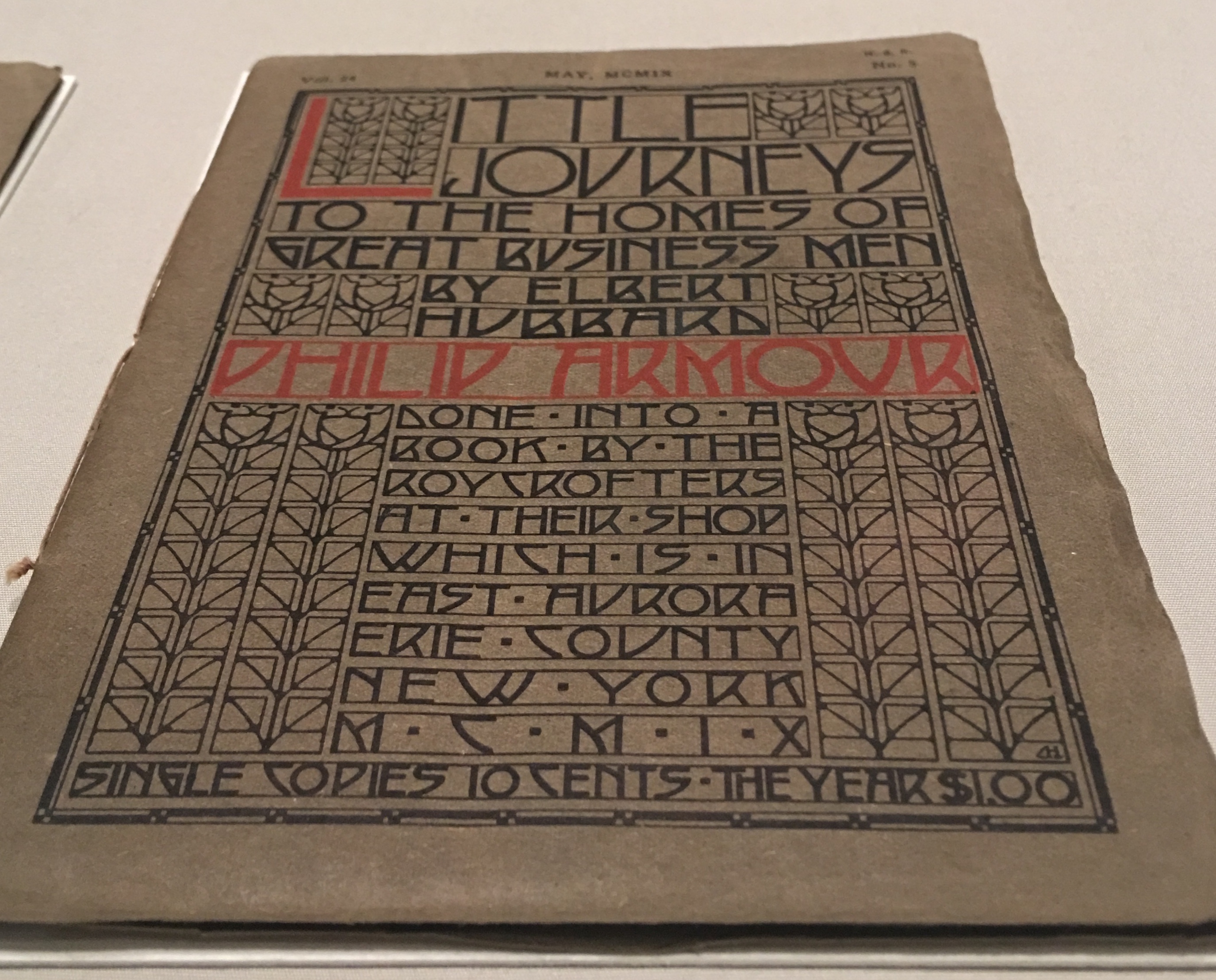
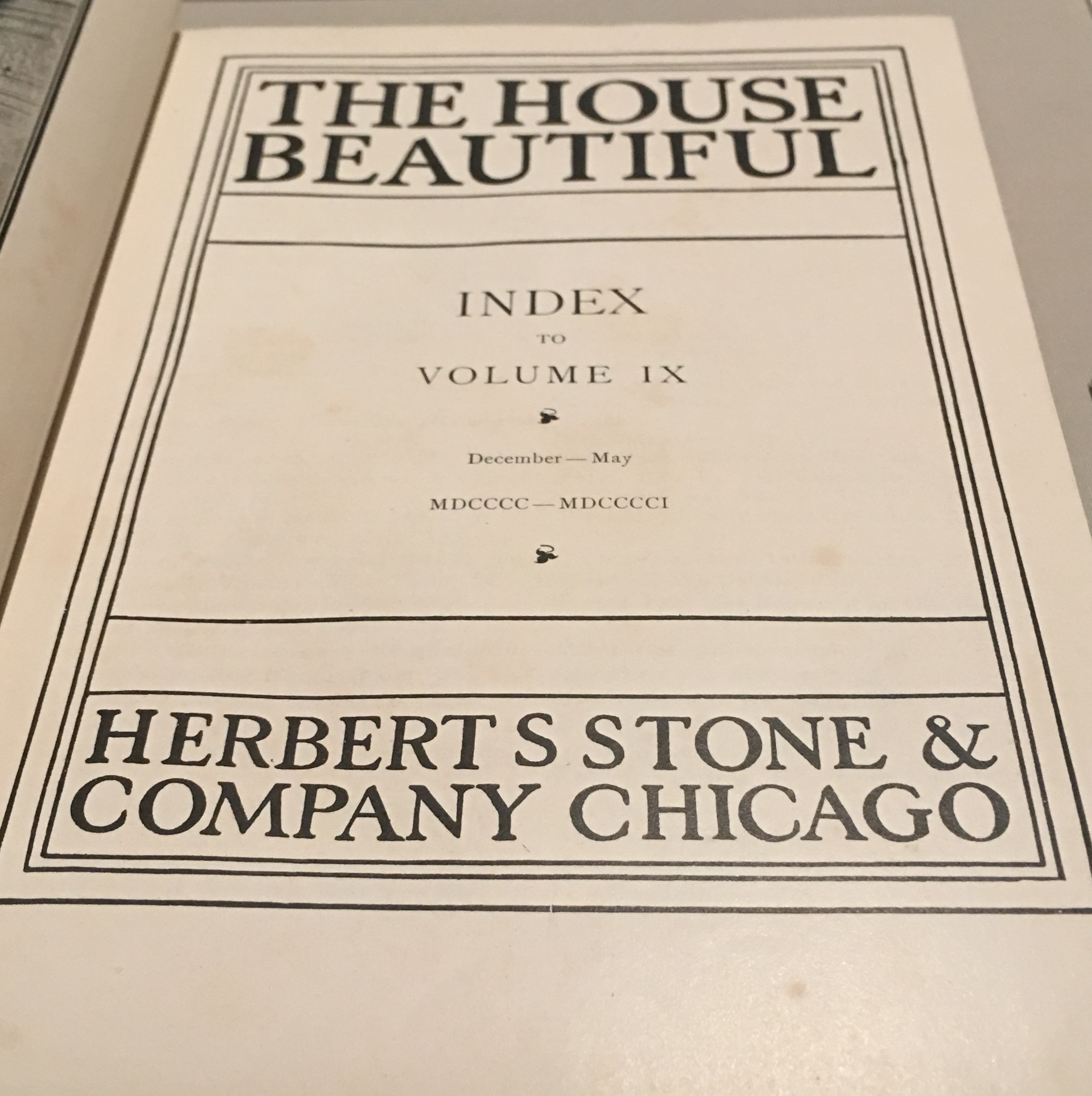
I had never been to the Harry Ransom center before going to this exhibition. In the past, their promotional materials for other events had gained my interest, but due to one thing or another I had never attended. The building looks huge on the outside, so I expected a full-size museum exhibition inside. What I found was much more humble. The Everyday Design exhibition was 2 rooms wide and located in the ground floor of the building. When I initially saw it I was a little disappointed, but overall the quality of the event made up for its size. I was especially drawn to the various books covers and flyers they had. As someone who works with computers all-day everyday, it is hard to imagine that all the fonts I look at everyday were at one point created by someone using no more than a pen and paper. It was fun going around and looking at all these hand-drawn letters and how the designers put so much attention to detail in order to create a unique typography to match the themes. In a way, it’s also sad to think that their art is obscured by how easy it is to find a great font nowadays. In any case, I enjoyed spending time at the exhibition. In the future, if I find out about new events by the HRC, I might be more inclined to attend.
I’ll leave all the pictures that I took of my experience below.


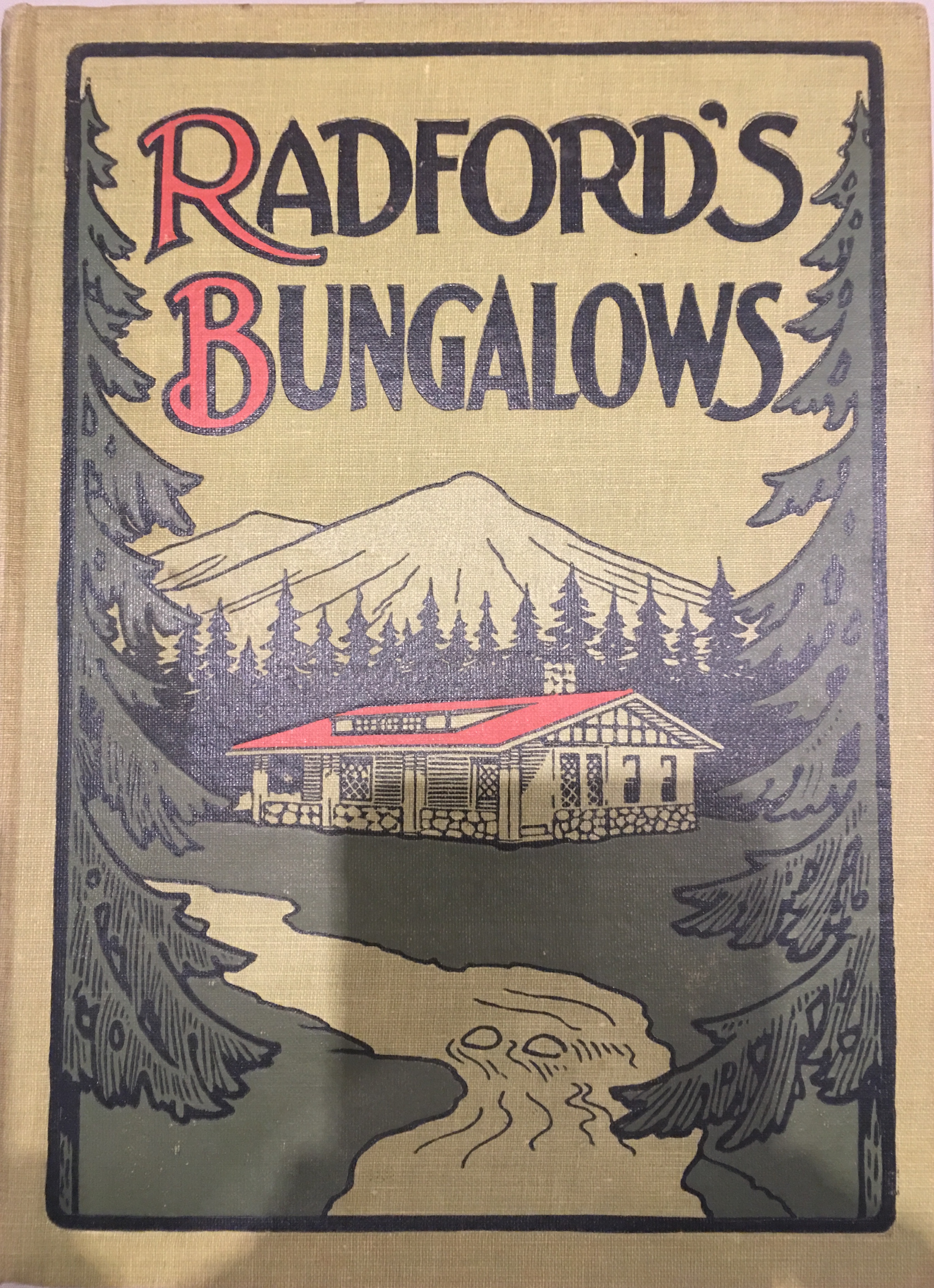
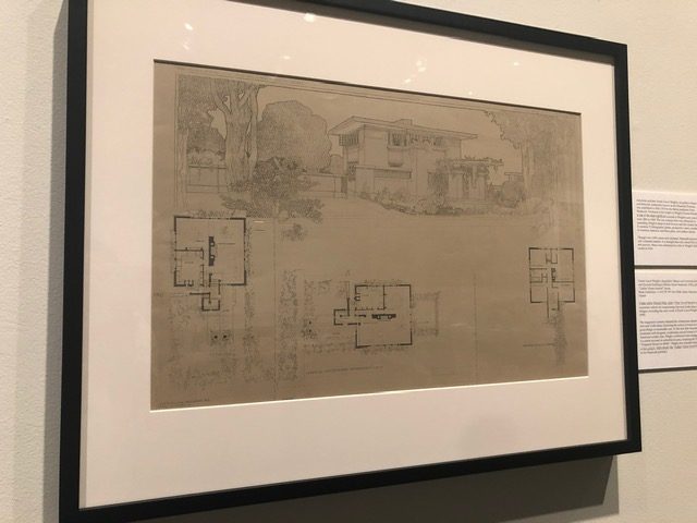
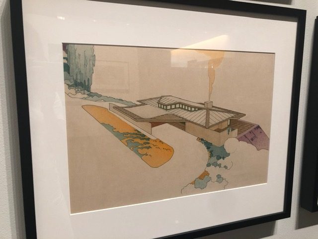
Also, as a bonus, I’ll leave a picture of the Frank Lloyd Wright part of the exhibition. One day I will get a house as nice as this one.
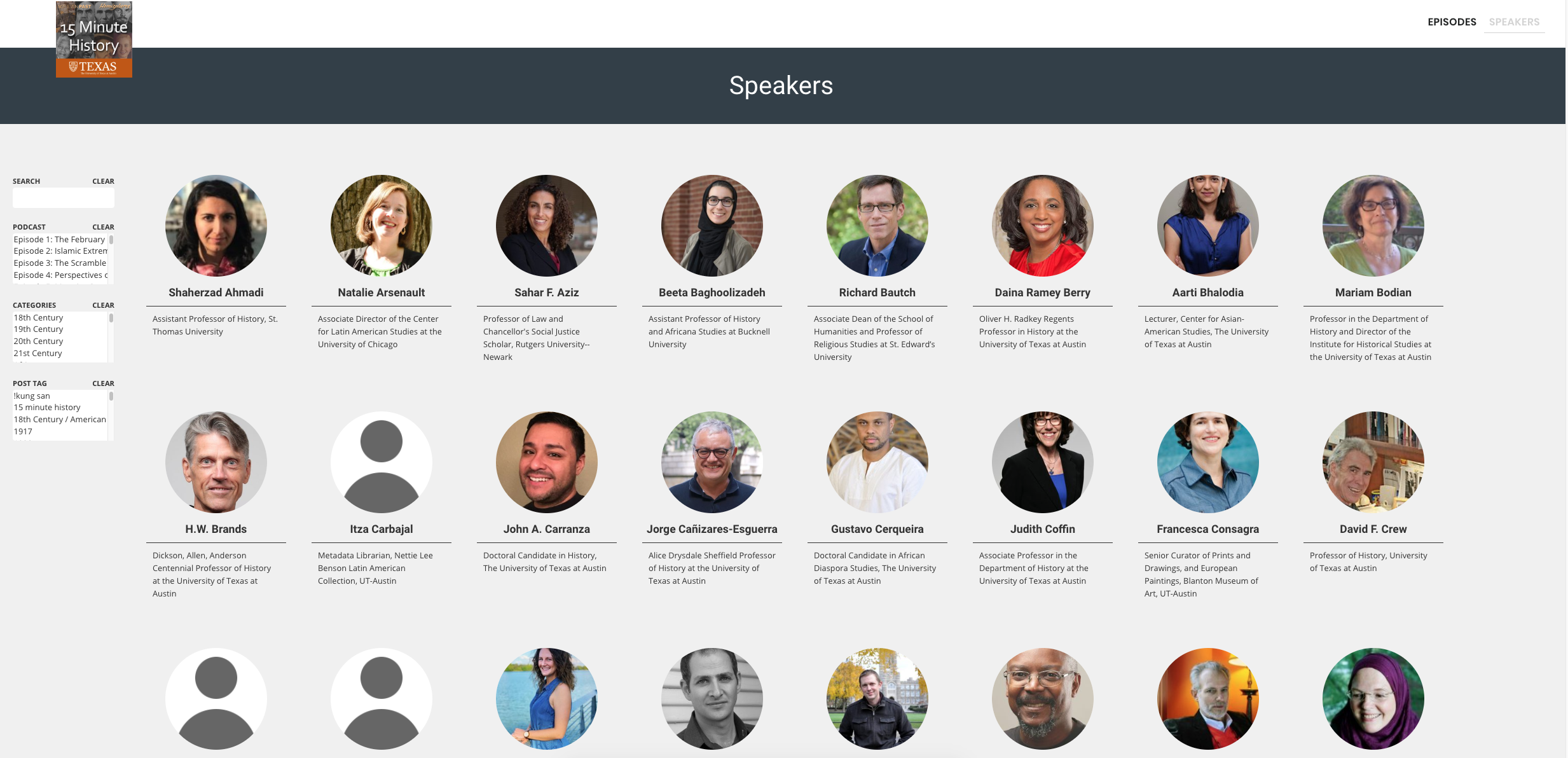
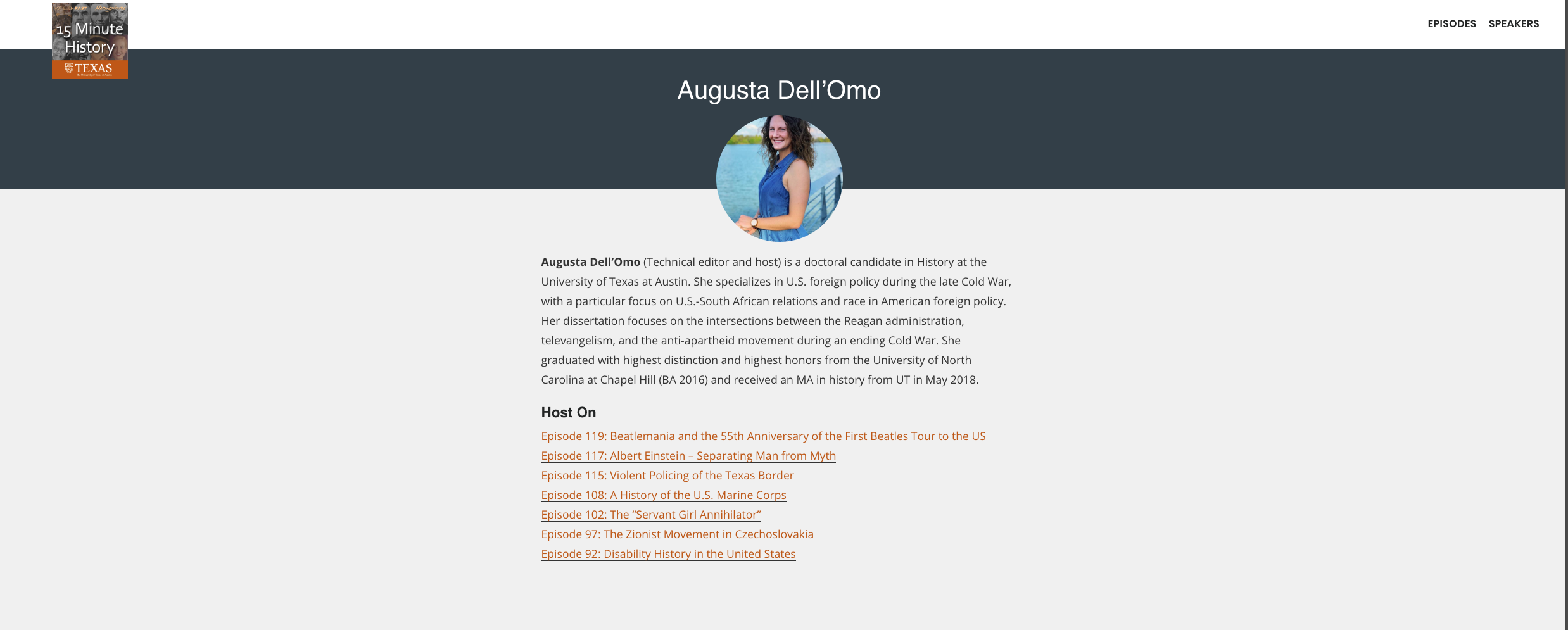
More than 100 posts
Previous code was calling wordpress data first 100 posts, but when future entries exceed 100 posts, previous code would not retrieved all the data, by applying a mounted function on vue and making another call to the data whenever the current called equals 100 posts.
This was updated on every taxonomy and post.
Errors were found on the site, when first using the search bar to filter the display, and then using the alphabetic bar to scroll the page. The website reloaded the model (making the filters empty), by forgetting about an specific current key on the router view this issue was solved.
5-2-19
HRC Visit
Monday we all took a trip to the Harry Ransom Center to view the current exhibit: “The Rise of Everyday Design: The Arts and Crafts Movement in Britain and America.” I always love learning about the history of art and design, and I really enjoyed going, especially since I didn’t know much about this movement going in.
The Arts and Crafts movement started in Britain in the mid-19th century and lasted into the 20th century, migrating to the U.S. in that time. It began as a reaction against industrialization and emphasized quality craftsmanship and simple design (the idea was that construction is as important, or more important, than design).
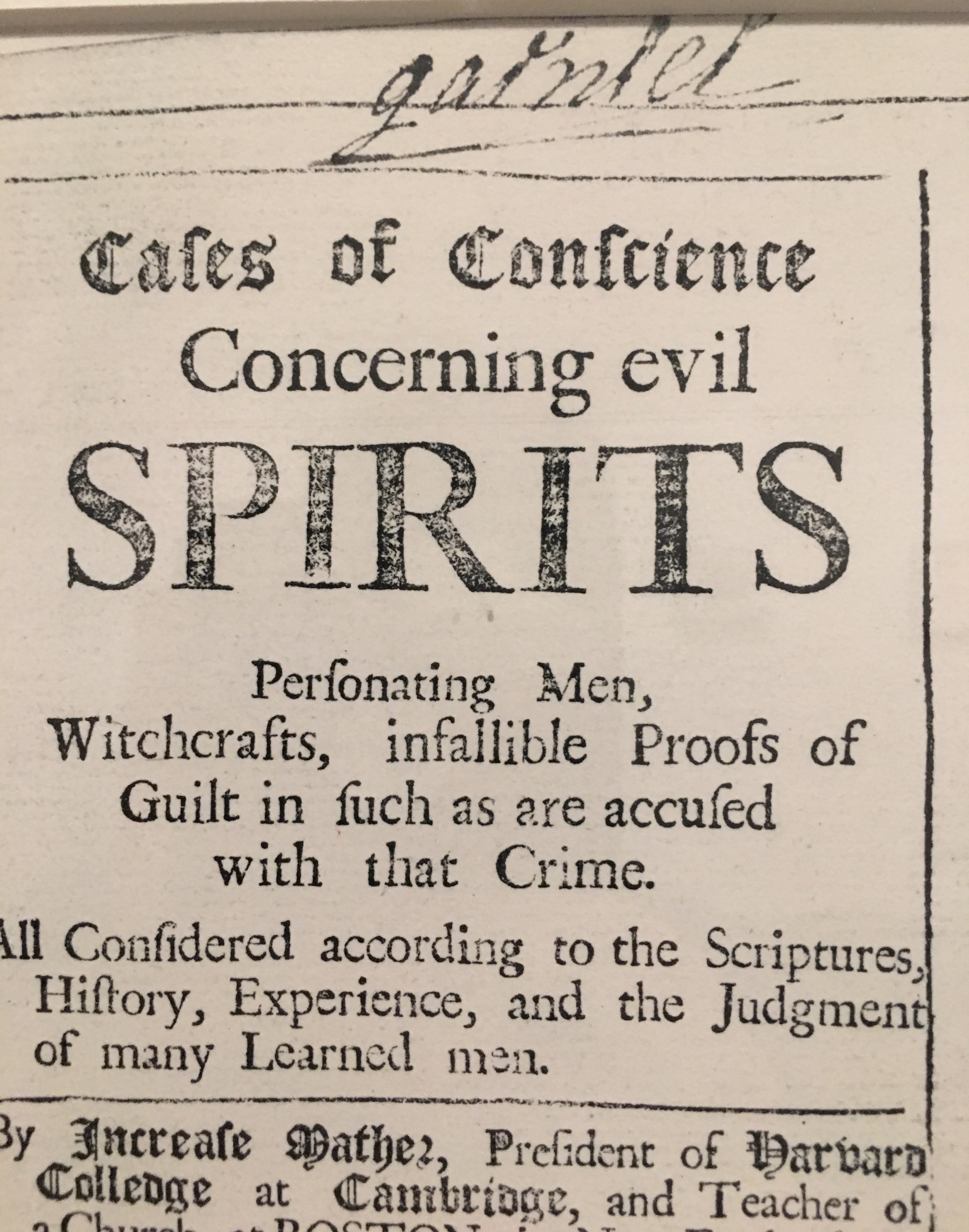
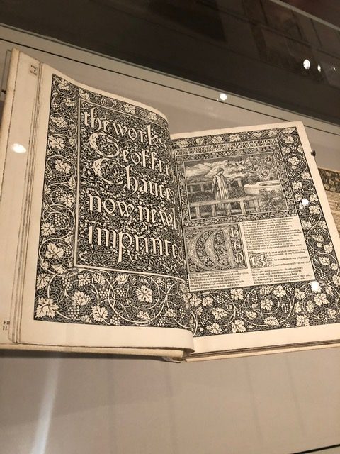
What was interesting is how the early Arts and Crafts reformers had very specific principles of design which was often closely tied to their ideas about political reform (many of the British designers were socialists). They produced informational materials, like this book called “The Grammar of Ornament” by Owen Jones, which is a kind of compendium of geometric patterns for architecture:

Their influences were very broad: Medievalism, Pre-Raphaelite/Classical, Folk, Middle Eastern (like the above page), and especially forms from nature.
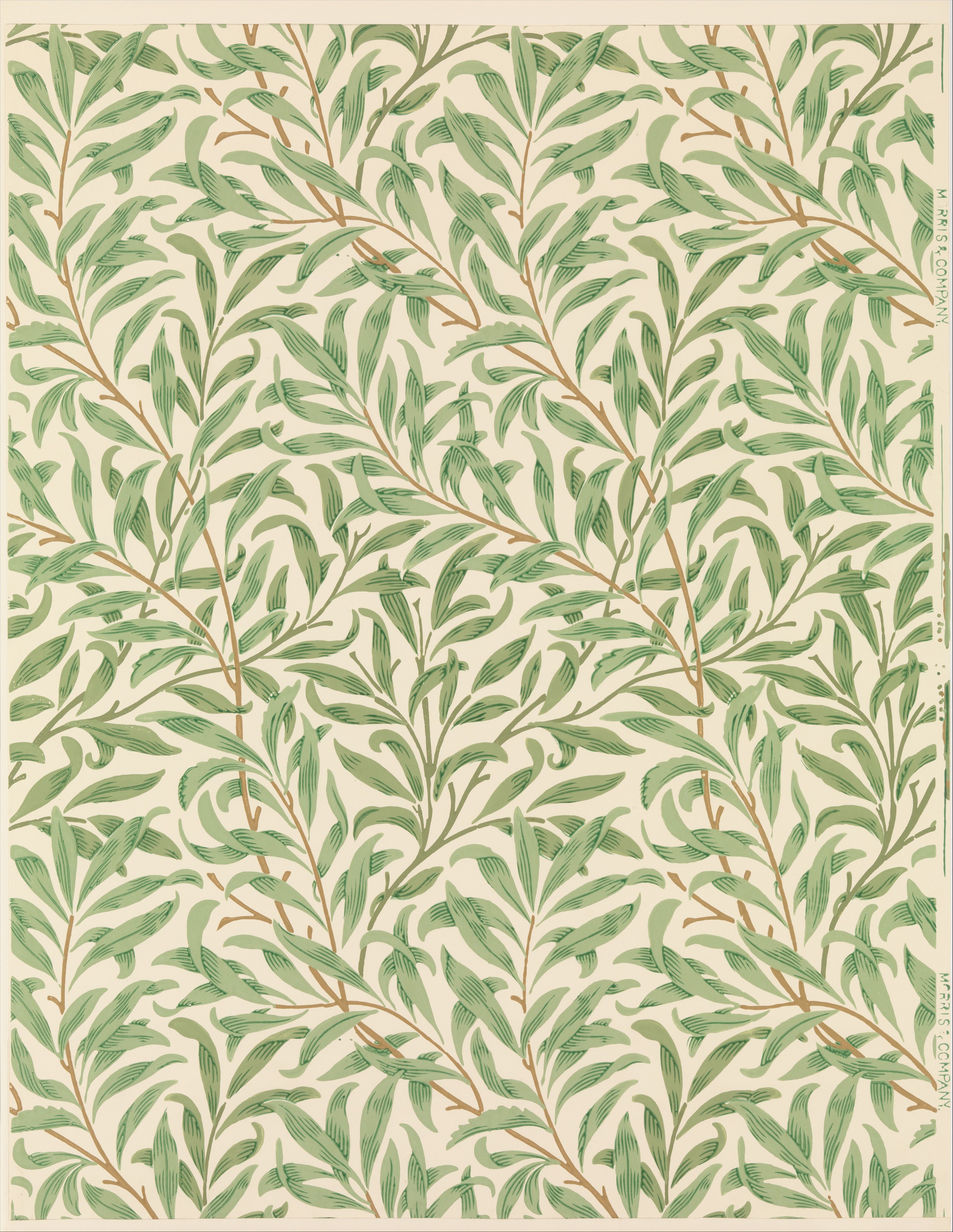
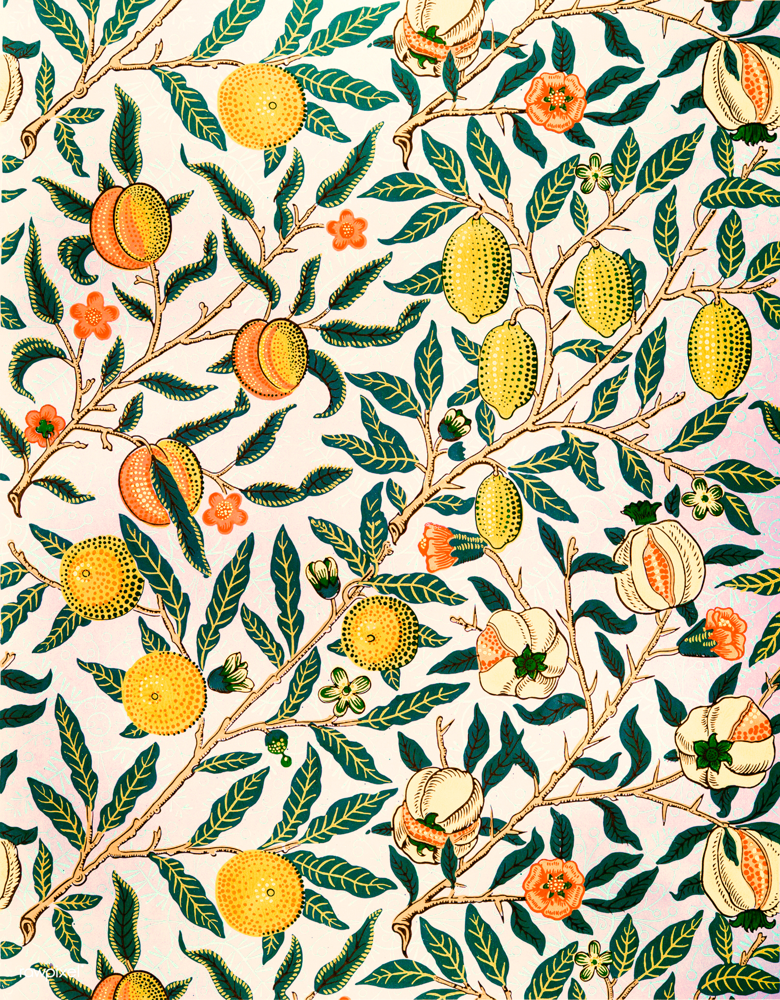
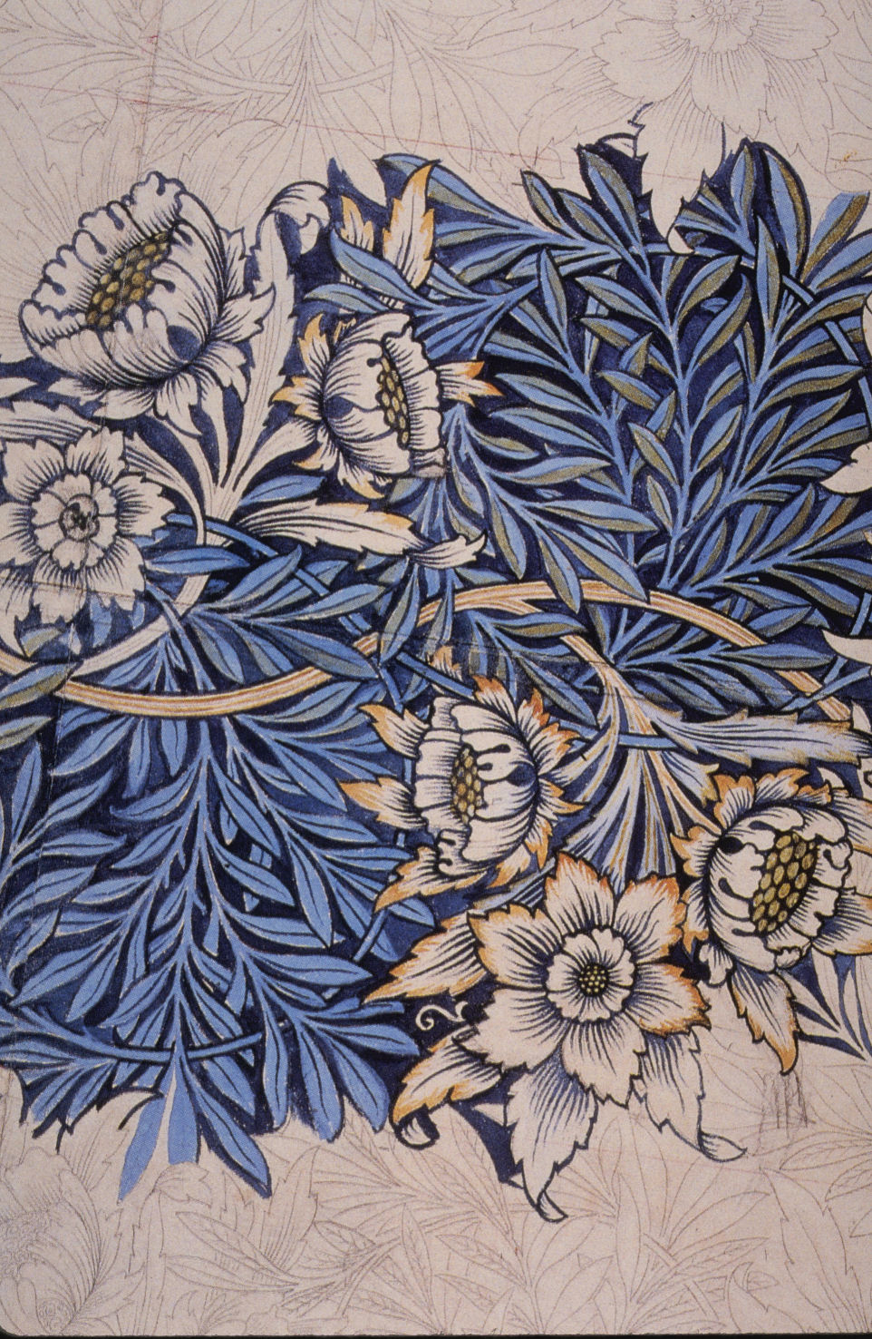
One of my favorite things at this exhibit were these textile patterns by the British designer William Morris (1834-1896), who was inspired by forms of flora and fauna. Some of his notebooks were on display showing his sketches of nature. I was really struck by how modern these look, you still see patterns like these all over, in people’s homes, etc, and yet all these designs were created in the 1800s.
The movement grew in popularity, especially among the middle class. This drove commercially-scaled production of furniture, textiles, etc, which was contrary to the founding ideals.
(All images from Wikimedia Commons)
5-1-19
Podcasting!
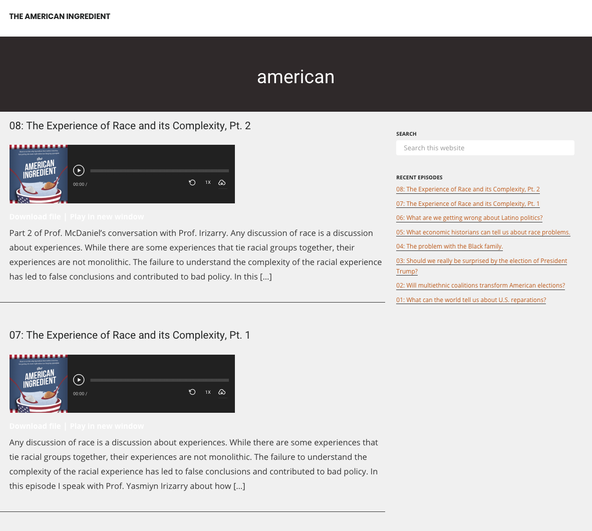
It’s been a long time since I posted updates on the podcasting sites! Since my last screenshots I have refined the overall styling and applied my CSS for 15 Minute History to all of our podcast sites. Here are some shots of the most current versions –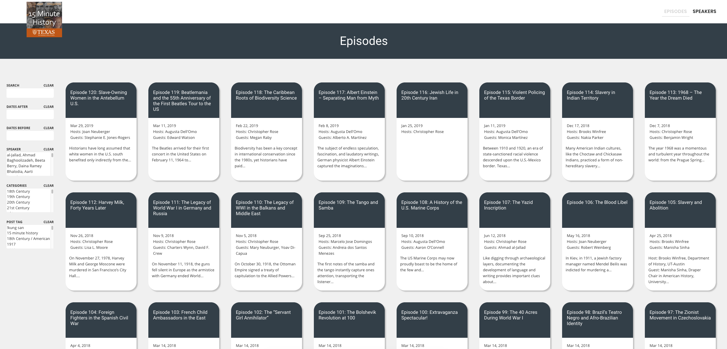
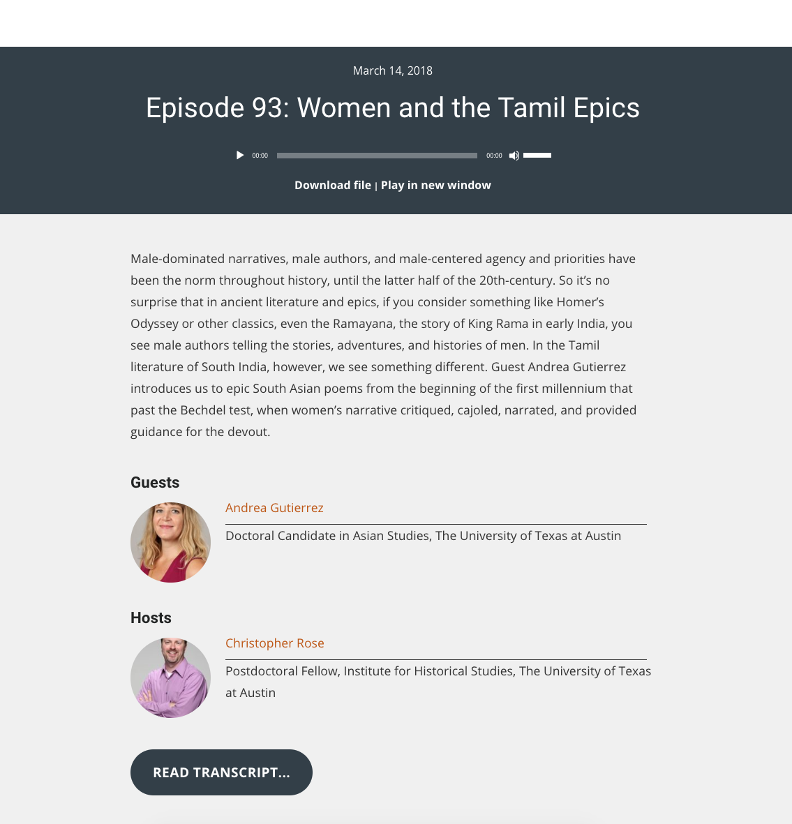
I initially used clip-path property to round the speaker images but it was not compatible with Firefox, Safari or IE. I corrected the issue by using border-radius to create the circular images and it gives off the same effect! I also added a drop shadow to the cards because the flat design wasn’t looking very finished. Overall the light grey content area, colored headers and increased title text size added a lot more interest to the site. I plan to update the default audio player and leave only a large play/pause button similar to the styling on This American Life (https://www.thisamericanlife.org/).
Another big change I’ve made is adding a color palette for client’s to choose from that corresponds to their branding. To select these colors I looked at UT’s brand guidelines and worked with Suloni to choose shades with high enough contrast to my white title text.
For the muted colors I found inspiration from the Pinterest loading cards. (I’ll add this image later). I chose corresponding link shades for all color options available.
A challenge in applying my 15 Minute History styling to the other pages was how it affected the American Ingredient site. This site features a global search function separate from our Episode and Guest search pages. I’m still not confident on this placement of this sidebar but all content on the site is behaving responsively at last! 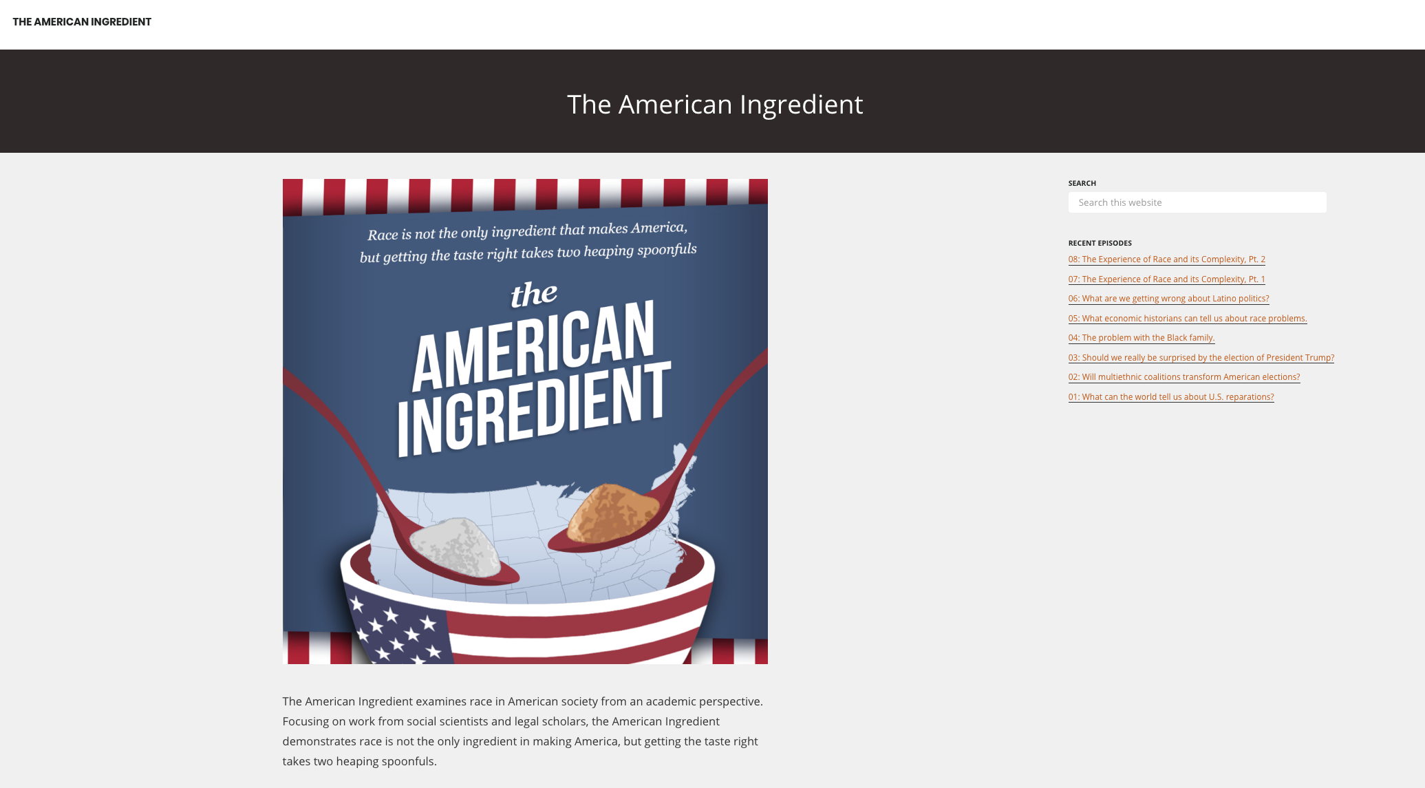
 Stacy and I met with the podcasting client last Friday to gain feedback on our progress and design so far. The client was pleased with the responsiveness and search features as well as the uniformity. He did request a LAITS podcast homepage be created that features logos from each podcast that link to their respective sites. This design as well as what’s included in the footer will be decided once the individual sites are completed. This has been such a good experience to get back into coding and learning how to customize a WordPress theme!
Rise of Everyday Design
I went to the Harry Ransom Center during my STA meeting this week to check out the Rise of Everyday Design exhibit. This was my first time to the Harry Ransom building so I really didn’t know what to expect. I found the inside of the building smaller than expected! It looks like a huge museum when you’re approaching.
I thought the exhibit was very thorough though I would have loved to see more product design from the Arts & Crafts movement vs mostly print and photography. I would definitely return to the HRC on my own time and really enjoyed the exhibit. Here are a few notable pieces I loved learning about –
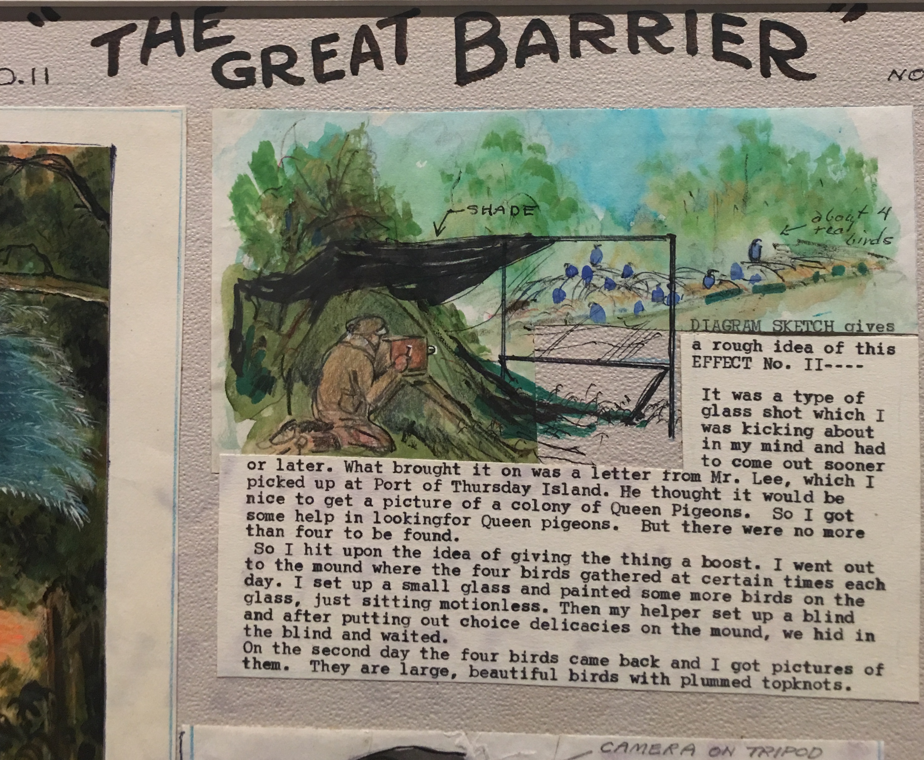
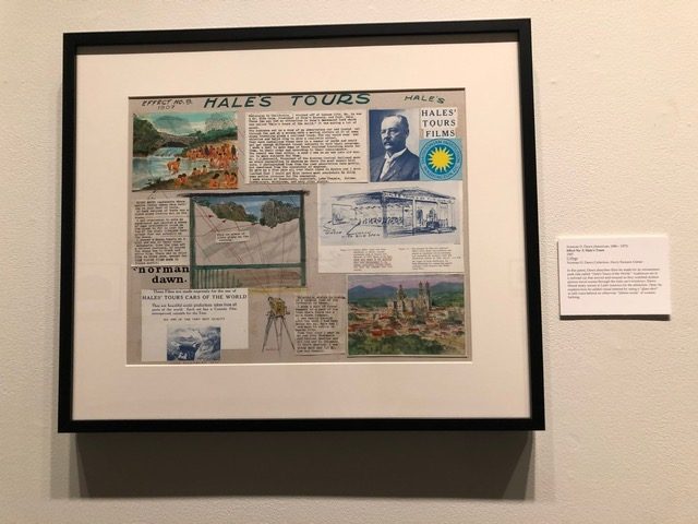
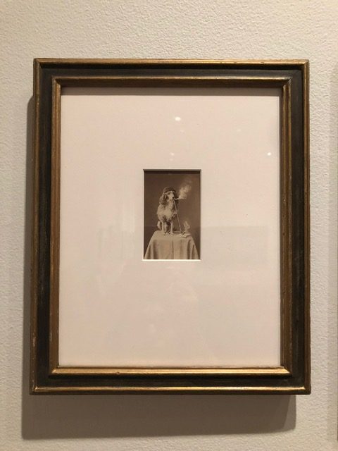
Norman Dawn’s Glass Shot:
I’d never heard of the term “glass shot” before and know very little about filming. Honestly I was drawn to this Norman Dawn exhibit because of his sketches and illustrations! I especially love the sketch of this weird contraption he built to test the exposure of film strips. The style of his drawing is very similar to the product design sketches in my textbooks and the kind we draw in class while prototyping our projects. I found it really cool that those standards and techniques have remained over time.


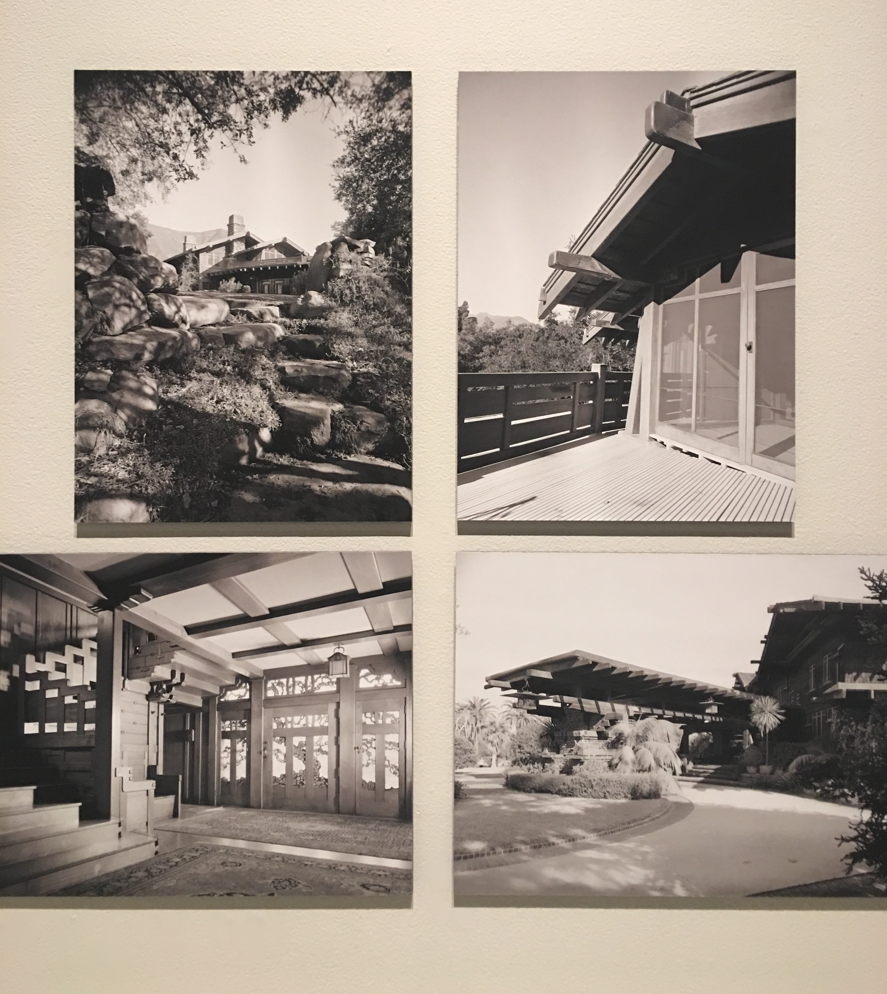
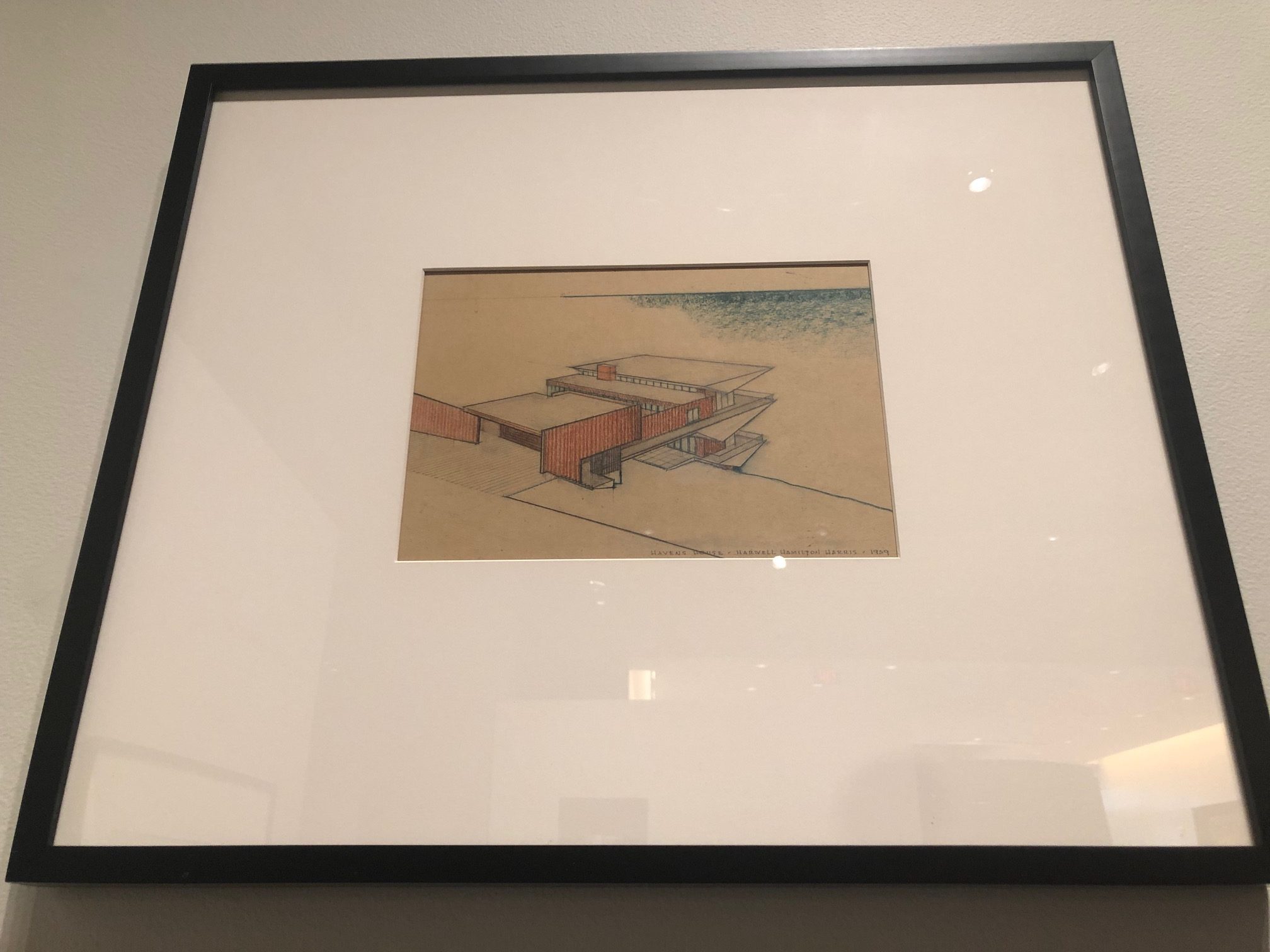
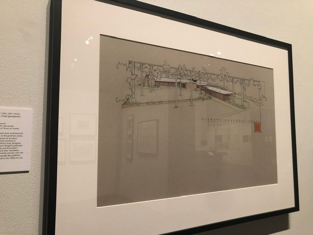
Architecture:
I love Frank LLoyd Wright’s work so I really enjoyed looking at his renderings as well as Harwell Hamilton Harris’ sketches. Perspective drawing is a skill I want to gain this year and both Wright and Harris provide beautiful examples. Wright’s clean lines and choice details in his renderings are so calculated and pristine. I love the detail of the carpet which was custom made for this particular house.
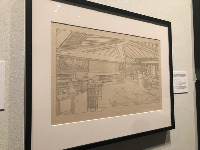
Harris’ use of color in his perspective sketches was great and really made them come alive.
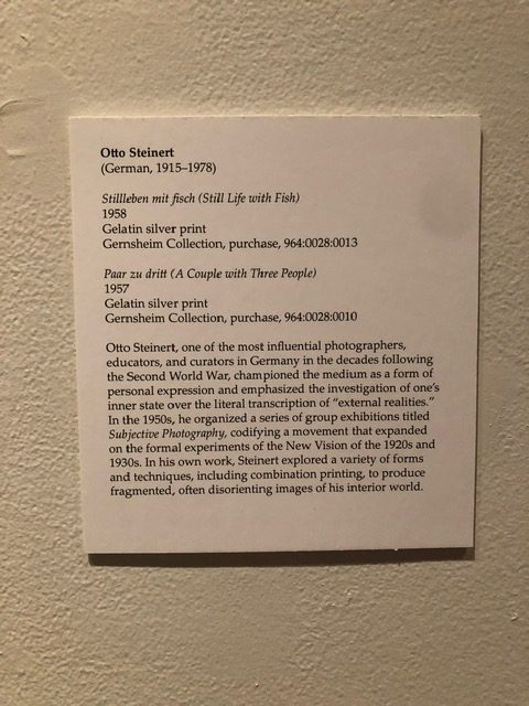
Photography:
I was very absorbed by the whole photography section of the exhibit, especially the work of Otto Steinert. I’d never heard of a gelatin silver print before but I really enjoyed the disorienting and whimsical nature of his print work.

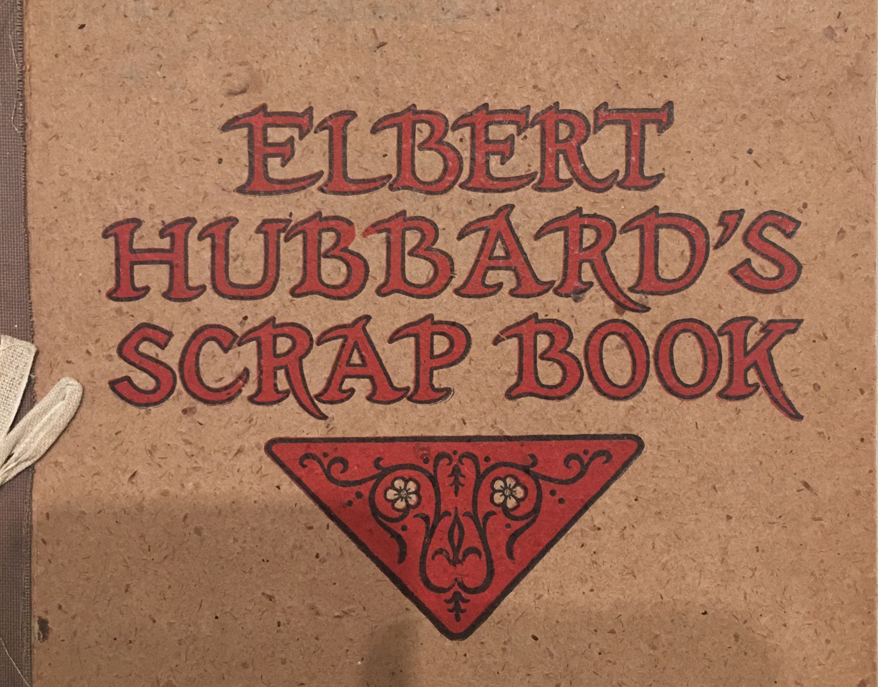
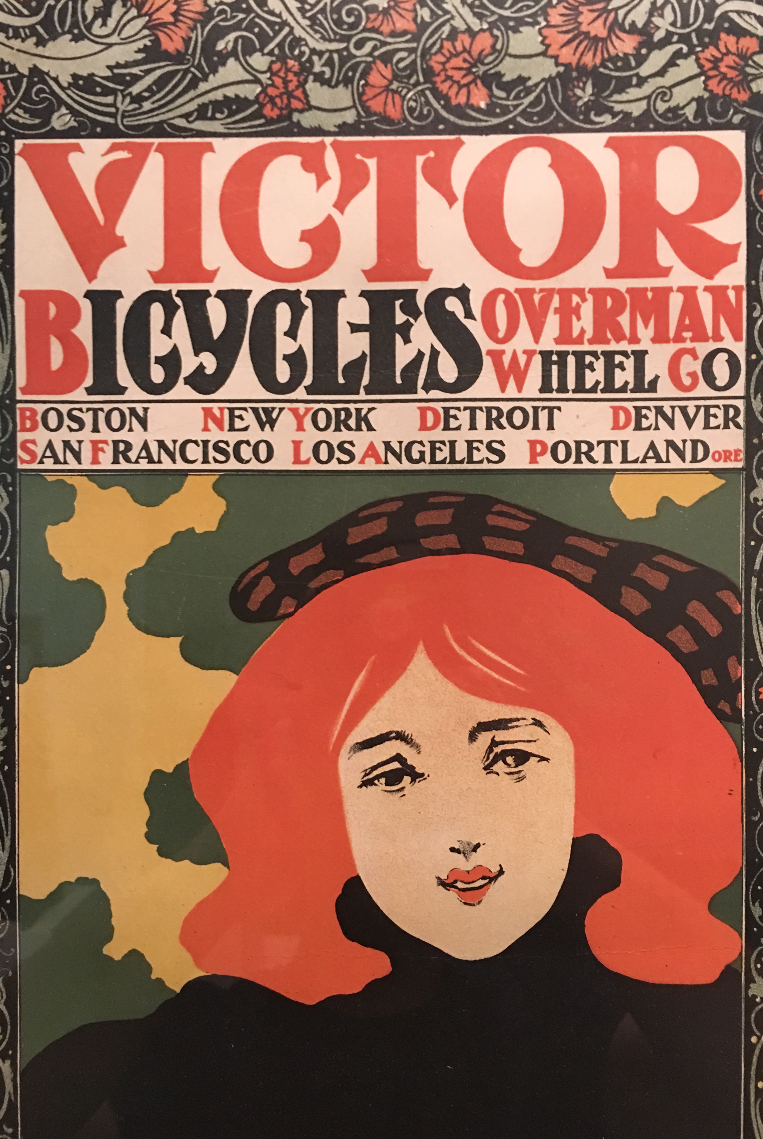
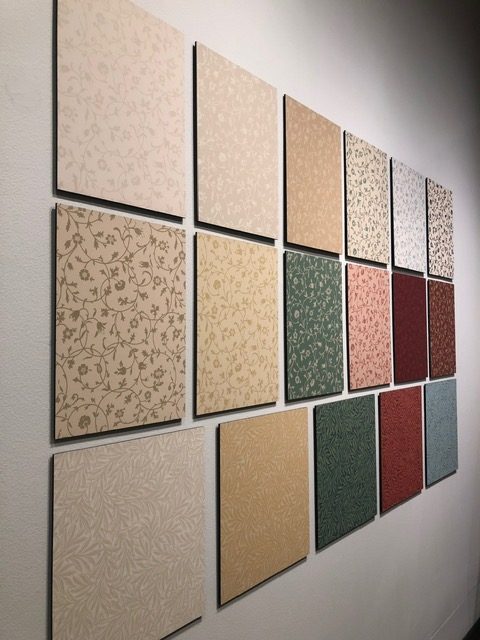
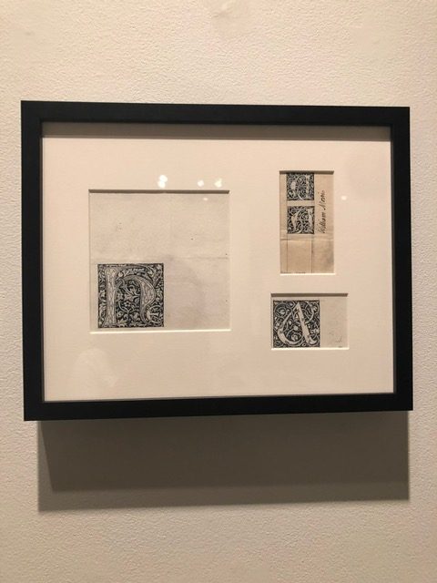
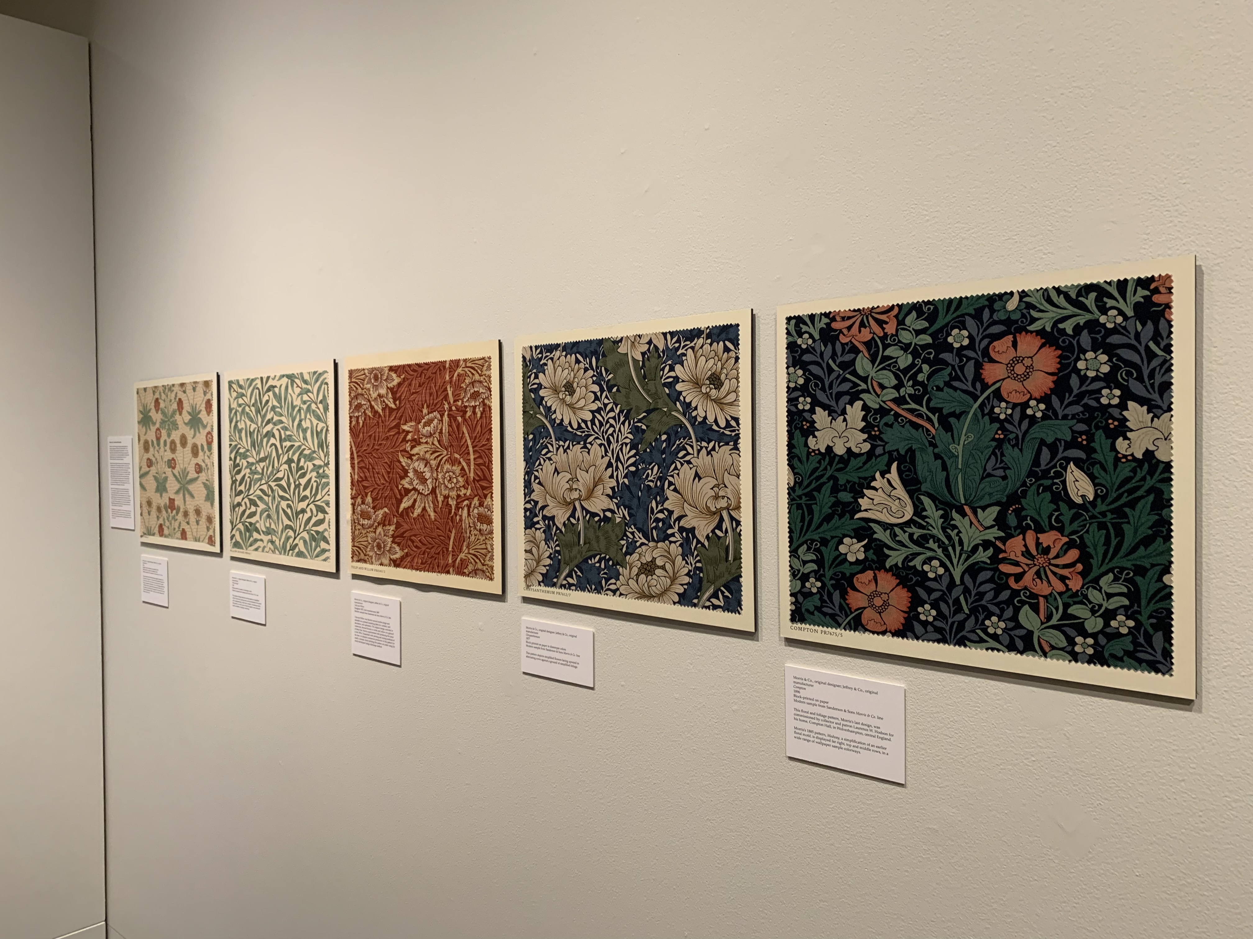
William Morris Textiles & Lettering:
I was drawn to these Morris & Co wallpaper and fabric prints due to my love of textiles and new fascination with wood-block printing! I recently took a class with Darrell Howard learning her process of Japanese Wood-block Printing. It’s equally laborious and beautiful. William Morris also used this labor-intensive method of printing to create his repeat nature patterns seen below. Morris’ vision of “art for all” really resonated with me. I also found his lettering work really fascinating. I think Jessica Hische (http://jessicahische.is/awesome) likely takes inspiration from this work.
 .
. 
- « Previous Page
- 1
- …
- 10
- 11
- 12
- 13
- 14
- …
- 62
- Next Page »