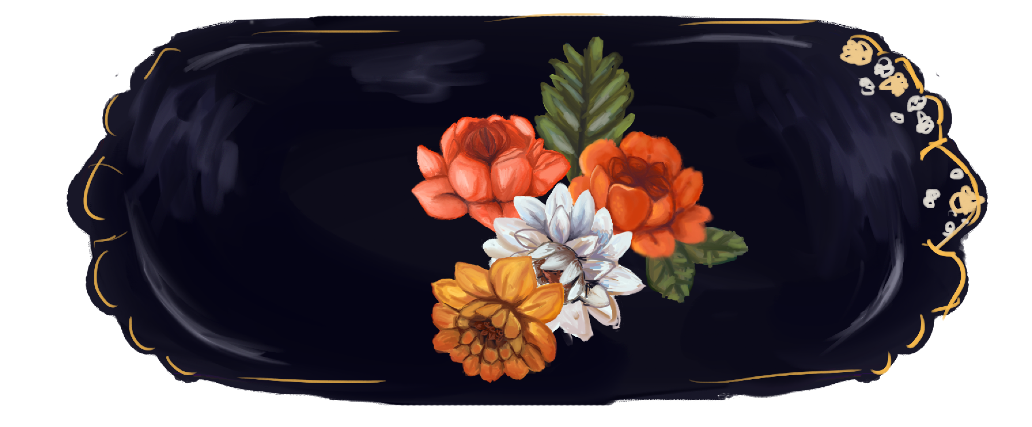
• We are STAs
    • Asha Rountree
    • Haley Ma
    • Kate Shih
    • Kyra Lee
    • Nicholas Peasley
    • Sasha Kenney
    • Shanda Horm
    • Shriya Atreya
    • Tomas Marulanda-Mesa
  • We were STAs
  • STA Presentation
    • STA Presentation 2017
    • STA Presentation 2016
  • Testimonials
  • Resources
  • Home

STA Blog

STA Work Blog

STAs: Student Technology Assistants

Who We Are
LAITS: IT and Facilities Director, Joe TenBarge initiated the Student Technology Assistant program in 2004. STAs are UT students who work on a variety of projects in collaboration with UT faculty and LAITS staff members. STAs assist College of Liberal Arts faculty members and administrative staff with print and web design. From building presentations, to creating audio/visual works, and producing online classes in the LAITS film studios, STAs are instrumental in helping COLA faculty realize their vision for multimedia projects that enhance their teaching and the students learning experience. By the end of their student careers, STAs have portfolios which demonstrate their accrued technical and design skills.


Prospective STAs:

Creative and technically inclined students are appointed as STAs for one year, with the possibility of being rehired as long as they study at the university. Applicants for the program are hired before both long semesters. Interested students may look for postings on Hire-A-Longhorn when positions are available. Positions will have Student Technology Assistant (illustrator or web designer) in the title of the job post.


Faculty and Staff:

Faculty & Staff with questions about services, please contact us.

https://liberalarts.utexas.edu/laits/contacts.php

  • Audio Services: Michael C Heidenreich, Audio Services Manager
  • Video Services: Kelly Webster, Video Production Supervisor
  • Graphic Design & Web Design Services: Suloni Robertson, Art Director / STA Program Manager

Week of 7/23

July 23, 2018 By Melissa Lam

Week of 7/23

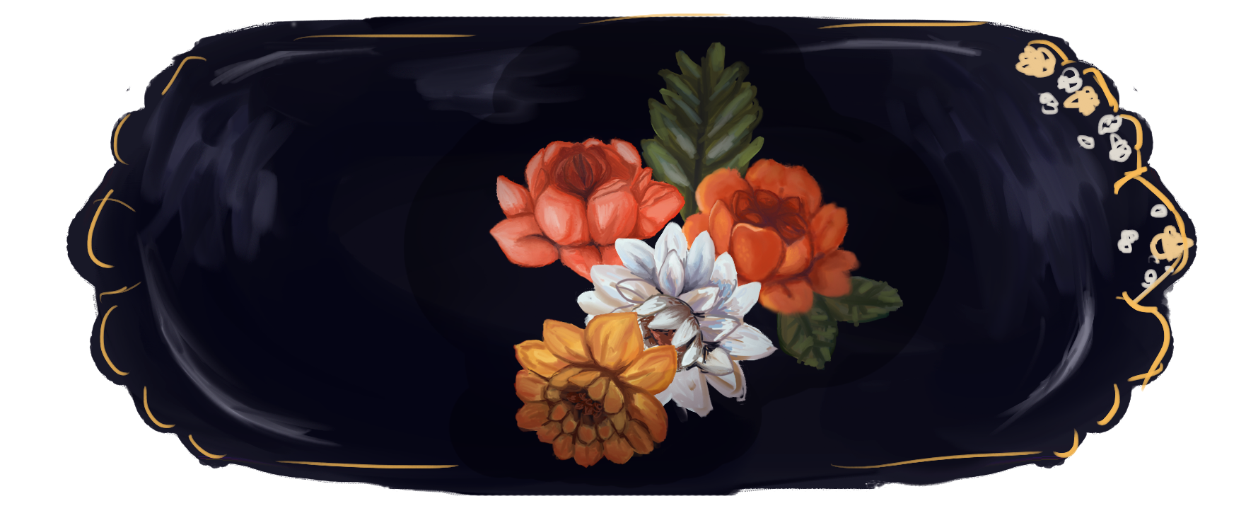
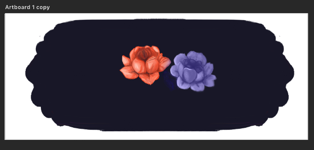
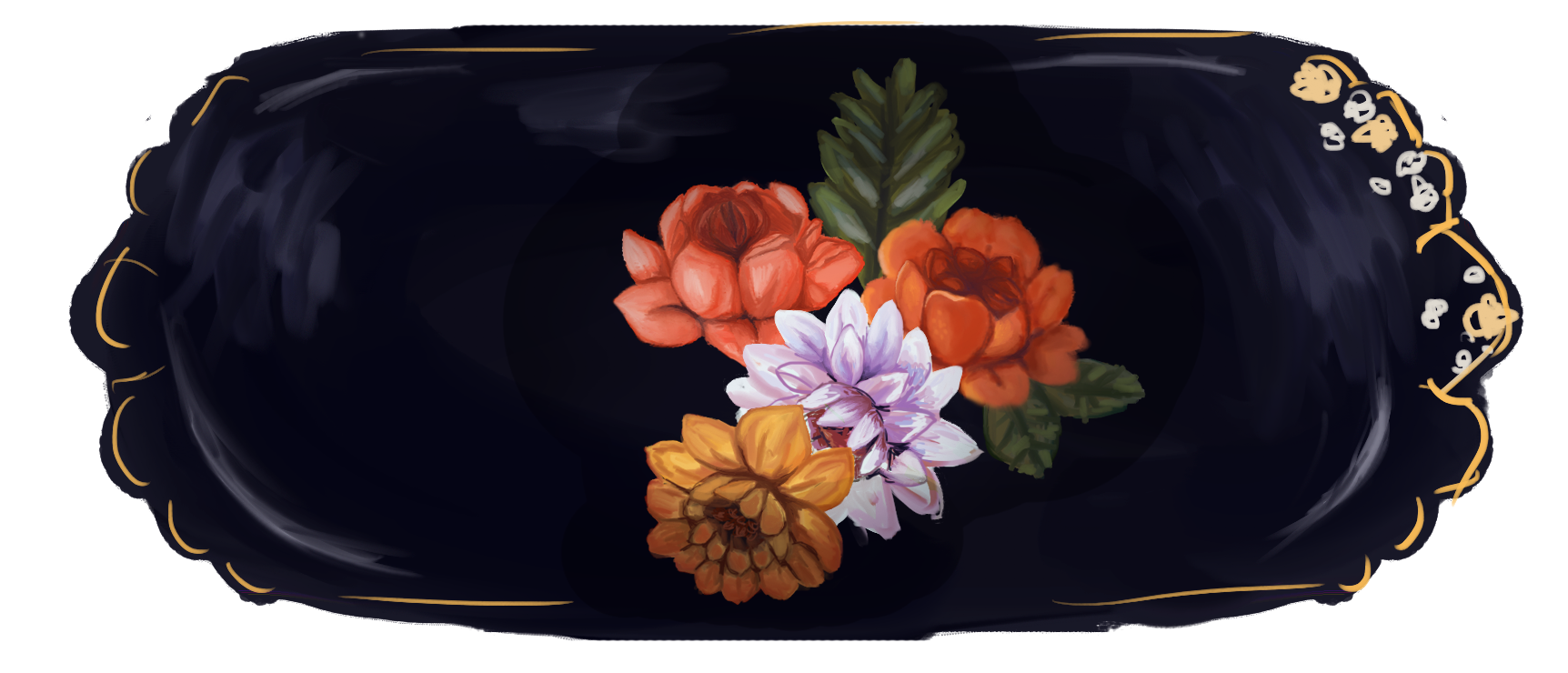
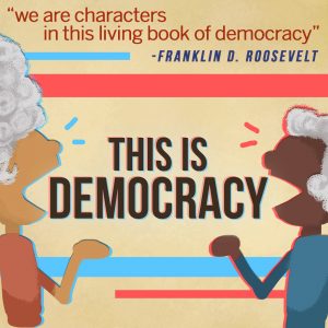
I finally finished the design for the “This is Democracy” podcast! This is the final design that Dr. Suri chose, compared with the first design I originally submitted:


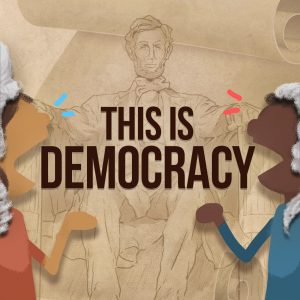
The Lincoln statue was a tedious process to trace, since I was afraid that if I made it more simplistic like the buildings from before it would not be as recognizable, since the statue is of a person. But I think the shading really tied everything together!

______________

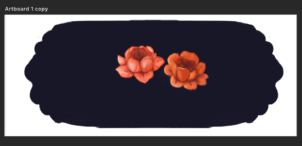
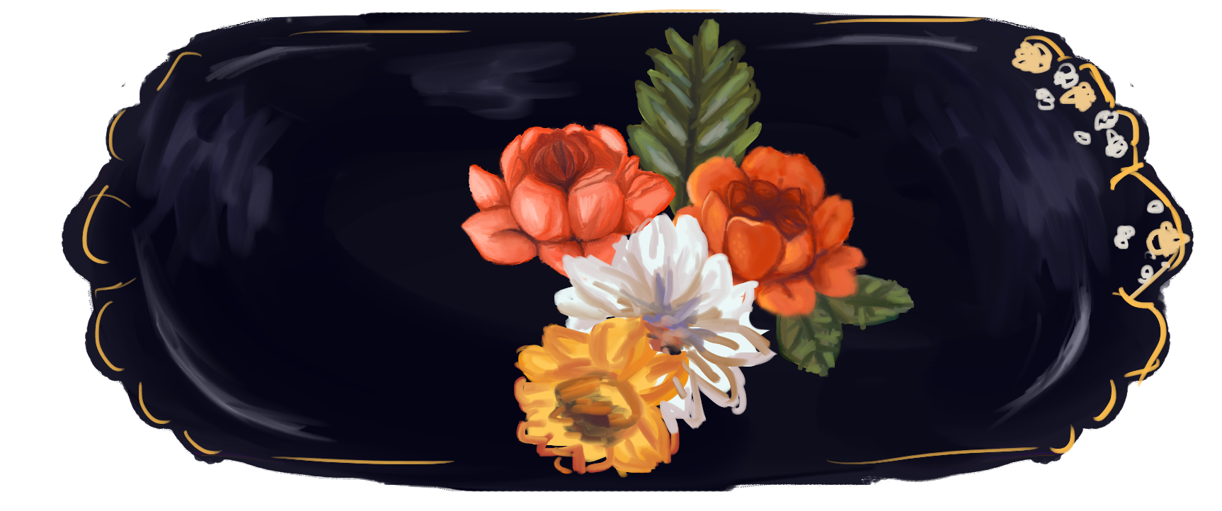
I also did most of the color for my illustration for RUS412, as of the meeting this is what I have:

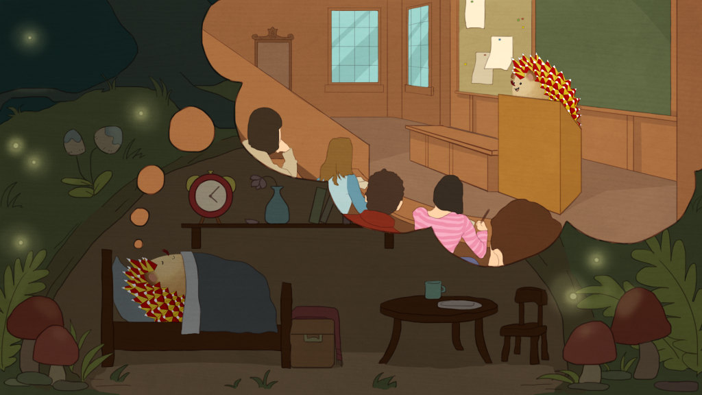
I’m going to play around a bit more with details, colors, and shading to try to match the style better. Also, I might change the time to 8pm or so and make the sky more like sunset because I don’t think fireflies come out at 4am!

_______________

Lastly, I worked on this animation of a mother + child walk cycle! The kid is supposed to be dragging the mom over to a store to buy a toy or something he wants, which is why he’s pointing and leaning forward more compared to the normal walk cycle. Tate got the walking (legs) part spaced out so that the two don’t step down at the same time, and I adjusted the hands so that they’re connected in every frame.

GIF

Filed Under: 2017-2018, Uncategorized

RUS412K Illustrations

July 23, 2018 By Duo

RUS412K Illustrations


This week I worked on the Lecture hall background for Tate and my first illustration assignment for Kathy! I used textured ink pen to do the outlines, and different watercolor texture brushes for coloring. I tried to keep each color within one single stroke, and applied different pen pressure in different areas to have different shades of the same color.

For Kathy’s illustration, I want Polina and Oleg and to be very cute and childlike as they play with the stethoscopes to listen to each other’s heart. I decided to let Polina kneel on her bed in a very carefree manner, and hold up the stethoscope to her own heart for Oleg as well because his arms are too short! I imagine a hedgehog must be new to the concept of heartbeats, so I gave him a surprised expression. Originally I want Polina to have a wide smile, but now I want to change it to a more surprised expression like Oleg’s after Suloni’s suggestion.

Filed Under: 2017-2018

UTPoll UI Design

July 17, 2018 By Jaclyn Alford

UTPoll UI Design


Suloni asked me to help out with the UI design for a new (free!) clicker system for UT classes. Having used a few clicker systems myself, I am excited to help out with this project and hope this tool will be standardized/help drop the cost of courses for students!


Here are the first few mockups of the “teacher” view home page (+ versions with my notes). I tied in elements of UT Box, Canvas, and the UT branding guidelines webpages. Hover effects are included considering instructors will likely be using the desktop version of this most of the time (unlike students who are just as likely to use the mobile version as the desktop).

The original tabs are really effective here for the menu!

Refs:

Squarecap

UT Branding + Canvas

Unstyled:


Teacher-View Folder Mockups with Notes:


Unstylized:


Teacher-View Editor Mockup


Some notes on Branding:

I had some concerns about the chosen logo; I provided an image for reference below. As you can see, the wonderful coloring and imagery is lost when the logo is scaled down. Also, the Tower imagery has already been used for 2 other UT applications and, thus, will not be distinguishable from these other apps (if you just use the symbol without “UTPoll”). The imagery only hints at its UT ownership but leaves out the polling aspect of the app.

Additionally, there is a possibility of the application being named “UT Instapoll.” I found that CALI (Center for Computer Assisted Legal Instruction), a law school organization, already has a tool called InstaPoll that seems to do the same thing as our poll application: https://www.cali.org/content/cali-instapoll. Users (instructors as well as students) would likely drop the “UT” in “UT Instapoll” when referring to the app for the purpose of brevity. I believe that “UTPoll” is concise and fits the tool well!

Updates:

Student view:

Yesterday I met with Suloni to discuss the designs, so I am currently working on those updates! Additionally, I will be meeting with the project managers to discuss the project today!

UPDATE:

Student Views


Accordion Style

Card Style

Popup Style


Mobile Mockups

Teacher:  Student:


Chris’s UI implementation of these designs

Teacher View:


Student View:


Filed Under: 2017-2018

RUS412K banner

July 17, 2018 By Kathy Vong

This past week was spent primarily on the RUS412K banner! I’ve made a little more progress since last time and experimented with some things.

Here’s my progress/process so far!

First I started by painting these two flowers. I played around with the Kyle Webster oil paint brushes. My goal at first was to try and get it to look as smooth and as blended as possible in order to match the style in the reference images I was provided.

Then, once I was happy with the style and had a better idea of the direction I needed to go in, I started roughly applying color on different layers for more flowers using the same oil brush I had been using. I also added some leaves that will be repainted later.

After roughly putting down colors, I start to polish and refine. I try to use a variety of colors to add more interest but also to keep the colors from getting to dull. I had issues with the gold/yellow flower as it was very easy for the colors to get muddy and turn brown. To combat this, I added more reds! Also, the oil brushes are very “wet” as they are simulating real oils, which can be a problem at times simply because of the way I’m approaching this painting. Since I’m doing things digitally, I have more flexibility regarding colors and tools. To make things easier, when I need more bright, saturated areas of color, I go back in with a hard round brush at 100% opacity. I then switch back to the oil brush and blend things out carefully. It’s a lot of trial and error, but it’s working well for me.

Next, as a test, I tried to make it feel more like a “dish” rather than just a flat painting. The highlights around the perimeter help, but there needs to be shadows to add depth and a sense of something “3D!” On top of everything, I put a layer on multiply, and using a soft round brush and a soft eraser at 20% opacity, I created shadows. Now it’s looking better! However it is affecting some of the colors, so there’s some more tweaking and experimenting to do later after all the flowers are done. For now, it’s working pretty well!

For the banners, there needs to be 7 different variations. There are 7 specific colors that have been chosen, so each unit has its own unique color, which means that I need to duplicate these banners and have some flowers change colors each time. I think white flowers will be the easiest to manipulate. At first, I tried to change the color of a flower with a layer on top set to “Color,” but as you can see here, this turns everything into that color. It loses a lot of interest and color! I will need to do a lot of paint-over work.

Since I decided to switch to changing the color of the white flowers, I put a layer on top set to “Overlay,” and it’s working really well! You can see a wider range of colors, and it’s more visually interesting.

That’s it for the banner!

I also worked on a profile view for the Garbage Man character, as assigned by Tate.


Filed Under: 2017-2018

July 17, 2018 By Rodrigo Villarreal

Connect the Dot Com

This week I also had to be a tester for a new Canvas Online Course that the Sanger Learning Center is developing. The course is targeted towards Freshmen so that they can be effective and successful at online classes. Although the course had some issues and areas for improvement I think it was a good learning experience. I found some new studying ideas and tips. I also learned about all the work it takes to make a good online class.

https://sta.laits.utexas.edu/blog/2018/07/17/23673-2/

Filed Under: 2017-2018

Dreamweaver Guide

July 17, 2018 By Rodrigo Villarreal

This week I was tasked with creating a guide that we could send to the people in charge of TBH. It would basically explain the basics of Dreamweaver in order for them to be able to edit and maintain the site from now on. Dreamweaver is a new program for me so I was excited to learn and get to know how it worked in order to be able to explain it. The guide also needs to be comprehensive, taking the user from knowing nothing through installing the server, downloading files and being able to edit a page. I’ve had some trouble in the process but the guide is more than halfway done. Originally I planned to download all the files for TBH but after a whole night it didn’t even finish! I modified the process a little but I think I’m well on my way to having a pretty good guide.

Filed Under: 2017-2018

  • « Previous Page
  • 1
  • …
  • 5
  • 6
  • 7
  • 8
  • 9
  • …
  • 43
  • Next Page »

link to LAITS home page

Video STA Home

© 2025 Liberal Arts Instructional Technology Services | Production Credits