This past week was spent primarily on the RUS412K banner! I’ve made a little more progress since last time and experimented with some things.
Here’s my progress/process so far!
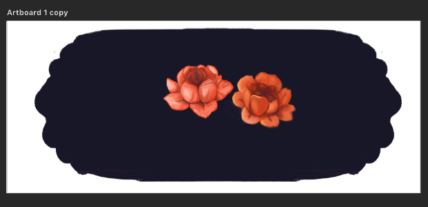
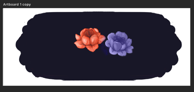
First I started by painting these two flowers. I played around with the Kyle Webster oil paint brushes. My goal at first was to try and get it to look as smooth and as blended as possible in order to match the style in the reference images I was provided.
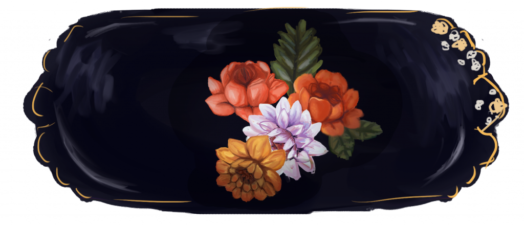
Then, once I was happy with the style and had a better idea of the direction I needed to go in, I started roughly applying color on different layers for more flowers using the same oil brush I had been using. I also added some leaves that will be repainted later.
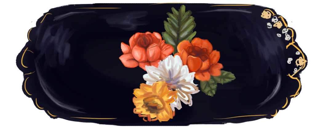
After roughly putting down colors, I start to polish and refine. I try to use a variety of colors to add more interest but also to keep the colors from getting to dull. I had issues with the gold/yellow flower as it was very easy for the colors to get muddy and turn brown. To combat this, I added more reds! Also, the oil brushes are very “wet” as they are simulating real oils, which can be a problem at times simply because of the way I’m approaching this painting. Since I’m doing things digitally, I have more flexibility regarding colors and tools. To make things easier, when I need more bright, saturated areas of color, I go back in with a hard round brush at 100% opacity. I then switch back to the oil brush and blend things out carefully. It’s a lot of trial and error, but it’s working well for me.
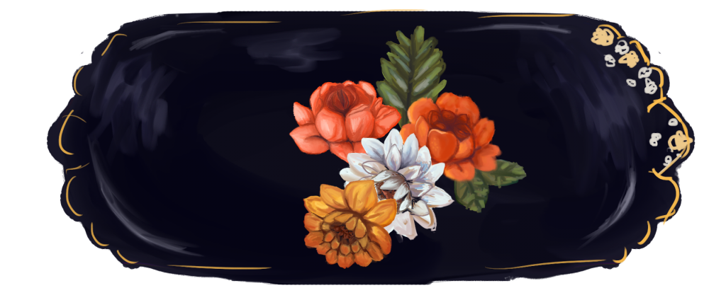
Next, as a test, I tried to make it feel more like a “dish” rather than just a flat painting. The highlights around the perimeter help, but there needs to be shadows to add depth and a sense of something “3D!” On top of everything, I put a layer on multiply, and using a soft round brush and a soft eraser at 20% opacity, I created shadows. Now it’s looking better! However it is affecting some of the colors, so there’s some more tweaking and experimenting to do later after all the flowers are done. For now, it’s working pretty well!
For the banners, there needs to be 7 different variations. There are 7 specific colors that have been chosen, so each unit has its own unique color, which means that I need to duplicate these banners and have some flowers change colors each time. I think white flowers will be the easiest to manipulate. At first, I tried to change the color of a flower with a layer on top set to “Color,” but as you can see here, this turns everything into that color. It loses a lot of interest and color! I will need to do a lot of paint-over work.
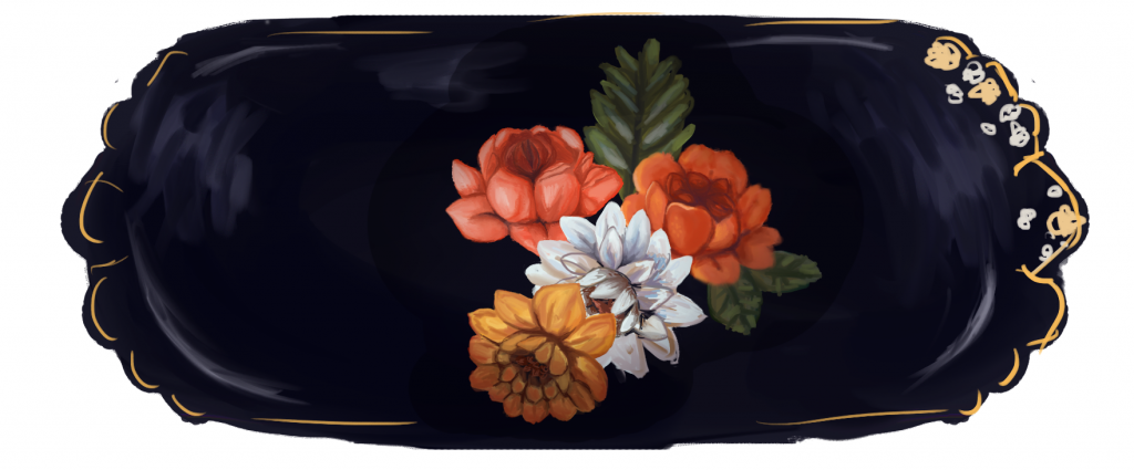
Since I decided to switch to changing the color of the white flowers, I put a layer on top set to “Overlay,” and it’s working really well! You can see a wider range of colors, and it’s more visually interesting.
That’s it for the banner!
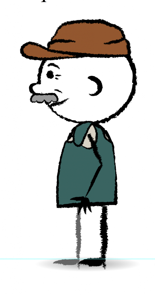
I also worked on a profile view for the Garbage Man character, as assigned by Tate.
