Welcome Esther! i hope you have fun at your STA Orientation.
STA Work Blog
STAs: Student Technology Assistants
Who We Are
LAITS: IT and Facilities Director, Joe TenBarge initiated the Student Technology Assistant program in 2004. STAs are UT students who work on a variety of projects in collaboration with UT faculty and LAITS staff members. STAs assist College of Liberal Arts faculty members and administrative staff with print and web design. From building presentations, to creating audio/visual works, and producing online classes in the LAITS film studios, STAs are instrumental in helping COLA faculty realize their vision for multimedia projects that enhance their teaching and the students learning experience. By the end of their student careers, STAs have portfolios which demonstrate their accrued technical and design skills.
Prospective STAs:
Creative and technically inclined students are appointed as STAs for one year, with the possibility of being rehired as long as they study at the university. Applicants for the program are hired before both long semesters. Interested students may look for postings on Hire-A-Longhorn when positions are available. Positions will have Student Technology Assistant (illustrator or web designer) in the title of the job post.
Faculty and Staff:
Faculty & Staff with questions about services, please contact us.
https://liberalarts.utexas.edu/laits/contacts.php
- Audio Services: Michael C Heidenreich, Audio Services Manager
- Video Services: Kelly Webster, Video Production Supervisor
- Graphic Design & Web Design Services: Suloni Robertson, Art Director / STA Program Manager
RBTL
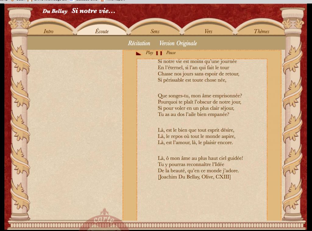
I stated last post that I was involved in a web dev project but never gave any info. The purpose is to re implement the French Class RBTL website which, not to my surprise, was previously a flash project. We are trying to create it to resemble the original as much as possible, all its beauty and its flaws.
So here’s some updates on the RBTL project.
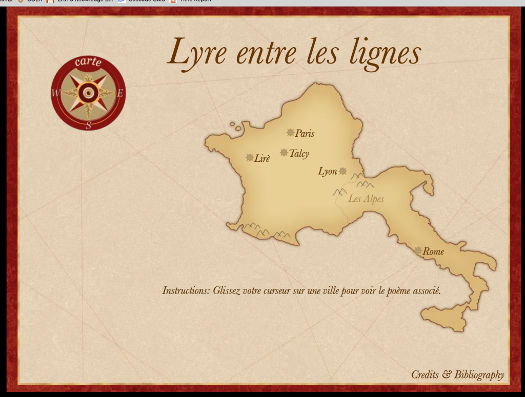
We started with the main page, it has a peculiar design because everything must float around this one map picture. It was hard to work with the positioning of the objects but we finished that.
Every city name is actually a pop-up and, when clicked, sends you to a page about a poem. We then stated developing the page for the first poem, the one in Paris.
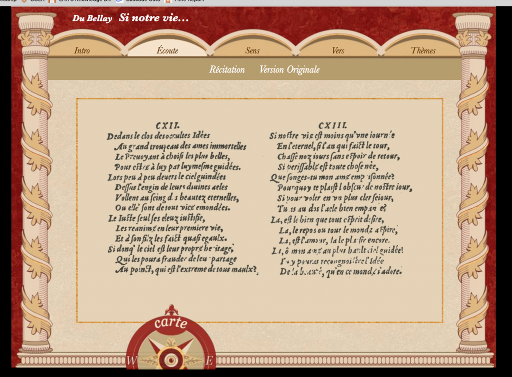
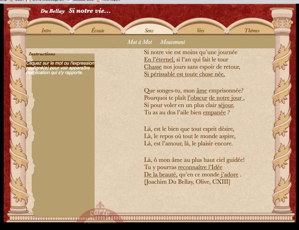
This page is also quite challenging. It not only has a complex design but A LOT of sub-pages.
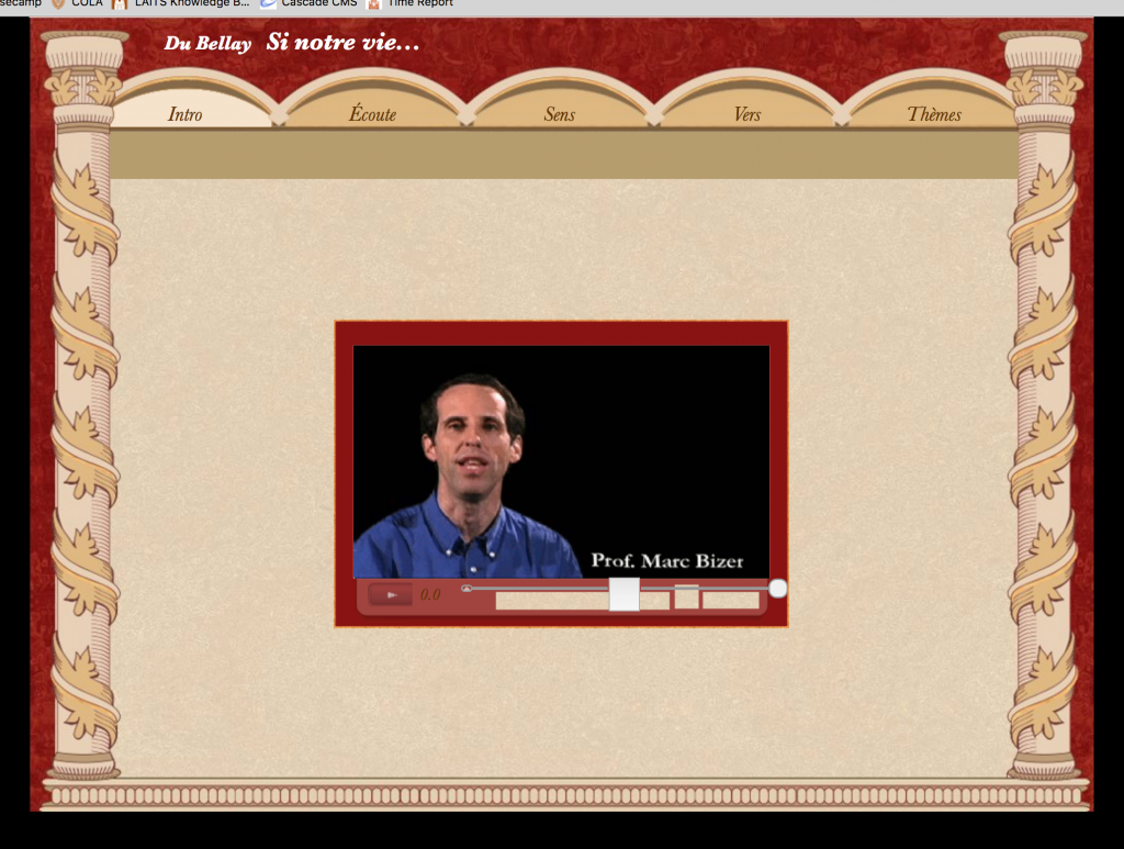
It was tricky to nail the 2 navigation bars in the top, but we did. The compass in the bottom is also a button that grows and shrinks. Here’s more pictures of other pages in development, including out very own video player.
I think this project is pretty long, and there’s lots more to go. But it has been a good experience. I have continued to develop my web design abilities, but most importantly how to write HTML, CSS and Java script code that is easy to write and in a professional format. This skills are invaluable in my opinion, and very useful in my career path. I am excited to keep working on this project and hopefully more like this next semester.
Summer Online Courses Postcard
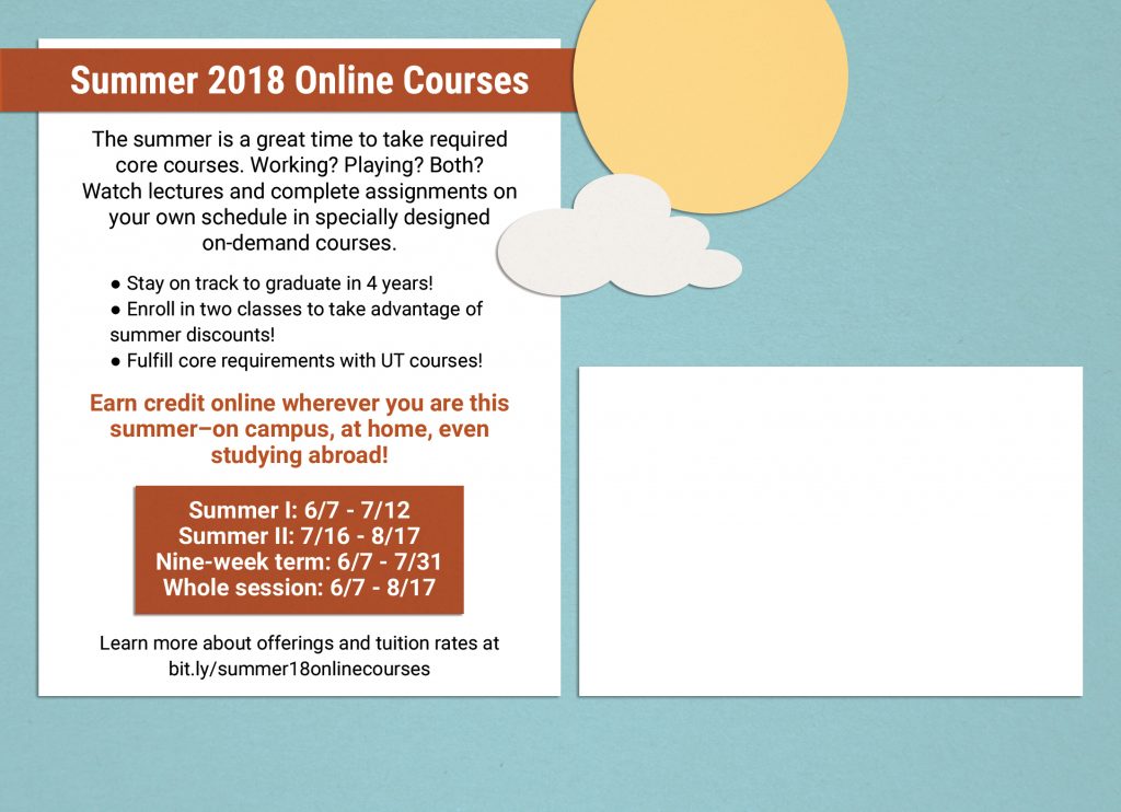
For this summer online courses postcard, they wanted the design to include summer elements and be collage-esque. To achieve this effect, I used clipping masks with paper textures and varying opacity. Additionally, drop shadows helped with the “cut and paste” style of the design as well. Below are design drafts.
TBH Redesign
TBH Landing Page Redesign
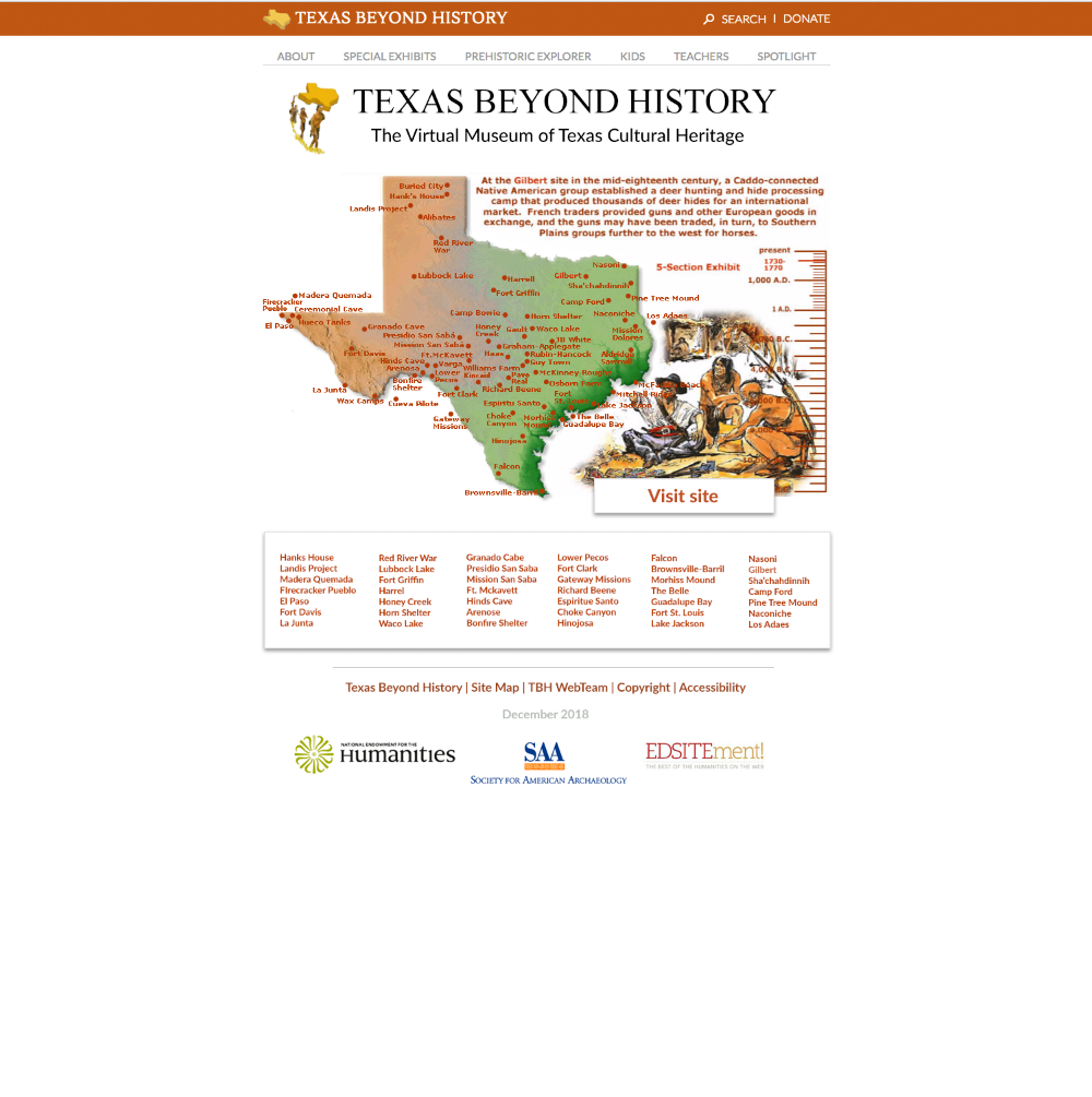
I was asked by Suloni to redesign the existing TBH homepage which looks like this: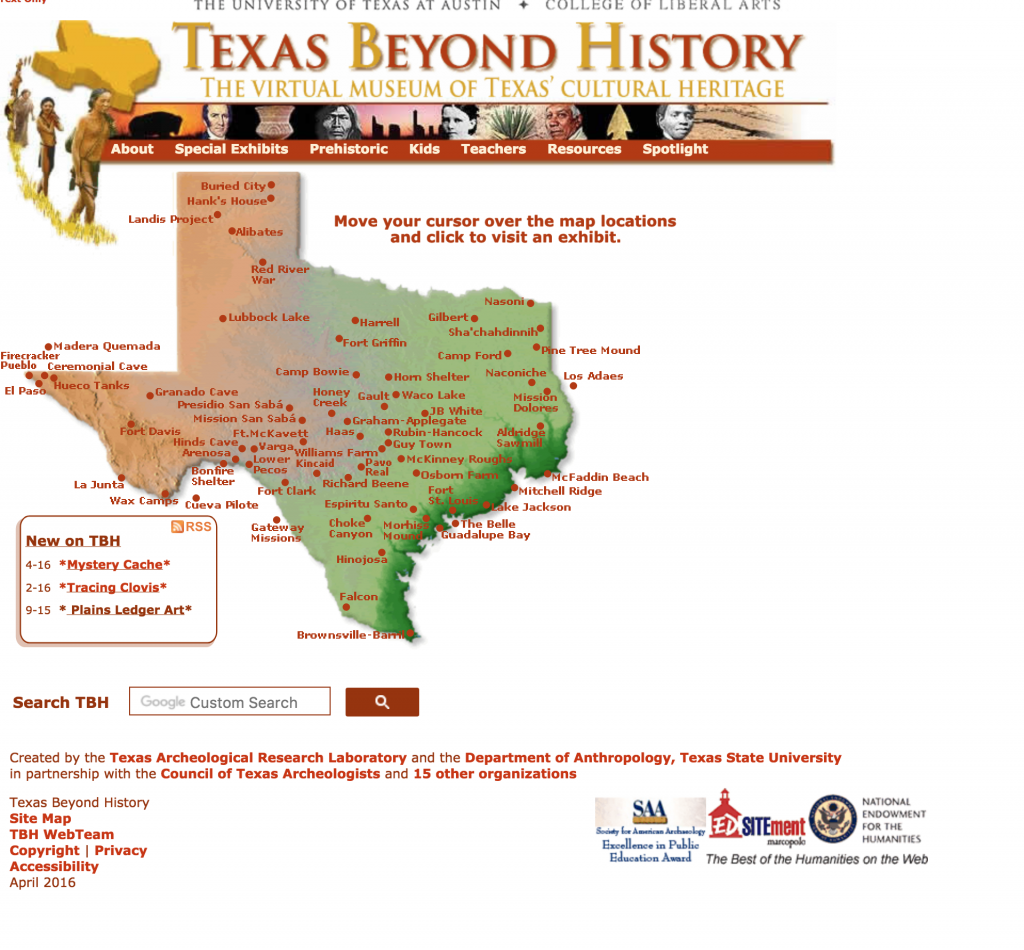
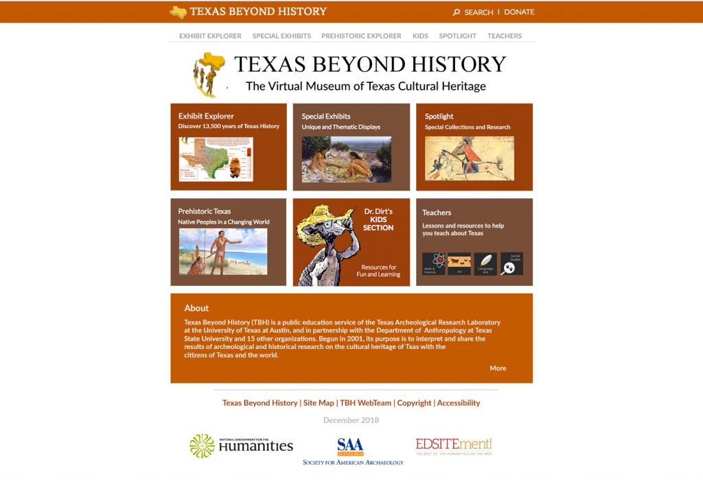
As you can see the design was really dated and uninspiring, especially since the main audience for this website is kids. We needed to update it to make it more tablet friendly/exicting and also give it a more “modern” feel. The client who oversees Texas beyond history typically does not like changes so Suloni had me create two design mockups. One was pretty close to the old design and the other was very different.
I tried to keep the same “feel” as the old website but add modern design elements such as the nav box/ drop shadows. I also reformatted header and footer to look cleaner.
This was my preferred design option. It offers a completely different look and feel from the old home page. It is clean and simple. The large icons are easier to press for children, especially since most will be accessing this site with a tablet. The client ended up choosing this version to our surprise! In the next coming weeks I will be working with Stacy, one of the web developers here, to bring this mockup to life in the new site using CSS/HTML.
More Icon Cards for LAITS Promotions
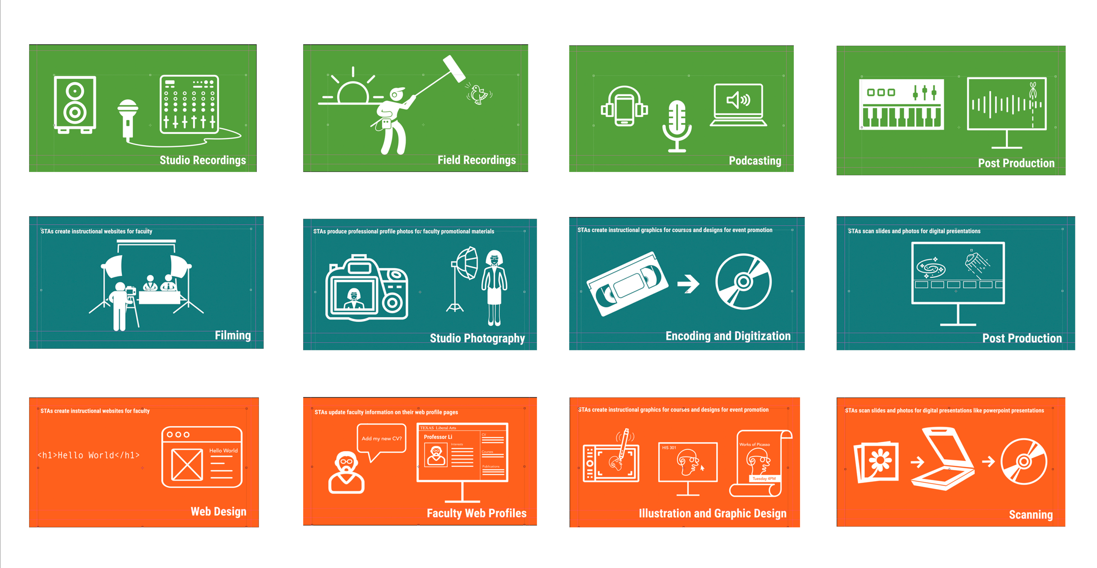
My project in the past couple of weeks has been laying out the designs for the three LAITS departments: audio, video and graphic design. Above are all the cards after three more iterations of edits and changes! I’m still in the process of working closely with Kelly and Samantha from video and audio to properly portray the tasks that their STAs work on. One thing I had to keep in my mind is how these cards may look once they become animated. Which parts should move or change?
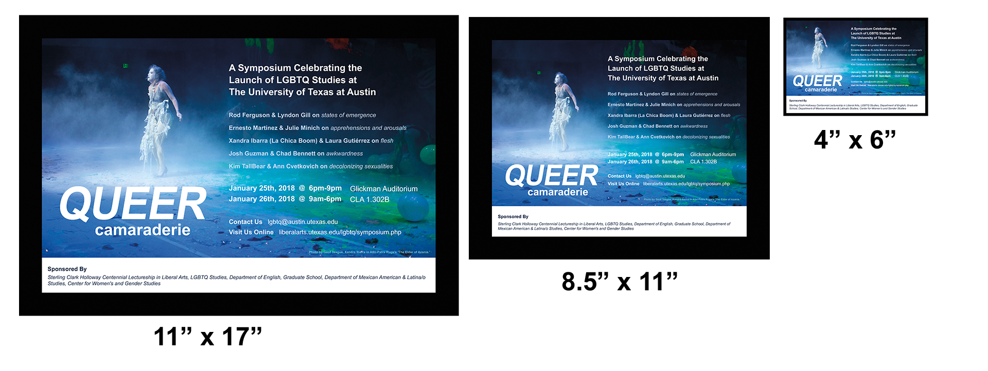
LGBTQ: Queer Camaraderie Poster [Draft 2]
- « Previous Page
- 1
- …
- 27
- 28
- 29
- 30
- 31
- …
- 43
- Next Page »
