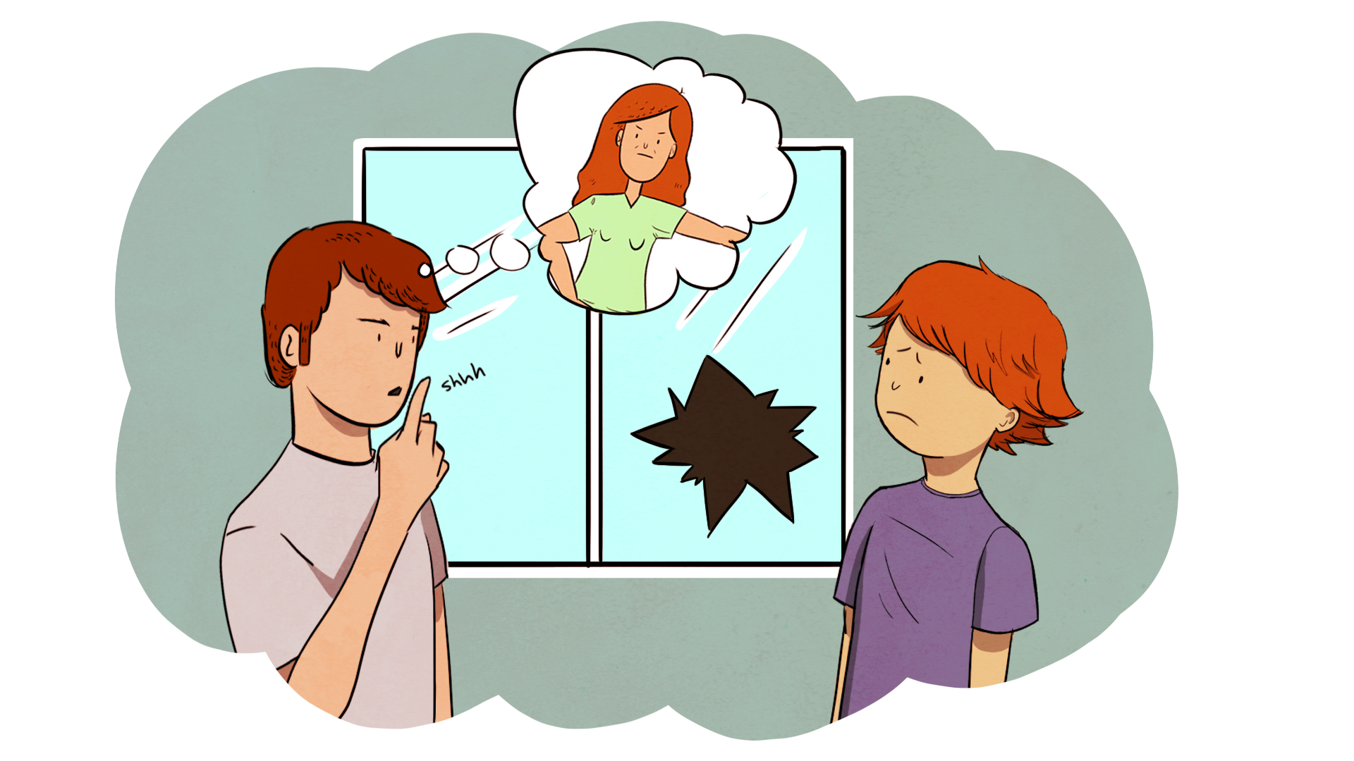
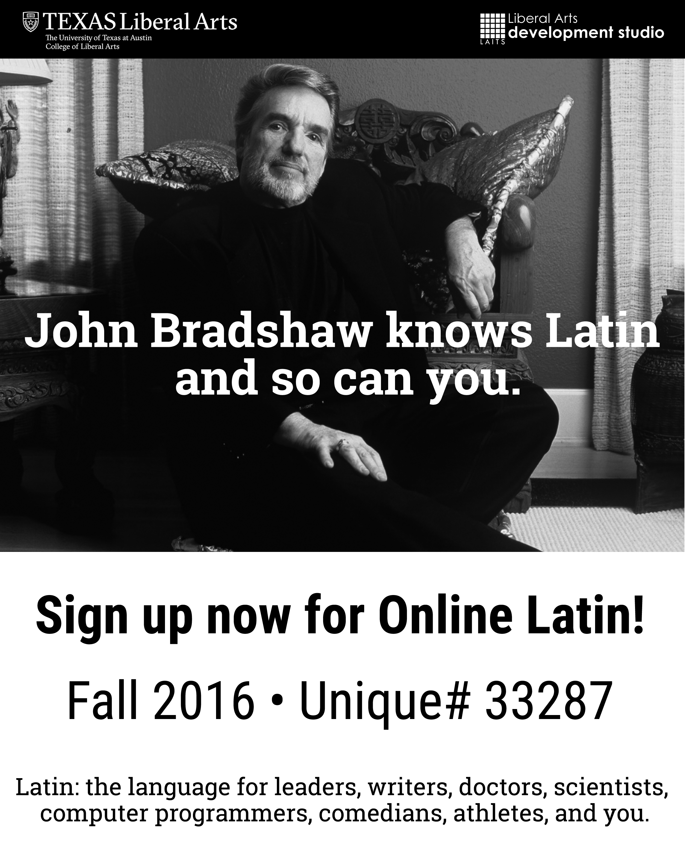
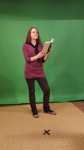
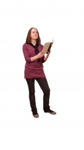
Latin Posters

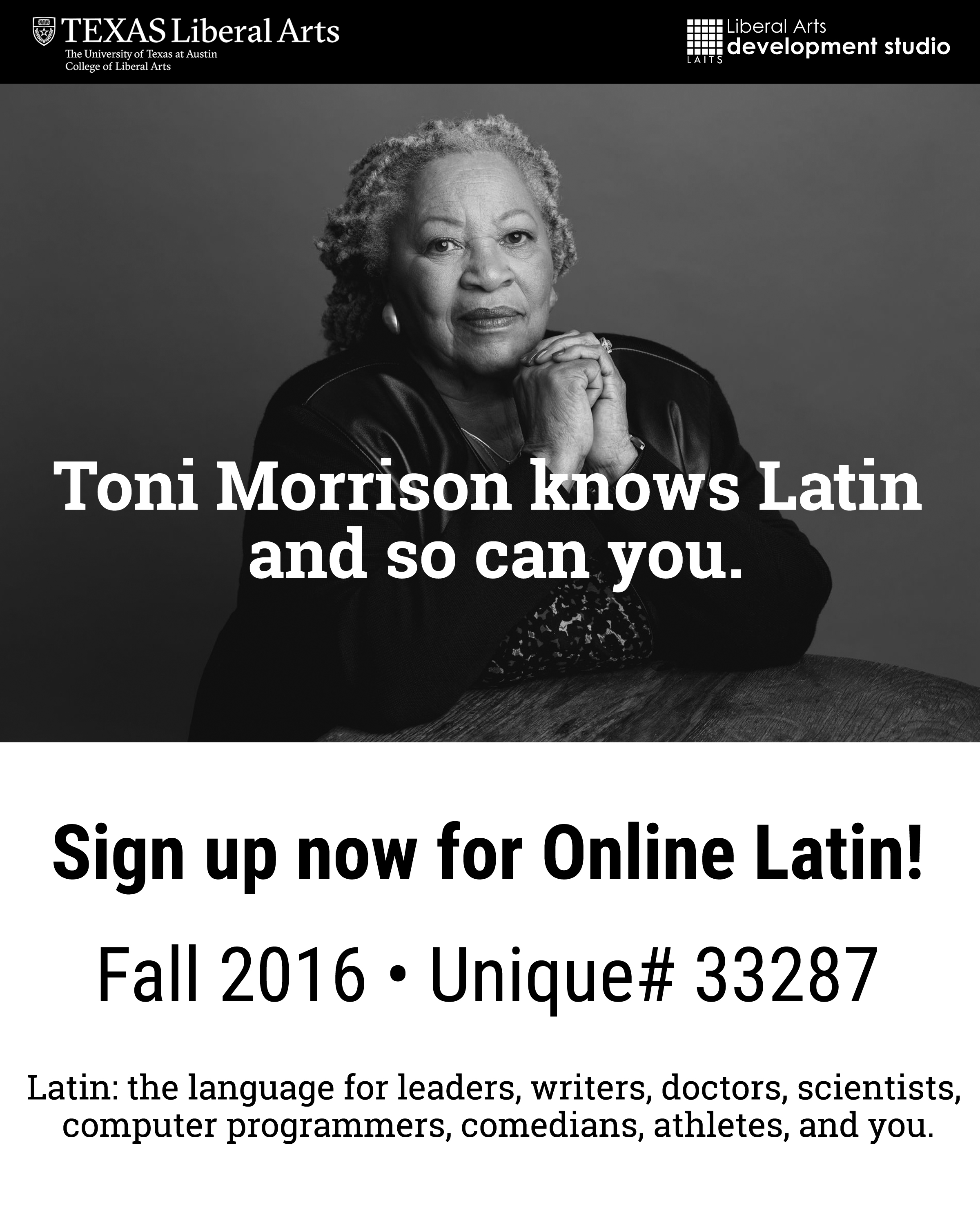
Made flyers promoting Online Latin using pictures of celebrity figures who know Latin themselves.
LAITS Student Technology Assistants collaborate with the College of Liberal Arts faculty and administration by re-imagining their instructional and promotional projects with a creative use of video, audio, web and graphic design. STAs learn technical skills on the job with LAITS development studio staff. They build presentations, produce audio/visual works, scan text documents & perform image correction. STAs are instrumental in helping COLA faculty realize their vision for instructional technology projects used to enhance the teaching and learning experience.
Made flyers promoting Online Latin using pictures of celebrity figures who know Latin themselves.
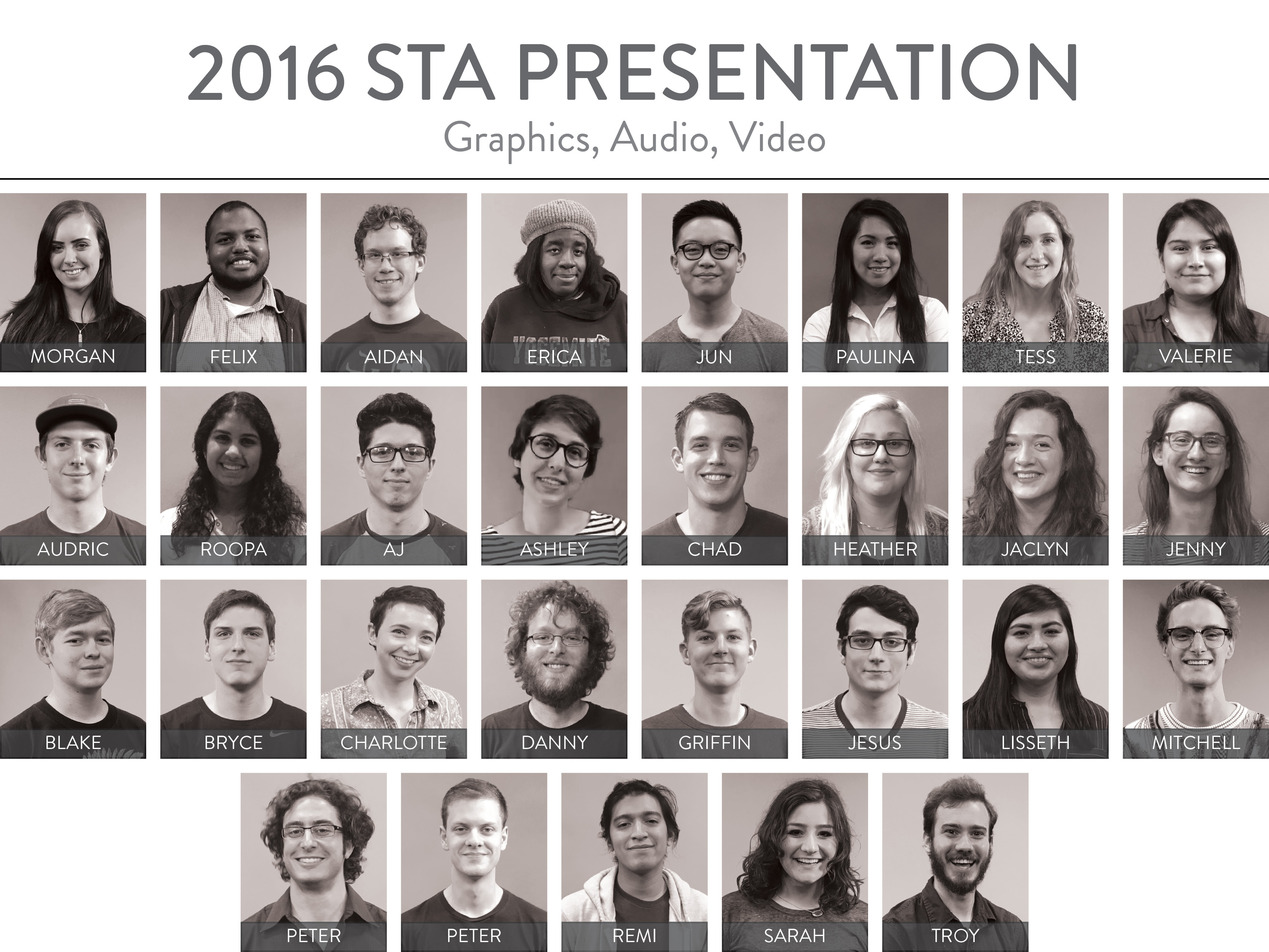
A grid made in InDesign of all the STAs working in LAITS for the end-of-year STA Presentation.

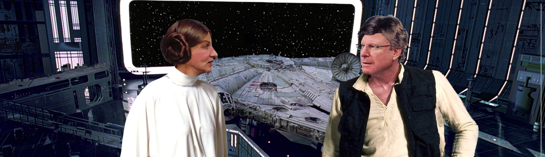
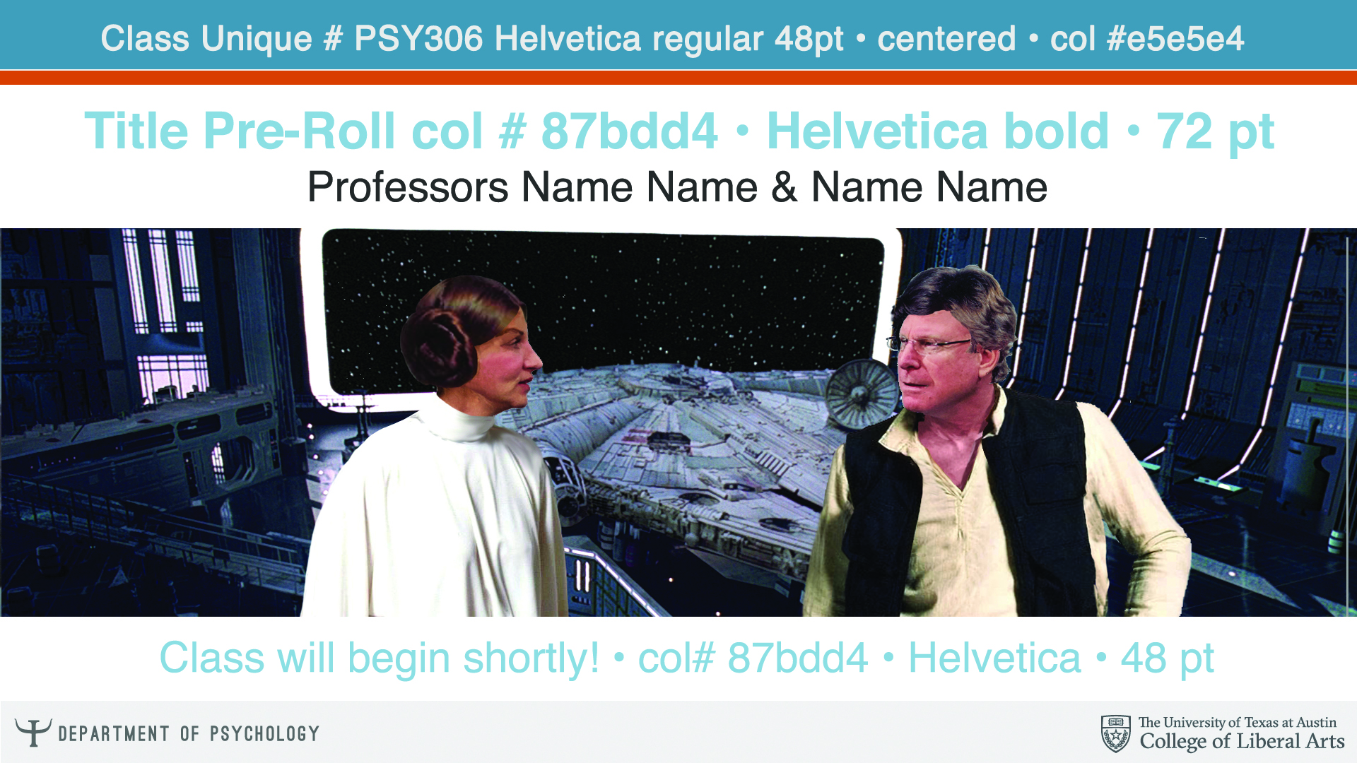
Used Photoshop to place Professors Metson and Buss into the hair, clothing, and setting of Han Solo and Leia Organa from Star Wars: Episode IV. Used as the pre-roll screen before their online class, PSY 306.
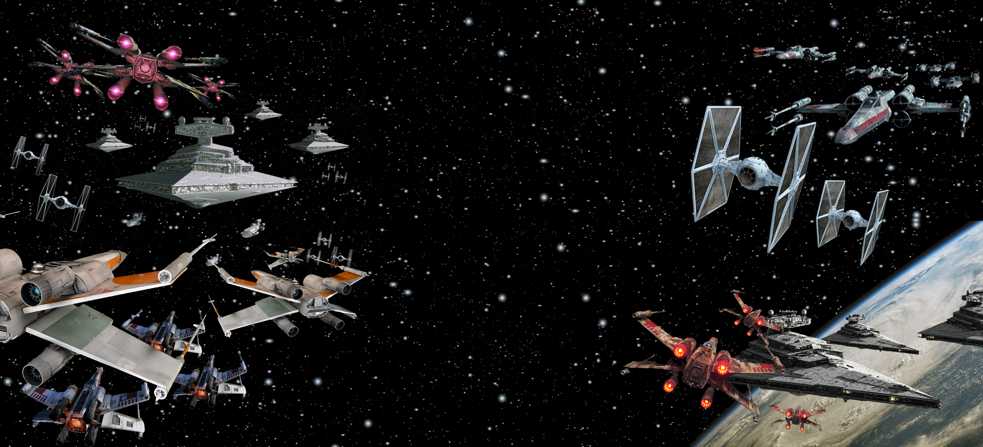
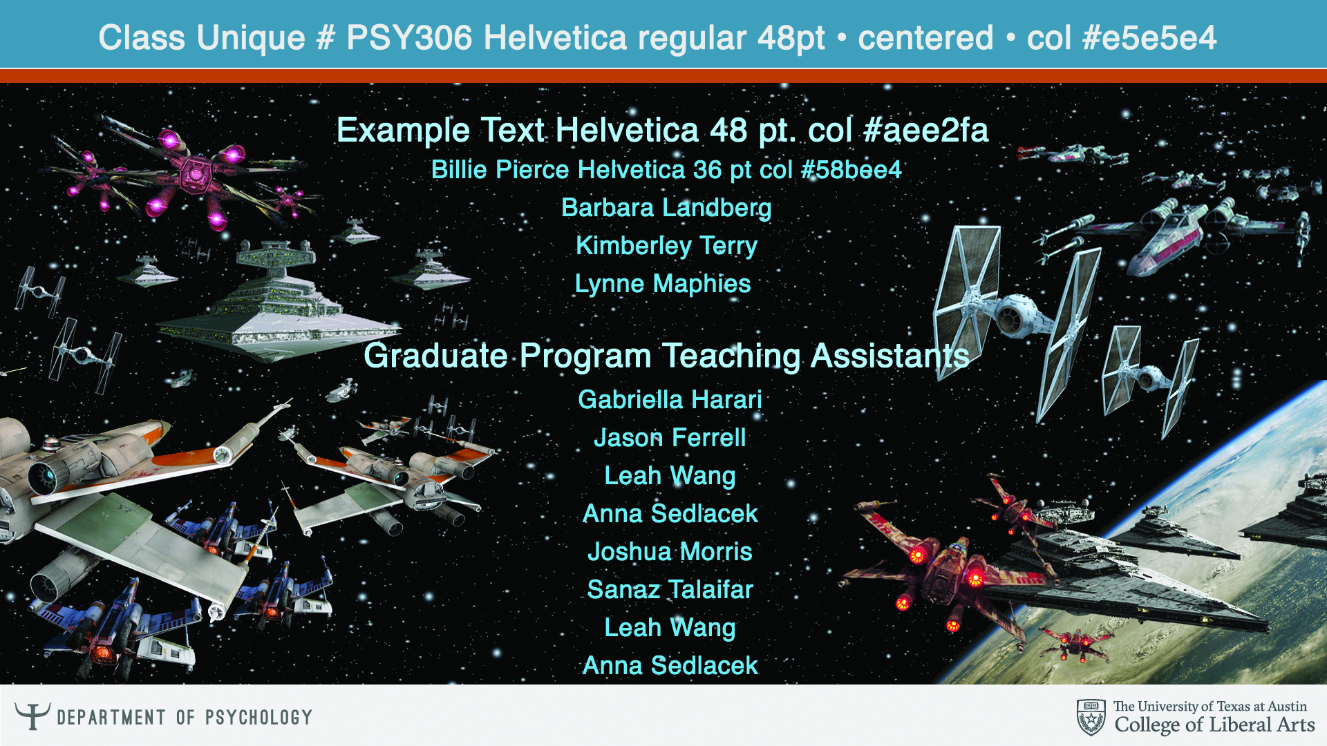
Using different pictures of X-wings, Star Destroyers, and TIE Fighters (all iconic Star Wars ships), I created a space battle scene. Formatted for the credits roll, the text is the same color used in the credits of Star Wars movies.
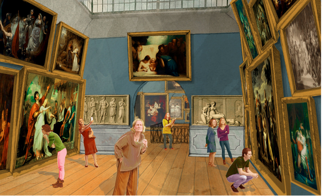
Request: Create 2 images for the What Jane Saw website. 1) Take the green screen images of the staff who worked on What Jane Saw and place them inside the What Jane Saw Exhibit. Add some stylization to the image. Image to be featured in the New York Times.
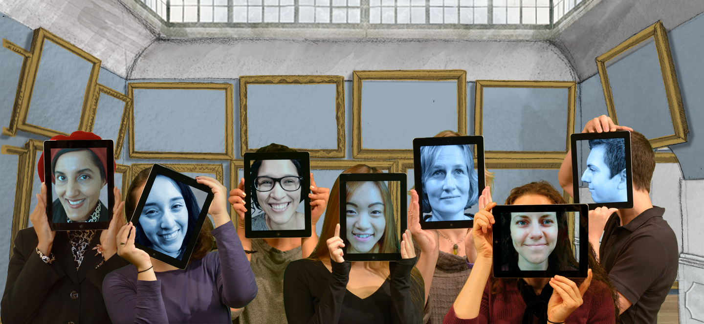
2) Create a line up of all the What Jane Saw staff inside one of the museum rooms with ipads over their faces.
Professor: Janine Barchas
Project Manager & Art Director: Suloni Robertson
Process:
1) First was to retrieve the green screen images of the staff that were taken of them observing an imaginary object.
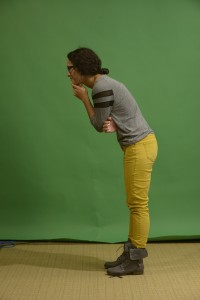
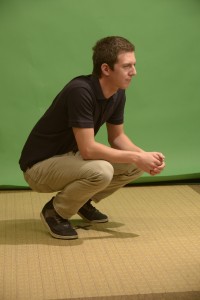
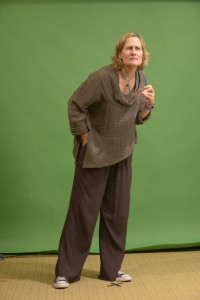
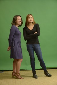
2) Next, was to key out the green screen and mask out their feet so I could place them into the exhibit.

3)Then I stylized it using a technique taught to me by Suloni. This stylization required giving the image a tint and adding noise., then adding a color and texture over the clothing to make it stand out. Next, adding small details to highlight features like the hair or clothes and then highlighting figures with a white stroke. Lastly, was to adjust the color of both the images of the staff and of the exhibit. I played with perspective and made the figures smaller or larger according to their location in the image. Adding shadows was the finishing touch so that the room looked to exist in a 3d space.
The final result
For the Second image, a similar process was done as far as retrieving the green screen image and cutting everyone out and placing them into a room. This image though didn’t require the stylization but rather lining up everyone who worked on the project together.
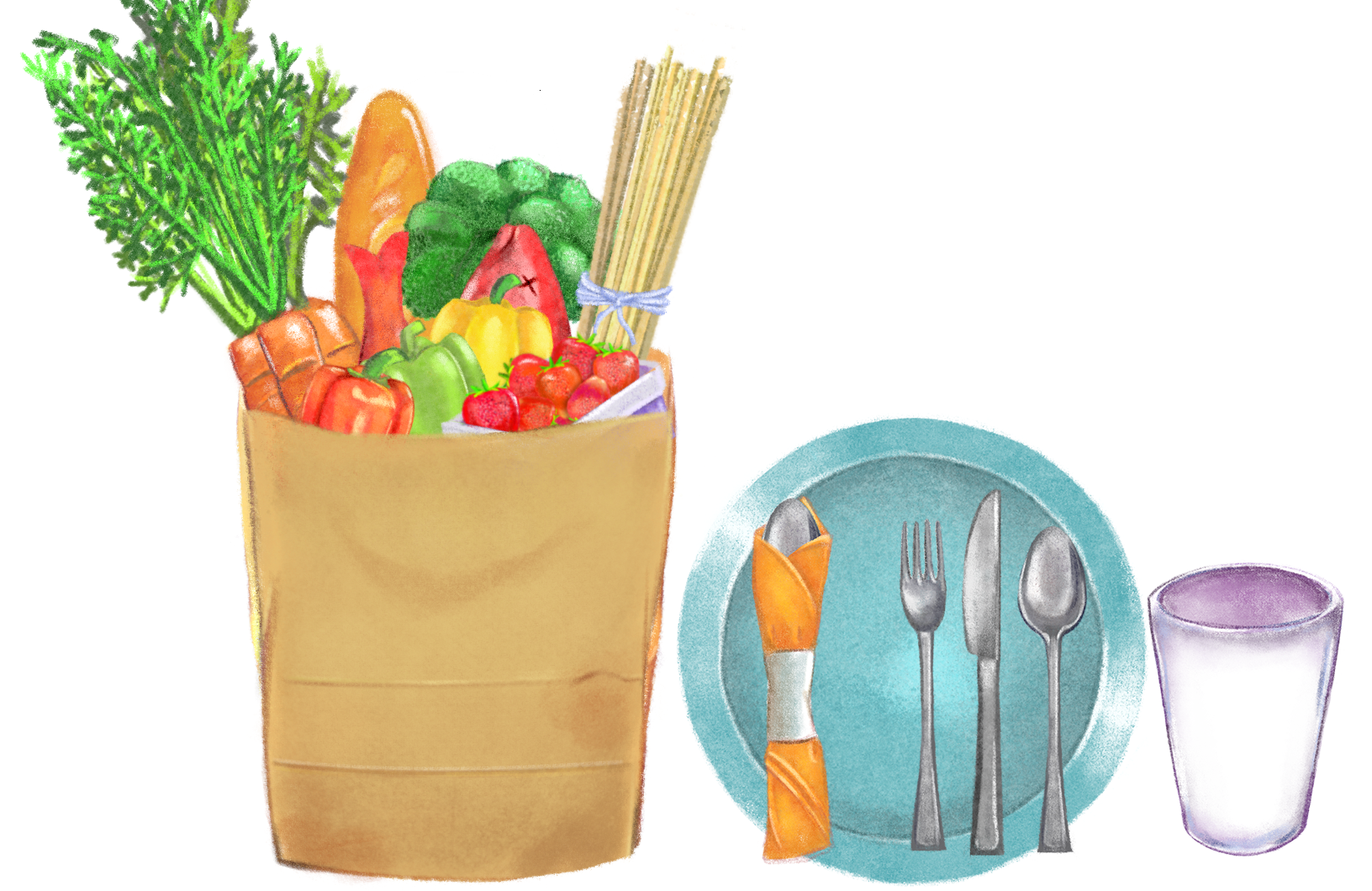
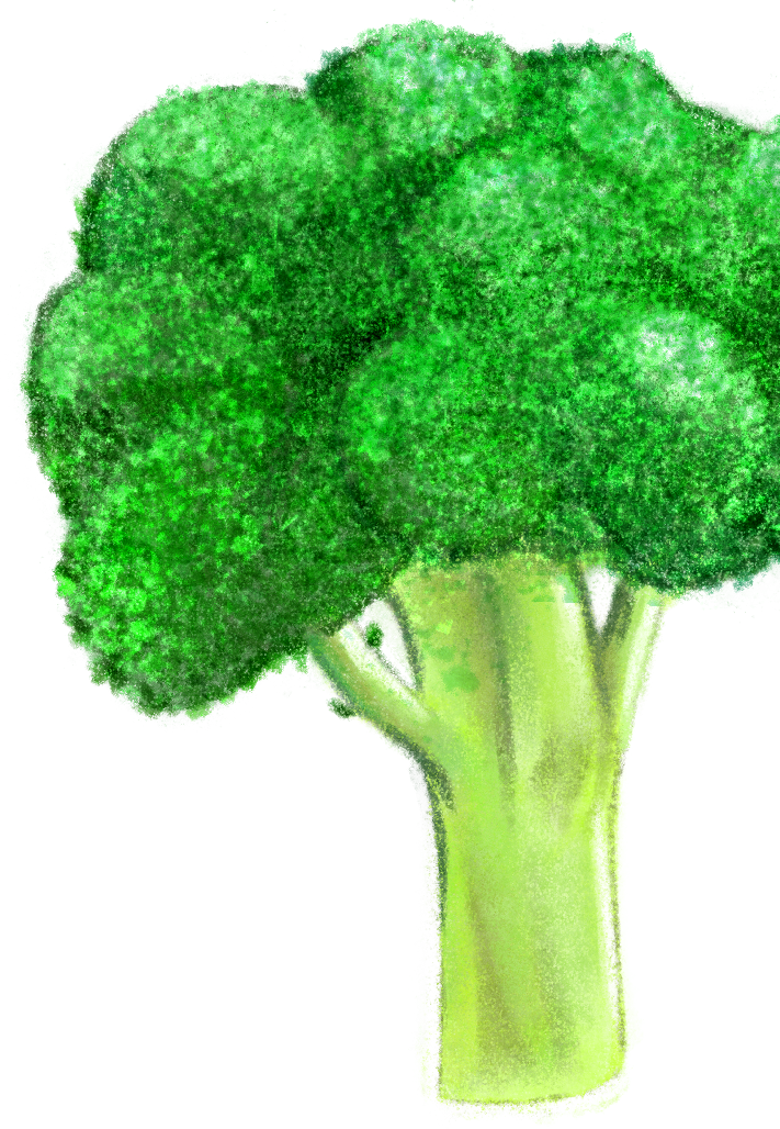
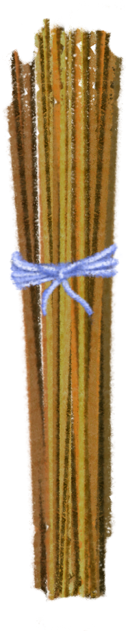
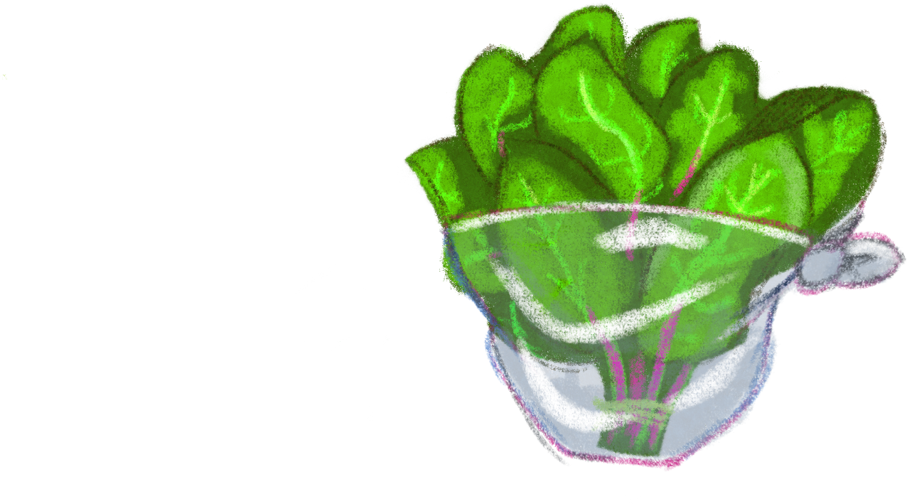
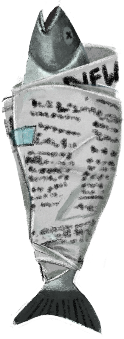
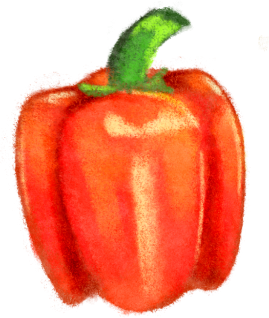
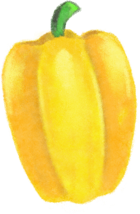
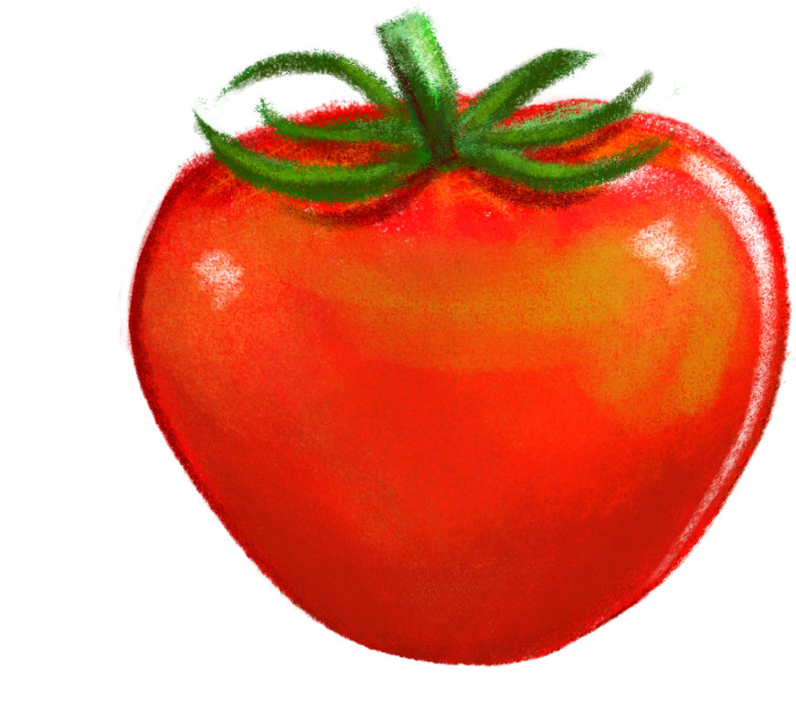
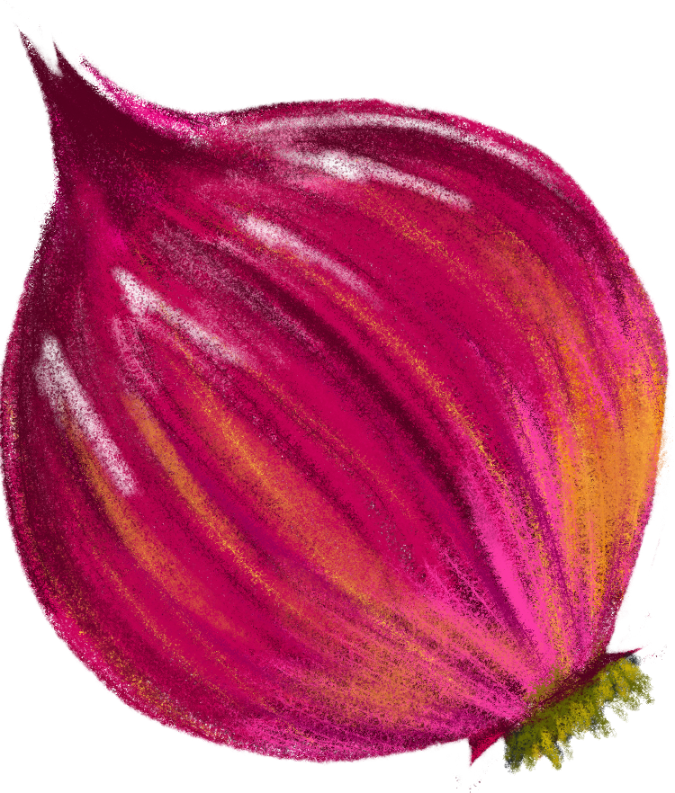
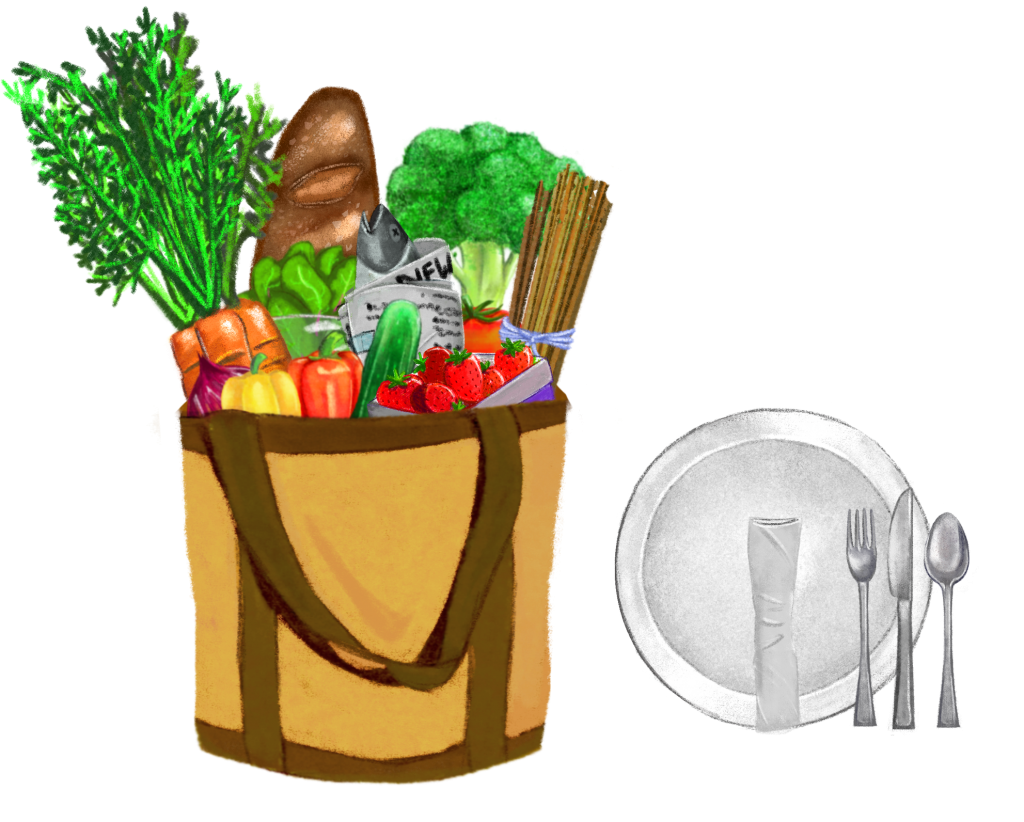
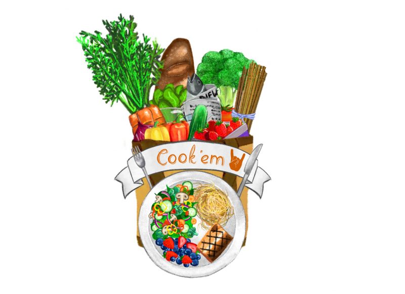
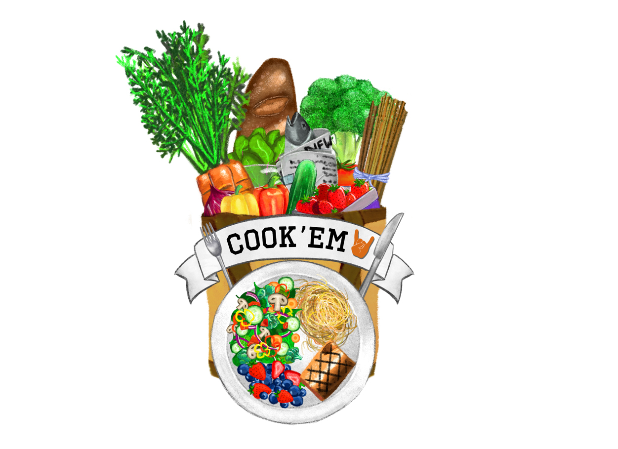
Request: Create graphic elements of a grocery bag filled with groceries.Draw specific groceries raw and then draw a plate with completed meals. Once all the graphics are drawn, create a 3 second intro animation of the grocery bag, and finally create a logo version of the graphics in black and white and in color.
Professor: Lydia C. Steinman
Project Managers: Suloni Robertson
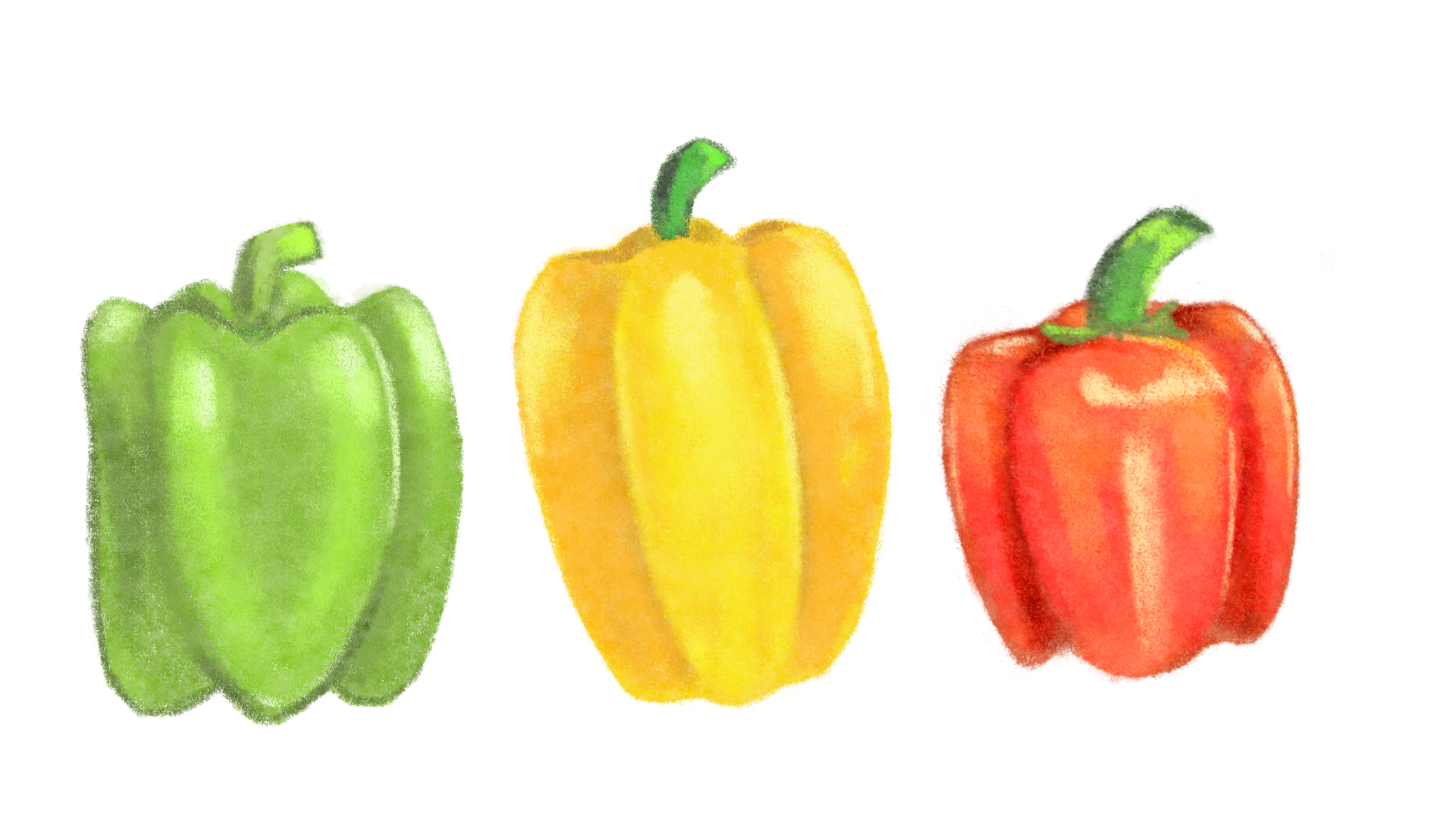
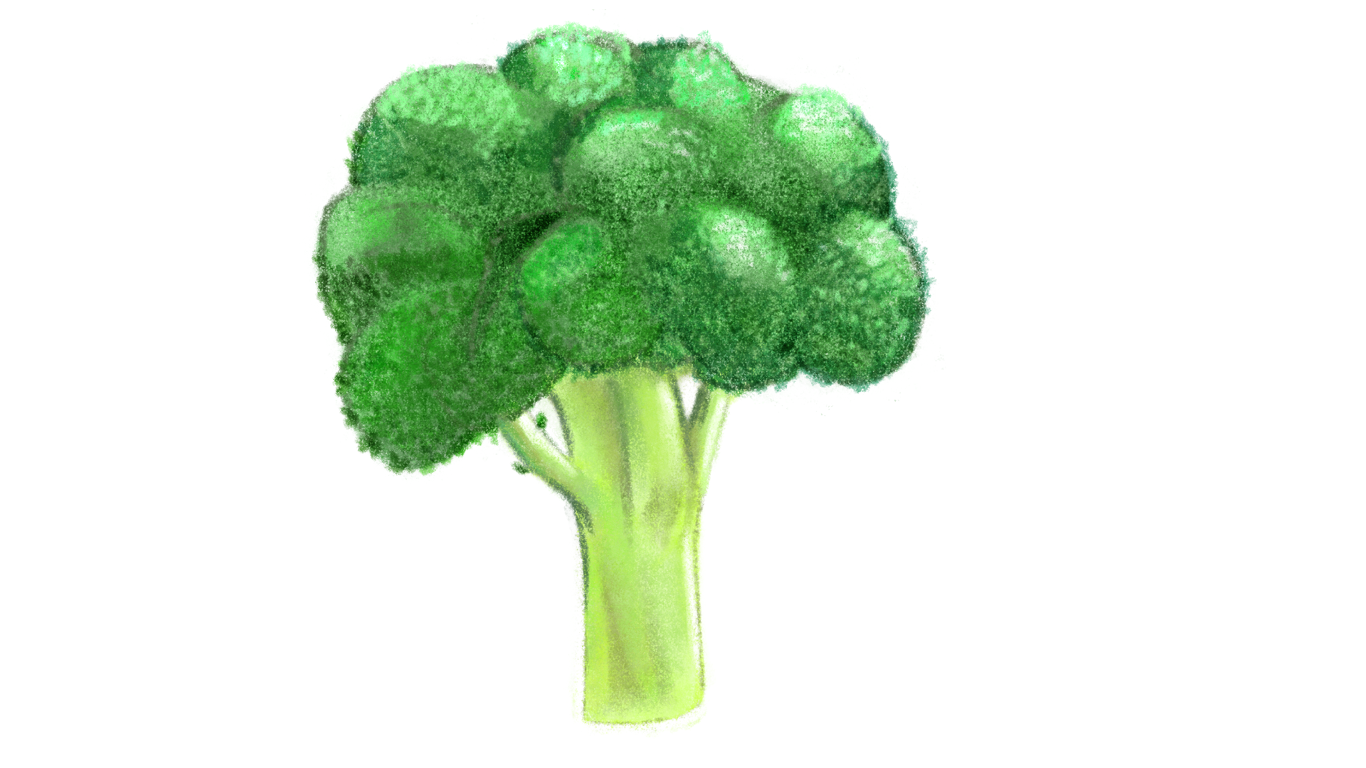
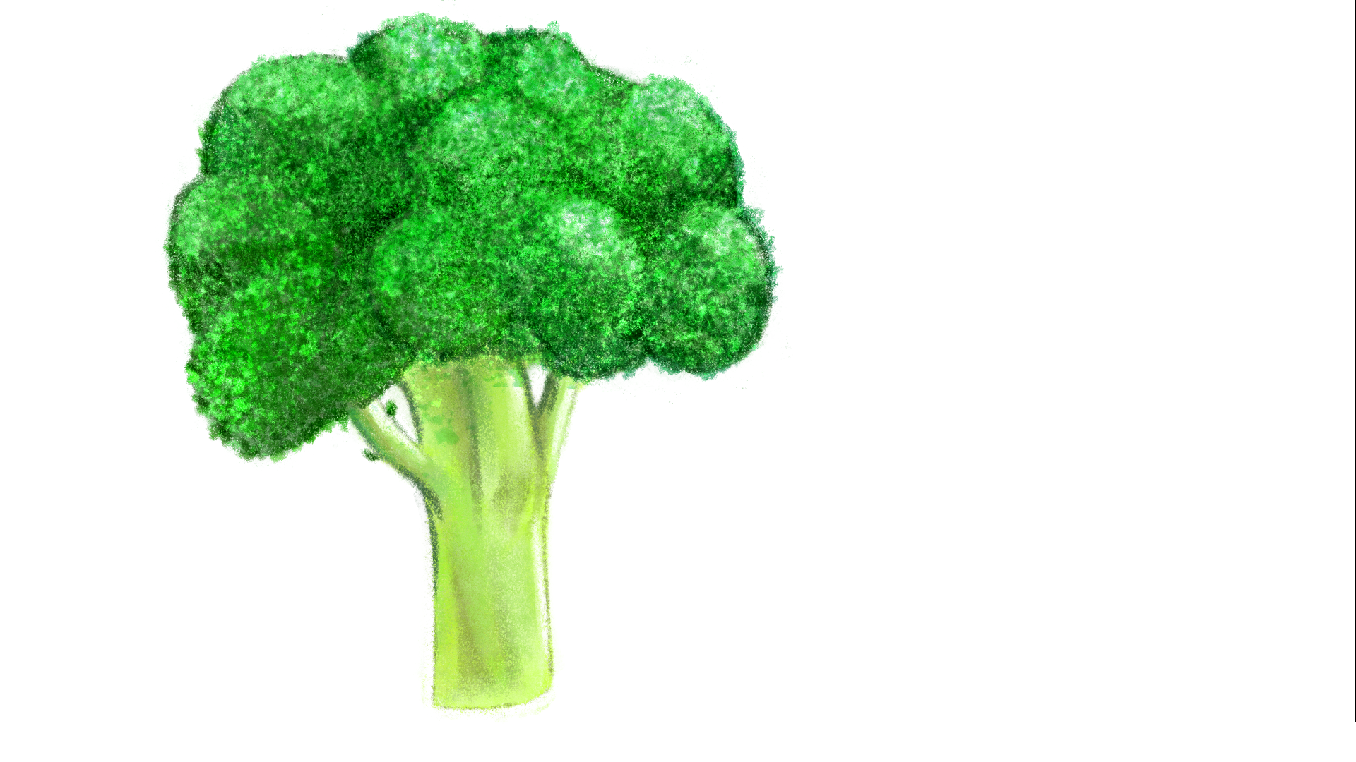
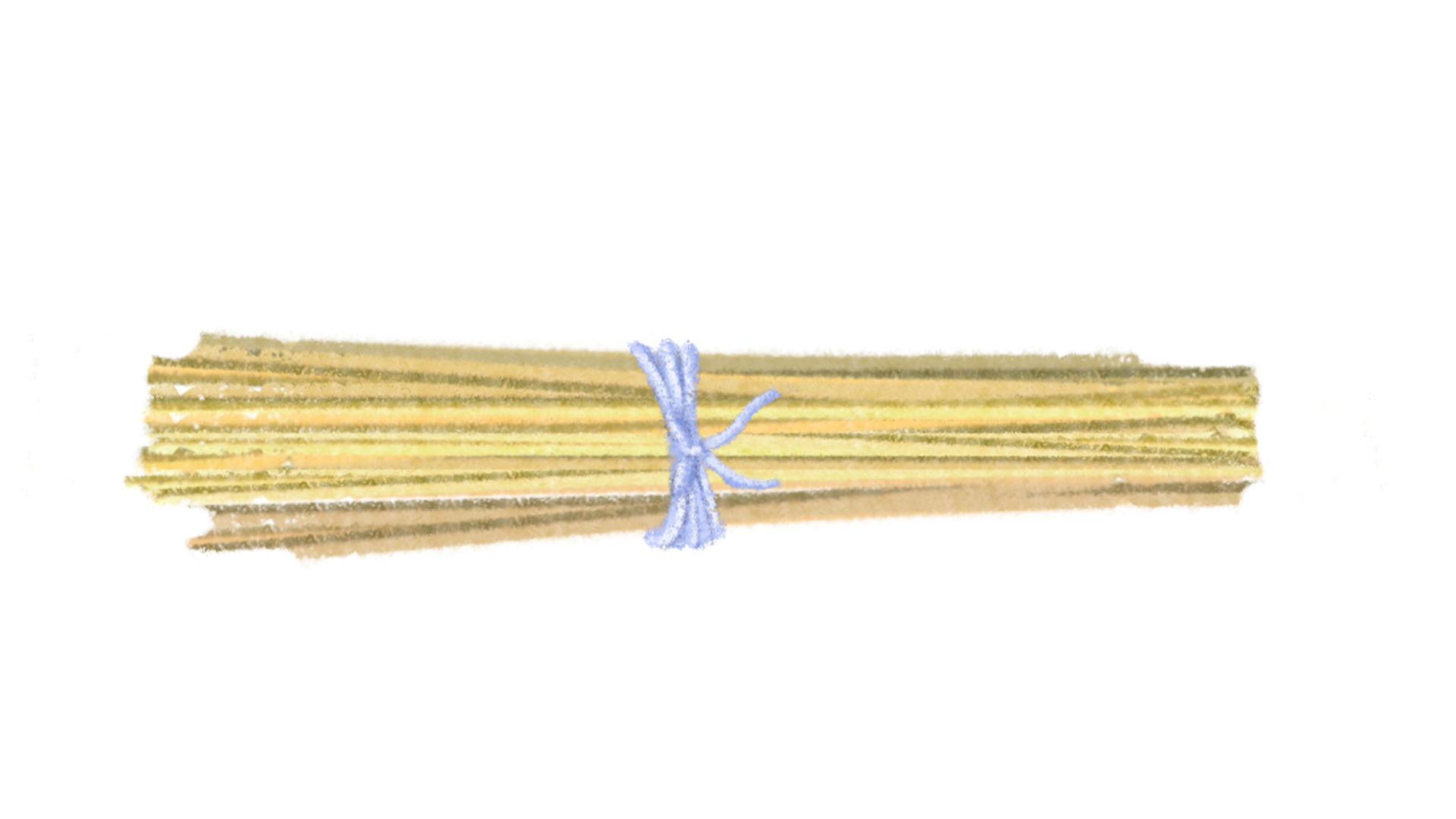
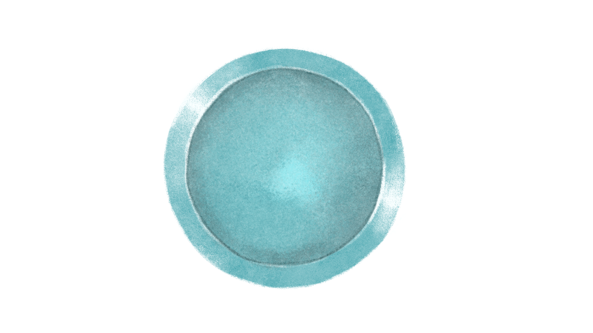
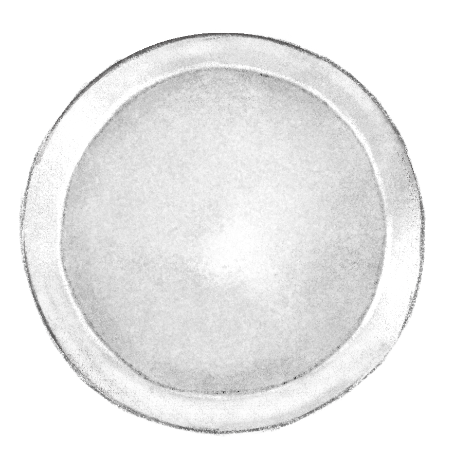
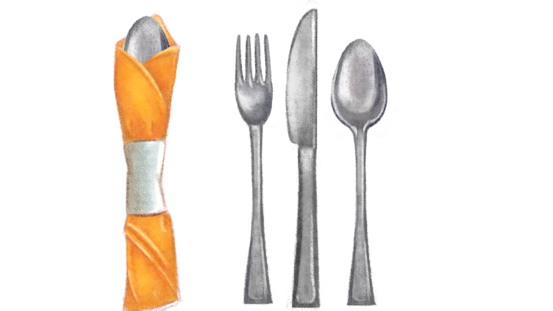
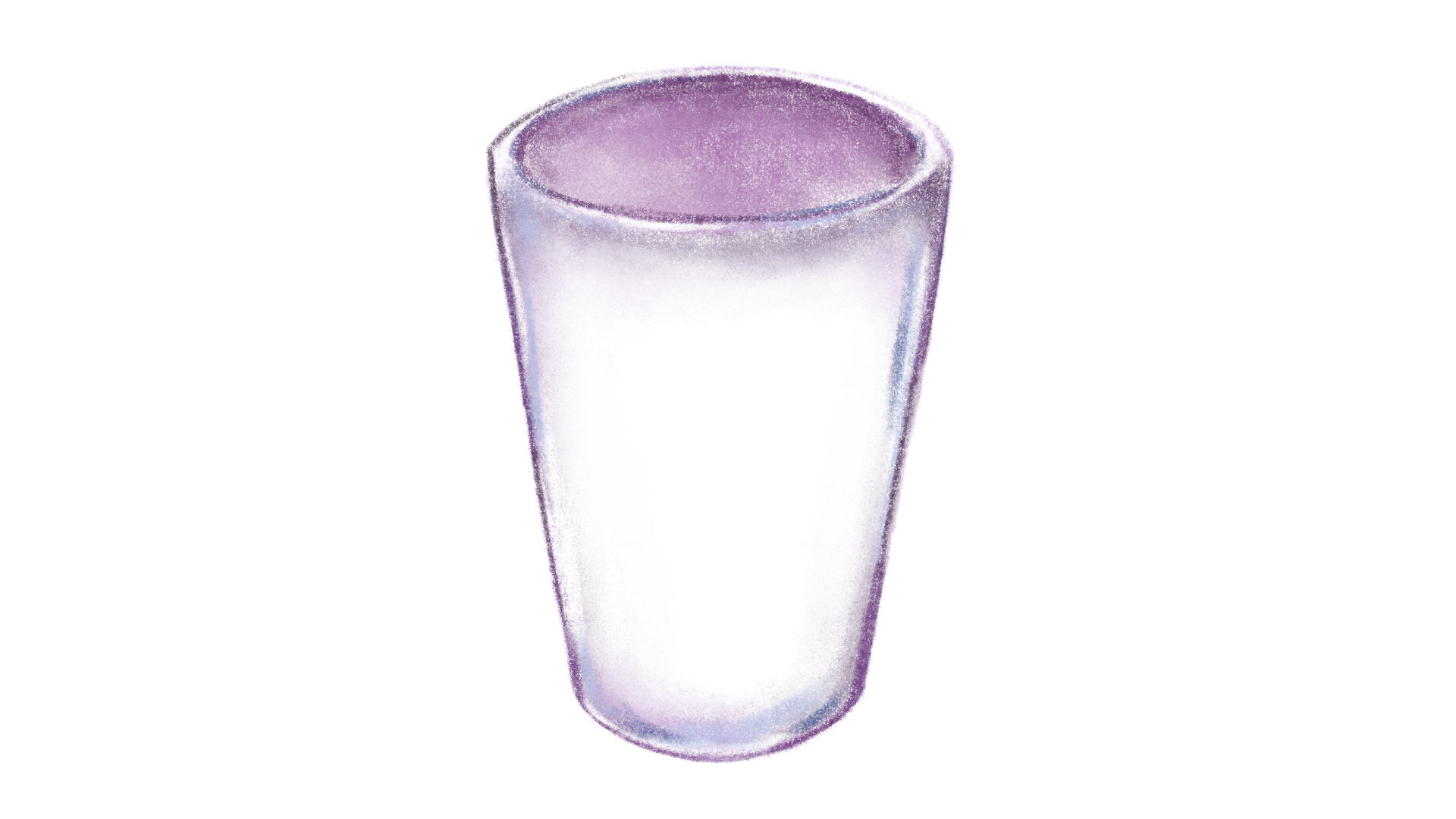
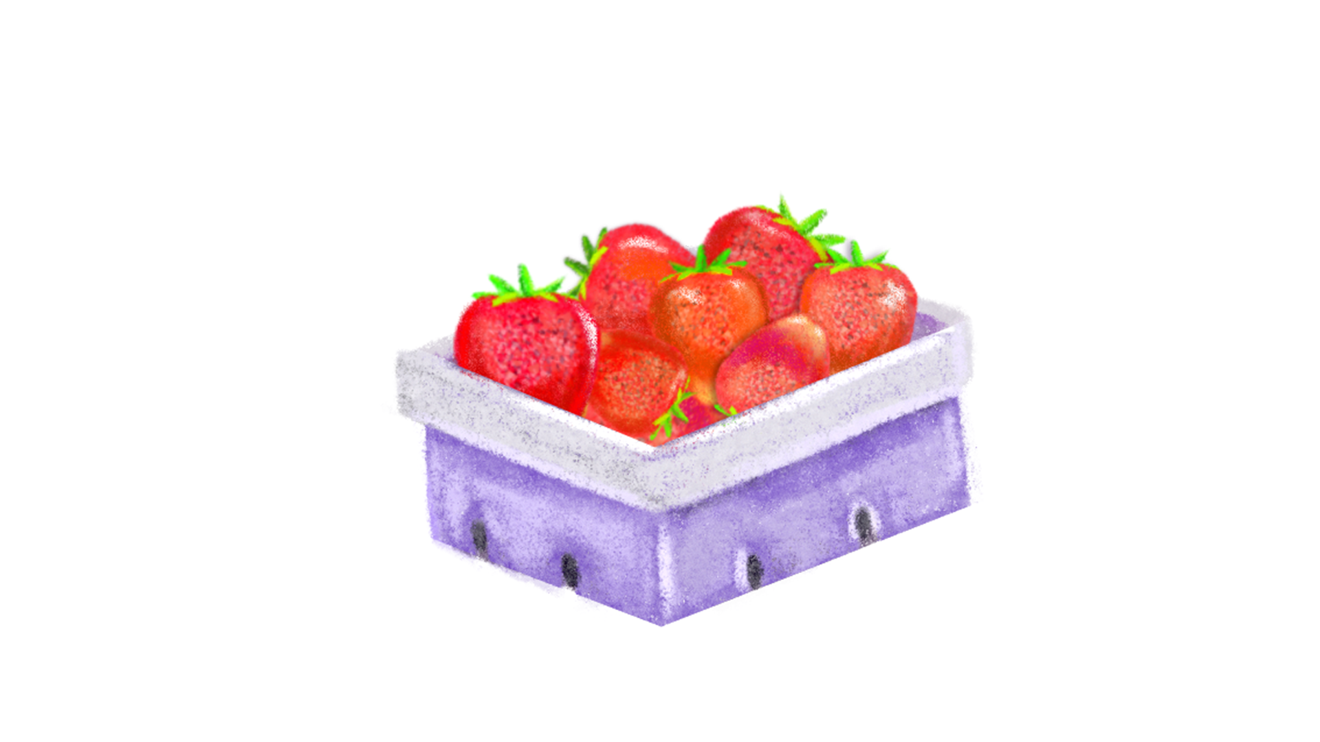
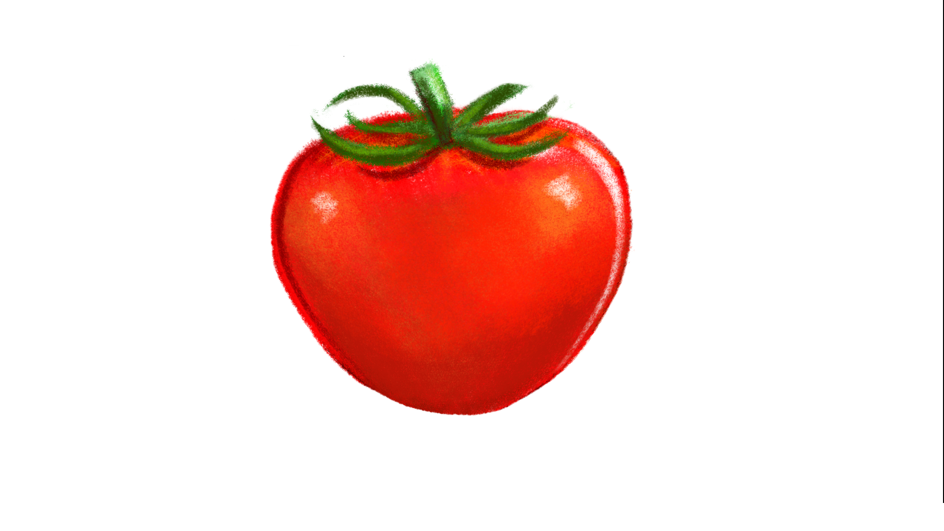
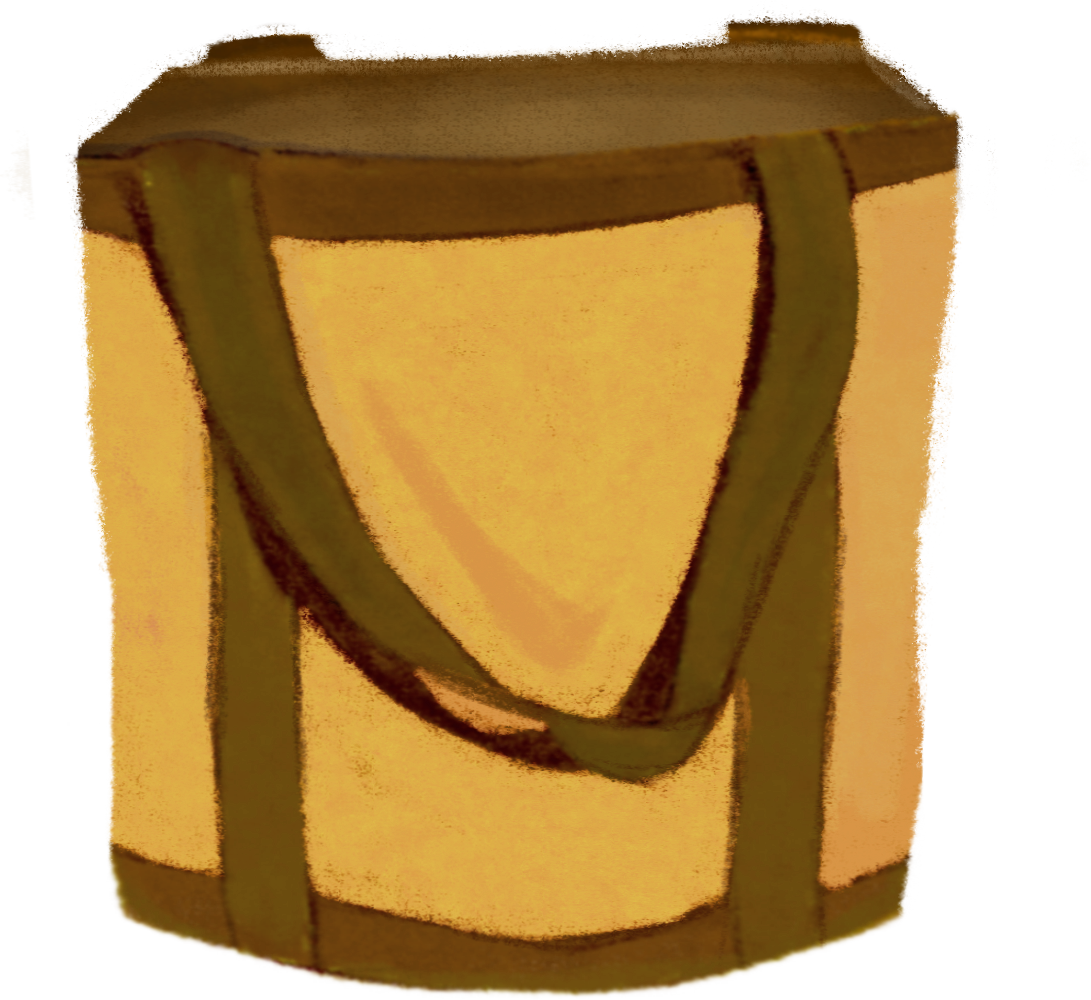
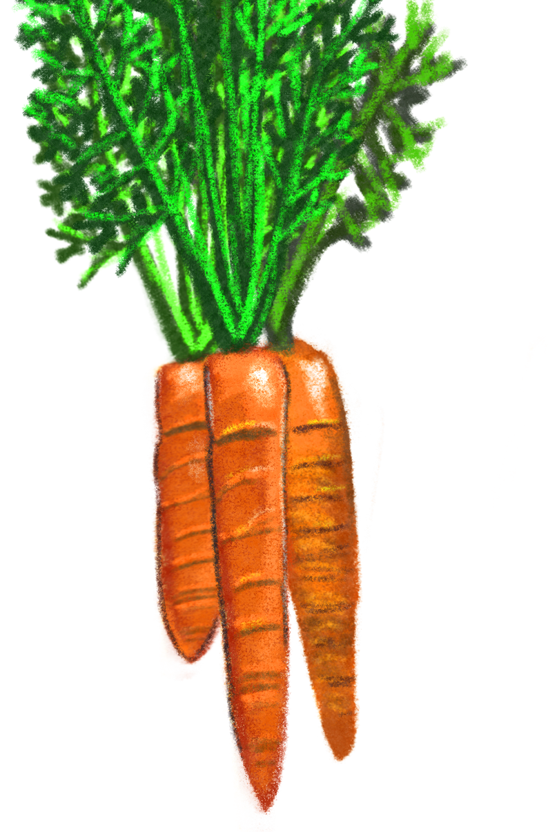
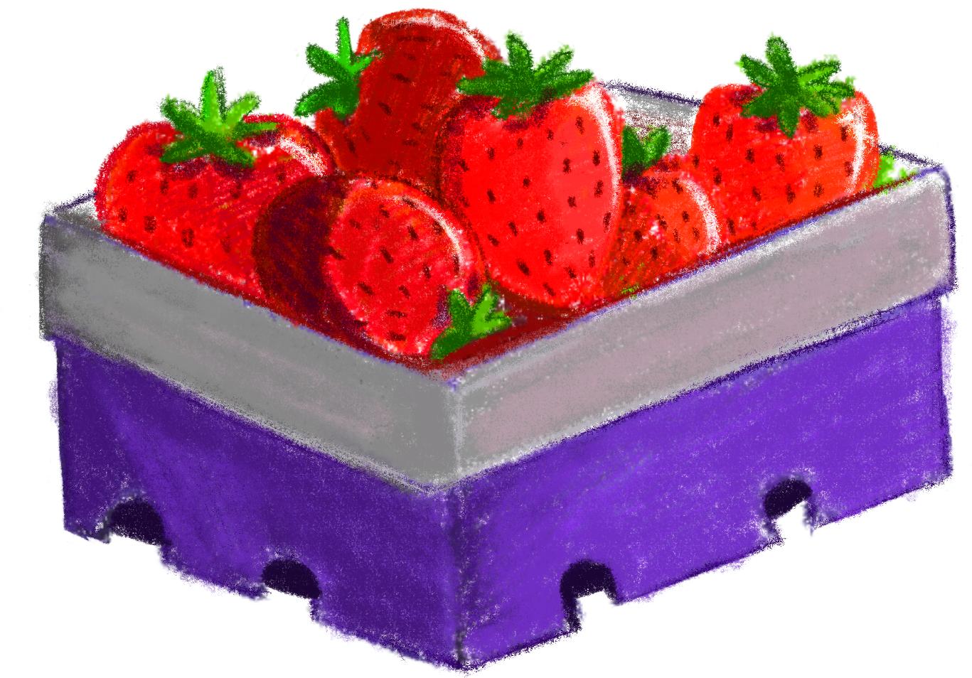
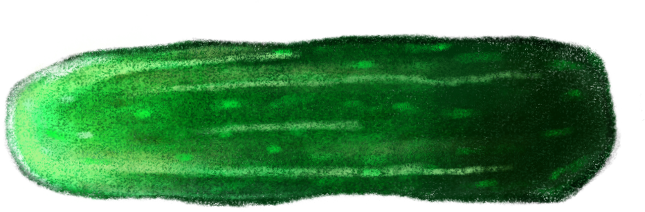
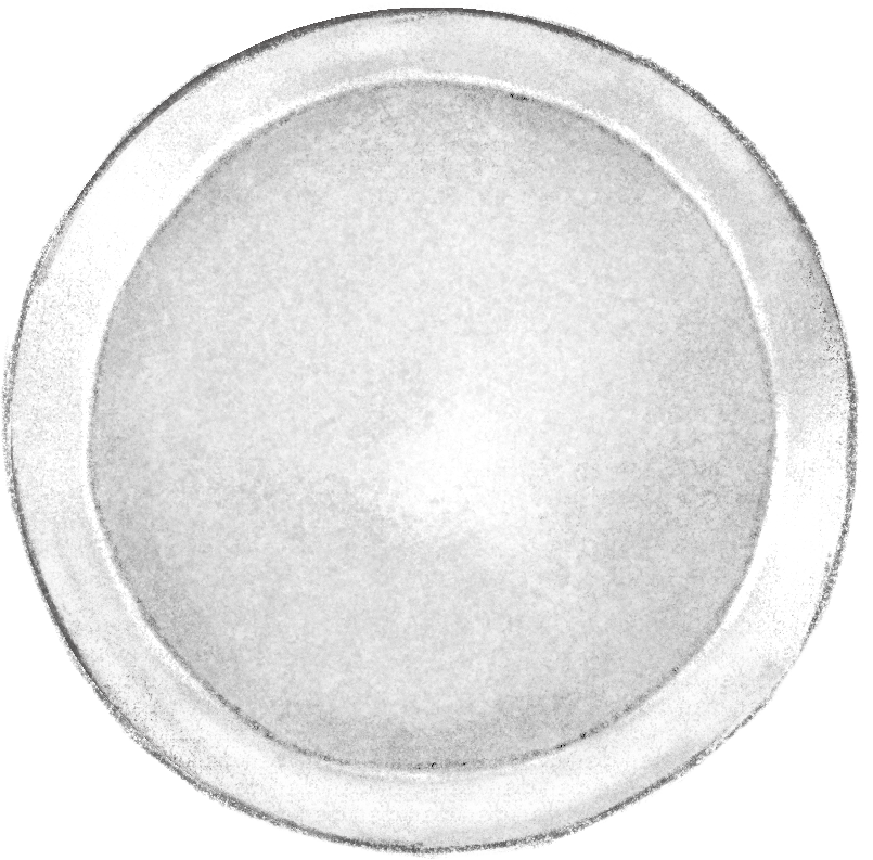
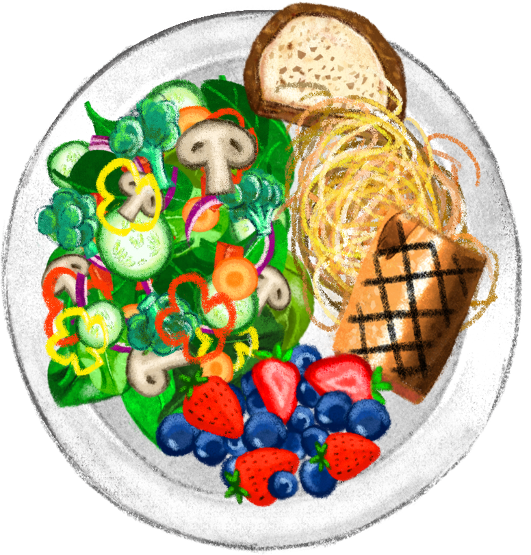
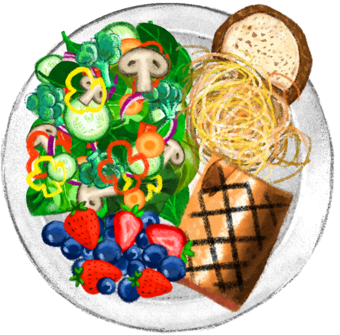
Process: First I was given the task of drawing specific groceries, a grocery bag, a plate, and utensils.The graphics were meant to be drawn in a chalk style . So first I had to establish what kind of chalk style was going to work. These were my first drafts of the groceries.


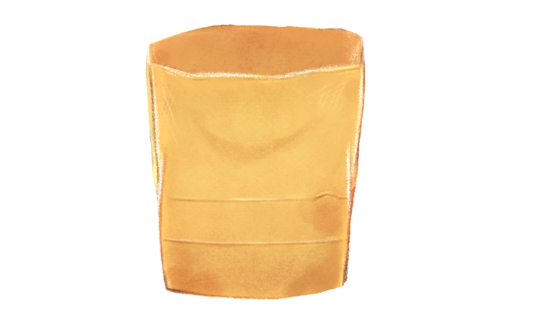


I had initially drew it with a paper bag but then a cloth bag was chosen instead. After switching the cloth bag, I went back and redrew some of the groceries to make the composition fit a bit more with the cloth bag.
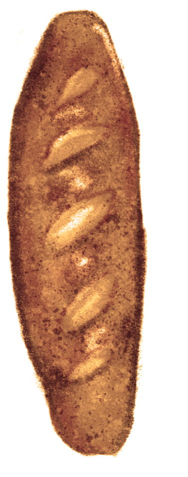
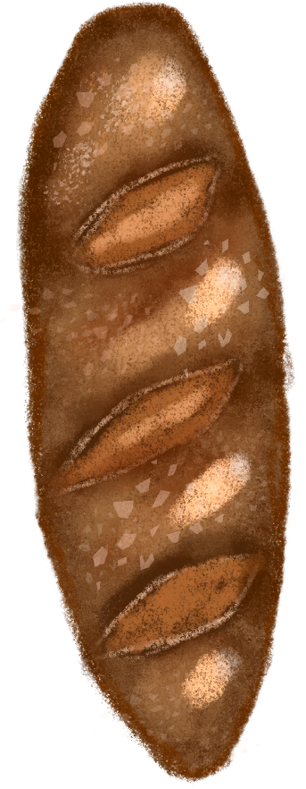
The bag went through 3 different iterations. The feedback I got for the first bag was to reduce the stitching and try a different color. I made the next two bags in response to the feedback and the light colored bag with more contrast was chosen. The baguette also changed since originally I had a white baguette. I had made a wheat one next but wasn’t satisfied with the overall look and redid it a third time and got the result from below. Originally, the animation was meant to show groceries being put into the bag and then when they come out, they get cut/diced/cook/ etc and are put on a plate that rolls out and is placed in front of the bag. There was also going to be some kind of juice to be made with the fruits. Much of the grocery list changed over time and some things were even cut out like a stamp that was going to be placed in the animation after all the food was done.


After getting all the graphic elements drawn and approved, I went on to arranging the groceries into the bag and plate.
The food arrangement also went through many iterations. It was important to get the proportions correct since the point of this animation was to show you how to eat healthier. Before, everything covered about 1/4 of the plate but after speaking with the professor we ended up taking the bread out of the plate and leaving the pasta as the only source of grain. It was important that the fruits and vegetables took up half the plate and then arranging the fish and pasta in a way that would keep the plate from looking too empty or too crowded.
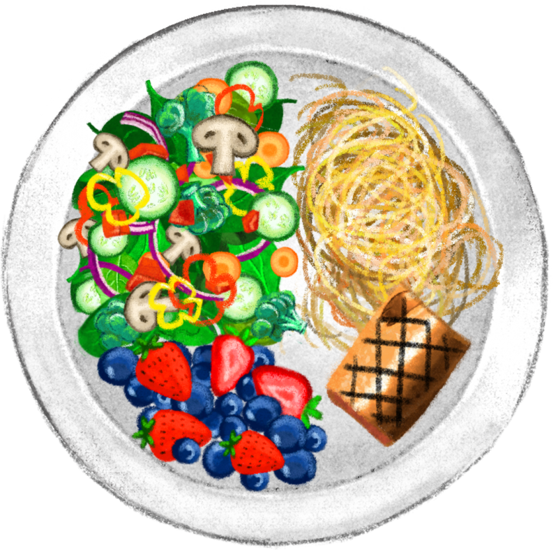
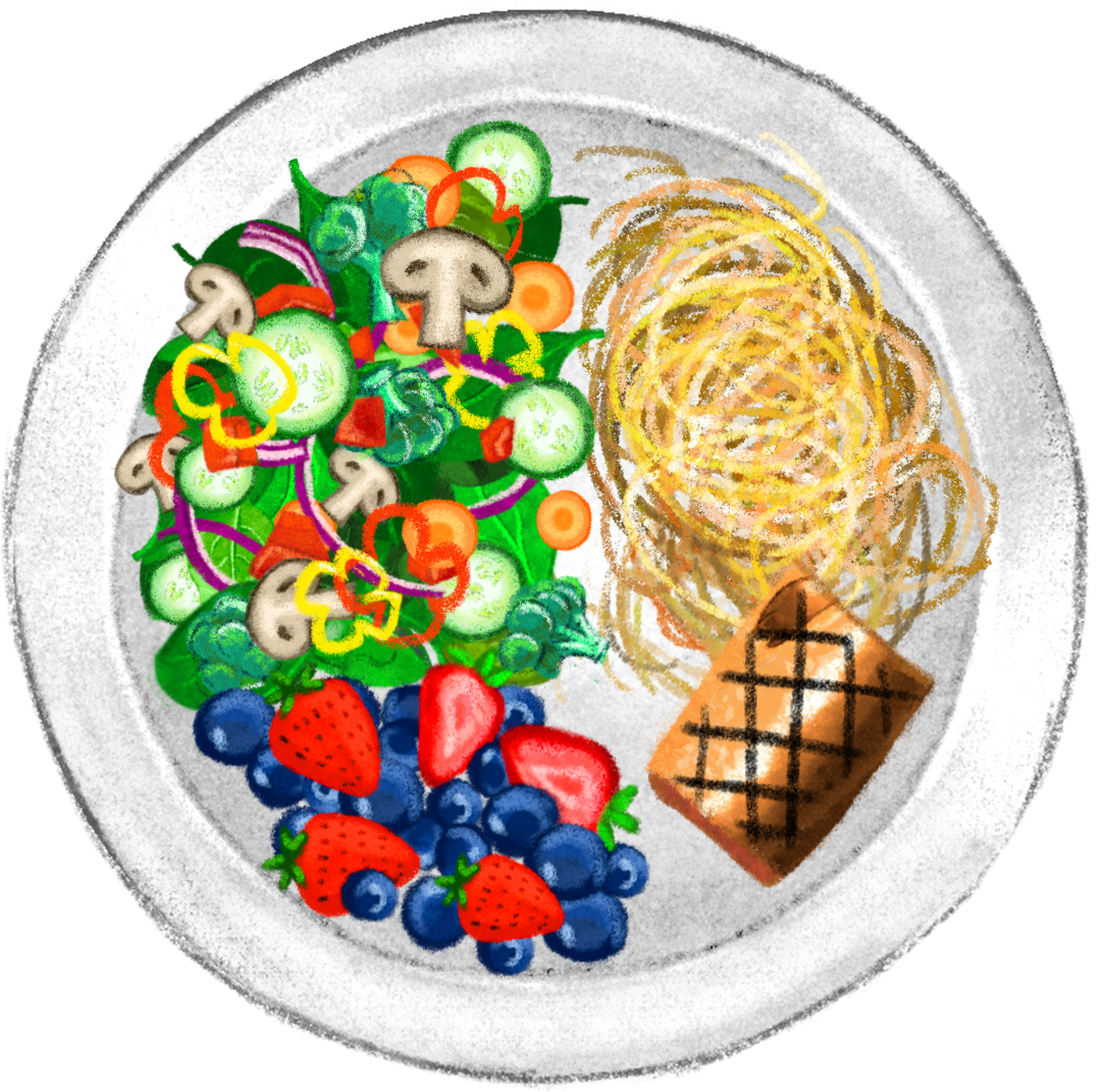

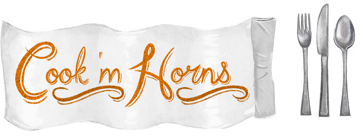
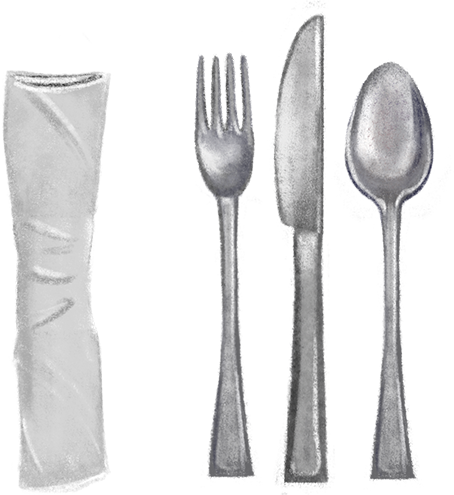
Finally, the text banner was to be made. This banner was suppose to be the napkin that rolls out after the food was made but changes were made when we saw how big the napkin was. I tried making it smaller but I didn’t want to make it too small since it was still going to be the rolled up napkin I had drawn earlier. Then I tried placing it on the bottom of the image but the professor was concerned about the amount of space it was taking up. Finally we settled on just making it a normal banner and taking out the napkin from the image. A lot of time was also spent trying to figure out what font to use for the image. I tried using a typeface I made on my own and 2 other free ones from online. None would fit just right. Then after meeting with the professor I narrowed it down to 3 options, a collegiate one, my script one, and a serif font. Then aligning it just right also proved to be troublesome. Finally the collegiate font was chosen and we kept it at the color black so that it would stand out even if it was reduced to a smaller size. I got rid of the spoon and then placed the fork and knife on either side of the banner to create more appeal. The placement of these utensils also prove to help us come up with a simple yet interactive animation for their movement.

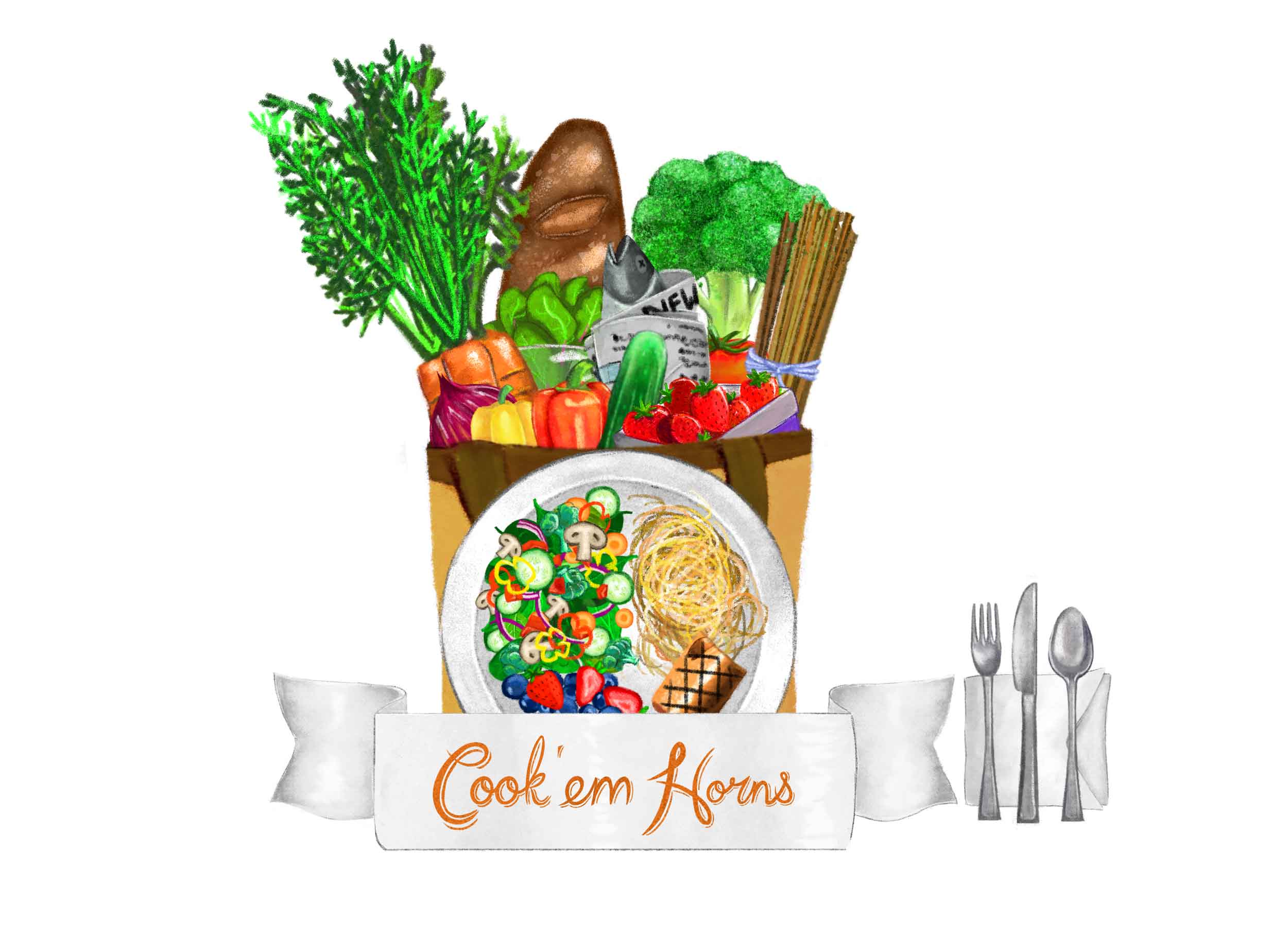


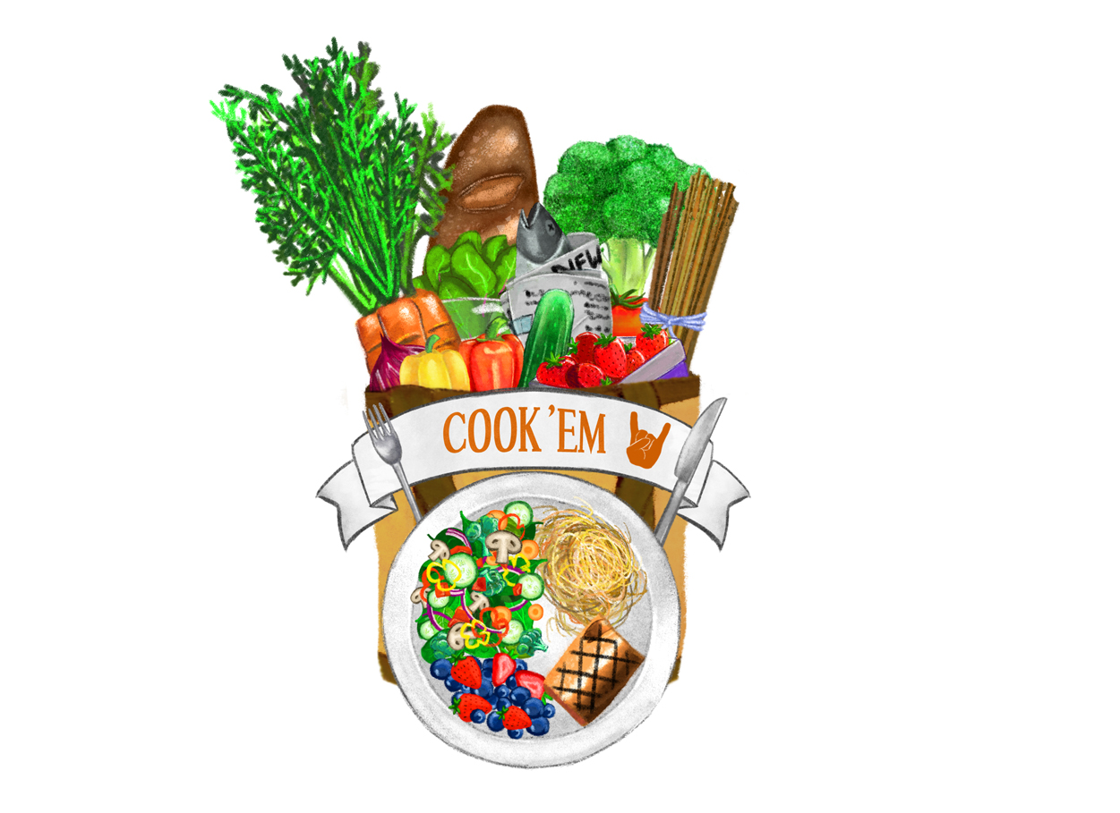

Finally the completed graphic would look like this:
In the beginning, the animation was something that would be very complex but then it turned out we only had 3 seconds of animation time so all of the original ideas were cut and changed. After speaking with Professor Steinman, we agreed on having the fork and knife come up from the plate and move out revealing the banner. At the time I was left to complete the animation and came up with this result:
From here the audio STA’s took it in and added sound effects to the video. Professor Steinman had requested some changes to be made but the video was given to one of the video STA’s to take over while I was called onto another assignment.
A couple of weeks later I came back to work on this project and finished off with working on the last of the request on making a logo version of the graphic. This meant taking it into illustrator which is the preferred software to use for logo design. I had to simplify the graphic which meant leaving out details and not having the chalk style. I was first told to create the logo in Black and white and then move into color from there. My project manager Suloni gave me examples of the desired look and from there I created the first version. Then I moved on to adding color and came up with 3 more versions. The second has the thick black lines but is colored in. The third one , I replaced the thick black lines to a desaturated dark blue so that it would look a bit more flat. And finally I made the last version with colored lines to give a bit more dimension.

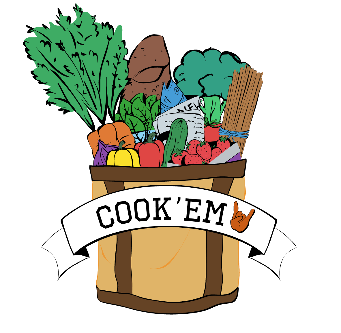


Final Images for Ch507