KB EDITS TO COME…
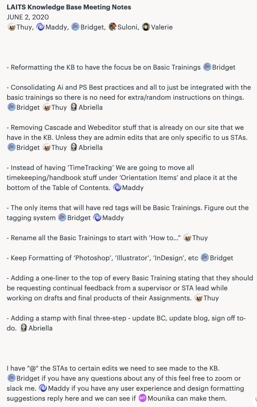
Maddy, Thuy, Bridget and I are going to be re-editing the KB instructions as well as the format of the table of contents entirely. Below are some of the edits and notes of the meeting we had about this.
Current Sta
Maddy, Thuy, Bridget and I are going to be re-editing the KB instructions as well as the format of the table of contents entirely. Below are some of the edits and notes of the meeting we had about this.
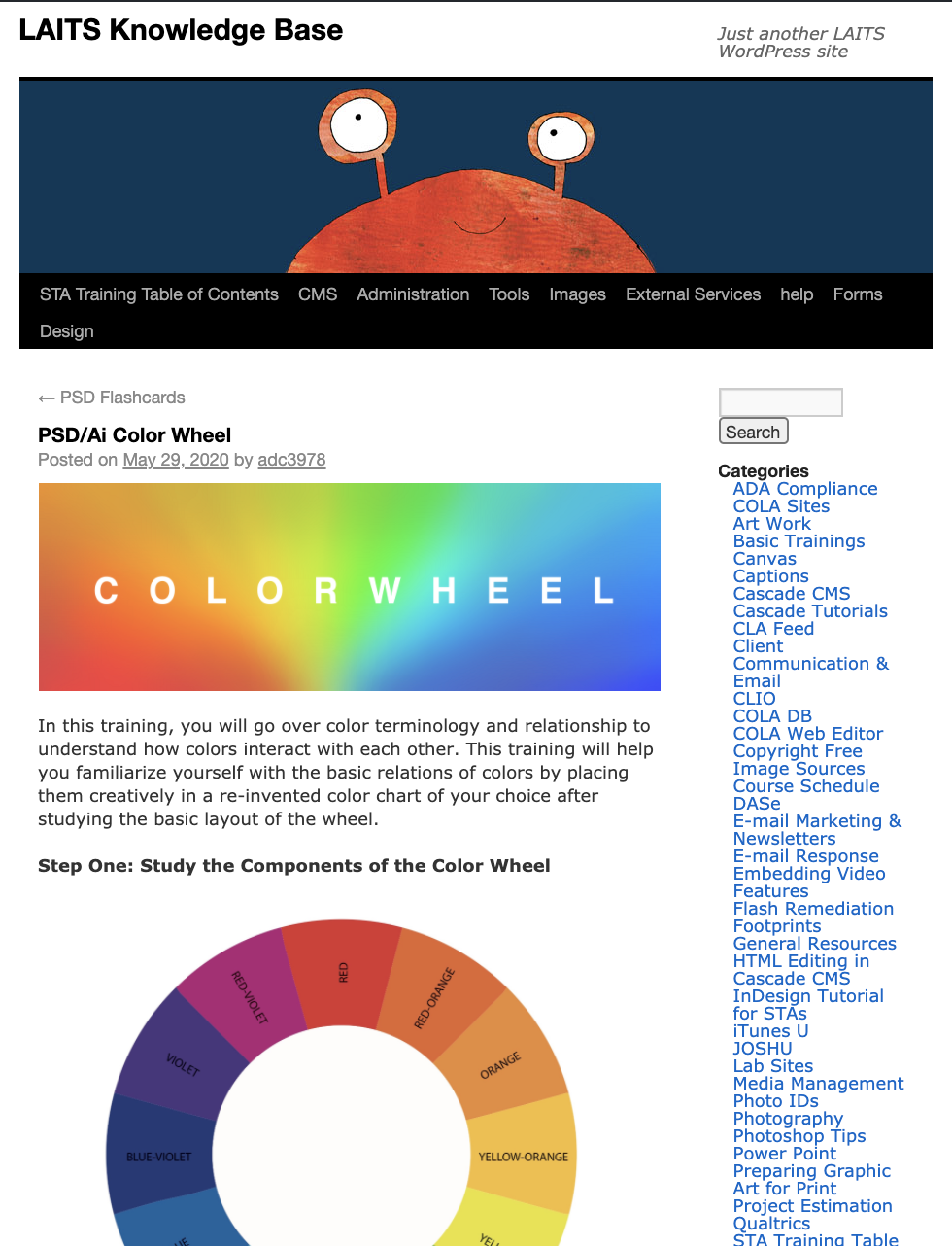
One last update to this basic training before closing it out as completed. Here is how it looks placed into the KB instructions.

I worked on training the COLA Web Editor chatbot on the new pages that I added under the Advanced Topics section for Cascade help.
Given below are some of the examples of the training phrases:
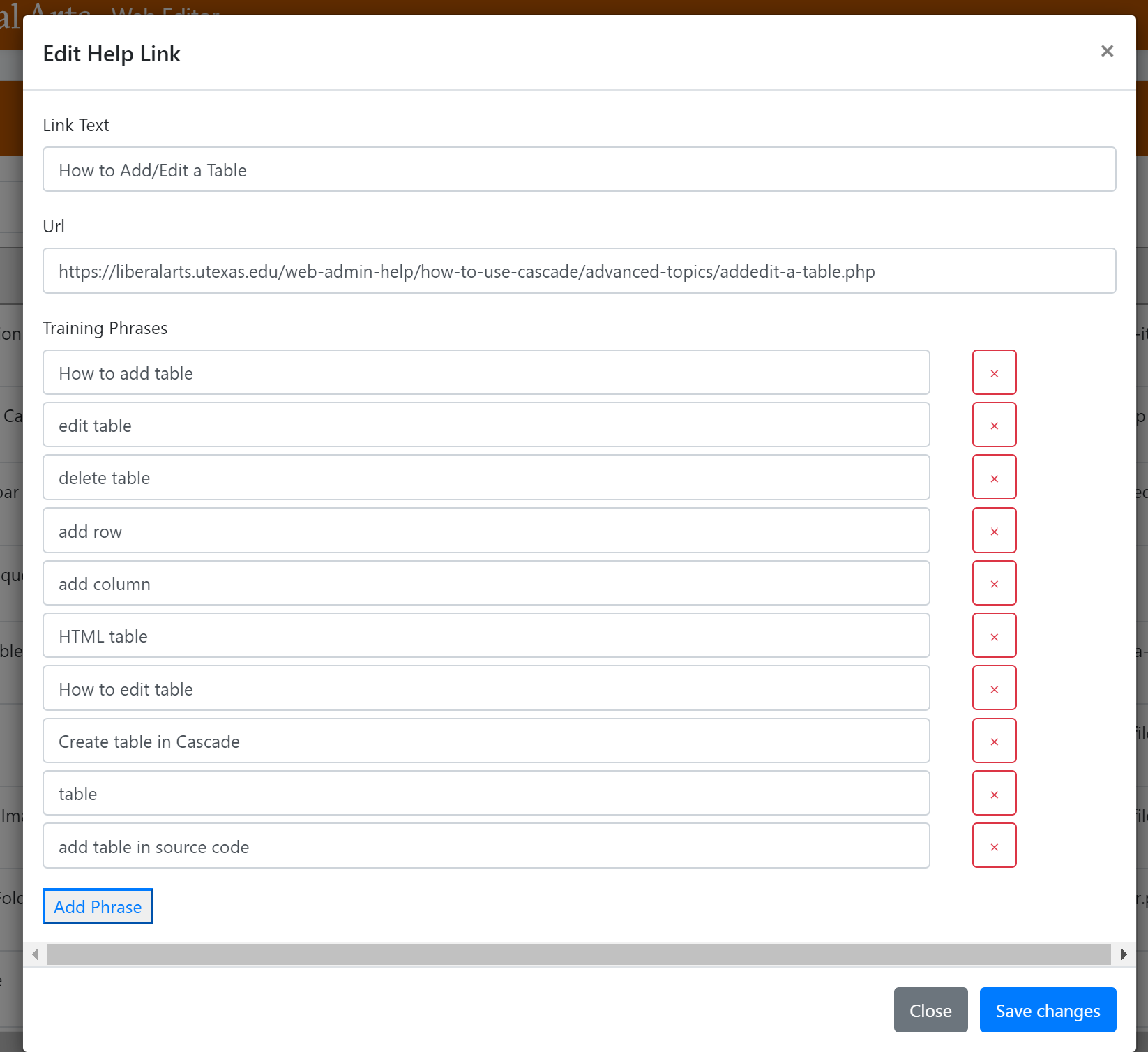
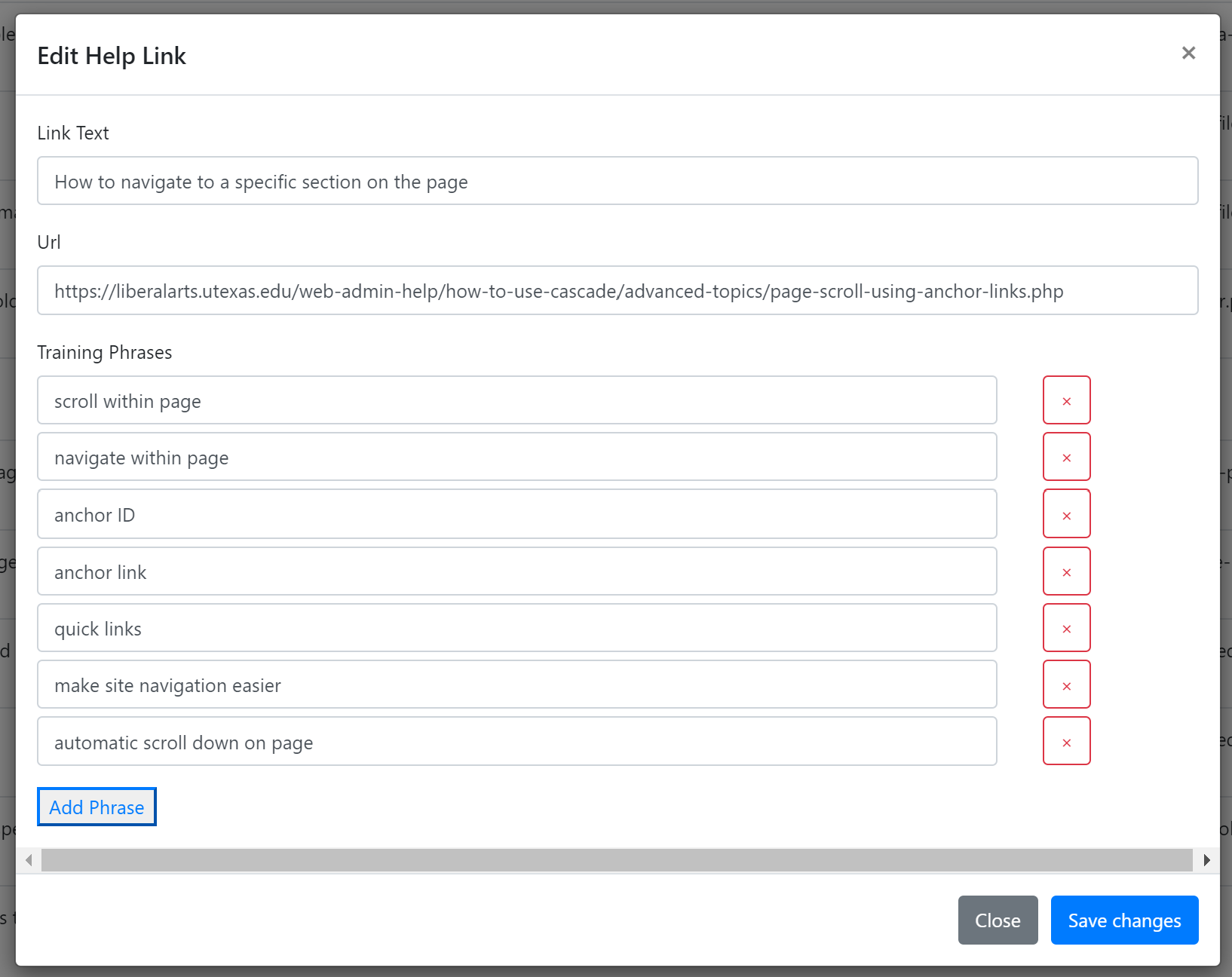
The chatbot is now trained to help a user with questions related to adding/editing tables and adding anchor links within a page in Cascade.

The Remote Studio System (RSS) is a set of equipment, training materials, LAITS staff support, and methodology designed to create professional, polished online instructional media. Our project was to annotate images to be used in the Remote Studio System (RSS) site. The goal was to use the figure captions given on the website to add annotations to the images – captions, labels, arrows, or other helpful design touches.
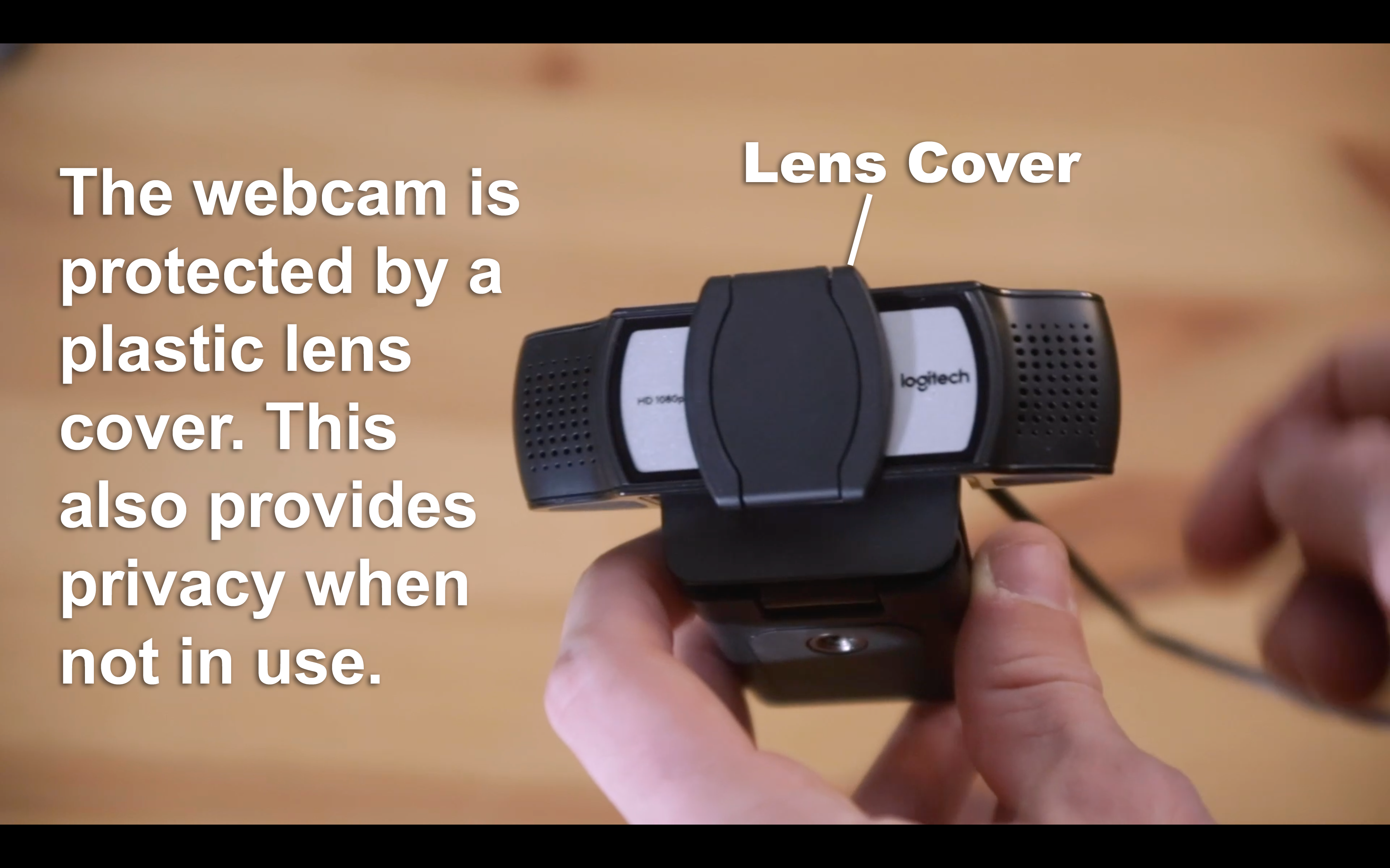
For example, the website contains the image with a caption as below:
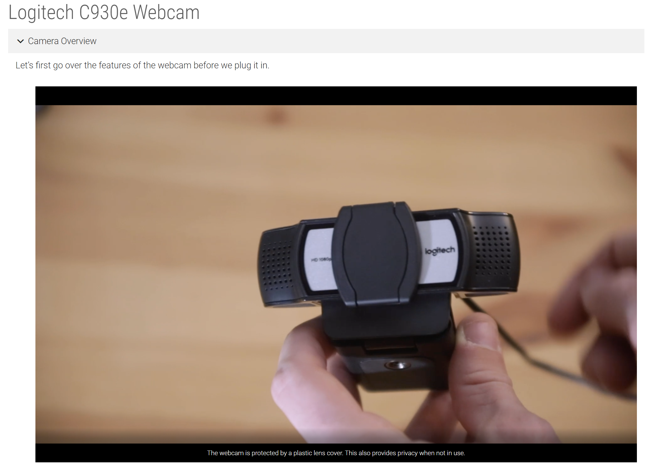
Using the caption, we need to annotate the image as below:
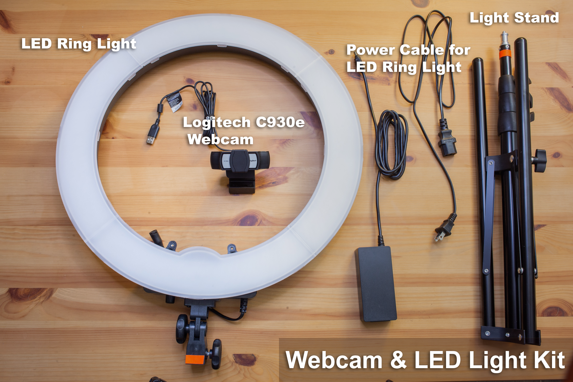
Another task was to annotate kit photos. For these, we had to add labels to all the equipment included in the kit as shown below.
We worked as a group to annotate more than 100 images for the RSS website for the ‘Webcam & LED Light’, ‘Microphone & IFB’ and ‘Backdrop’ tabs.
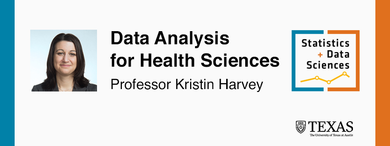
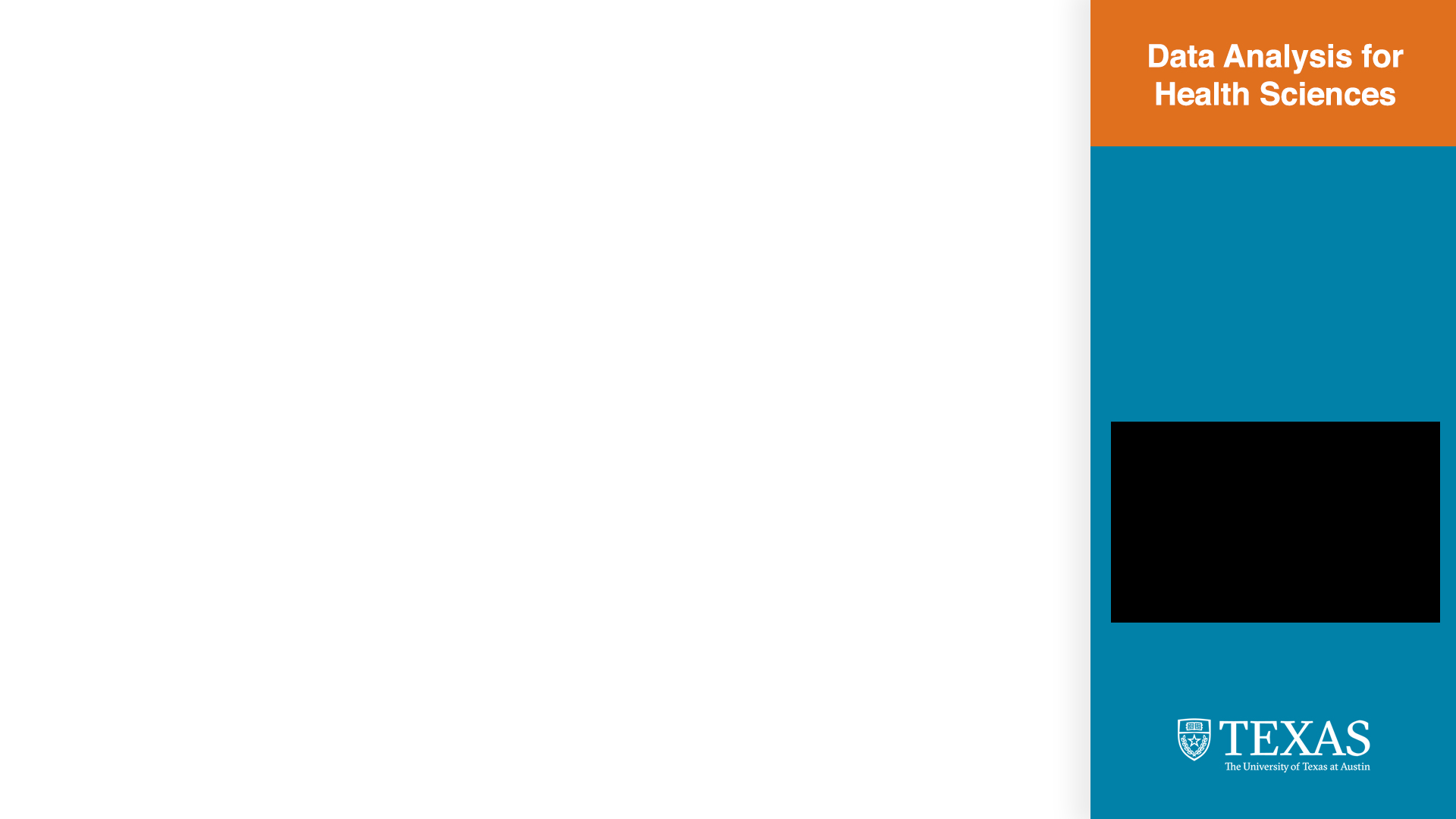
We had to redesign the templates for this course to fit both the UT branding and the Statistic and Data Sciences Department branding, which ended up being a completely different color scheme and layout than the original template. It was an interesting process.
![]()

We made some more progress thanks to Thuy and Abriella this week! The final keyframes are looking gooood!
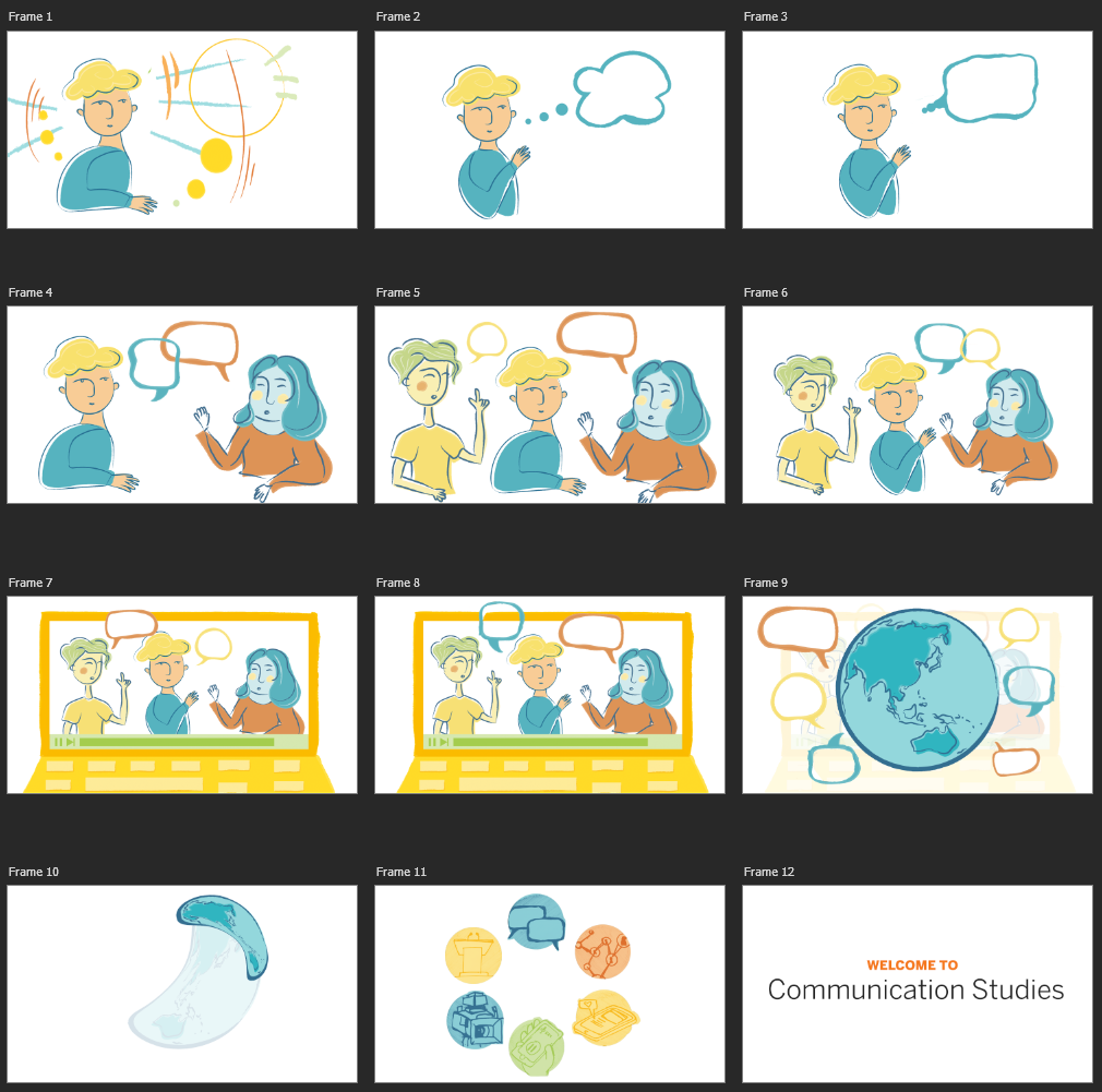
As for next steps, I want to add some subtle/abstract background to the frames so that they won’t be floating on white space. We also will need to draw final versions of the icons in Frame 11 once the sketches are approved.
The course is also made up of three segments, each of which needs a title card and ~5 second animation. Here are my drafts so far, in the same style and color palette.


Note… the professor’s set for the “Q&A” portion of the class is modeled after Zach Galifianakis’ Between Two Ferns interview series… hence the ferns. 🙂
Once all this is finalized we can start animation!!