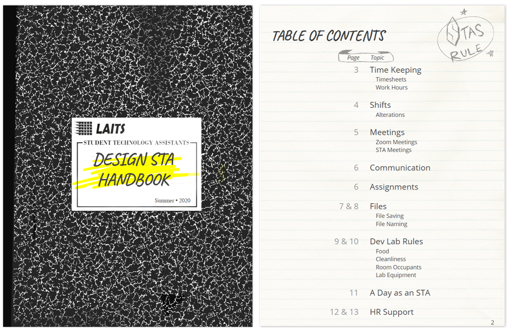
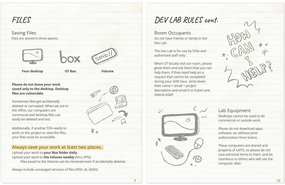
• We are STAs
    • Asha Rountree
    • Haley Ma
    • Kate Shih
    • Kyra Lee
    • Nicholas Peasley
    • Sasha Kenney
    • Shanda Horm
    • Shriya Atreya
    • Tomas Marulanda-Mesa
  • We were STAs
  • STA Presentation
    • STA Presentation 2017
    • STA Presentation 2016
  • Testimonials
  • Resources
  • Home

STA Blog

Current Sta

Epic Similes UI/UX

February 14, 2020 By Maddy Kaniewski

Epic Similes UI/UX

I’m starting to design the UI/UX for Dr. Deborah Beck’s online database of epic similes in Greek literature. We met last week with her to see what she wanted from the site.


She told us the purpose of the site is when somebody is reading and they see a simile that interests them or is relevant to their research, they could go on the site and search the simile to learn more about it from her classification system. For example, you read “Achilles is like a bird” in the Iliad. You could then go to the site and can search for details about that simile.


She also wants users to have a lot of discoverability of the other data; so from a user’s first search they could easily stumble into other similes also in the Iliad, or about Achilles, or birds, etc. The site is mostly for academic use, so users will be scholars and undergrads. She wants the site to feel fun and interactive while you read.


Here is its current design. There is lots of extraneous data and unhelpful search options.


Below are some sketches and a rough Adobe XD layout for now. I am waiting for Dr. Beck to sort through what data she needs on the website and send it over, so until then the content on these drafts is TBD. I’m most excited for paring down the search options and improving the UX for each search category.


Project: Epic Similes Database
Client/Prof: Dr. Deborah Beck
Completion status: beginning
Staff guidance: Suloni Robertson, Valerie Tran, Chris Pittman
STA team members: Me and Jake Engelberg
Description/plans: Create an online database to host Dr. Beck’s research over epic similies in Greek literature.
To be completed: End of summer

Filed Under: 2019 Fall-Winter | Spring-Summer 2020, We are STAs

STA Poster Spring 2020

February 7, 2020 By Maddy Kaniewski

STA Roster Poster

Thuy and I are making the STA poster for the semester. The brief is to fit the theme of “champions” and include ~35 headshots and names of each STA. The first thing I thought of for “champions” was designs of vintage Olympic graphics. Thuy was inspired by retro movie poster/ad designs, so because they both draw from a similar time era our ideas have been easy to mesh.


Right now I’m illustrating pictures to represent each team (audio, graphics, video, project management) inspired by graphics from the Helsinki Olympics. I’m taking the illustrative feeling and colors from the poster, while adding some more ~retro~ style hashmarks and shading. I’m not a big digital illustrator but it’s fun using the tablet! Thuy is working on the typography and we’ll do formatting together.


Inspiration pic:


Project: STA Spring 2020 Poster
Client/Prof: LAITS
Completion status: drafting
Staff guidance: Suloni Robertson, Valerie Tran
STA team members: me, Thuy Nguyen
Description/plans: Design a poster to showcase all the STA team’s portraits. Theme is “champions”. The design of this poster will carry into the designs for the spring STA presentation.
To be completed: Feb 11th

Filed Under: 2019 Fall-Winter | Spring-Summer 2020, We are STAs

French Reformatting

January 24, 2020 By Maddy Kaniewski

Back at it

I had a nice break from school and LAITS, I got to see my cat, knit a lot, and visit Enchanted Rock. I’m back and ready to get working again 🙂


We are updating the formatting for an online French course. Mostly we are making sure section headers are accurate and follow the new styling.


We are using very basic CSS to edit each lesson. This standardization will help the students by improving the clarity of the course and making it look more professional.

Filed Under: 2019 Fall-Winter | Spring-Summer 2020, We are STAs

GRG 301K

December 11, 2019 By Maddy Kaniewski

Geography Flyer


GRG 301K made me think about switching to a Meteorology major until I found out UT doesn’t offer one. At least I can design posters about meteorology now.


Project: GRG 301K Promotional Flyer
Client/Prof: Department of Geography and the Environment
Completion status: Dec 3rd-10th (complete)
Staff guidance: Suloni Robertson, Valerie Tran
STA team members: Just me
Description/plans: Create a digital signage for GRG 301K course, to be displayed on building monitors
To be completed: ASAP

Filed Under: 2019 Fall-Winter | Spring-Summer 2020, We are STAs

McCombs Studio Testing 2

October 31, 2019 By Maddy Kaniewski

Color Testing Update

It turns out the initial screen I was color testing on had a completely different color profile than most other screens in the office – so while my first round of color edits looked ok to me, the photo highlights looked green or red on most other screens.


After talking to some LAITS people who knew more about the screens’ color profiles, I stopped playing with hue/saturation and brightness/contrast settings. The screens don’t get “brighter” per say, because pure white/”brightness” only appears as blue. I used a tan and black gradient map and lowered the green/blue highlights and raised red highlights in curves to achieve this effect. The contrast is also nicer on camera now. Knowing how tricky color balancing a neutral like this is on the screens I’m happy with these results!


Filed Under: 2019 Fall-Winter | Spring-Summer 2020, We are STAs

McCombs Studio Testing

October 29, 2019 By Maddy Kaniewski

McCombs

The McCombs graphics team sent over assets they’d like to be used for the online courses. My job now is to take their templates and edit them for each class. One major concern is color correcting. LAITS courses are filmed in a studio with a digital monitor backing the professor. While this allows each course to easily look different, filming a digital screen often leads to color issues like in the image below. Understandably McCombs wants to stick to their color palette, so I’ve been working on color correcting the images to come out looking “right” on camera.


This burnt orange and white image looks brown and light blue on camera.


Here are my files:

The color corrected ones look salmon-colored on a computer screen, but as you can see in the images I took from the studio they end up looking tan on camera. I did 5 of these.

Filed Under: 2019 Fall-Winter | Spring-Summer 2020, We are STAs

  • « Previous Page
  • 1
  • …
  • 114
  • 115
  • 116
  • 117
  • 118
  • …
  • 126
  • Next Page »

link to LAITS home page

Video STA Home

© 2025 Liberal Arts Instructional Technology Services | Production Credits