Working Through Intro Training
STA Handbook Powerpoint
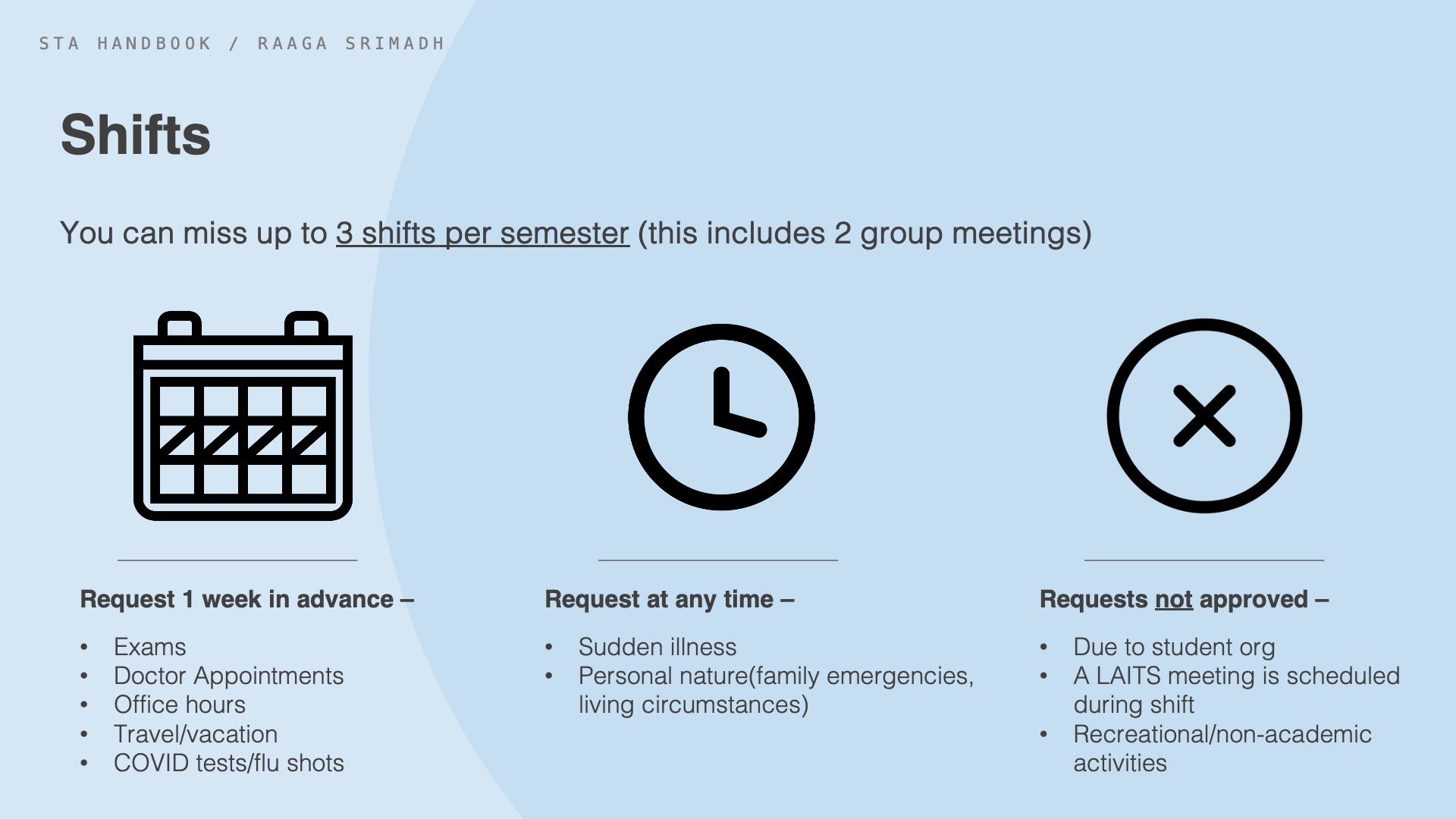
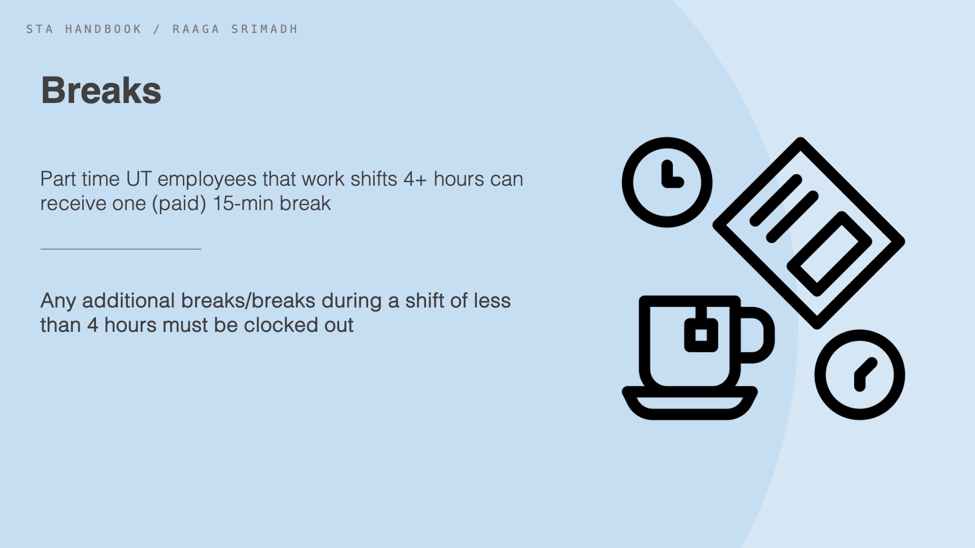
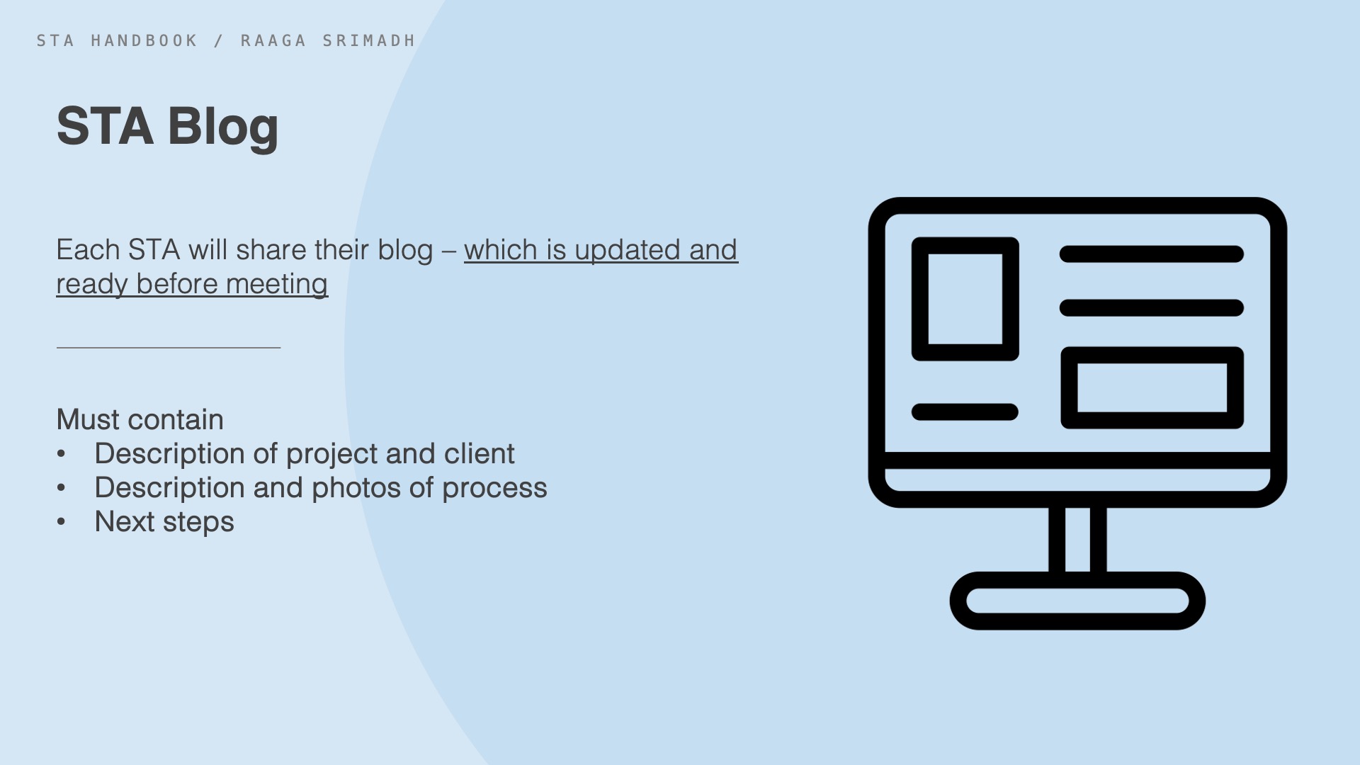
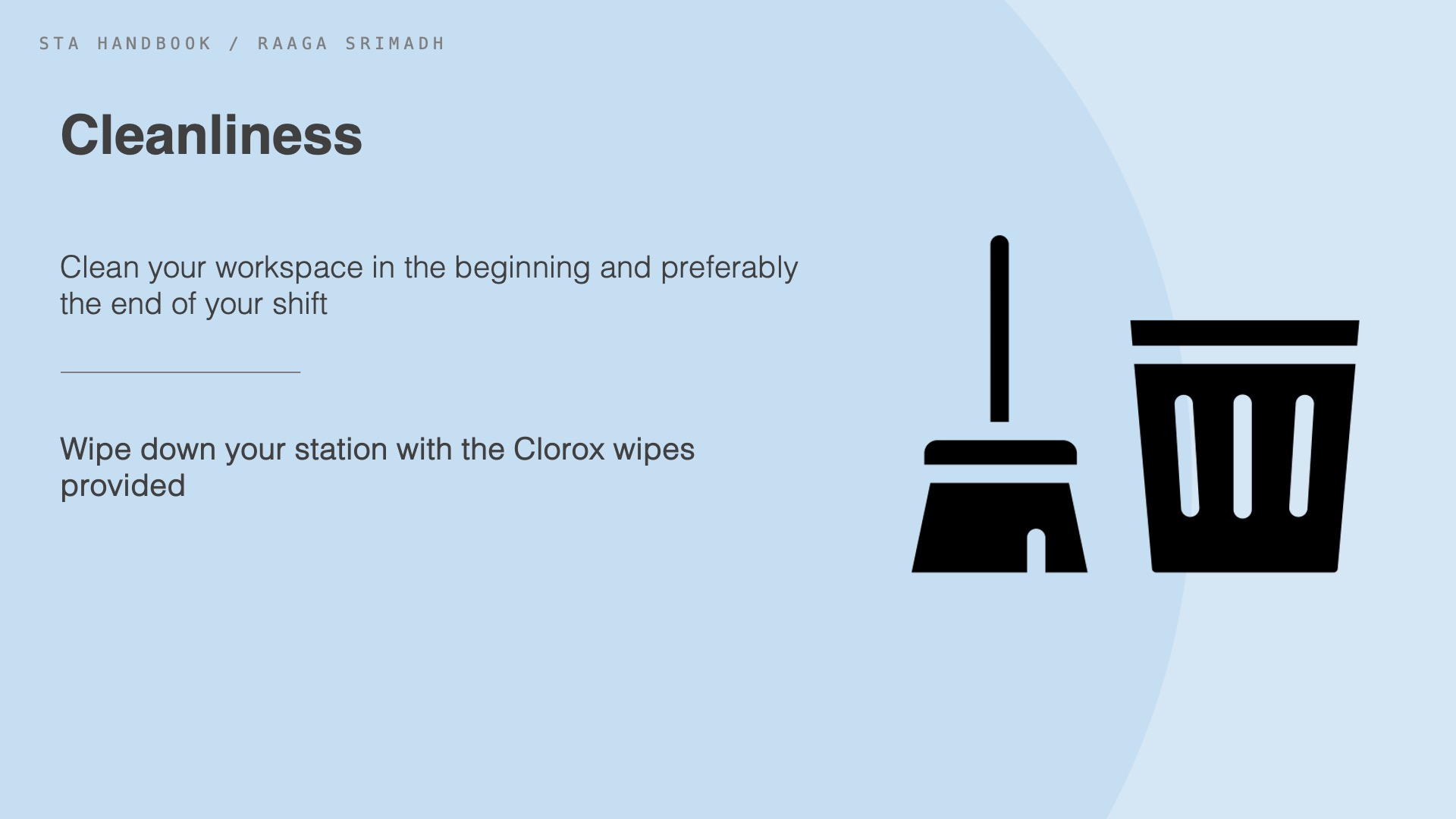
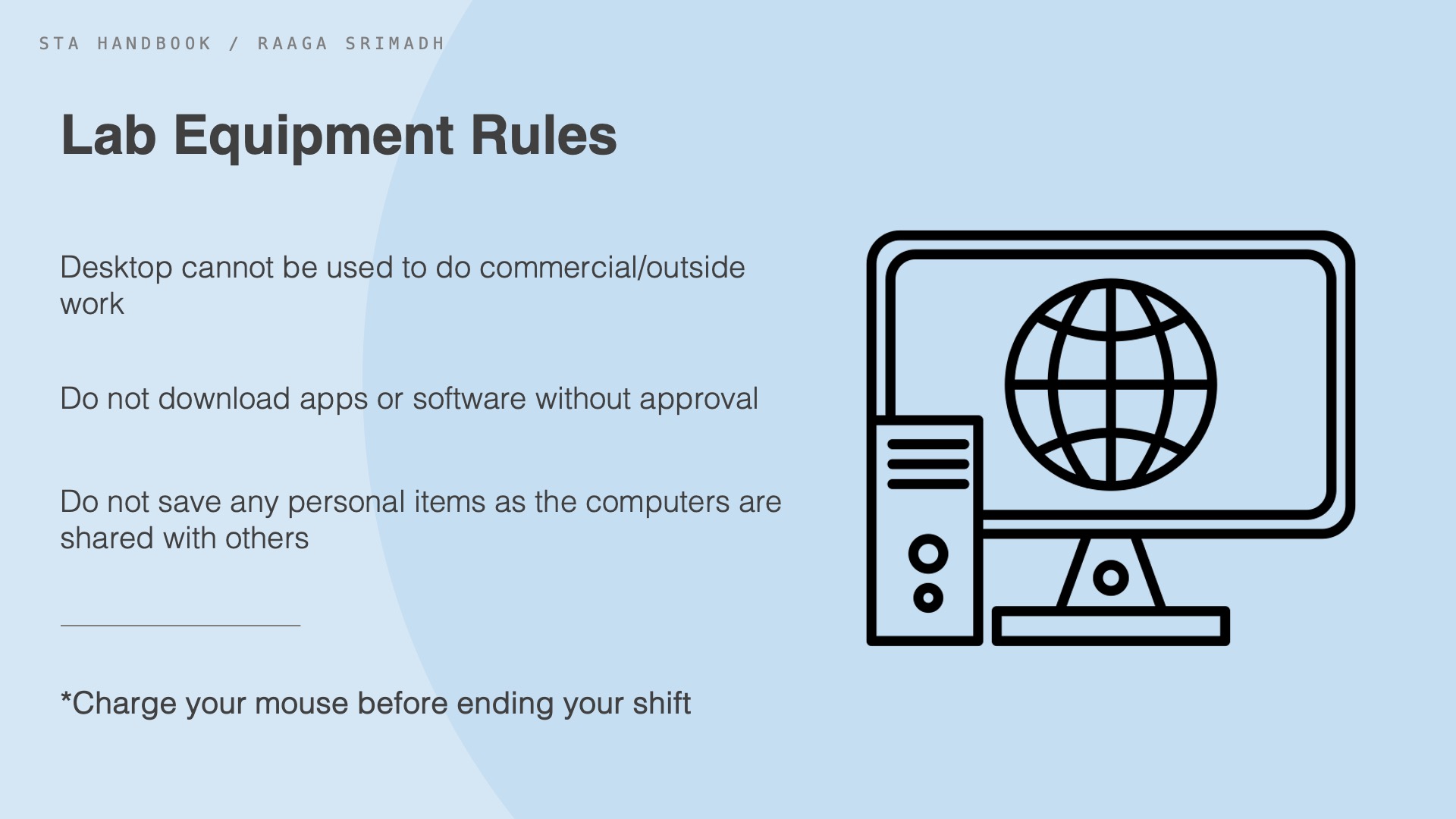
This week, I began working on my training tasks, familiarizing myself with the platforms we use, as well as the lab. For my first training project, I worked on creating a powerpoint that helped me better grasp the content within the STA handbook. I chose 5 rules that apply to my experience here as an STA, and formatted them in a powerpoint. This is the final slide set I came up with–

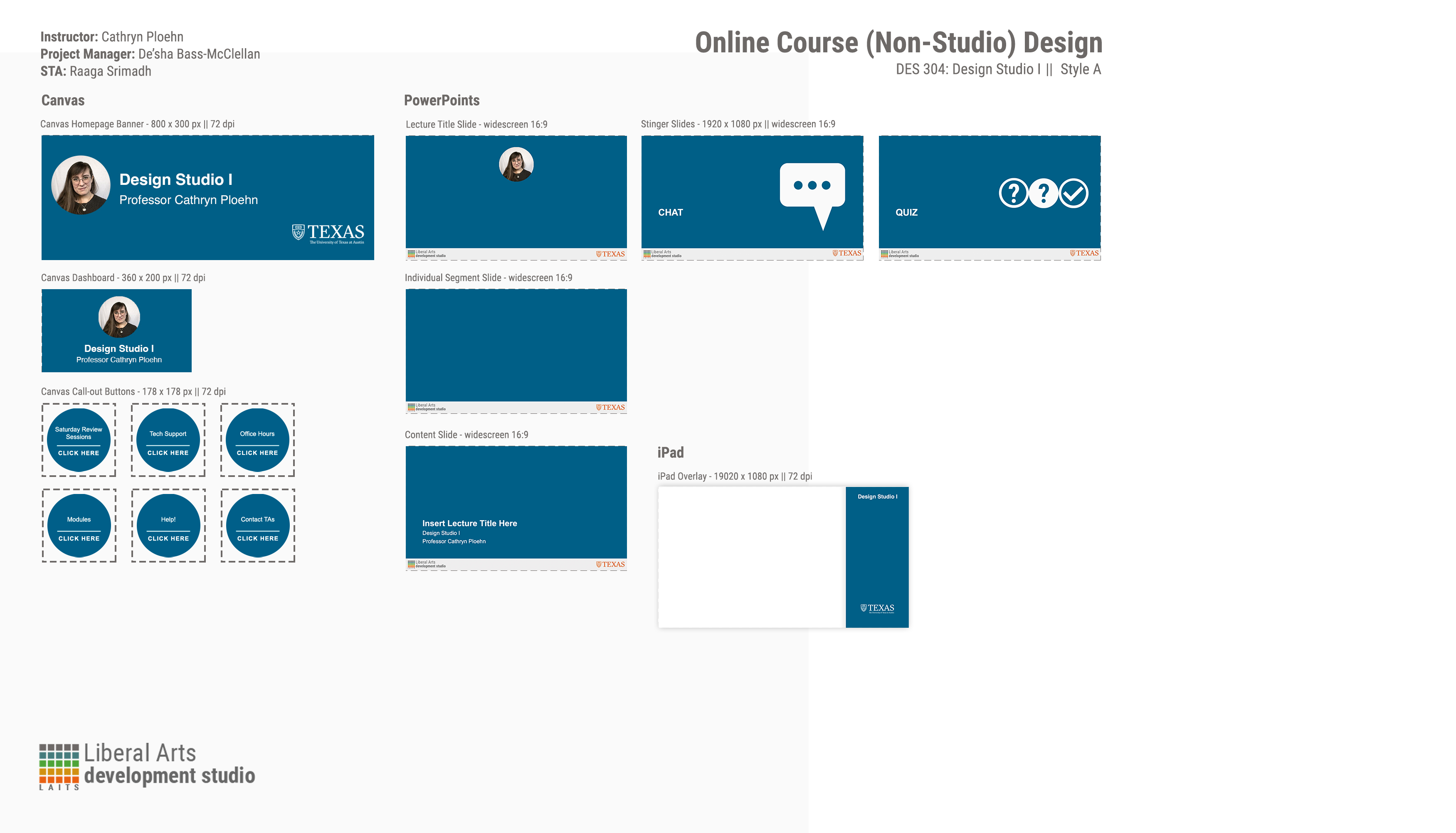
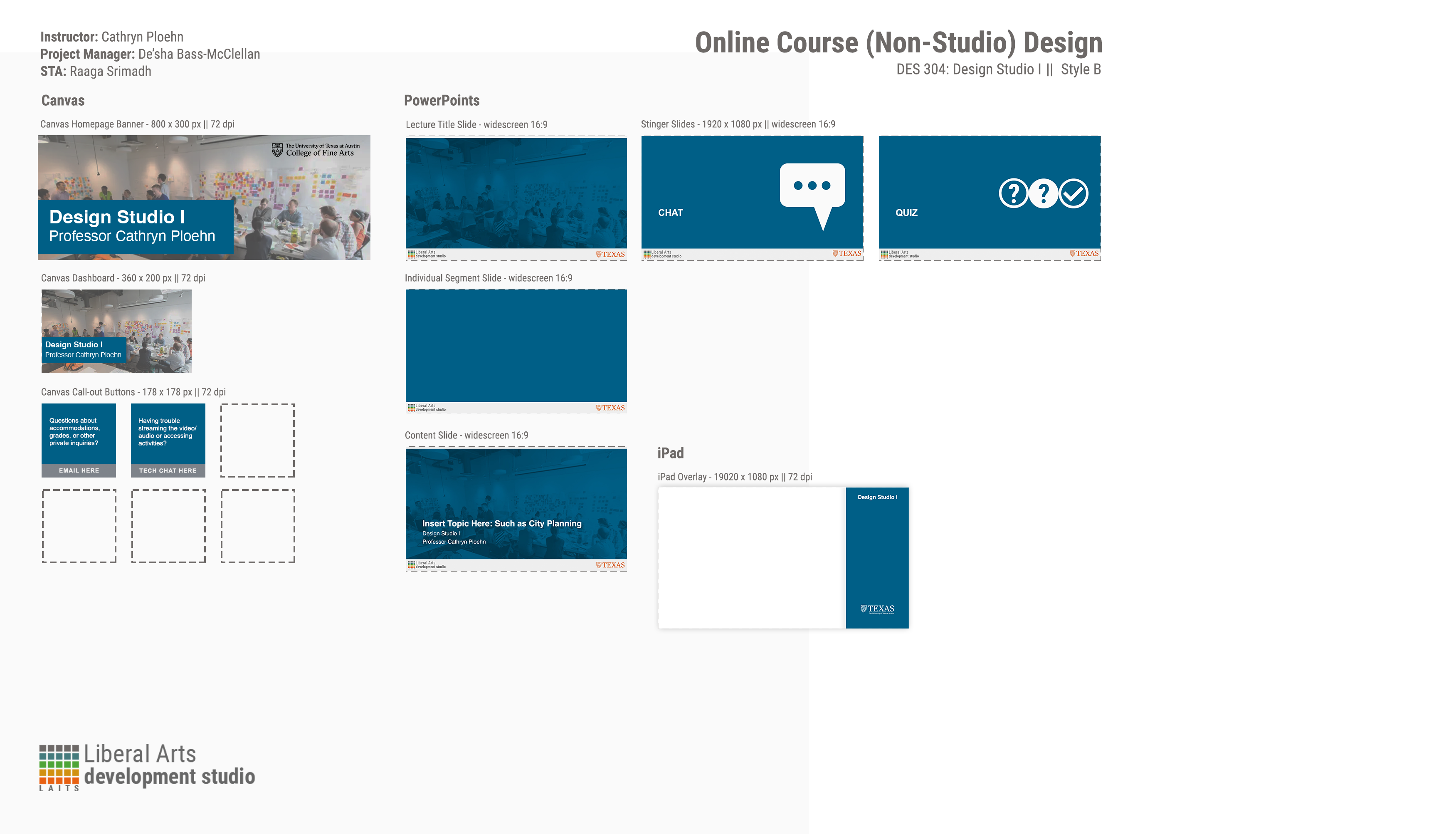
Following this project, I began working on the remaining projects within the Basic STA Training category. The first being Style A&B Course Graphics.
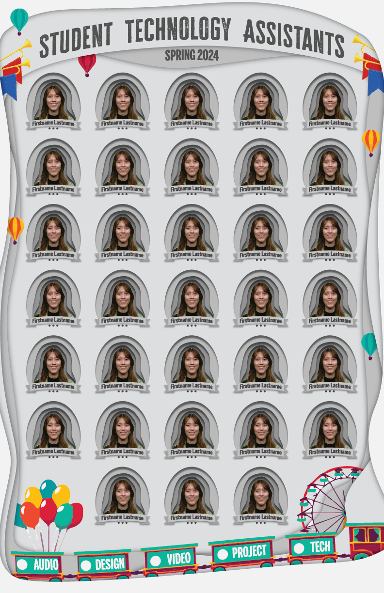
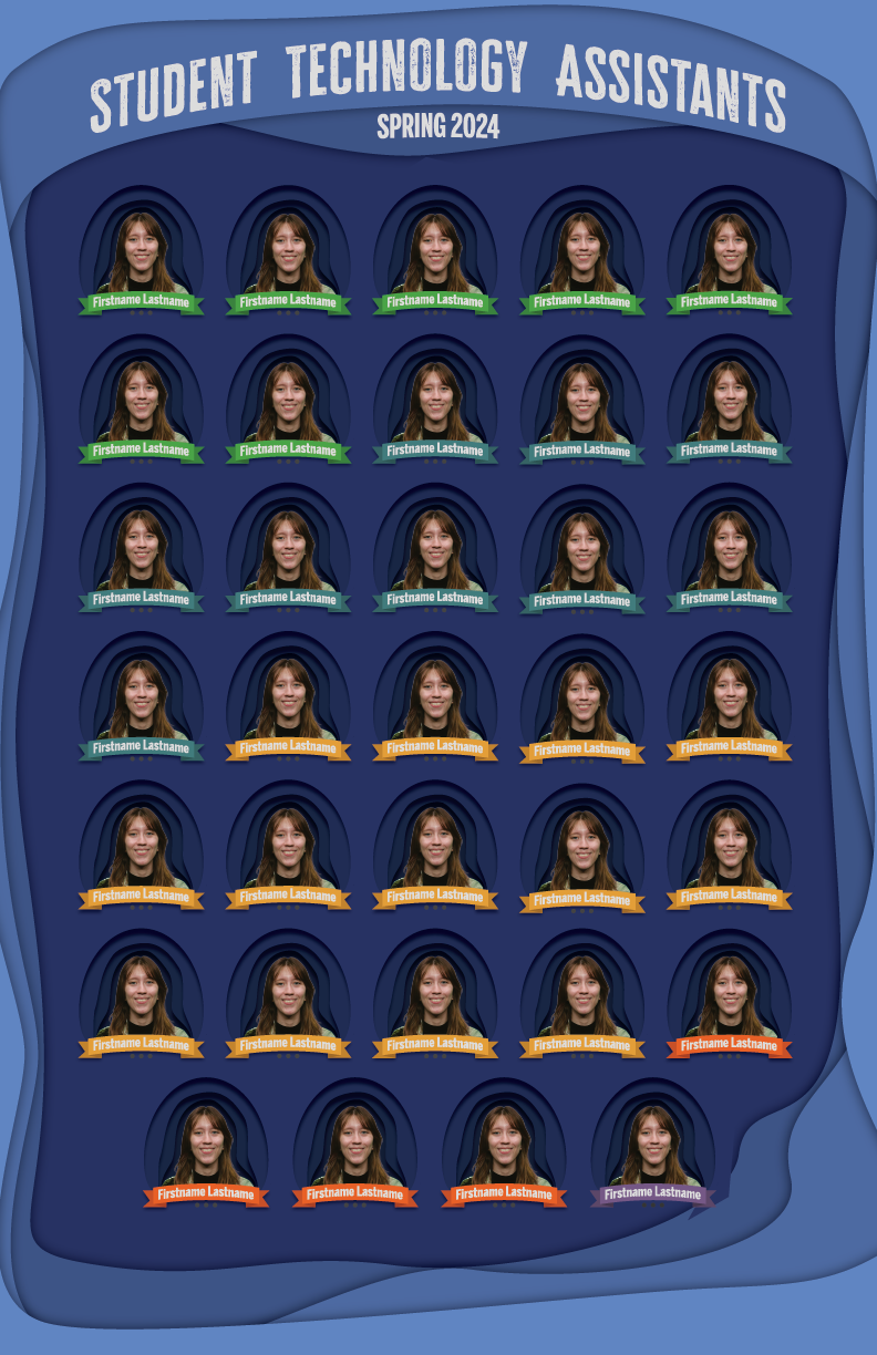
Style A&B Course Graphics
For this training module, I used Canvas and Powerpoint templates to create Style A and Style B Designs for DES304 – Design Studio I. This was more self-paced and involved my first experience gathering feedback from Basecamp.
This training module helped set me up for the following task– Custom/Studio Course Graphics, which is what I continued into the next week.
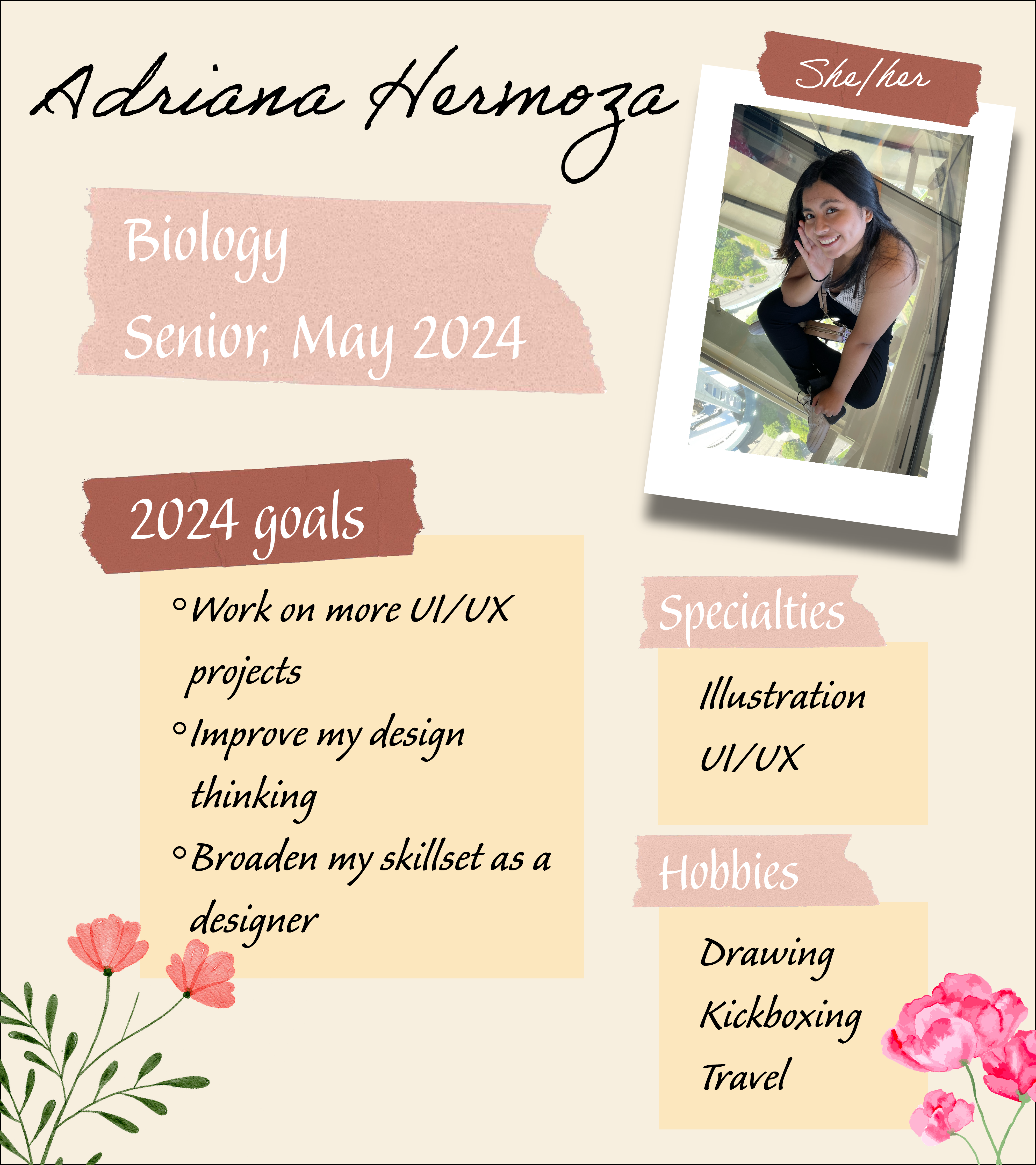
STA Blog Banner and Caricature
In addition to my training modules this week, I had the opportunity to create a blog banner and caricature to better represent my creative style on the team. It was an excellent way to ease into the program and exercise my design skills.