Final Images for Ch507
Request: Make a canvas banner, add 2 or 3 canvas button designs
Professor: Camilla Hsieh
Project Managers: Suloni Robertson, Emily Farias
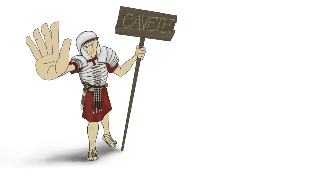
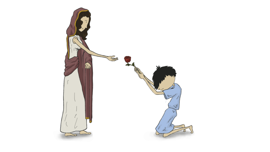
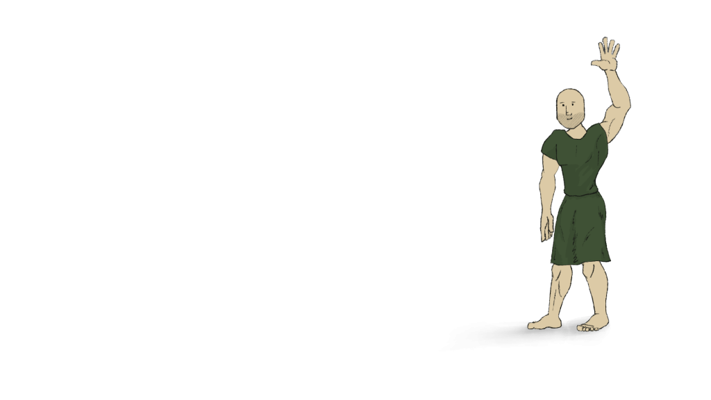
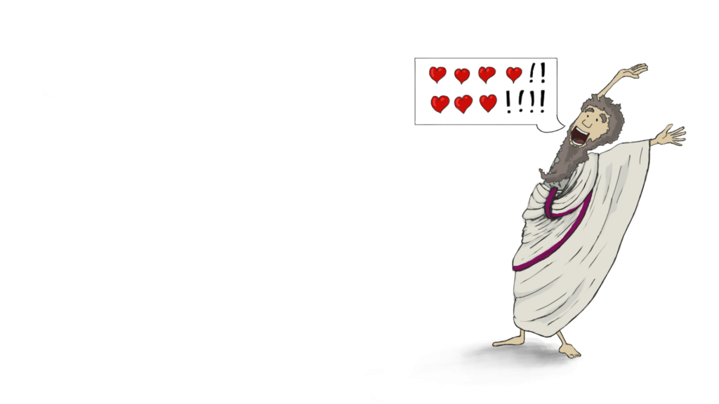
In most of the Ch507 presentations, the graphics that I created for the examples would often contain members of a chinese family. Because these characters were reoccurring I decided to put them into the Ch507 Canvas Banner. The logo is also on the corner of the banner. Another banner was created using instead just the logo.
For the first round of buttons, I had chosen to go with the same style as the illustrations used in the videos and came up with 2 buttons. The first is a cat in the same style as one of the illustration examples in the Ch507 powerpoint and the second I chose to make a horse since the logo for the class is a horse.
After discussing with the professor, it was decided on making the buttons more in the style that is like the logo for the class which is a horse in an ink painting style. These were the results I came up with since then.
LOGO:
-Note that these are not finalized just yet.
Request: Scan pictures and put into a powerpoint for professor to read off of during her award ceremony. Create a collage with the old newspaper clippings of the professor.
Professor: Elizabeth Butler Cullingford
Project Managers: Suloni Robertson
Process: First I scanned all of Professor Cullingford’s images and then scanned her newspaper clippings. After arranging the the images into a powerpoint according to her instructions, I took the scanned newspaper clippings and rearranged them using photoshop.
By Teresa Cagle
The COLA history department requested to have their homepage banner changed to advertise an upcoming panel.
They submitted this graphic to be edited:
Suloni and I agreed that the graphic was a little text heavy to be a banner. I created two drafts of the banner for Suloni to choose from. Here is the first graphic, that she did not select:
And here is the product we submitted to the client:
We agreed that the black background looked a lot cleaner and made the text more readable. In the end, the client decided to design their own graphic and did not use our recommendations.
By Paulina Lam
By soods