• We are STAs
    • Asha Rountree
    • Haley Ma
    • Kate Shih
    • Kyra Lee
    • Nicholas Peasley
    • Sasha Kenney
    • Shanda Horm
    • Shriya Atreya
    • Tomas Marulanda-Mesa
  • We were STAs
  • STA Presentation
    • STA Presentation 2017
    • STA Presentation 2016
  • Testimonials
  • Resources
  • Home

STA Blog

Valerie Tran

Valerie Tran

v-lab interactive & Psych CE

February 18, 2019 By Valerie Tran

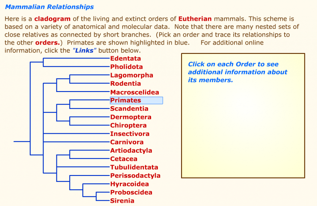
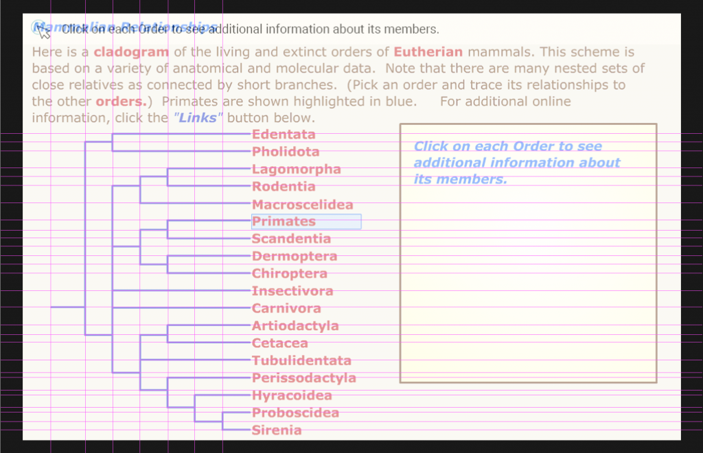
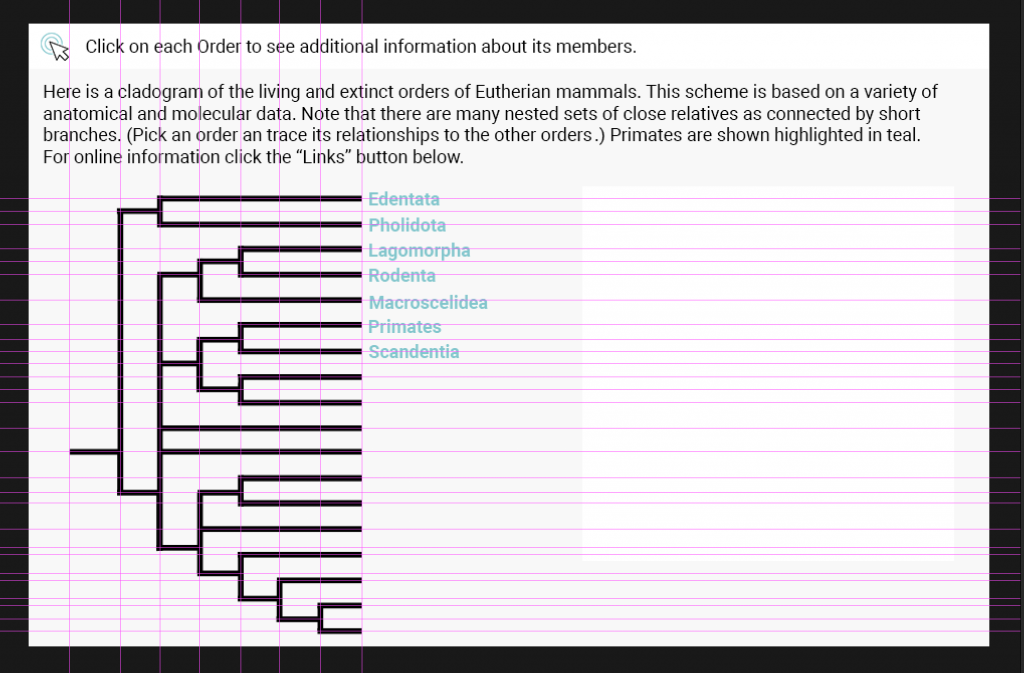
Today, I started off the first half of my shift with working on the interactives for the v-lab/e-anthro class. I added more text and added small background shapes to the parts of the interactive where there were thinner strokes. This was done so that the user doesn’t struggle with trying to click the text on the cladogram, and so that the folks who will be putting them into canvasser won’t struggle with working with them. Below is the progress!

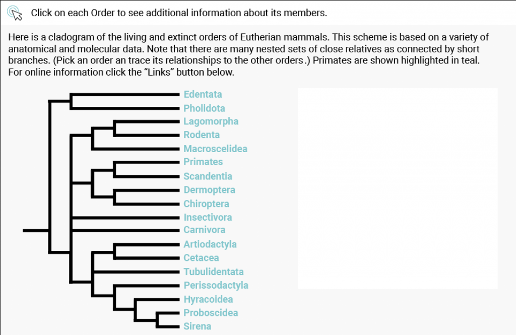
I took out the guides so that you can see the interactive progress more clearly. It looks pretty good so far if I do say so myself. It did take me a while to organize all the layers so that I can easily turn them off and export certain layers into .PNGs for Canvasser.

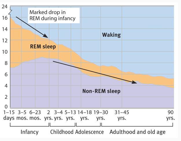
The second half of my shift was composed of working on the Psychology CE PowerPoint. I was tasked to create and recreate the diagram and graphics for the PowerPoint for this course. They are unable to use these graphics and diagrams because of copyright, so they reached out to us to create, recreate, and/or find public domain graphics.

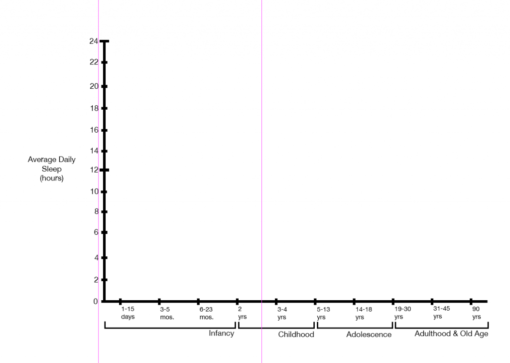
I am currently working on the graph for the 8th slide of the power point. It is a graph that plots average daily sleep against age and developmental stage in order to display a trend between REM sleep, non-REM sleep, and waking hours. Here’s the original graph:

look at dat graph

I wanted to see if I could make a different, but similar graph. I wasn’t too keen on the different units of measurements for the age group buckets (days, months, years), and I didn’t know how to feel about the brackets used to delineate the developmental stages.

To start, I brought in the original graph and lowered the opacity of its respective layer. I then turned on the grid and got to work. I sketched a few graph designs on paper (though I’m not sure where those papers went…). I then translated them into Photoshop. These were the concept graphs I made:

Graph with slanted developmental stage categories
Graph with vertical developmental stage categories

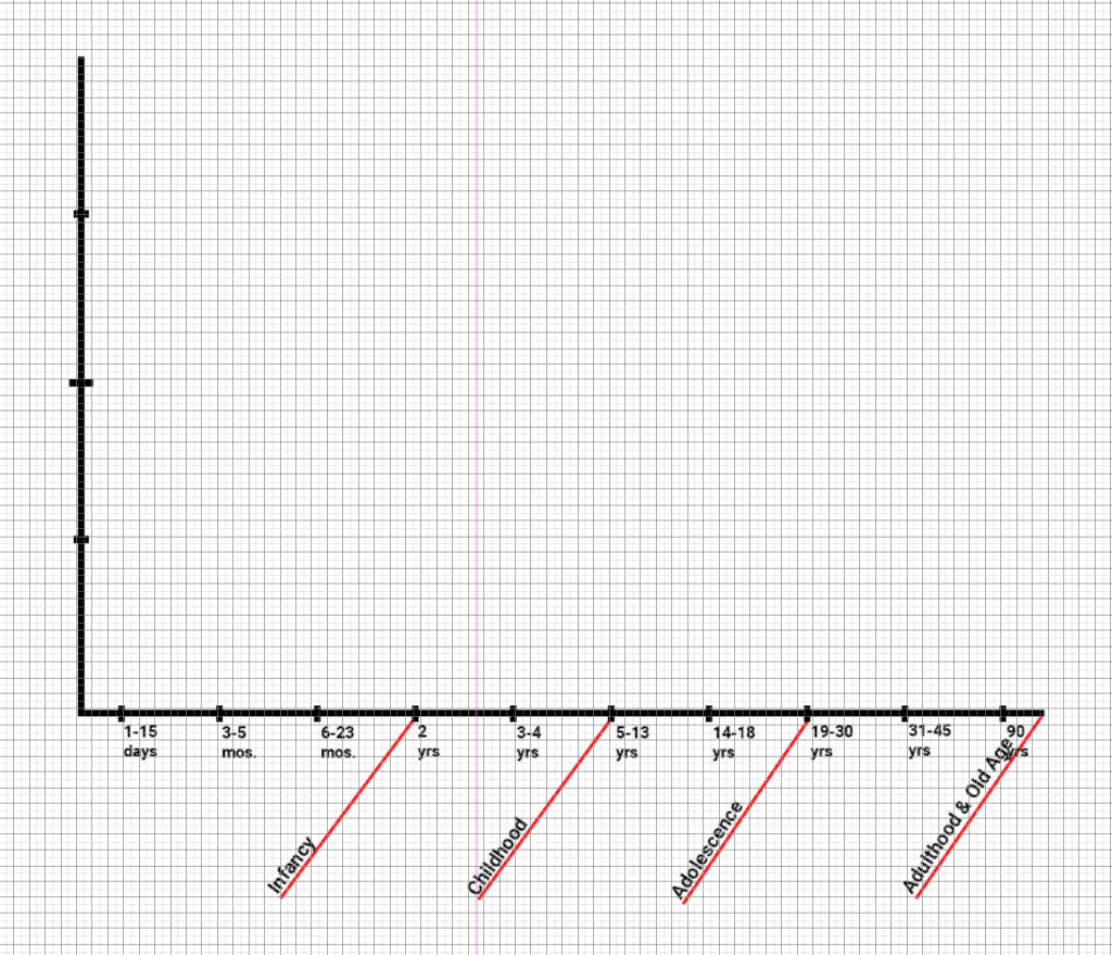
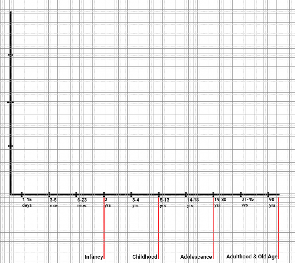
In short, I do not like these concept graphs I came up with. They’re more unclear than the original. I guess don’t fix something if it ain’t broke. So, I scrapped the two ideas/concepts above and started recreating the original graph.

Looks familiar, huh?

That’s all I did for this shift. More to come on Friday!

Filed Under: 2018 Fall - 2019 Spring

v-lab interactive

February 18, 2019 By Valerie Tran

Today I worked on a v-lab interactive for the e-Anthro course! I asked Estella to help me out and clarify some things about the interactive-making process because I confused myself a bit, haha. I also used Emily’s guide to making an interactive to make sure the text and colors were aligned with the style guide for this project.

I looked through the list of interactives that Emily assigned me to update and decided to do the Lab 1, Section 2 interactives. After deciding which interactive I would work on, I took a screenshot of the original graphic/interactive that was from that lab and section.

The original interactive from the course’s old site.

I then dragged the screenshot into Photoshop onto its own layer and lowered that layer’s opacity. Once I lowered the opacity, I created some guides to ensure that the content I create will be similar to the original (albeit with a more modern look).

Transparent screenshot with proper guides.

After this, I added the instructions and texts. I followed the style guide/instructions that Emily made and set the text to Roboto, pt. 18 in #ffffff (black). The teal colored assets were accessed via UTBox and they were dragged into Phototshop and into their own layers. I then added the text that is a part of the interactive in Roboto pt. 18 in #7ec7ce (the teal color). I arranged the text so that everything was aligned and that all the text weren’t too snug.

Progress so far

That’s all I did for this shift 🙂

Filed Under: 2018 Fall - 2019 Spring

Even More Sticker Updates

February 11, 2019 By Valerie Tran

Adding the texture to the background was a cake walk. It was the cathedral and its MANY accents and colors that took up a lot of time. Despite the tedious nature of the task, I think it paid off! What do you think?

There are SO. MANY. LAYERS. I used so many clipping masks. This .psd file for this graphic is W I L D.

Oh I also added text! 🙂 I’ll work on this more on Monday. I think I’m gonna bring this into Adobe Illustrator and try out other fonts. I know that the client wants a version of this in Russian, but I’ll have to discuss that with Tate and Suloni on Monday. That’s all for this time!

Filed Under: 2018 Fall - 2019 Spring

More Russian Sticker Updates

February 11, 2019 By Valerie Tran

Here’s some updates on the progress of this sticker. St. Basil’s cathedral is very tedious to draw.

Last week’s progress!

A lot of the upcoming progress photos are mostly me drawing the cathedral and figuring out how to prevent Polina and Oleg from getting to lost in the background.

This week’s progress!
Polina and Oleg with a glow.
Polina and Oleg with a drop shadow.

I preferred the version with the drop shadow for Polina and Oleg. It kind of makes them look like little paper cut outs. I also added more colors to the cathedral. I’m currently trying to figure out what size to make it. I’m also adding more green and cream accents to the towers. Suloni and Tate suggested that I add wood texture to the background and the cathedral to harken to the style of the world that Polina and Oleg came from. BUT that’s for next shift! That’s all for today 🙂

Filed Under: 2018 Fall - 2019 Spring

TID Podcast

February 11, 2019 By Valerie Tran

I was tasked to make a digital wall monitor display earlier this semester for the “This is Democracy”. It was going to be displayed behind the hosts of the podcast. Here are some progress photos of the process!

The above is what I proposed to them the first time around. However, it wasn’t meant to be because a lot of it was covered and didn’t advertise the podcast well while the hosts were present (see below).

So, I was then tasked to make a collage using screen shots of historical clips that were provided to me by the client. These were the end products.

I adjusted the way the collage looked because this was BAD. I don’t think the client was fond of it, and I can understand why. With Suloni’s guidance, I redid the collage and gave the client 2 different tints to choose from.

The above two were much cleaner and clearer. The client preferred the sepia-toned collage. However, when they took it for a test run it didn’t look too spectacular.

It was back to the drawing board. I warmed up the collage with a more red-orange tint in the hopes that it would prevent the display from being too washed out and yellow.

But to no avail. Adding a more orange tint wasn’t the move. It made the display look more yellow. It was then suggested that the original sepia tint be kept and used for the podcast.

I hope that they’re okay with the original collage.

Filed Under: 2018 Fall - 2019 Spring

Russian 2″ Sticker progress!

February 4, 2019 By Valerie Tran

I’m working on a sticker for the Russian course! Here’s the progress:

Zoom Screen Shot 2019-02-04 at 2.10.11 PM.png

Filed Under: 2018 Fall - 2019 Spring

  • « Previous Page
  • 1
  • 2
  • 3
  • 4
  • 5
  • 6
  • …
  • 14
  • Next Page »

link to LAITS home page

Video STA Home

© 2025 Liberal Arts Instructional Technology Services | Production Credits