• We are STAs
    • Asha Rountree
    • Haley Ma
    • Kate Shih
    • Kyra Lee
    • Nicholas Peasley
    • Sasha Kenney
    • Shanda Horm
    • Shriya Atreya
    • Tomas Marulanda-Mesa
  • We were STAs
  • STA Presentation
    • STA Presentation 2017
    • STA Presentation 2016
  • Testimonials
  • Resources
  • Home

STA Blog

Poonum Mehta

Poonum Mehta

Color Correction Training!

September 23, 2020 By Poonum Mehta

I’ve just finished this color correction training, it’s pretty relaxing in contrast to all my other assignments (which I love but sometimes it’s fun to just click buttons and see what looks different).  The results:

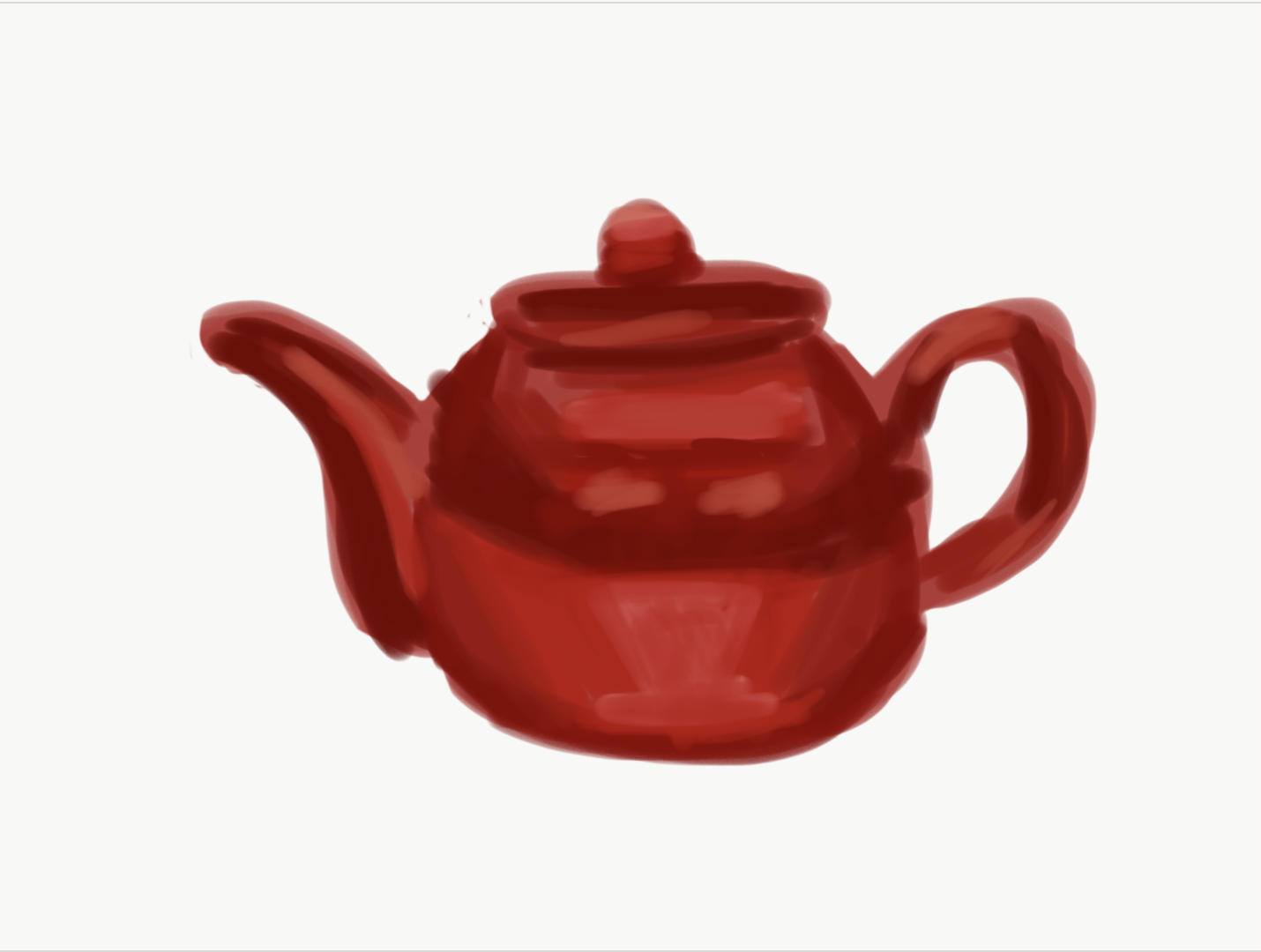
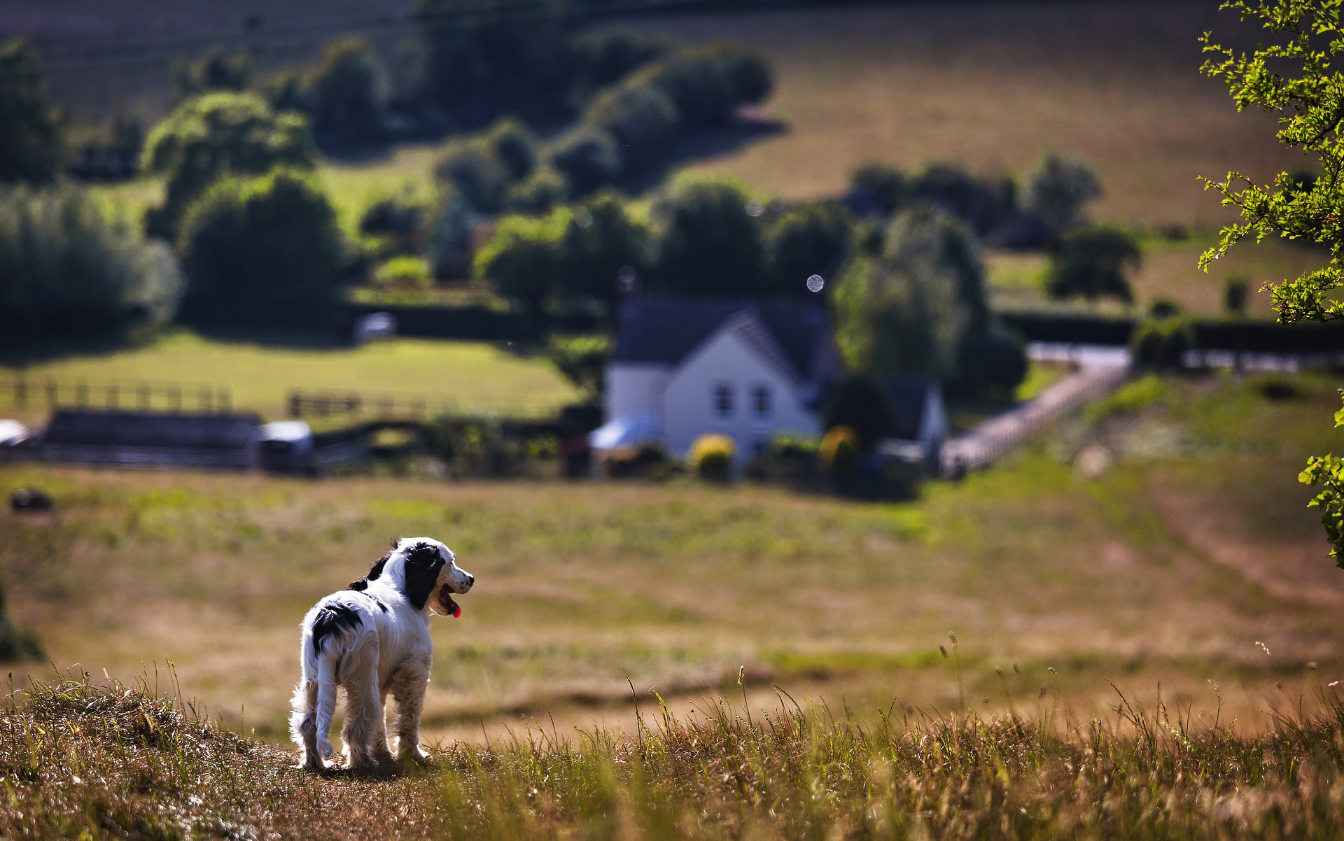
Curves adjusted to impact contrast:

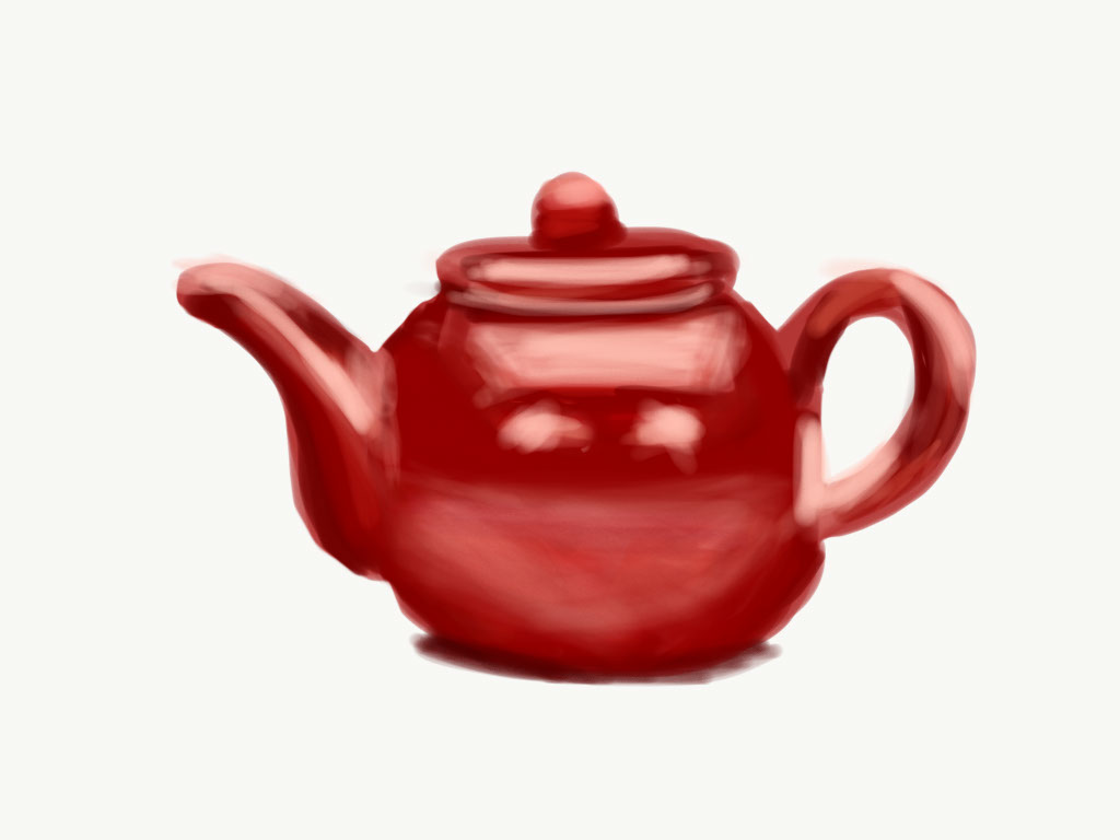
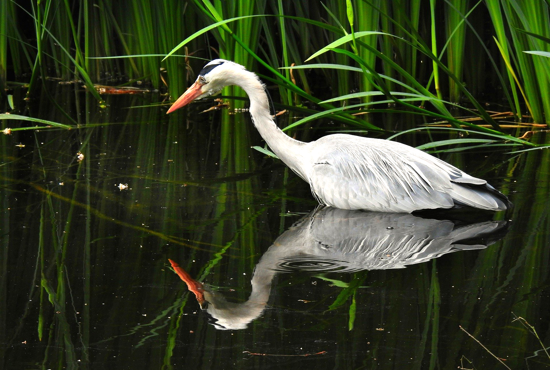
Levels adjusted to impact contrast:

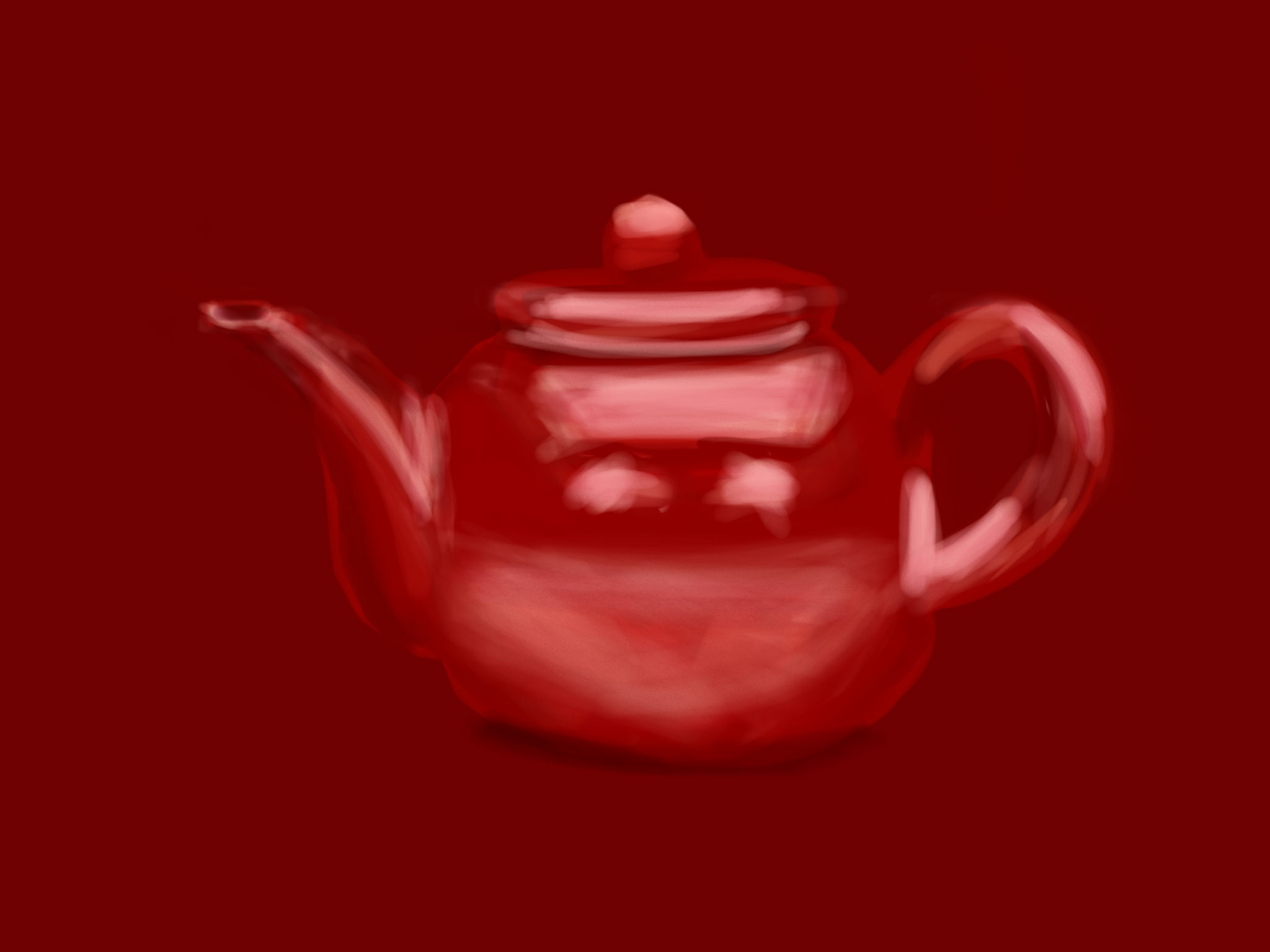
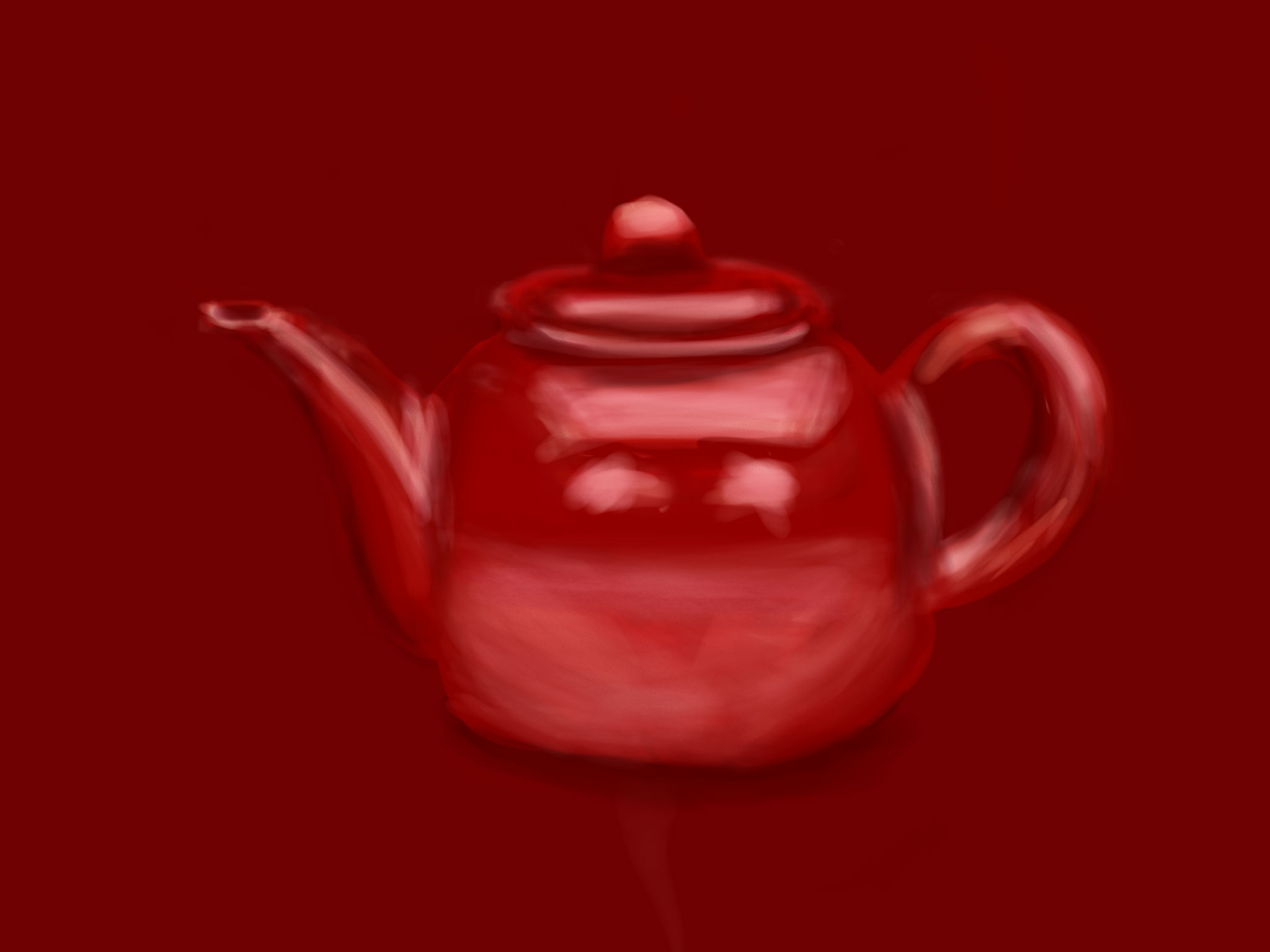
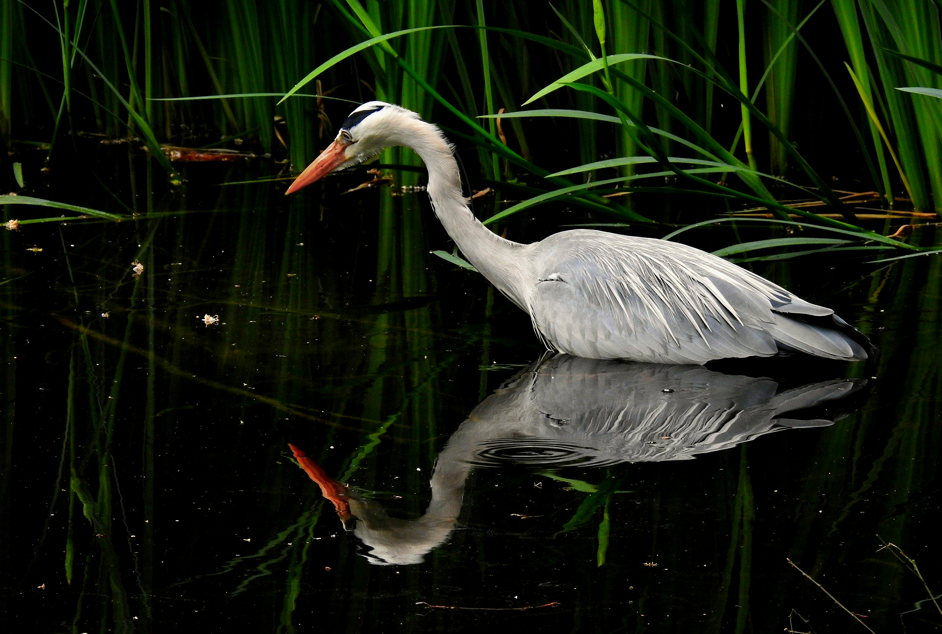
Brightness/contrast adjusted to impact highlights/shadows:

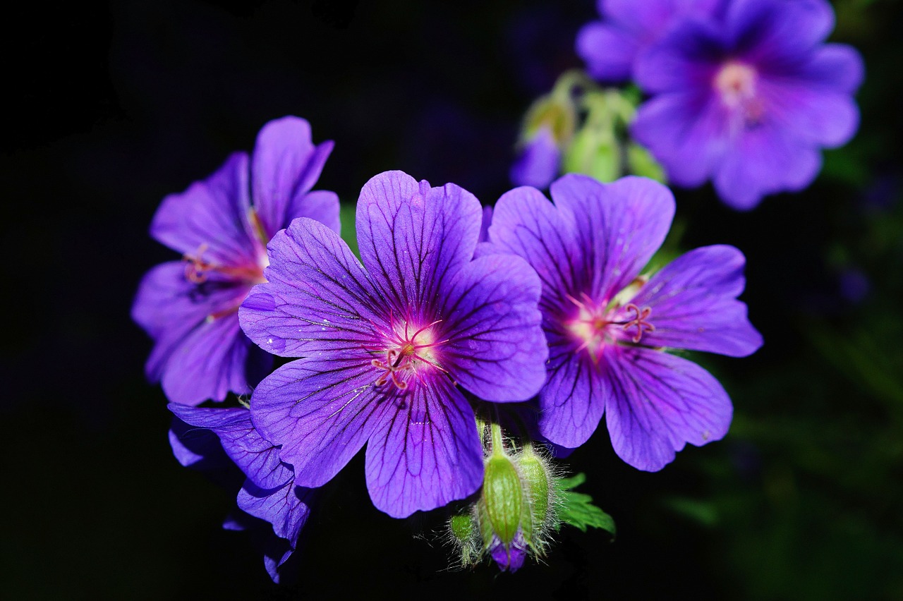
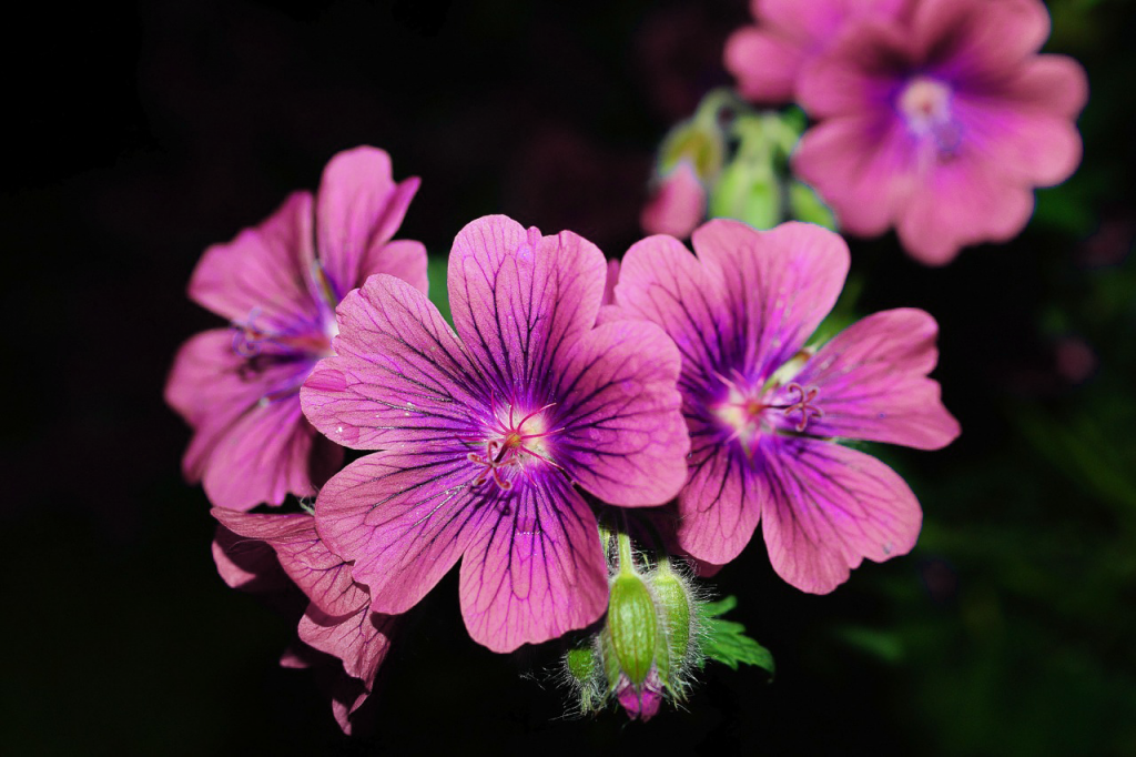
Used saturation to change the color of this flower:

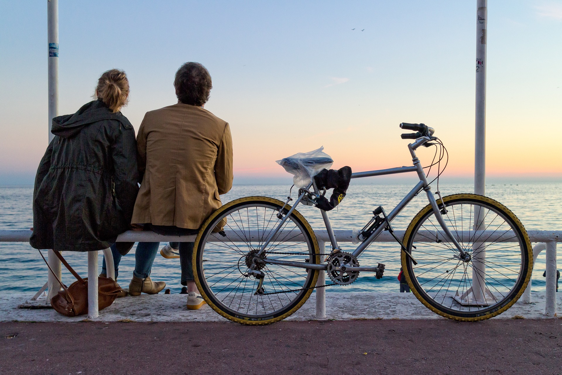
Used vibrance to make this image brighter without deep frying it (this was cool to learn!!):

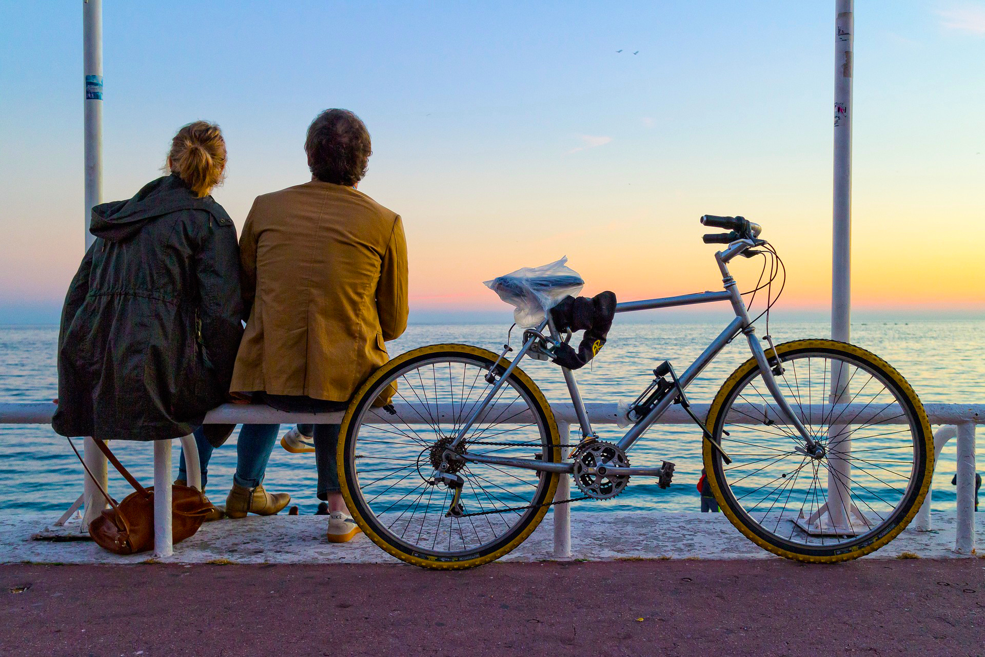
Used color balance to give these photos cool and warm effects:

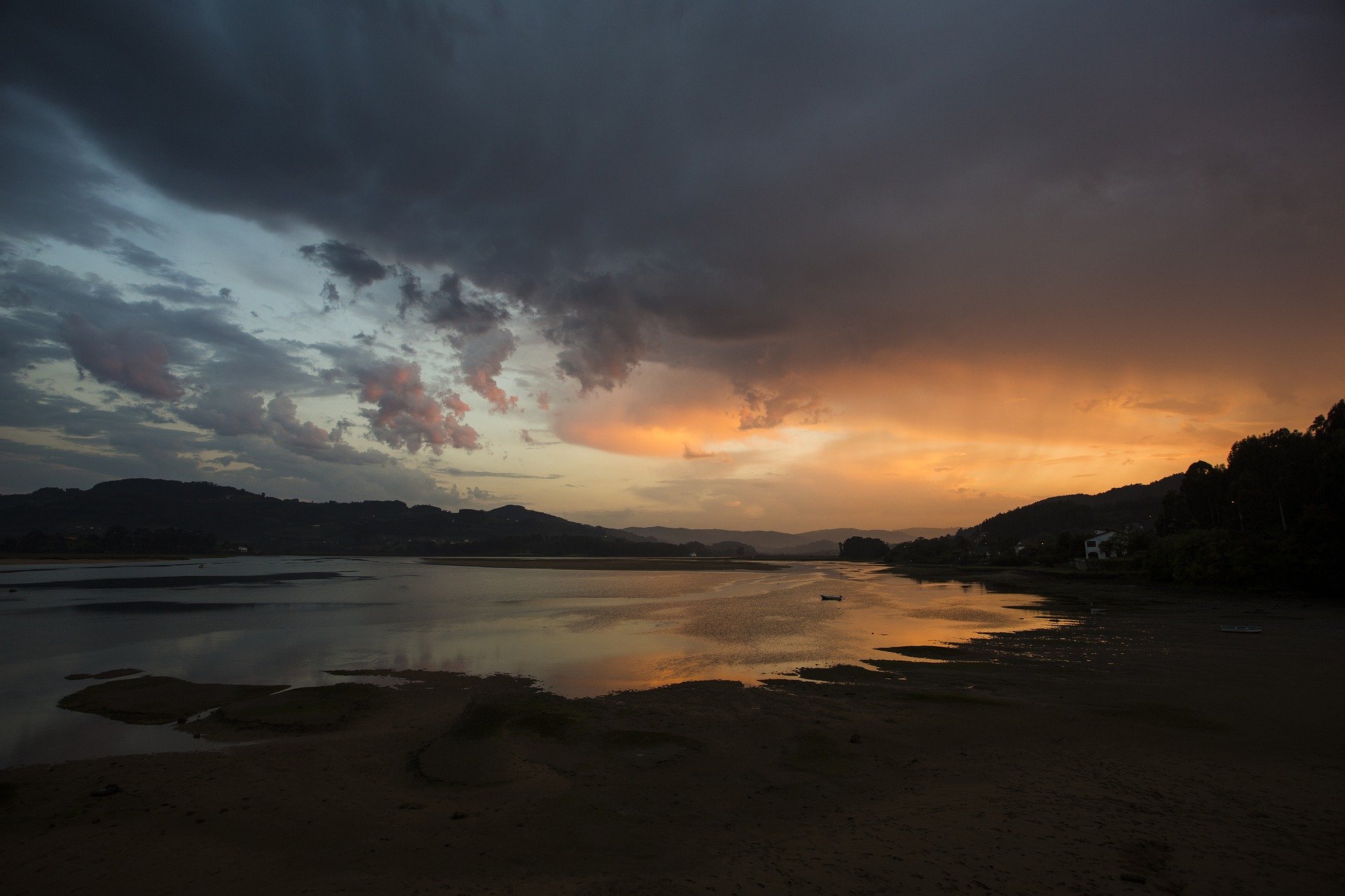
Used the selection tool and exposure droppers to give this photo more natural lighting:

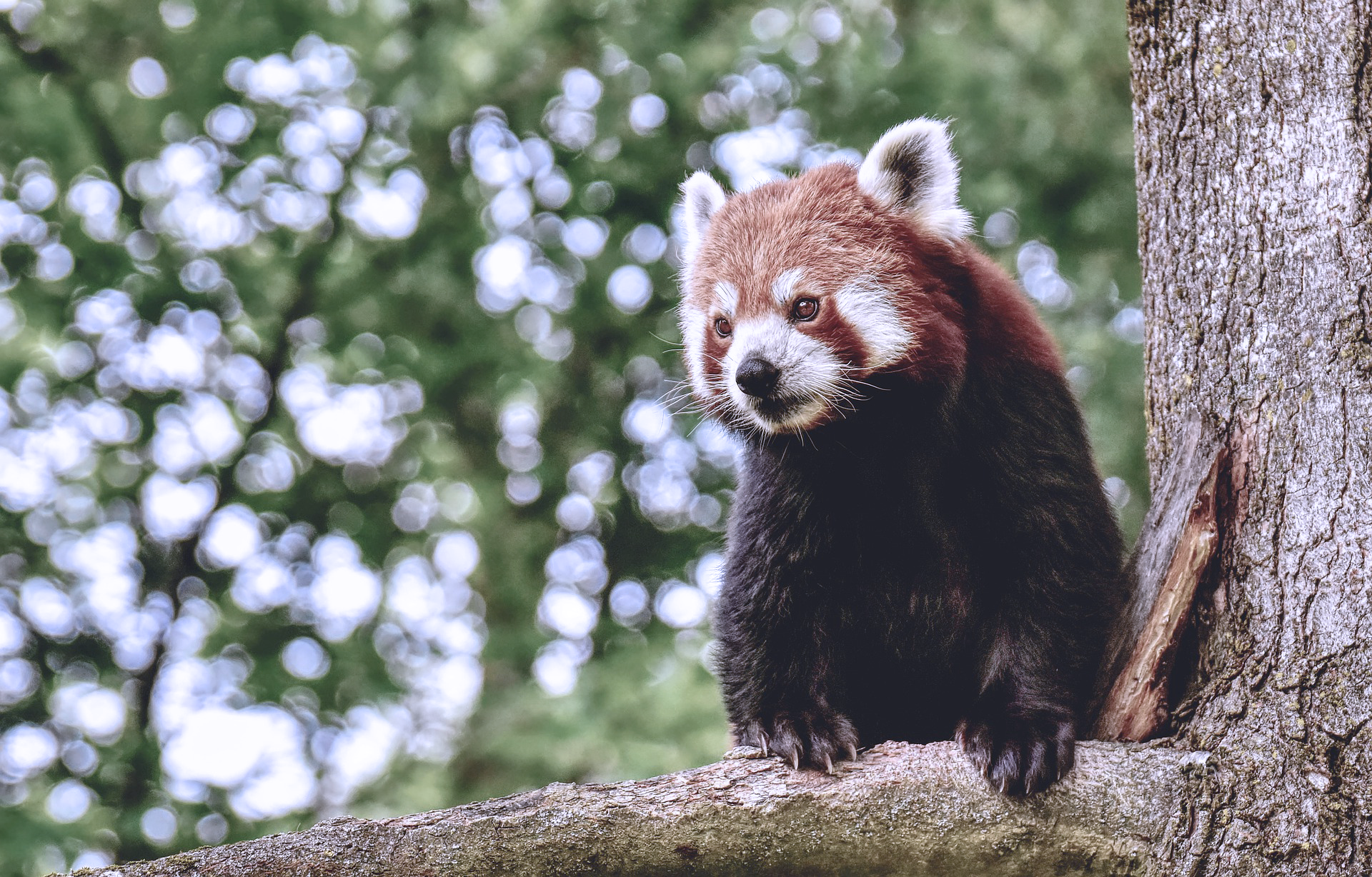
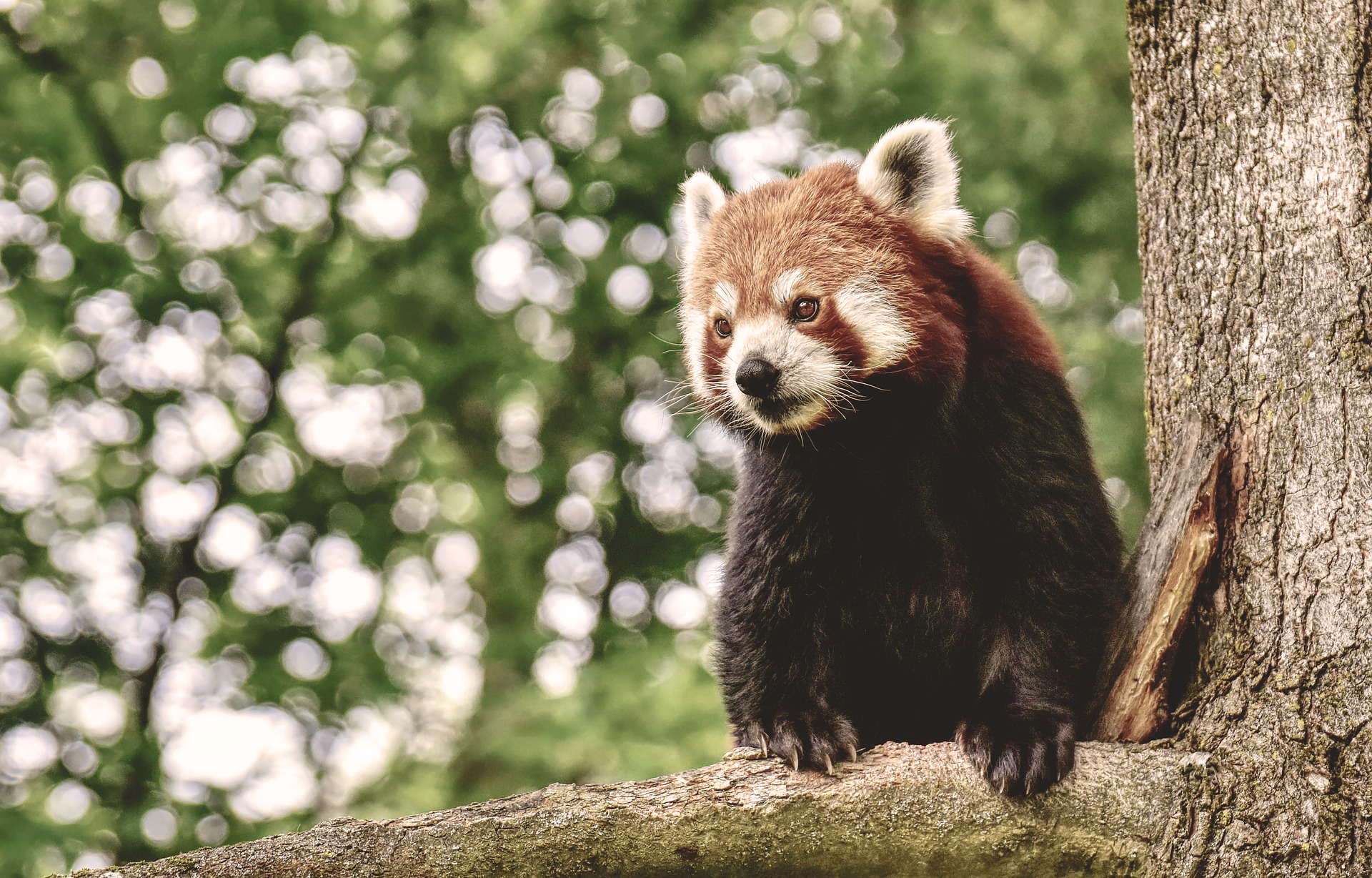
Used warm and cool tone filters to transform this red panda:

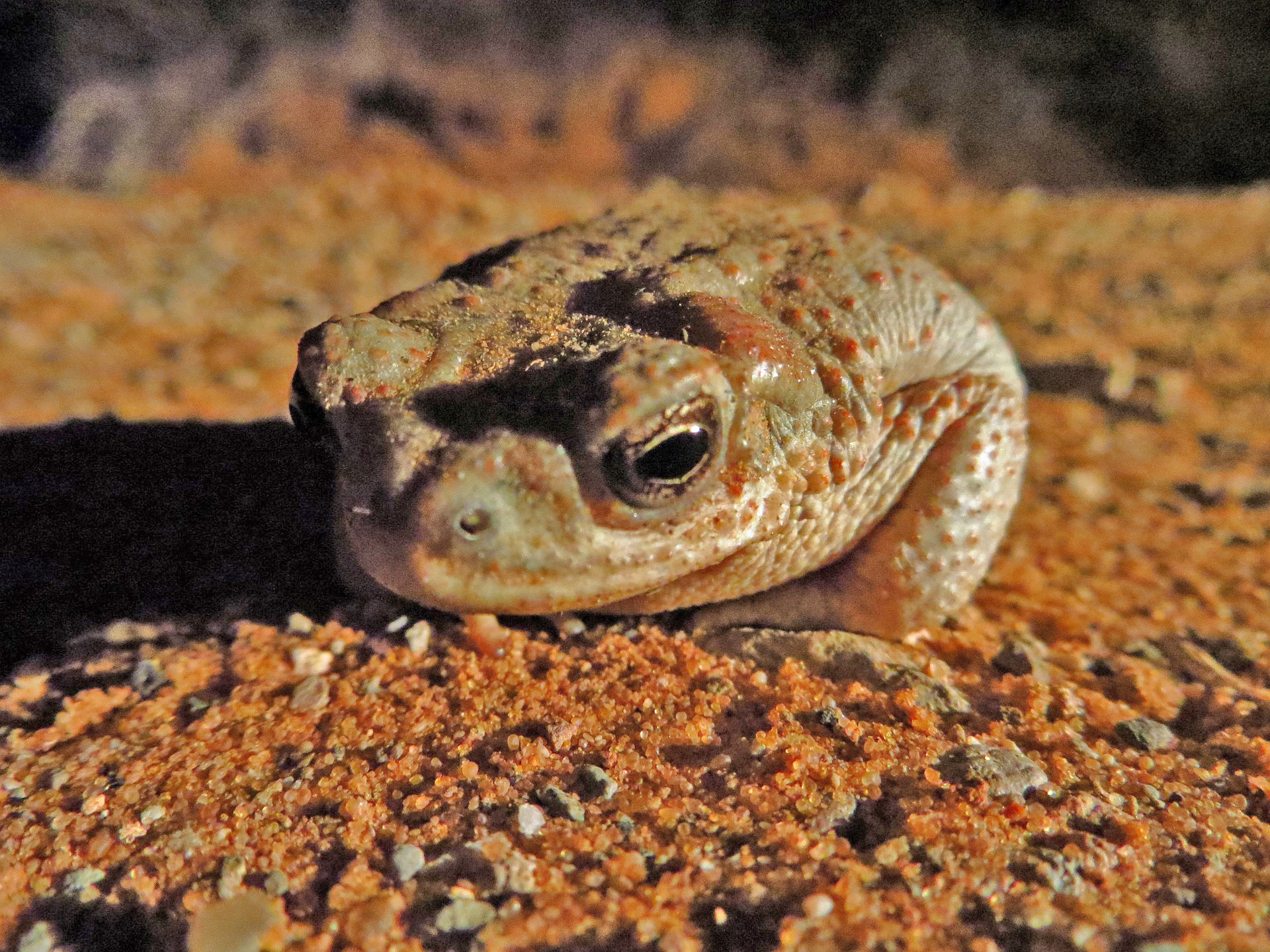
Used highlights/shadows to brighten and darken this image:


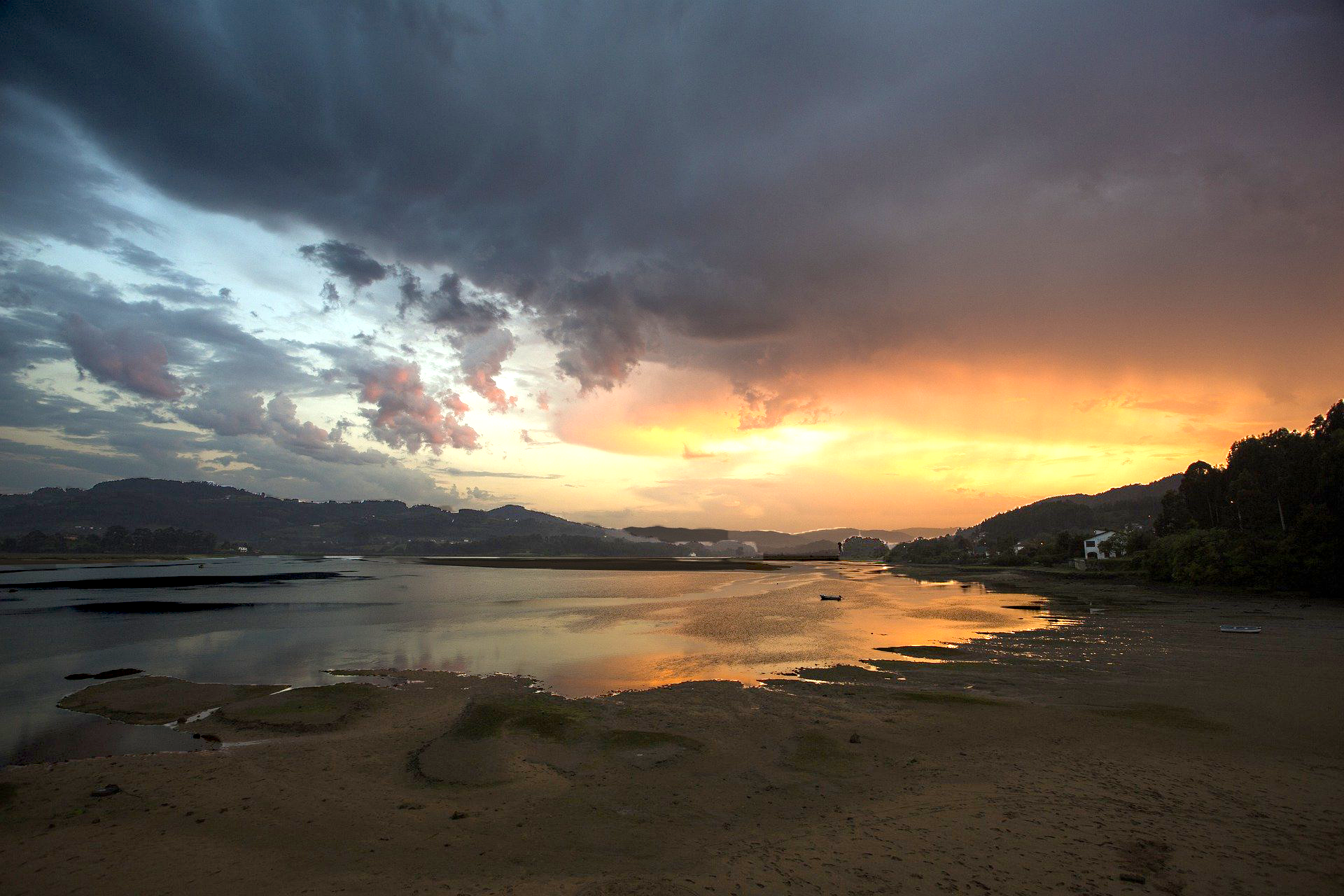
And finally, used the gradient tool to brighten part of this photo:

Filed Under: 2020 Summer | 2020 Fall

PSD Painting – Done!

September 17, 2020 By Poonum Mehta

Spot the difference o.o

This was fun! I feel like I’m getting better at adding and pulling back depths of color. I also figured out where the eyedropper tool was on my iPad today..would’ve been super cool of me to have figured out last week but that’s okay.


Filed Under: 2020 Summer | 2020 Fall

Studio Course Graphics

September 10, 2020 By Poonum Mehta

This studio course graphics training was a BOAT LOAD. I’m not entirely sure if I’m actually finished yet but I’ve created all of the assets. I ended up changing up my initial design a bit to include some black squares/lines, so I had to go back and adjust everything a tiny bit. Really happy with the results! I’ve just attached a couple of the assets here to give you all an idea of how the initial design was adjusted for the different formats. Really happy I got to keep my fonts consistent, but still trying to figure out how to embed the main font into powerpoint.


Here’s some powerpoint slides, the title and a stinger:

Here are the canvas designs:

And finally, a studio mock-up including my screen designs:


Super fun! Took my entire workday just to export files and shift things around lol. Until next week 🙂

Filed Under: 2020 Summer | 2020 Fall

Studio Graphic Training

September 3, 2020 By Poonum Mehta

Small update on studio graphics, I designed a storyboard for a potential animation! The idea here is that the color bars/boxes slide across the screen. I’m terrible at drawing so I didn’t visualize my entire concept but the animation would end with one of the black grid squares expanding and the title of the course fading in.

Filed Under: 2020 Summer | 2020 Fall

PSD Painting

September 3, 2020 By Poonum Mehta

I feel like I’ve spent a decade working on this teapot but it’s definitely paid off!! I’ve never considered myself skilled in fine arts. I can put graphics together and can kind of trace things, but paintings always been lost on me. Getting step-by-step feedback from Abriella for this assignment was sooooo helpful and I feel like the hard work really paid off. I understand shadowing and highlights so much better now. Luckily, because of how many times I resubmit photos of this teapot, I’ve documented the whole process:

First, I drew out the background shading:

Then I added in some highlights (pretty harsh ones now that I’m looking back):

Adding in the spout gave me some kind of highlighting/shadowing clarity:

From here, the other elements of shading made more sense. I now knew how to delicately add in bits of dark and light to create depth without having harsh lines. Final product:


Next week I’ll work on creating my OWN painting, which I’m sure will be an entirely new challenge, but I’m looking forward to it!

Filed Under: Uncategorized

Studio Graphics Training

September 1, 2020 By Poonum Mehta

Started working on a studio graphics training. Here’s my first digital monitor backdrop design for twentieth century art, inspired by de stijl’s signature grid design. I just posted this for feedback but I honestly feel like making the background blue and using white/yellow/red as the accents may be a better idea; I’m not sure if white would appear to bright on the screen for a backdrop. Might play around with that tomorrow based on what feedback I get.

Filed Under: 2020 Summer | 2020 Fall

  • « Previous Page
  • 1
  • …
  • 5
  • 6
  • 7
  • 8
  • 9
  • …
  • 11
  • Next Page »

link to LAITS home page

Video STA Home

© 2025 Liberal Arts Instructional Technology Services | Production Credits