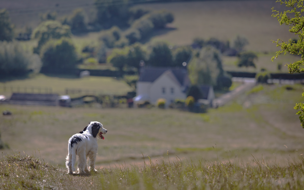
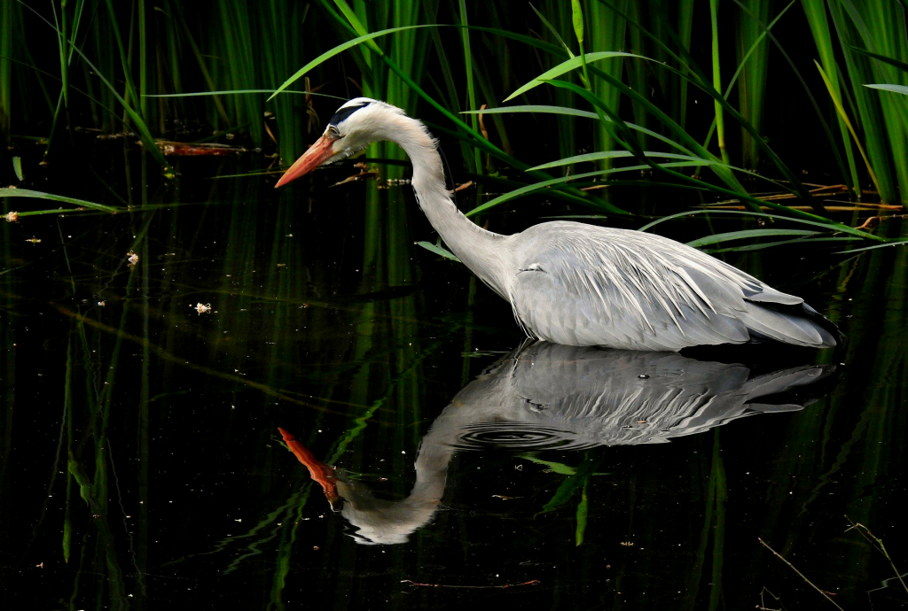
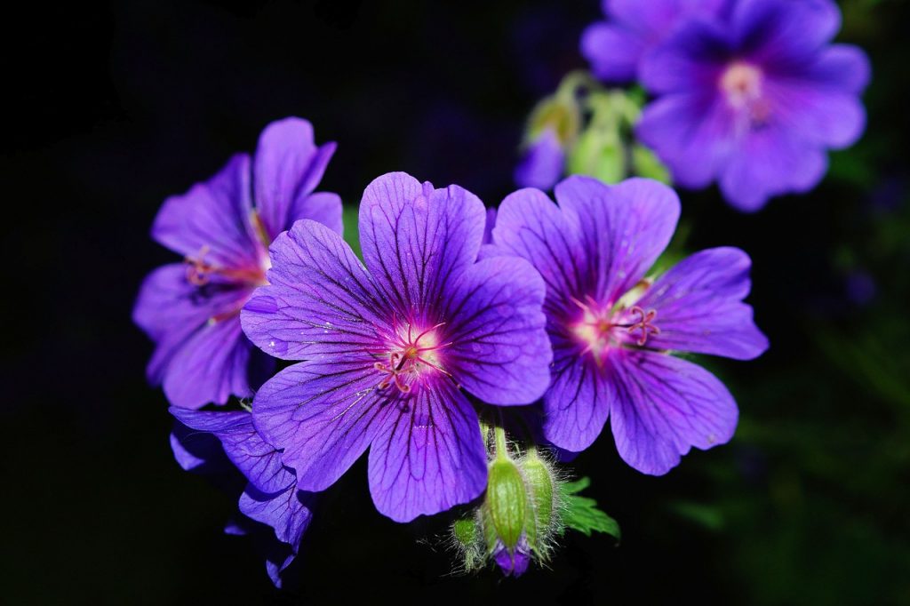
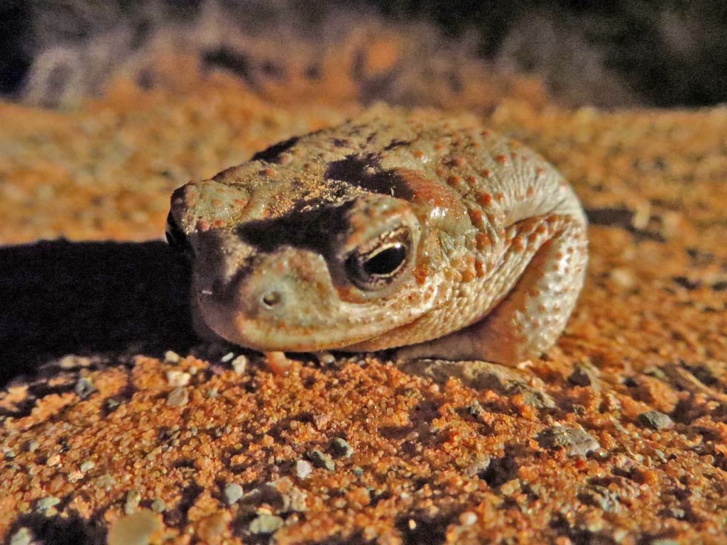
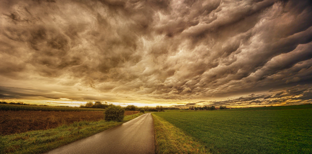
I’ve just finished this color correction training, it’s pretty relaxing in contrast to all my other assignments (which I love but sometimes it’s fun to just click buttons and see what looks different). The results:
Curves adjusted to impact contrast:
Levels adjusted to impact contrast:
Brightness/contrast adjusted to impact highlights/shadows:
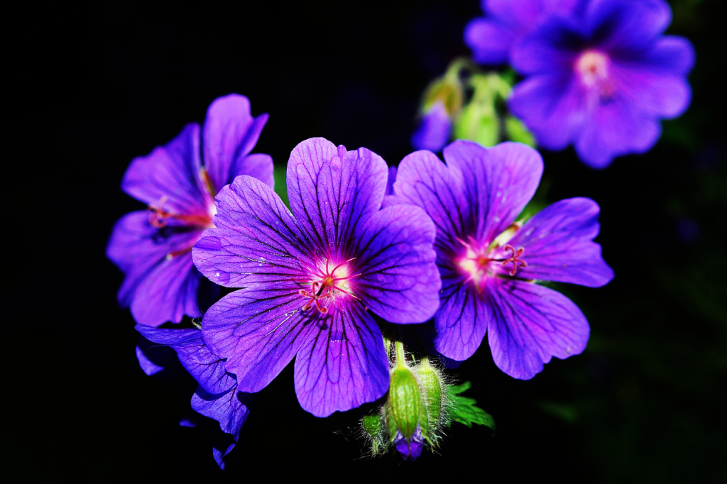
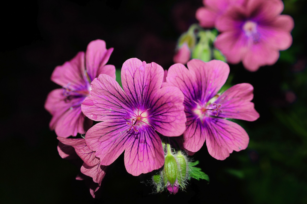
Used saturation to change the color of this flower:
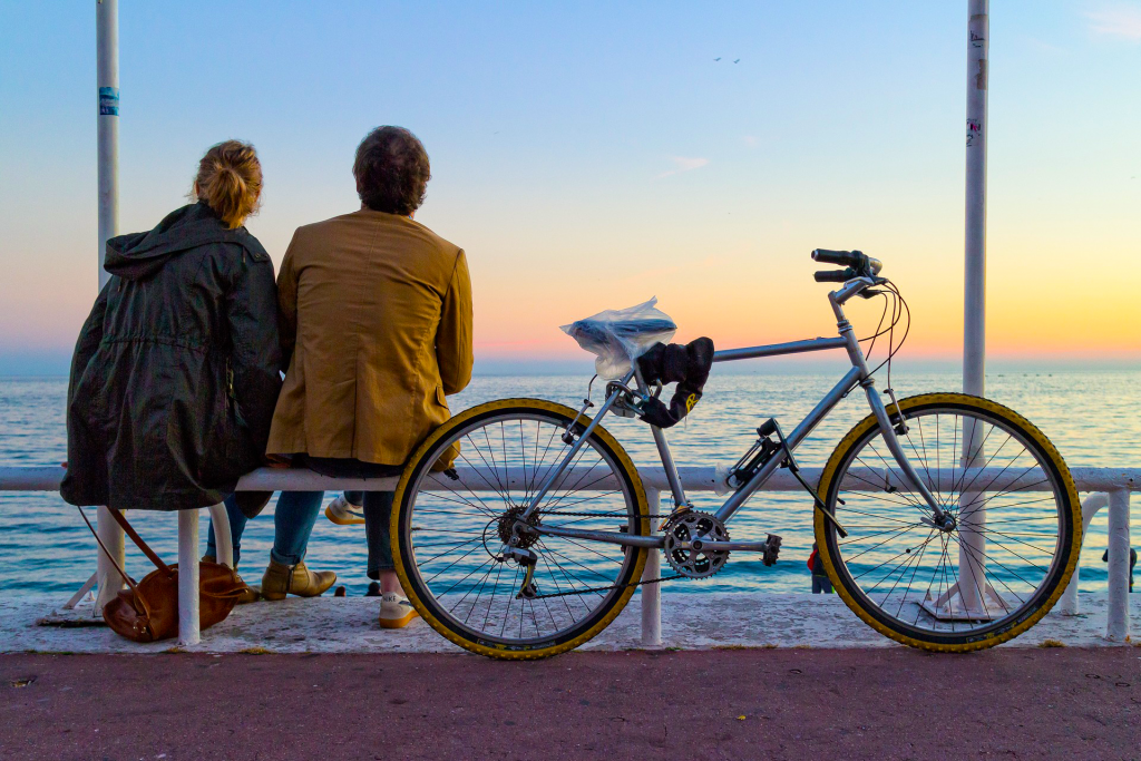
Used vibrance to make this image brighter without deep frying it (this was cool to learn!!):
Used color balance to give these photos cool and warm effects:
Used the selection tool and exposure droppers to give this photo more natural lighting:
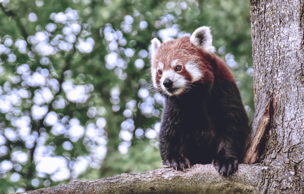
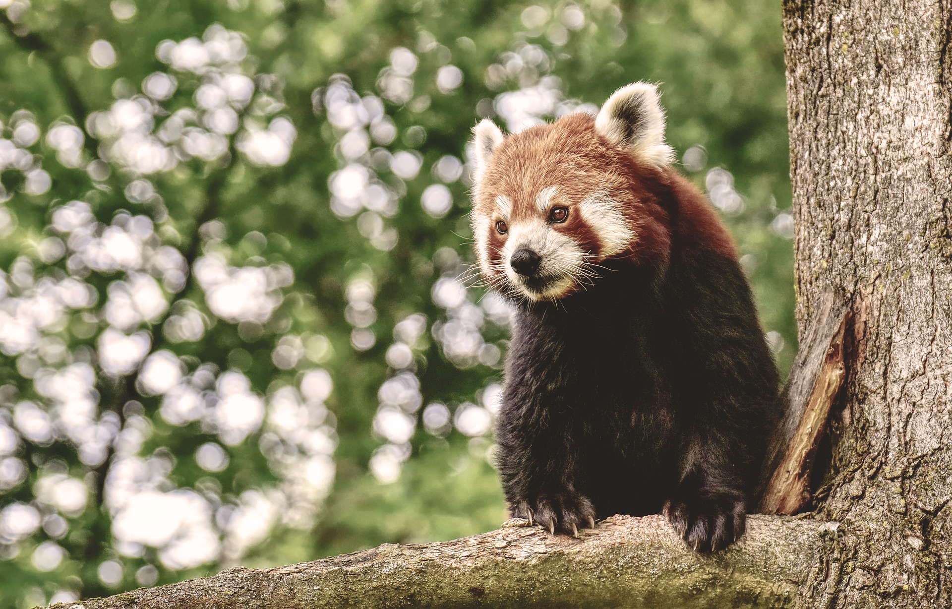
Used warm and cool tone filters to transform this red panda:
Used highlights/shadows to brighten and darken this image:
And finally, used the gradient tool to brighten part of this photo:

