Fall 2024 STA Posters
Project: 2024 STA Roster Posters
Client /Prof: LAITS
Staff guidance: De’sha
Description/plans: The overall theme for the posters is Movie Productions!!
For the Fall semester, we are creating an overall roster poster and individual team posters based on movies.
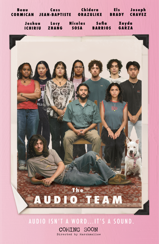
For the Audio Team Poster, the design will be based on “The Royal Tenenbaums” movie poster.
For the Classroom Support Team Poster, the design will be based on the “Glass Onion” movie poster.

Challenges: The Classroom Support poster was challenging because I had to recreate the outdoor settings of the original poster and create a composition for 14 STAs as opposed to the 9-person cast of Glass Onion. An additional challenge was the variety of poses; some STAs had a wide range, while others had limited options. De’sha and I worked together to establish poses for the 14 STAs to avoid a “crowded” look and to create different levels of visual hierarchy. We also edited some of their clothing, as many wore black, to help them feel more integrated into the scene.
Overall Experience: This was a very fun project to undertake and I loved seeing everyone work on their designated posters! I can’t wait to see them printed out and see the reactions from the other STA teams.
