March – April Trainings
Animate Simple Course Graphics
The goal of this training is to grasp the basics of Adobe After Effects through some basic animation practice. The instructions were to animate a simple course graphics intro. Here is what I came up with!
I enjoyed working with Photoshop and After Effects to make this very simple course intro. This was a good introduction to the software. I think if I were to go back and revise it I would add some people viewing the art and make the text more colorful.
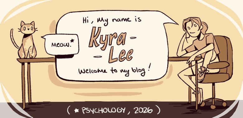
Logo Design
For this training I was tasked with creating a personal brand/logo. Here are some variations and the final chosen design.
Several elements included in the logo and how they represent me:
- Cat – because I like cats 🙂
- Cap – I wear caps a lot and usually draw myself wearing one
- Pencil – to show that I do illustration
- Star – my cat’s name is Star!
- Red Color – I use red a lot in my art, so using it here makes it recognizable as me
- Kyrartist – My “brand” name!
Logo Animation
For this training I brought the logo I just designed into After Effects to give it some movement! I learned some new techniques like the trim paths feature and how to use the graph editor.
For my first time animating a logo in After Effects I’m pretty happy with this! I like how the star looks like it’s being drawn and the subtle movement of the hand and head. If I were to revise this I would make the logo appear in a more interesting and unified way. Maybe having the head turn around and put some follow through on the hat. I would also like to add movement to the face to give it more personality. Making the eyes blink and the mouth go from neutral to smirking can really bring the logo to life and feel inviting.
Painting in Photoshop
Finally, I completed this quick Photoshop training where I got to explore the different textured brushes.
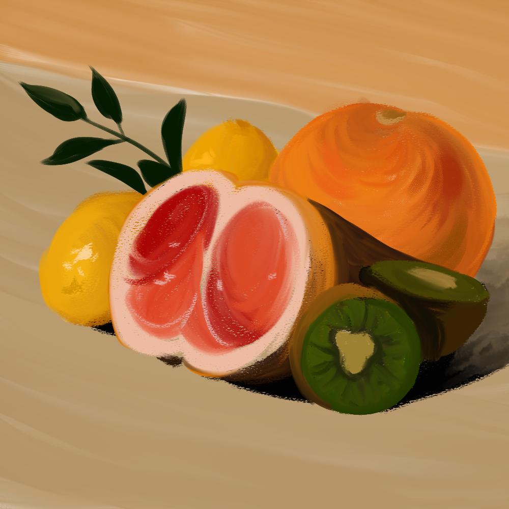
I’ve mostly used Ps for line art and more flat color illustrations, so this was a nice change of pace. I love how the coloring on the orange turned out. I like the movement in the brush strokes and the variations in hue/saturation.
One thing I would improve on for next time is to refrain from using the color picker. This would help develop my color observation skills.