Virtual Labs UI Update
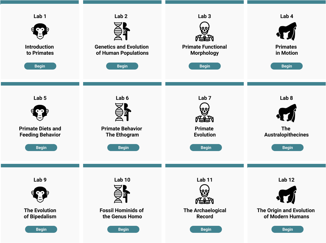
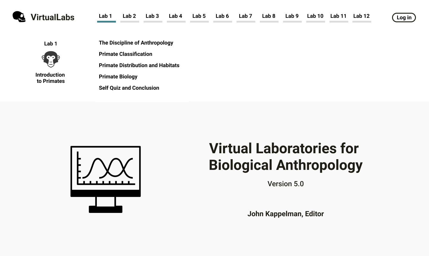
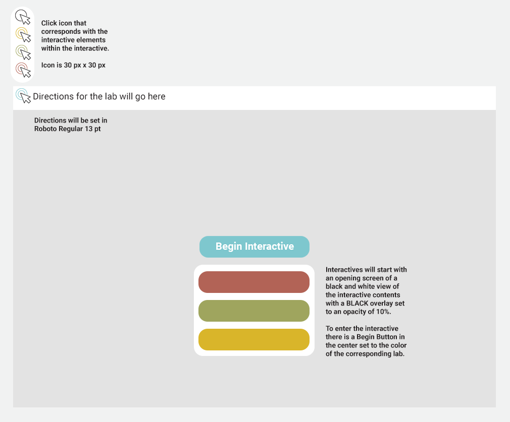
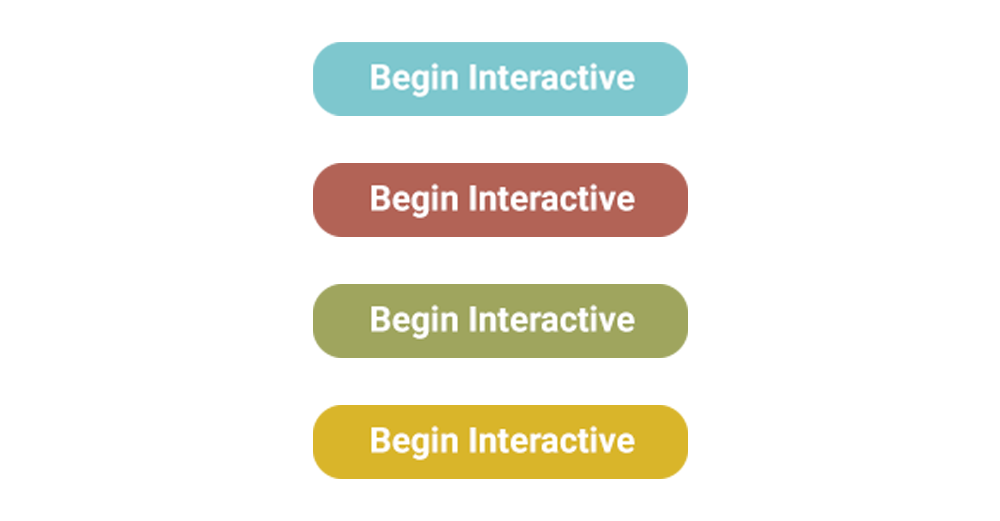
Here is an update on the UI design for the Virtual Labs site. Since my last update we have decided to use only one color of the four presented. We went with the teal color as we believed it offered the bet contrast for screen visibility. In addition, Suloni had some notes for me, primarily reemphasizing the lab numbers in the navigation bar and main menu. Below are the changes out into effect.
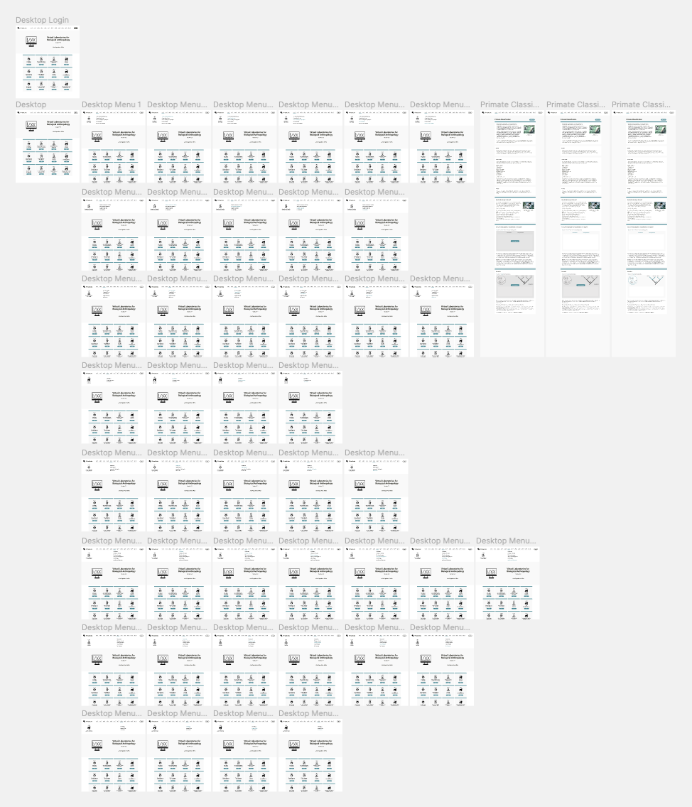
I spent some of Friday updating my mockup and prototype of the site. I made sure everything was consistent with the styling of the interactives. This entailed small changes including updating the font size, line height, padding, etc. Below you can see all the pages laid out in the order of their flow.
As of now, I have a mockup for the homepage and what a lab section will look like. This week I will focus on designing a couple more pages and assets needed for the new site’s design. This includes a resources page, glossary, credits, and a min-max button. You can click on the homepage below to navigate through the prototype.
