• We are STAs
    • Asha Rountree
    • Haley Ma
    • Kate Shih
    • Kyra Lee
    • Nicholas Peasley
    • Sasha Kenney
    • Shanda Horm
    • Shriya Atreya
    • Tomas Marulanda-Mesa
  • We were STAs
  • STA Presentation
    • STA Presentation 2017
    • STA Presentation 2016
  • Testimonials
  • Resources
  • Home

STA Blog

Cristina Villarreal Núñez

Cristina Villarreal Núñez

Reformatting for Texas Global

May 12, 2021 By Cristina Villarreal Núñez

Reformatting for Texas Global

This project is something that has been going on –on and off– since February of this year. Basically, the premise of the project is reformatting a bunch of their old ppt presentations that they use in their Innovation Readiness course.


Since February, I’ve worked on this project at different stages of the progress, too (accompanied by other STAs, of course). For instance, I worked on gathering a bunch of images from the official Texas Global archives to use in the ppts back in March. I worked on reformatting back then too, when we were working with a different template.


The most recent update I have for this project comes from yesterday’s work. A lot of changes had been made to the template we were using since the last time I’d worked on this project, so with the newest version set in stone, I worked on reformatting two different presentations, that being the Benefits ppt and the Competition ppt.


Poonum is currently overseeing that project among us STAs, but there’s exterior project managers still checking in and making changes to the plans every so often. So the conclusion to this project is still pending…


Filed Under: 2021 Spring - 2021 Summer

Student Success Tool Logo Final Update

May 7, 2021 By Cristina Villarreal Núñez

Student Success Tool Logo Final Update

Welcome to the last episode of the saga of designing the upcoming Student Success Tool logo! This has really been a nail biter, but we have finally chosen an official logo for the app, and I’m excited to share it with you. But first things first, Here’s what happened after last week’s update and before getting to the final logo.


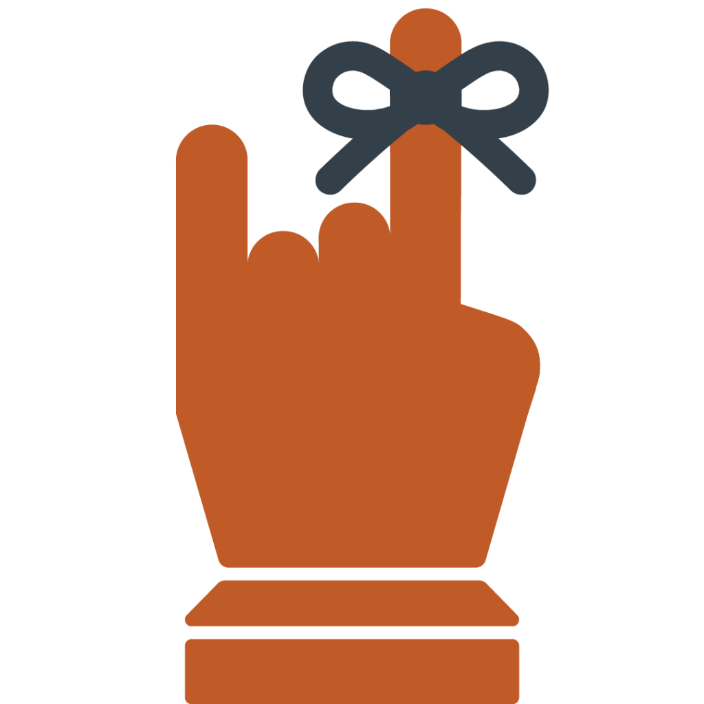
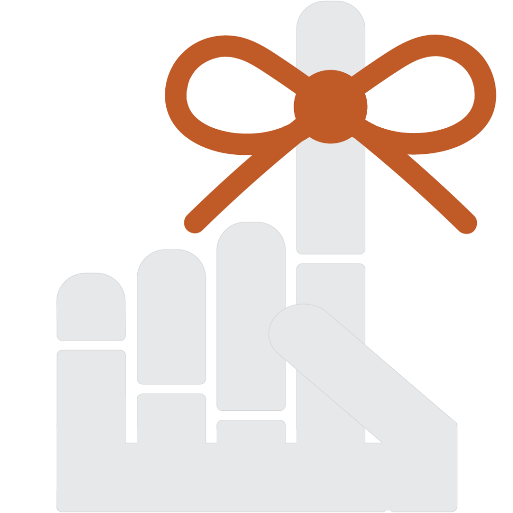
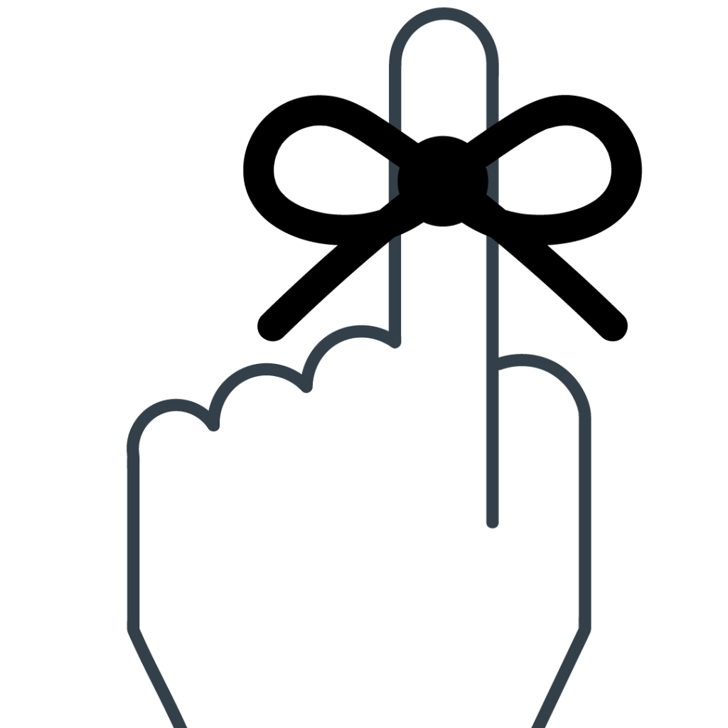
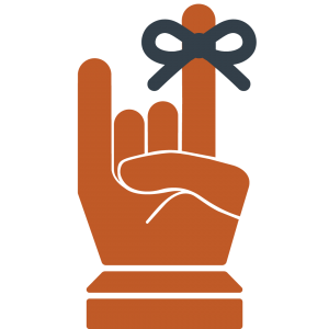
After making suggestions for the client on our pitches for the Ribbon Reminder logo and the Calendar logos, she got back to us with their comments. First she said they really like the Calendar logo, but that they prefer to more forward with the Ribbon Reminder logo. Then, she said that the general consensus among their team was that they preferred the front-facing Hook’Em Ribbon Reminder logo, rather than the back-facing index finger Ribbon Reminder logo that we had suggested. So that’s the one we moved on with. The team also wanted to make a slight adjustment to the logo and add a rounder edge on the thumb of that design, so I did that.


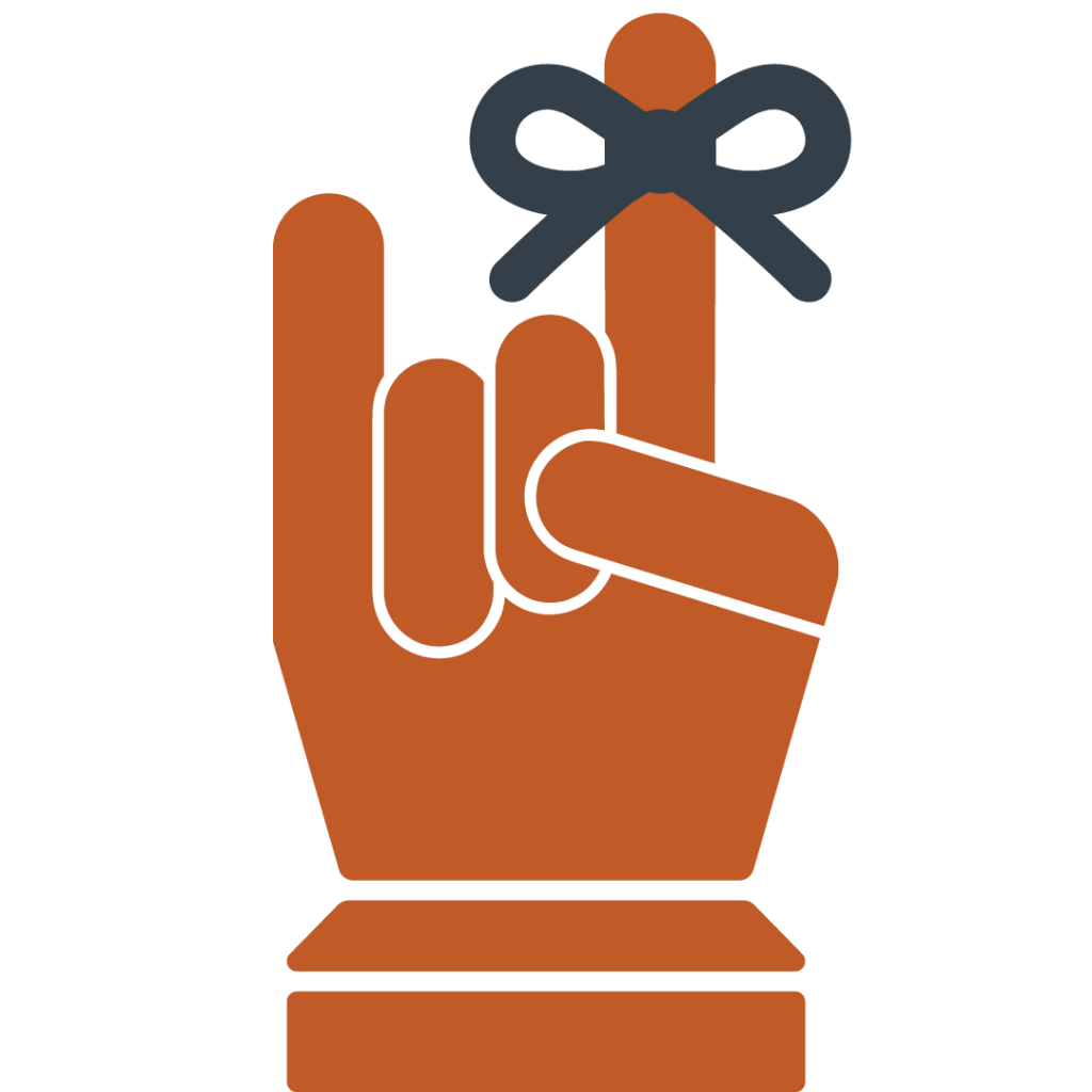
However, it didn’t take long before the team came up with a new adjustment they’d like to try out. This time it was trying to move the thumb down so it could hit both folded (middle) fingers. So, Valerie provided some inspiration pics for me to try and emulate, and I got down to business. But after I made that design come to live it was clear to all of us that the previous version was a more successful design. This is what that newer edit looked like though…


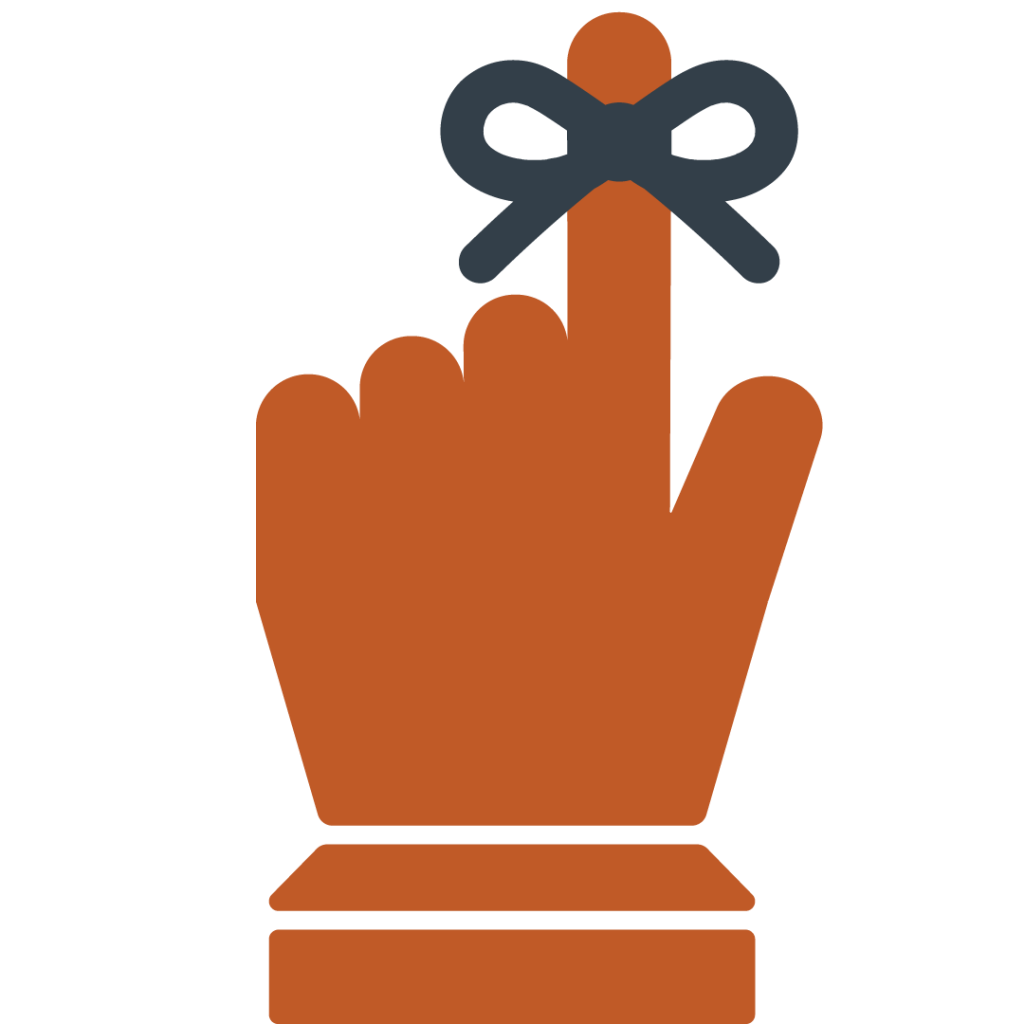
Nonetheless, the following is the final design chosen for the Student Success Tool app that will be featured in the UT app store. Unless there are further edits to be made, this is the end of the road for this project. Thank you for tuning in!

Filed Under: 2021 Spring - 2021 Summer

Student Success Tool Logo Update Pt.2

April 30, 2021 By Cristina Villarreal Núñez

Student Success Tool Logo Update Pt.2

Welcome back to the thrilling saga of designing the upcoming Student Success Tool app logo! You may remember from my last post that I concluded last week with a few new drafts (the Shape-Style Approach Drafts). You might also remember that I some more feedback on those that I didn’t get to work on before the end of my shift.


Well, I started this week working on said feedback. Basically, I was tasked with:

– Reducing the size of the ribbon

– Decreasing the padding between the closed thumb the rest of the hand (for the design with a closed thumb)

– Pushing the knuckles closer together

– Fixing the angle of the thumb (for the designs with an open thumb)


So I worked on that feedback (and posted some of the corrections on Basecamp). But before I was able to finish up all of the new drafts, we got comments from the client asking about the color scheme, requesting new additions to the drafts (like a wrist) and other details. So, I got to work on it. We still didn’t have a consensus for color palette so I started working on the other needs for this batch of drafts and this is how some of them came out…


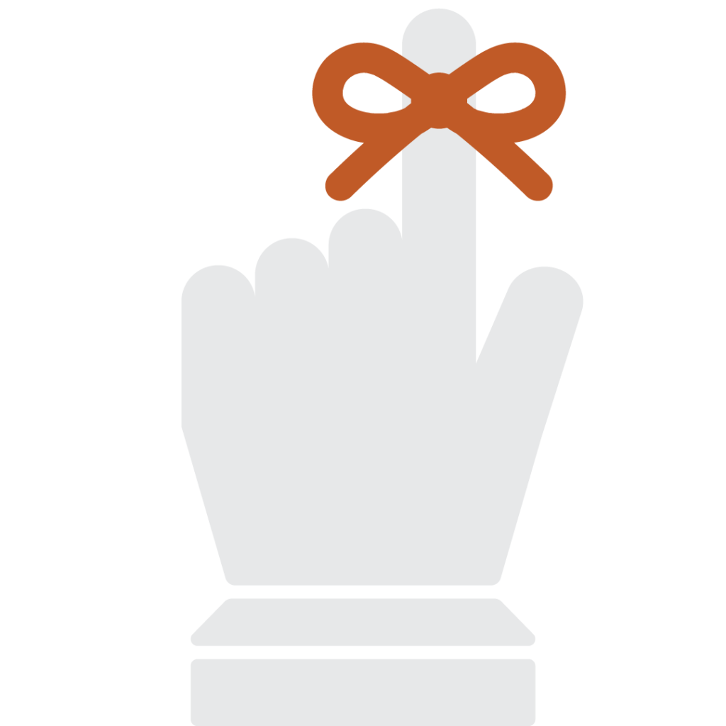
After that, I started working on a few color combos to see how they would look like. The most successful one being a combo of a burnt orange hand with a dark gray ribbon. So the next few drafts for that design were done in that color palette. (At this point I also noticed that I made a mistake with the previous Hook ‘Em version since I left the thumb extended, when that gesture is done with the thumb closed shut. I fixed that mistake in the next batch of drafts.)


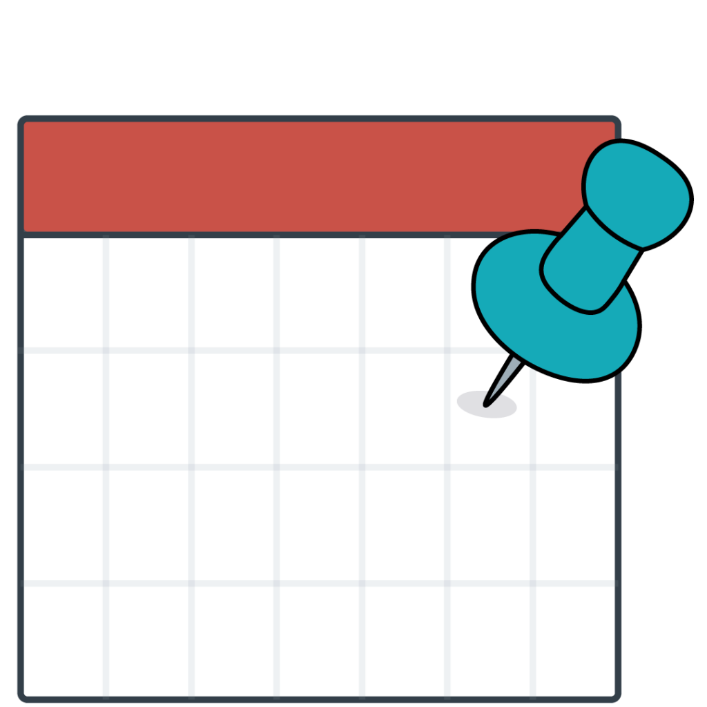
After this batch, Valerie and I agreed that these were all very solid designs and that the first one (top left) was the strongest of these. Then, I was tasked to revisit the calendar logo and work out a new color palette for that design that would match the schemes from the other apps available at the UT app store. So, naturally, I made 24 different color variations to test out and figure out a new color palette. I won’t bore you with all the details, but the following drafts were my top 3 favorite drafts.


Now we are waiting for the client to get back to us with their comments. But you know the routine. I’ll keep you posted on what happens. For now that’s it. Thanks for tuning in!

Filed Under: 2021 Spring - 2021 Summer

Student Success Tool Logo Update

April 23, 2021 By Cristina Villarreal Núñez

Student Success Tool Logo Update

Welcome back to this journey of designing the logo for the upcoming Student Success Tool that will soon be launched for UT professors to implement in their classes starting this Summer 2021. Last time I posted about this I concluded with a teaser of the theme of this update: shape-based logo drafts. So, after I got that feedback, I started working on the following drafts.


Original Shape-Based Drafts

Note: I started out working with these two because they are the ones with the lower stakes, given that the strongest direction for the logo was decidedly the String Ribbon Reminder route.


Calendar and Target Reminder Drafts


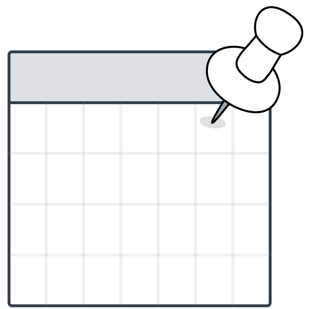
For these I pretty much kept the original idea they were rooted from and got rid of all of the lines. Additionally, I refined the shape of the push pins to be more geometric.


Afterward, Valerie and Bridget (the client) had a chat to settle on one design. Bridget took some of my previous drafts to her project partners to review them. The general consensus pointed towards the finger with the ribbon being the better concept, but that it needs refinements. Furthermore, one concern they had was that though was that if and when the logo got reduced in size it might look like it’s the middle finger, rather than the index. So, to address that, I was tasked to work on the following drafts:


1. A more polished version of the finger logo (and trying to see if tilting it could solve the middle finger issue)

2. A palm-forward version of the finger logo

3. A palm-forward Hook ’em hand with the string


And so, I got to work…


The Failed Shape-Based Batch


I consider these four attempts the failed batch because they steered away from the goal in a major way. But they were born out of a need to try new things. The first two designs with the black background were an attempt at the palm-forward version and the palm-forward Hook ’em hand. I added the black backgrounds to contrast the white hands that would not have been visible with a transparent background over a white page. However, the main problem with those two was that the visual of the hand was not coming through the way it did with the other drafts.


The bottom two drafts were supposed to be a more refined version of the ones above, but they were also not quite as string as they could have been. So, as soon as I came to that conclusion (that Valerie agreed with), I started out on a new batch of drafts.


Afterwards, Valerie suggested a more shape-style approach to reimagining this logo, and that’s what I did for the following designs.


Shape-Style Approach Drafts


About an hour after I posted these I got some more feedback, but I haven’t yet have time to work on it. So, more on this on the next update. Stay tuned!

Filed Under: 2021 Spring - 2021 Summer

Lesson 5: Color Update

April 23, 2021 By Cristina Villarreal Núñez

Lesson 5: Color Update

As promised, here is an update on the Color Theory KB I made out of my part of Lesson 5.


So, contrary to what I originally believed, my part of this lesson would not be part of a single KB with contributions of various STAs. Rather, there are going to be various final KBs for this lesson, and everything I personally worked on would be its own KB. Fun!


Therefore, once I got the chance (considering I was working on other projects at the time that were time sensitive), I started working on transferring all of the info I collected/wrote and the tutorials I repurposed and designed into a KB post. This process took about two hours to complete including the reformatting of images and text because frankly this tutorial is quite long.


Additionally, in one of our daily meetings, I got really insightful feedback from a fellow STA saying that I should probably change the name of the KB from the original “Moods and Meanings of Color” to something psychology related. So I changed the name to “Color Theory, History, and Psychology.” So I did, but after long consideration and further working on the banner, the official name for the KB just became “Color Theory.”


Finally, I started working on a banner. I skimmed trough many of the other lessons and tutorials we have in our STA database to find inspiration and I was truly mesmerized by the beautiful banner my peer STAs have created throughout the years. The stakes were high. Thereupon, I searched for some inspiration of images related to color, the history of color, color wheels and color schemes. I finally settled on a concept for the banner: the color prism, because not only is this topic directly related to the history of color theory, but it fits the aesthetic and purpose of this tutorial as well. I made a bunch of different drafts for the banner. Some were scrapped because the title was too long, so I changed it. Some were then scrapped to make room for new ideas, like changing the perspective and positioning of the prism to the center. At this point I got a lot of great feedback from Suloni herself, and the “peanut gallery.” which I assume were Valerie and Maddy. All in all, it was all really helpful to finish this task.


This is what the final version of the banner ended up looking like:


Fun fact, when I uploaded the final banner into the KB I had some trouble trying to figure out why it was shifted to the right, but Maddy suggested I ask Abriella, so I did. After I got feedback from her, we were able to figure out the problem was just an easily fixable issue with the Left-center-right align of the image. A few moments later, boom! I published the KB…


At last, here is the link to the KB tutorial: http://sites.la.utexas.edu/kb/2021/04/08/5-color-color-theory/ Feel free to check it out!

Filed Under: 2021 Spring - 2021 Summer

Student Success Tool Logo

April 16, 2021 By Cristina Villarreal Núñez

Student Success Tool Logo

Last week I was assigned this new project to design a logo for the upcoming Student Success Tool that will soon be launched for UT professors to implement in their classes starting this Summer 2021. This tool “allows instructors to message individual students or groups of students that show inactivity in the course or assignments past a due date. Instructors can also message the entire class preemptively to alert them of upcoming due dates.”


Some of the requirements I was specifically told to include in the development of this logo were:

1. To project the concepts of reminders, check-ins, and communication.

2. To completely avoid any imagery that might associate this tool with grades or grade calculation.

3. To completely avoid longhorn imagery because we do not own the rights to it.


Brainstorming and Refined Ideas


Afterwards, I had a meeting with Bridget, the person in the client position. We talked about some aspects of the requirements and went through my brainstormed ideas. We settled on 3 top ideas for this logo:


1. Is number 10 in my brainstorm, aka, the string ribbon reminder idea.

2. Is the calendar route idea, specifically referring to number 2B from my refined barnstorm ideas.

3. Is the target/bullseye idea, also known as idea 8G.


Initial Drafts


Drafts After Feedback

Note: I made a bunch of different drafts for all three of these logo directions after getting feedback. However, the ones you’ll see were the most successful versions.


String Ribbon Reminder Drafts


Calendar Reminder Drafts


Target Reminder Drafts


Nonetheless, after I made these I got feedback saying I should try doing something less line heavy and more shape based. To see those stay tuned and check out my upcoming post: Student Success Tool Logo Update…

Filed Under: 2021 Spring - 2021 Summer

  • « Previous Page
  • 1
  • …
  • 8
  • 9
  • 10
  • 11
  • 12
  • …
  • 17
  • Next Page »

link to LAITS home page

Video STA Home

© 2025 Liberal Arts Instructional Technology Services | Production Credits