Intro to Typography training:
Learned more about typefaces and their effect on design.
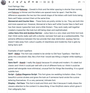
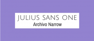
Some font pairings I thought were simple and cool:
I like the modern feel of Julius Sans One. To me it looks expensive paired with Archivo Narrow. I think its good for brand titles.
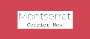
I like this pairing because it gives me a typewriter feel but there is a good separation between the two fonts. Usually in my mind titles are bold rather than thin but Montserrat in this example is the opposite. It’s thinner than Courier New but it works.
HTML/CSS training:
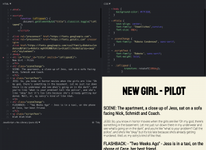
I spent a lot of time trying to animate the title text and do a wave. This is an example of something similar to what I was trying to do.
I am not very good at JavaScript so I tried making the animation with just CSS and still have not made it work :/. I did not want to spend anymore time on this training so I started others and I’ll revisit this later with a fresh mind.
