Design Training p2
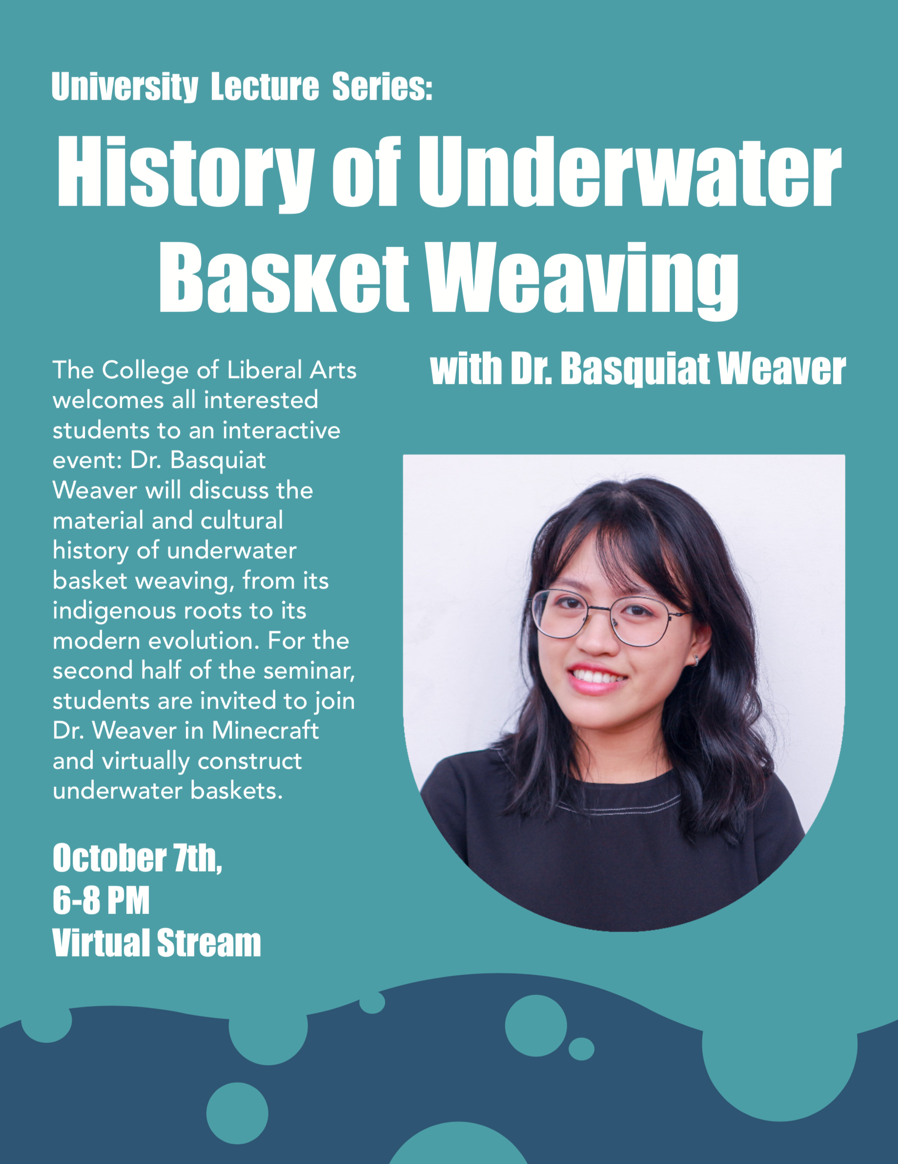
I worked on the training called: Typography | Type Hierarchy in InDesign written by Megan. The point of the poster is to practice hierarchy of elements in a poster and knowing what information is most important to highlight.
I went a little playful with mine such as cropping the image into the shape of a basket. I also did the title in a cascading justification to mimic the swaying movement of water. On the bottom are my “hand-drawn” elements to bring out the idea of being underwater some more.
We also have to use a special glyph at least once in the poster. I used the lower “K”. My font is impact and the lowercase “k” is taller than all the other lowercase letters. I switched it out for a special shorter “k”.
Currently feedback is still pending from Megan on anything to edit further but this was what I made. I really enjoyed this poster and tried to do something more dynamic and playful from what I usually do and hopefully it is successful.
