• We are STAs
    • Asha Rountree
    • Haley Ma
    • Kate Shih
    • Kyra Lee
    • Nicholas Peasley
    • Sasha Kenney
    • Shanda Horm
    • Shriya Atreya
    • Tomas Marulanda-Mesa
  • We were STAs
  • STA Presentation
    • STA Presentation 2017
    • STA Presentation 2016
  • Testimonials
  • Resources
  • Home

STA Blog

Abriella Corker

Abriella Corker

Art Things

February 3, 2020 By Abriella Corker

ART THINGS

GIF


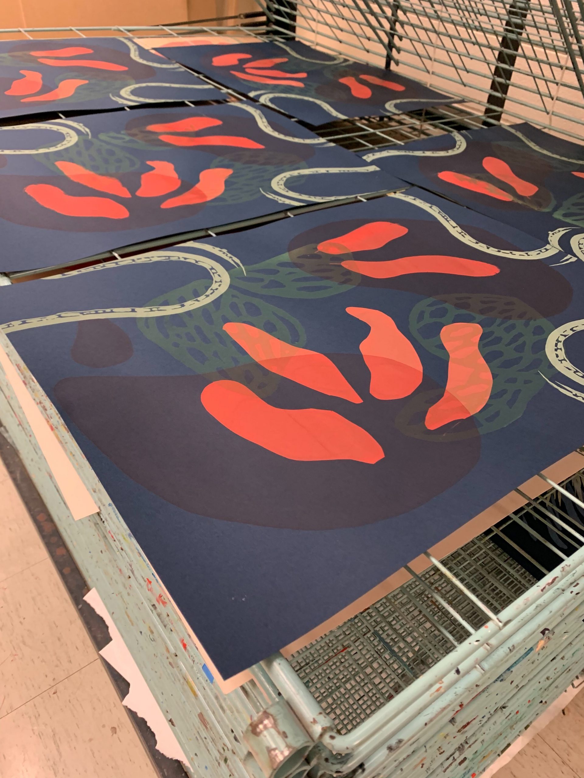
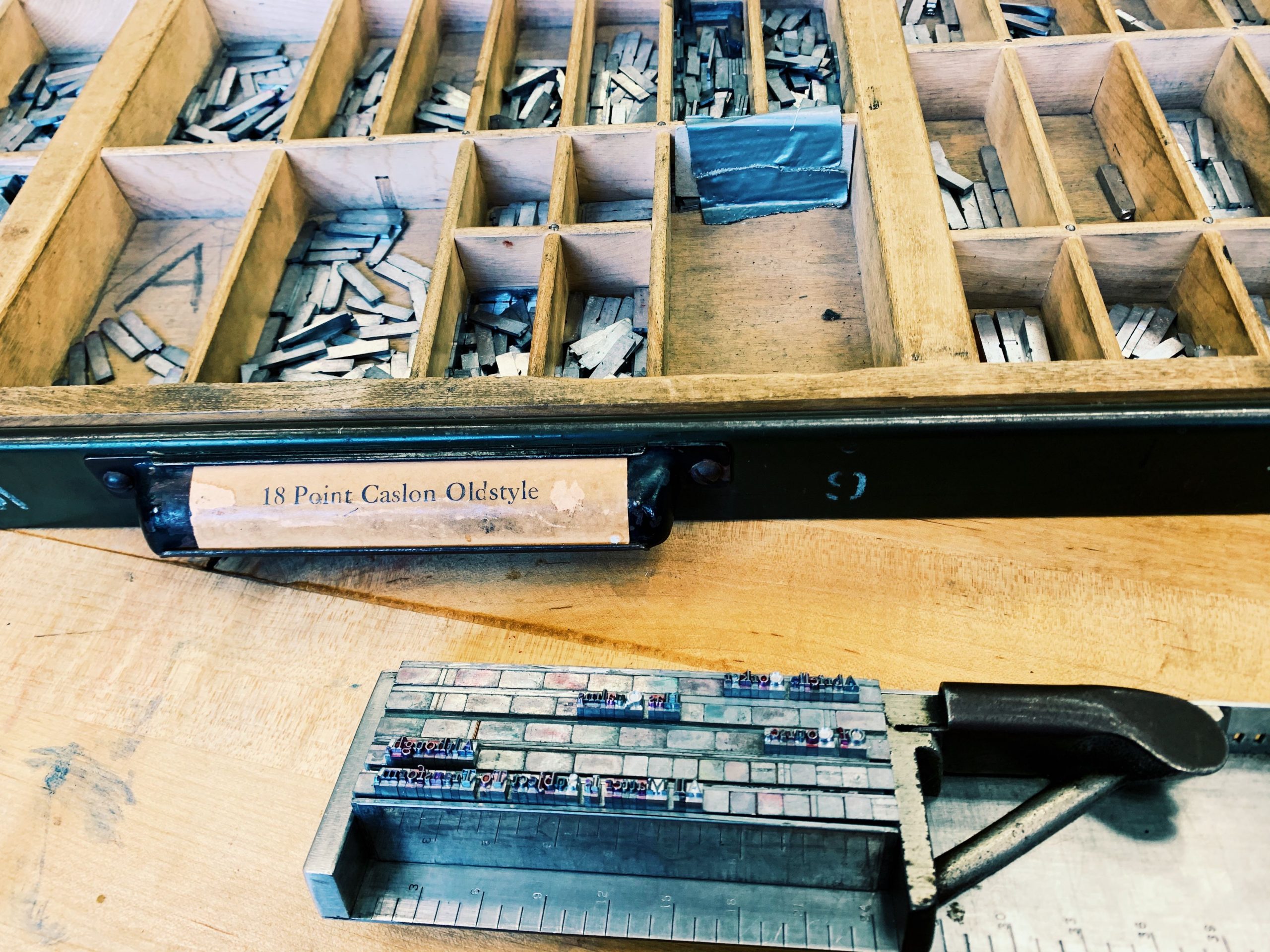
Things have been a little stressful with managing school, work, and personal projects. I always complain but never show what it actually is I got going on. These are some of the more delightful things that required lots of effort but brought me joy. I am taking intermediate serigraphy and we are putting together an 8 layer print of 15 editions. Each layer based off of ambiguous terms that were related to this reading we did on the poor image (https://www.e-flux.com/journal/10/61362/in-defense-of-the-poor-image/). I am starting on the last 4 layers this week. The image below were studies from a book on art in Mexico. This was a personal mini art exploration to give to someone and not for class. Although I did make it in one of my classes :0 oops! The last two images are what I am working on in my letter press class. We are working with metal typeface and I am so excited I am really loving the process and everything I have learned so far in the readings. There is so much to printed text and digital text that I never realized. So many hacks and rules about how to make things come together. I am hoping what I learn here can make me a better designer in the office when it comes to putting together designs with texts for our clients.


Processed with VSCO with g3 preset

Filed Under: 2019 Fall-Winter | Spring-Summer 2020

Updating the KB

February 3, 2020 By Abriella Corker

UPDATING THE KB WITH BASIC TRAININGS

We have been adding basic trainings to the KB and will continue to do so in between projects. Thuy, Bridget, and I have been the ones who have edited these so far. They have more instruction and examples implemented in them to give new hires a more well-rounded training. Folders in the server will eventually be updated to correspond with the content in here.

Filed Under: 2019 Fall-Winter | Spring-Summer 2020

Web Support

January 30, 2020 By Abriella Corker

WEB SUPPORT

GIF

Lately Bridget, Thuy, and I have been working on web support questions from the years 2018-2019 as well as current incoming questions. These questions involve editing sites on Cascade and using the COLA web editor. Our job is to filter through these emails that have been sent and determine what is being asked. We then look up if it is information that has already been documented on our web-support site or is not documented but needs to be. We are doing this because recently, in the last few months, we have added a chat bot to our web editing site to help making searching for answers easier for staff, admins, faculty, and grad students.


Below is an image of the chat bot that we have, a screenshot of the type of document that has already been added to the bot to link people too, and lastly what the training for the bot looks like. We include the title of the webpage with the instructions, and the hyperlink, and included various types of phrases that could possibly be asked about the topics answered in that instruction guide. As we go through more emails, we can identify a larger quantity of phrasing of questions that can be added to links we already have in the chat bot to make it more intelligent and accurate.


Underneath is part of the excel spreadsheet Bridget has made for keeping track of the type of documentation that needs to be made and added to our instructional site. These are what we have found so far during our first round of filtering through emails. Once, we start making these after the first round look throughs are complete, we can make the documentation needed and train the chat bot all at once. Then we will go through the second round of emails we previously filtered and update their status that the chat bot has been trained.


Filed Under: 2019 Fall-Winter | Spring-Summer 2020

Editing for Infograph Handbook

January 23, 2020 By Abriella Corker

INFOGRAPHS FOR HANDBOOK

FIBERS SECTION

This is the design me and Thuy came up with for the double bar graph comparing the soluble to insoluble foods. On the bottom they are sectioned by a healthy food group (vegetables, fruits, grains, and nuts+seeds). Then above marked as squiggles will be two specific food items in that section. One that is higher in soluble fiber and the other that is higher in insoluble fibers. The units will be in grams based off of what we found when looking up information. We will also include how much per serving size of each specific food item. Maybe all 1/2 a cup serving size. On top of each bar graph, we were thinking of adding some icons of the food itself to make it more lively / artsy.

These are some examples of the food we’d like to pair against each other in each group (Vegetables, Grains, Fruits, and Nuts and Seeds). We purposefully chose, in each group, 1 food that is higher in soluble, and 1 that is higher in insoluble.

Here is an inspiration image for how we would like the look of the icons to be with the graph.

FATS SECTION

Here is the layout for the fats it will be in a schematic so the types of fatty rich foods shown more clearly. The color will go from light to dark for each tier. The example foods may be actual images in a bubble or an icon as well to match the bar graph icons for the fibers. The organization goes from unsaturated fats to poly and mono unsaturated, then to the types of omegas, then to examples of nutritional sources for these omegas.

Some foods high in Omega-3, 6, and 9.

Omega-3:

  • Tuna
  • Salmon
  • Flaxseed
Omega-6:
  • Pistachios
  • Pumpkin seeds
  • Acai
Omega-9:
  • Olives
  • Avocado
  • Almonds
We were thinking of just having the names and image or illustration / icon of the food in the bubble, as the graph is pretty dense already.


Here are some examples that we liked the styling of that might help inform us as to how we’d like the look of this to be.


COMPLIMENTARY PROTEINS SECTION

This one will have common meat replacing foods for sources of protein. I have about 6. This darker line will be the percentage of the daily intake out of the 100% daily intake of protein per how ever much the serving size would be. They will have an icon in the center and a name underneath to follow the icon type of the graphs before.

These are some resources we found on protein to help inform how our sketched out design will be laid out.


Styling that me and Thuy would like to replicate for this section.

SUPPLEMENTATION  SECTION

This info graph will show the types of common nutrients on the y-axis and on the x-axis will be the percent of people deficient in that nutrient on average. It will have a rounded end on the bars and will be long and vertical. This section could be developed a little more but it had the least amount of information.

Filed Under: 2019 Fall-Winter | Spring-Summer 2020

Nutrition Education Infographics

January 23, 2020 By Abriella Corker

INFOGRAPHS

Project: Nutrition Education Infographics

Client: Marissa Duswalt Epstein – Lecturer and the Director of The University of Texas Nutrition Institute

Completion status: In progress

Description / plans: Create info graphs to be used in her nutrition handbook. The first assignment is to create an info graph based off of a design brief before starting on graphs for the handbook to establish a sense of style for the overall look in accordance with the styling of the handbook.


These are the rough sketches for the layout of the design brief. It is a comparison chart of calorie density to water content based on a certain volume of a type of food. I drew these out a Thuy then made edits on AI while I helped her make decisions on the type of edits to make within the file.


Here is the first graph that Thuy put together based off of my third sketch above. We are waiting for the client to provide feedback on what she thinks of the design. It is very simplistic to not distract from the information trying to be conveyed through the graph and the text that would be on the handbook. We based the look off of the design guidelines and the appearance of the handbook. Thuy added these icons to make the graph appear more visually appealing and less plain.


Filed Under: 2019 Fall-Winter | Spring-Summer 2020, Uncategorized

CLIOs

January 23, 2020 By Abriella Corker

CLIO EDITING

As you can see I have been completing formatting for huge amount of CLIOs. These edits include adding headers, adding a photo to the banner, formatting text with bullets and proper bolding, as well as adding backgrounds to images with captions. There are still more in my basecamp assigned to me to complete and more to assign myself in the future. Most of these are live now so I will make any edits in the live site.

Filed Under: 2019 Fall-Winter | Spring-Summer 2020

  • « Previous Page
  • 1
  • …
  • 34
  • 35
  • 36
  • 37
  • 38
  • …
  • 50
  • Next Page »

link to LAITS home page

Video STA Home

© 2025 Liberal Arts Instructional Technology Services | Production Credits