INFOGRAPHS FOR HANDBOOK
FIBERS SECTION
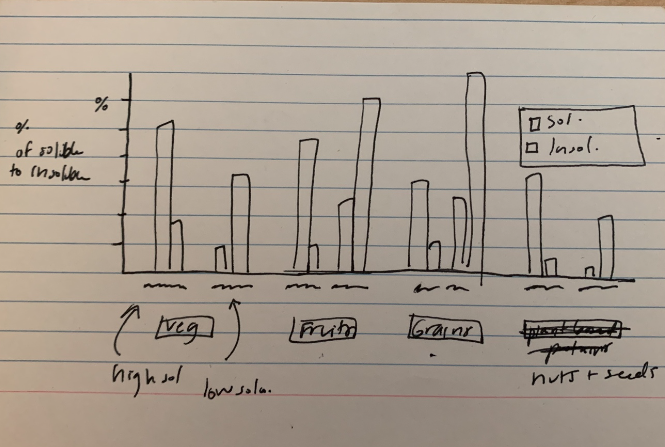
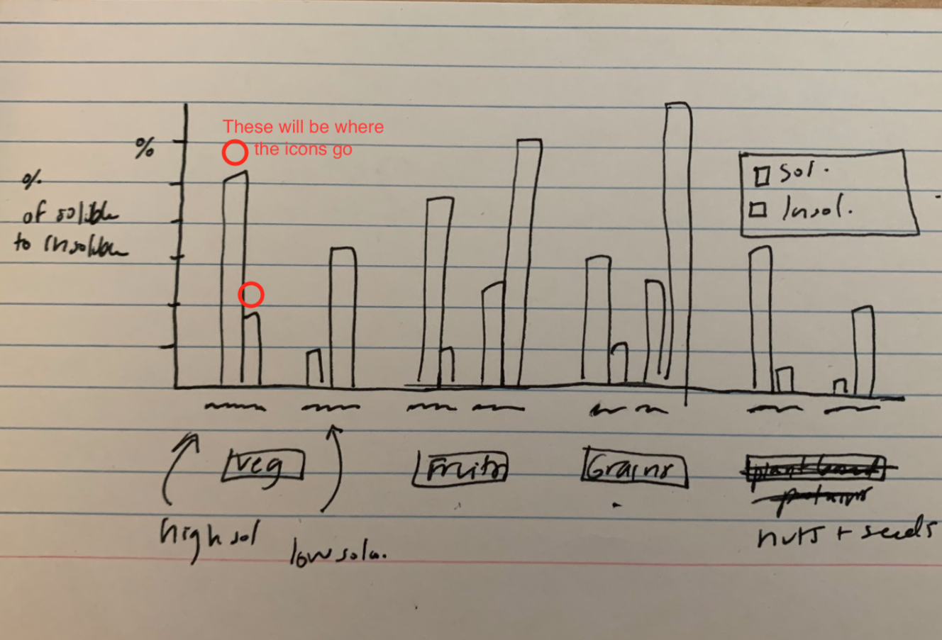
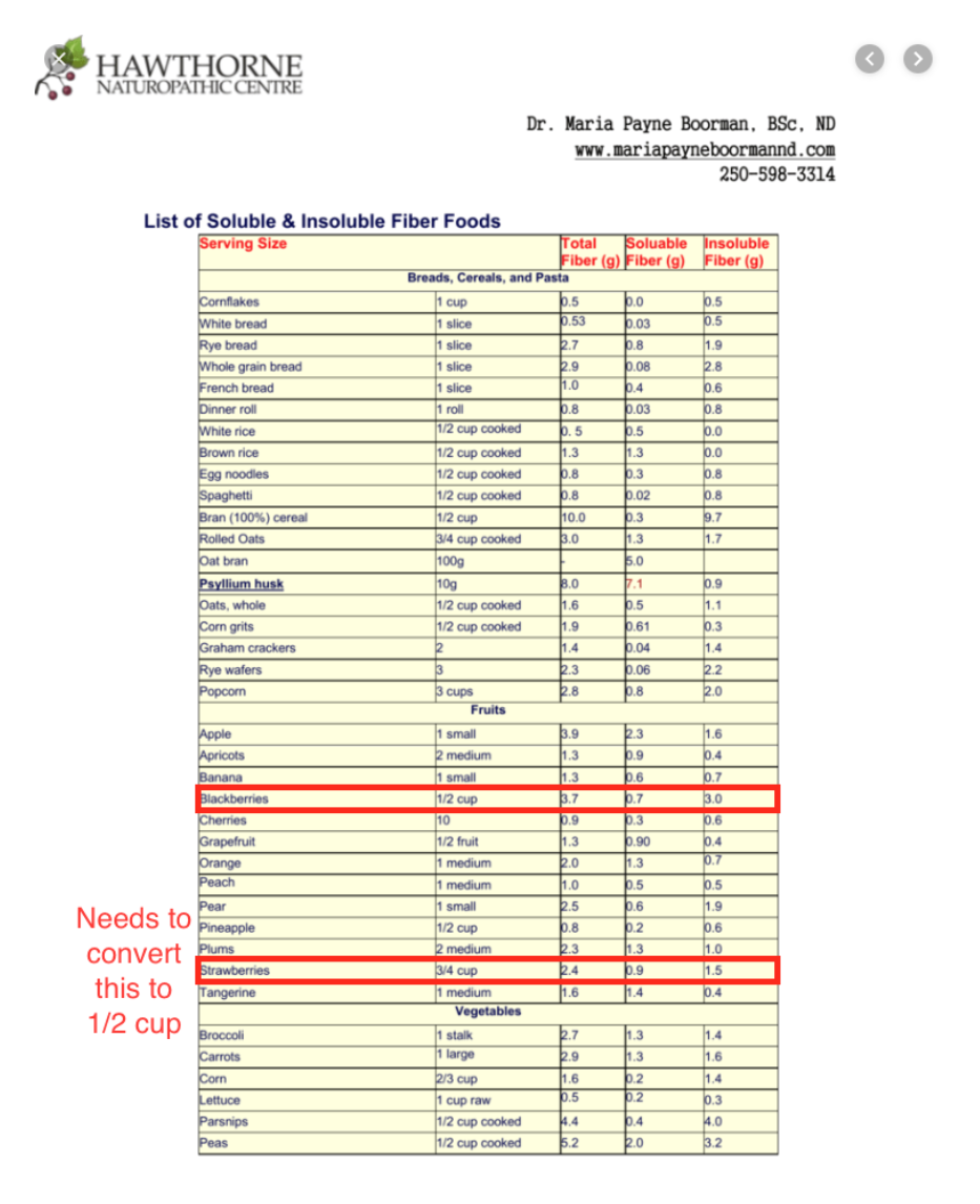
This is the design me and Thuy came up with for the double bar graph comparing the soluble to insoluble foods. On the bottom they are sectioned by a healthy food group (vegetables, fruits, grains, and nuts+seeds). Then above marked as squiggles will be two specific food items in that section. One that is higher in soluble fiber and the other that is higher in insoluble fibers. The units will be in grams based off of what we found when looking up information. We will also include how much per serving size of each specific food item. Maybe all 1/2 a cup serving size. On top of each bar graph, we were thinking of adding some icons of the food itself to make it more lively / artsy.
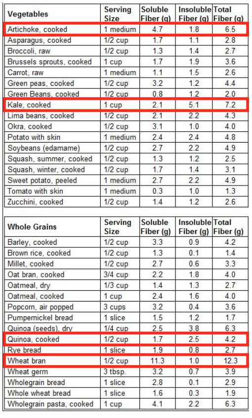
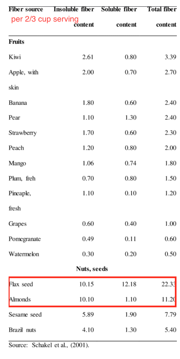
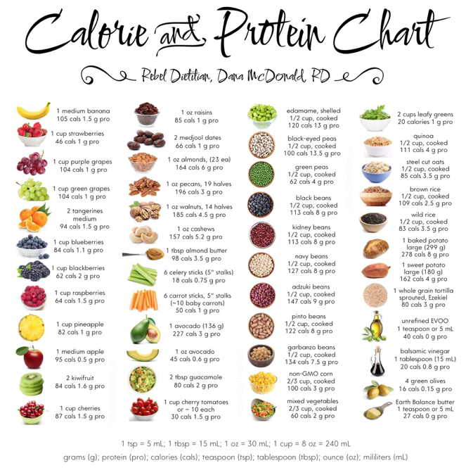
These are some examples of the food we’d like to pair against each other in each group (Vegetables, Grains, Fruits, and Nuts and Seeds). We purposefully chose, in each group, 1 food that is higher in soluble, and 1 that is higher in insoluble.
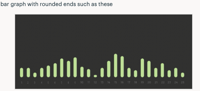
Here is an inspiration image for how we would like the look of the icons to be with the graph.
FATS SECTION
Here is the layout for the fats it will be in a schematic so the types of fatty rich foods shown more clearly. The color will go from light to dark for each tier. The example foods may be actual images in a bubble or an icon as well to match the bar graph icons for the fibers. The organization goes from unsaturated fats to poly and mono unsaturated, then to the types of omegas, then to examples of nutritional sources for these omegas.
Some foods high in Omega-3, 6, and 9.
Omega-3:
- Tuna
- Salmon
- Flaxseed
- Pistachios
- Pumpkin seeds
- Acai
- Olives
- Avocado
- Almonds
Here are some examples that we liked the styling of that might help inform us as to how we’d like the look of this to be.
COMPLIMENTARY PROTEINS SECTION
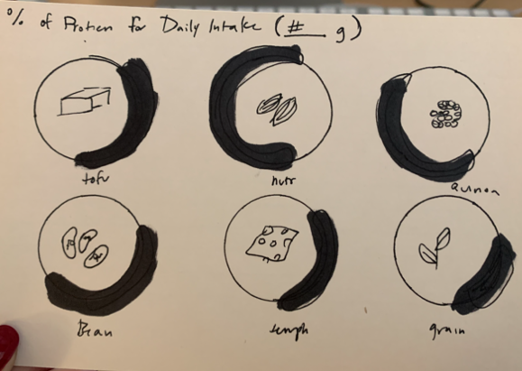
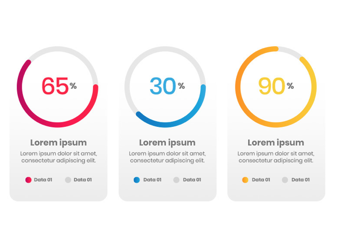
This one will have common meat replacing foods for sources of protein. I have about 6. This darker line will be the percentage of the daily intake out of the 100% daily intake of protein per how ever much the serving size would be. They will have an icon in the center and a name underneath to follow the icon type of the graphs before.
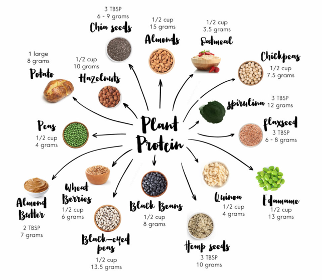
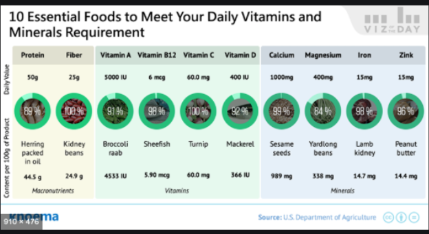
These are some resources we found on protein to help inform how our sketched out design will be laid out.
Styling that me and Thuy would like to replicate for this section.
SUPPLEMENTATION SECTION
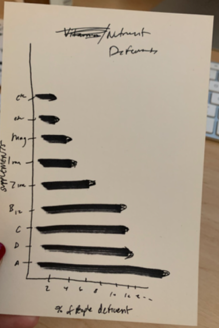
This info graph will show the types of common nutrients on the y-axis and on the x-axis will be the percent of people deficient in that nutrient on average. It will have a rounded end on the bars and will be long and vertical. This section could be developed a little more but it had the least amount of information.
